Questions as text
Q1 · The diagram shows a production possibility curve for digital televisions and CD players 0455/11 May/June 2013
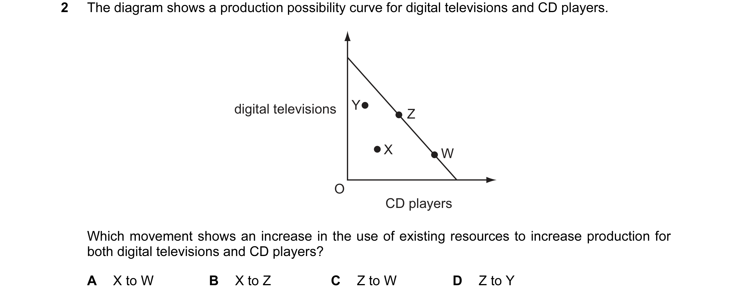
2 The diagram shows a production possibility curve for digital televisions and CD players. digital televisions Y Z X W O CD players Which movement shows an increase in the use of existing resources to increase production for both digital televisions and CD players? A X to W B X to Z C Z to W D Z to Y
1 marks
Answer: B
This question in 0455/11 May/June 2013
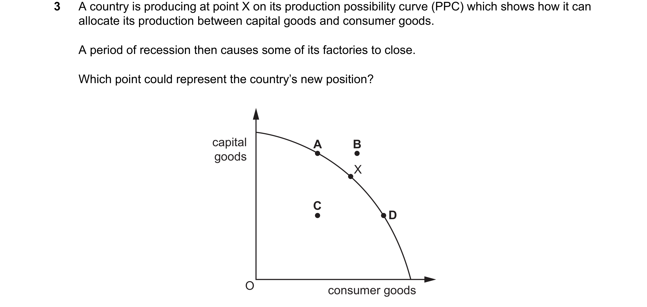
Q2 · A country is producing at point X on its production possibility curve which shows how it… 0455/12 May/June 2013
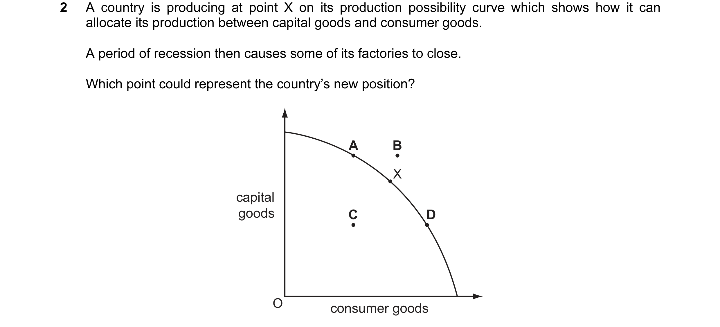
2 A country is producing at point X on its production possibility curve which shows how it can allocate its production between capital goods and consumer goods. A period of recession then causes some of its factories to close. Which point could represent the country’s new position? A B X capital goods C D O consumer goods
1 marks
Answer: C
This question in 0455/12 May/June 2013
Q3 · The diagram shows a production possibility curve for digital televisions and CD players 0455/13 May/June 2013
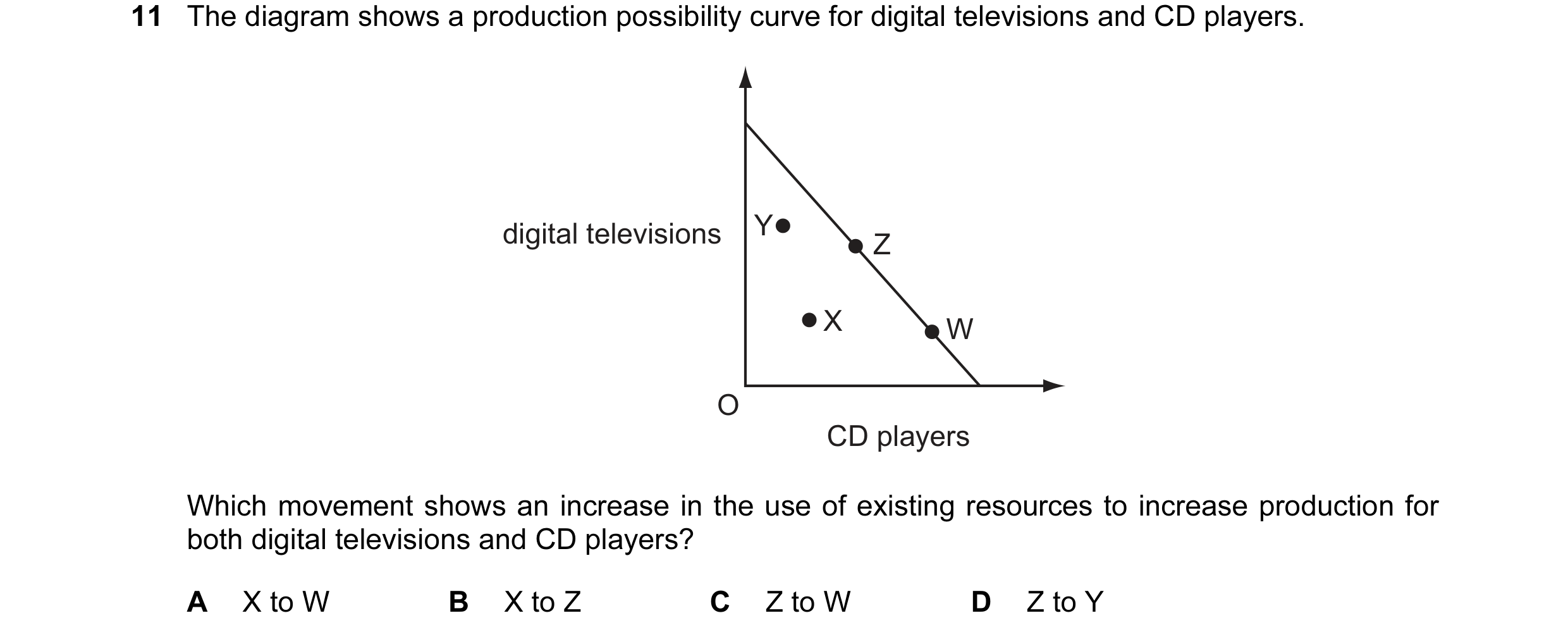
11 The diagram shows a production possibility curve for digital televisions and CD players. digital televisions Y Z X W O CD players Which movement shows an increase in the use of existing resources to increase production for both digital televisions and CD players? A X to W B X to Z C Z to W D Z to Y
1 marks
Answer: B
This question in 0455/13 May/June 2013
Q4 · How does a production possibility curve show that scarcity exists? 0455/11 Oct/Nov 2013
11 How does a production possibility curve show that scarcity exists? A It shows that a rise in demand for one of the products increases its price. B It shows that as more resources are used to produce a product, its price rises. C It shows that at any point outside the production possibility curve an economy is wasting resources. D It shows that there is a limit to the quantity of products that can be produced with existing resources and technology.
1 marks
Answer: D
This question in 0455/11 Oct/Nov 2013
Q5 · How does a production possibility curve show that scarcity exists? 0455/12 Oct/Nov 2013
2 How does a production possibility curve show that scarcity exists? A It shows that a rise in demand for one of the products increases its price. B It shows that as more resources are used to produce a product, its price rises. C It shows that at any point outside the production possibility curve an economy is wasting resources. D It shows that there is a limit to the quantity of products that can be produced with existing resources and technology.
1 marks
Answer: D
This question in 0455/12 Oct/Nov 2013
Q6 · An economy produces different types of goods using its limited resources 0455/13 Oct/Nov 2013
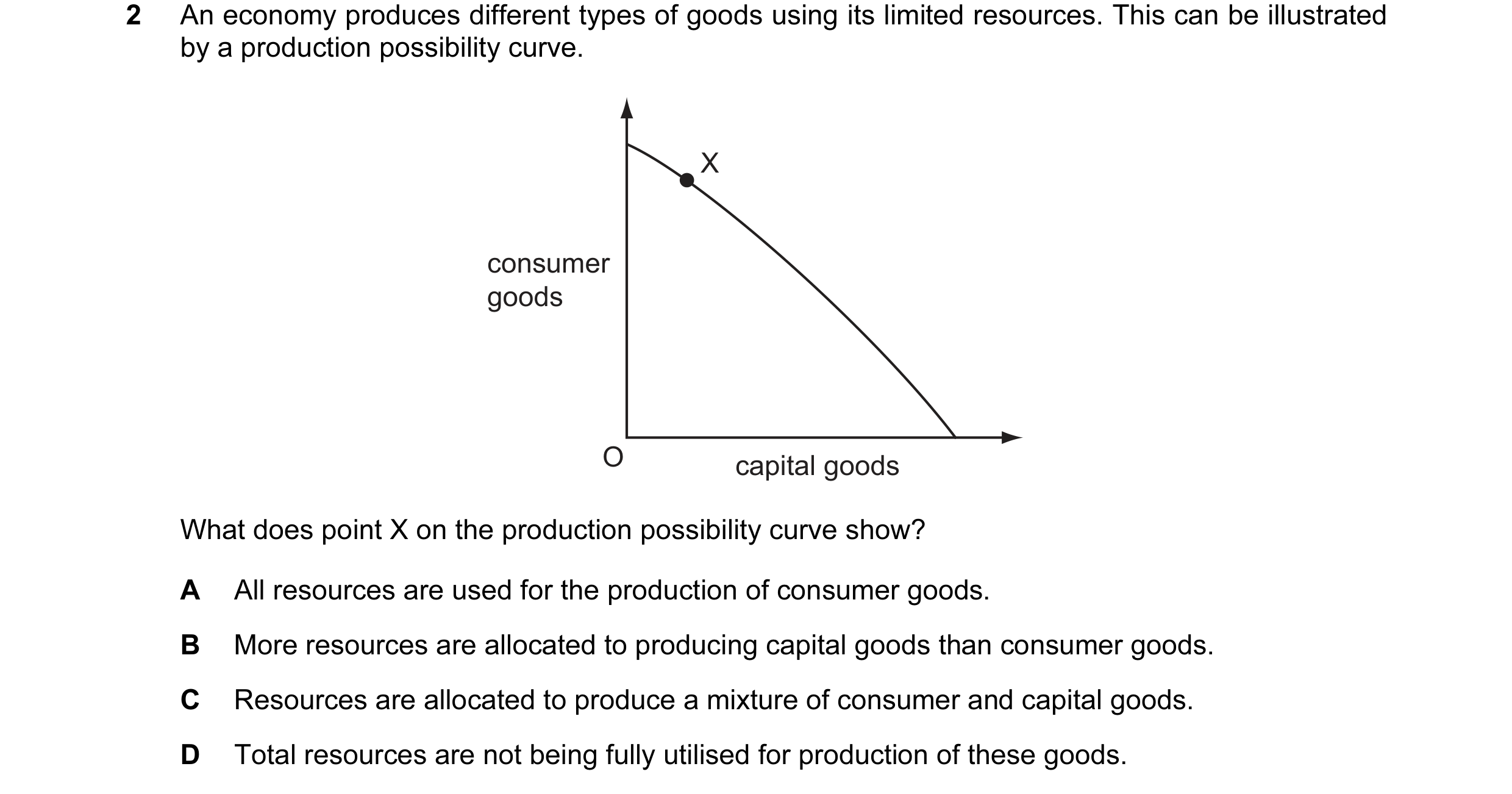
2 An economy produces different types of goods using its limited resources. This can be illustrated by a production possibility curve. X consumer goods O capital goods What does point X on the production possibility curve show? A All resources are used for the production of consumer goods. B More resources are allocated to producing capital goods than consumer goods. C Resources are allocated to produce a mixture of consumer and capital goods. D Total resources are not being fully utilised for production of these goods.
1 marks
Answer: C
This question in 0455/13 Oct/Nov 2013
Q7 · Using all available resources, an economy produces different combinations of two types of… 0455/11 May/June 2014
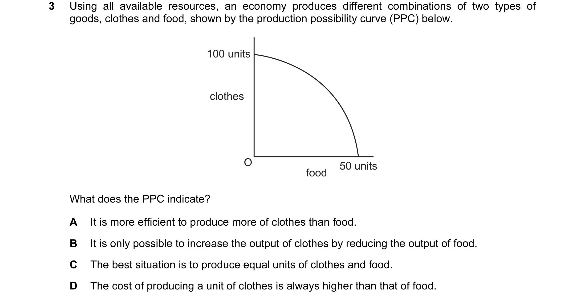
2 Using all available resources, an economy produces different combinations of two types of goods, clothes and food, shown by the production possibility curve (PPC) below. 100 units clothes O 50 units food What does the PPC indicate? A It is more efficient to produce more of clothes than food. B It is only possible to increase the output of clothes by reducing the output of food. C The best situation is to produce equal units of clothes and food. D The cost of producing a unit of clothes is always higher than that of food.
1 marks
Answer: B
This question in 0455/11 May/June 2014
Q8 · How is an immediate effect of an increase in unemployment illustrated on a production… 0455/12 May/June 2014
2 How is an immediate effect of an increase in unemployment illustrated on a production possibility curve diagram? A a movement of the production point closer to the curve B a movement of the production point further inside the curve C a shift of the production possibility curve inwards D a shift of the production possibility curve outwards
1 marks
Answer: B
This question in 0455/12 May/June 2014
Q9 · Using all available resources, an economy produces different combinations of two types of… 0455/13 May/June 2014
3 Using all available resources, an economy produces different combinations of two types of goods, clothes and food, shown by the production possibility curve (PPC) below. 100 units clothes O 50 units food What does the PPC indicate? A It is more efficient to produce more of clothes than food. B It is only possible to increase the output of clothes by reducing the output of food. C The best situation is to produce equal units of clothes and food. D The cost of producing a unit of clothes is always higher than that of food.
1 marks
Answer: B
This question in 0455/13 May/June 2014
Q10 · The diagram shows two production possibility curves for an economy 0455/11 Oct/Nov 2014
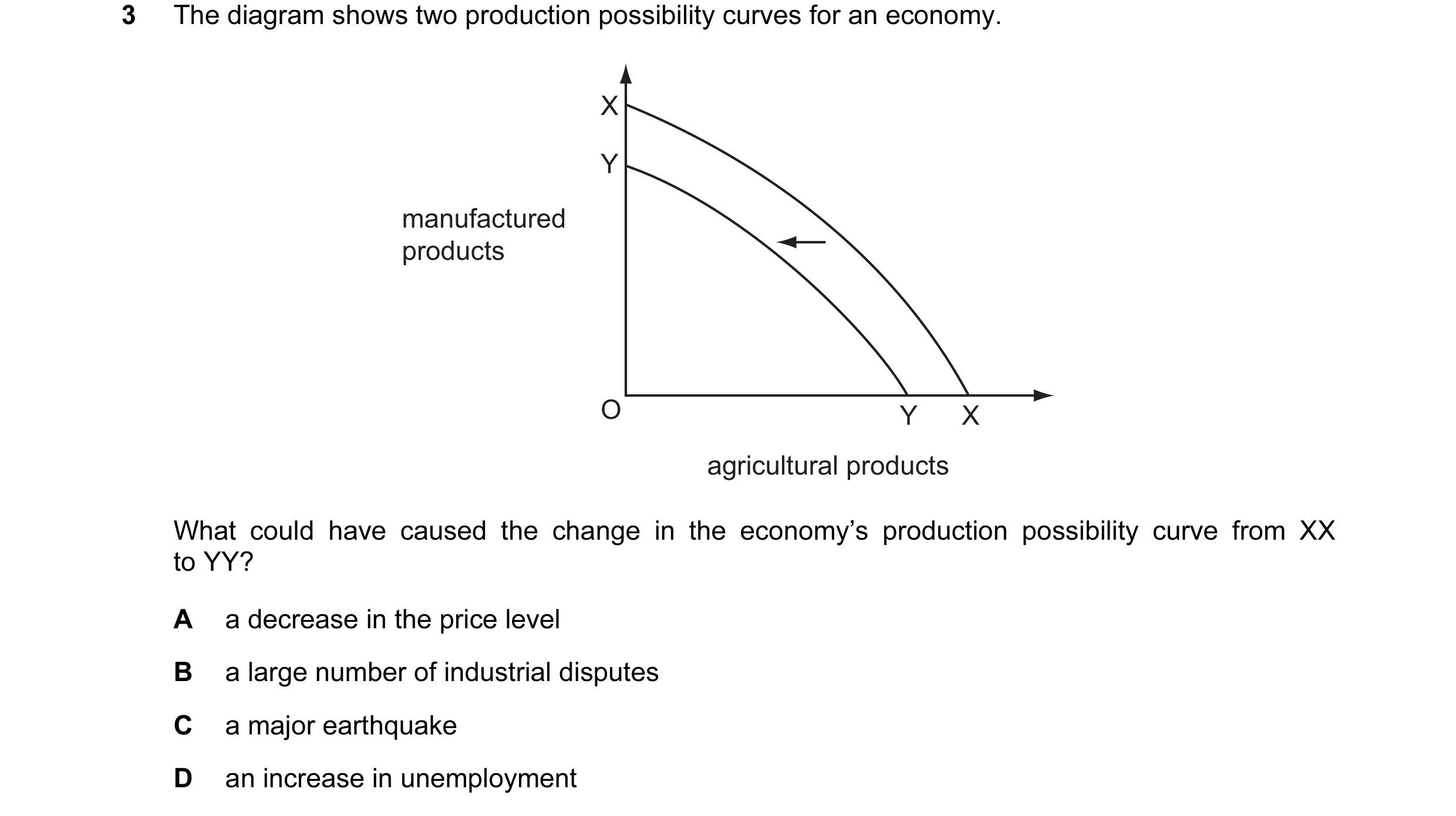
4 The diagram shows two production possibility curves for an economy. X Y manufactured products O Y X agricultural products What could have caused the change in the economy’s production possibility curve from XX to YY? A a decrease in the price level B a large number of industrial disputes C a major earthquake D an increase in unemployment
1 marks
Answer: C
This question in 0455/11 Oct/Nov 2014
Q11 · The diagram shows two production possibility curves for an economy 0455/12 Oct/Nov 2014
3 The diagram shows two production possibility curves for an economy. X Y manufactured products O Y X agricultural products What could have caused the change in the economy’s production possibility curve from XX to YY? A a decrease in the price level B a large number of industrial disputes C a major earthquake D an increase in unemployment
1 marks
Answer: C
This question in 0455/12 Oct/Nov 2014
Q12 · In the diagram, what does the production possibility line PQ illustrate? 0455/13 Oct/Nov 2014
2 In the diagram, what does the production possibility line PQ illustrate? P product Y O product X Q A constant opportunity cost B decreasing opportunity cost C diseconomies of scale D economies of scale
1 marks
Answer: A
This question in 0455/13 Oct/Nov 2014
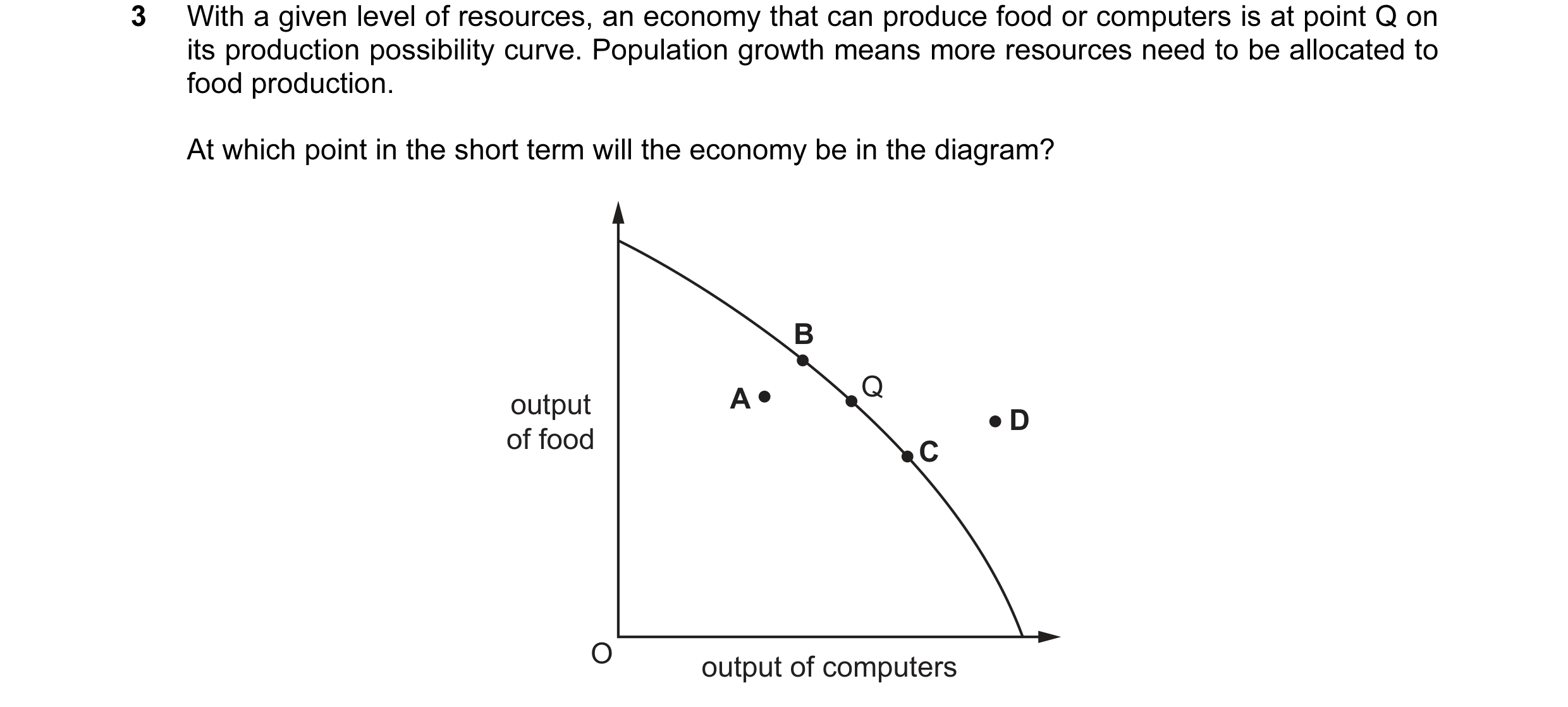
Q13 · With a given level of resources, an economy that can produce food or computers is at… 0455/11 May/June 2015
3 With a given level of resources, an economy that can produce food or computers is at point Q on its production possibility curve. Population growth means more resources need to be allocated to food production. At which point in the short term will the economy be in the diagram? B A Q output D of food C O output of computers
1 marks
Answer: B
This question in 0455/11 May/June 2015
Q14 · The diagram shows production possibility curves (PPC) for a country that can produce… 0455/12 May/June 2015
3 The diagram shows production possibility curves (PPC) for a country that can produce agricultural products or manufactured products. Its current PPC passes through points Q and S but the country is currently experiencing unemployment. Q R agricultural products P S O manufactured products If there is now full employment at the same time as new agricultural techniques enable an increase in productivity, what would be the movement on the PPC diagram? A P to R B P to S C Q to R D S to Q
1 marks
Answer: A
This question in 0455/12 May/June 2015
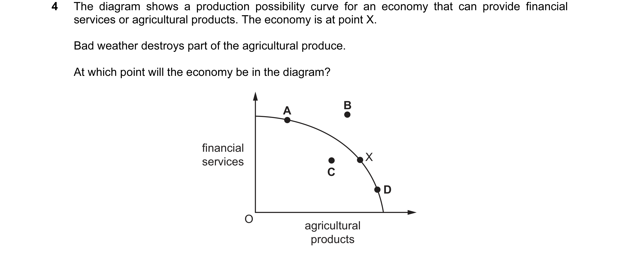
Q15 · The diagram shows a production possibility curve for an economy that can provide… 0455/11 Oct/Nov 2015
4 The diagram shows a production possibility curve for an economy that can provide financial services or agricultural products. The economy is at point X. Bad weather destroys part of the agricultural produce. At which point will the economy be in the diagram? A B financial services X C D O agricultural products
1 marks
Answer: C
This question in 0455/11 Oct/Nov 2015
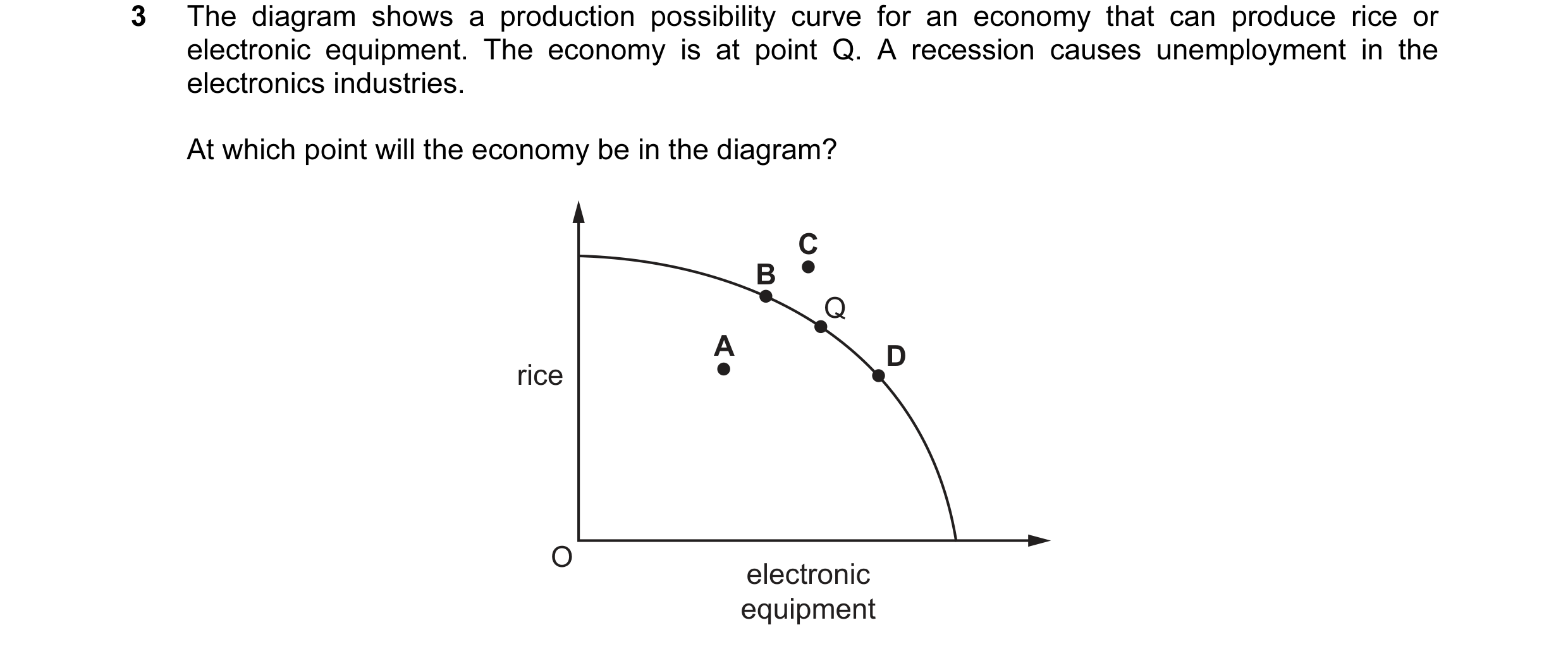
Q16 · The diagram shows a production possibility curve for an economy that can produce rice or… 0455/12 Oct/Nov 2015
3 The diagram shows a production possibility curve for an economy that can produce rice or electronic equipment. The economy is at point Q. A recession causes unemployment in the electronics industries. At which point will the economy be in the diagram? C B Q A D rice O electronic equipment
1 marks
Answer: A
This question in 0455/12 Oct/Nov 2015
Q17 · The diagram shows a country’s production possibility curve for rice and wheat 0455/12 Feb/March 2016
2 The diagram shows a country’s production possibility curve for rice and wheat. P rice Q R S O wheat A major flood destroys a large area of agricultural land. Which movement could represent the resulting change in output? A P to Q B Q to R C R to S D S to P
1 marks
Answer: A
This question in 0455/12 Feb/March 2016
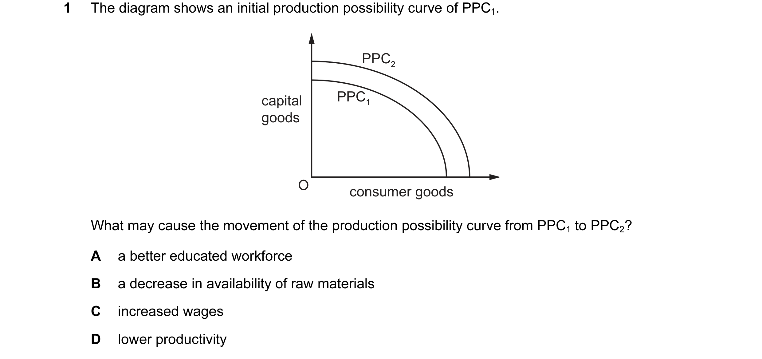
Q18 · The diagram shows an initial production possibility curve of PPC1 0455/11 May/June 2016
1 The diagram shows an initial production possibility curve of PPC1. PPC2 capital PPC1 goods O consumer goods What may cause the movement of the production possibility curve from PPC1 to PPC2? A a better educated workforce B a decrease in availability of raw materials C increased wages D lower productivity
1 marks
Answer: A
This question in 0455/11 May/June 2016
Q19 · What economic concept must be at work when there is movement by a country along its… 0455/12 May/June 2016
1 What economic concept must be at work when there is movement by a country along its production possibility curve? A economies of scale B equilibrium price C maximum profit D opportunity cost
1 marks
Answer: D
This question in 0455/12 May/June 2016
Q20 · Which statement about a production possibility curve is correct? 0455/13 May/June 2016
1 Which statement about a production possibility curve is correct? A A production possibility curve is an alternative name for an industry supply curve. B A production possibility curve is an economic model of potential output. C A realistic production possibility curve must be drawn as a straight line. D A production possibility curve applies only to an economy’s production of goods.
1 marks
Answer: B
This question in 0455/13 May/June 2016
Q21 · The diagram shows a production possibility curve for maize and cotton 0455/12 Oct/Nov 2016
3 The diagram shows a production possibility curve for maize and cotton. P Q maize R S O cotton Bad weather causes a poor harvest for both crops. Which movement could be used to represent this change? A P to R B Q to R C S to Q D S to R
1 marks
This question in 0455/12 Oct/Nov 2016
Q22 · In 2014 private companies began to drill in areas of the country to exploit natural gas… 0455/13 Oct/Nov 2016
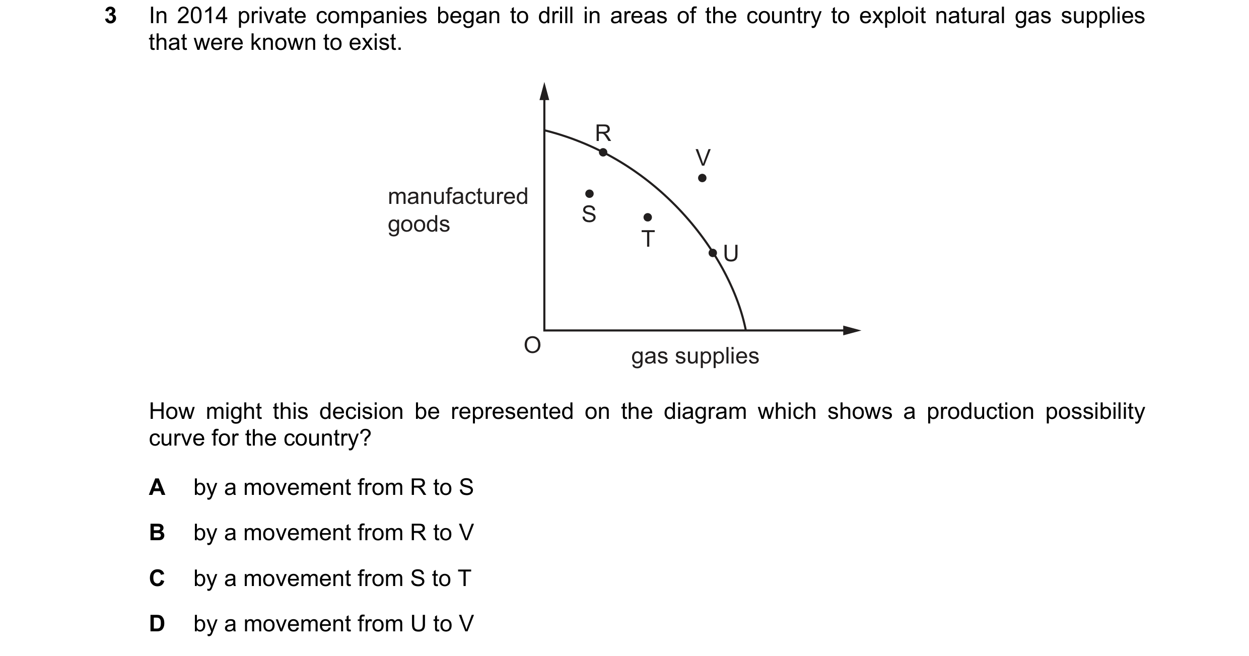
3 In 2014 private companies began to drill in areas of the country to exploit natural gas supplies that were known to exist. R V manufactured goods S T U O gas supplies How might this decision be represented on the diagram which shows a production possibility curve for the country? A by a movement from R to S B by a movement from R to V C by a movement from S to T D by a movement from U to V
1 marks
Answer: C
This question in 0455/13 Oct/Nov 2016
Q23 · The diagram shows a production possibility curve for a country 0455/12 Feb/March 2017
2 The diagram shows a production possibility curve for a country. As a result of an increase in demand for manufactured goods it moves from a situation of unemployment to full employment. agriculture E F G H O manufactured goods How would this be represented on this diagram? A by a movement from E to G B by a movement from F to E C by a movement from F to G D by a movement from G to H
1 marks
Answer: C
This question in 0455/12 Feb/March 2017
Q24 · The diagram shows a production possibility curve for an economy 0455/11 May/June 2017
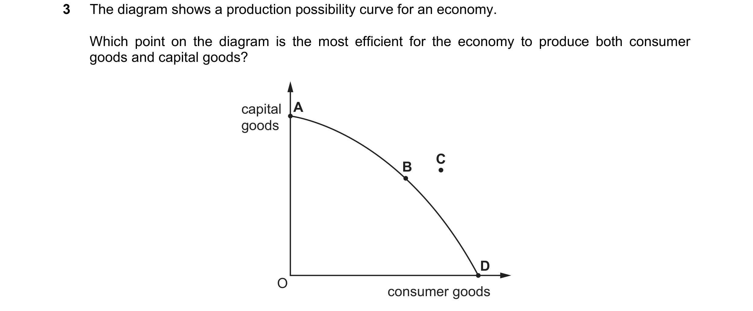
3 The diagram shows a production possibility curve for an economy. Which point on the diagram is the most efficient for the economy to produce both consumer goods and capital goods? capital A goods C B D O consumer goods
1 marks
Answer: B
This question in 0455/11 May/June 2017
Q25 · The diagram shows a production possibility curve for cars and furniture 0455/12 May/June 2017
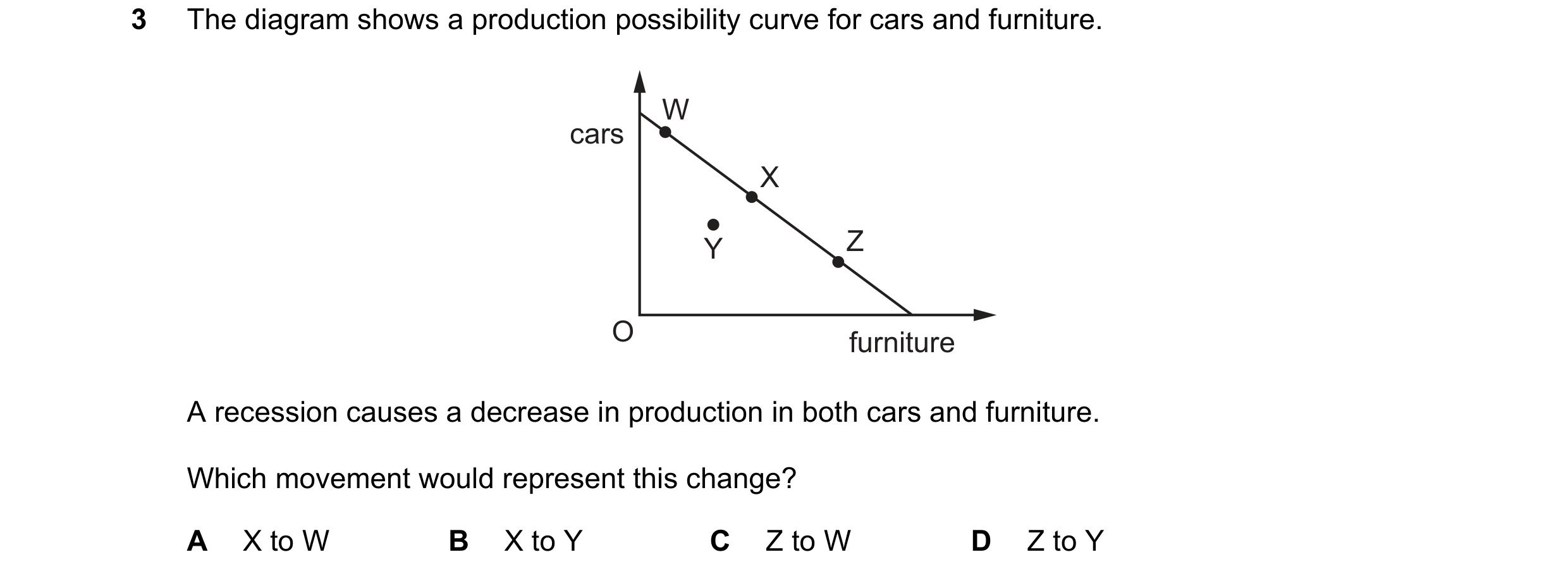
3 The diagram shows a production possibility curve for cars and furniture. W cars X Y Z O furniture A recession causes a decrease in production in both cars and furniture. Which movement would represent this change? A X to W B X to Y C Z to W D Z to Y
1 marks
Answer: B
This question in 0455/12 May/June 2017
Q26 · The diagram shows a production possibility curve for agriculture and machinery 0455/13 May/June 2017
3 The diagram shows a production possibility curve for agriculture and machinery. agriculture L K N M O machinery As a country develops, its primary production decreases and its secondary production increases. Which movement would represent this change? A K to L B L to N C M to N D N to L
1 marks
Answer: B
This question in 0455/13 May/June 2017
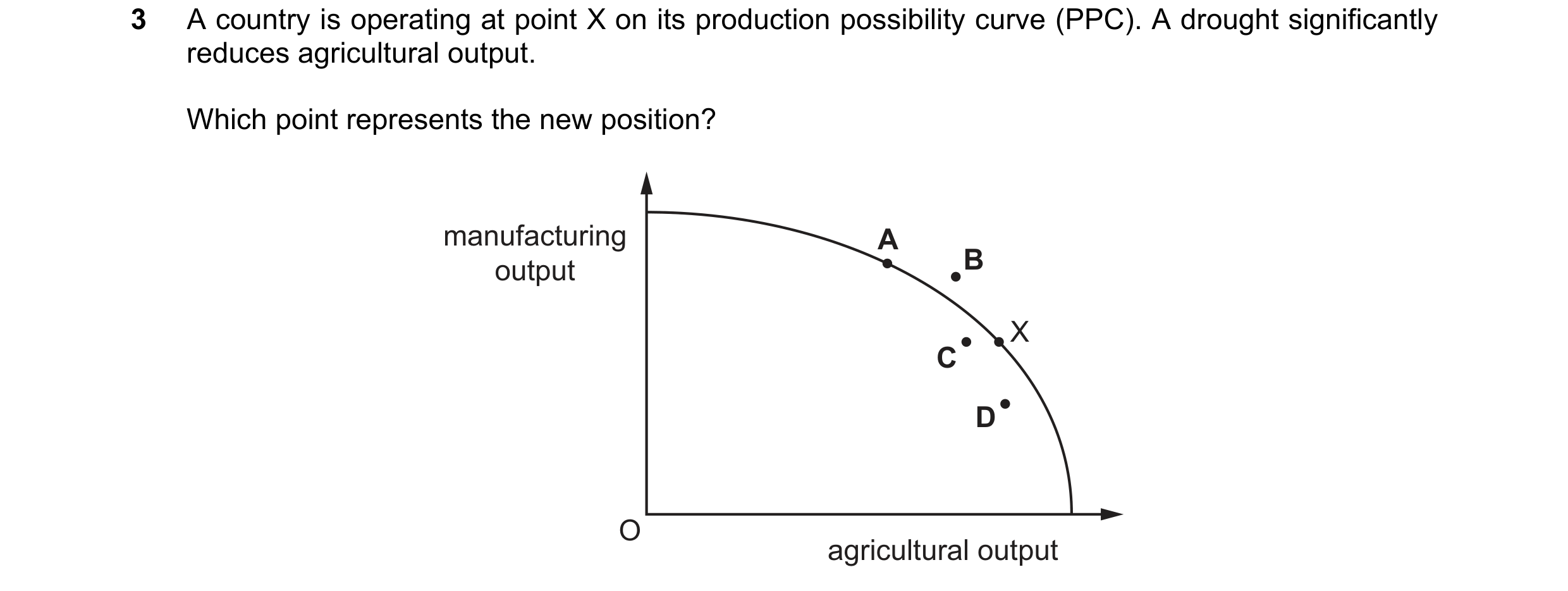
Q27 · A country is operating at point X on its production possibility curve (PPC) 0455/11 Oct/Nov 2017
3 A country is operating at point X on its production possibility curve (PPC). A drought significantly reduces agricultural output. Which point represents the new position? manufacturing A output B X C D O agricultural output
1 marks
Answer: C
This question in 0455/11 Oct/Nov 2017
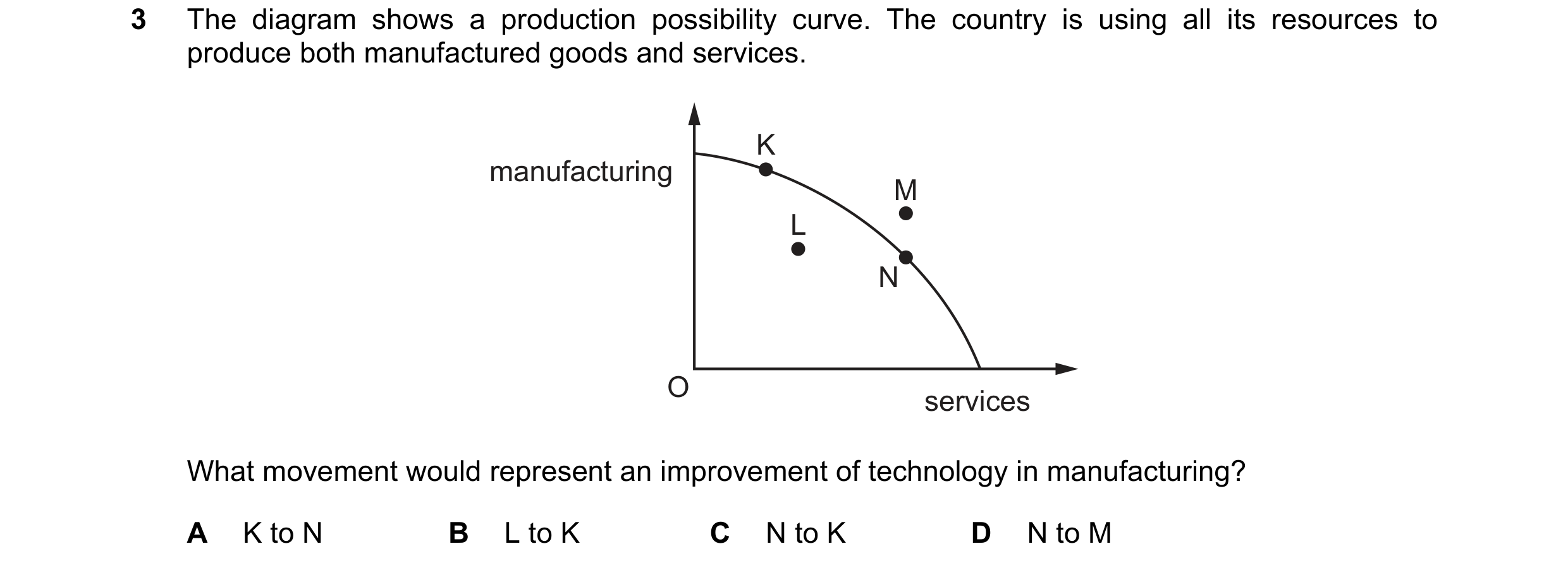
Q28 · The diagram shows a production possibility curve 0455/12 Oct/Nov 2017
3 The diagram shows a production possibility curve. The country is using all its resources to produce both manufactured goods and services. K manufacturing M L N O services What movement would represent an improvement of technology in manufacturing? A K to N B L to K C N to K D N to M
1 marks
Answer: D
This question in 0455/12 Oct/Nov 2017
Q29 · The diagram shows a production possibility curve diagram 0455/13 Oct/Nov 2017
3 The diagram shows a production possibility curve diagram. A country’s initial position is X. services R X T S O manufacturing Better manufacturing processes are introduced and the country improves its tourist facilities. What would represent this? A S to T B T to R C X to R D X to T
1 marks
Answer: C
This question in 0455/13 Oct/Nov 2017
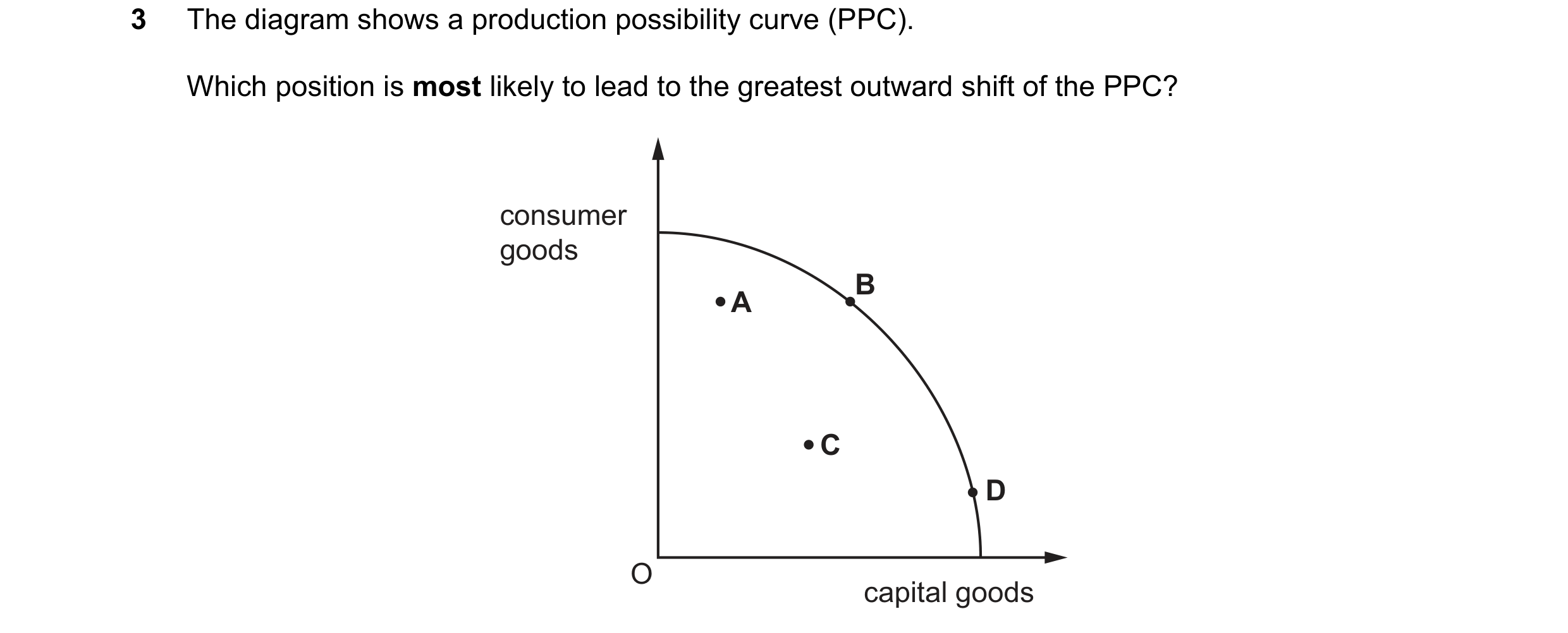
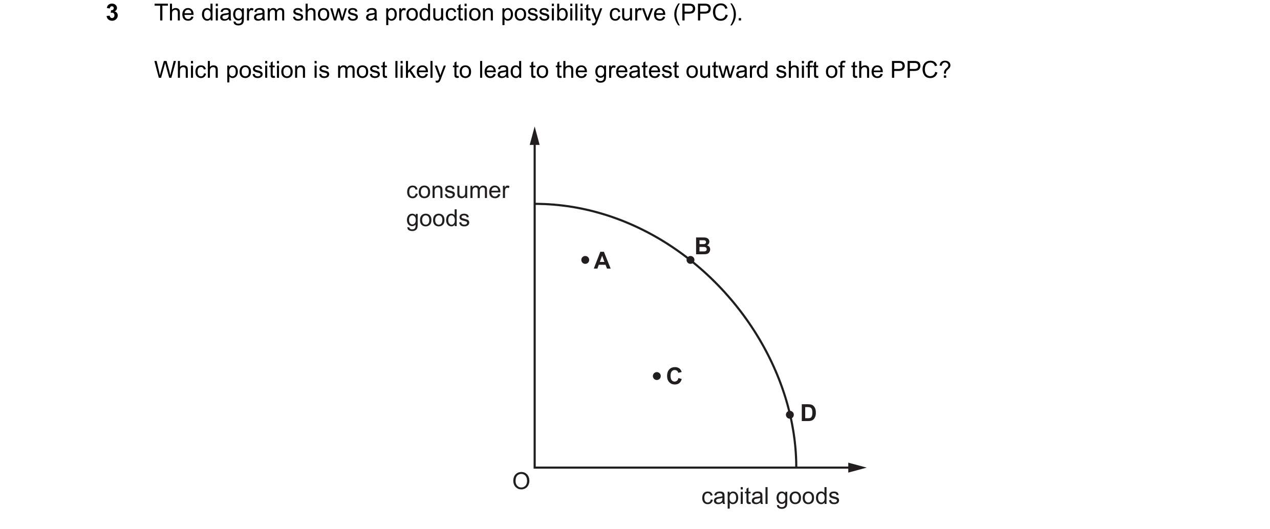
Q30 · The diagram shows a production possibility curve (PPC) 0455/12 May/June 2018
3 The diagram shows a production possibility curve (PPC). Which position is most likely to lead to the greatest outward shift of the PPC? consumer goods B A C D O capital goods
1 marks
Answer: D
This question in 0455/12 May/June 2018
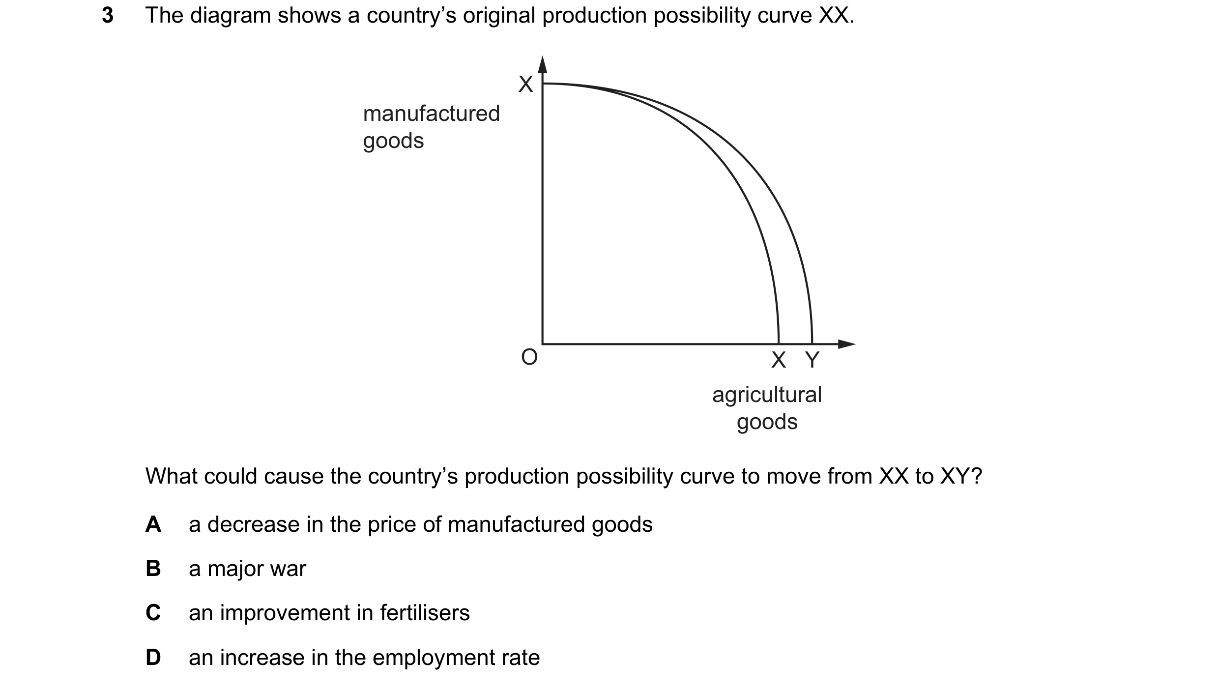
Q31 · The diagram shows a country’s original production possibility curve XX 0455/13 May/June 2018
3 The diagram shows a country’s original production possibility curve XX. X manufactured goods O X Y agricultural goods What could cause the country’s production possibility curve to move from XX to XY? A a decrease in the price of manufactured goods B a major war C an improvement in fertilisers D an increase in the employment rate
1 marks
Answer: C
This question in 0455/13 May/June 2018
Q32 · The diagram shows the production possibility curve (PPC) for an economy 0455/11 Oct/Nov 2018
3 The diagram shows the production possibility curve (PPC) for an economy. capital goods X Y Z O consumer goods What will happen to the opportunity cost of producing more units of consumer goods in terms of capital goods as the economy moves down its PPC from point X to point Z? A It will decrease continuously from point X to point Z. B It will decrease up to point Y and then increase towards point Z. C It will increase continuously from point X to point Z. D It will increase up to point Y and then decrease towards point Z.
1 marks
Answer: C
This question in 0455/11 Oct/Nov 2018
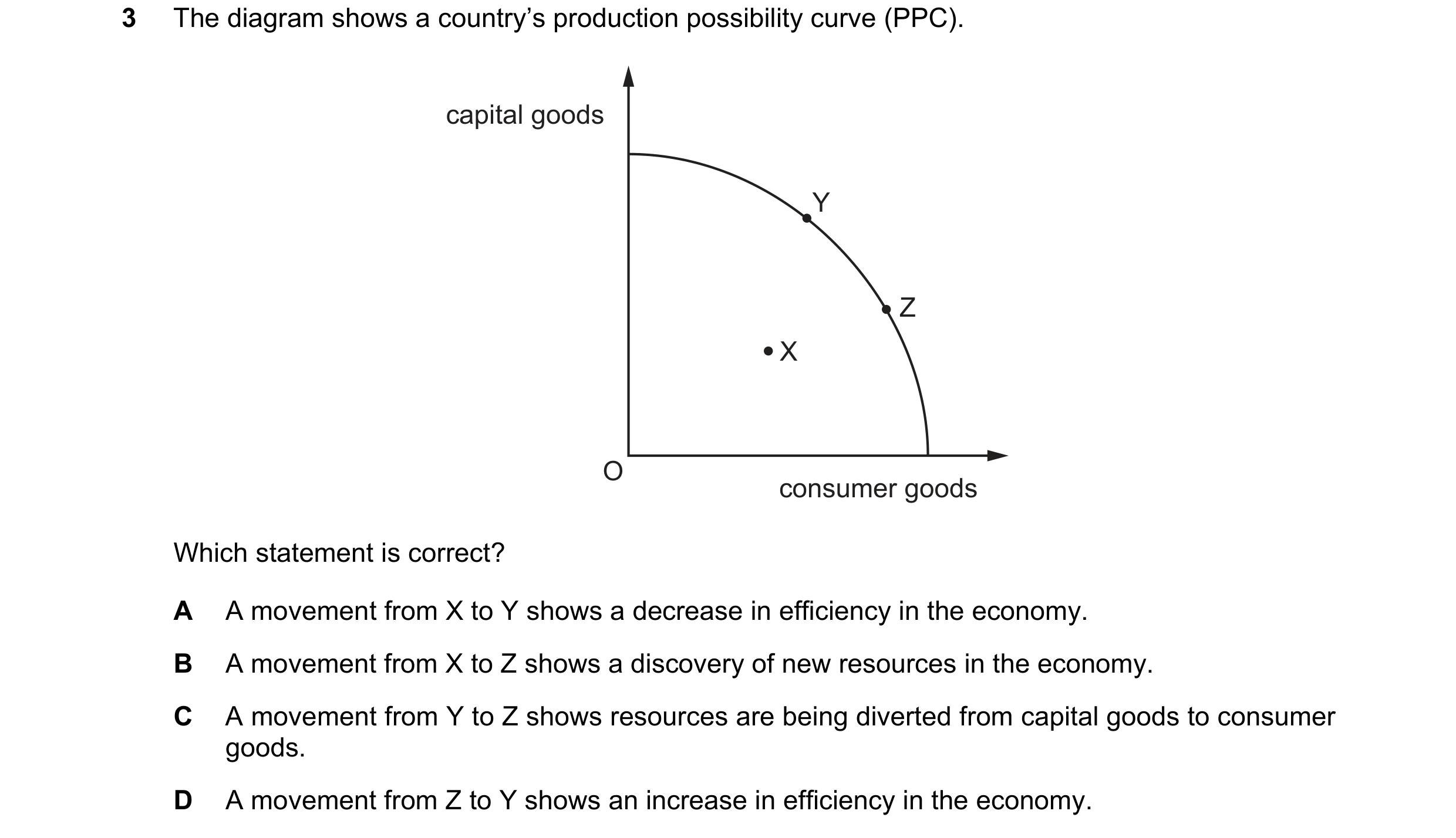
Q33 · The diagram shows a country’s production possibility curve (PPC) 0455/12 Oct/Nov 2018
3 The diagram shows a country’s production possibility curve (PPC). capital goods Y Z X O consumer goods Which statement is correct? A A movement from X to Y shows a decrease in efficiency in the economy. B A movement from X to Z shows a discovery of new resources in the economy. C A movement from Y to Z shows resources are being diverted from capital goods to consumer goods. D A movement from Z to Y shows an increase in efficiency in the economy.
1 marks
Answer: C
This question in 0455/12 Oct/Nov 2018
Q34 · The diagram shows a production possibility curve (PPC) for an economy 0455/13 Oct/Nov 2018
3 The diagram shows a production possibility curve (PPC) for an economy. output of R W Z Y X O output of S Which change on the diagram could represent an increase in unemployment? A W to X B W to Y C Y to X D Y to Z
1 marks
Answer: B
This question in 0455/13 Oct/Nov 2018
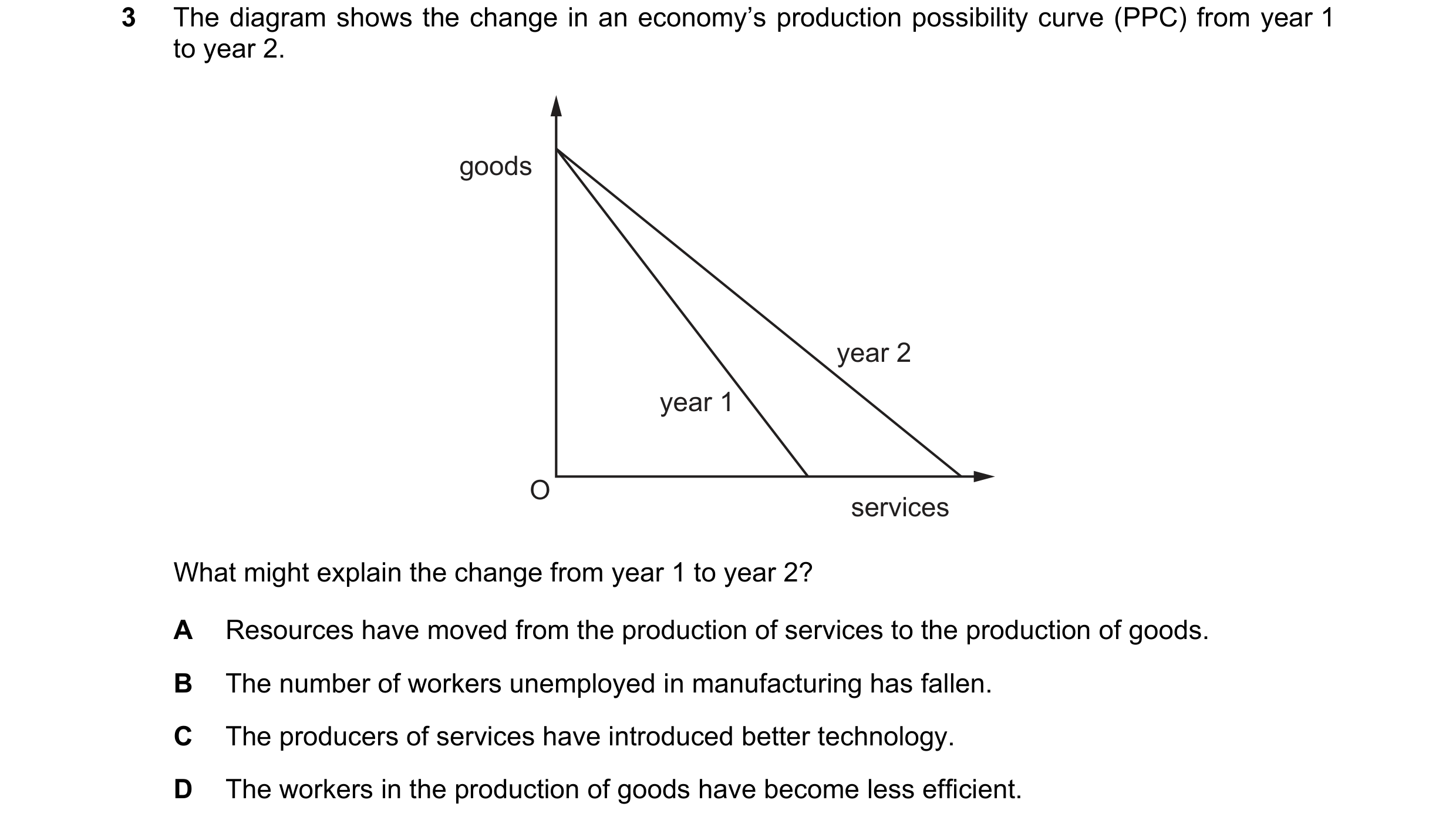
Q35 · The diagram shows the change in an economy’s production possibility curve (PPC) from year… 0455/12 Feb/March 2019
3 The diagram shows the change in an economy’s production possibility curve (PPC) from year 1 to year 2. goods year 2 year 1 O services What might explain the change from year 1 to year 2? A Resources have moved from the production of services to the production of goods. B The number of workers unemployed in manufacturing has fallen. C The producers of services have introduced better technology. D The workers in the production of goods have become less efficient.
1 marks
Answer: C
This question in 0455/12 Feb/March 2019
Q36 · The diagram shows a production possibility curve (PPC) 0455/11 May/June 2019
2 The diagram shows a production possibility curve (PPC). goods O services Why is the curve usually drawn like this? A International free trade exists. B Opportunity cost changes. C Resources are unlimited in supply. D Some resources will be unemployed.
1 marks
Answer: B
This question in 0455/11 May/June 2019
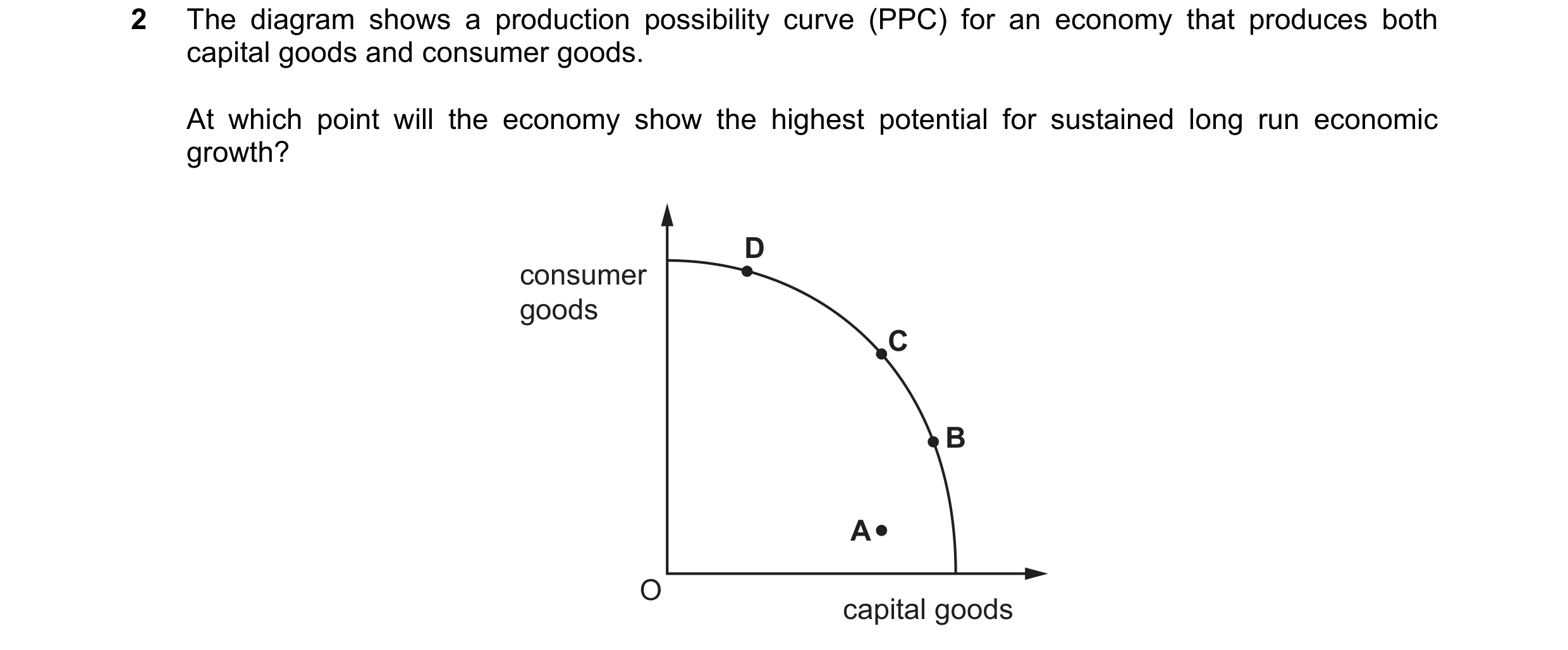
Q37 · The diagram shows a production possibility curve (PPC) for an economy that produces both… 0455/12 May/June 2019
2 The diagram shows a production possibility curve (PPC) for an economy that produces both capital goods and consumer goods. At which point will the economy show the highest potential for sustained long run economic growth? D consumer goods C B A O capital goods
1 marks
Answer: B
This question in 0455/12 May/June 2019
Q38 · What would cause an outward shift of a country’s production possibility curve (PPC)? 0455/13 May/June 2019
2 What would cause an outward shift of a country’s production possibility curve (PPC)? A a fall in unemployment B an increase in the rate of income tax C an increase in the labour force D a reduction in expenditure on education
1 marks
Answer: C
This question in 0455/13 May/June 2019
Q39 · Countries X and Y have identical resources 0455/11 Oct/Nov 2019
2 Countries X and Y have identical resources. The diagram shows their production possibility curves. food Y X O drink What can be concluded from the diagram? A X can produce food and drink more cheaply than Y. B X experiences higher unemployment than Y. C Y can produce food and drink more efficiently than X. D Y has higher retail prices than X.
1 marks
Answer: C
This question in 0455/11 Oct/Nov 2019
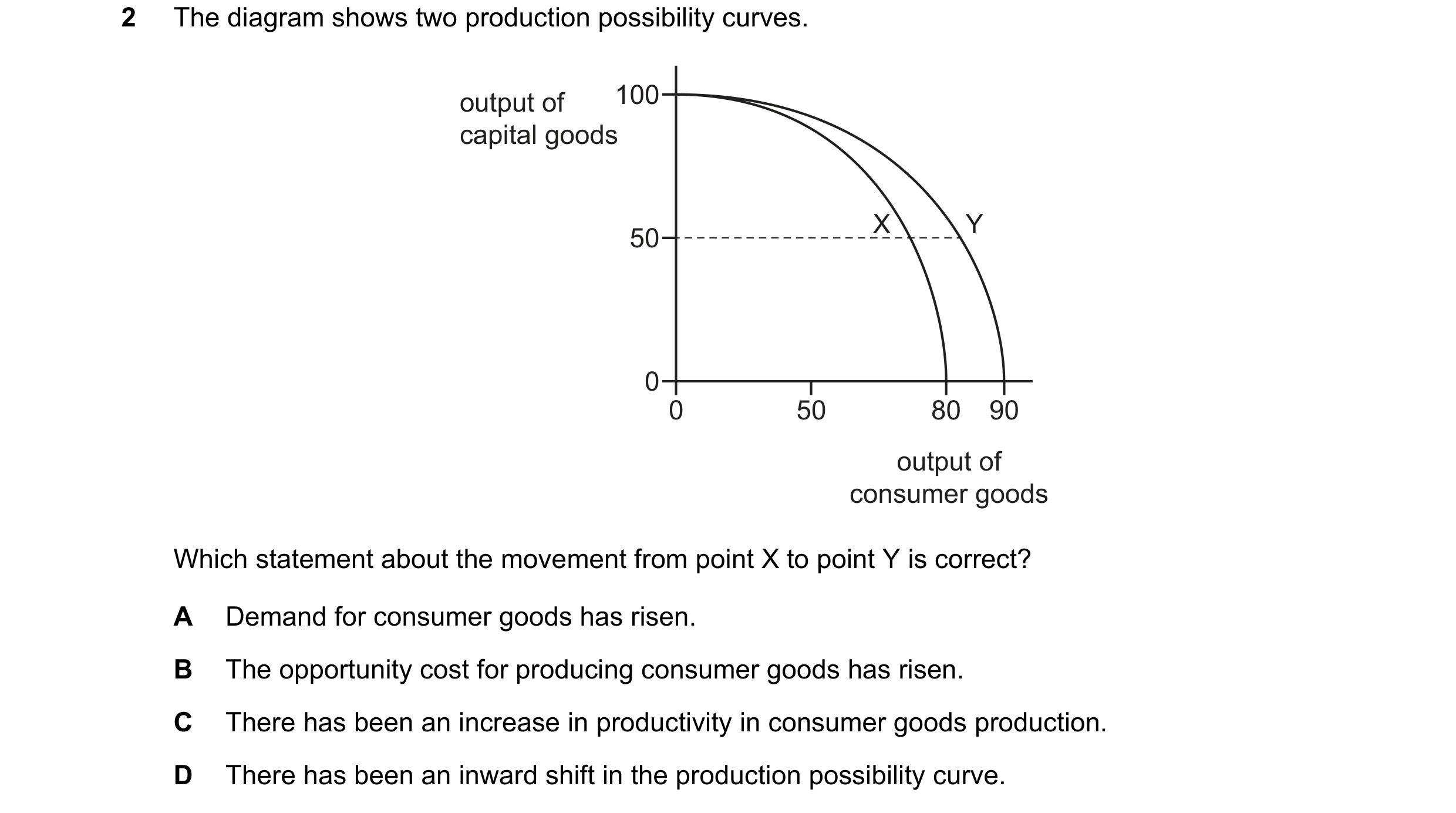
Q40 · The diagram shows two production possibility curves 0455/12 Oct/Nov 2019
2 The diagram shows two production possibility curves. output of 100 capital goods X Y 50 0 0 50 80 90 output of consumer goods Which statement about the movement from point X to point Y is correct? A Demand for consumer goods has risen. B The opportunity cost for producing consumer goods has risen. C There has been an increase in productivity in consumer goods production. D There has been an inward shift in the production possibility curve.
1 marks
Answer: C
This question in 0455/12 Oct/Nov 2019
Q41 · The diagram shows the production possibility curve (PPC) of a country producing at point T 0455/12 Feb/March 2020
2 The diagram shows the production possibility curve (PPC) of a country producing at point T. U health V services T S W O non-health services The country has an ageing population and decides to allocate more resources to the production of health services. Which movement shows this change in resource allocation? A T to S B T to U C T to V D T to W
1 marks
This question in 0455/12 Feb/March 2020
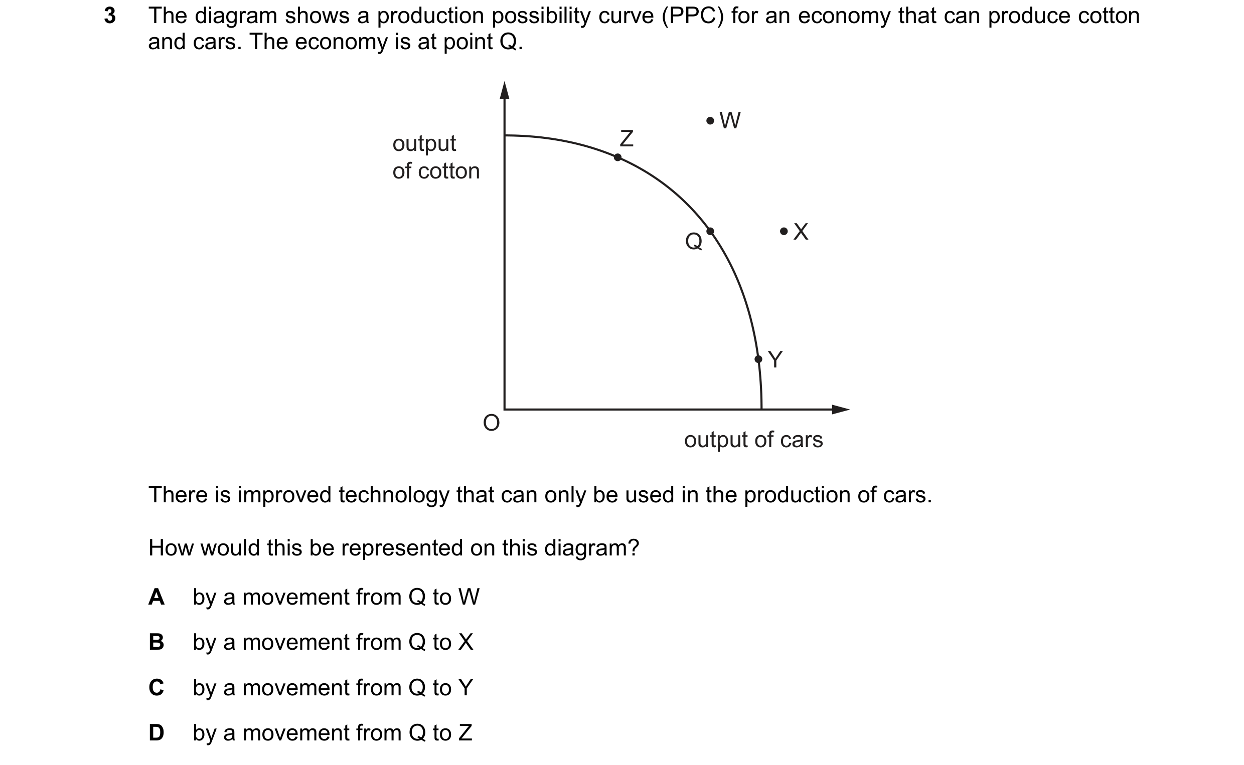
Q42 · The diagram shows a production possibility curve (PPC) for an economy that can produce… 0455/11 May/June 2020
3 The diagram shows a production possibility curve (PPC) for an economy that can produce cotton and cars. The economy is at point Q. W output Z of cotton Q X Y O output of cars There is improved technology that can only be used in the production of cars. How would this be represented on this diagram? A by a movement from Q to W B by a movement from Q to X C by a movement from Q to Y D by a movement from Q to Z
1 marks
Answer: B
This question in 0455/11 May/June 2020
Q43 · The diagram shows a production possibility curve (PPC) 0455/12 May/June 2020
2 The diagram shows a production possibility curve (PPC). Which of these points shows the largest possible output of product Y currently achievable? product Y A B C D O product X
1 marks
Answer: B
This question in 0455/12 May/June 2020
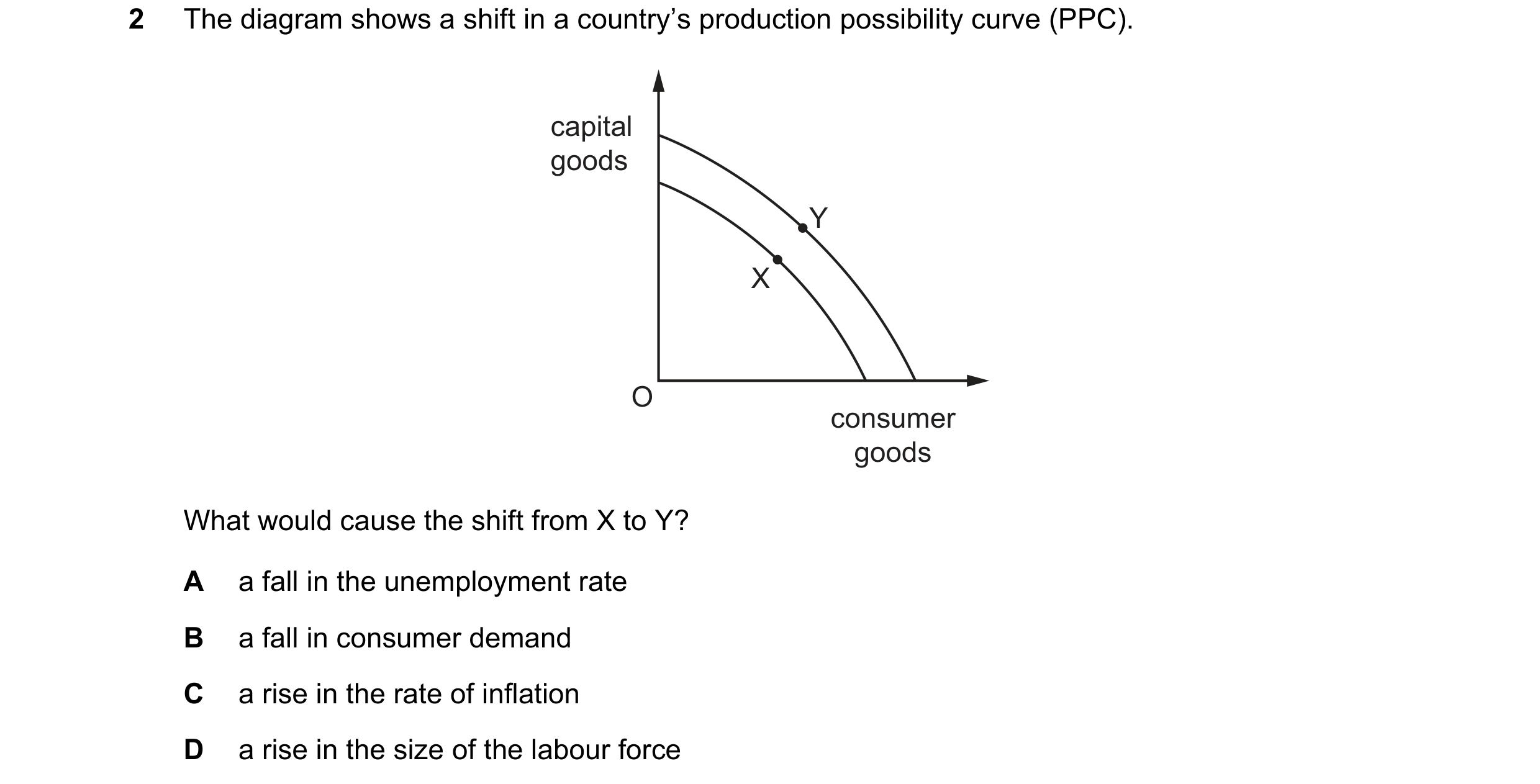
Q44 · The diagram shows a shift in a country’s production possibility curve (PPC) 0455/13 May/June 2020
2 The diagram shows a shift in a country’s production possibility curve (PPC). capital goods Y X O consumer goods What would cause the shift from X to Y? A a fall in the unemployment rate B a fall in consumer demand C a rise in the rate of inflation D a rise in the size of the labour force
1 marks
Answer: D
This question in 0455/13 May/June 2020
Q45 · A government is not allowed to increase its military spending 0455/13 May/June 2020
19 A government is not allowed to increase its military spending. Government spending is currently at X. Which diagram illustrates a possible change in government spending? A B Y military military spending Y spending X X O O non-military non-military spending spending C D Y military military spending X spending X Y O O non-military non-military spending spending
1 marks
Answer: D
This question in 0455/13 May/June 2020
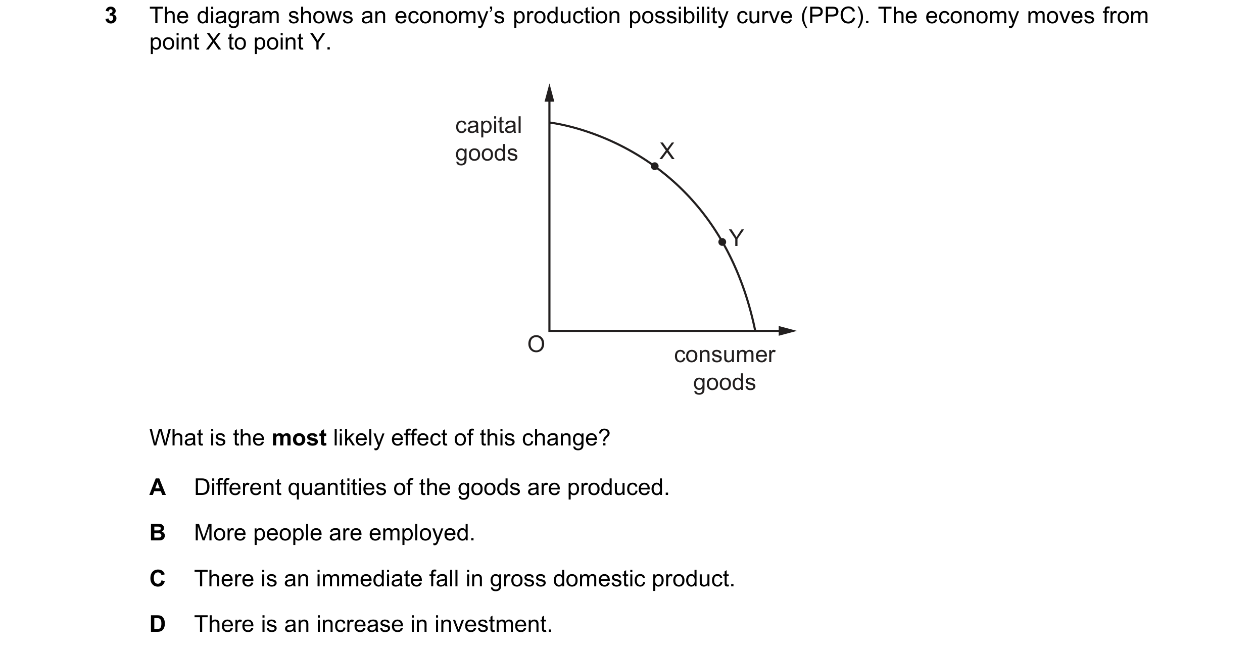
Q46 · The diagram shows an economy’s production possibility curve (PPC) 0455/11 Oct/Nov 2020
3 The diagram shows an economy’s production possibility curve (PPC). The economy moves from point X to point Y. capital goods X Y O consumer goods What is the most likely effect of this change? A Different quantities of the goods are produced. B More people are employed. C There is an immediate fall in gross domestic product. D There is an increase in investment.
1 marks
Answer: A
This question in 0455/11 Oct/Nov 2020
Q47 · The diagram shows a production possibility curve (PPC) for a country 0455/12 Oct/Nov 2020
3 The diagram shows a production possibility curve (PPC) for a country. The country moved from position X to position Y on the PPC. capital goods X Y O consumer goods What is the most likely reason for this change? A Firms have decided to increase investment in technology. B New economic resources have been discovered in the country. C The government has brought about an increase in living standards. D The government has encouraged long-term economic growth.
1 marks
Answer: C
This question in 0455/12 Oct/Nov 2020
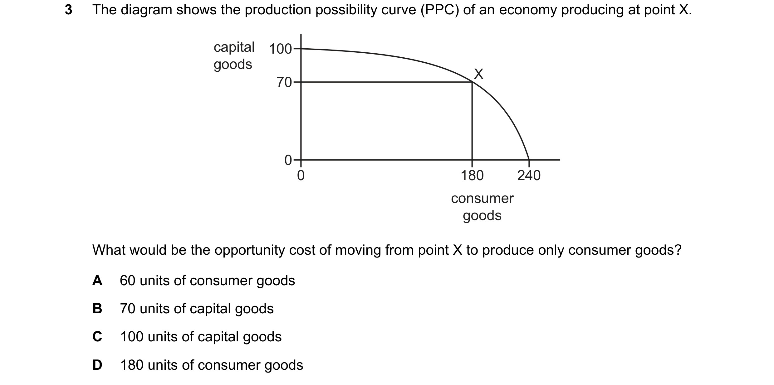
Q48 · The diagram shows the production possibility curve (PPC) of an economy producing at point… 0455/13 Oct/Nov 2020
3 The diagram shows the production possibility curve (PPC) of an economy producing at point X. capital 100 goods X 70 0 0 180 240 consumer goods What would be the opportunity cost of moving from point X to produce only consumer goods? A 60 units of consumer goods B 70 units of capital goods C 100 units of capital goods D 180 units of consumer goods
1 marks
Answer: B
This question in 0455/13 Oct/Nov 2020
Q49 · The table shows the maximum production possibilities for goods and services for a country 0455/12 Feb/March 2021
3 The table shows the maximum production possibilities for goods and services for a country. goods services (millions of units) (millions of units) 100 0 80 20 60 40 40 60 20 80 0 100 The country originally produced only goods but now produces 20 million units of services. The country continues to operate at maximum production possibility. What is the opportunity cost for this country? A 20 million units of goods B 100 million units of goods C 20 million units of services D zero
1 marks
Answer: A
This question in 0455/12 Feb/March 2021
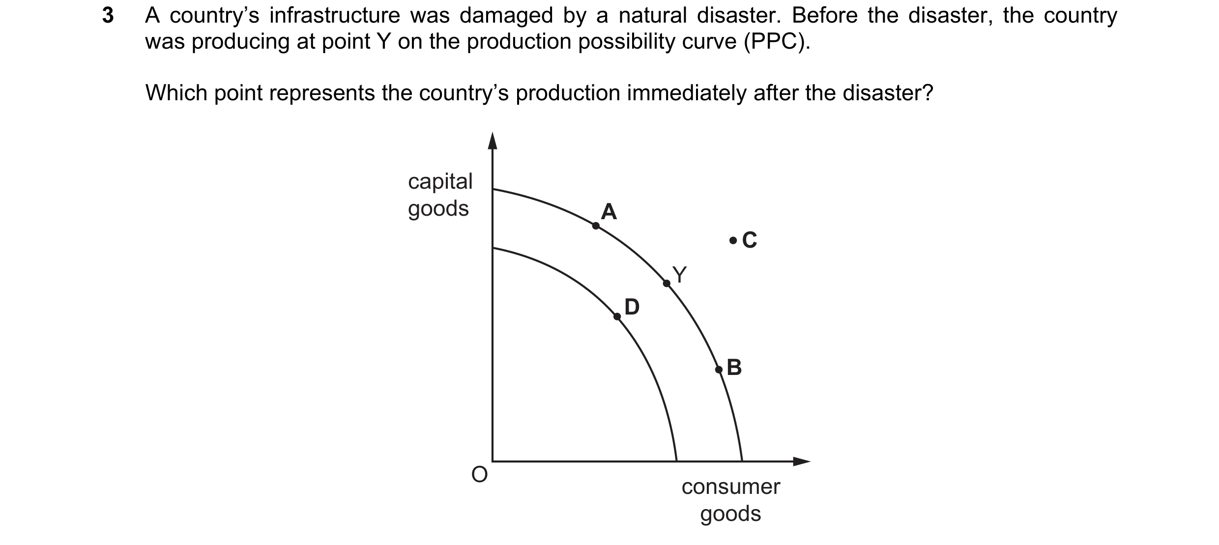
Q50 · A country’s infrastructure was damaged by a natural disaster 0455/11 May/June 2021
3 A country’s infrastructure was damaged by a natural disaster. Before the disaster, the country was producing at point Y on the production possibility curve (PPC). Which point represents the country’s production immediately after the disaster? capital goods A C Y D B O consumer goods
1 marks
Answer: D
This question in 0455/11 May/June 2021
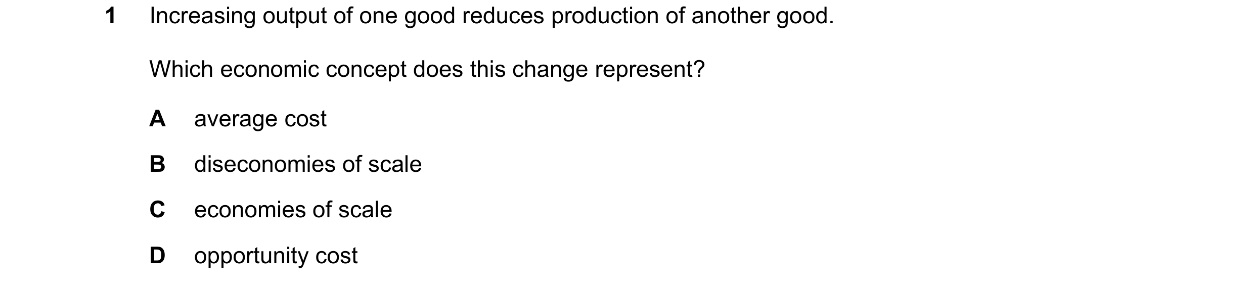
Q51 · Increasing output of one good reduces production of another good 0455/13 May/June 2021
1 Increasing output of one good reduces production of another good. Which economic concept does this change represent? A average cost B diseconomies of scale C economies of scale D opportunity cost
1 marks
Answer: D
This question in 0455/13 May/June 2021
Q52 · The production possibility curve (PPC) shows the hours per day that a person has for… 0455/13 May/June 2021
3 The production possibility curve (PPC) shows the hours per day that a person has for either work or leisure. R 15 work S 12 (hours) T 9 U 6 V 3 W 0 0 3 6 9 12 15 leisure (hours) This person works 6 hours a day but then decides to work 9 hours a day. Which movement shows this change? A T to R B T to U C U to V D U to T
1 marks
Answer: D
This question in 0455/13 May/June 2021
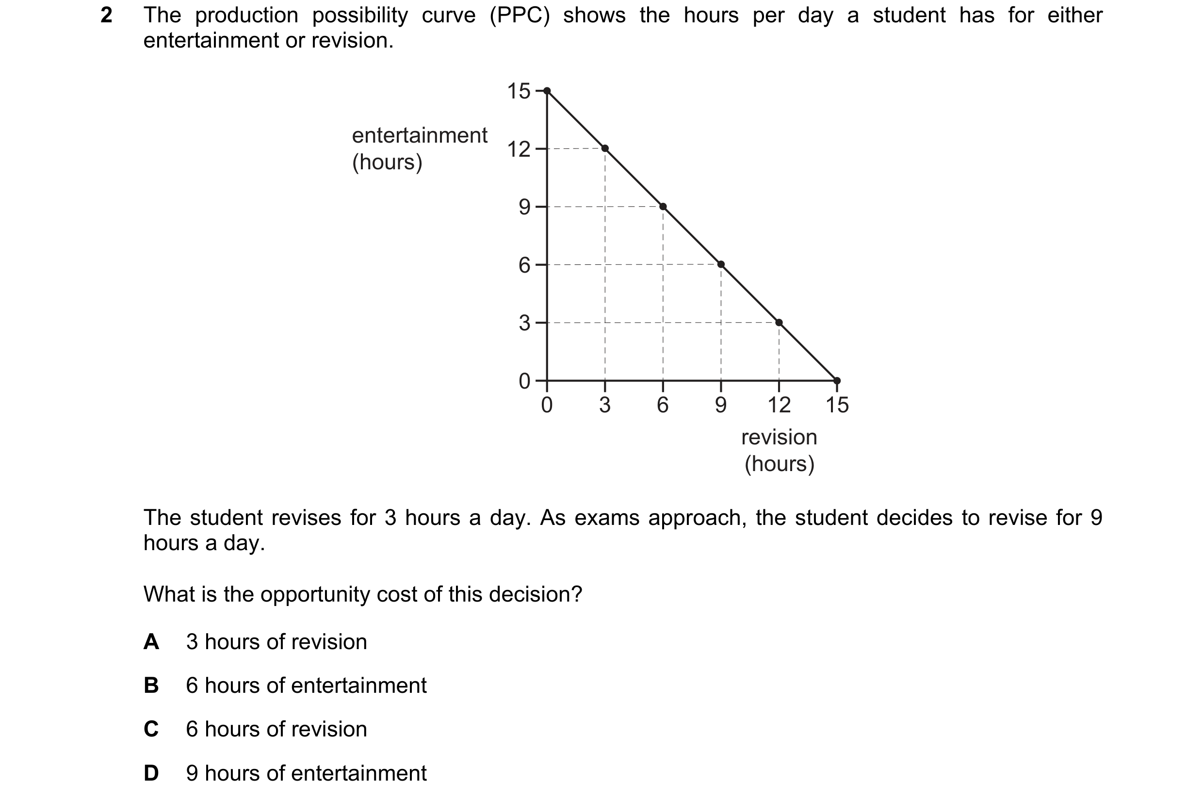
Q53 · The production possibility curve (PPC) shows the hours per day a student has for either… 0455/11 Oct/Nov 2021
2 The production possibility curve (PPC) shows the hours per day a student has for either entertainment or revision. 15 entertainment 12 (hours) 9 6 3 0 0 3 6 9 12 15 revision (hours) The student revises for 3 hours a day. As exams approach, the student decides to revise for 9 hours a day. What is the opportunity cost of this decision? A 3 hours of revision B 6 hours of entertainment C 6 hours of revision D 9 hours of entertainment
1 marks
Answer: B
This question in 0455/11 Oct/Nov 2021
Q54 · Which diagram shows an opportunity cost by movement from point X to point Y? 0455/13 Oct/Nov 2021
2 Which diagram shows an opportunity cost by movement from point X to point Y? A B capital capital goods Y goods Y X X O O consumer consumer goods goods C D Y capital capital Y goods X goods X O O consumer consumer goods goods
1 marks
Answer: C
This question in 0455/13 Oct/Nov 2021
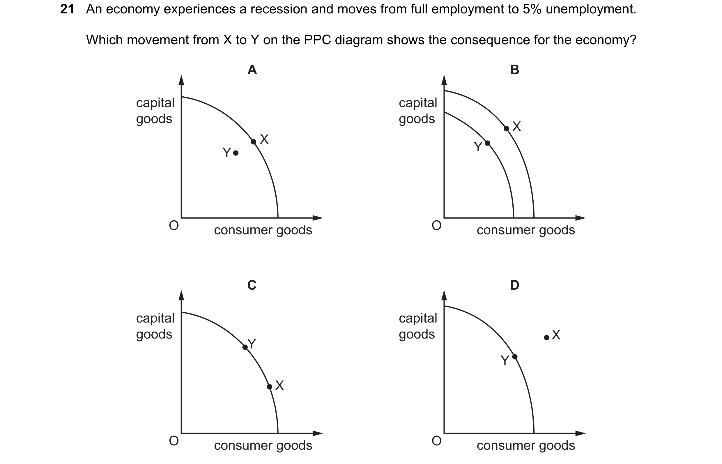
Q55 · An economy experiences a recession and moves from full employment to 5% unemployment 0455/11 May/June 2022
21 An economy experiences a recession and moves from full employment to 5% unemployment. Which movement from X to Y on the PPC diagram shows the consequence for the economy? A B capital capital goods goods X X Y Y O consumer goods O consumer goods C D capital capital goods goods X Y Y X O consumer goods O consumer goods
1 marks
Answer: A
This question in 0455/11 May/June 2022
Q56 · What is the purpose of an economy’s production possibility curve (PPC)? 0455/11 May/June 2022
24 What is the purpose of an economy’s production possibility curve (PPC)? A It answers the question of what to produce in an economy. B It enables microeconomic decisions to be taken by firms. C It measures the supply of goods and services available in an economy. D It shows the productive capacity in an economy at a point in time.
1 marks
Answer: D
This question in 0455/11 May/June 2022
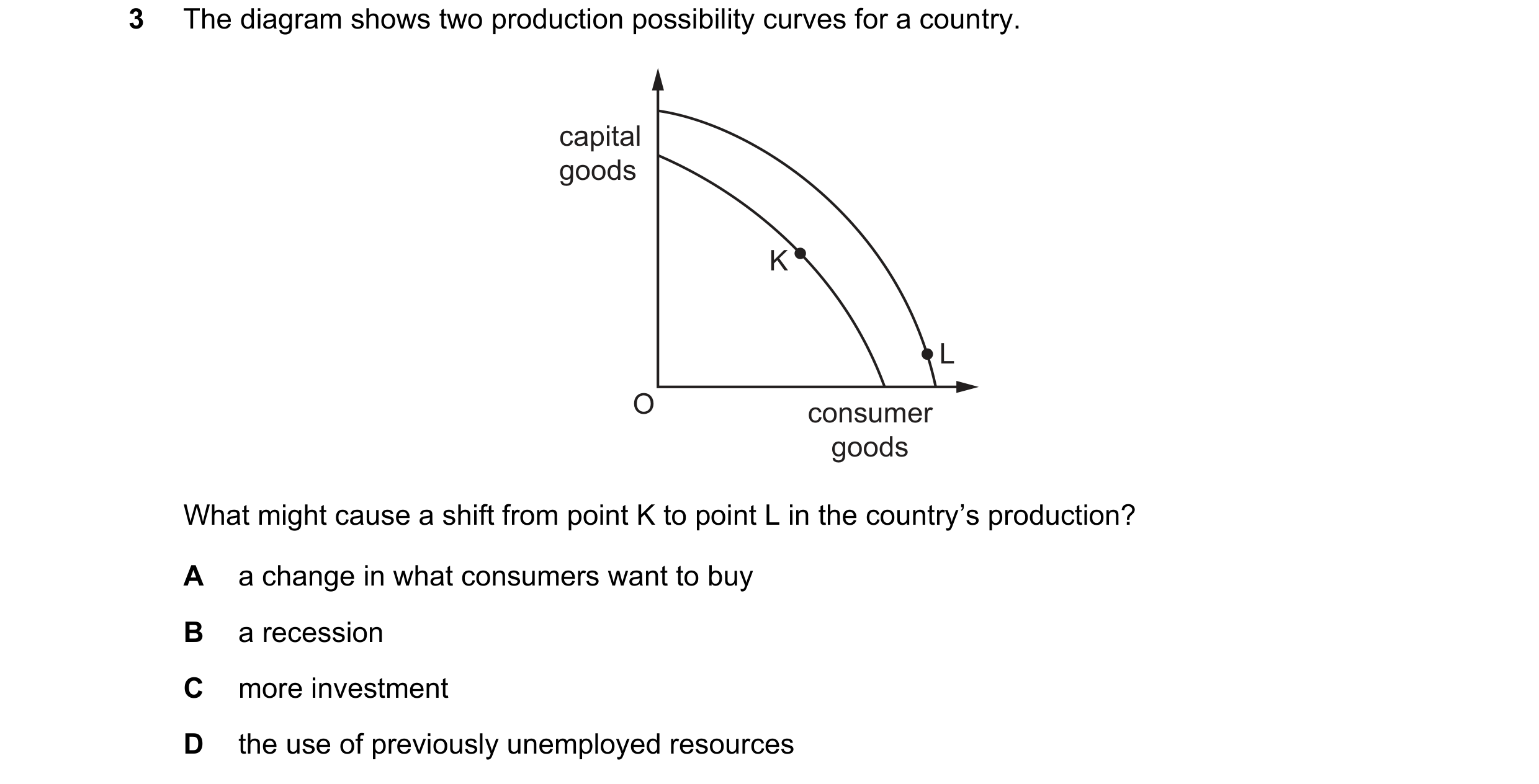
Q57 · The diagram shows two production possibility curves for a country 0455/12 May/June 2022
3 The diagram shows two production possibility curves for a country. capital goods K L O consumer goods What might cause a shift from point K to point L in the country’s production? A a change in what consumers want to buy B a recession C more investment D the use of previously unemployed resources
1 marks
Answer: C
This question in 0455/12 May/June 2022
Q58 · What would cause a shift in a country’s production possibility curve? 0455/13 May/June 2022
3 What would cause a shift in a country’s production possibility curve? A a fall in unemployment B a recovery from a recession C a rise in prices D the destruction of factories in a war
1 marks
Answer: D
This question in 0455/13 May/June 2022
Q59 · The diagram shows a production possibility curve (PPC) for country Z 0455/11 Oct/Nov 2022
3 The diagram shows a production possibility curve (PPC) for country Z. Government policy is to move the economy from point X to point Y on the PPC. capital X goods Y O consumer goods What is the most likely effect of this policy? A Living standards rise in the short run. B More capital goods are produced. C Prices of consumer goods increase. D Total output increases.
1 marks
Answer: A
This question in 0455/11 Oct/Nov 2022
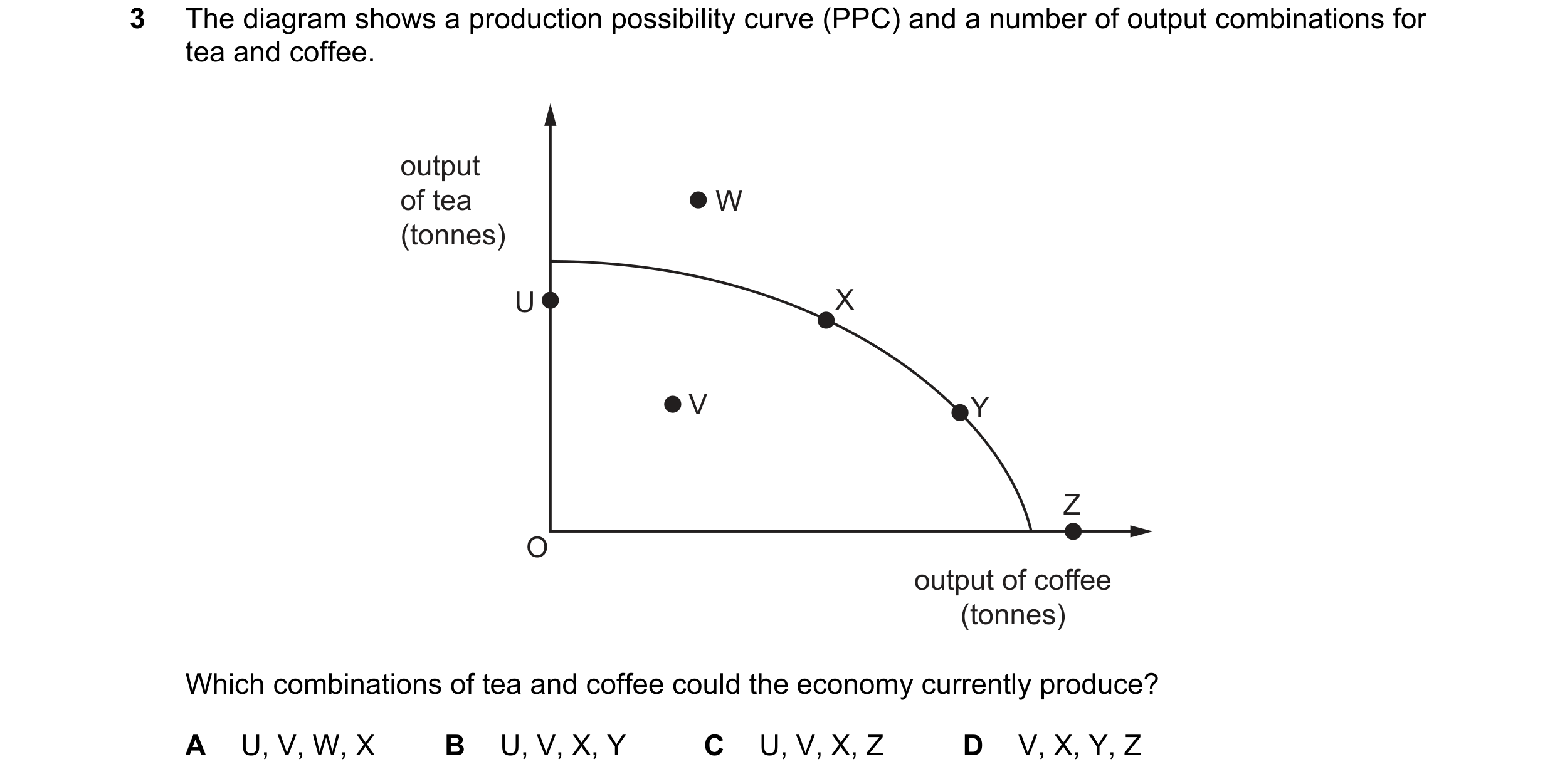
Q60 · The diagram shows a production possibility curve (PPC) and a number of output… 0455/12 Oct/Nov 2022
3 The diagram shows a production possibility curve (PPC) and a number of output combinations for tea and coffee. output of tea W (tonnes) U X V Y Z O output of coffee (tonnes) Which combinations of tea and coffee could the economy currently produce? A U, V, W, X B U, V, X, Y C U, V, X, Z D V, X, Y, Z
1 marks
Answer: B
This question in 0455/12 Oct/Nov 2022
Q61 · The diagram shows production possibility curves (PPC) for an economy that produces two… 0455/13 Oct/Nov 2022
3 The diagram shows production possibility curves (PPC) for an economy that produces two goods, sweet potatoes and onions. Initially the economy is operating on PPC1. sweet potatoes PPC2 PPC1 O onions Which combination of changes could shift PPC1 to PPC2? change 1 change 2 A a fuller use of existing a reduction in the price resources in onion farms of sweet potatoes B a reduction in the price a larger population of onions in the country C an increase in the price of an increased consumer sweet potatoes preference for onions D an increase in the training a greater use of technology of onion farmers on onion farms
1 marks
Answer: D
This question in 0455/13 Oct/Nov 2022
Q62 · What does a point on a production possibility curve for an economy represent? 0455/11 May/June 2023
2 What does a point on a production possibility curve for an economy represent? A economic growth is falling B inefficient use of resources available C maximum output possible with current technology D total demand for goods and services
1 marks
Answer: C
This question in 0455/11 May/June 2023
Q63 · A country’s production possibility curve (PPC) moves from PPC1 to PPC2 0455/12 May/June 2023
2 A country’s production possibility curve (PPC) moves from PPC1 to PPC2. consumer goods PPC1 PPC2 O capital goods What could cause this movement in the PPC? better higher lower education investment unemployment A false false true B false true false C true false true D true true false
1 marks
Answer: D
This question in 0455/12 May/June 2023
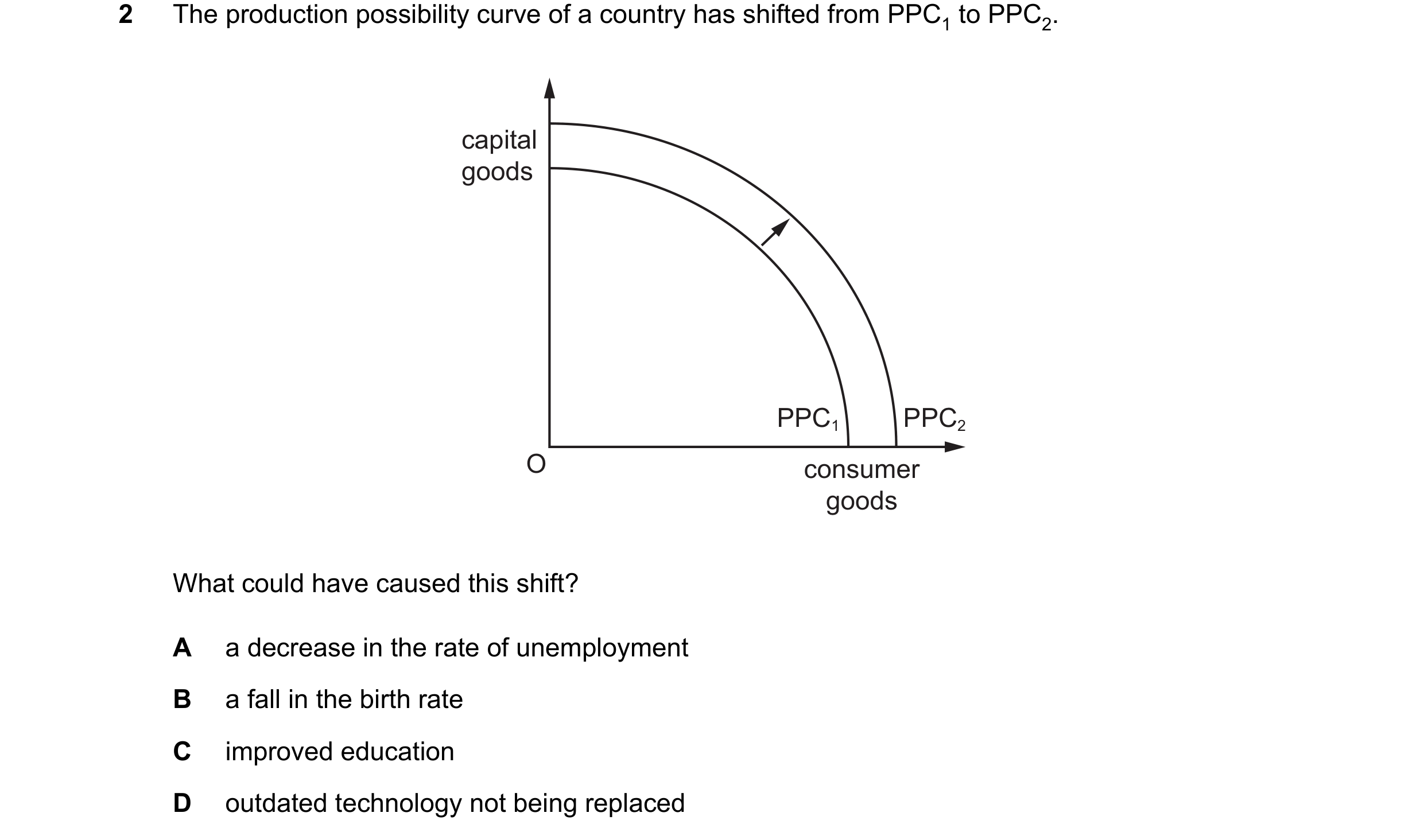
Q64 · The production possibility curve of a country has shifted from PPC1 to PPC2 0455/13 May/June 2023
2 The production possibility curve of a country has shifted from PPC1 to PPC2. capital goods PPC1 PPC2 O consumer goods What could have caused this shift? A a decrease in the rate of unemployment B a fall in the birth rate C improved education D outdated technology not being replaced
1 marks
Answer: C
This question in 0455/13 May/June 2023
Q65 · The diagram shows the production possibility curve (PPC) for an economy producing… 0455/11 Oct/Nov 2023
2 The diagram shows the production possibility curve (PPC) for an economy producing consumer goods and capital goods. N consumer goods M L O G H J capital goods The economy is currently producing OM consumer goods and OG capital goods. It decides to increase production of capital goods to OH. What is the opportunity cost of this decision in terms of consumer goods? A JG B ML C MN D NL
1 marks
Answer: B
This question in 0455/11 Oct/Nov 2023
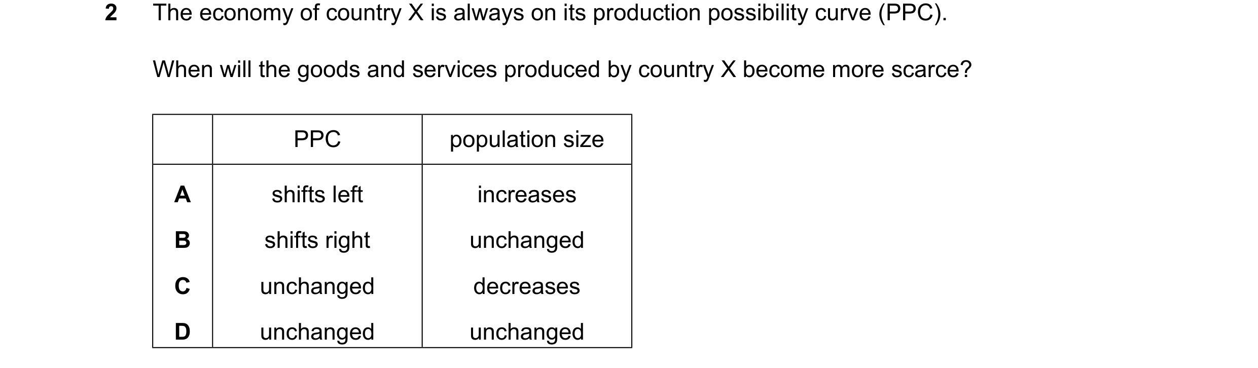
Q66 · The economy of country X is always on its production possibility curve (PPC) 0455/12 Oct/Nov 2023
2 The economy of country X is always on its production possibility curve (PPC). When will the goods and services produced by country X become more scarce? PPC population size A shifts left increases B shifts right unchanged C unchanged decreases D unchanged unchanged
1 marks
Answer: A
This question in 0455/12 Oct/Nov 2023
Q67 · The diagram shows a production possibility curve (PPC) for a country 0455/13 Oct/Nov 2023
2 The diagram shows a production possibility curve (PPC) for a country. The country moved from position X to position Y on the PPC. capital goods X Y O consumer goods What is the most likely reason for this change? A Firms have decided to increase investment in technology. B New economic resources have been discovered in the country. C The government has brought about an increase in living standards. D The government has encouraged long-term economic growth.
1 marks
Answer: C
This question in 0455/13 Oct/Nov 2023
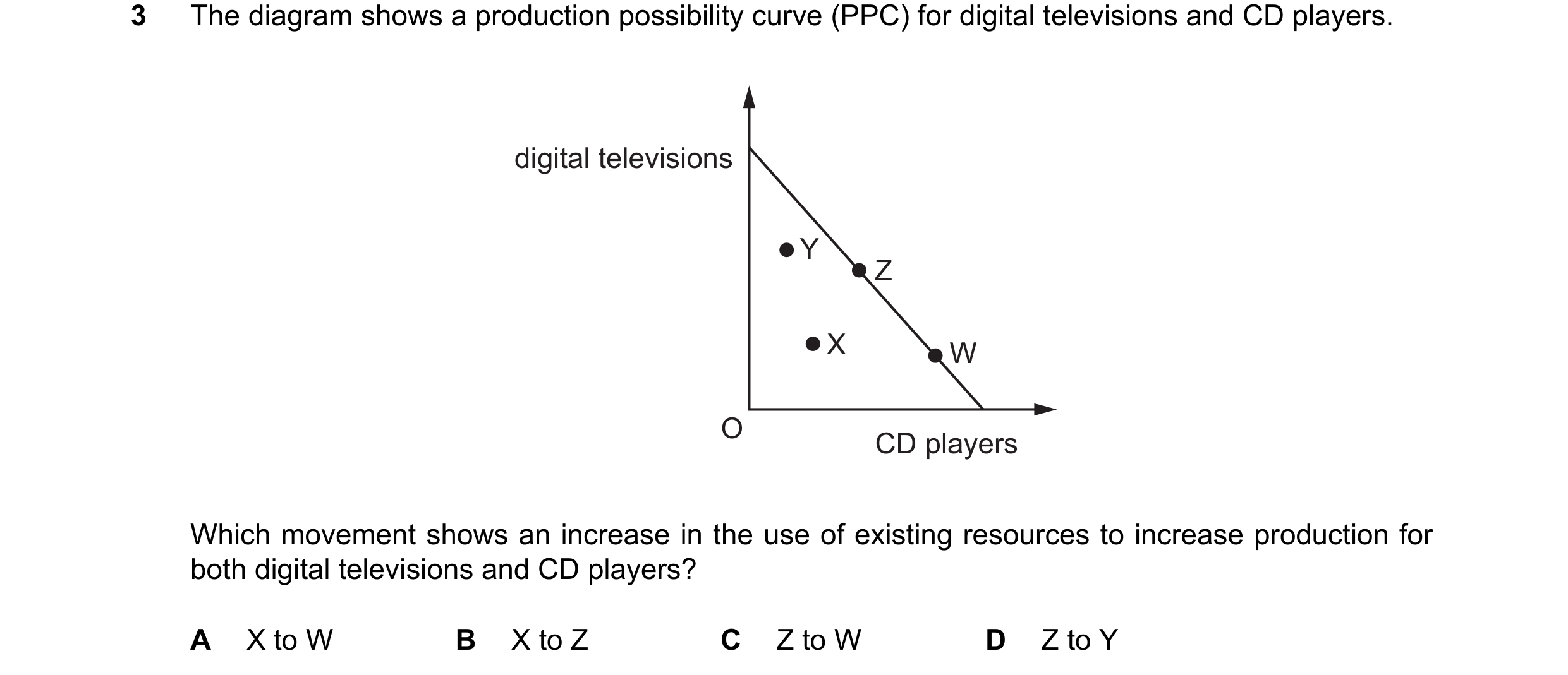
Q68 · The diagram shows a production possibility curve (PPC) for digital televisions and CD… 0455/12 Feb/March 2024
3 The diagram shows a production possibility curve (PPC) for digital televisions and CD players. digital televisions Y Z X W O CD players Which movement shows an increase in the use of existing resources to increase production for both digital televisions and CD players? A X to W B X to Z C Z to W D Z to Y
1 marks
Answer: B
This question in 0455/12 Feb/March 2024
Q69 · Capital P goods R U O S V Q consumer goods Which current combination of capital and… 0455/12 May/June 2024
3 capital P goods R U O S V Q consumer goods Which current combination of capital and consumer goods would produce the greatest number of consumer goods in the future? A O and Q B P and O C R and S D U and V
1 marks
Answer: B
This question in 0455/12 May/June 2024
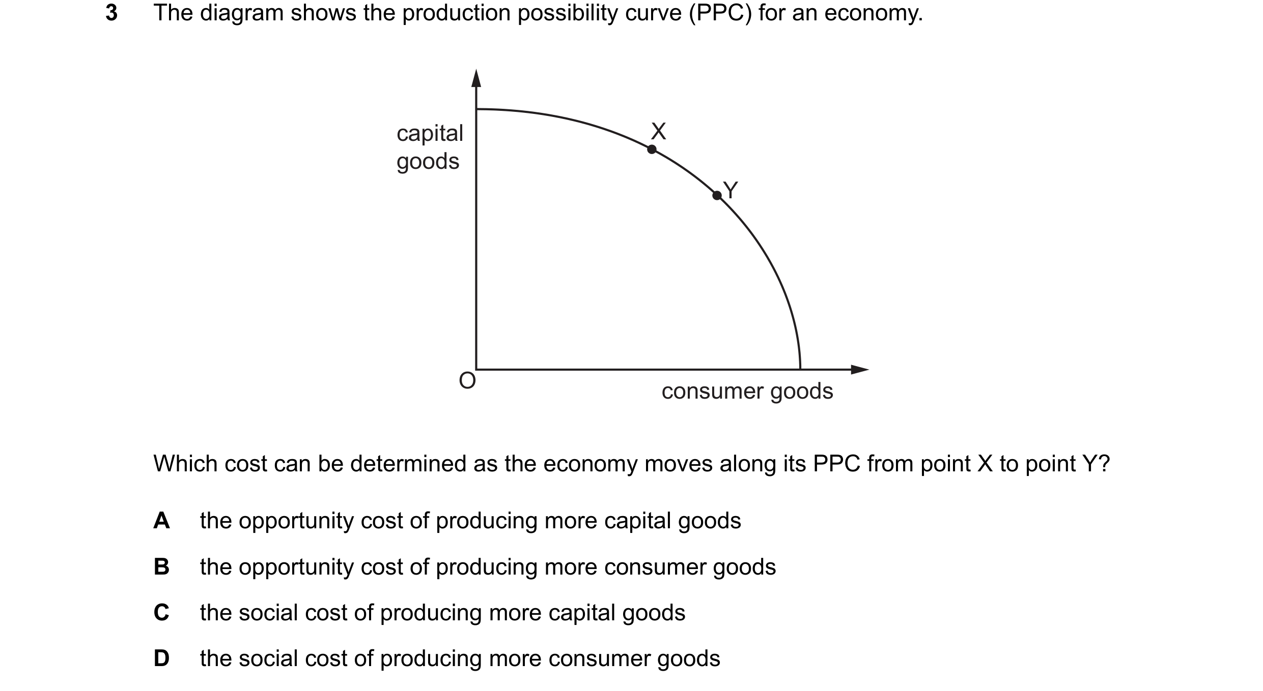
Q70 · The diagram shows the production possibility curve (PPC) for an economy 0455/11 Oct/Nov 2024
3 The diagram shows the production possibility curve (PPC) for an economy. capital X goods Y O consumer goods Which cost can be determined as the economy moves along its PPC from point X to point Y? A the opportunity cost of producing more capital goods B the opportunity cost of producing more consumer goods C the social cost of producing more capital goods D the social cost of producing more consumer goods
1 marks
Answer: B
This question in 0455/11 Oct/Nov 2024
Q71 · The diagram shows a production possibility curve (PPC) for an economy that produces two… 0455/12 Oct/Nov 2024
3 The diagram shows a production possibility curve (PPC) for an economy that produces two goods, X and Y. Which point shows the greatest opportunity cost of producing one more unit of good X? A good Y B D C O good X
1 marks
Answer: C
This question in 0455/12 Oct/Nov 2024
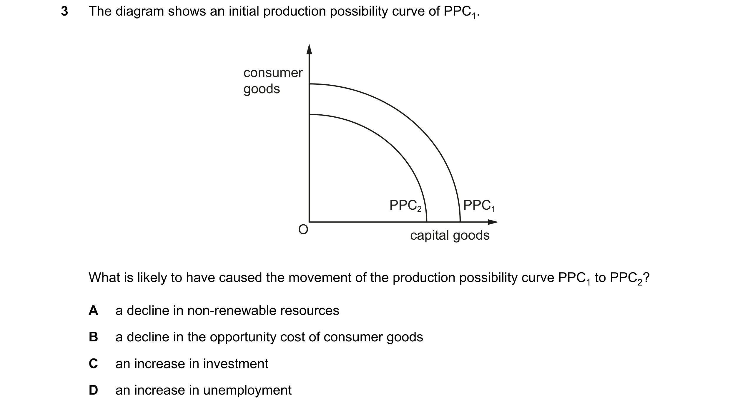
Q72 · The diagram shows an initial production possibility curve of PPC1 0455/12 Feb/March 2025
3 The diagram shows an initial production possibility curve of PPC1. consumer goods PPC2 PPC1 O capital goods What is likely to have caused the movement of the production possibility curve PPC1 to PPC2? A a decline in non-renewable resources B a decline in the opportunity cost of consumer goods C an increase in investment D an increase in unemployment
1 marks
Answer: A
This question in 0455/12 Feb/March 2025
Q73 · The diagram shows a production possibility curve (PPC) 0455/11 May/June 2025
3 The diagram shows a production possibility curve (PPC). The economy is using all of its available resources. W Z manufactured goods Y X O agricultural goods A government decides to encourage more production of manufactured goods instead of agricultural goods. Which movement shows this policy change? A W to X B W to Y C X to W D Z to X
1 marks
Answer: C
This question in 0455/11 May/June 2025
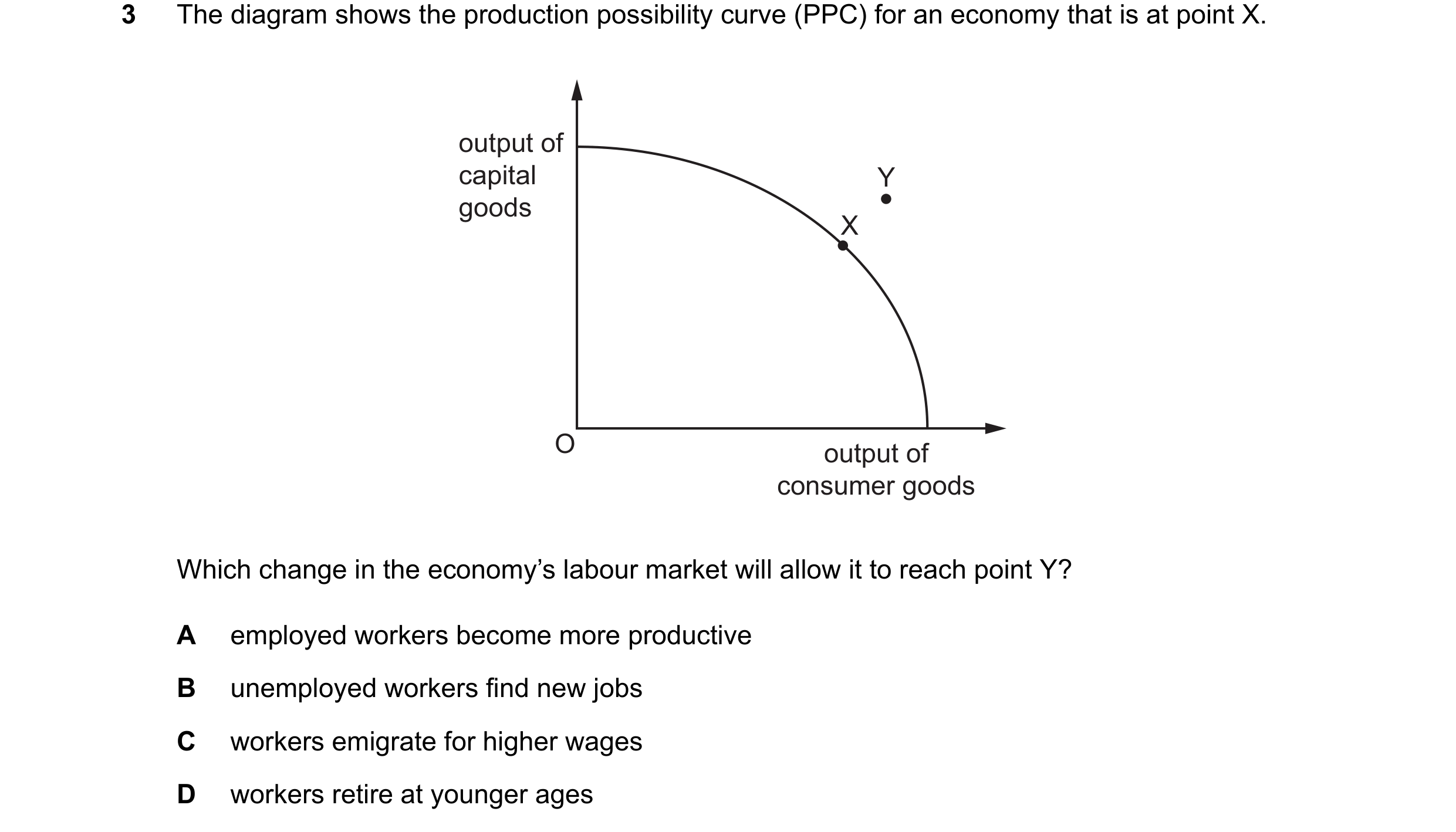
Q74 · The diagram shows the production possibility curve (PPC) for an economy that is at point X 0455/12 May/June 2025
3 The diagram shows the production possibility curve (PPC) for an economy that is at point X. output of capital Y goods X O output of consumer goods Which change in the economy’s labour market will allow it to reach point Y? A employed workers become more productive B unemployed workers find new jobs C workers emigrate for higher wages D workers retire at younger ages
1 marks
Answer: A
This question in 0455/12 May/June 2025
Q75 · An economy produces different types of goods using its limited resources 0455/13 May/June 2025
3 An economy produces different types of goods using its limited resources. This can be illustrated by a production possibility curve (PPC). consumer X goods O capital goods What does point X on the PPC show? A All resources are used for the production of consumer goods. B More resources are allocated to producing capital goods than consumer goods. C Resources are allocated to produce a mixture of consumer goods and capital goods. D Total resources are not being fully utilised for production of these goods.
1 marks
Answer: C
This question in 0455/13 May/June 2025
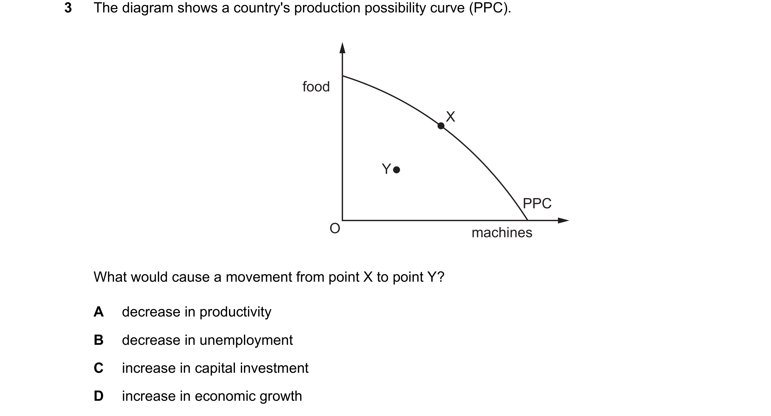
Q76 · The diagram shows a country's production possibility curve (PPC) 0455/11 Oct/Nov 2025
3 The diagram shows a country's production possibility curve (PPC). food X Y PPC O machines What would cause a movement from point X to point Y? A decrease in productivity B decrease in unemployment C increase in capital investment D increase in economic growth
1 marks
Answer: A
This question in 0455/11 Oct/Nov 2025
Q77 · An economy operating on its production possibility curve (PPC) enters a recession that… 0455/11 Oct/Nov 2025
21 An economy operating on its production possibility curve (PPC) enters a recession that causes unemployment. As the recession gets worse some unemployed workers emigrate in search of jobs overseas. How are these effects of the recession shown on a diagram of the economy’s PPC in the short-term and the long-term? short-term effect on long-term effect on the PPC diagram the PPC diagram A movement to a point movement to a point inside the PPC inside the PPC B movement to a point shift of PPC to the left inside the PPC C shift of PPC to the left movement to a point inside the PPC D shift of PPC to the left shift of PPC to the left
1 marks
Answer: B
This question in 0455/11 Oct/Nov 2025
Q78 · A country is producing at point X on its production possibility curve (PPC) which shows… 0455/12 Oct/Nov 2025
3 A country is producing at point X on its production possibility curve (PPC) which shows how it can allocate its production between capital goods and consumer goods. A period of recession then causes some of its factories to close. Which point could represent the country’s new position? capital A B goods X C D O consumer goods
1 marks
Answer: C
This question in 0455/12 Oct/Nov 2025
Q79 · The diagram shows a production possibility curve (PPC) 0455/13 Oct/Nov 2025
3 The diagram shows a production possibility curve (PPC). Which position is most likely to lead to the greatest outward shift of the PPC? consumer goods B A C D O capital goods
1 marks
Answer: D
This question in 0455/13 Oct/Nov 2025
 1 / 33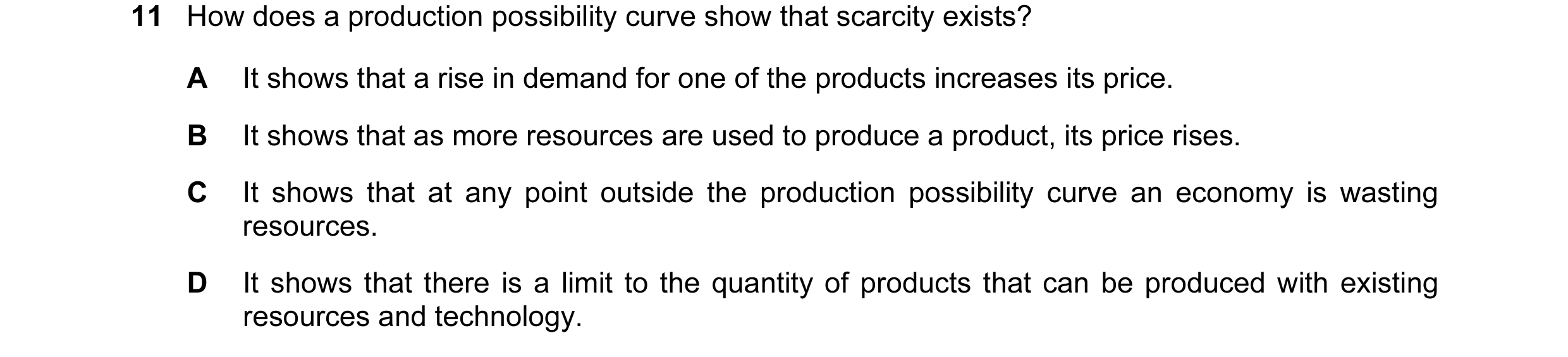
 2 / 33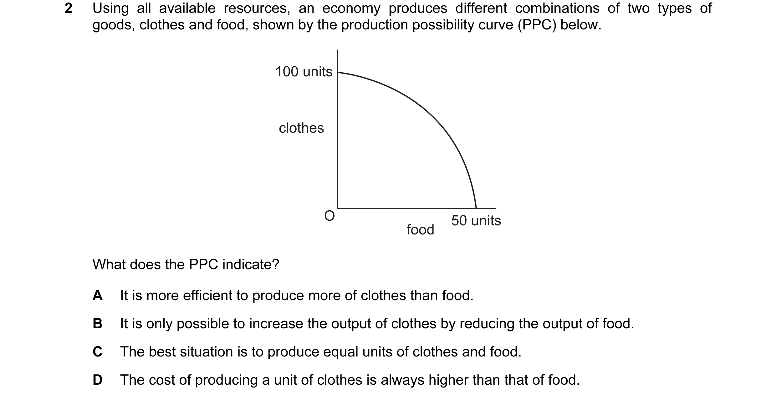
 3 / 33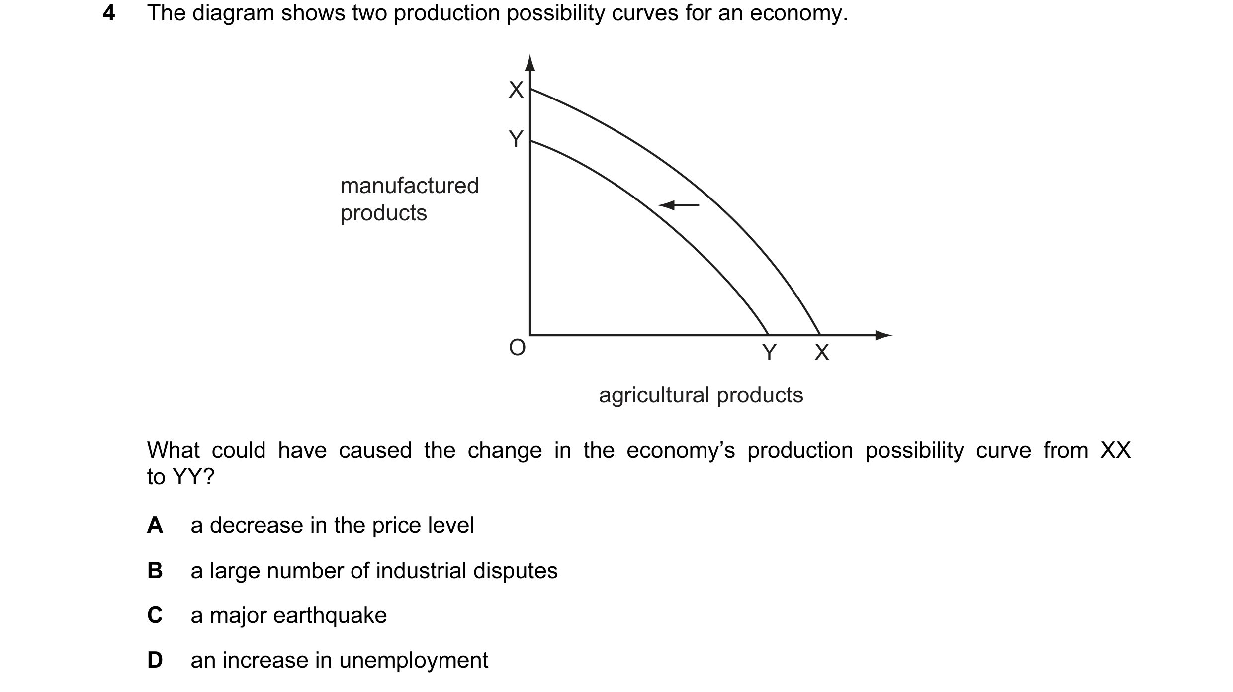
 4 / 33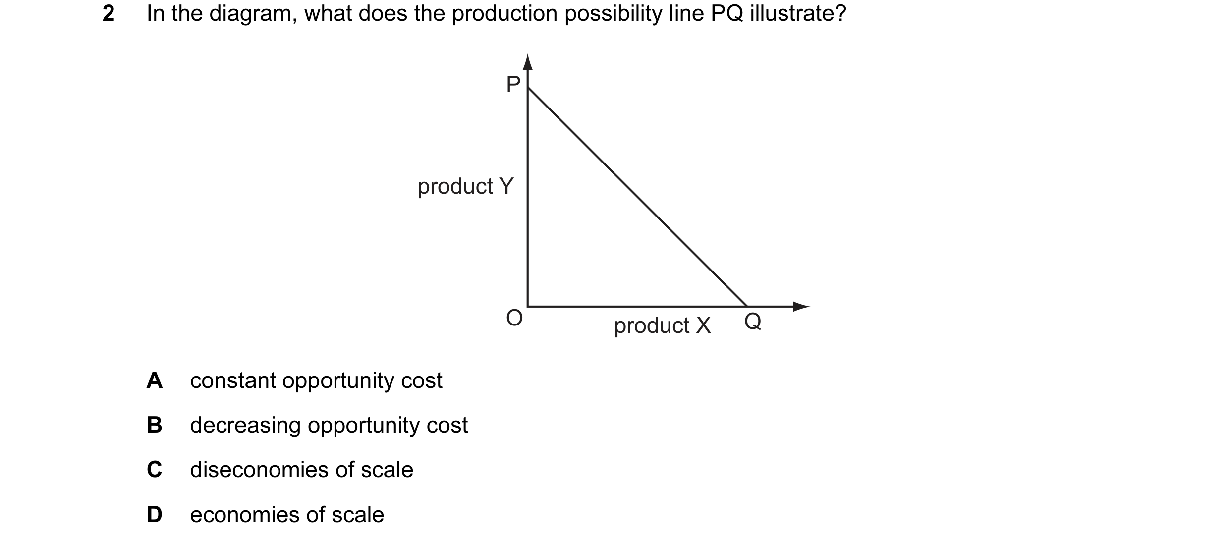
 5 / 33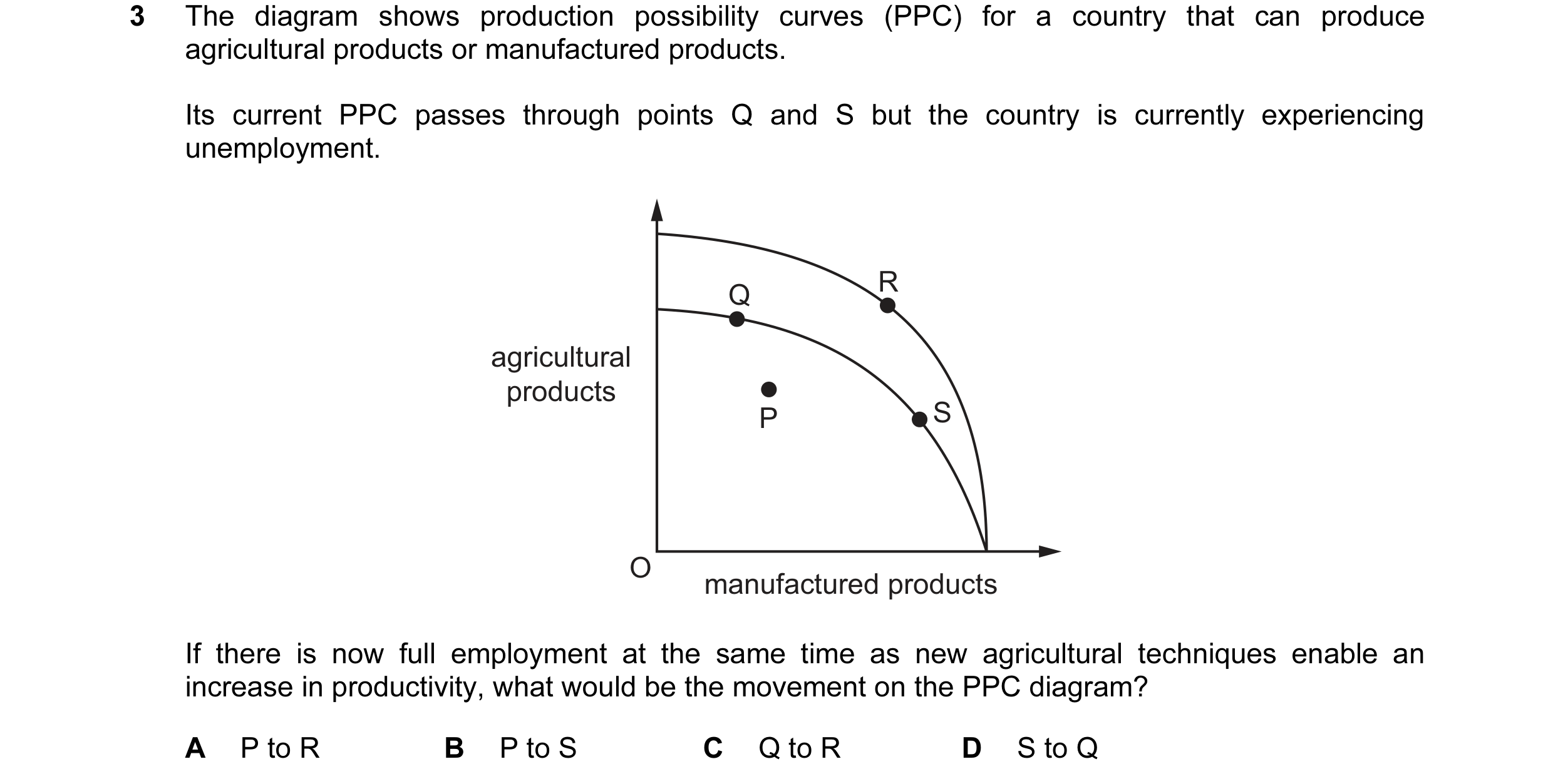
 6 / 33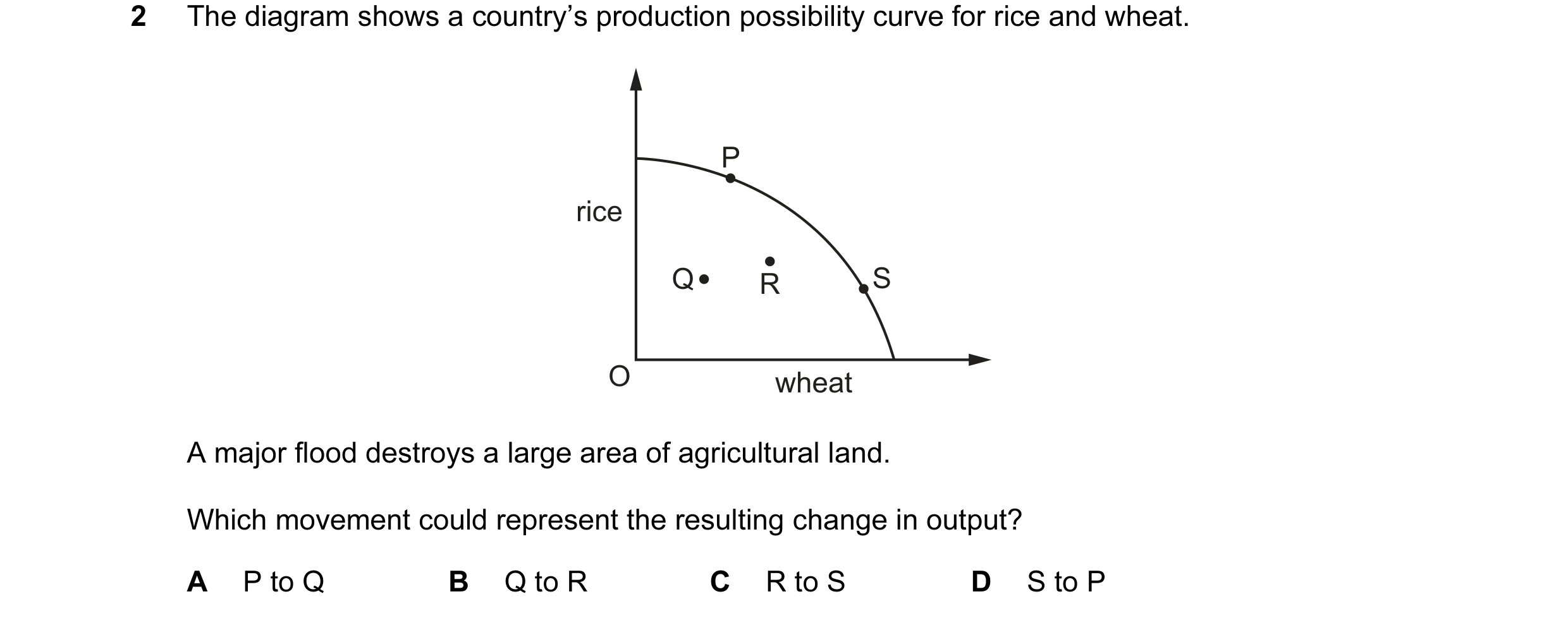
 7 / 33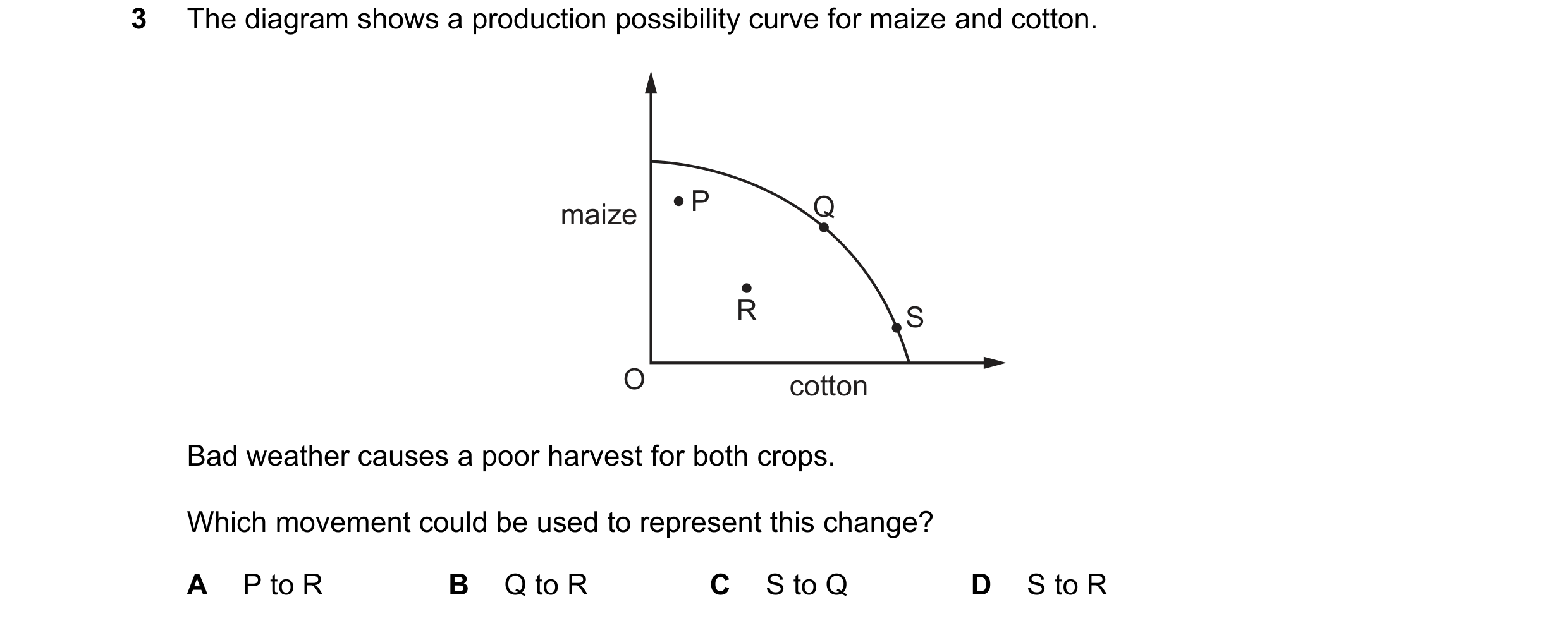
 8 / 33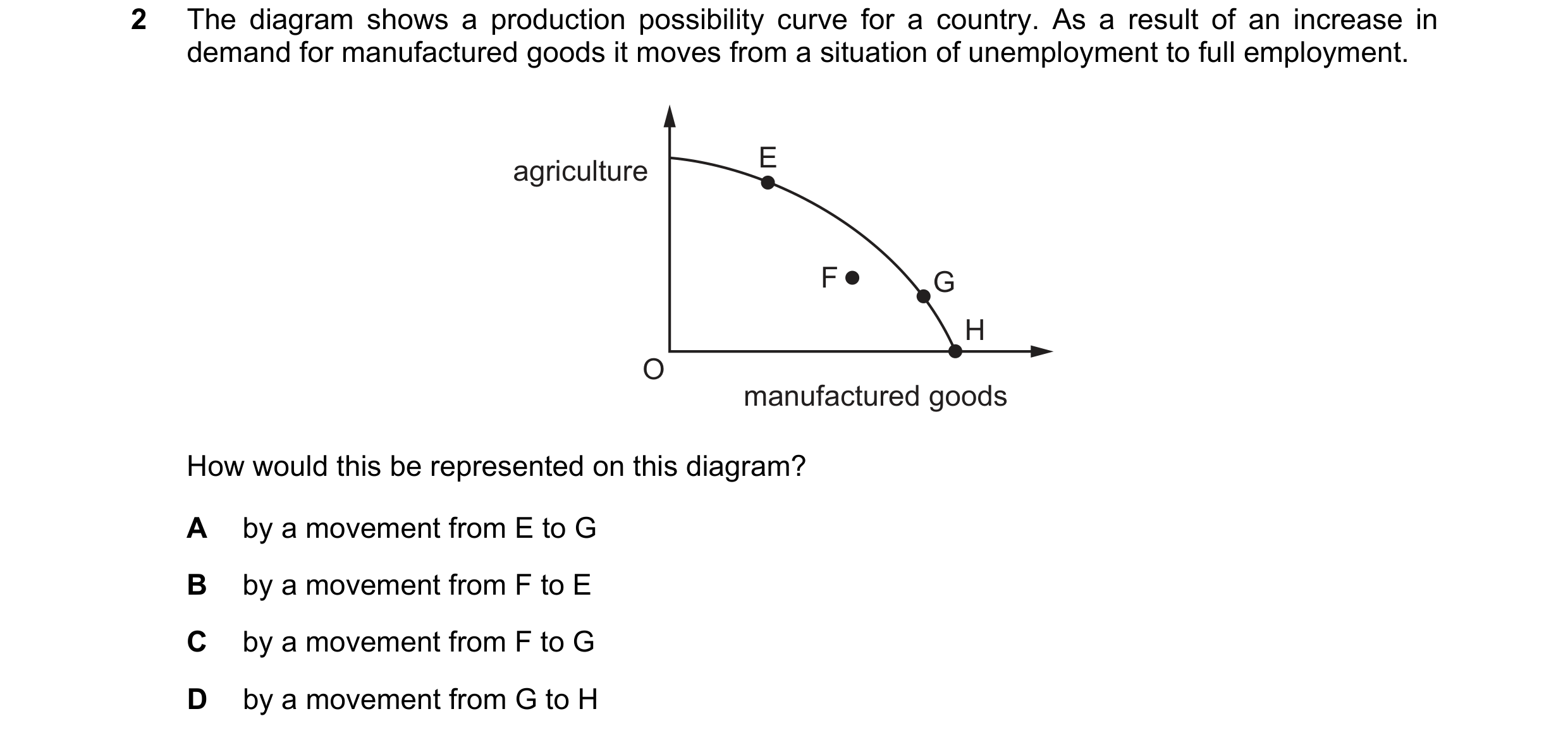
 9 / 33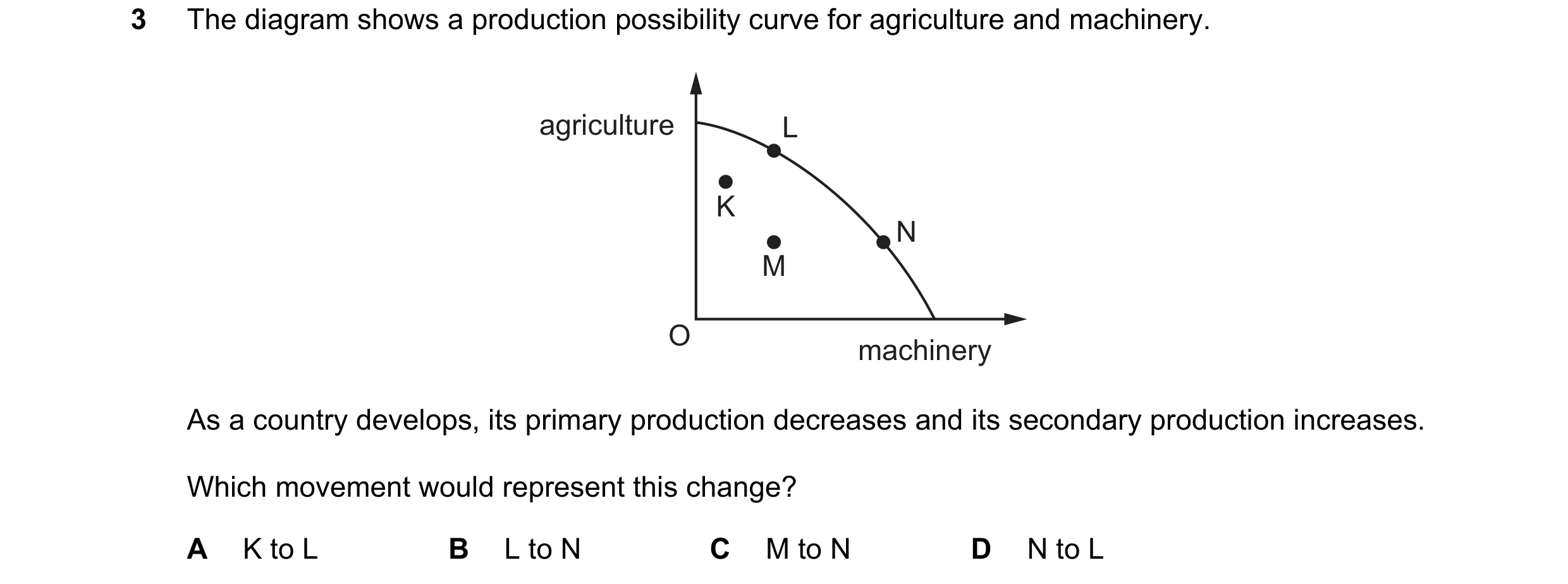
 10 / 33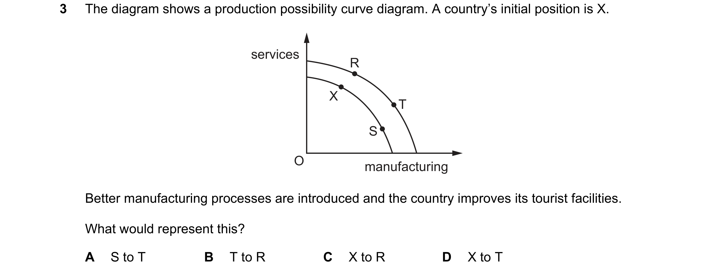
 11 / 33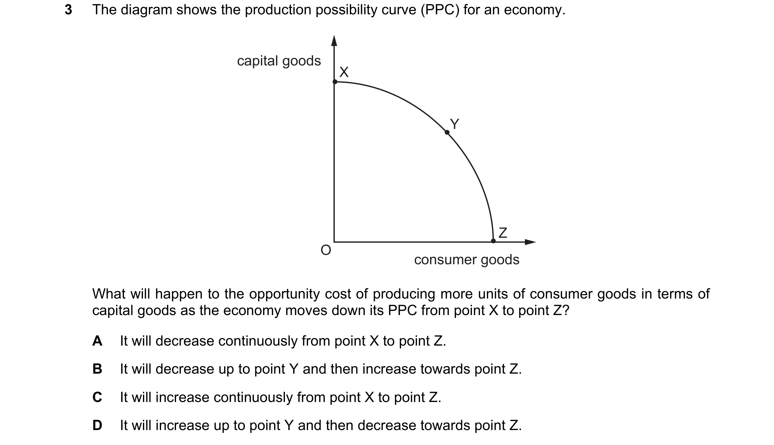
 12 / 33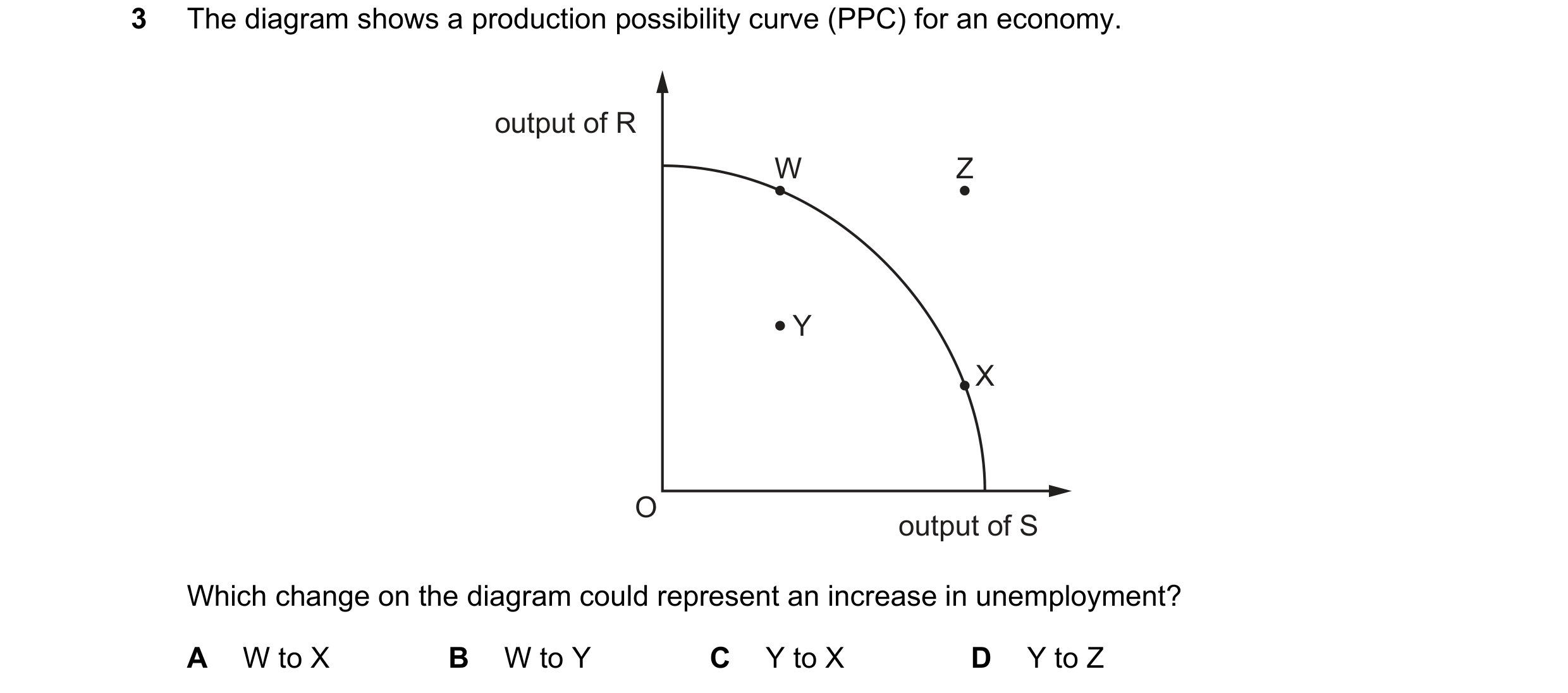
 13 / 33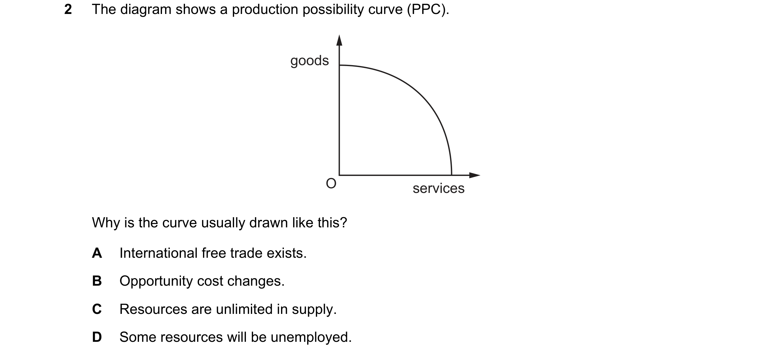
 14 / 33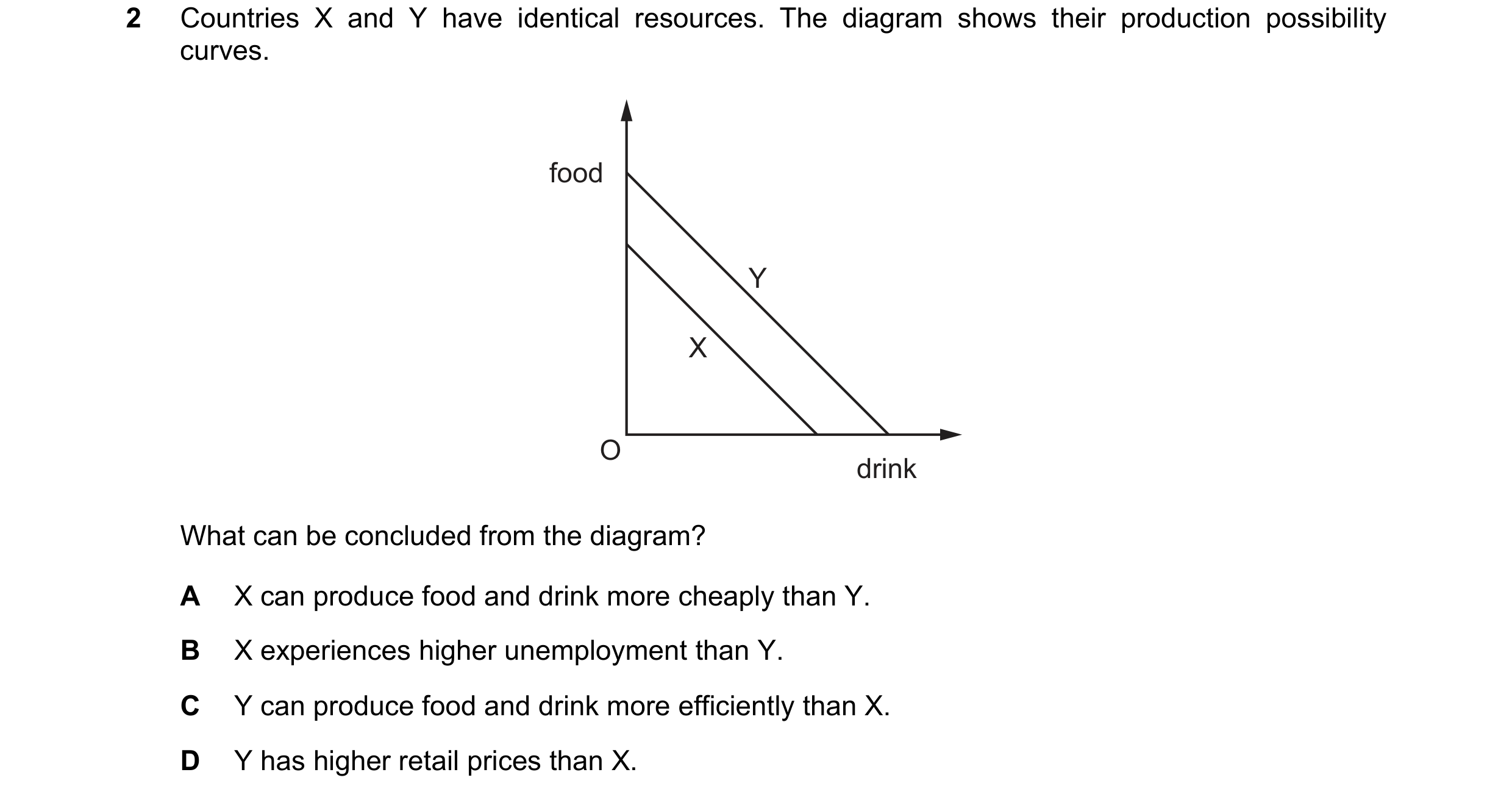
 15 / 33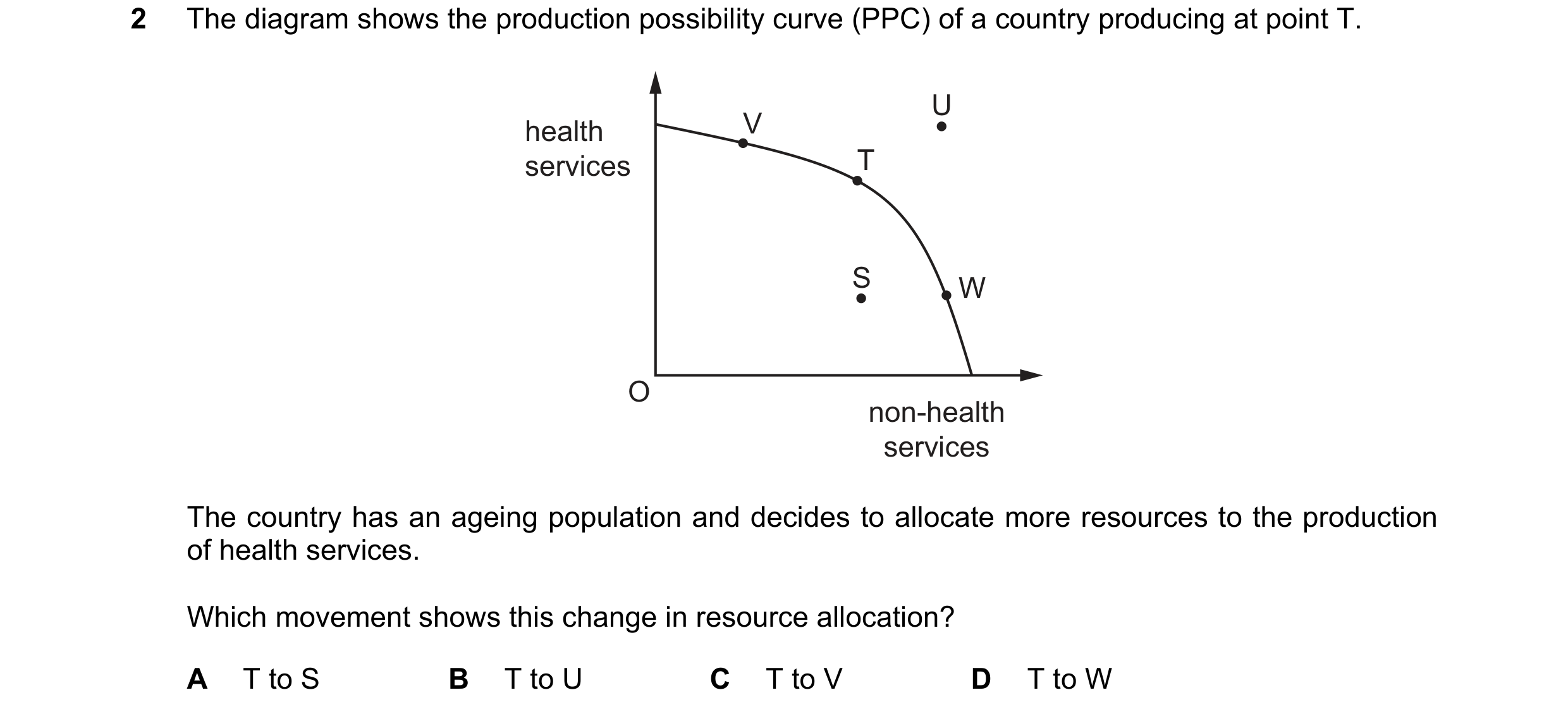
 16 / 33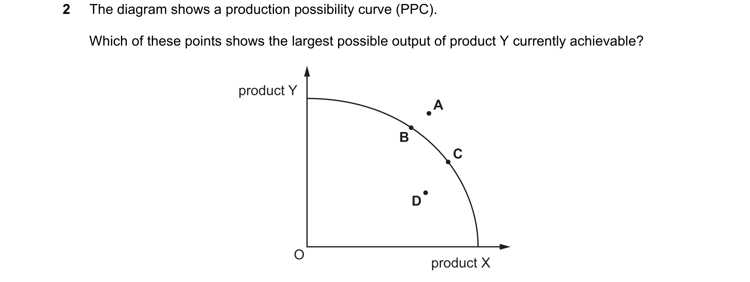
 17 / 33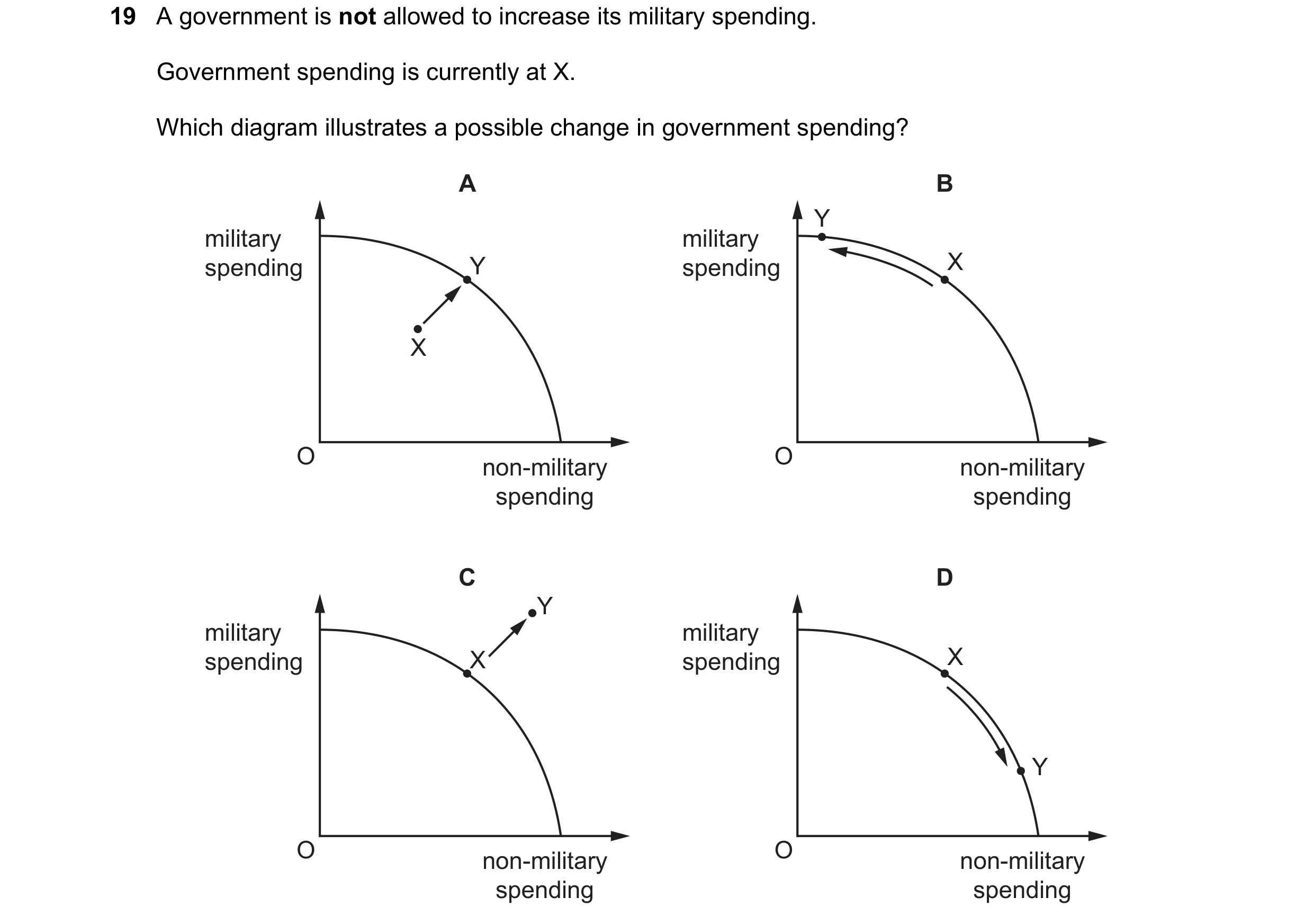
 18 / 33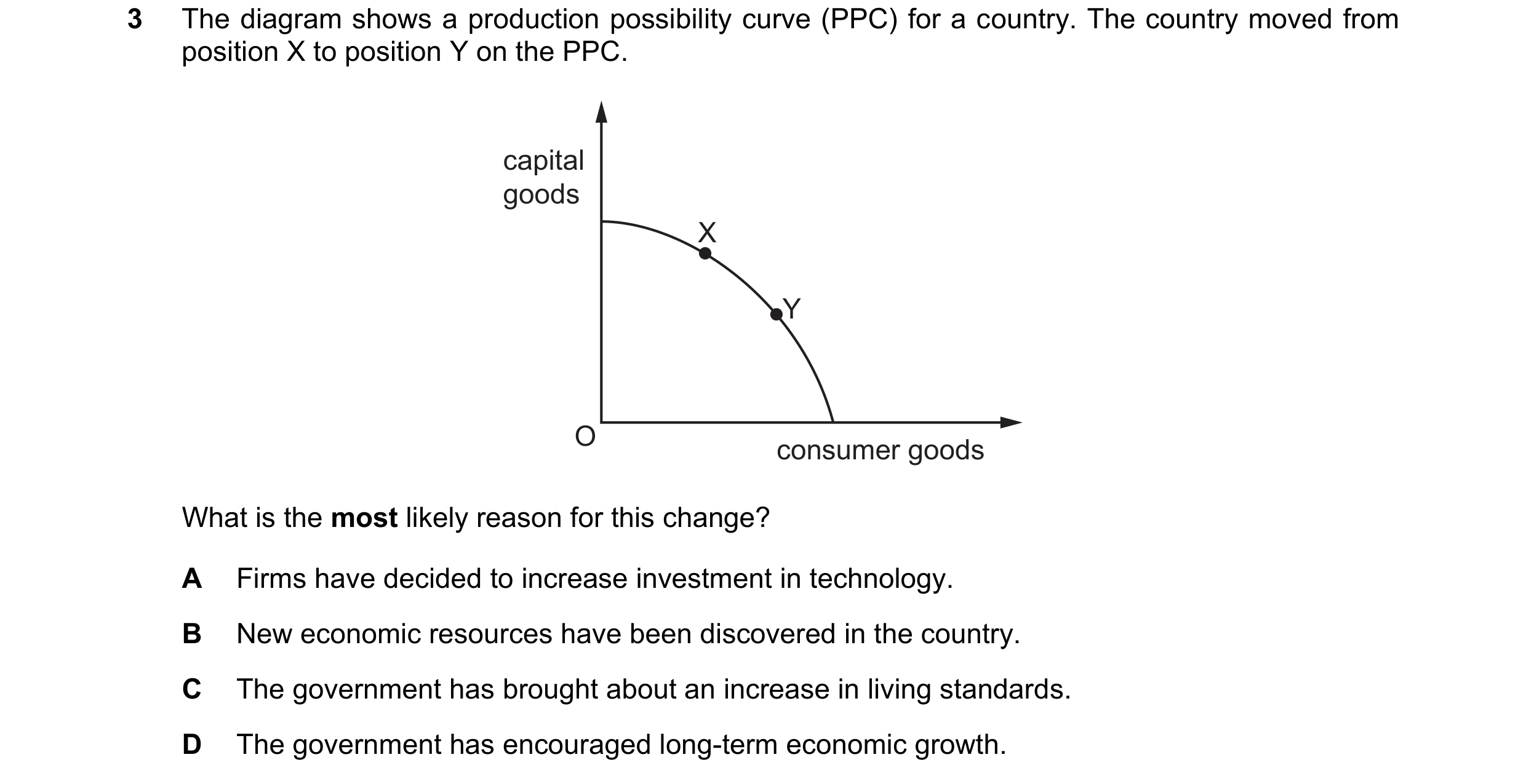
 19 / 33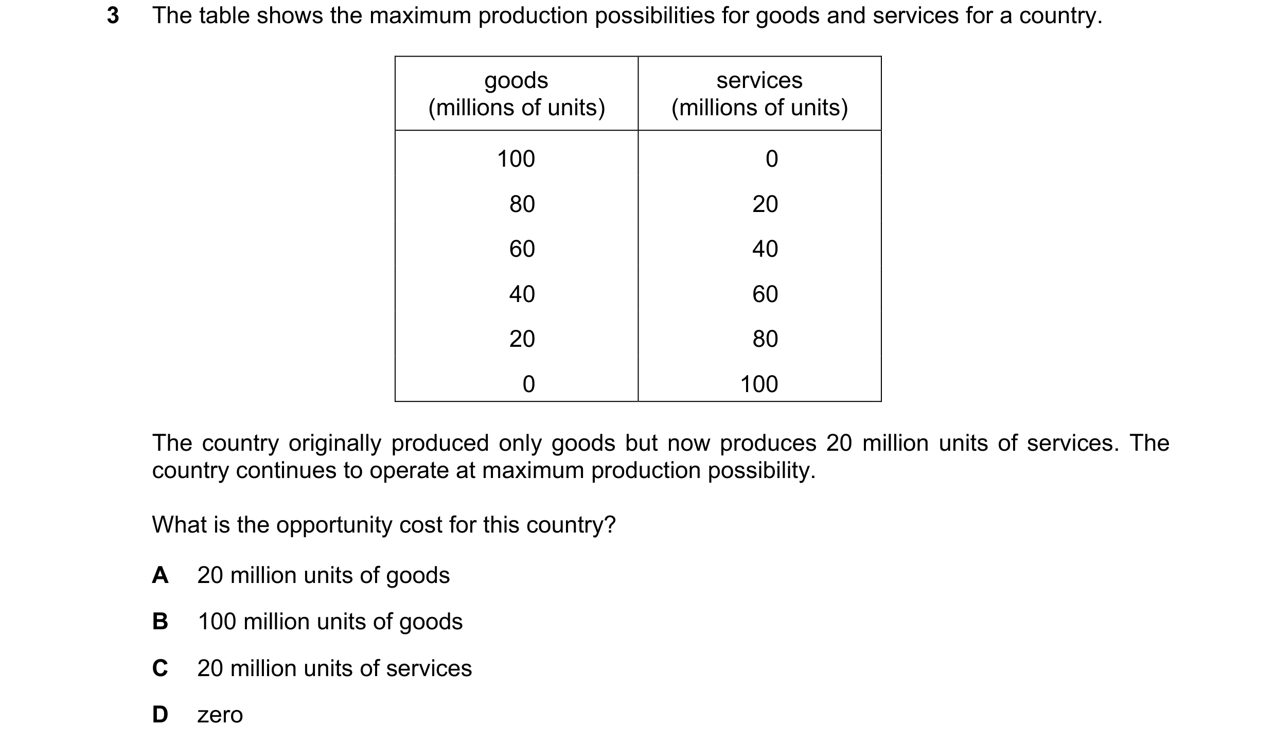
 20 / 33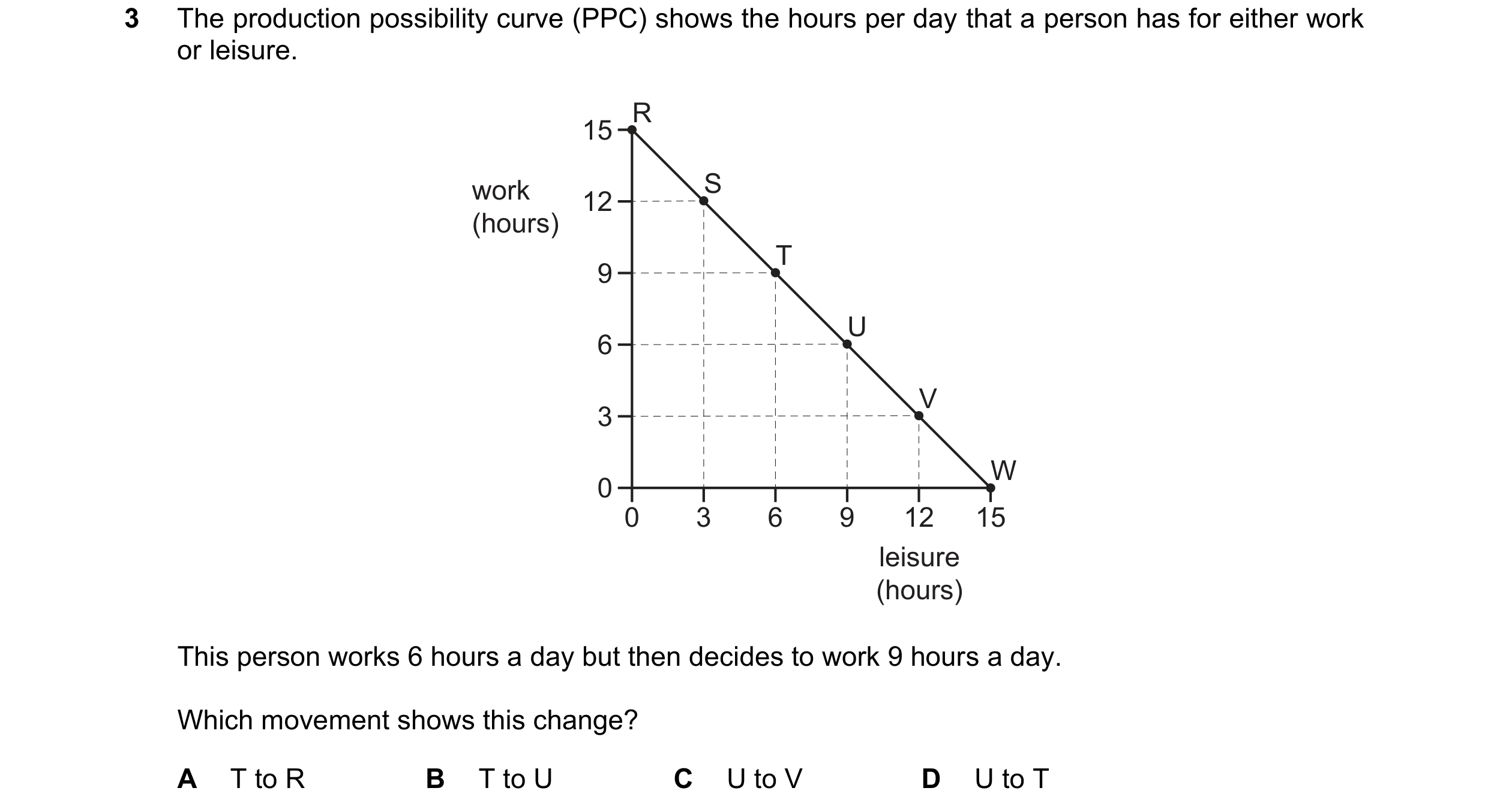
 21 / 33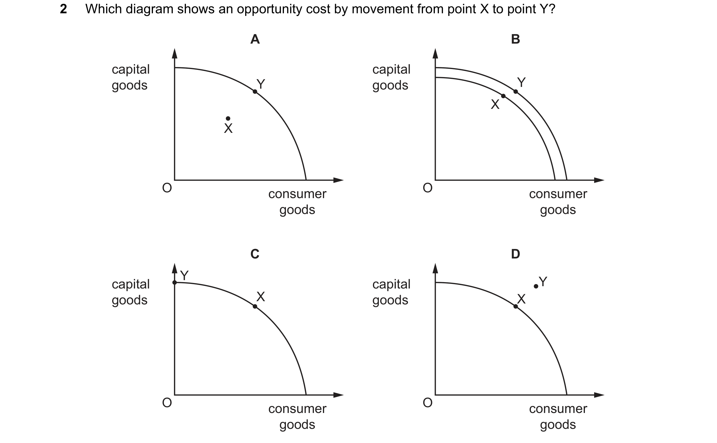
 22 / 33
 23 / 33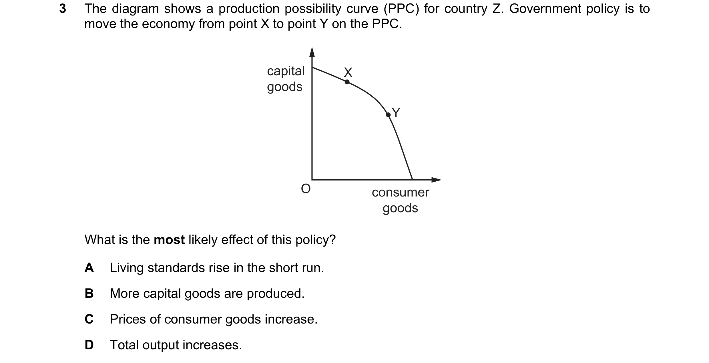
 24 / 33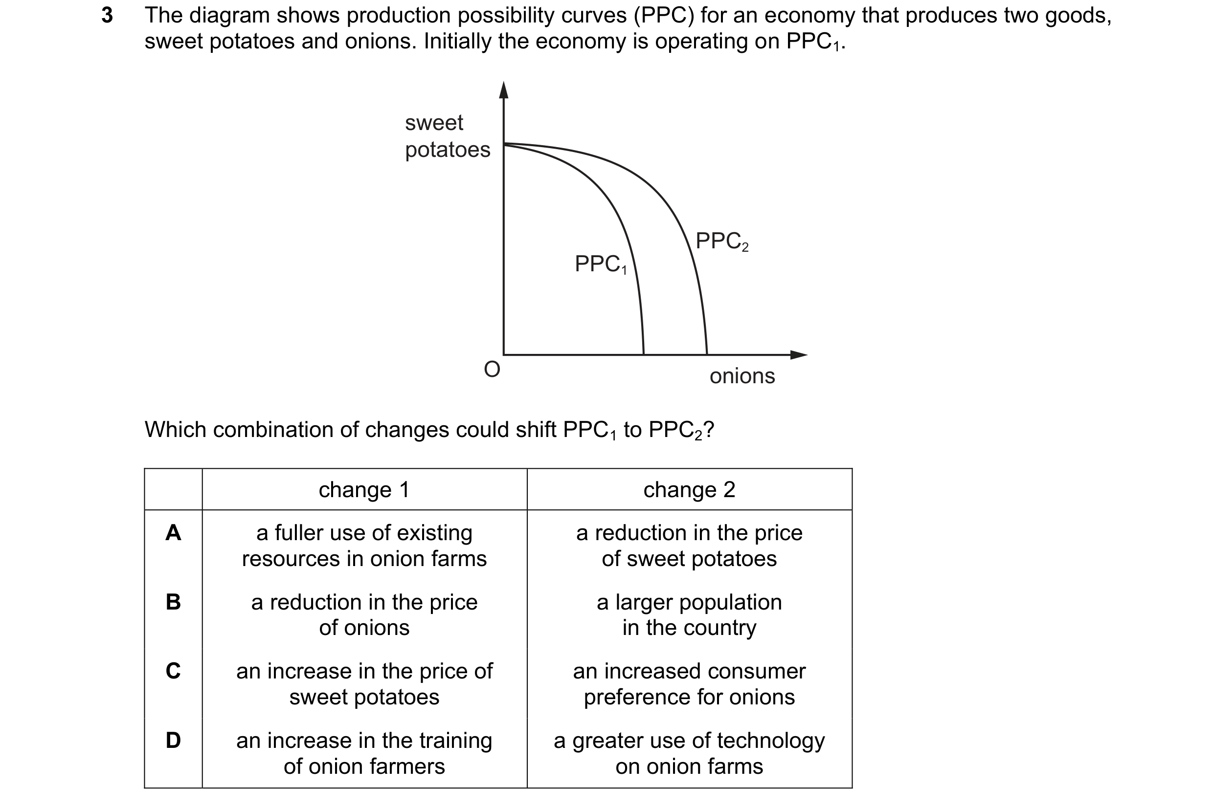
 25 / 33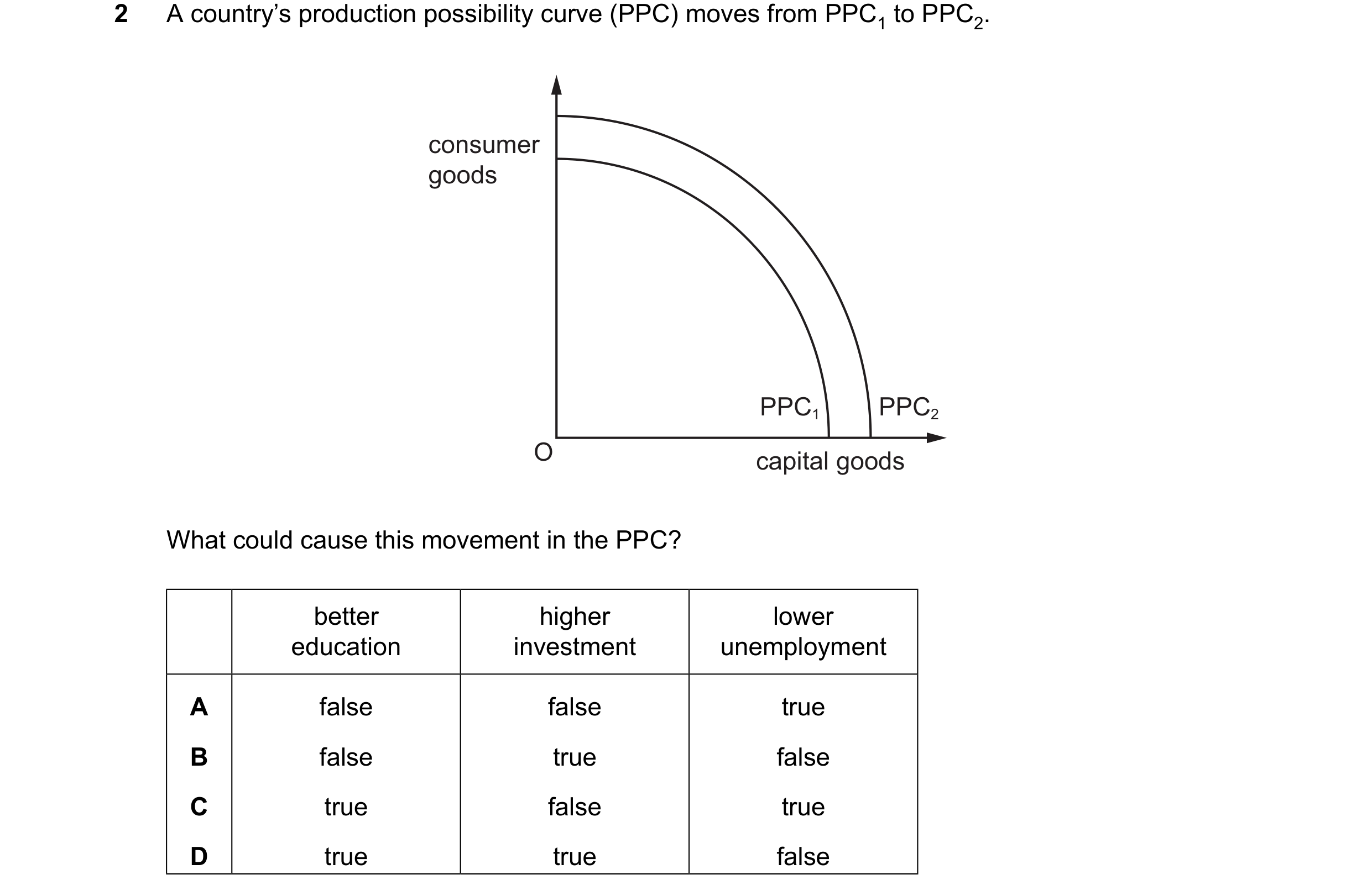
 26 / 33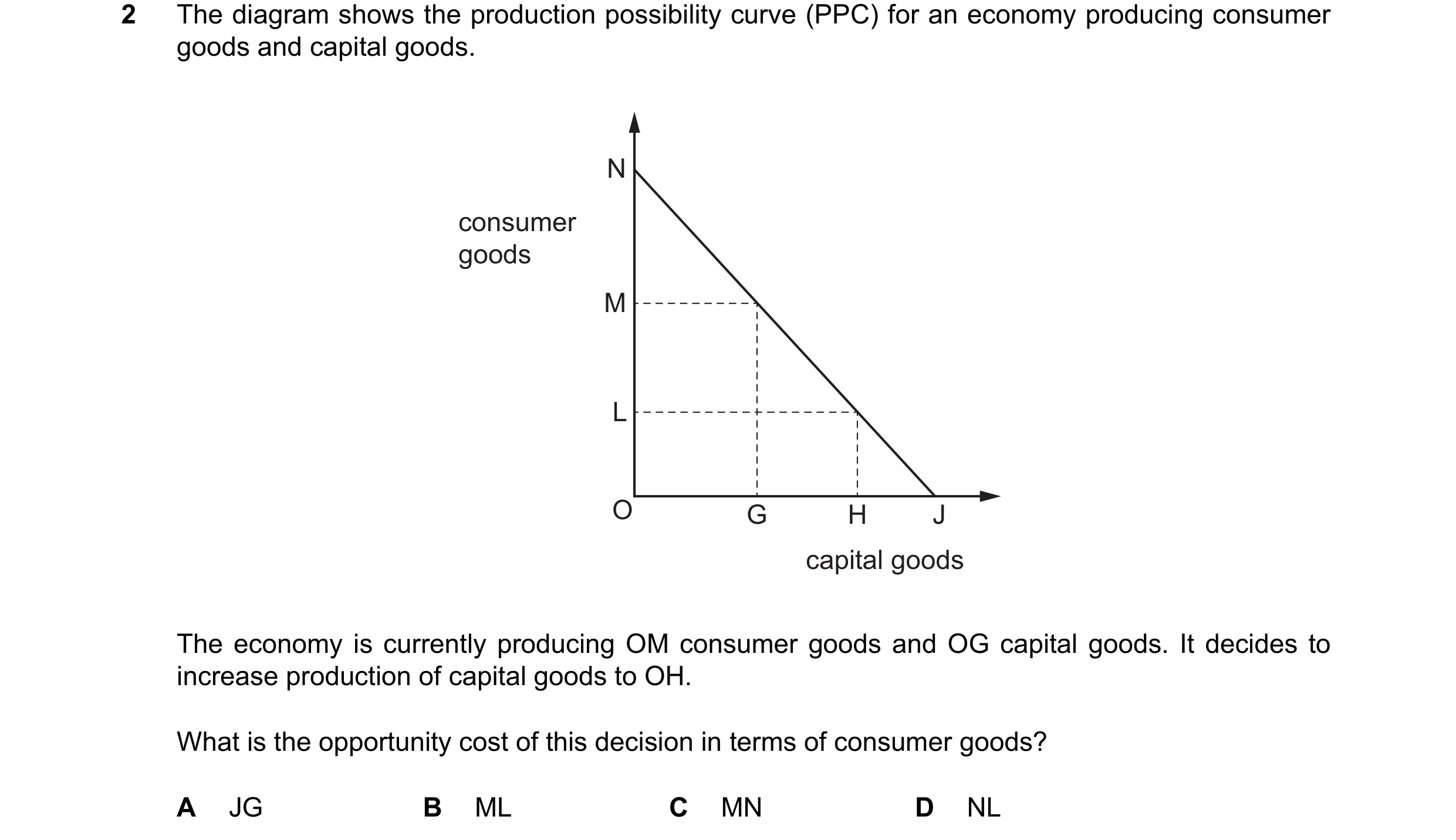
 27 / 33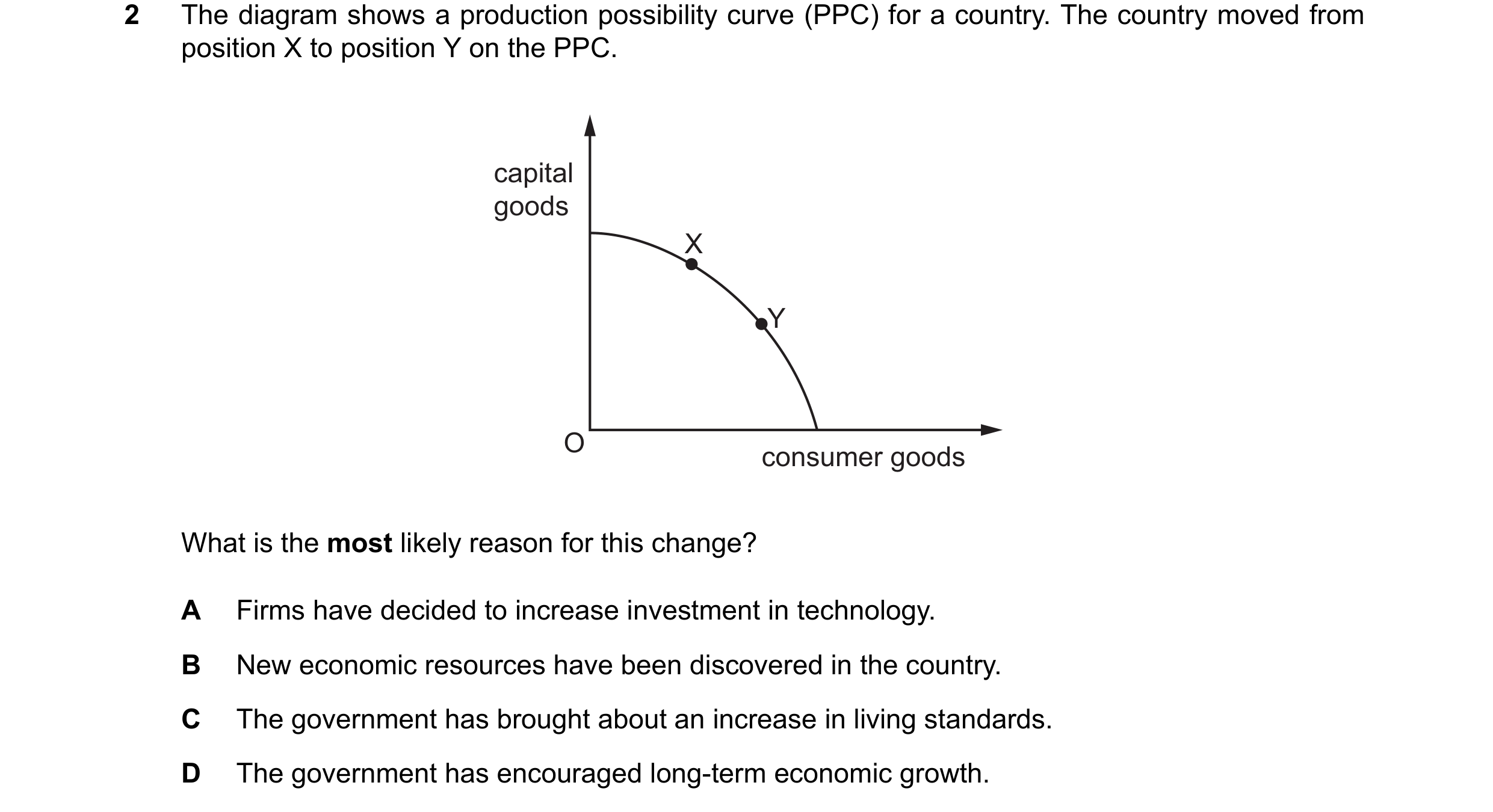
 28 / 33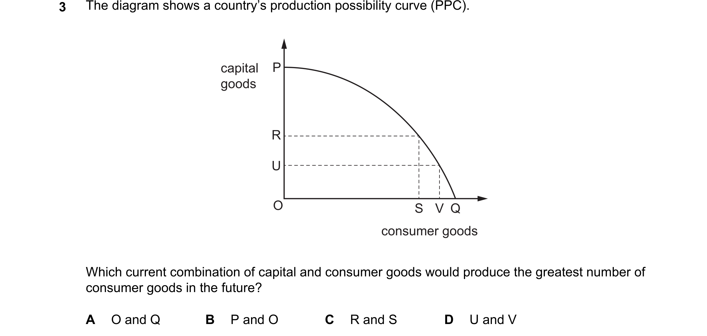
 29 / 33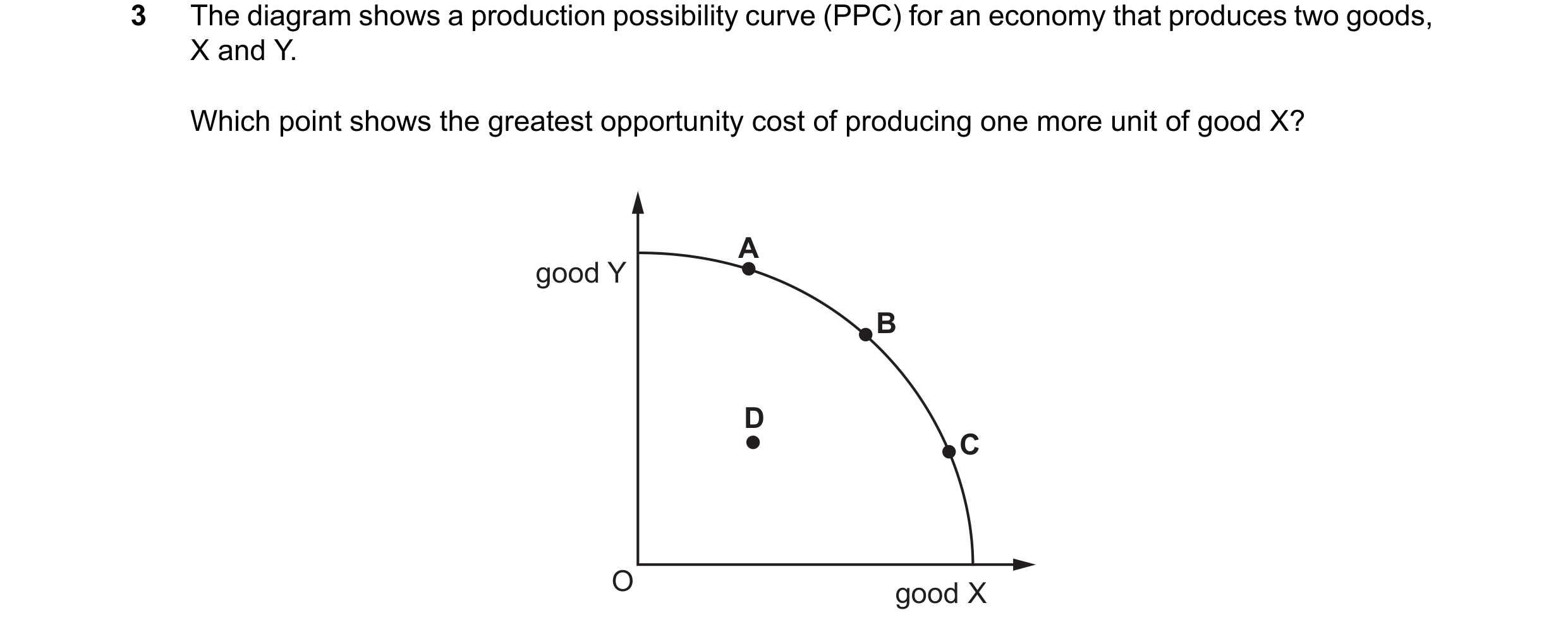
 30 / 33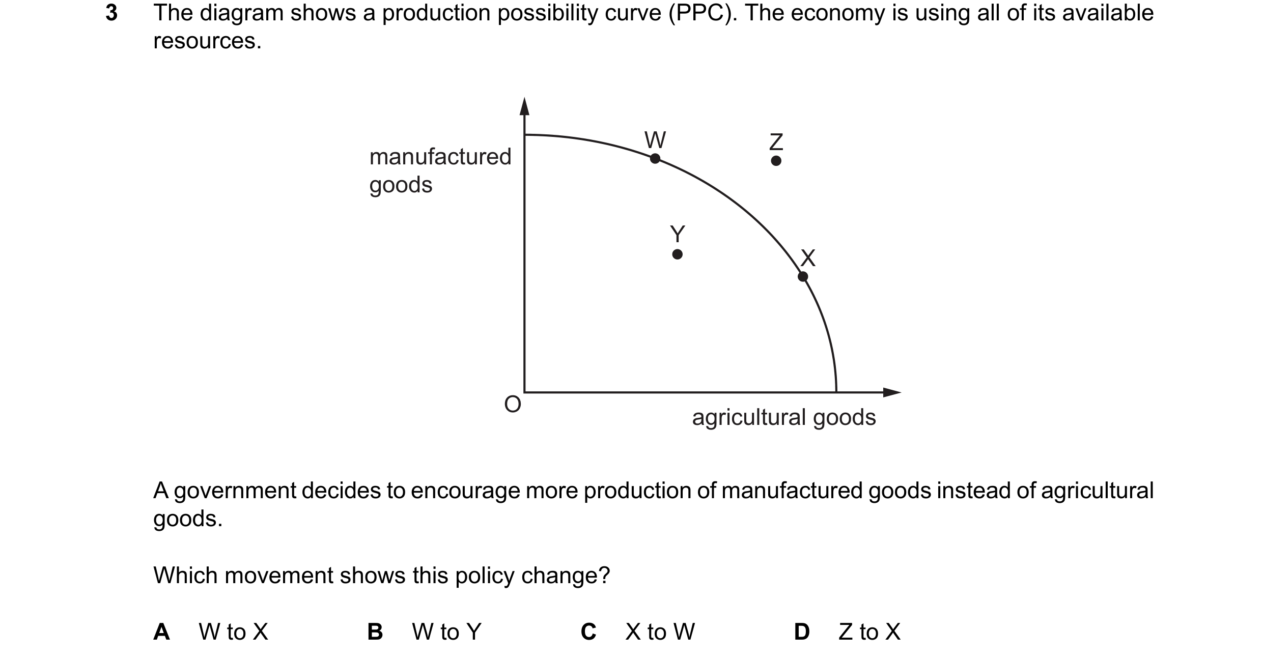
 31 / 33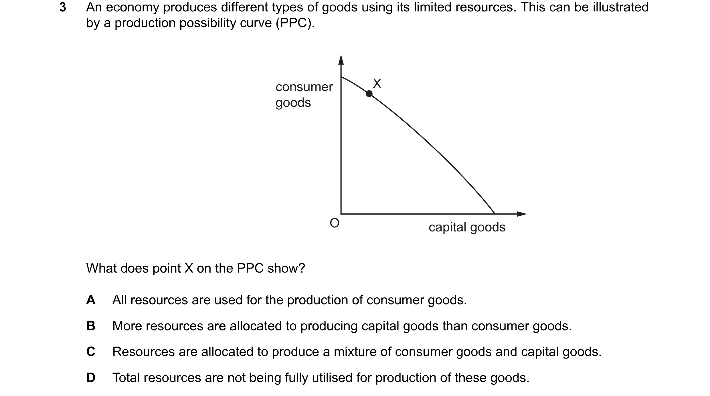
 32 / 33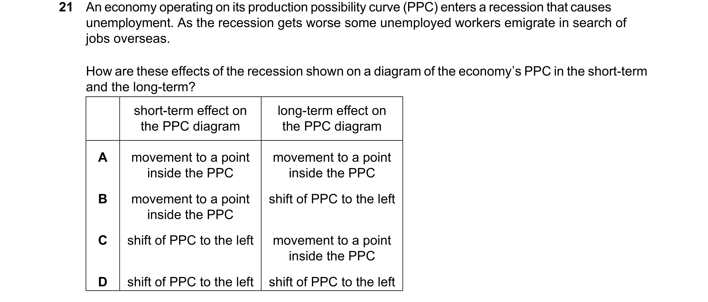
 33 / 33