Questions as text
Q1 · The table below shows the average daily sunshine, s, and the total monthly rainfall, r… 0580/31 Oct/Nov 2008
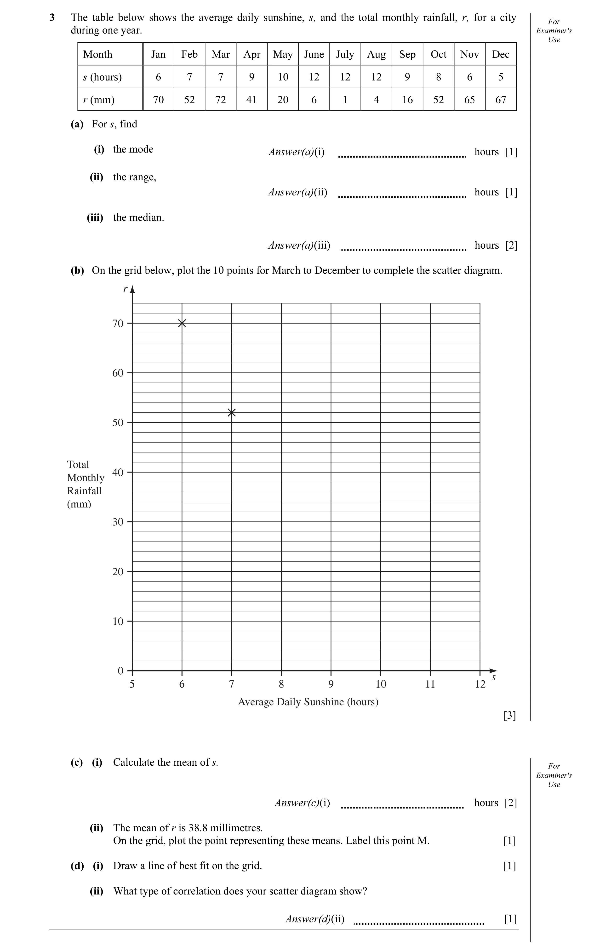
3 The table below shows the average daily sunshine, s, and the total monthly rainfall, r, for a city For during one year. Examiner's Use Month Jan Feb Mar Apr May June July Aug Sep Oct Nov Dec s (hours) 6 7 7 9 10 12 12 12 9 8 6 5 r (mm) 70 52 72 41 20 6 1 4 16 52 65 67 (a) For s, find (i) the mode Answer(a)(i) hours [1] (ii) the range, Answer(a)(ii) hours [1] (iii) the median. Answer(a)(iii) hours [2] (b) On the grid below, plot the 10 points for March to December to complete the scatter diagram. r 70 60 50 Total 40 Monthly Rainfall (mm) 30 20 10 0 s 5 6 7 8 9 10 11 12 Average Daily Sunshine (hours) [3] (c) (i) Calculate the mean of s. For Examiner's Use Answer(c)(i) hours [2] (ii) The mean of r is 38.8 millimetres. On the grid, plot the point representing these means. Label this point M. [1] (d) (i) Draw a line of best fit on the grid. [1] (ii) What type of correlation does your scatter diagram show? Answer(d)(ii) [1]
12 marks
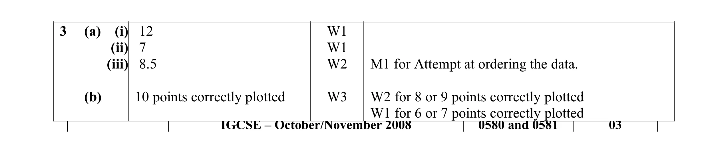
Mark scheme: 3 (a) (i) 12 W1 (ii) 7 W1 (iii) 8.5 W2 M1 for Attempt at ordering the data. (b) 10 points correctly plotted W3 W2 for 8 or 9 points correctly plotted W1 for 6 or 7 points correctly plotted IGCSE – October/November 2008 0580 and 0581 03
This question in 0580/31 Oct/Nov 2008
Q2 · Twelve students each answer 30 questions in a quiz 0580/31 May/June 2010
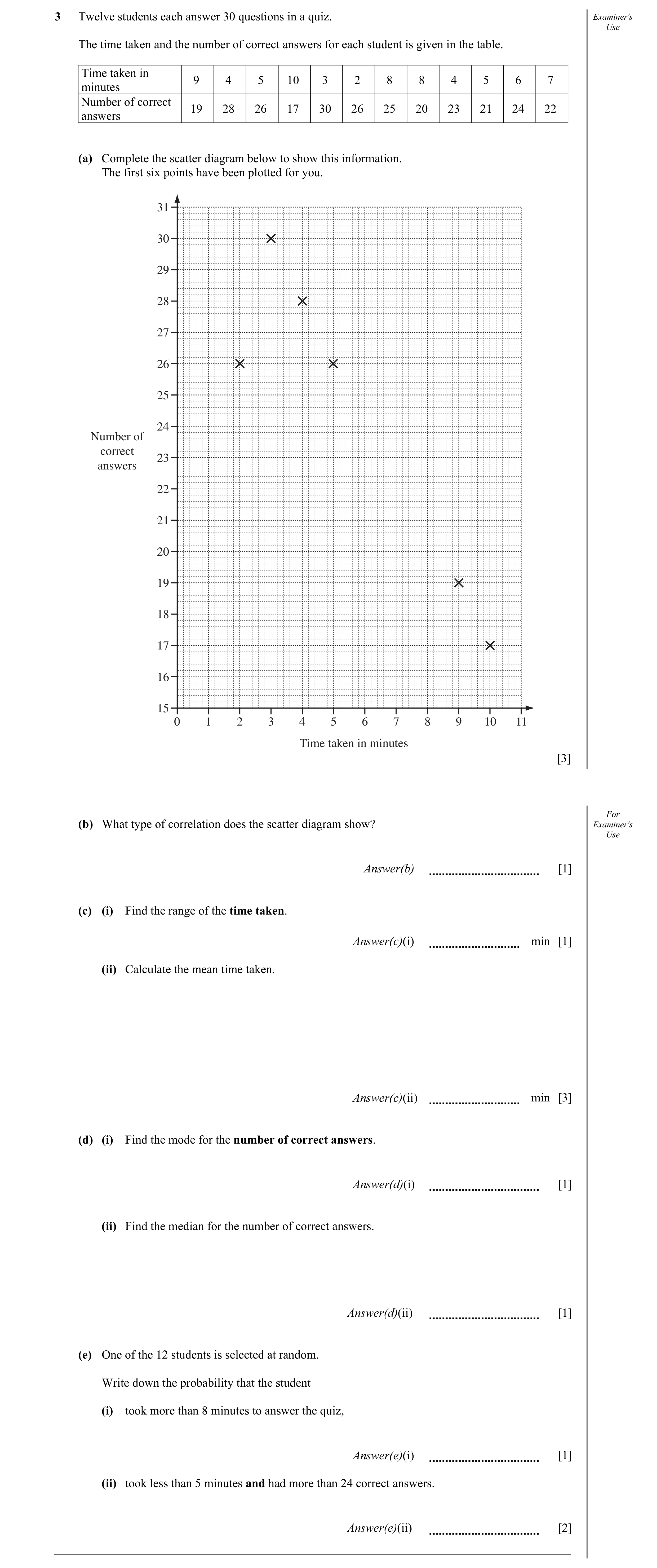
3 Twelve students each answer 30 questions in a quiz. Examiner's Use The time taken and the number of correct answers for each student is given in the table. Time taken in 9 4 5 10 3 2 8 8 4 5 6 7 minutes Number of correct 19 28 26 17 30 26 25 20 23 21 24 22 answers (a) Complete the scatter diagram below to show this information. The first six points have been plotted for you. 31 30 29 28 27 26 25 24 Number of correct 23 answers 22 21 20 19 18 17 16 15 0 1 2 3 4 5 6 7 8 9 10 11 Time taken in minutes [3] For (b) What type of correlation does the scatter diagram show? Examiner's Use Answer(b) [1] (c) (i) Find the range of the time taken. Answer(c)(i) min [1] (ii) Calculate the mean time taken. Answer(c)(ii) min [3] (d) (i) Find the mode for the number of correct answers. Answer(d)(i) [1] (ii) Find the median for the number of correct answers. Answer(d)(ii) [1] (e) One of the 12 students is selected at random. Write down the probability that the student (i) took more than 8 minutes to answer the quiz, Answer(e)(i) [1] (ii) took less than 5 minutes and had more than 24 correct answers. Answer(e)(ii) [2]
13 marks
Mark scheme: 3 (a) 6 points correctly plotted 3 P2 for 4 or 5 points, P1 for 2 or 3 points (b) negative cao 1 (c) (i) 8 cao 1 (ii) art 5.92 3 M1 for attempt to add the 12 values (for time) implied by 71 M1 dep for division by 12 SC1 for 23.4 (d) (i) 26 cao 1 (ii) 23.5 cao 1 2 (e) (i) oe 1 0.166 or 0.167 or 16.6% or 16.7% 12 3 (ii) oe 2 0.25 or 25% 12 SC1 for (4,28) (2,26) (3,30) listed or ringed on diagram or table
This question in 0580/31 May/June 2010
Q3 · For Examiner's Month Total rainfall (mm) Average daily sunshine (hours) Use January 79 6… 0580/31 Oct/Nov 2010
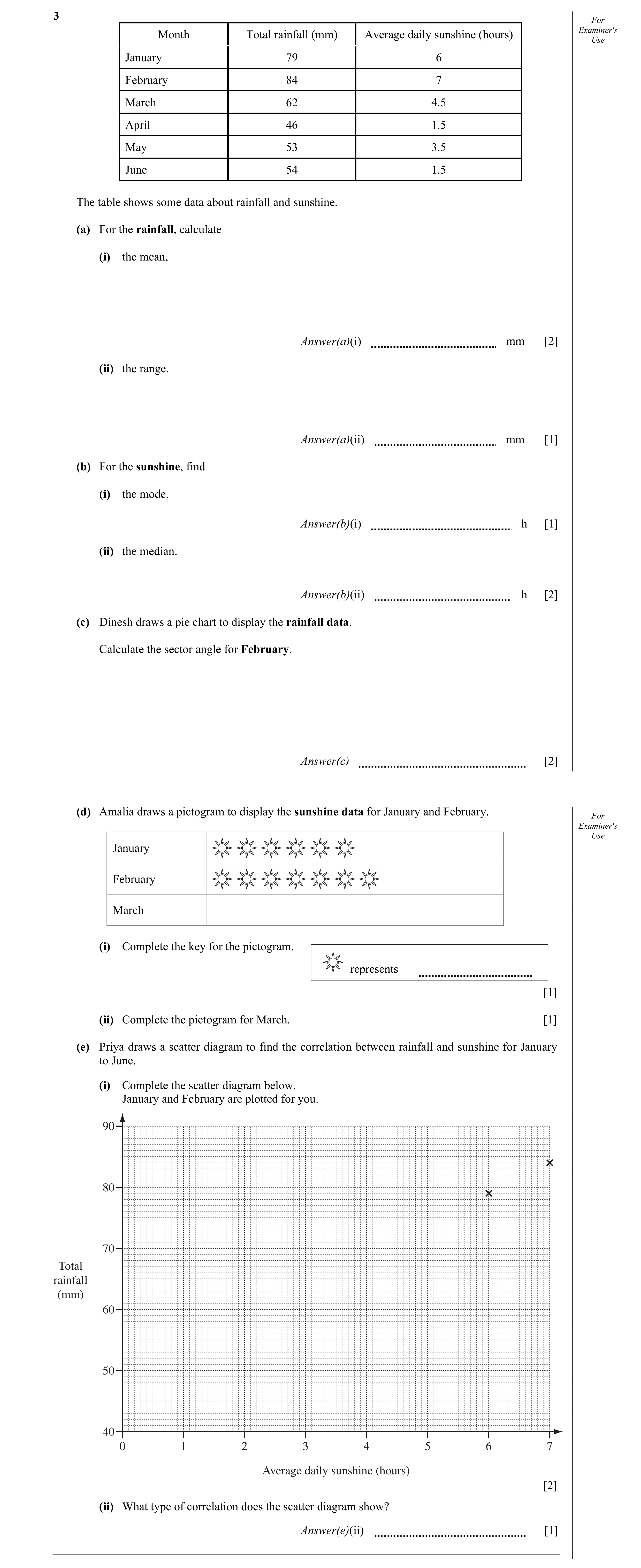
3 For Examiner's Month Total rainfall (mm) Average daily sunshine (hours) Use January 79 6 February 84 7 March 62 4.5 April 46 1.5 May 53 3.5 June 54 1.5 The table shows some data about rainfall and sunshine. (a) For the rainfall, calculate (i) the mean, Answer(a)(i) mm [2] (ii) the range. Answer(a)(ii) mm [1] (b) For the sunshine, find (i) the mode, Answer(b)(i) h [1] (ii) the median. Answer(b)(ii) h [2] (c) Dinesh draws a pie chart to display the rainfall data. Calculate the sector angle for February. Answer(c) [2] (d) Amalia draws a pictogram to display the sunshine data for January and February. For Examiner's Use January February March (i) Complete the key for the pictogram. represents [1] (ii) Complete the pictogram for March. [1] (e) Priya draws a scatter diagram to find the correlation between rainfall and sunshine for January to June. (i) Complete the scatter diagram below. January and February are plotted for you. 90 80 70 Total rainfall (mm) 60 50 40 0 1 2 3 4 5 6 7 Average daily sunshine (hours) [2] (ii) What type of correlation does the scatter diagram show? Answer(e)(ii) [1]
13 marks
Mark scheme: 3 (a) (i) 63 2 M1 for their “378” ÷ 6 or SC1 for 333 seen (ii) 38 cao 1 (b) (i) 1.5 cao 1 (ii) 4 2 B1 for attempt to order the numbers (c) 80° 2 M1 for 84 ÷ their total × 360 (d) (i) 1 hour 1 (ii) 4 and a half more suns drawn 1 Condone size, shape of suns (e) (i) 4 correct plots 2 B1 for 3 or 2 correct (ii) Positive 1 IGCSE – October/November 2010 0580 31
This question in 0580/31 Oct/Nov 2010
Q4 · The table shows the average temperature and rainfall each month at Wellington airport 0580/32 Oct/Nov 2011
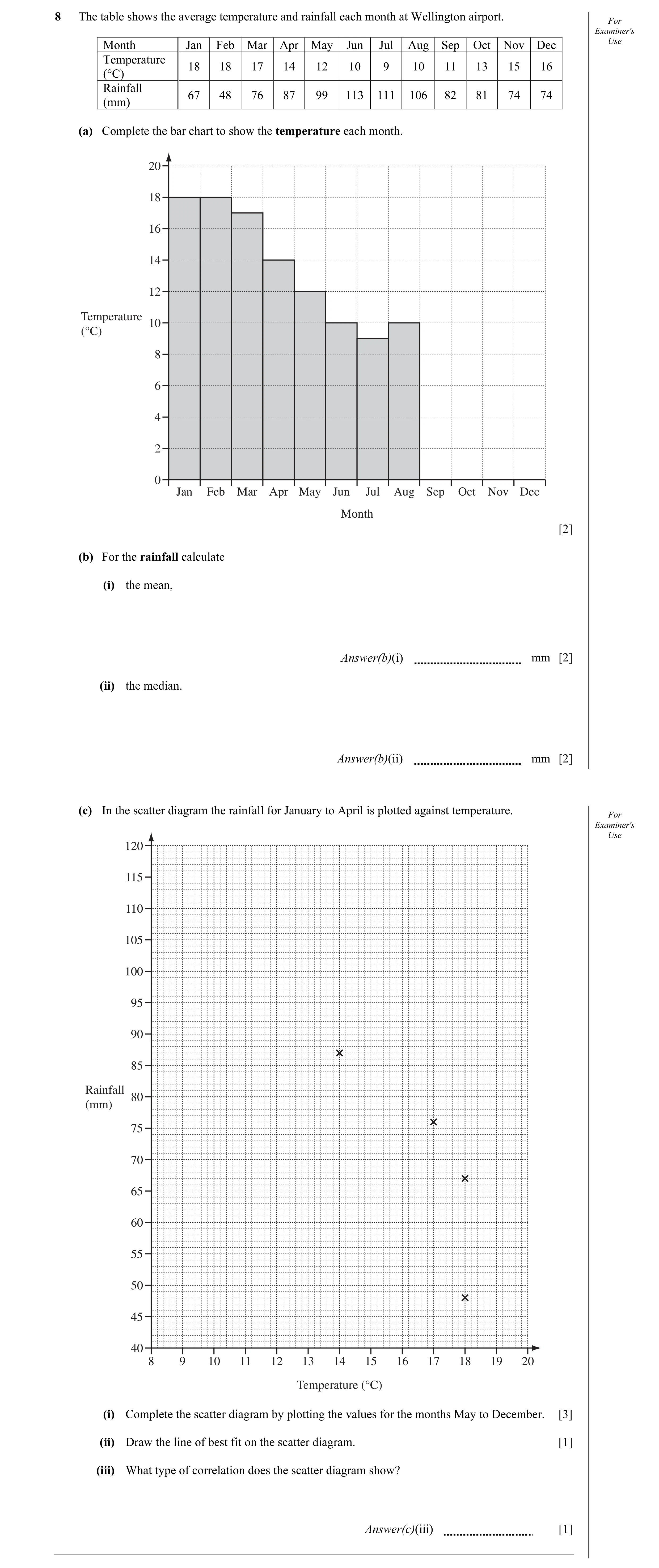
8 The table shows the average temperature and rainfall each month at Wellington airport. For Examiner's Month Jan Feb Mar Apr May Jun Jul Aug Sep Oct Nov Dec Use Temperature 18 18 17 14 12 10 9 10 11 13 15 16 (°C) Rainfall 67 48 76 87 99 113 111 106 82 81 74 74 (mm) (a) Complete the bar chart to show the temperature each month. 20 18 16 14 12 Temperature 10 (°C) 8 6 4 2 0 Jan Feb Mar Apr May Jun Jul Aug Sep Oct Nov Dec Month [2] (b) For the rainfall calculate (i) the mean, Answer(b)(i) mm [2] (ii) the median. Answer(b)(ii) mm [2] (c) In the scatter diagram the rainfall for January to April is plotted against temperature. For Examiner's Use 120 115 110 105 100 95 90 85 Rainfall 80 (mm) 75 70 65 60 55 50 45 40 8 9 10 11 12 13 14 15 16 17 18 19 20 Temperature (°C) (i) Complete the scatter diagram by plotting the values for the months May to December. [3] (ii) Draw the line of best fit on the scatter diagram. [1] (iii) What type of correlation does the scatter diagram show? Answer(c)(iii) [1]
11 marks
Mark scheme: 8 (a) heights 11, 13, 15, 16 2 B1 for 3 correct (b) (i) 84.8(3…) 2 M1 addition of 12 rainfall values (ii) 81.5 2 Either M1 for evidence of ordering values or substantial part of list (at least first 7 or last 7) or M1 for answers of 81 and 82 (c) (i) 8 values correctly plotted P3 P2 for 6 or 7 correct P1 for 4 or 5 correct (ii) Line of best fit 1 Must be continuous and straight (iii) Negative 1 IGCSE – October/November 2011 0580 32
This question in 0580/32 Oct/Nov 2011
Q5 · The table shows the marks for ten students in their Chemistry papers for Unit A and Unit B 0580/33 May/June 2012
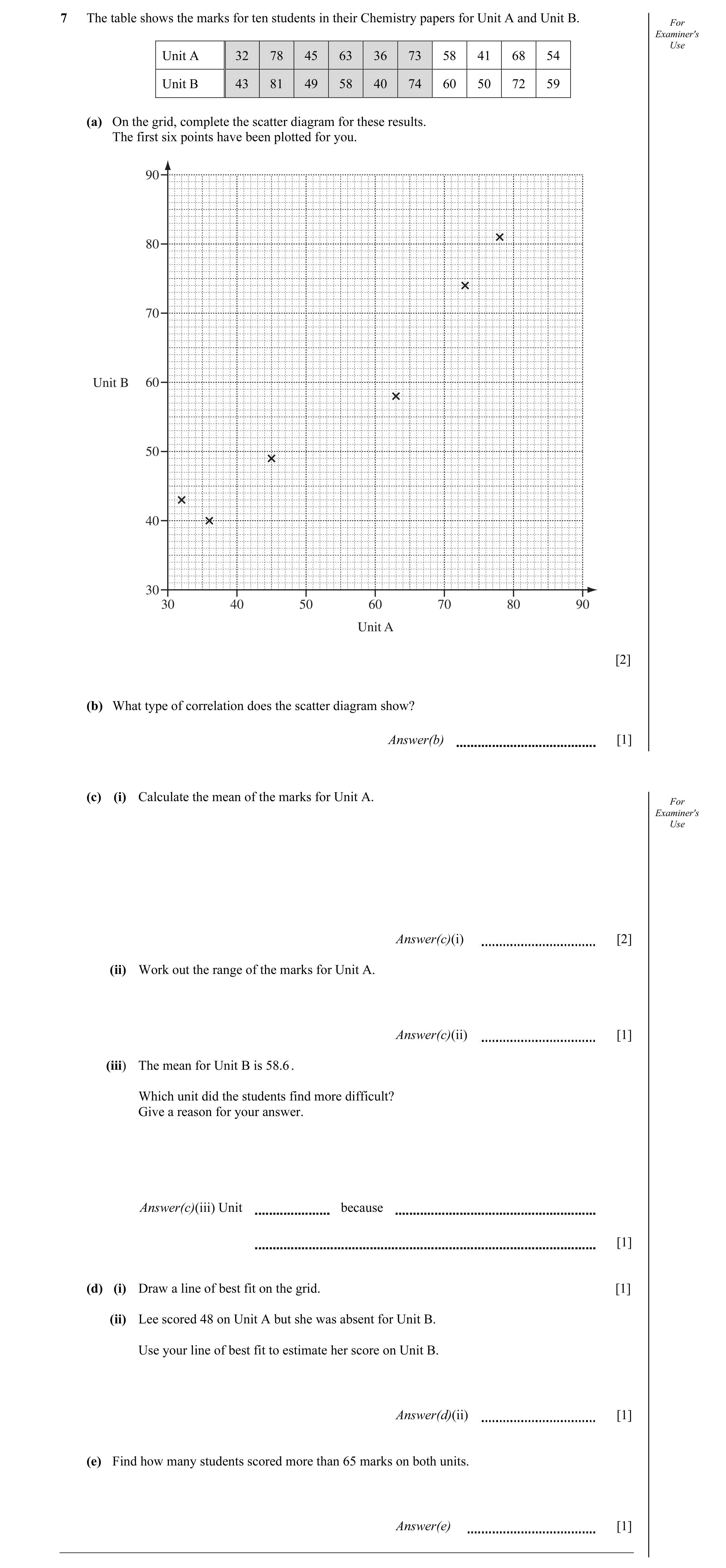
7 The table shows the marks for ten students in their Chemistry papers for Unit A and Unit B. For Examiner's Use Unit A 32 78 45 63 36 73 58 41 68 54 Unit B 43 81 49 58 40 74 60 50 72 59 (a) On the grid, complete the scatter diagram for these results. The first six points have been plotted for you. 90 80 70 Unit B 60 50 40 30 30 40 50 60 70 80 90 Unit A [2] (b) What type of correlation does the scatter diagram show? Answer(b) [1] (c) (i) Calculate the mean of the marks for Unit A. For Examiner's Use Answer(c)(i) [2] (ii) Work out the range of the marks for Unit A. Answer(c)(ii) [1] (iii) The mean for Unit B is 58.6 . Which unit did the students find more difficult? Give a reason for your answer. Answer(c)(iii) Unit because [1] (d) (i) Draw a line of best fit on the grid. [1] (ii) Lee scored 48 on Unit A but she was absent for Unit B. Use your line of best fit to estimate her score on Unit B. Answer(d)(ii) [1] (e) Find how many students scored more than 65 marks on both units. Answer(e) [1]
10 marks
Mark scheme: 7 (a) four points correctly plotted 2 M1 for three points correctly plotted (b) positive 1 ignore extras like ‘strong’ (c) (i) 54.8 2 M1 for their sum (548) ÷ 10 (ii) 46 1 (iii) A and it has a lower mean 1ft allow any correct reason using appropriate information from the table and ft their mean (d) (i) correct ruled line 1 at A = 40 allow 44–48 at A = 70 allow 70–78 (ii) correct reading from their line 1ft read from their ruled line (e) 3 1ft
This question in 0580/33 May/June 2012
Q6 · The table shows the height, in metres, above sea-level and the temperature, in °C, at… 0580/31 May/June 2013
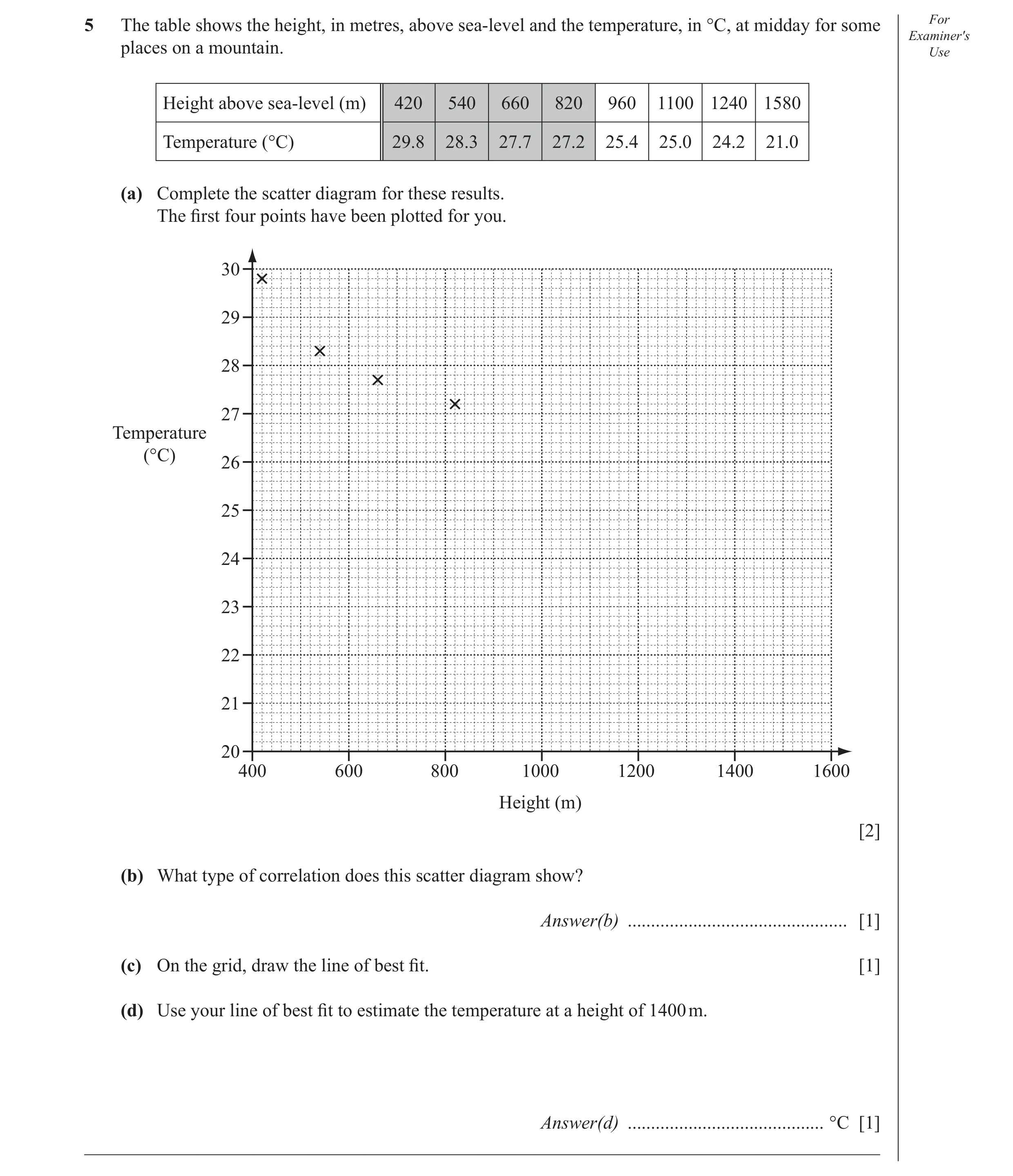
5 The table shows the height, in metres, above sea-level and the temperature, in °C, at midday for some For Examiner′s places on a mountain. Use Height above sea-level (m) 420 540 660 820 960 1100 1240 1580 Temperature (°C) 29.8 28.3 27.7 27.2 25.4 25.0 24.2 21.0 (a) Complete the scatter diagram for these results. The fi rst four points have been plotted for you. 30 29 28 27 Temperature (°C) 26 25 24 23 22 21 20 400 600 800 1000 1200 1400 1600 Height (m) [2] (b) What type of correlation does this scatter diagram show? Answer(b) … [1] (c) On the grid, draw the line of best fi t. [1] (d) Use your line of best fi t to estimate the temperature at a height of 1400 m. Answer(d) … °C [1] _____________________________________________________________________________________
5 marks
Mark scheme: 5 (a) 4 points plotted correctly 2 B1 for 3 points plotted correctly (b) negative 1 (c) correct ruled line 1 (d) 22.4 – 22.8 1ft Ft from their (c) if ruled and negative gradient IGCSE – May/June 2013 0580 31
This question in 0580/31 May/June 2013
Q7 · For Examiner′s Use 5 Sweet 4 shop 3 Distance (km) 2 1 Home 0 14 10 14 20 14 30 14 40 14… 0580/32 May/June 2013
8 For Examiner′s Use 5 Sweet 4 shop 3 Distance (km) 2 1 Home 0 14 10 14 20 14 30 14 40 14 50 15 00 15 10 15 20 15 30 15 40 Time (a) Jono walked from his home to a sweet shop. Use the travel graph to calculate his walking speed in kilometres per hour. Answer(a) … km/h [2] (b) Jono stayed in the sweet shop for 20 minutes. He then ran home at a steady speed of 12 km/h. (i) On the grid above, complete the travel graph for Jono. [2] (ii) Write down the time Jono arrived home. Answer(b)(ii) … [1] (c) The sweet shop owner records how much time and how much money children spend in his shop. For Examiner′s Use Time in shop (min) 3 6 7 9 10 11 12 14 15 15 20 Money spent ($) 0.50 1.20 1.10 1.60 2.00 1.70 2.00 2.80 2.30 2.90 3.00 3 2 Money spent ($) 1 0 5 10 15 20 25 Time in shop (min) (i) Complete the scatter diagram. The fi rst seven points have been plotted for you. [2] (ii) What type of correlation does this scatter diagram show? Answer(c)(ii) … [1] (iii) On the grid, draw the line of best fi t. [1] (iv) A child spent $2.50 in the shop. Use your line of best fi t to estimate how long the child was in the shop. Answer(c)(iv) … min [1] _____________________________________________________________________________________
10 marks
Mark scheme: 4 8 (a) 6 2 M1 for [× 60] oe 40 (b) (i) Line from (1450,4) to (1510,4) 1 Line from (1510,4) to (1530,0) 1ft Ft is (their 1510,4) to (their 1510 + 20,0) (b) (ii) 1530 1ft (c) (i) 4 points plotted correctly 2 P1 for 3 correct (ii) Positive 1 (iii) Correct ruled line 1 (iv) 12< Ans <16 1ft IGCSE – May/June 2013 0580 32
This question in 0580/32 May/June 2013
Q8 · 12 people each solved the same puzzle 0580/32 Oct/Nov 2013
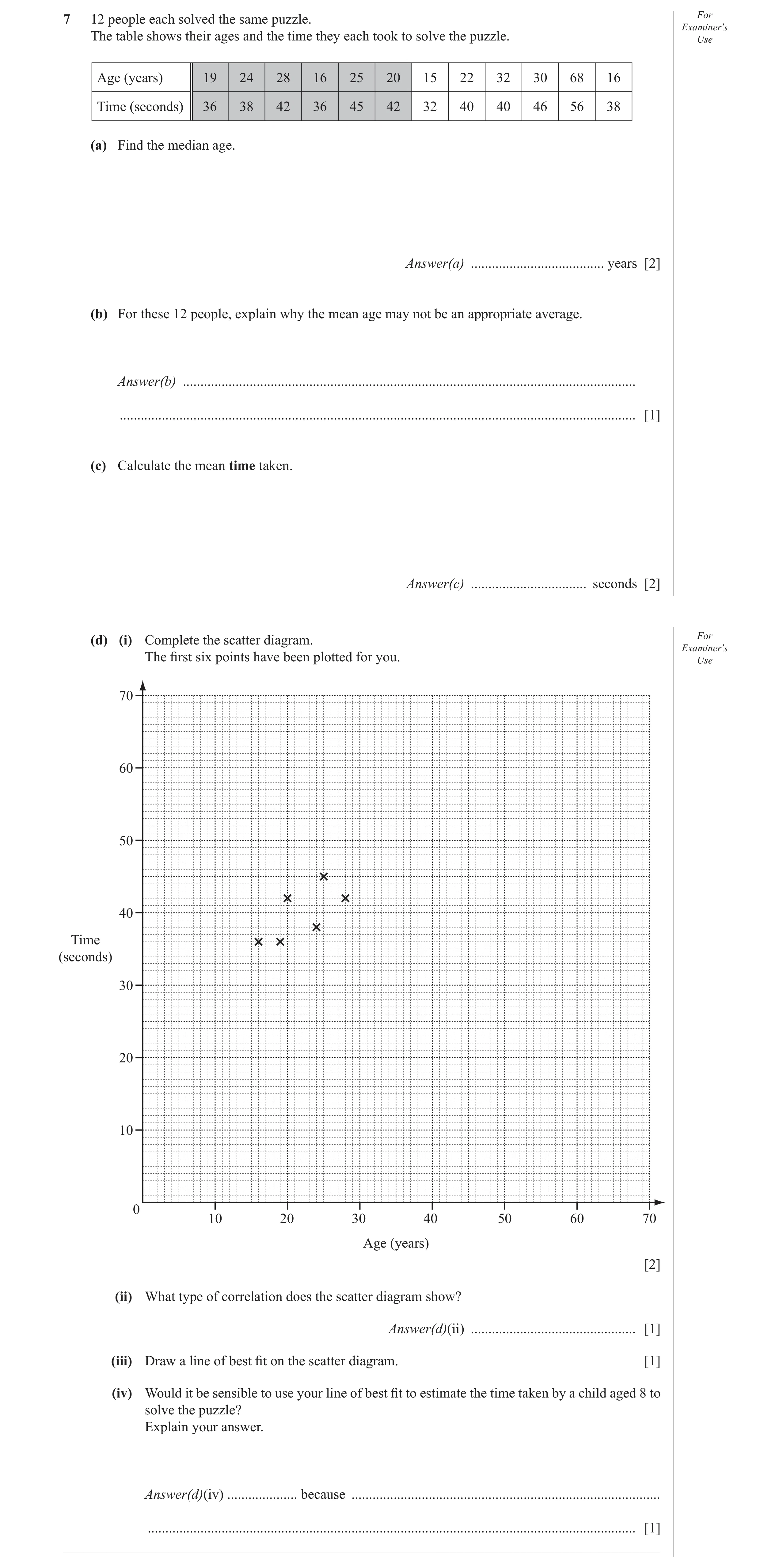
7 12 people each solved the same puzzle. For Examiner′s The table shows their ages and the time they each took to solve the puzzle. Use Age (years) 19 24 28 16 25 20 15 22 32 30 68 16 Time (seconds) 36 38 42 36 45 42 32 40 40 46 56 38 (a) Find the median age. Answer(a) … years [2] (b) For these 12 people, explain why the mean age may not be an appropriate average. Answer(b) … … [1] (c) Calculate the mean time taken. Answer(c) … seconds [2] (d) (i) Complete the scatter diagram. For Examiner′s The fi rst six points have been plotted for you. Use 70 60 50 40 Time (seconds) 30 20 10 0 10 20 30 40 50 60 70 Age (years) [2] (ii) What type of correlation does the scatter diagram show? Answer(d)(ii) … [1] (iii) Draw a line of best fi t on the scatter diagram. [1] (iv) Would it be sensible to use your line of best fi t to estimate the time taken by a child aged 8 to solve the puzzle? Explain your answer. Answer(d)(iv) … because … … [1] _____________________________________________________________________________________
10 marks
Mark scheme: 7 (a) 23 2 M1 for clear attempt to find middle If zero scored then SC1 for 40 (b) [Affected by an] extreme value oe 1 (c) 40.9 2 M1 for (36+38+42+36+45+42+32+40+40+46+56+38) ÷ 12 implied by 491 ÷ 12 If zero scored then SC1 for 26.25 or 26.3 (d) (i) 6 points correctly plotted P2 P1 for 4 or 5 correctly plotted (ii) positive 1 (iii) line of best fit ruled and 1 dep on at least 11 points on graph continuous (iv) No, [estimate unreliable as] 1 outside range [of data] IGCSE – October/November 2013 0580 32
This question in 0580/32 Oct/Nov 2013
Q9 · 12 athletes took part in the 100 metres race 0580/31 Oct/Nov 2014
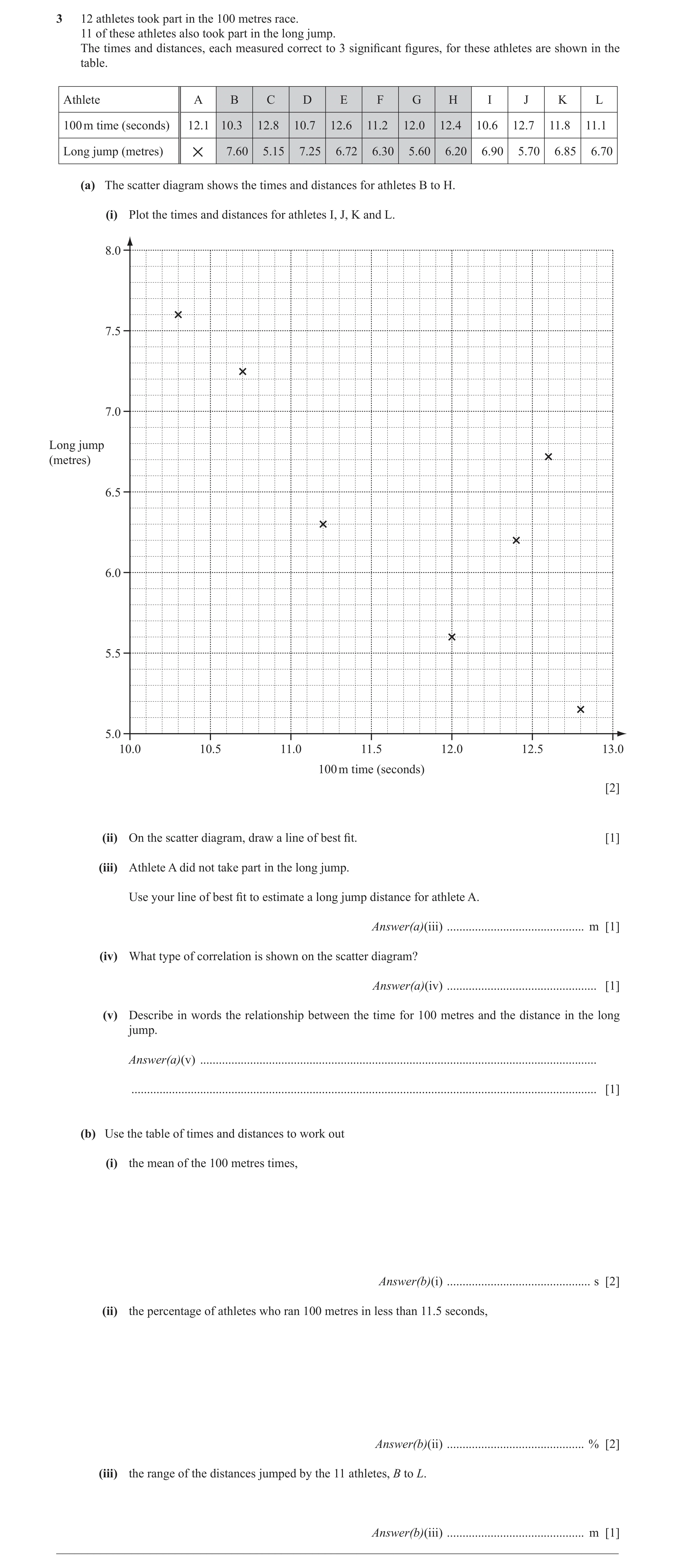
3 12 athletes took part in the 100 metres race. 11 of these athletes also took part in the long jump. The times and distances, each measured correct to 3 signifi cant fi gures, for these athletes are shown in the table. Athlete A B C D E F G H I J K L 100 m time (seconds) 12.1 10.3 12.8 10.7 12.6 11.2 12.0 12.4 10.6 12.7 11.8 11.1 Long jump (metres) 7.60 5.15 7.25 6.72 6.30 5.60 6.20 6.90 5.70 6.85 6.70 × (a) The scatter diagram shows the times and distances for athletes B to H. (i) Plot the times and distances for athletes I, J, K and L. 8.0 7.5 7.0 Long jump (metres) 6.5 6.0 5.5 5.0 10.0 10.5 11.0 11.5 12.0 12.5 13.0 100 m time (seconds) [2] (ii) On the scatter diagram, draw a line of best fi t. [1] (iii) Athlete A did not take part in the long jump. Use your line of best fi t to estimate a long jump distance for athlete A. Answer(a)(iii) … m [1] (iv) What type of correlation is shown on the scatter diagram? Answer(a)(iv) … [1] (v) Describe in words the relationship between the time for 100 metres and the distance in the long jump. Answer(a)(v) … … [1] (b) Use the table of times and distances to work out (i) the mean of the 100 metres times, Answer(b)(i) … s [2] (ii) the percentage of athletes who ran 100 metres in less than 11.5 seconds, Answer(b)(ii) … % [2] (iii) the range of the distances jumped by the 11 athletes, B to L. Answer(b)(iii) … m [1] __________________________________________________________________________________________
11 marks
Mark scheme: 3 (a) (i) 4 points correctly plotted. 2 B1 for 1 correct (ii) Correct continuous ruled line of best fit. 1 Dependent on at least 8 points on graph (iii) Distance on their line of best fit. 1FT FT their single straight line in part (ii). (iv) Negative 1 (v) Faster the time, the longer the distance oe 1 ÷ 12 (b) (i) 11.7 or 11.69... NFWW 2 M1 for Attempt at ∑f 5 (ii) 41.7 or 41.66 to 41.67 2 B1 for seen 12 (iii) 2.45 1
This question in 0580/31 Oct/Nov 2014
Q10 · Ten students take a physics examination and a mathematics examination 0580/32 Feb/March 2015
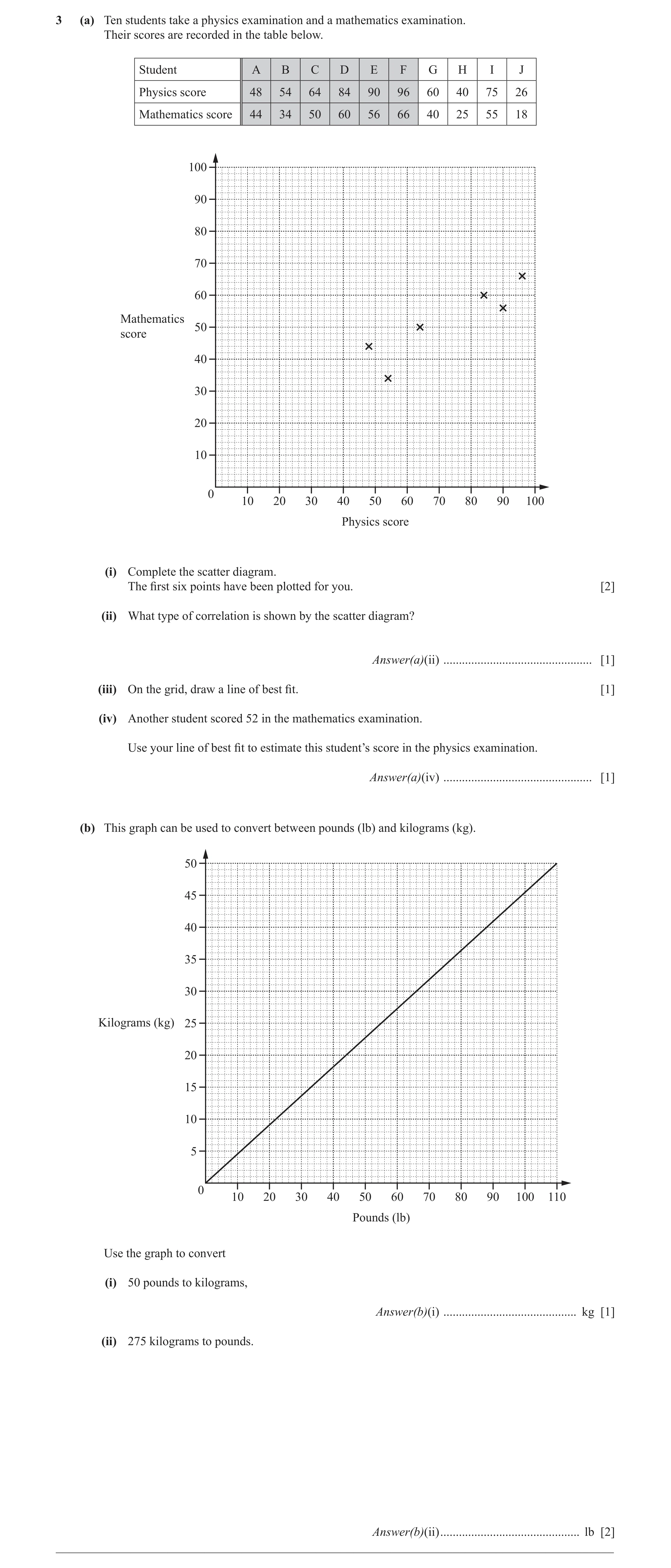
3 (a) Ten students take a physics examination and a mathematics examination. Their scores are recorded in the table below. Student A B C D E F G H I J Physics score 48 54 64 84 90 96 60 40 75 26 Mathematics score 44 34 50 60 56 66 40 25 55 18 100 90 80 70 60 Mathematics 50 score 40 30 20 10 0 10 20 30 40 50 60 70 80 90 100 Physics score (i) Complete the scatter diagram. The first six points have been plotted for you. [2] (ii) What type of correlation is shown by the scatter diagram? Answer(a)(ii) … [1] (iii) On the grid, draw a line of best fit. [1] (iv) Another student scored 52 in the mathematics examination. Use your line of best fit to estimate this student’s score in the physics examination. Answer(a)(iv) … [1] (b) This graph can be used to convert between pounds (lb) and kilograms (kg). 50 45 40 35 30 Kilograms (kg) 25 20 15 10 5 0 10 20 30 40 50 60 70 80 90 100 110 Pounds (lb) Use the graph to convert (i) 50 pounds to kilograms, Answer(b)(i) … kg [1] (ii) 275 kilograms to pounds. Answer(b)(ii) … lb [2] __________________________________________________________________________________________
8 marks
Mark scheme: 3 (a) (i) 4 points correctly plotted 2 B1 for 3 correct points (ii) positive 1 (iii) correct ruled straight line 1 (iv) 74 1FT Strict ft their line (b) (i) 22 < ans ≤ 23 1 (ii) 590 ≤ ans ≤ 620 2 275 M1 for × their 110 oe their 50
This question in 0580/32 Feb/March 2015
Q11 · A manufacturer makes rods 0580/33 May/June 2015
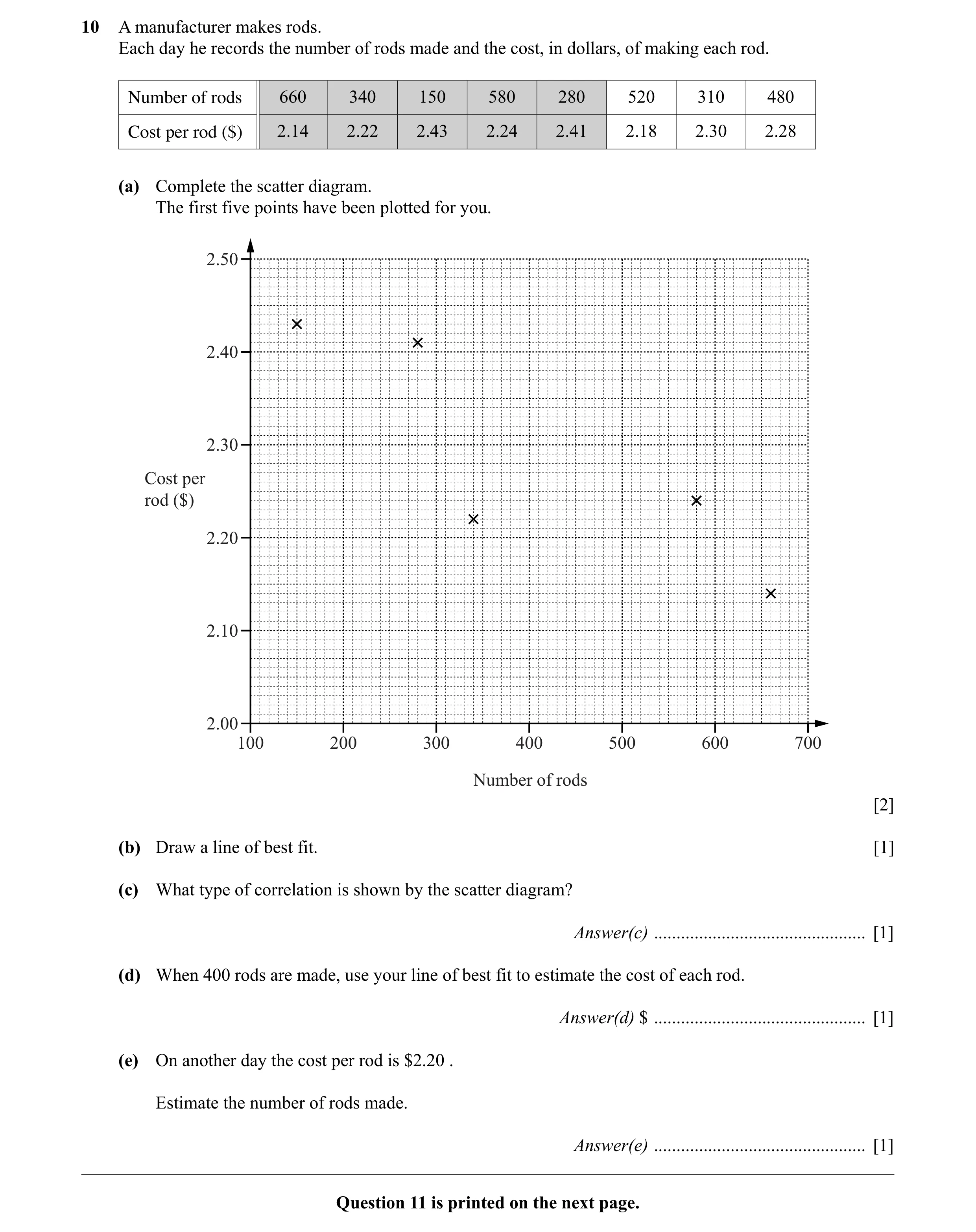
10 A manufacturer makes rods. Each day he records the number of rods made and the cost, in dollars, of making each rod. Number of rods 660 340 150 580 280 520 310 480 Cost per rod ($) 2.14 2.22 2.43 2.24 2.41 2.18 2.30 2.28 (a) Complete the scatter diagram. The first five points have been plotted for you. 2.50 2.40 2.30 Cost per rod ($) 2.20 2.10 2.00 100 200 300 400 500 600 700 Number of rods [2] (b) Draw a line of best fit. [1] (c) What type of correlation is shown by the scatter diagram? Answer(c) … [1] (d) When 400 rods are made, use your line of best fit to estimate the cost of each rod. Answer(d) $ … [1] (e) On another day the cost per rod is $2.20 . Estimate the number of rods made. Answer(e) … [1] Question 11 is printed on the next page.
6 marks
Mark scheme: 10 (a) three correct points 2 B1 for two correct points (b) correct ruled continuous line of best 1 fit (c) negative 1 (d) 2.25 to 2.30 1 FT their straight line of best fit if negative (e) 460 to 560 1 FT their straight line of best fit if negative
This question in 0580/33 May/June 2015
Q12 · Bataar is comparing the engine size of a car with the distance it travels on one gallon… 0580/33 Oct/Nov 2015
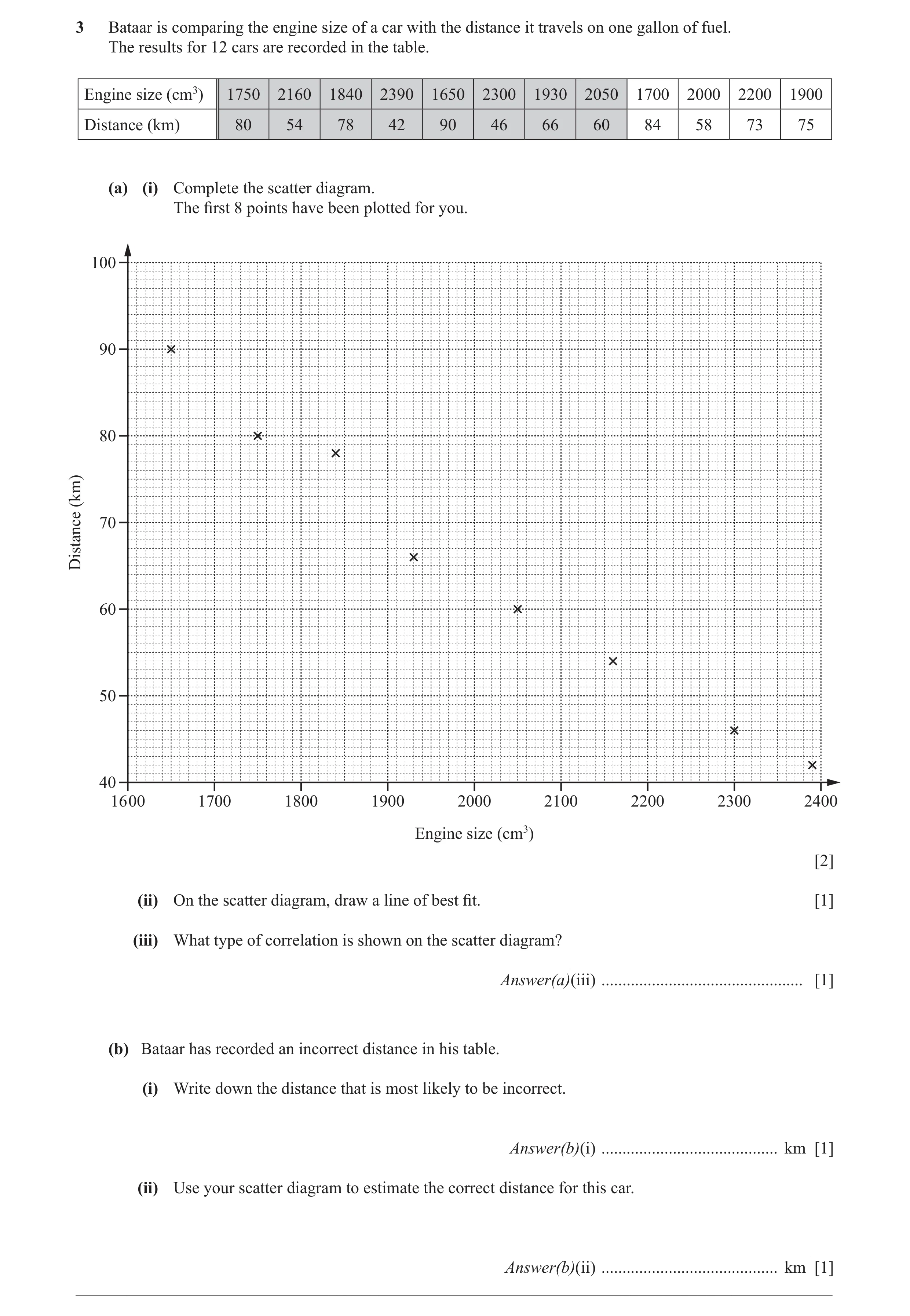
3 Bataar is comparing the engine size of a car with the distance it travels on one gallon of fuel. The results for 12 cars are recorded in the table. Engine size (cm3) 1750 2160 1840 2390 1650 2300 1930 2050 1700 2000 2200 1900 Distance (km) 80 54 78 42 90 46 66 60 84 58 73 75 (a) (i) Complete the scatter diagram. The first 8 points have been plotted for you. 100 90 80 (km) Distance 70 60 50 40 16 00 1700 1800 1900 2000 2100 2200 2300 2400 Engine size (cm3) [2] (ii) On the scatter diagram, draw a line of best fit. [1] (iii) What type of correlation is shown on the scatter diagram? Answer(a)(iii) … [1] (b) Bataar has recorded an incorrect distance in his table. (i) Write down the distance that is most likely to be incorrect. Answer(b)(i) … km [1] (ii) Use your scatter diagram to estimate the correct distance for this car. Answer(b)(ii) … km [1] __________________________________________________________________________________________
6 marks
Mark scheme: 3 (a) (i) 4 points correctly plotted 2 B1 for 3 points correctly plotted (ii) Correct ruled line of best fit 1 (iii) Negative 1 (b) (i) 73 1 (ii) 50 to 56 1FT FT their straight line of best fit if negative and their (b)(i)
This question in 0580/33 Oct/Nov 2015
Q13 · Ten students each take two French tests 0580/32 Feb/March 2016
3 Ten students each take two French tests. Their marks are recorded in the table below. Student A B C D E F G H I J Test 1 65 34 95 31 88 48 38 80 100 57 Test 2 59 32 90 29 93 51 37 72 92 54 (a) One of the ten students is chosen at random. Find the probability that their mark on Test 2 is higher than their mark on Test 1. … [1] (b) (i) Complete the scatter diagram. The first six points have been plotted for you. 100 90 80 70 60 Test 2 50 40 30 20 10 0 10 20 30 40 50 60 70 80 90 100 Test 1 [2] (ii) What type of correlation is shown on the scatter diagram? … [1] (iii) On the grid, draw the line of best fit. [1] (iv) Another student scored 45 marks on Test 2. Use your line of best fit to estimate the mark for this student on Test 1. … [1] (v) A different student scored 10 marks on Test 1. Explain why you should not use your scatter diagram to estimate their mark on Test 2. … [1]
7 marks
Mark scheme: 2 3 (a) oe 1 10 (b) (i) 4 points correctly plotted 2 B1 for 3 correct points (ii) positive 1 (iii) correct ruled line 1 (iv) 46 to 48 1FT strict FT from their line if positive (v) 10 is not in range of recorded 1 test 1 results
This question in 0580/32 Feb/March 2016
Q14 · The table shows the age and the total distance travelled for 10 cars 0580/32 May/June 2016
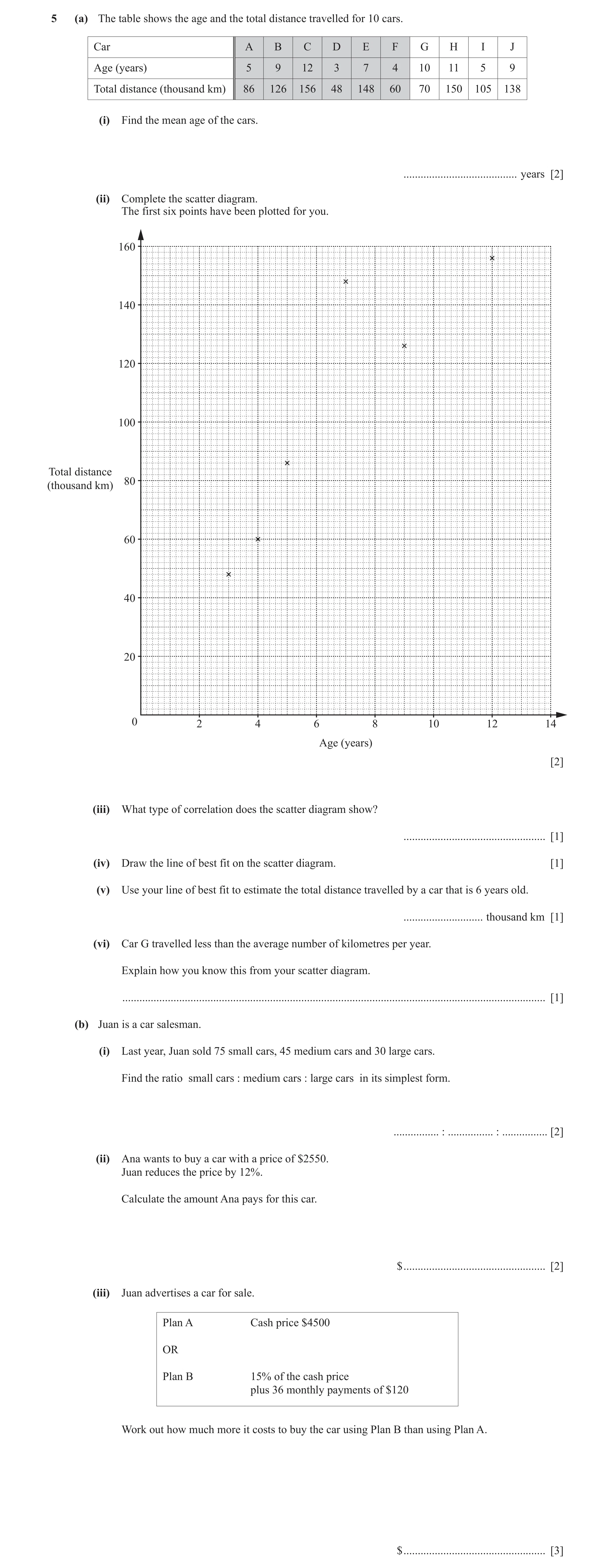
5 (a) The table shows the age and the total distance travelled for 10 cars. Car A B C D E F G H I J Age (years) 5 9 12 3 7 4 10 11 5 9 Total distance (thousand km) 86 126 156 48 148 60 70 150 105 138 (i) Find the mean age of the cars. … years [2] (ii) Complete the scatter diagram. The first six points have been plotted for you. 160 140 120 100 Total distance 80(thousand km) 60 40 20 0 2 4 6 8 10 12 14 Age (years) [2] (iii) What type of correlation does the scatter diagram show? … [1] (iv) Draw the line of best fit on the scatter diagram. [1] (v) Use your line of best fit to estimate the total distance travelled by a car that is 6 years old. … thousand km [1] (vi) Car G travelled less than the average number of kilometres per year. Explain how you know this from your scatter diagram. … [1] (b) Juan is a car salesman. (i) Last year, Juan sold 75 small cars, 45 medium cars and 30 large cars. Find the ratio small cars : medium cars : large cars in its simplest form. … : … : … [2] (ii) Ana wants to buy a car with a price of $2550. Juan reduces the price by 12%. Calculate the amount Ana pays for this car. $ … [2] (iii) Juan advertises a car for sale. Plan A Cash price $4500 OR Plan B 15% of the cash price plus 36 monthly payments of $120 Work out how much more it costs to buy the car using Plan B than using Plan A. $ … [3]
15 marks
Mark scheme: 5 (a) (i) 7.5 2 M1 for (5+9+12+3+7+4+10+11+5+9) ÷ 10 or better (ii) 4 points correct 2 B1 for 3 correct (iii) Positive 1 (iv) Ruled line of best fit 1 (v) 84 to 96 1FT FT their positive line of best fit (vi) (Point) below /lower than/right of/under 1 line (of best fit) (b) (i) 5 : 3 : 2 2 M1 for 75 : 45 : 30 or better (ii) 2244 2 M1 for [ 2550 × ] 0.88 oe (iii) 495 3 M2 for 36 × 120 + 0.15 × 4500 soi or M1 for 36 × 120 or 0.15 × 4500 soi
This question in 0580/32 May/June 2016
Q15 · Ten students estimate the length and width of their rectangular school hall 0580/32 Feb/March 2017
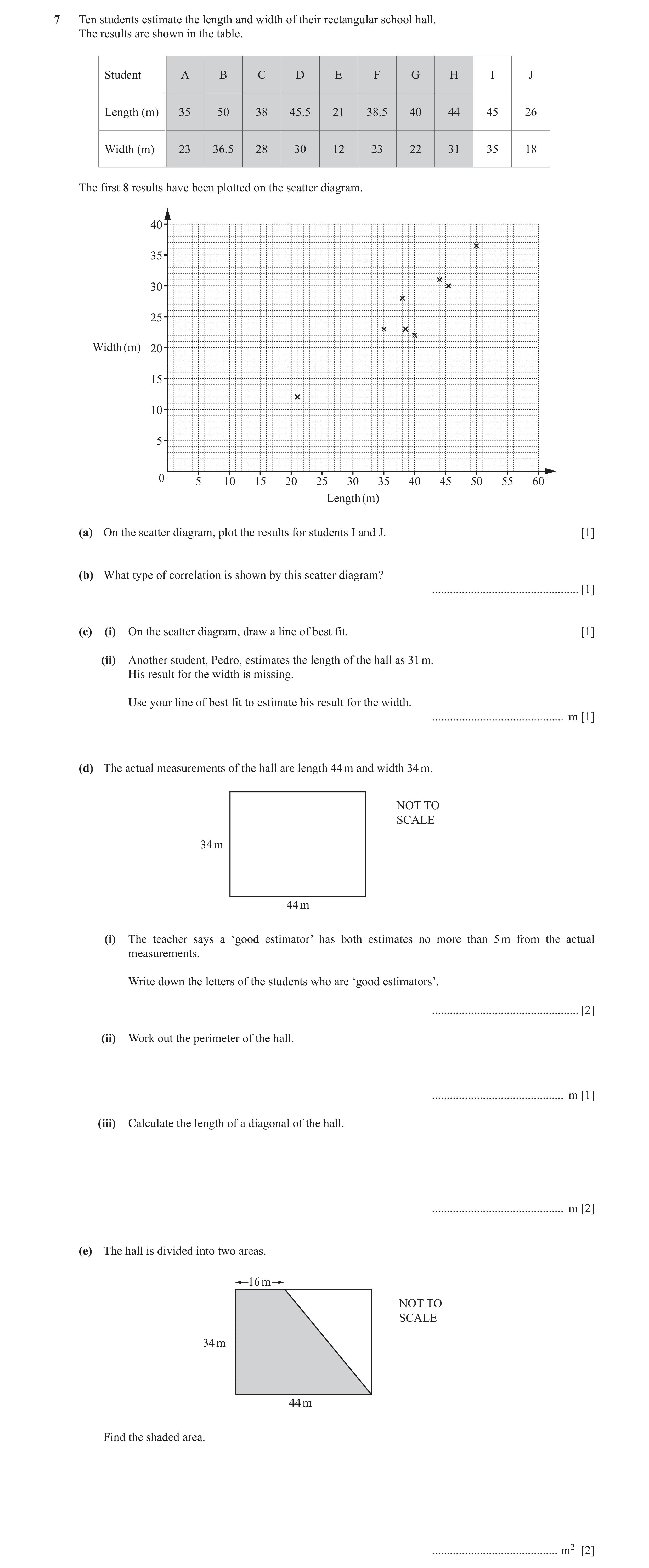
7 Ten students estimate the length and width of their rectangular school hall. The results are shown in the table. Student A B C D E F G H I J Length (m) 35 50 38 45.5 21 38.5 40 44 45 26 Width (m) 23 36.5 28 30 12 23 22 31 35 18 The first 8 results have been plotted on the scatter diagram. 40 35 30 25 Width (m) 20 15 10 5 0 5 10 15 20 25 30 35 40 45 50 55 60 Length (m) (a) On the scatter diagram, plot the results for students I and J. [1] (b) What type of correlation is shown by this scatter diagram? … [1] (c) (i) On the scatter diagram, draw a line of best fit. [1] (ii) Another student, Pedro, estimates the length of the hall as 31 m. His result for the width is missing. Use your line of best fit to estimate his result for the width. … m [1] (d) The actual measurements of the hall are length 44 m and width 34 m. NOT TO SCALE 34 m 44 m (i) The teacher says a ‘good estimator’ has both estimates no more than 5 m from the actual measurements. Write down the letters of the students who are ‘good estimators’. … [2] (ii) Work out the perimeter of the hall. … m [1] (iii) Calculate the length of a diagonal of the hall. … m [2] (e) The hall is divided into two areas. 16 m NOT TO SCALE 34 m 44 m Find the shaded area. … m2 [2]
11 marks
Mark scheme: 7 (a) I, J correctly plotted 1 (b) positive 1 (c) (i) ruled line of best fit 1 (ii) 16 to 19 1 (d) (i) D, H, I 2 M1 for 2 correct and no extras or for 3 correct and 1 extra (ii) 156 1 (iii) 55.6 or 55.60 to 55.61 2 M1 for 342 + 442 or better (e) 1020 2 (16 + 44 ) M1 for × 34 oe 2
This question in 0580/32 Feb/March 2017
Q16 · Lucy asked 12 people how many hours they each spent playing a computer game and the… 0580/31 May/June 2018
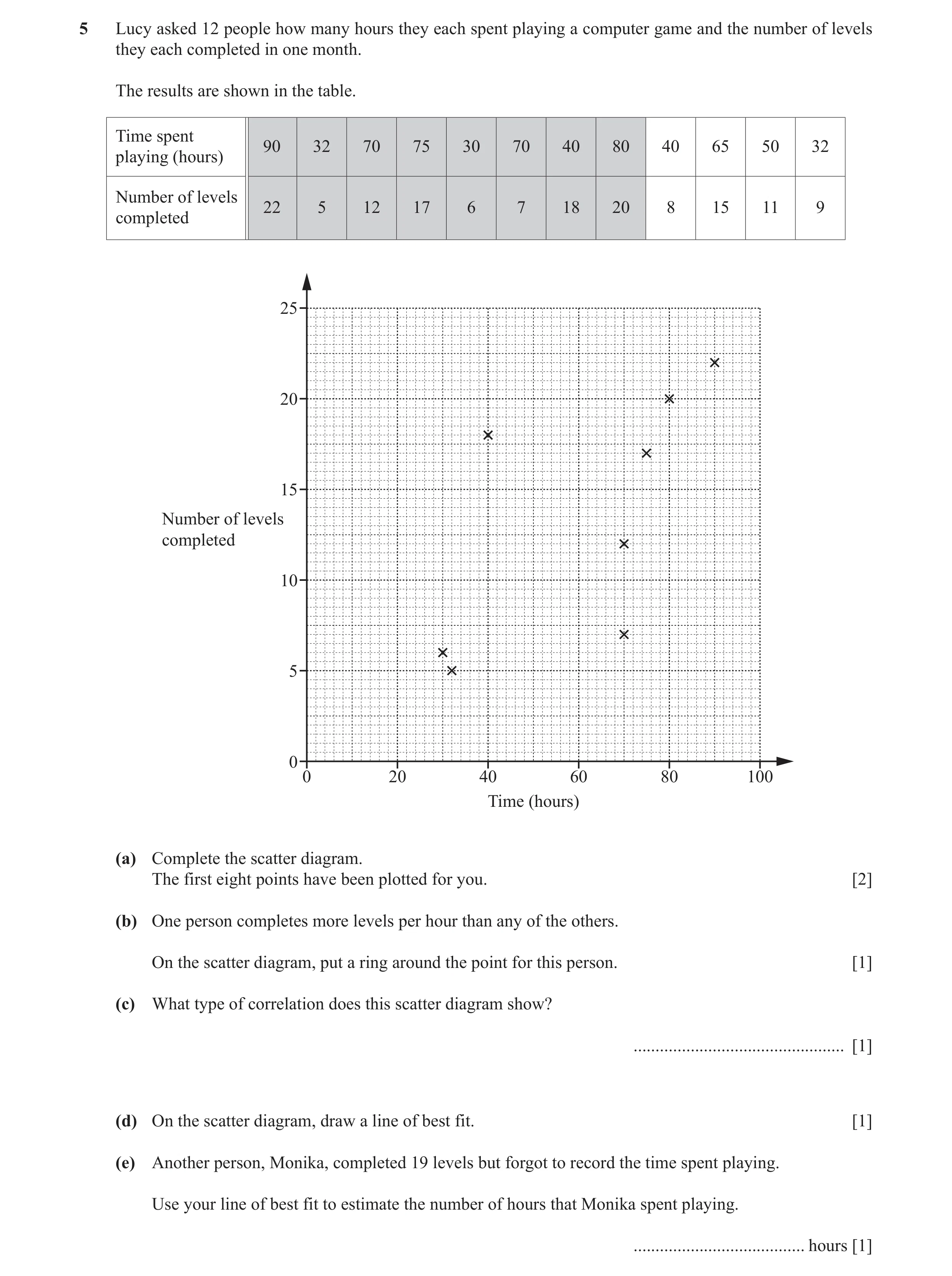
5 Lucy asked 12 people how many hours they each spent playing a computer game and the number of levels they each completed in one month. The results are shown in the table. Time spent 90 32 70 75 30 70 40 80 40 65 50 32 playing (hours) Number of levels 22 5 12 17 6 7 18 20 8 15 11 9 completed 25 20 15 Number of levels completed 10 5 0 0 20 40 60 80 100 Time (hours) (a) Complete the scatter diagram. The first eight points have been plotted for you. [2] (b) One person completes more levels per hour than any of the others. On the scatter diagram, put a ring around the point for this person. [1] (c) What type of correlation does this scatter diagram show? … [1] (d) On the scatter diagram, draw a line of best fit. [1] (e) Another person, Monika, completed 19 levels but forgot to record the time spent playing. Use your line of best fit to estimate the number of hours that Monika spent playing. … hours [1]
6 marks
Mark scheme: 5(a) 4 points correctly plotted 2 B1 for 2 or 3 points correctly plotted 5(b) (40, 18) indicated 1 5(c) Positive 1 5(d) Correct ruled line 1 5(e) 76 to 80 1 FT their ruled line of best fit
This question in 0580/31 May/June 2018
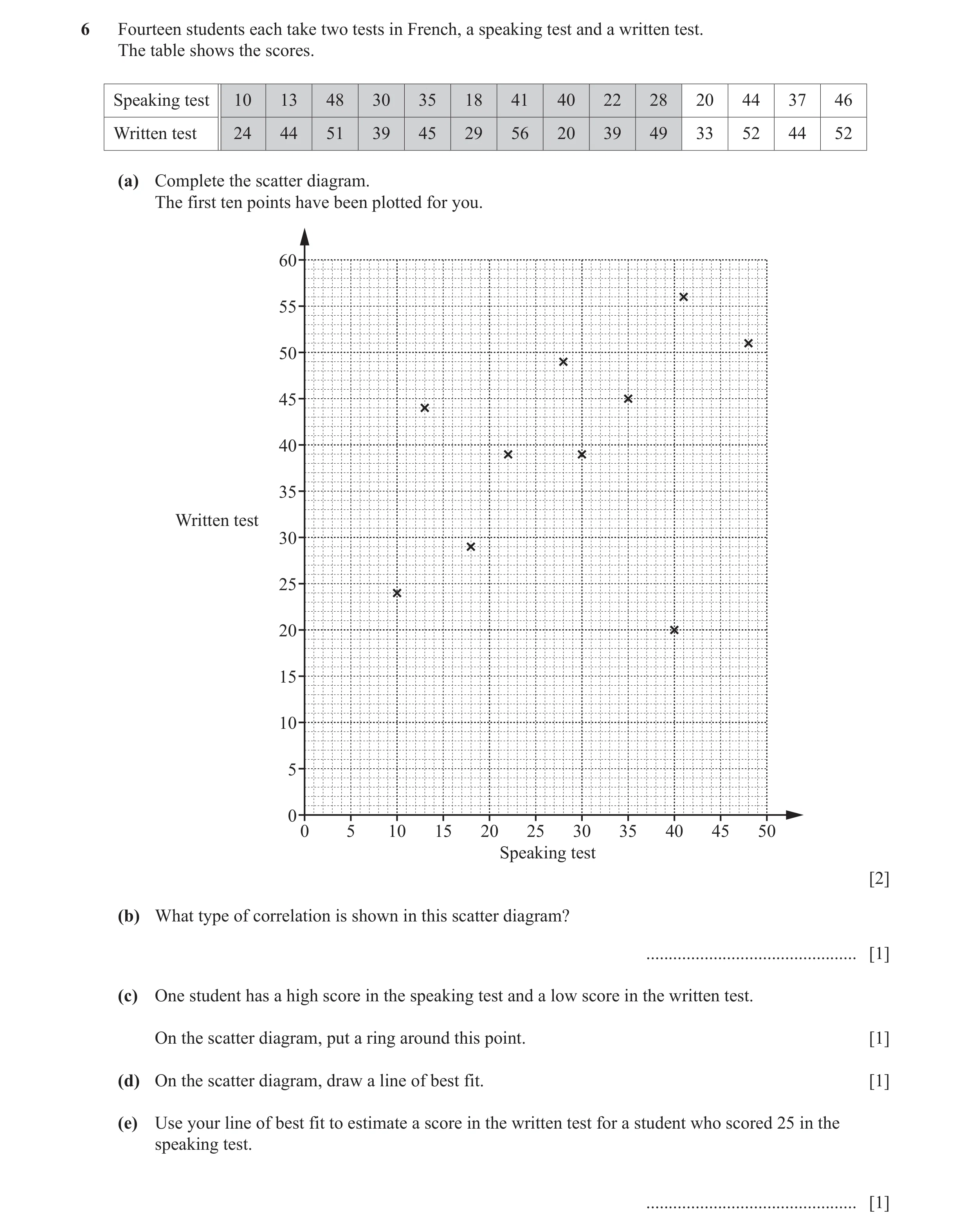
Q17 · Fourteen students each take two tests in French, a speaking test and a written test 0580/31 May/June 2019
6 Fourteen students each take two tests in French, a speaking test and a written test. The table shows the scores. Speaking test 10 13 48 30 35 18 41 40 22 28 20 44 37 46 Written test 24 44 51 39 45 29 56 20 39 49 33 52 44 52 (a) Complete the scatter diagram. The first ten points have been plotted for you. 60 55 50 45 40 35 Written test 30 25 20 15 10 5 0 0 5 10 15 20 25 30 35 40 45 50 Speaking test [2] (b) What type of correlation is shown in this scatter diagram? … [1] (c) One student has a high score in the speaking test and a low score in the written test. On the scatter diagram, put a ring around this point. [1] (d) On the scatter diagram, draw a line of best fit. [1] (e) Use your line of best fit to estimate a score in the written test for a student who scored 25 in the speaking test. … [1]
6 marks
Mark scheme: 6(a) 4 points correctly plotted 2 B1 for 2 or 3 points correctly plotted 6(b) Positive 1 6(c) (40, 20) indicated 1 6(d) Ruled line of best fit 1 6(e) 33 to 42 1 FT their positive line
This question in 0580/31 May/June 2019
Q18 · Belle records the height, in centimetres, and the mass, in kilograms, of some goats 0580/32 May/June 2020
3 Belle records the height, in centimetres, and the mass, in kilograms, of some goats. Some of her results are shown in the scatter diagram. 36 35 34 Mass (kg) 33 32 31 30 20 25 30 35 40 Height (cm) (a) The table shows four more results. Height (cm) 23 30 36 38 Mass (kg) 31.2 33.5 34.6 34.8 Plot these points on the scatter diagram. [2] (b) What type of correlation is shown in this scatter diagram? … [1] (c) (i) Draw a line of best fit on the scatter diagram. [1] (ii) Use your line of best fit to estimate the height of a goat with mass 32.5 kg. … cm [1] (d) Work out the percentage of the 12 goats that have a height between 26 cm and 35 cm. … % [3]
8 marks
Mark scheme: 3(a) 4 points correctly plotted 2 B1 for 2 or 3 points correctly plotted 3(b) Positive 1 3(c)(i) Ruled line of best fit 1 3(c)(ii) 25 to 27 1 FT their ruled line with positive gradient 3(d) 41.7 or 41.66 to 41.67 3 5 M2 for × 100 12 their 5 or M1 for × 100 12 or B1 for 5
This question in 0580/32 May/June 2020
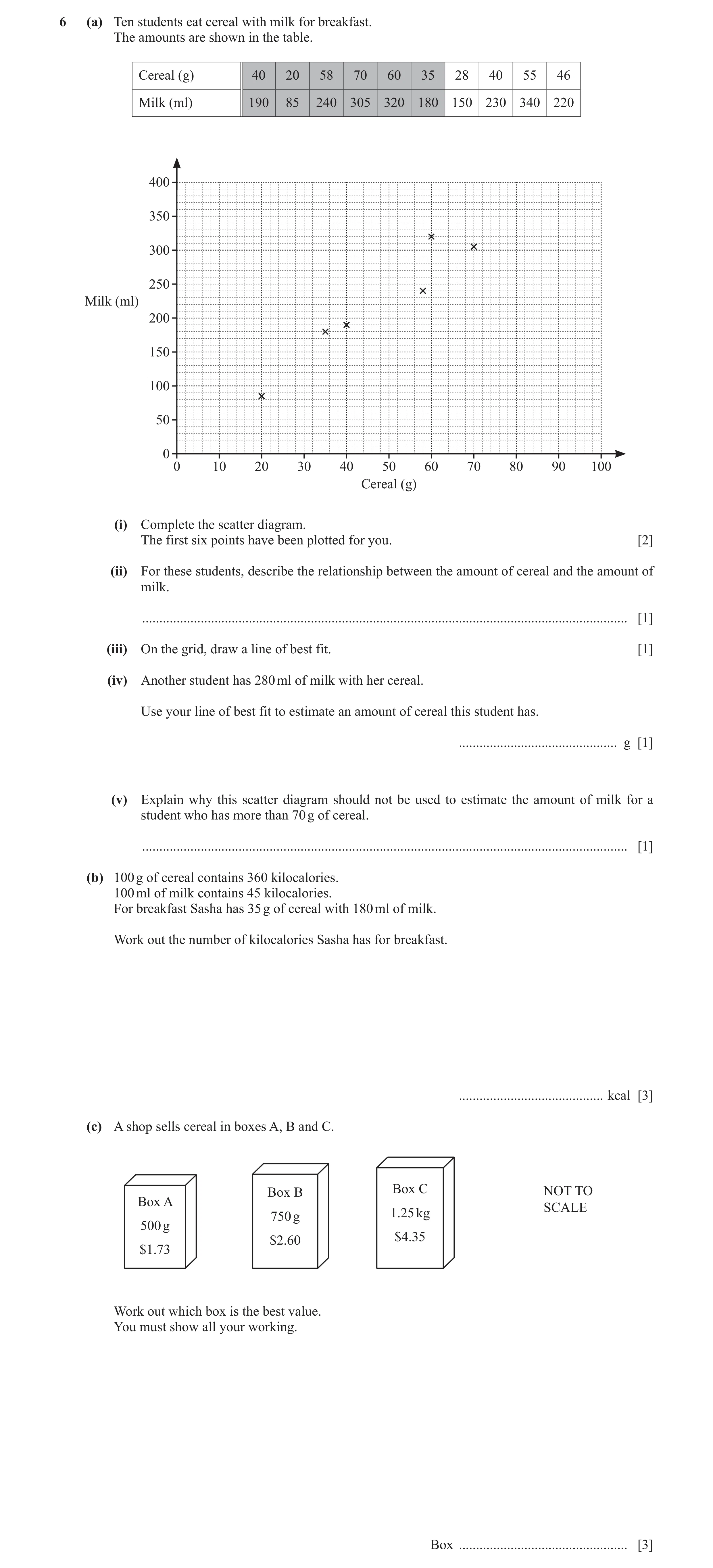
Q19 · Ten students eat cereal with milk for breakfast 0580/33 May/June 2020
6 (a) Ten students eat cereal with milk for breakfast. The amounts are shown in the table. Cereal (g) 40 20 58 70 60 35 28 40 55 46 Milk (ml) 190 85 240 305 320 180 150 230 340 220 400 350 300 250 Milk (ml) 200 150 100 50 0 0 10 20 30 40 50 60 70 80 90 100 Cereal (g) (i) Complete the scatter diagram. The first six points have been plotted for you. [2] (ii) For these students, describe the relationship between the amount of cereal and the amount of milk. … [1] (iii) On the grid, draw a line of best fit. [1] (iv) Another student has 280 ml of milk with her cereal. Use your line of best fit to estimate an amount of cereal this student has. … g [1] (v) Explain why this scatter diagram should not be used to estimate the amount of milk for a student who has more than 70 g of cereal. … [1] (b) 100 g of cereal contains 360 kilocalories. 100 ml of milk contains 45 kilocalories. For breakfast Sasha has 35 g of cereal with 180 ml of milk. Work out the number of kilocalories Sasha has for breakfast. … kcal [3] (c) A shop sells cereal in boxes A, B and C. Box B Box C NOT TO Box A SCALE 750 g 1.25 kg 500 g $2.60 $4.35 $1.73 Work out which box is the best value. You must show all your working. Box … [3]
12 marks
Mark scheme: 6(a)(i) 4 points correctly plotted 2 B1 for 2 or 3 points correctly plotted 6(a)(ii) As the amount of cereal increases the 1 amount of milk increases oe 6(a)(iii) Ruled line of best fit drawn 1 6(a)(iv) 52 to 60 1 6(a)(v) Outside given data oe 1 6(b) 207 3 35 180 M2 for × 360 + × 45 oe 100 100 35 180 or M1 for × 360 or × 45 100 100 6(c) Box A 3 M2 for 3 correct divisions shown but either With correct comparisons made of not evaluated to suitable accuracy or wrong the 3 boxes with suitable accuracy box selected shown M1 for 2 correct divisions shown for 2 boxes
This question in 0580/33 May/June 2020
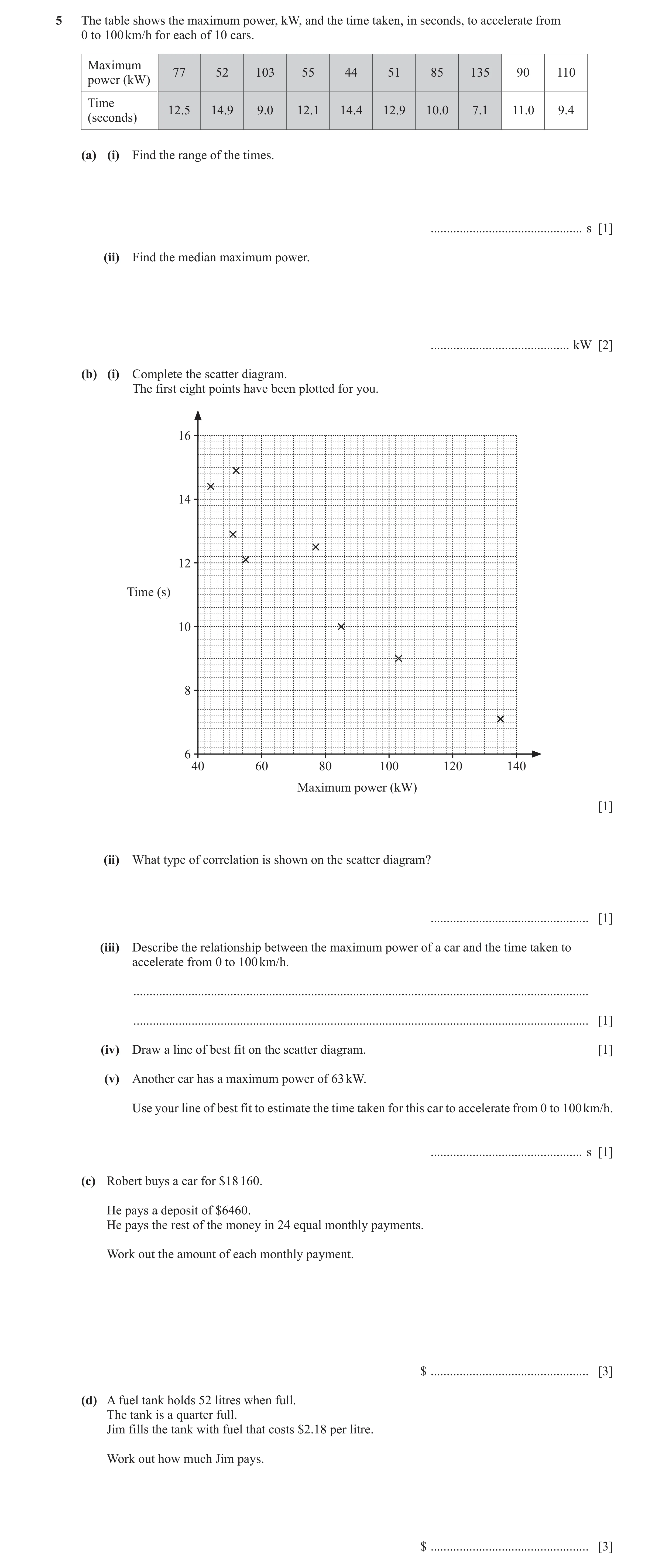
Q20 · The table shows the maximum power, kW, and the time taken, in seconds, to accelerate from… 0580/33 Oct/Nov 2020
5 The table shows the maximum power, kW, and the time taken, in seconds, to accelerate from 0 to 100 km/h for each of 10 cars. Maximum 77 52 103 55 44 51 85 135 90 110 power (kW) Time 12.5 14.9 9.0 12.1 14.4 12.9 10.0 7.1 11.0 9.4 (seconds) (a) (i) Find the range of the times. … s [1] (ii) Find the median maximum power. … kW [2] (b) (i) Complete the scatter diagram. The first eight points have been plotted for you. 16 14 12 Time (s) 10 8 6 40 60 80 100 120 140 Maximum power (kW) [1] (ii) What type of correlation is shown on the scatter diagram? … [1] (iii) Describe the relationship between the maximum power of a car and the time taken to accelerate from 0 to 100 km/h. … … [1] (iv) Draw a line of best fit on the scatter diagram. [1] (v) Another car has a maximum power of 63 kW. Use your line of best fit to estimate the time taken for this car to accelerate from 0 to 100 km/h. … s [1] (c) Robert buys a car for $18 160. He pays a deposit of $6460. He pays the rest of the money in 24 equal monthly payments. Work out the amount of each monthly payment. $ … [3] (d) A fuel tank holds 52 litres when full. The tank is a quarter full. Jim fills the tank with fuel that costs $2.18 per litre. Work out how much Jim pays. $ … [3]
14 marks
Mark scheme: 5(a)(i) 7.8 1 5(a)(ii) 81 2 M1 for an ordered list of at least the first 6 or last 6 values or B1 for 77 and 85 both identified 5(b)(i) Points plotted at (90, 11.0) and (110, 9.4) 1 5(b)(ii) Negative 1 5(b)(iii) [The] greater [the maximum] power the 1 less time [needed to accelerate from 0 to 100 km/h] oe 5(b)(iv) Correct ruled line 1 5(b)(v) 12.5 to 13.5 1 FT from their line provided negative gradient 5(c) 487.5[0] cao 3 18160 − 6460 M2 for or better 24 or M1 for 18 160 – 6460 5(d) 85.02 cao 3 M2 for 0.75 × 52 × 2.18 oe or M1 for 0.75 × 52 oe soi by 39 or for 52 × 2.18 soi by 113.36 If 0 scored, SC1 for 0.25 × 52 × 2.18 oe
This question in 0580/33 Oct/Nov 2020
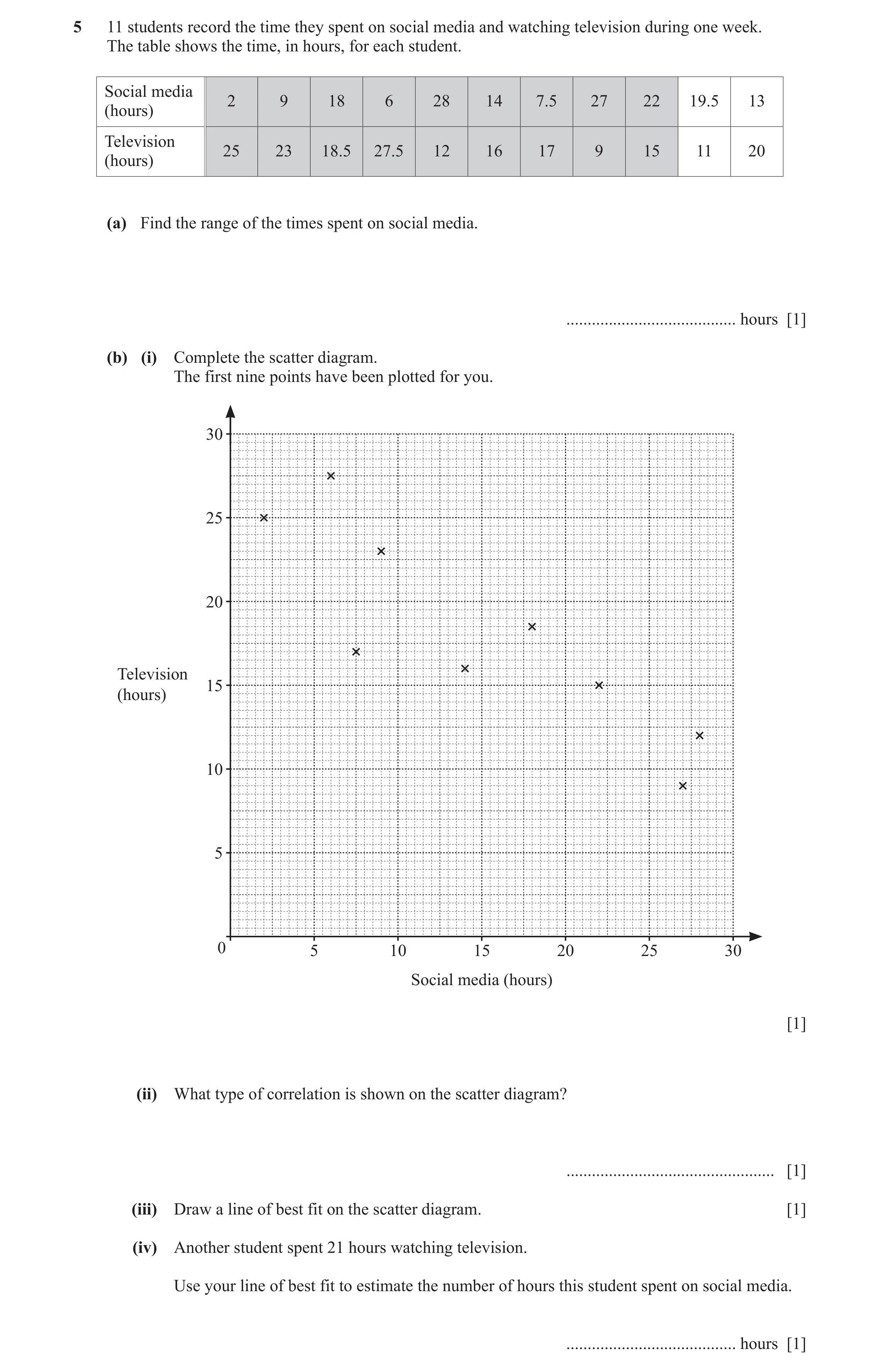
Q21 · 11 students record the time they spent on social media and watching television during one… 0580/31 Oct/Nov 2021
5 11 students record the time they spent on social media and watching television during one week. The table shows the time, in hours, for each student. Social media 2 9 18 6 28 14 7.5 27 22 19.5 13 (hours) Television 25 23 18.5 27.5 12 16 17 9 15 11 20 (hours) (a) Find the range of the times spent on social media. … hours [1] (b) (i) Complete the scatter diagram. The first nine points have been plotted for you. 30 25 20 Television 15 (hours) 10 5 0 5 10 15 20 25 30 Social media (hours) [1] (ii) What type of correlation is shown on the scatter diagram? … [1] (iii) Draw a line of best fit on the scatter diagram. [1] (iv) Another student spent 21 hours watching television. Use your line of best fit to estimate the number of hours this student spent on social media. … hours [1]
5 marks
Mark scheme: 5(a) 26 1 5(b)(i) Points plotted at (13, 20) and (19.5, 11) 1 5(b)(ii) Negative 1 5(b)(iii) Correct ruled line 1 5(b)(iv) 7.5 to 13.5 1 FT from their straight line provided negative gradient
This question in 0580/31 Oct/Nov 2021
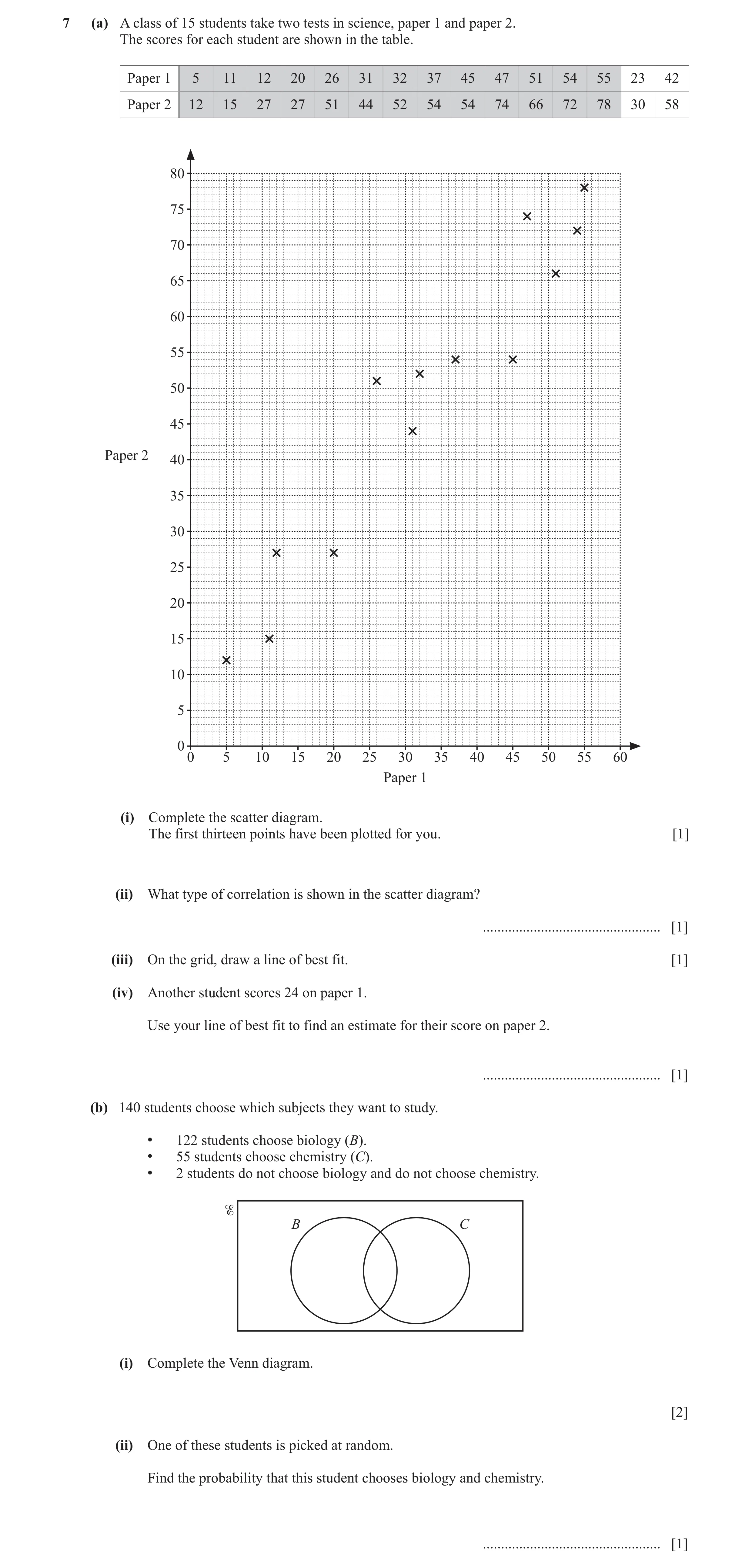
Q22 · A class of 15 students take two tests in science, paper 1 and paper 2 0580/31 May/June 2022
7 (a) A class of 15 students take two tests in science, paper 1 and paper 2. The scores for each student are shown in the table. Paper 1 5 11 12 20 26 31 32 37 45 47 51 54 55 23 42 Paper 2 12 15 27 27 51 44 52 54 54 74 66 72 78 30 58 80 75 70 65 60 55 50 45 Paper 2 40 35 30 25 20 15 10 5 0 0 5 10 15 20 25 30 35 40 45 50 55 60 Paper 1 (i) Complete the scatter diagram. The first thirteen points have been plotted for you. [1] (ii) What type of correlation is shown in the scatter diagram? … [1] (iii) On the grid, draw a line of best fit. [1] (iv) Another student scores 24 on paper 1. Use your line of best fit to find an estimate for their score on paper 2. … [1] (b) 140 students choose which subjects they want to study. • 122 students choose biology (B). • 55 students choose chemistry (C). • 2 students do not choose biology and do not choose chemistry. B C (i) Complete the Venn diagram. [2] (ii) One of these students is picked at random. Find the probability that this student chooses biology and chemistry. … [1]
7 marks
Mark scheme: 7(a)(i) 2 points correctly plotted 1 7(a)(ii) Positive 1 7(a)(iii) A ruled line of best fit within tolerance 1 7(a)(iv) 32 – 42 1 FT their ruled line with positive gradient 7(b)(i) 2 B1 for 2 or 3 correct values in the correct places or for the 2 correctly positioned and total in B equals 122 and total in C equals 55 provided B C ≠ 7(b)(ii) 39 1 FT their B C oe 140
This question in 0580/31 May/June 2022
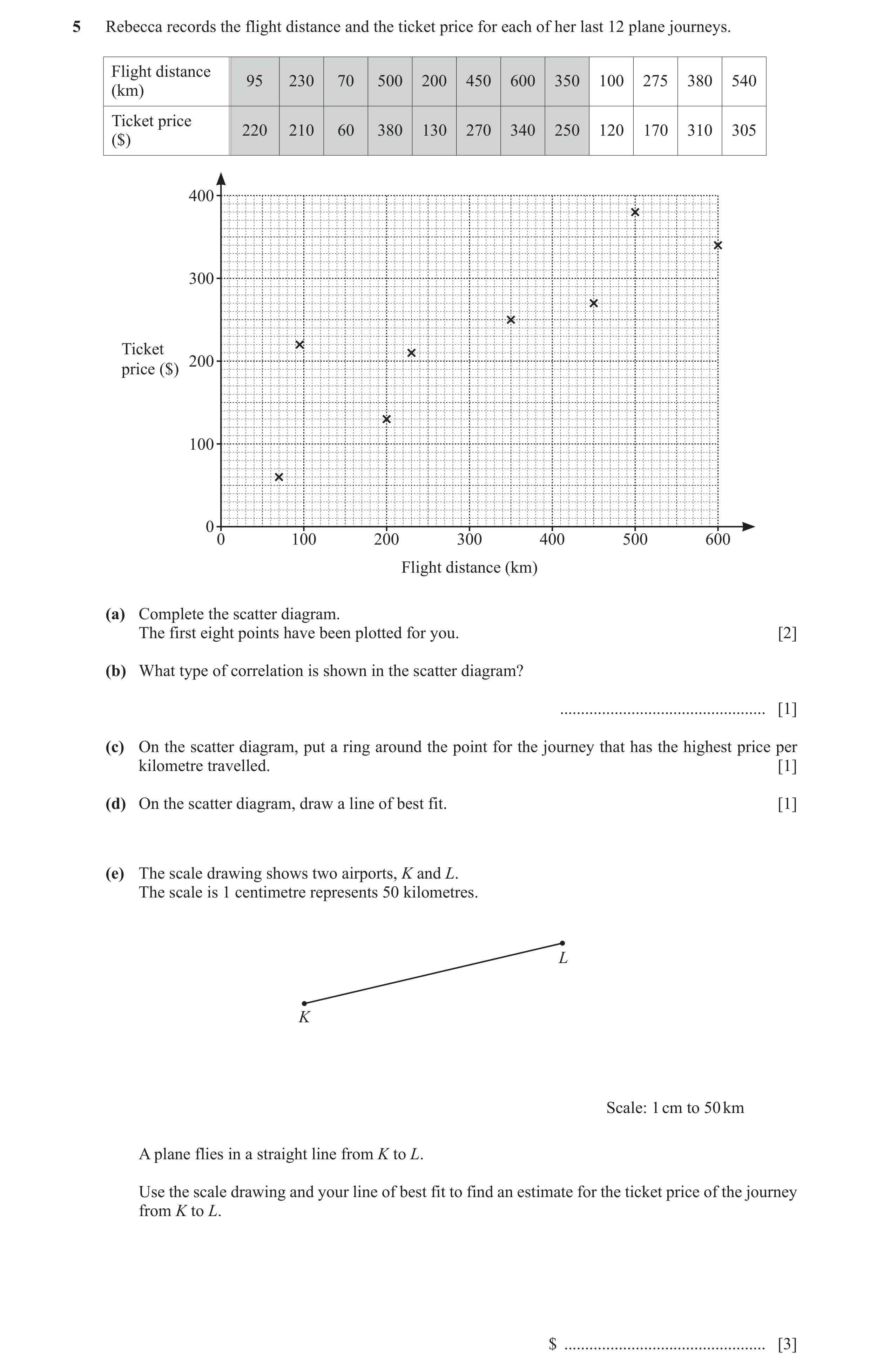
Q23 · Rebecca records the flight distance and the ticket price for each of her last 12 plane… 0580/32 May/June 2022
5 Rebecca records the flight distance and the ticket price for each of her last 12 plane journeys. Flight distance 95 230 70 500 200 450 600 350 100 275 380 540 (km) Ticket price 220 210 60 380 130 270 340 250 120 170 310 305 ($) 400 300 Ticket 200 price ($) 100 0 0 100 200 300 400 500 600 Flight distance (km) (a) Complete the scatter diagram. The first eight points have been plotted for you. [2] (b) What type of correlation is shown in the scatter diagram? … [1] (c) On the scatter diagram, put a ring around the point for the journey that has the highest price per kilometre travelled. [1] (d) On the scatter diagram, draw a line of best fit. [1] (e) The scale drawing shows two airports, K and L. The scale is 1 centimetre represents 50 kilometres. L K Scale: 1 cm to 50 km A plane flies in a straight line from K to L. Use the scale drawing and your line of best fit to find an estimate for the ticket price of the journey from K to L. $ … [3]
8 marks
Mark scheme: 5(a) Four points correctly plotted 2 B1 for 2 or 3 points correctly plotted 5(b) Positive 1 5(c) Point at (95, 220) indicated 1 5(d) Ruled line of best fit drawn 1 5(e) Correct estimate supported 3 B2 for 310 to 330 (km) by their line of best fit and a or B1 for 6.2 to 6.6 seen distance of 310 to 330 or M1 for their KL×50
This question in 0580/32 May/June 2022
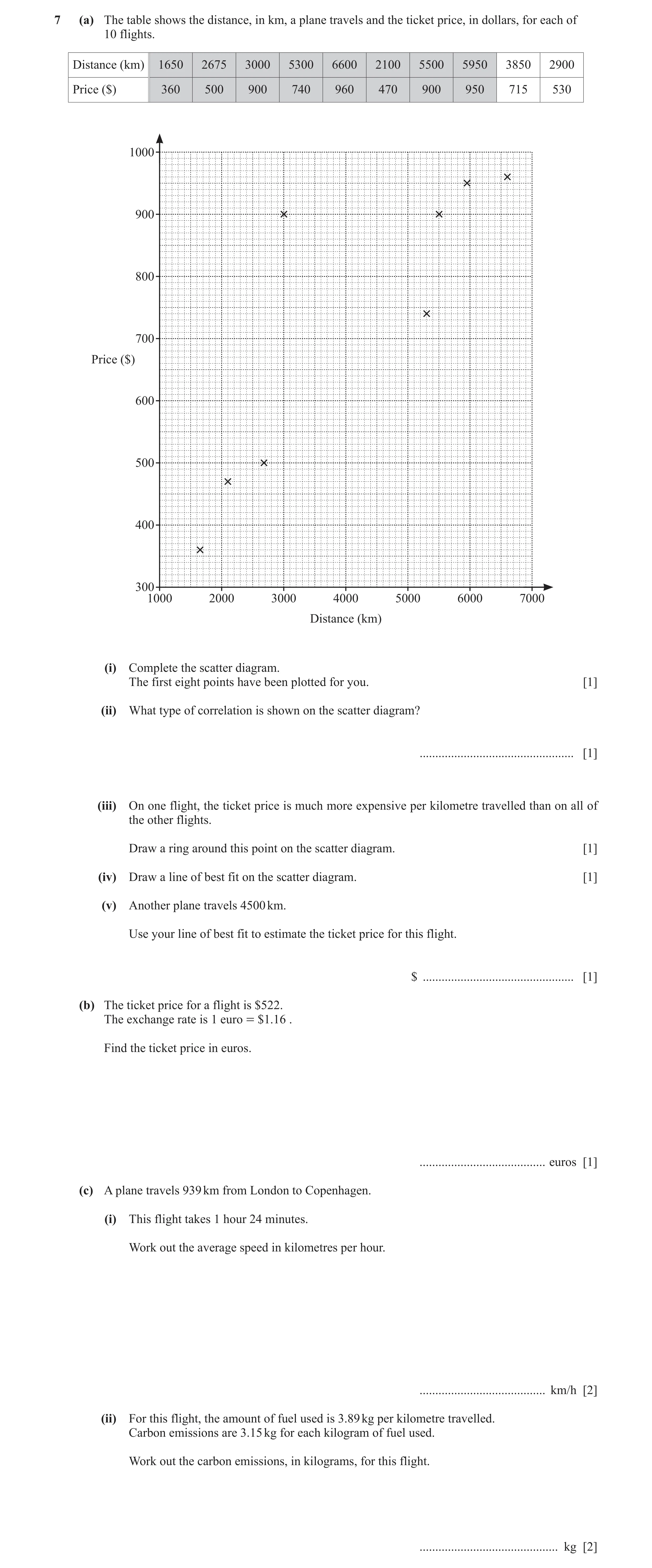
Q24 · The table shows the distance, in km, a plane travels and the ticket price, in dollars… 0580/33 Oct/Nov 2022
7 (a) The table shows the distance, in km, a plane travels and the ticket price, in dollars, for each of 10 flights. Distance (km) 1650 2675 3000 5300 6600 2100 5500 5950 3850 2900 Price ($) 360 500 900 740 960 470 900 950 715 530 1000 900 800 700 Price ($) 600 500 400 300 1000 2000 3000 4000 5000 6000 7000 Distance (km) (i) Complete the scatter diagram. The first eight points have been plotted for you. [1] (ii) What type of correlation is shown on the scatter diagram? … [1] (iii) On one flight, the ticket price is much more expensive per kilometre travelled than on all of the other flights. Draw a ring around this point on the scatter diagram. [1] (iv) Draw a line of best fit on the scatter diagram. [1] (v) Another plane travels 4500 km. Use your line of best fit to estimate the ticket price for this flight. $ … [1] (b) The ticket price for a flight is $522. The exchange rate is 1 euro = $1.16 . Find the ticket price in euros. … euros [1] (c) A plane travels 939 km from London to Copenhagen. (i) This flight takes 1 hour 24 minutes. Work out the average speed in kilometres per hour. … km/h [2] (ii) For this flight, the amount of fuel used is 3.89 kg per kilometre travelled. Carbon emissions are 3.15 kg for each kilogram of fuel used. Work out the carbon emissions, in kilograms, for this flight. … kg [2]
10 marks
Mark scheme: 7(a)(i) Points plotted at (3850, 715) and 1 (2900, 530) 7(a)(ii) Positive 1 7(a)(iii) Ring around (3000, 900) 1 7(a)(iv) Correct ruled line 1 7(a)(v) 720 to 760 1 FT from their line provided positive gradient 7(b) 450 1 7(c)(i) 671 or 670.7… 2 M1 for 939 ÷ 1.4 oe or 939 ÷ their time 7(c)(ii) 11 500 or 11 510 or 11 506.[…] 2 M1 for 3.89 939 3.15
This question in 0580/33 Oct/Nov 2022
Q25 · Fidel gives different amounts of water to some plants 0580/32 May/June 2023
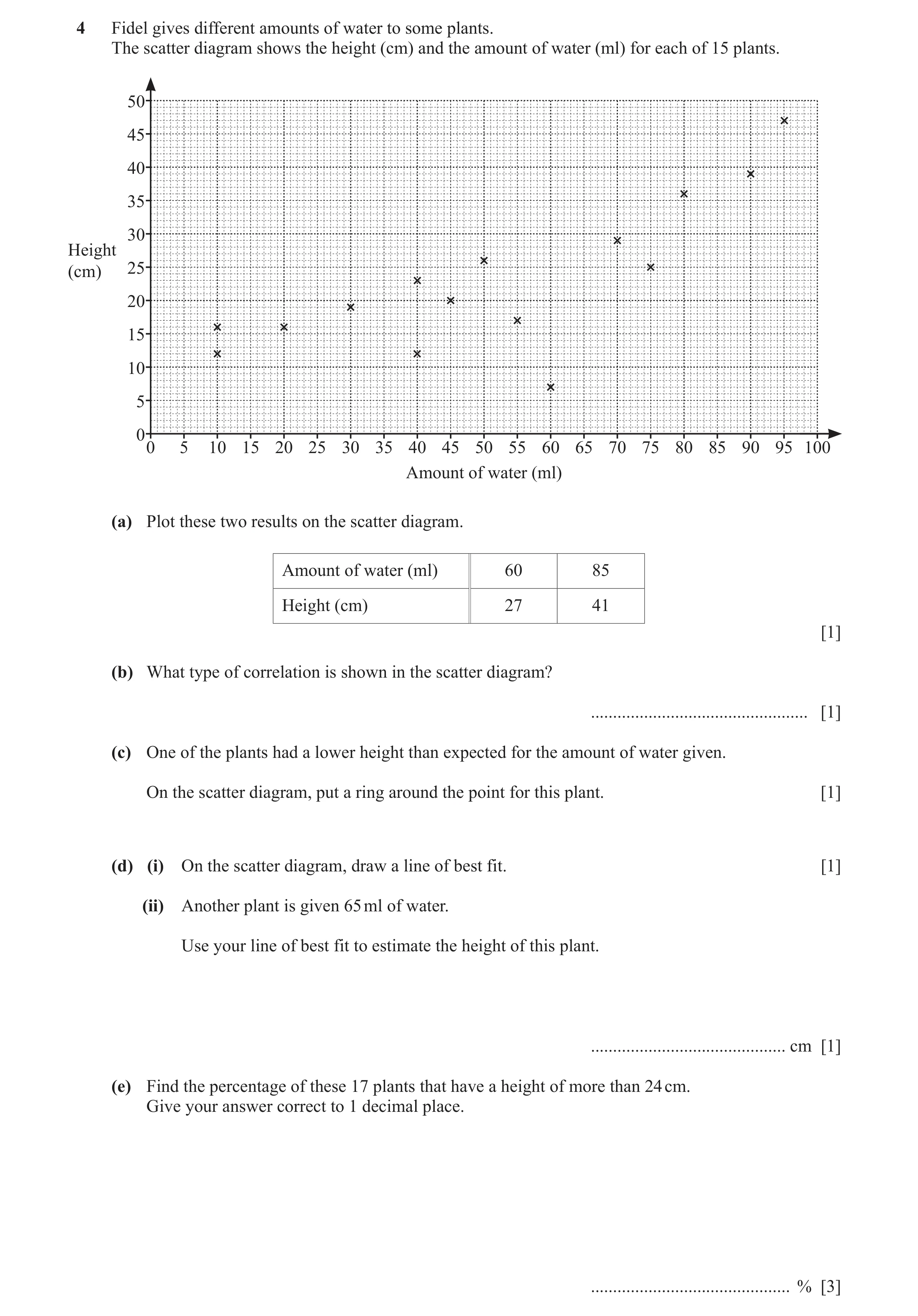
4 Fidel gives different amounts of water to some plants. The scatter diagram shows the height (cm) and the amount of water (ml) for each of 15 plants. 50 45 40 35 30 Height (cm) 25 20 15 10 5 0 0 5 10 15 20 25 30 35 40 45 50 55 60 65 70 75 80 85 90 95 100 Amount of water (ml) (a) Plot these two results on the scatter diagram. Amount of water (ml) 60 85 Height (cm) 27 41 [1] (b) What type of correlation is shown in the scatter diagram? … [1] (c) One of the plants had a lower height than expected for the amount of water given. On the scatter diagram, put a ring around the point for this plant. [1] (d) (i) On the scatter diagram, draw a line of best fit. [1] (ii) Another plant is given 65 ml of water. Use your line of best fit to estimate the height of this plant. … cm [1] (e) Find the percentage of these 17 plants that have a height of more than 24 cm. Give your answer correct to 1 decimal place. … % [3]
8 marks
Mark scheme: 4(a) Two points accurately plotted 1 4(b) Positive 1 4(c) (60, 7) indicated 1 4(d)(i) Accurate straight line of best fit 1 4(d)(ii) 24 to 32 1 FT their straight line with positive gradient with tolerance ± 1 square 4(e) 47.1 3 B2 for 47.05 or 47.06 or 47.05…. or 8 their 8 M1 for × 100 or × 100 oe 17 17 B1 for their answer to more than 1 dp correctly rounded to 1 dp
This question in 0580/32 May/June 2023
Q26 · The scatter diagram shows the distance travelled and the cost for each of 12 taxi journeys 0580/31 Oct/Nov 2024
5 (a) The scatter diagram shows the distance travelled and the cost for each of 12 taxi journeys. 25 20 15 Cost ($) 10 5 0 0 2 4 6 8 10 Distance (km) (i) ‘The scatter diagram shows positive correlation.’ Is this statement true or false? Give a reason for your answer. … because … … [1] (ii) On one journey, the cost per kilometre travelled was much more expensive than on all of the other journeys. Draw a ring around this point on the scatter diagram. [1] (iii) Draw a line of best fit on the scatter diagram. [1] (iv) Another journey is 8 km long. Use your line of best fit to find an estimate for the cost of this journey. $ … [1] (b) Arit, Luke and Marie share the cost of a taxi journey. The cost is $26.40 . (i) Calculate how much Arit pays if they share the cost equally. $ … [1] (ii) They decide to share the cost in proportion to the distance they each travel in the taxi. Arit travels 12 km, Luke travels 3 km and Marie travels 7.5 km. (a) Write the ratio 12 : 3 : 7.5 in its simplest form. … : … : … [2] (b) Calculate how much more Arit pays than if they share the cost equally. $ … [3] (c) Jin invests some money from his taxi company. He invests $18 600 at a rate of 1.7% per year compound interest. Calculate the value of the investment at the end of 6 years. Give your answer correct to the nearest dollar. $ … [3]
13 marks
Mark scheme: 5(a)(i) True and correct description of 1 correlation e.g. as the distance increases the cost increases 5(a)(ii) (1, 15) circled 1 5(a)(iii) Acceptable ruled line of best fit drawn 1 5(a)(iv) 16 to 19 1 If 0 scored, FT their straight line of best fit with positive gradient 5(b)(i) 8.8[0] 1 5(b)(ii)(a) 8 : 2 : 5 2 M1 for any correct equivalent ratio 5(b)(ii)(b) 5.28 3 B2 for 14.08 26.40 or M1 for m 12 + 3 + 7.5 where m = 1, 3 ,7.5 or 12 or M1FT for 26.40 k (their 8 + their 2 + their 5) where k = 1 or their 8 or their 2 or their 5 oe 5(c) 20 580 cao 3 B2 for answer 20 579.68[…] or 20 579.7[0] or 20 600[.00] 1.7 6 or M1 for 18600 1 + oe 100 B1 for their answer correctly rounded
This question in 0580/31 Oct/Nov 2024
Q27 · A school records the marks students score in Paper 1 and Paper 2 of a subject 0580/32 Oct/Nov 2025
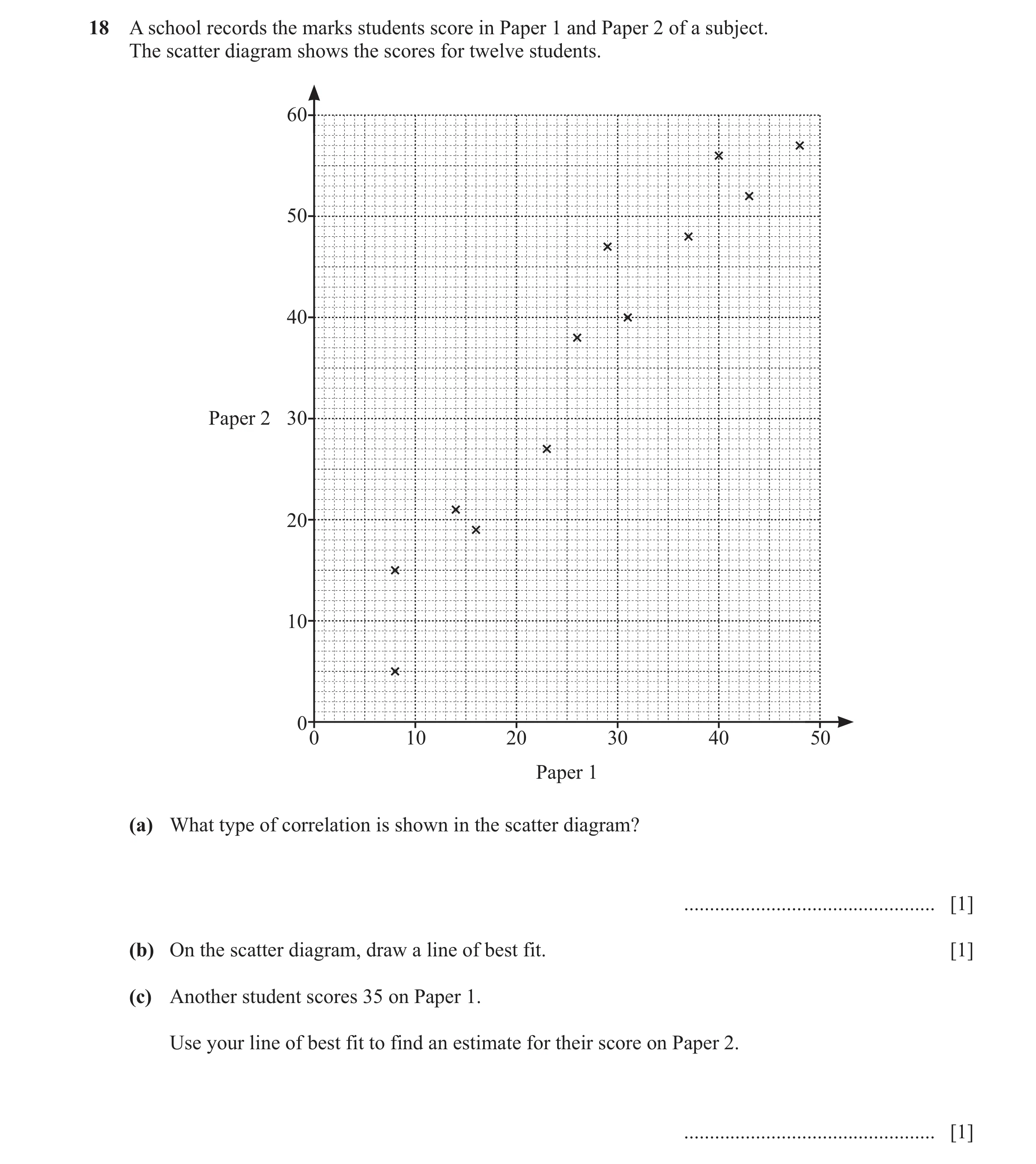
18 A school records the marks students score in Paper 1 and Paper 2 of a subject. The scatter diagram shows the scores for twelve students. 60 50 40 Paper 2 30 20 10 00 10 20 30 40 50 Paper 1 (a) What type of correlation is shown in the scatter diagram? … [1] (b) On the scatter diagram, draw a line of best fit. [1] (c) Another student scores 35 on Paper 1. Use your line of best fit to find an estimate for their score on Paper 2. … [1]
3 marks
Mark scheme: 18(a) positive 1 18(b) Acceptable ruled line of best fit 1 18(c) 42 – 47 1 FT their straight line of best fit with positive gradient
This question in 0580/32 Oct/Nov 2025
 11 / 44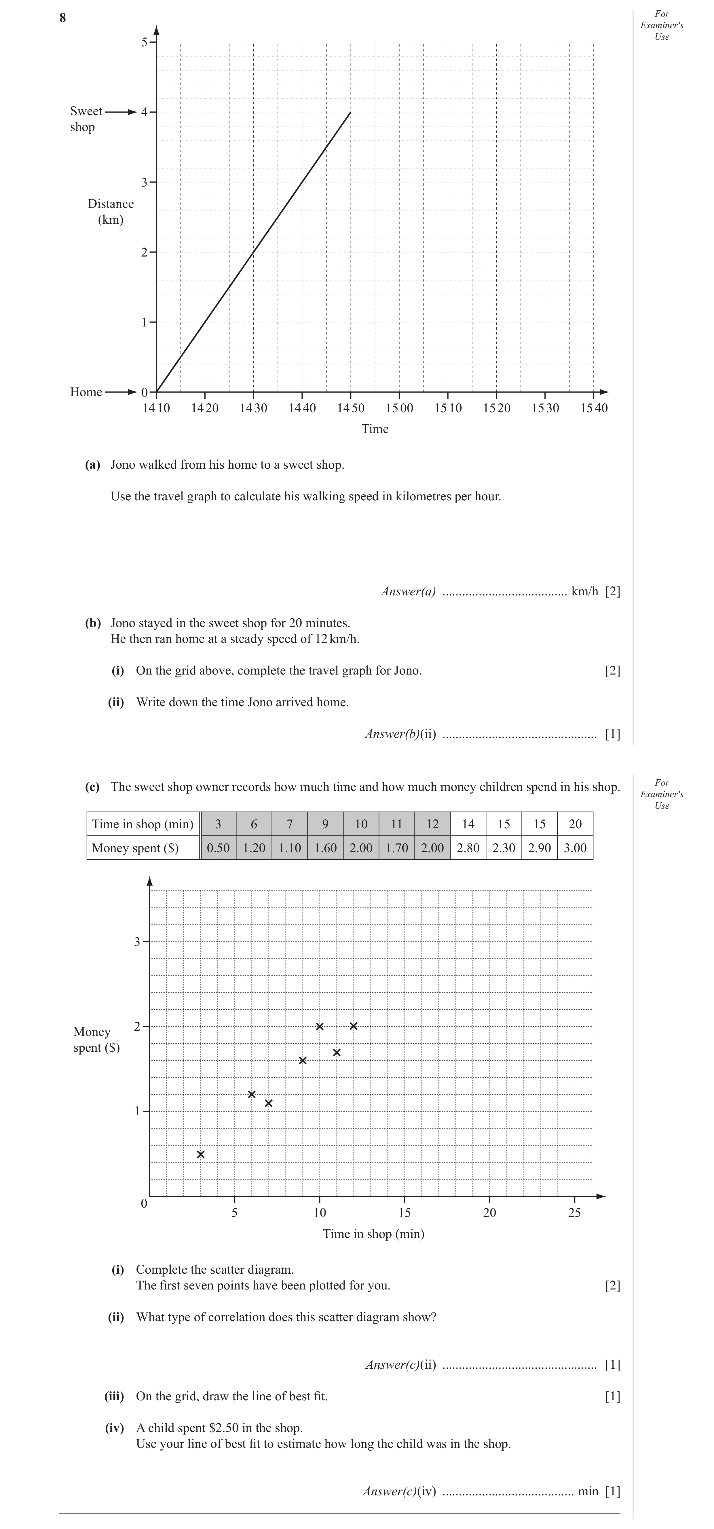
 20 / 44
 21 / 44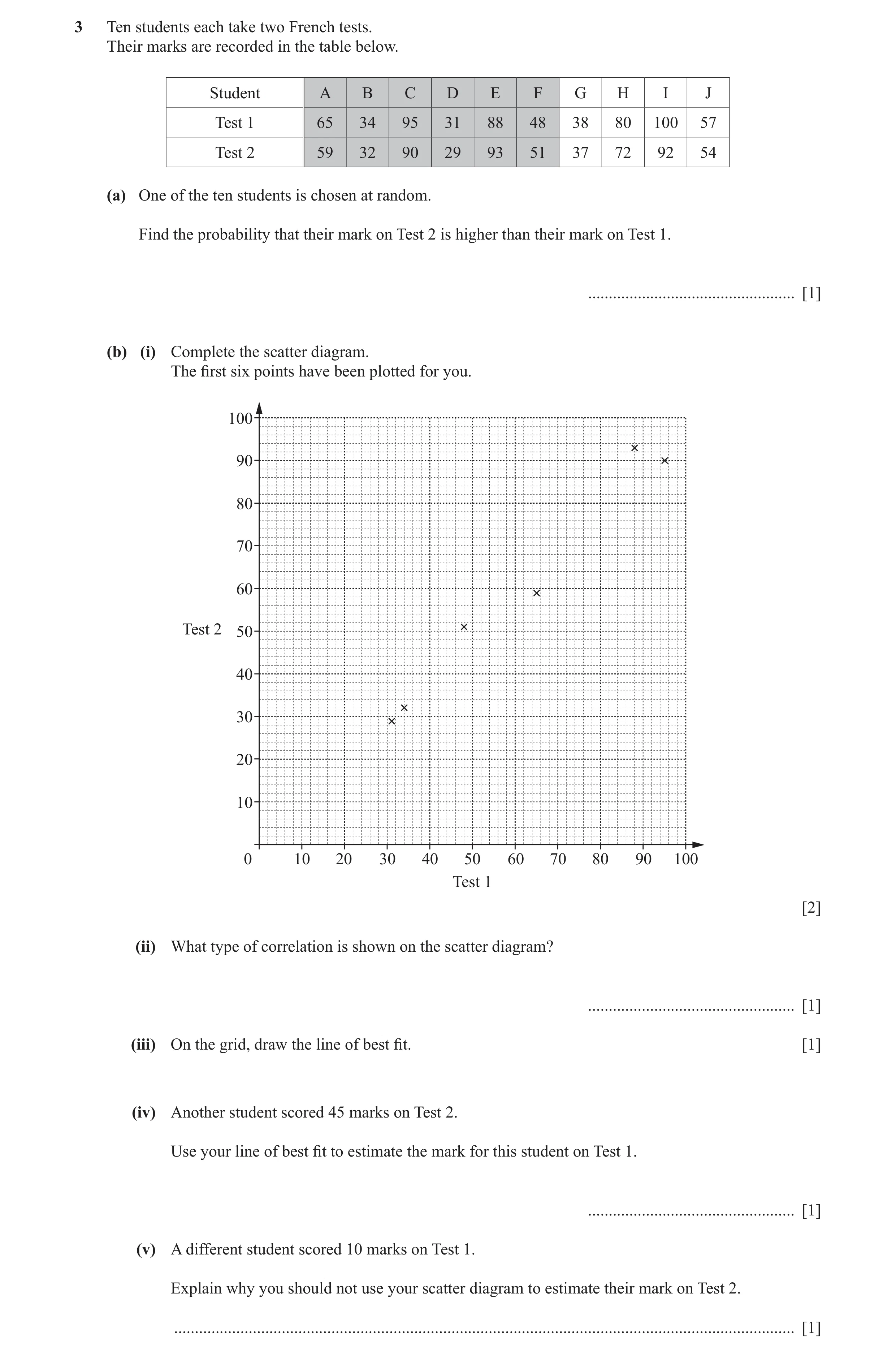
 28 / 44
 29 / 44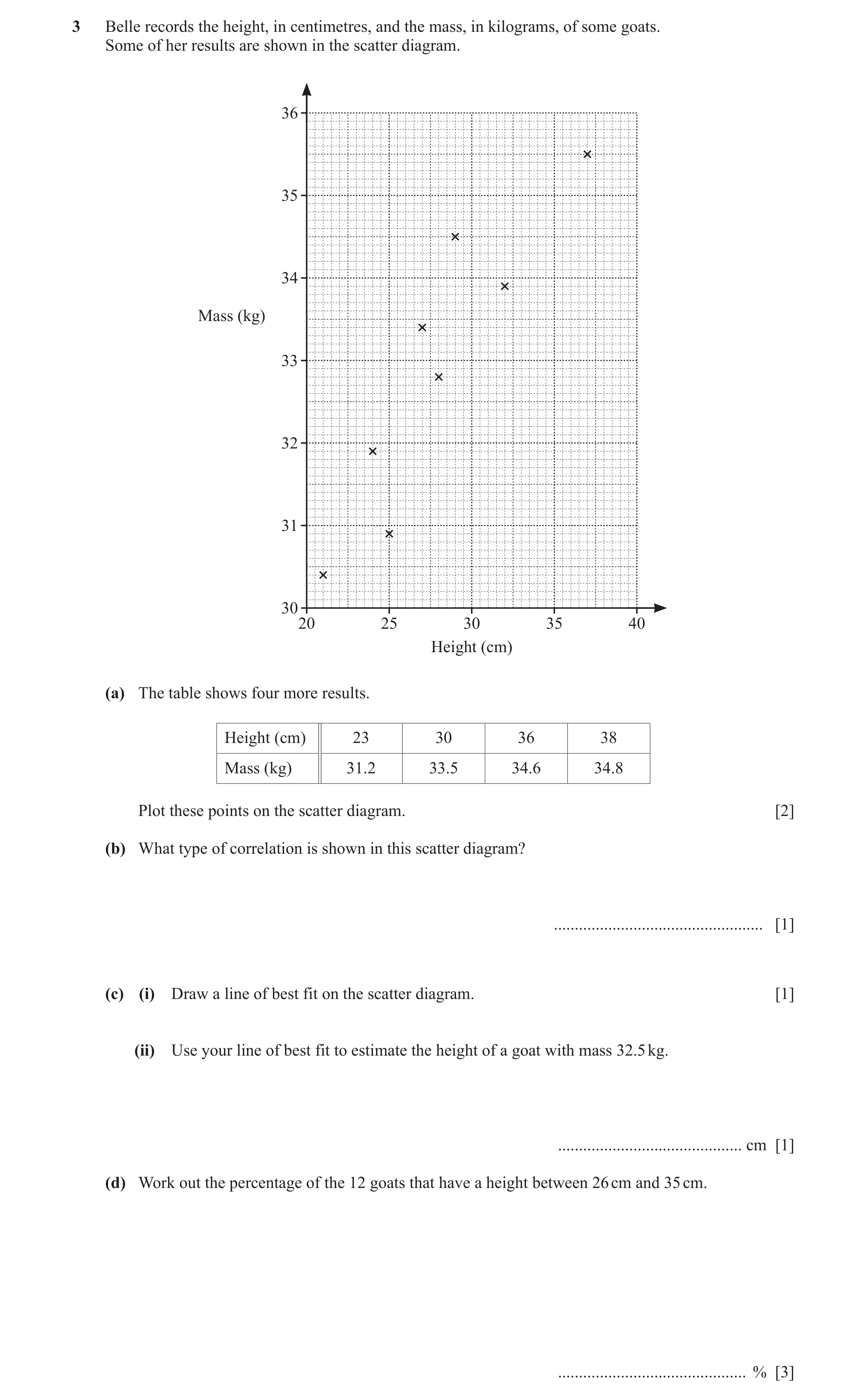
 41 / 44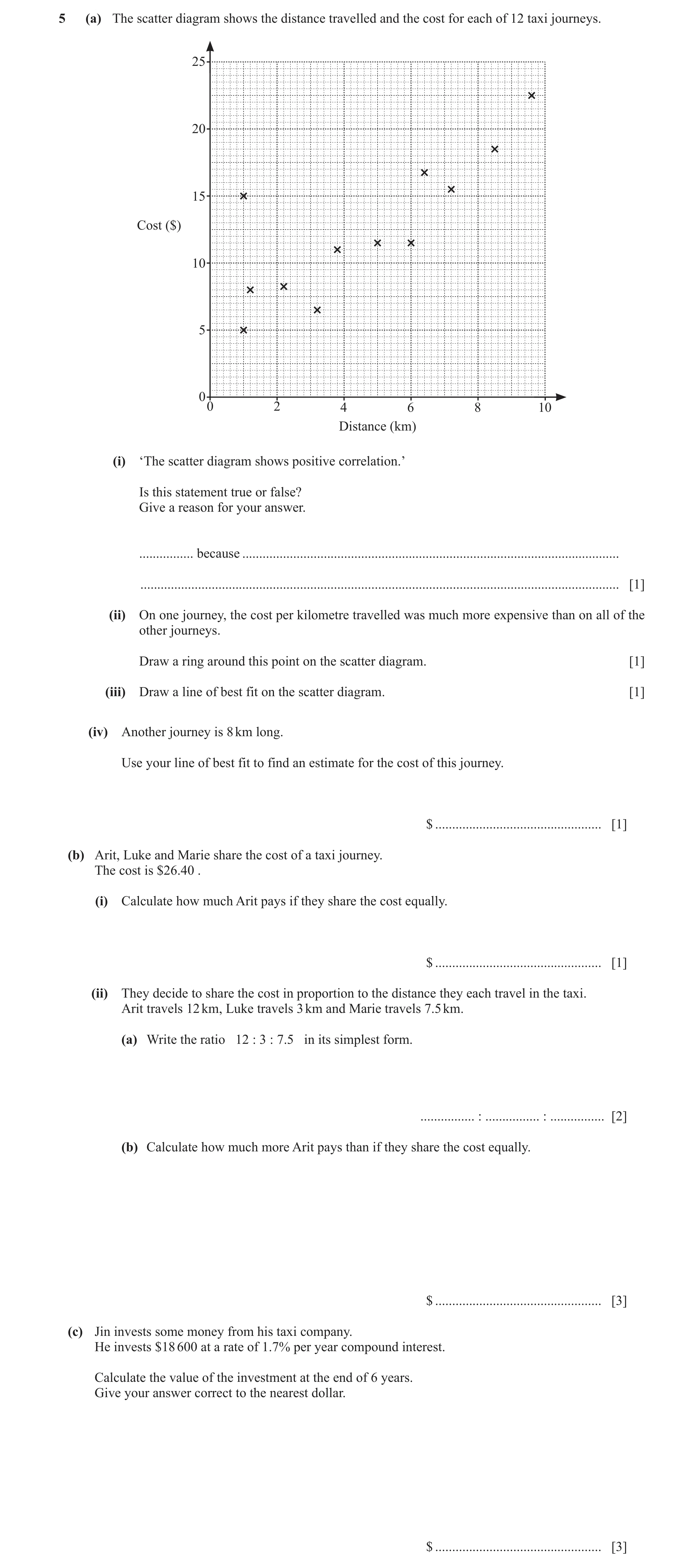
 44 / 44
 12
12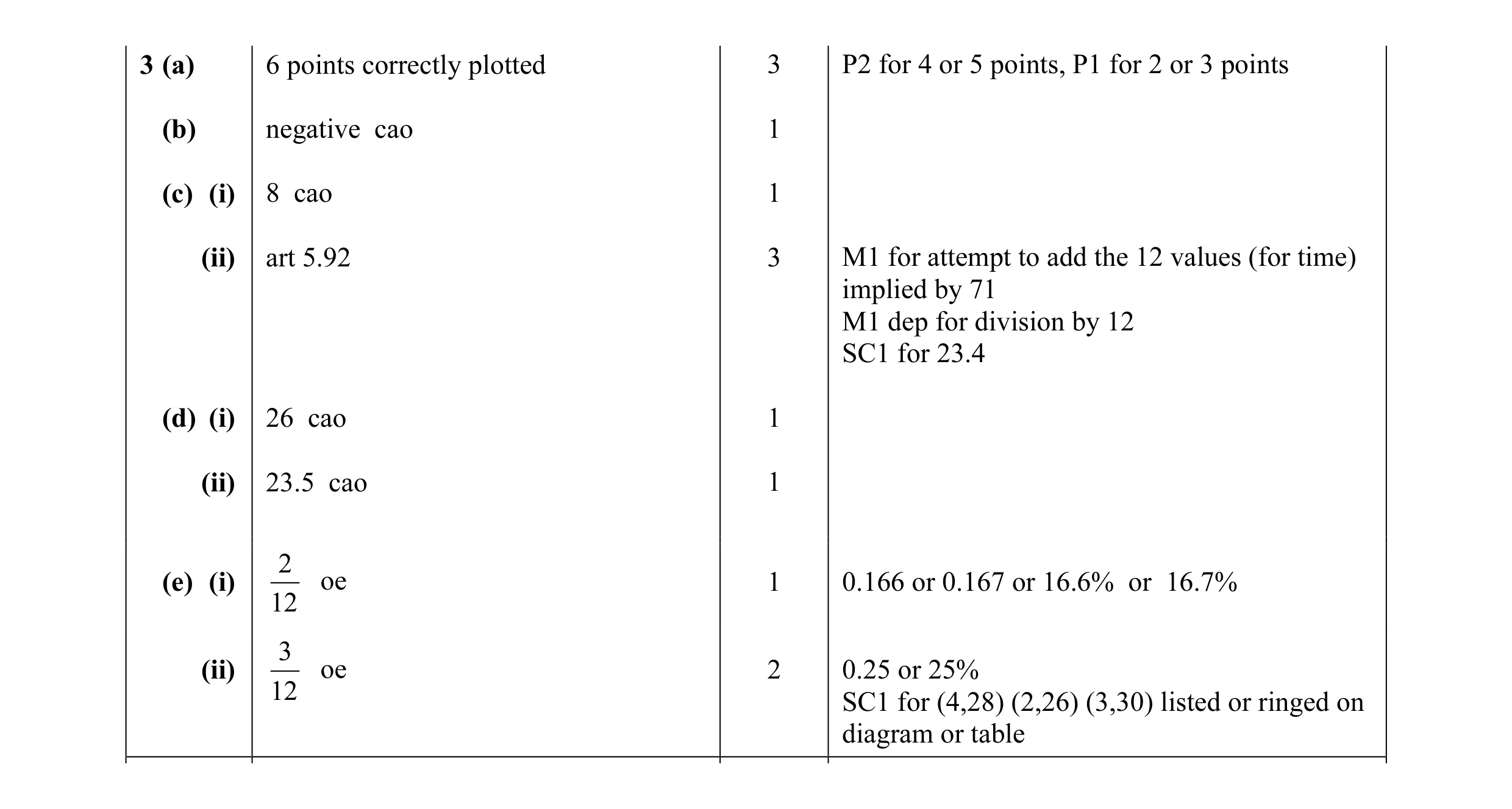 13
13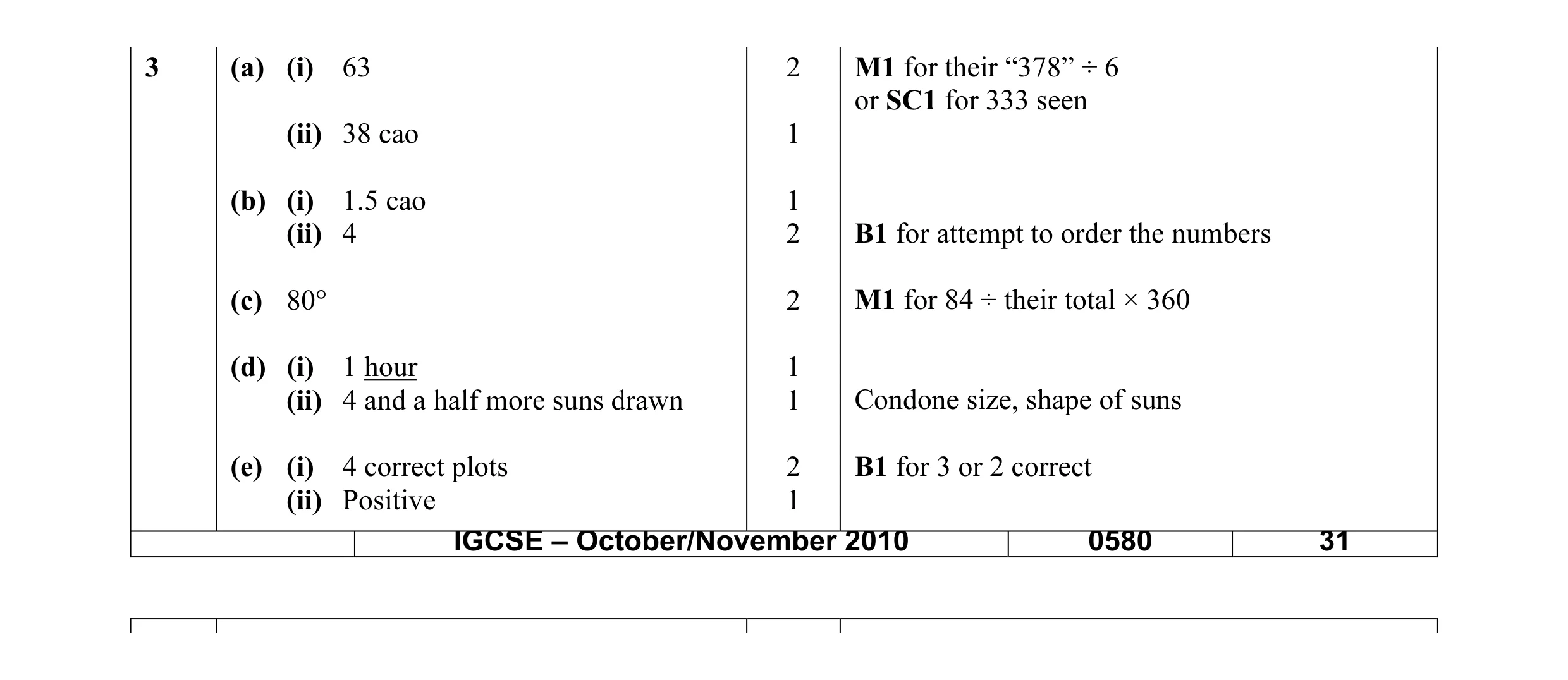 13
13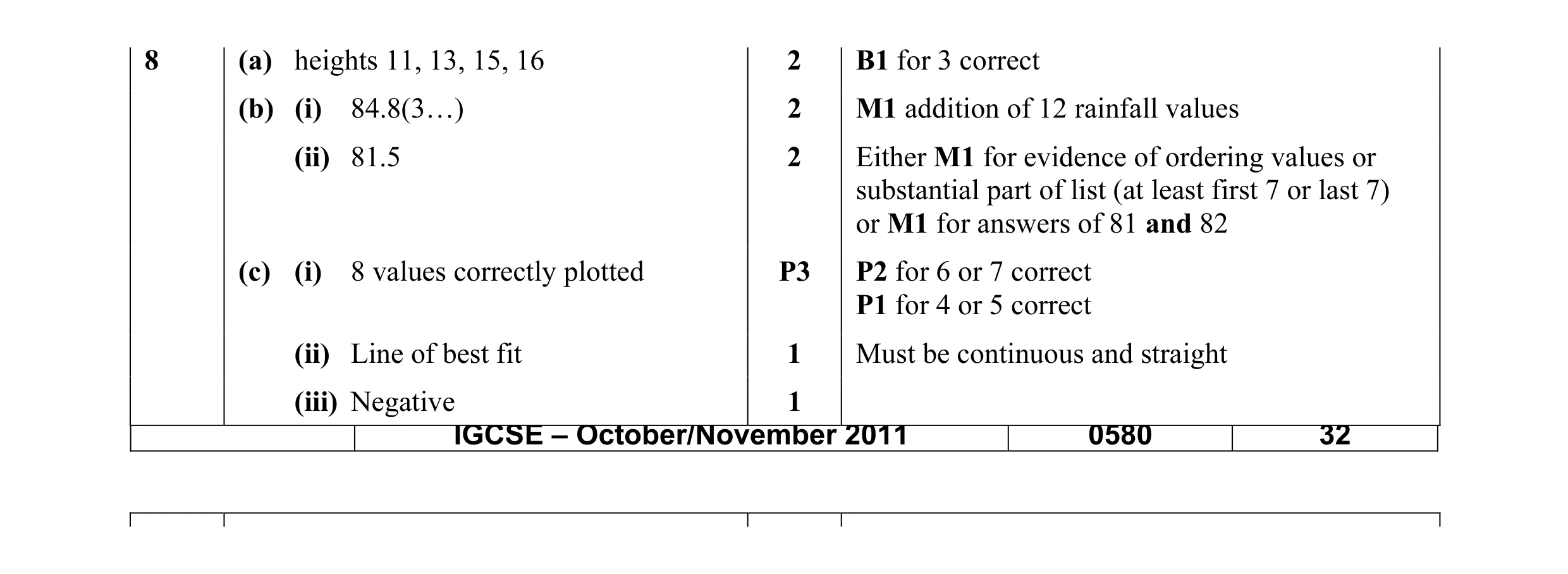 11
11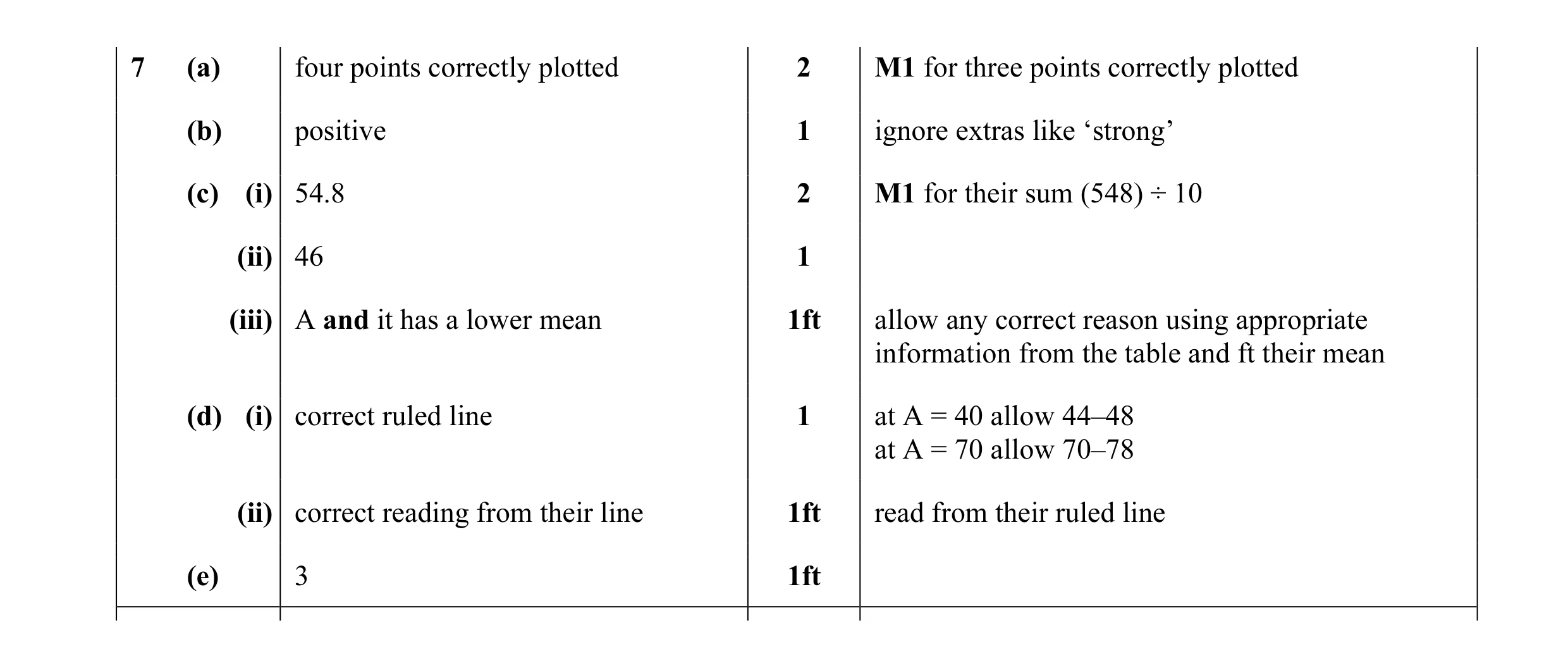 10
10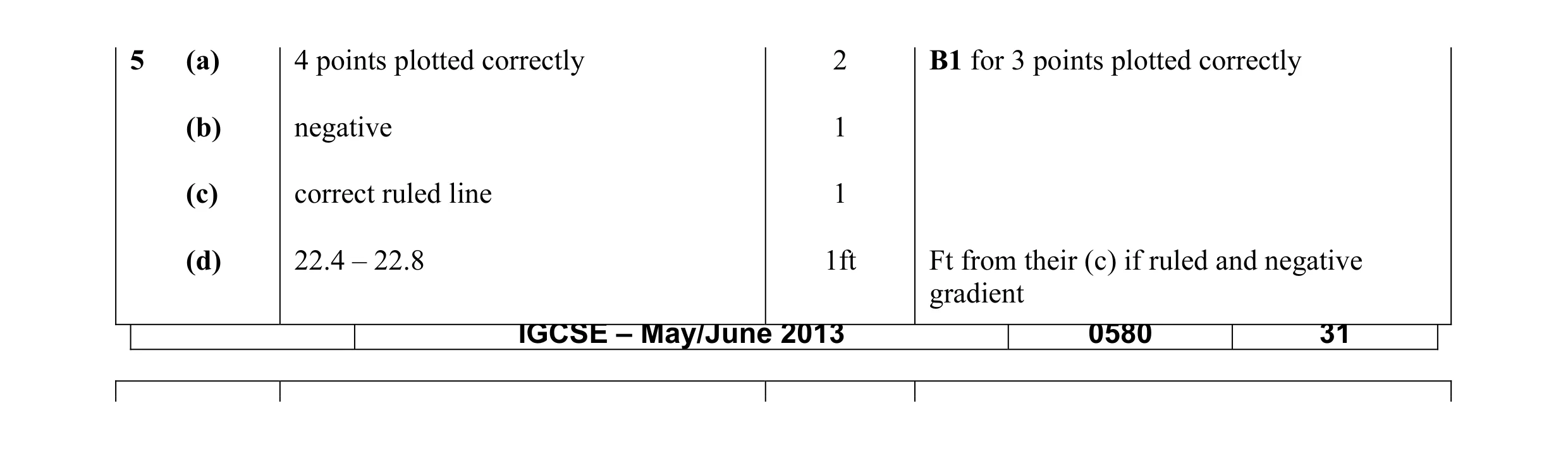 5
5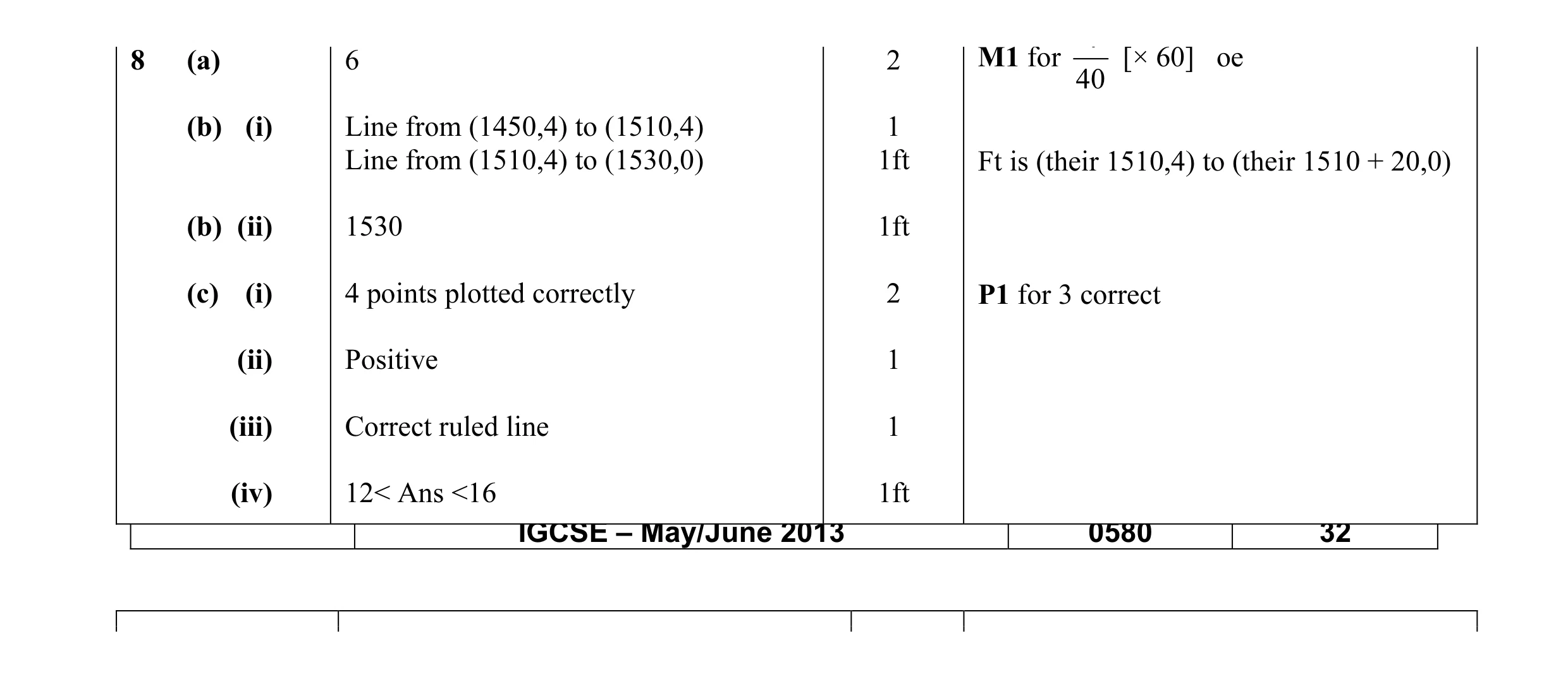 10
10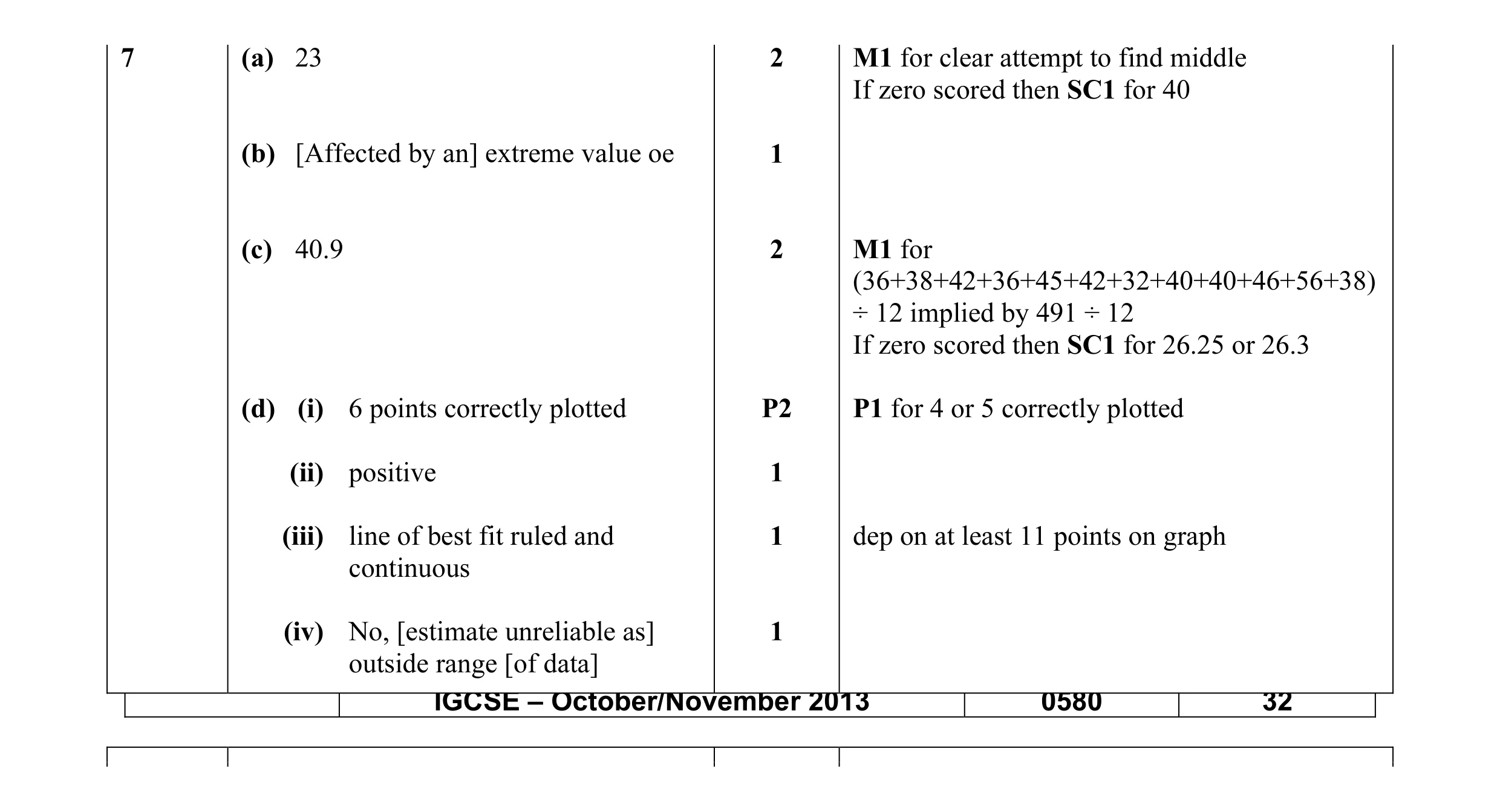 10
10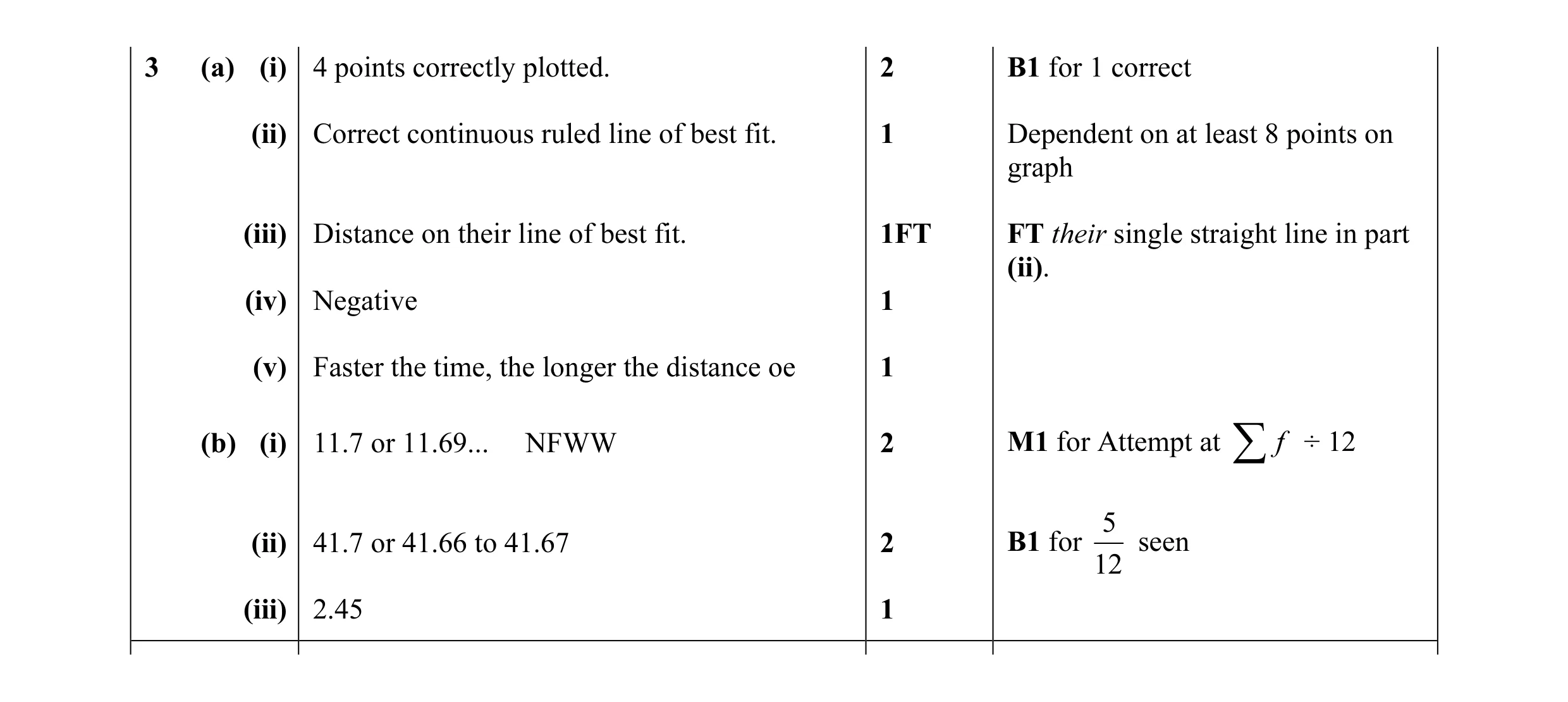 11
11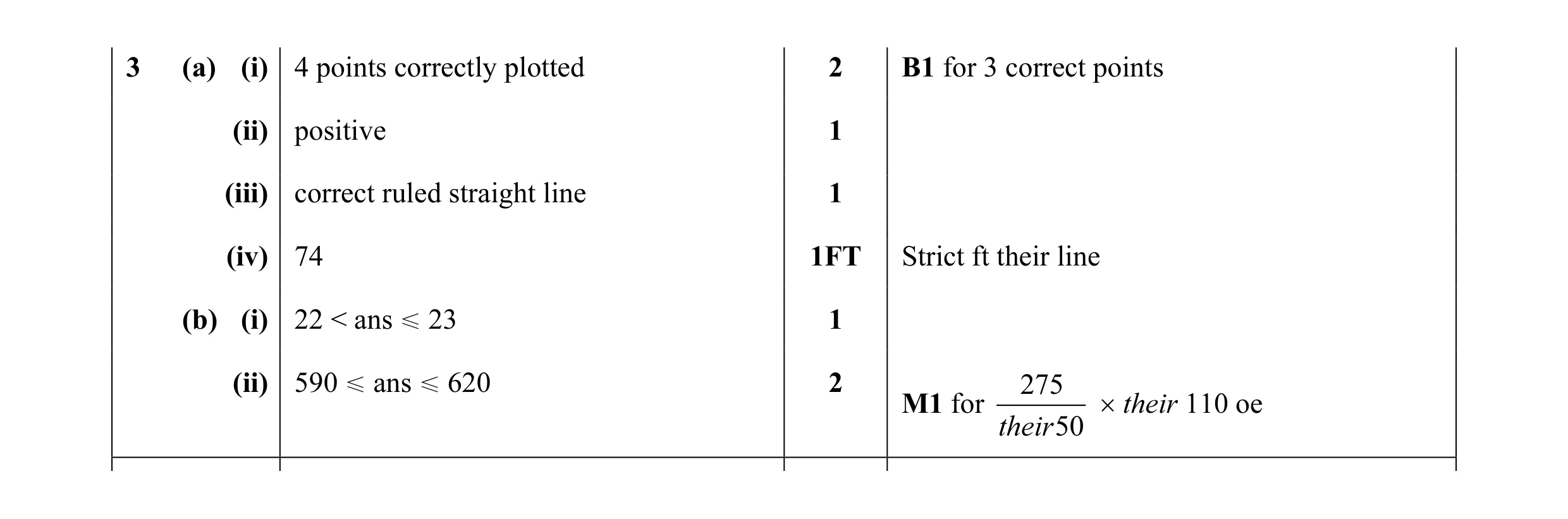 8
8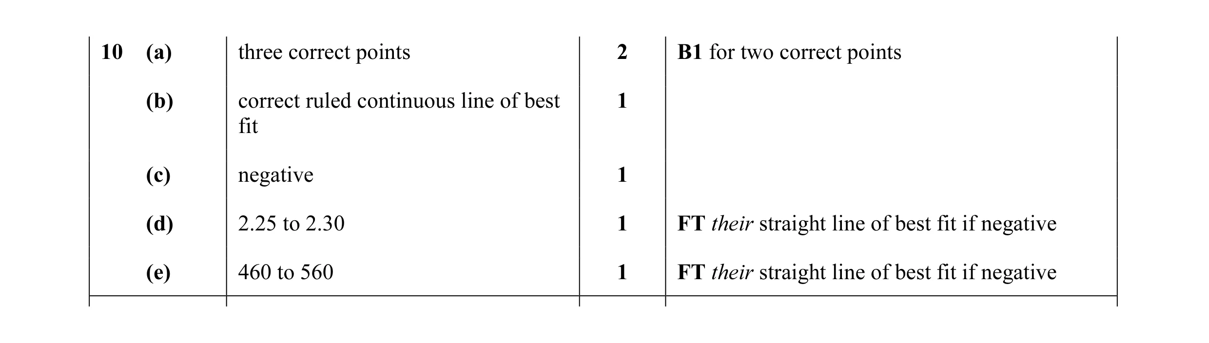 6
6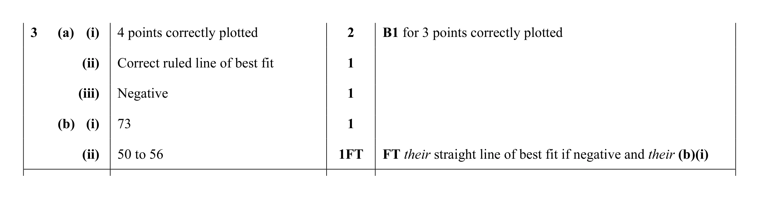 6
6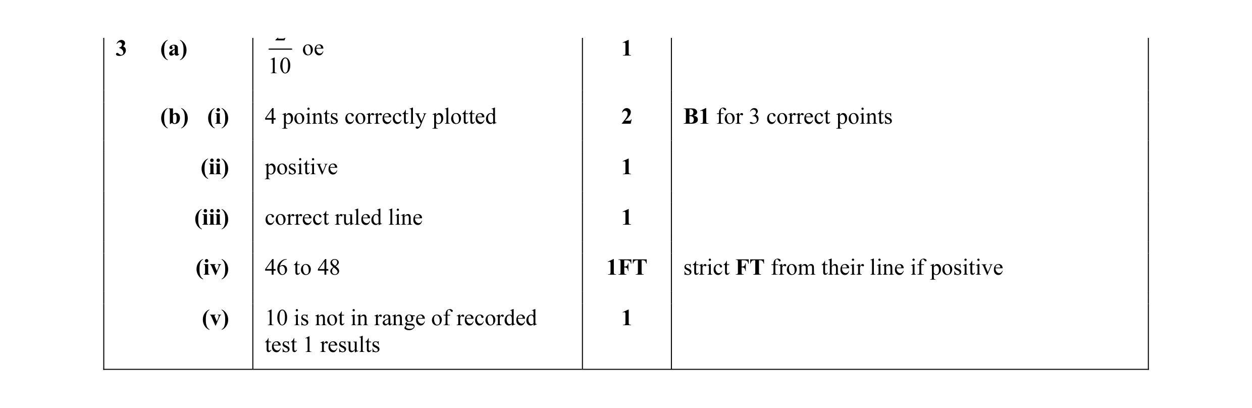 7
7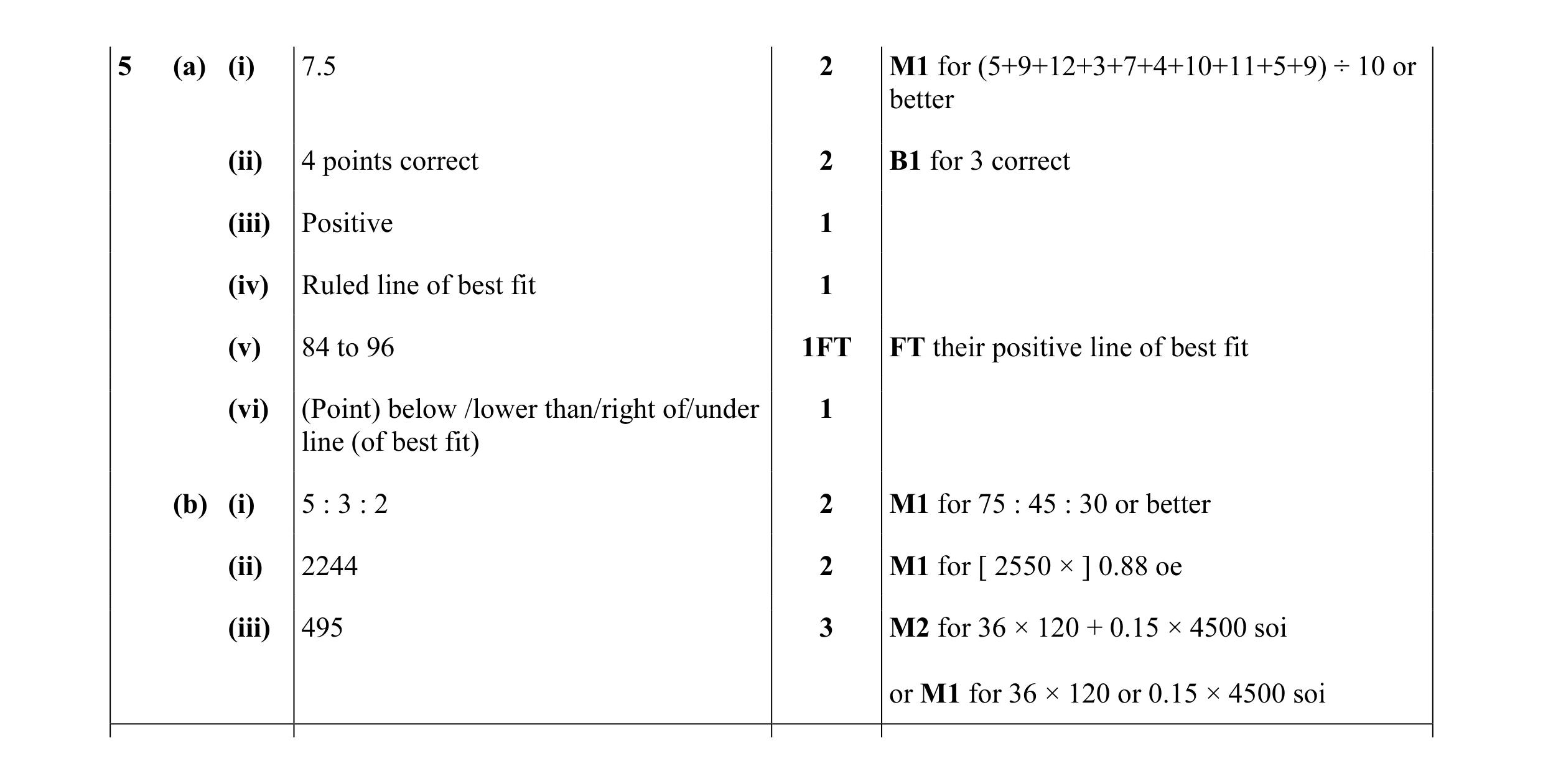 15
15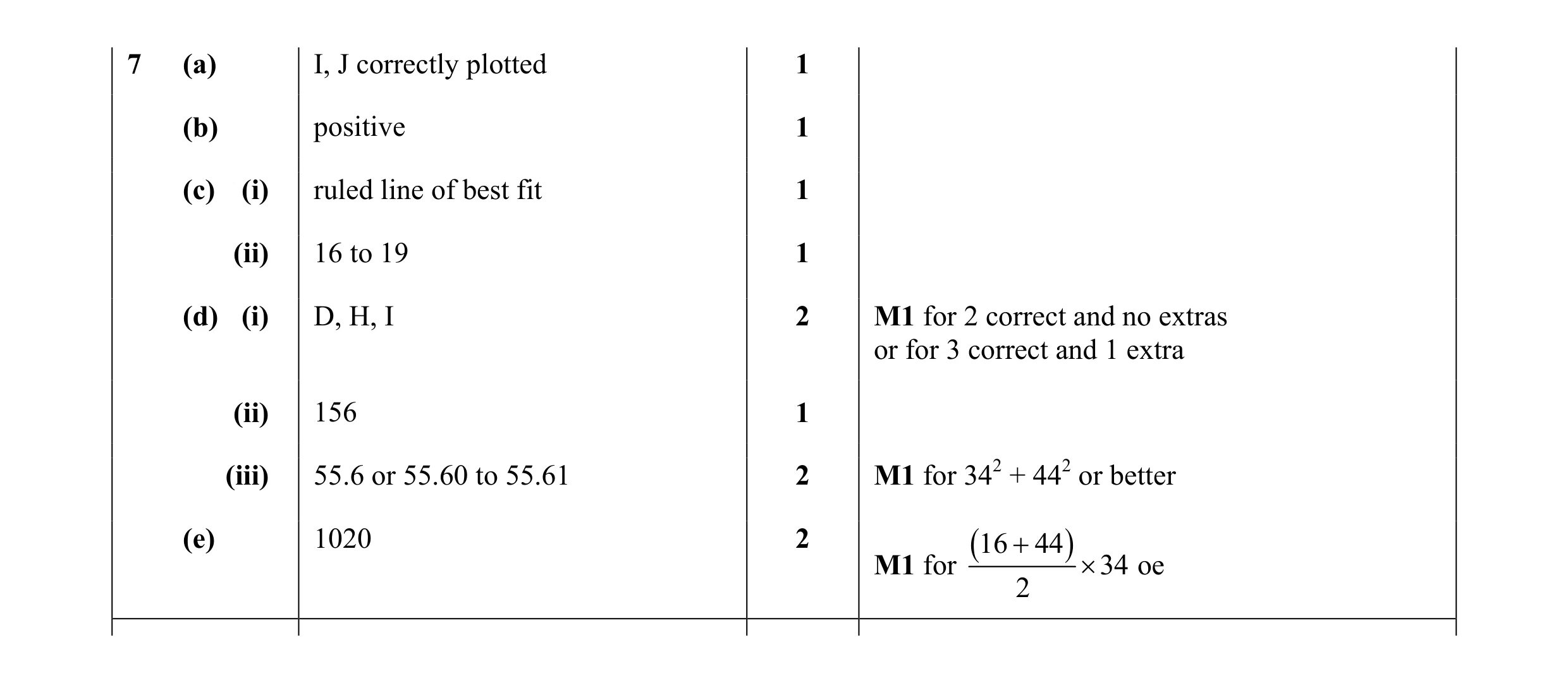 11
11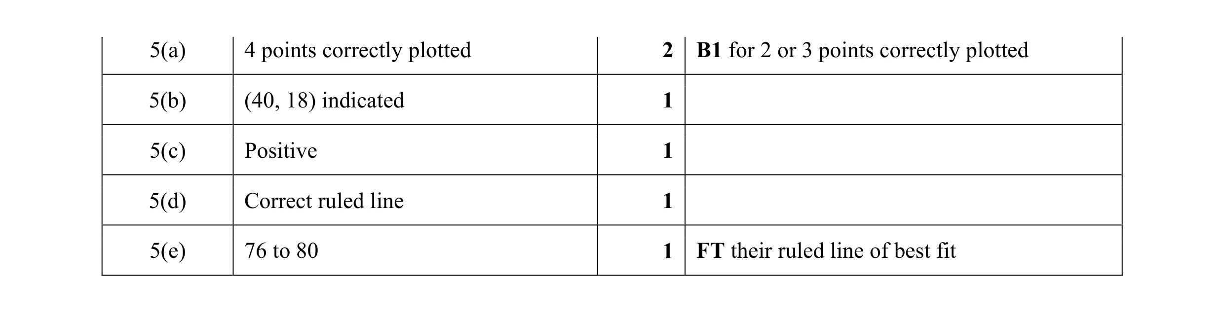 6
6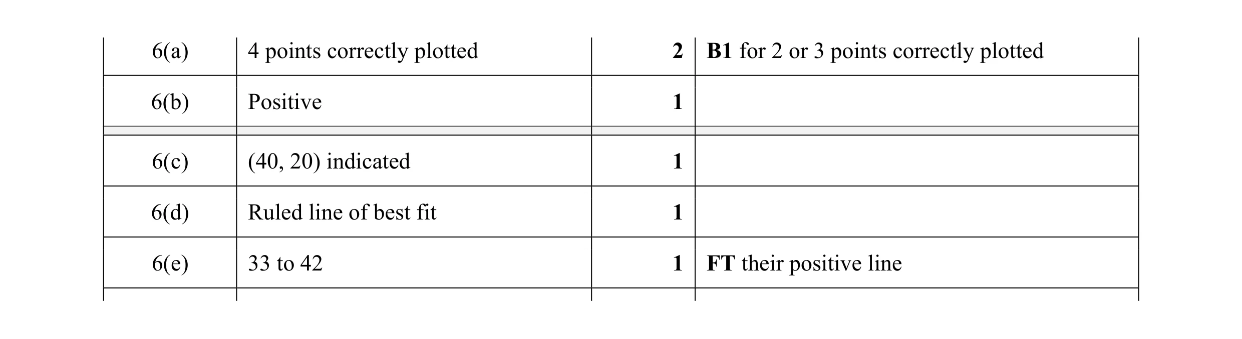 6
6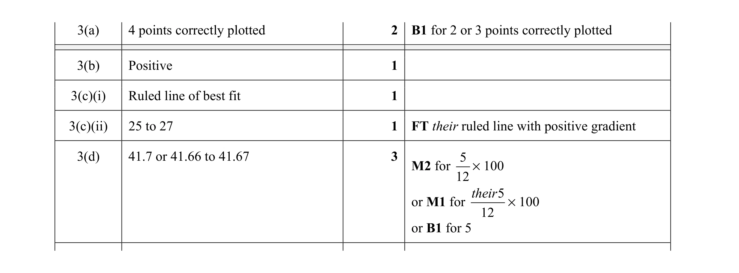 8
8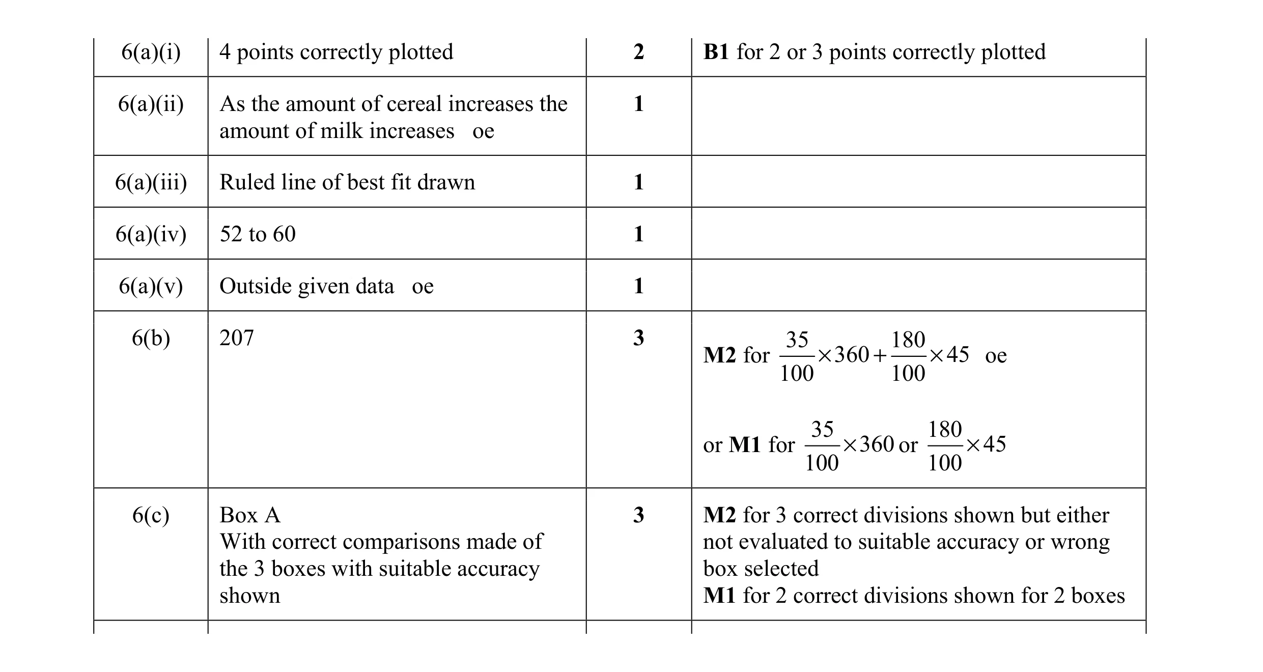 12
12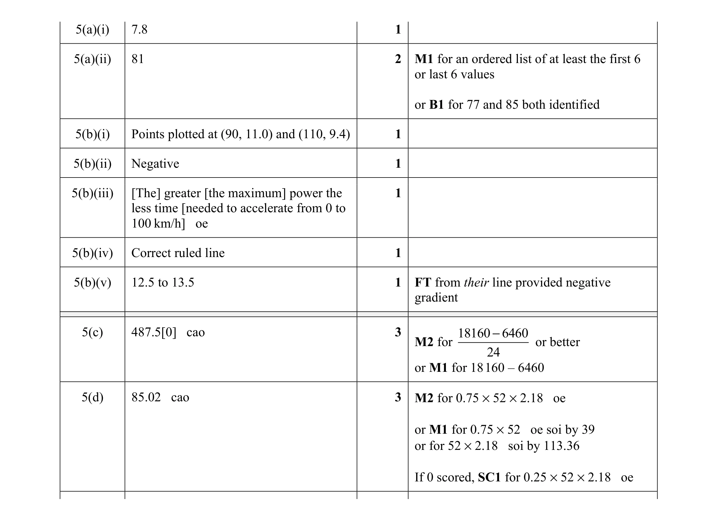 14
14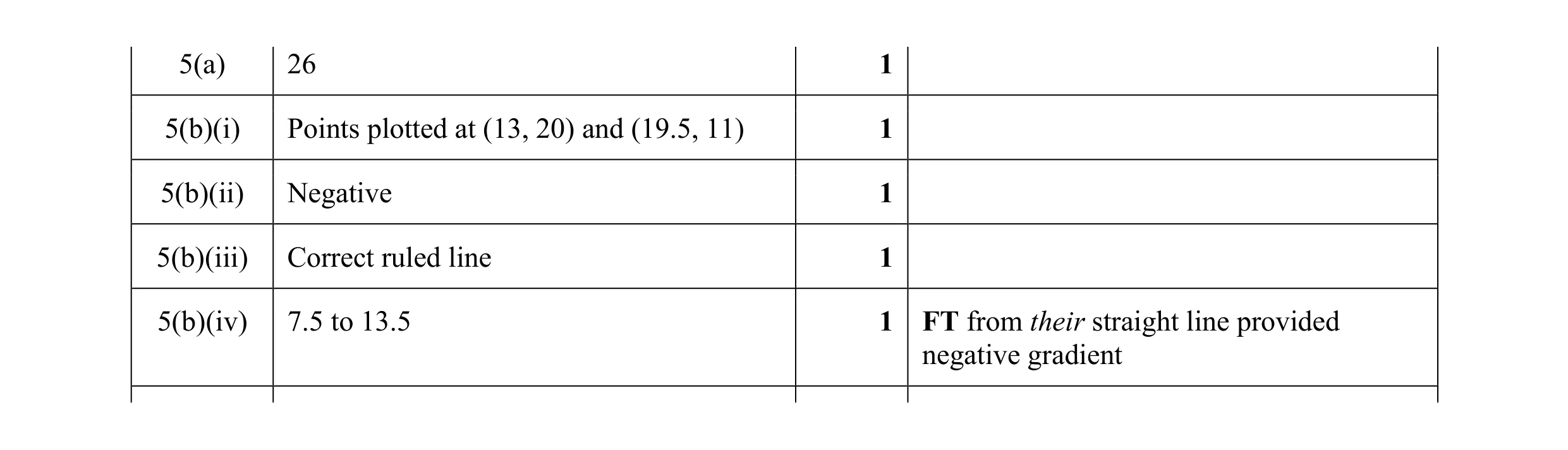 5
5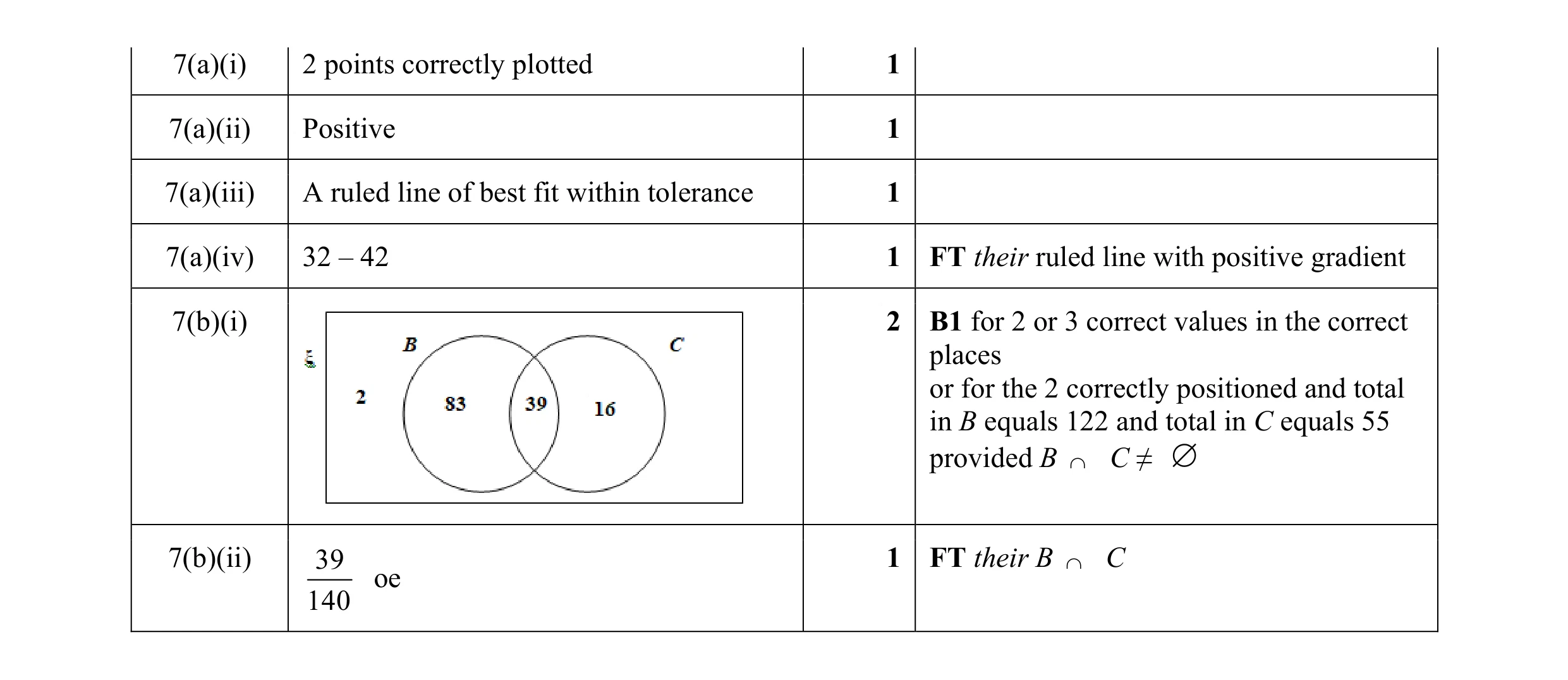 7
7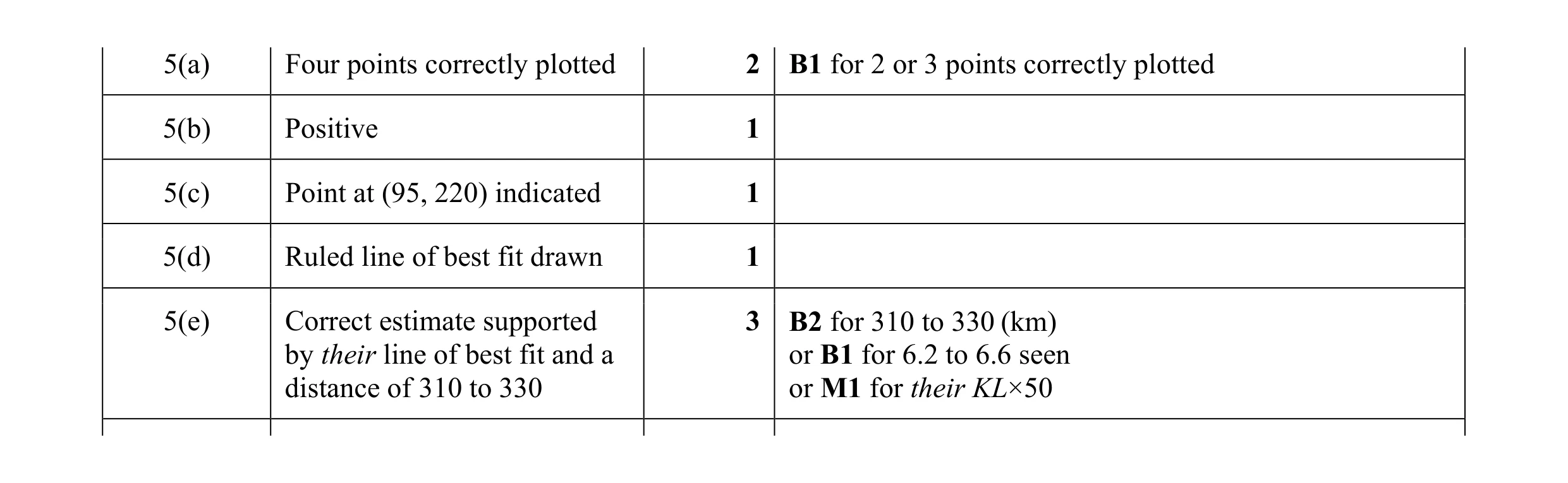 8
8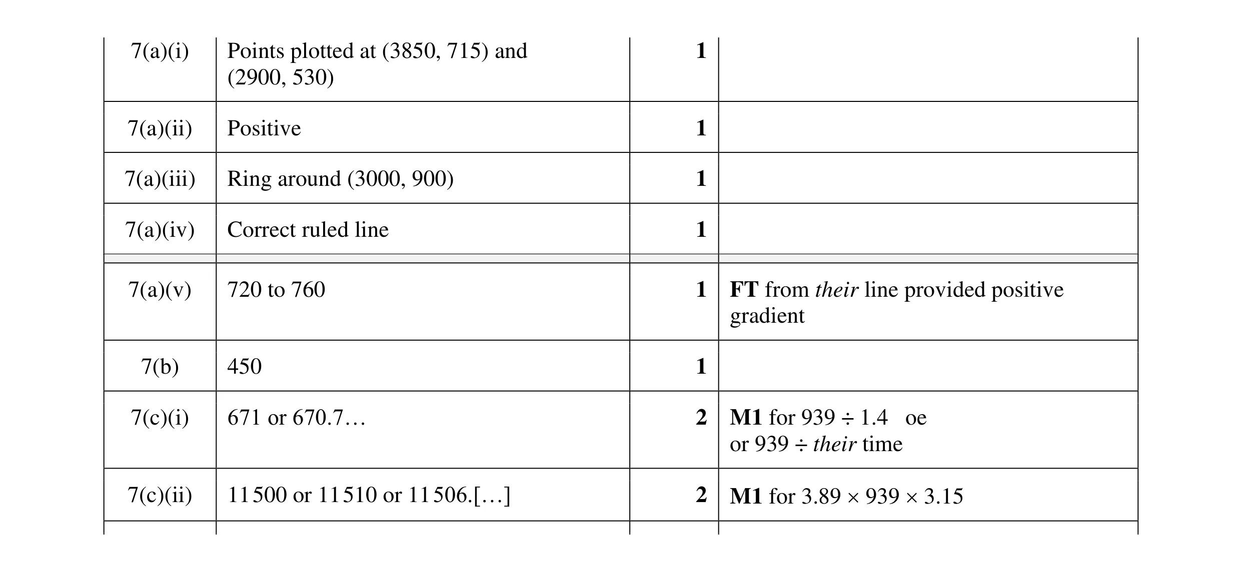 10
10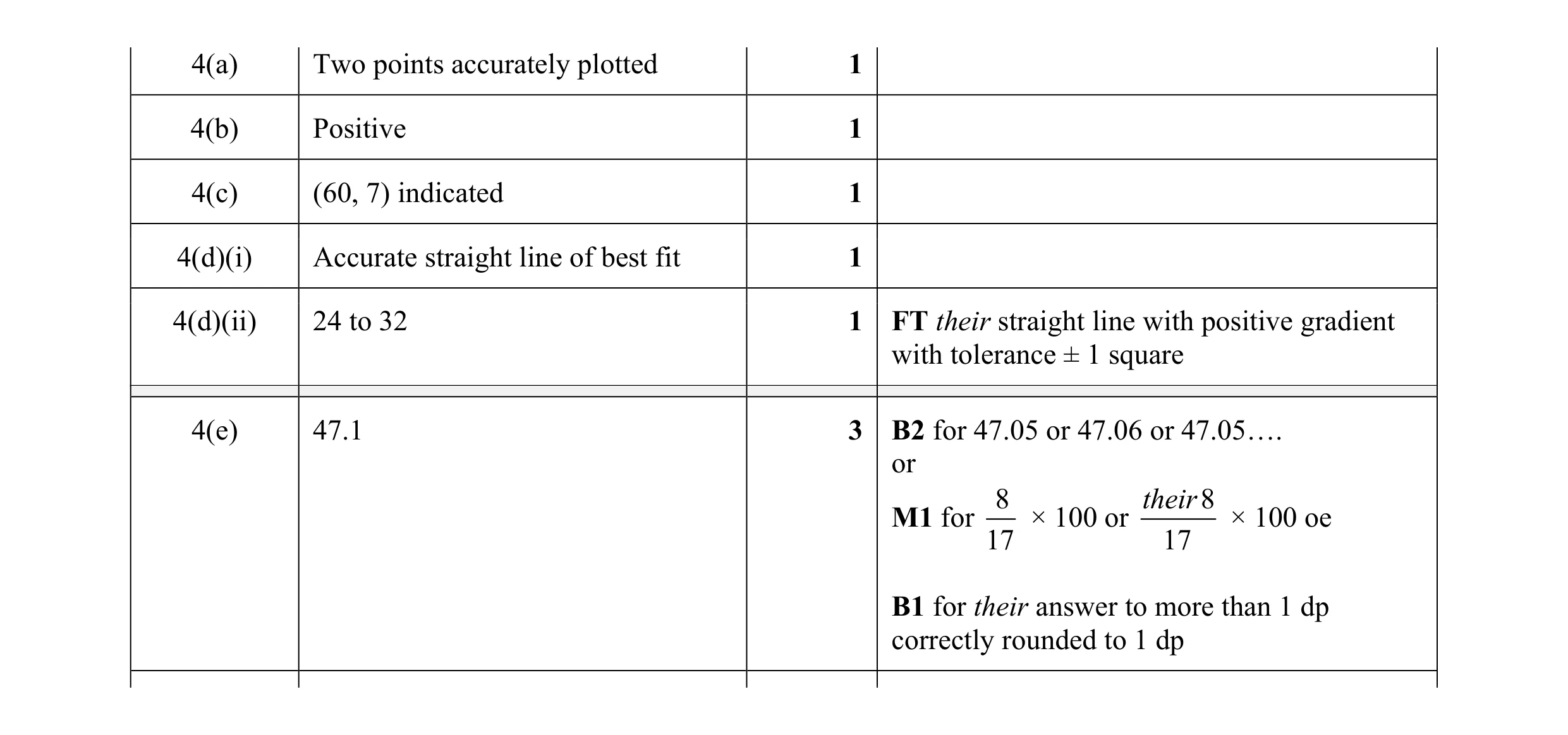 8
8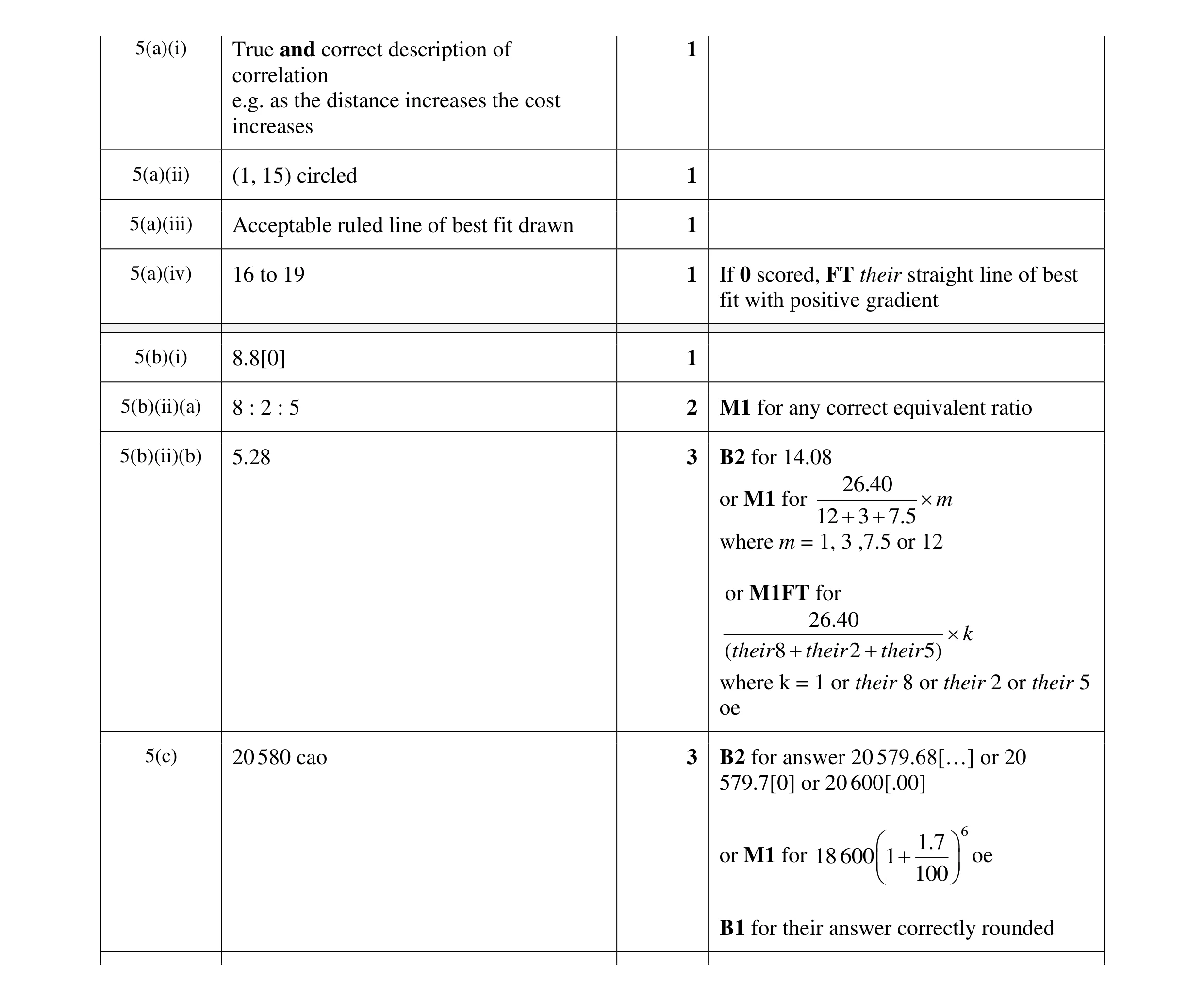 13
13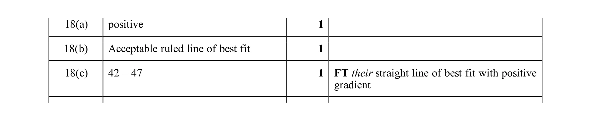 3
3