Questions as text
Q1 · Which word describes the correlation in the scatter graph below? 0580/11 Oct/Nov 2006
3 Which word describes the correlation in the scatter graph below? positive negative none Answer [1]
1 marks
Mark scheme: 3 Negative (allow –ve) 1 Not allow ‘N’ or ‘n’ or ‘No’
This question in 0580/11 Oct/Nov 2006
Q2 · Fifteen children ran a 60 metre race 0580/12 May/June 2010
11 Fifteen children ran a 60 metre race. Examiner's In the scatter diagram below, the time taken is plotted against the age for each child. Use 18 17 16 15 14 Time (seconds) 13 12 11 10 9 8 7 8 9 10 11 12 13 14 Age (years) (a) Draw a line of best fit on the scatter diagram. [1] (b) What type of correlation does the scatter diagram show? Answer(b) [1] (c) Describe how the times taken change with the ages of the children. Answer (c) [1]
3 marks
Mark scheme: 11 (a) Line of fit by eye 1 (b) Negative 1 (c) Older children run faster 1
This question in 0580/12 May/June 2010
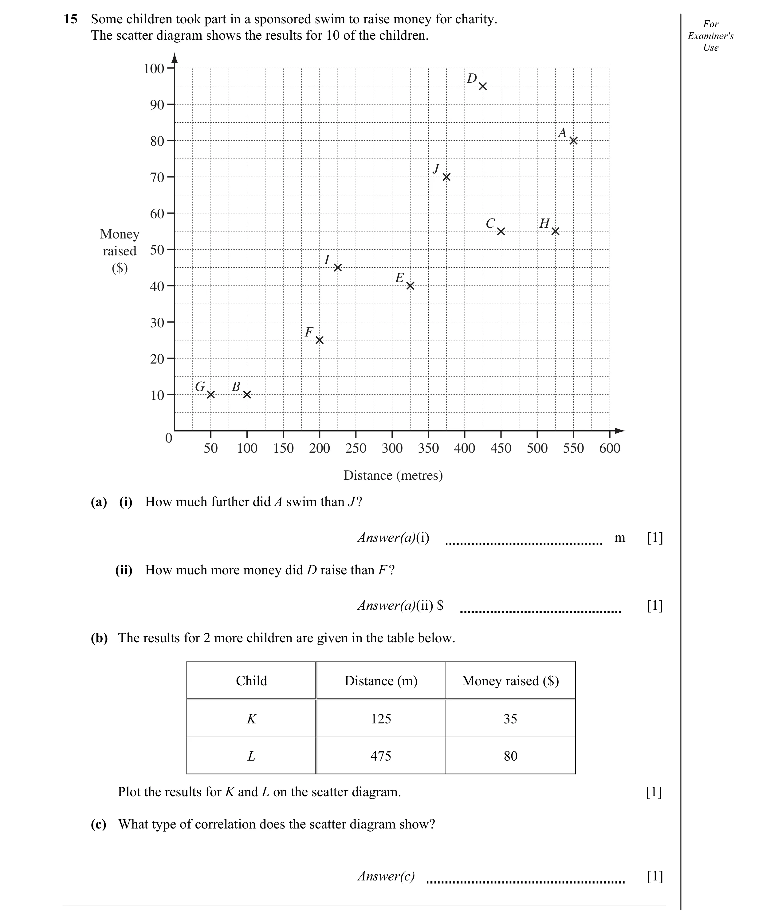
Q3 · Some children took part in a sponsored swim to raise money for charity 0580/12 Oct/Nov 2010
15 Some children took part in a sponsored swim to raise money for charity. For The scatter diagram shows the results for 10 of the children. Examiner's Use 100 D 90 A 80 J 70 60 C H Money raised 50 I ($) E 40 30 F 20 G B 10 0 50 100 150 200 250 300 350 400 450 500 550 600 Distance (metres) (a) (i) How much further did A swim than J ? Answer(a)(i) m [1] (ii) How much more money did D raise than F ? Answer(a)(ii) $ [1] (b) The results for 2 more children are given in the table below. Child Distance (m) Money raised ($) K 125 35 L 475 80 Plot the results for K and L on the scatter diagram. [1] (c) What type of correlation does the scatter diagram show? Answer(c) [1]
4 marks
Mark scheme: 15 (a) (i) 175 1 (ii) 70 1 (b) 2 points plotted correctly (±1mm). 1 (c) Positive 1 IGCSE – October/November 2010 0580 12
This question in 0580/12 Oct/Nov 2010
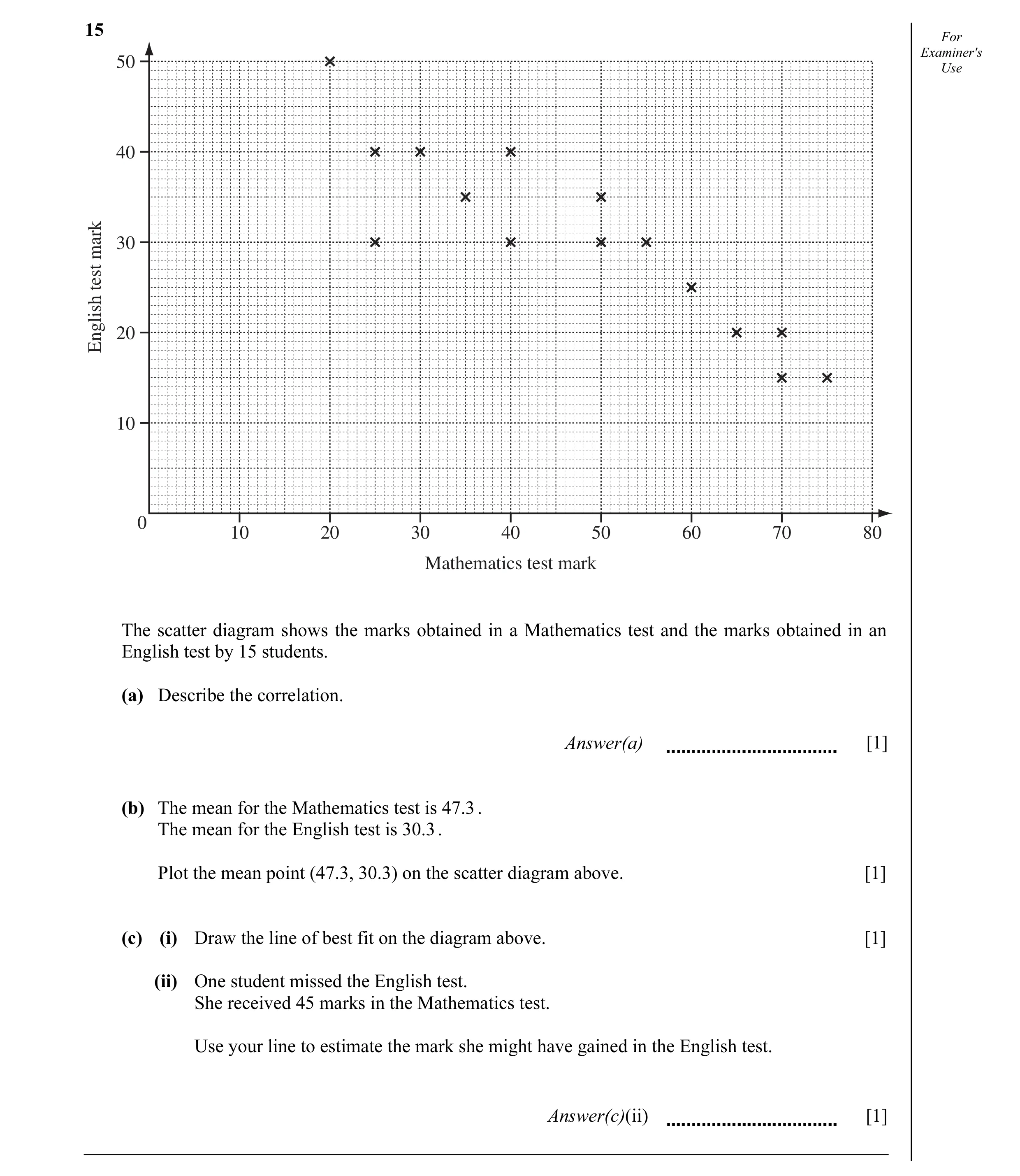
Q4 · For Examiner's 50 Use 40 30mark test 20English 10 0 10 20 30 40 50 60 70 80 Mathematics… 0580/11 Oct/Nov 2011
15 For Examiner's 50 Use 40 30mark test 20English 10 0 10 20 30 40 50 60 70 80 Mathematics test mark The scatter diagram shows the marks obtained in a Mathematics test and the marks obtained in an English test by 15 students. (a) Describe the correlation. Answer(a) [1] (b) The mean for the Mathematics test is 47.3 . The mean for the English test is 30.3 . Plot the mean point (47.3, 30.3) on the scatter diagram above. [1] (c) (i) Draw the line of best fit on the diagram above. [1] (ii) One student missed the English test. She received 45 marks in the Mathematics test. Use your line to estimate the mark she might have gained in the English test. Answer(c)(ii) [1]
4 marks
Mark scheme: 15 (a) Negative 1 Ignore embellishments (b) Correct point 1 (c) (i) Accurate ruled line 1 (ii) English mark 1ft Follow through their (c)(i)
This question in 0580/11 Oct/Nov 2011
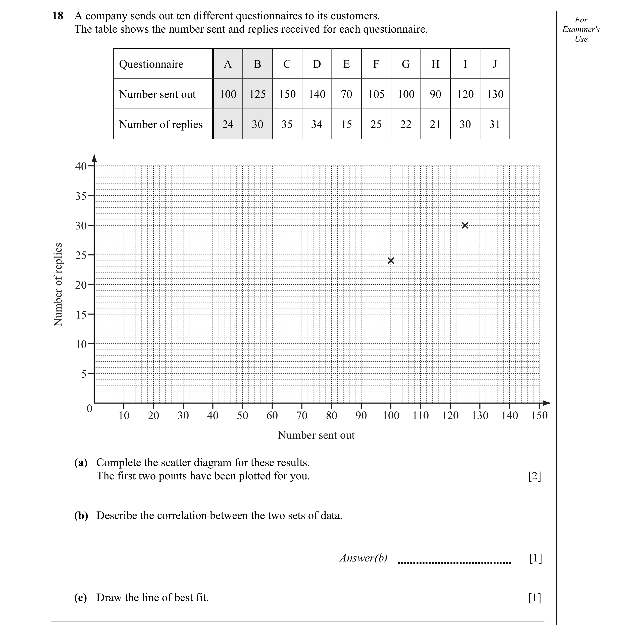
Q5 · A company sends out ten different questionnaires to its customers 0580/12 Oct/Nov 2012
18 A company sends out ten different questionnaires to its customers. For The table shows the number sent and replies received for each questionnaire. Examiner's Use Questionnaire A B C D E F G H I J Number sent out 100 125 150 140 70 105 100 90 120 130 Number of replies 24 30 35 34 15 25 22 21 30 31 40 35 30 25replies of 20 15Number 10 5 0 10 20 30 40 50 60 70 80 90 100 110 120 130 140 150 Number sent out (a) Complete the scatter diagram for these results. The first two points have been plotted for you. [2] (b) Describe the correlation between the two sets of data. Answer(b) [1] (c) Draw the line of best fit. [1]
4 marks
Mark scheme: 18 (a) Points plotted correctly 2 B1 6 or 7 points correct (b) Positive 1 (c) Line of best fit ruled 1 √
This question in 0580/12 Oct/Nov 2012
Q6 · On the fi rst day of each month, a café owner records the midday temperature (°C) and the… 0580/13 May/June 2013
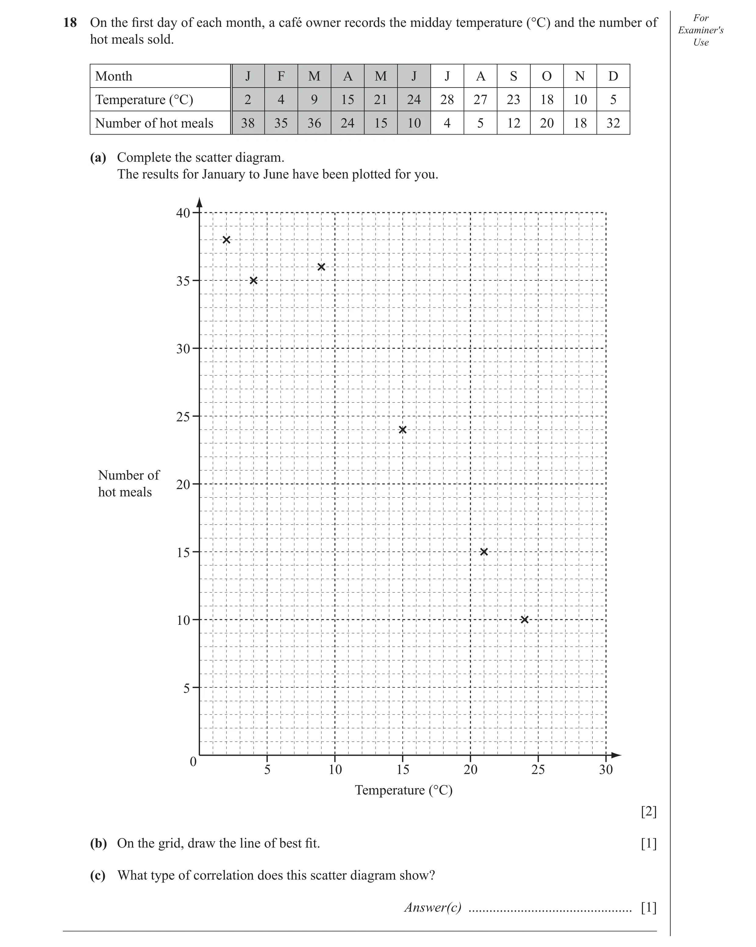
18 On the fi rst day of each month, a café owner records the midday temperature (°C) and the number of For Examiner′s hot meals sold. Use Month J F M A M J J A S O N D Temperature (°C) 2 4 9 15 21 24 28 27 23 18 10 5 Number of hot meals 38 35 36 24 15 10 4 5 12 20 18 32 (a) Complete the scatter diagram. The results for January to June have been plotted for you. 40 35 30 25 Number of 20 hot meals 15 10 5 0 5 10 15 20 25 30 Temperature (°C) [2] (b) On the grid, draw the line of best fi t. [1] (c) What type of correlation does this scatter diagram show? Answer(c) … [1] _____________________________________________________________________________________
4 marks
Mark scheme: 18 (a) 6 points correctly plotted 2 B1 for 4 or 5 correct (b) Correct ruled line of best fit. 1 (c) Negative 1
This question in 0580/13 May/June 2013
Q7 · The scatter diagram shows the rainfall and the average temperature in a city for the… 0580/11 May/June 2014
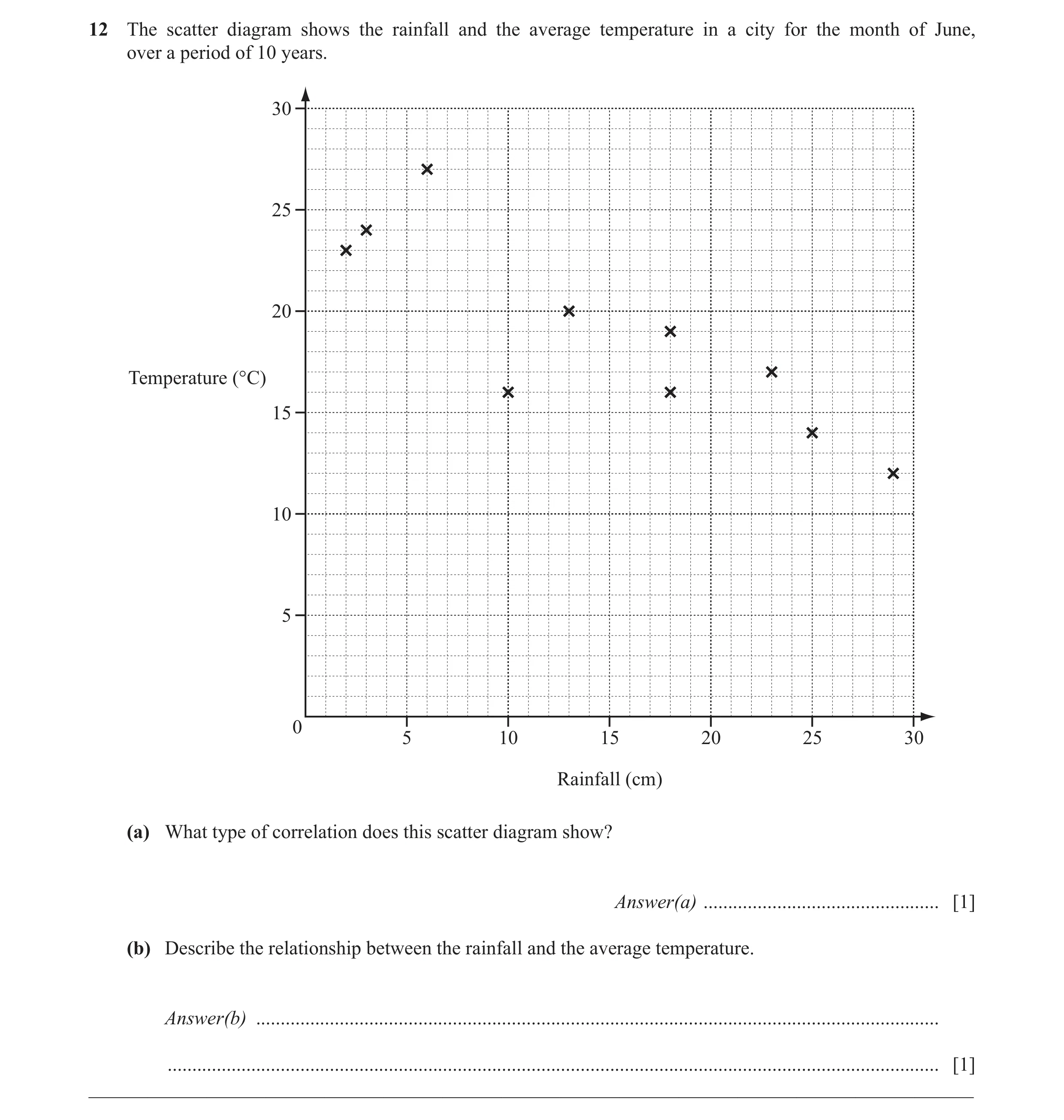
12 The scatter diagram shows the rainfall and the average temperature in a city for the month of June, over a period of 10 years. 30 25 20 Temperature (°C) 15 10 5 0 5 10 15 20 25 30 Rainfall (cm) (a) What type of correlation does this scatter diagram show? Answer(a) … [1] (b) Describe the relationship between the rainfall and the average temperature. Answer(b) … … [1] __________________________________________________________________________________________
2 marks
Mark scheme: 12 (a) Negative 1 (b) More rain [suggests] lower temperature oe 1
This question in 0580/11 May/June 2014
Q8 · The scatter diagram shows the results of height plotted against shoe size for 8 people 0580/12 Oct/Nov 2014
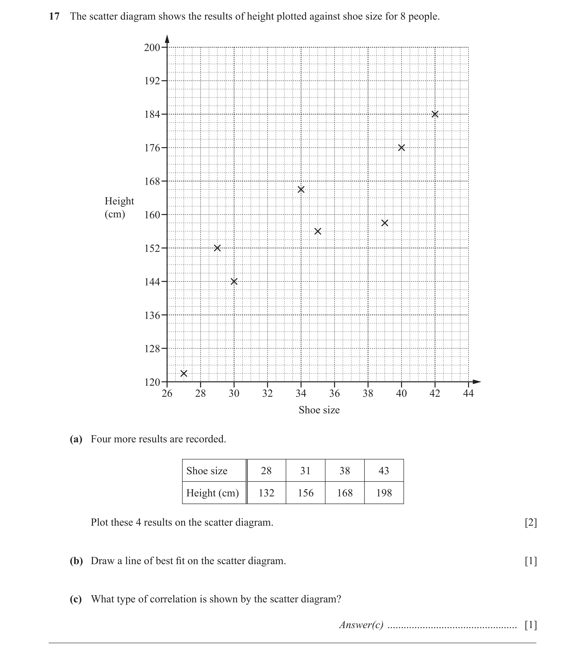
17 The scatter diagram shows the results of height plotted against shoe size for 8 people. 200 192 184 176 168 Height (cm) 160 152 144 136 128 120 26 28 30 32 34 36 38 40 42 44 Shoe size (a) Four more results are recorded. Shoe size 28 31 38 43 Height (cm) 132 156 168 198 Plot these 4 results on the scatter diagram. [2] (b) Draw a line of best fi t on the scatter diagram. [1] (c) What type of correlation is shown by the scatter diagram? Answer(c) … [1] __________________________________________________________________________________________
4 marks
Mark scheme: 17 (a) 4 points correctly plotted 2 B1 for 3 correct (b) Correct ruled line of best fit 1 (c) Positive 1
This question in 0580/12 Oct/Nov 2014
Q9 · The scatter diagram shows the heights and masses of some fi ve-year-old boys 0580/13 Oct/Nov 2014
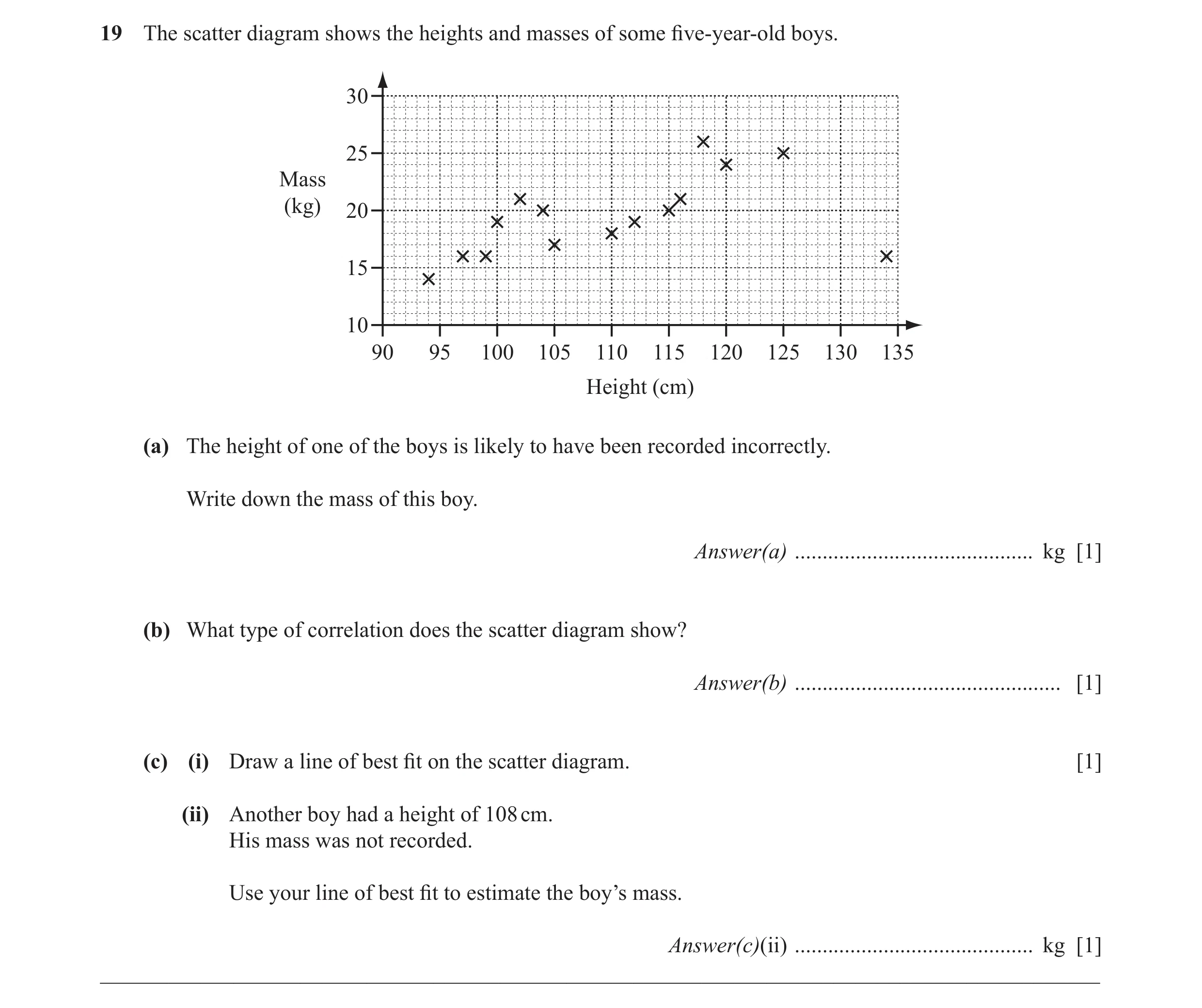
19 The scatter diagram shows the heights and masses of some fi ve-year-old boys. 30 25 Mass (kg) 20 15 10 90 95 100 105 110 115 120 125 130 135 Height (cm) (a) The height of one of the boys is likely to have been recorded incorrectly. Write down the mass of this boy. Answer(a) … kg [1] (b) What type of correlation does the scatter diagram show? Answer(b) … [1] (c) (i) Draw a line of best fi t on the scatter diagram. [1] (ii) Another boy had a height of 108 cm. His mass was not recorded. Use your line of best fi t to estimate the boy’s mass. Answer(c)(ii) … kg [1] __________________________________________________________________________________________
4 marks
Mark scheme: 19 (a) 16 [kg] 1 (b) Positive 1 (c) (i) Ruled line of best fit 1 (ii) Correct reading from ruled line 1FT
This question in 0580/13 Oct/Nov 2014
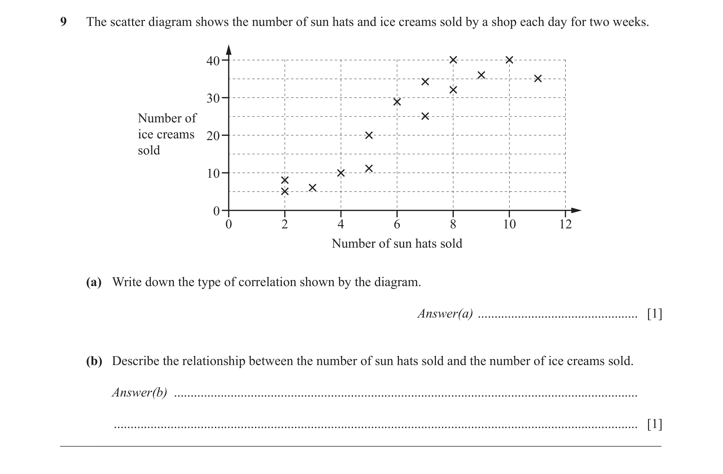
Q10 · The scatter diagram shows the number of sun hats and ice creams sold by a shop each day… 0580/11 May/June 2015
9 The scatter diagram shows the number of sun hats and ice creams sold by a shop each day for two weeks. 40 30 Number of ice creams 20 sold 10 0 0 2 4 6 8 10 12 Number of sun hats sold (a) Write down the type of correlation shown by the diagram. Answer(a) … [1] (b) Describe the relationship between the number of sun hats sold and the number of ice creams sold. Answer(b) … … [1] __________________________________________________________________________________________
2 marks
Mark scheme: 9 (a) positive 1 (b) More ice creams sold, 1 more sun hats sold oe
This question in 0580/11 May/June 2015
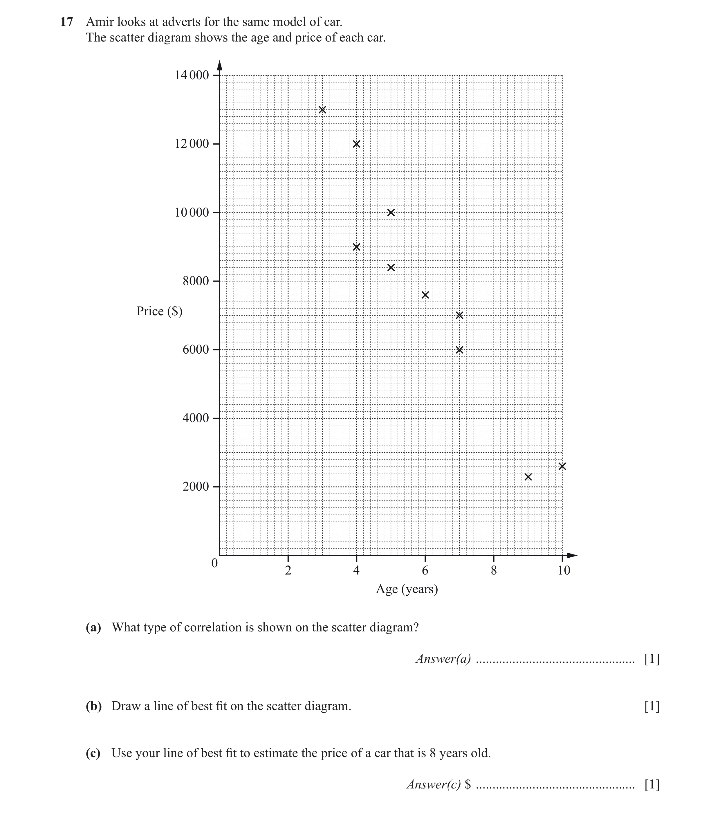
Q11 · Amir looks at adverts for the same model of car 0580/11 Oct/Nov 2015
17 Amir looks at adverts for the same model of car. The scatter diagram shows the age and price of each car. 14 000 12 000 10 000 8000 Price ($) 6000 4000 2000 0 2 4 6 8 10 Age (years) (a) What type of correlation is shown on the scatter diagram? Answer(a) … [1] (b) Draw a line of best fit on the scatter diagram. [1] (c) Use your line of best fit to estimate the price of a car that is 8 years old. Answer(c) $ … [1] __________________________________________________________________________________________
3 marks
Mark scheme: 17 (a) Negative 1 (b) Single ruled line of best fit 1 (c) 4000 to 5100 1 FT a single ruled line of negative gradient 2
This question in 0580/11 Oct/Nov 2015
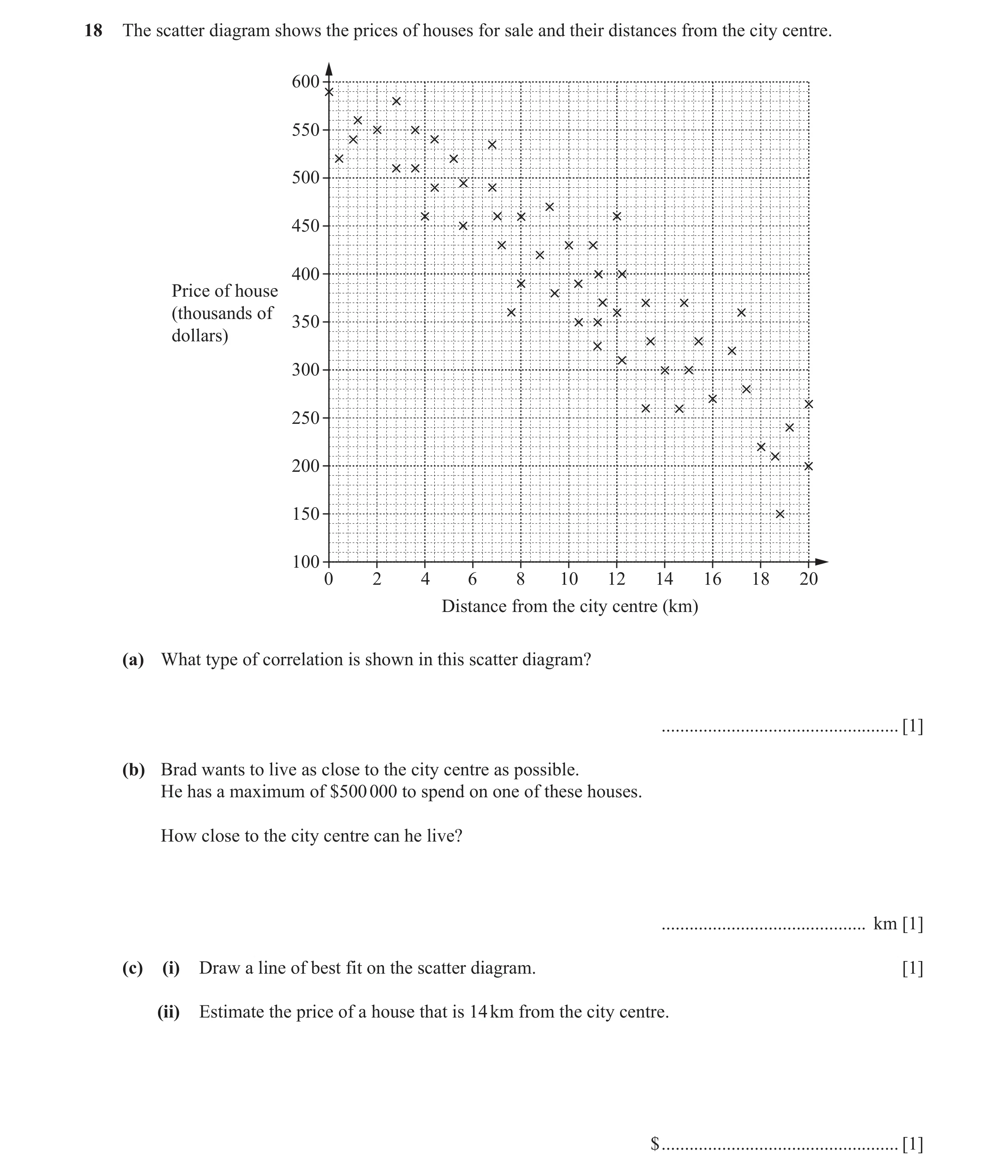
Q12 · The scatter diagram shows the prices of houses for sale and their distances from the city… 0580/11 May/June 2016
18 The scatter diagram shows the prices of houses for sale and their distances from the city centre. 600 550 500 450 400 Price of house (thousands of 350 dollars) 300 250 200 150 100 0 2 4 6 8 10 12 14 16 18 20 Distance from the city centre (km) (a) What type of correlation is shown in this scatter diagram? … [1] (b) Brad wants to live as close to the city centre as possible. He has a maximum of $500 000 to spend on one of these houses. How close to the city centre can he live? … km [1] (c) (i) Draw a line of best fit on the scatter diagram. [1] (ii) Estimate the price of a house that is 14 km from the city centre. $ … [1]
4 marks
Mark scheme: 18 (a) Negative 1 (b) 4 1 (c) (i) Ruled line of best fit 1 (ii) 250 000 to 380 000 1
This question in 0580/11 May/June 2016
Q13 · What type of correlation is shown by the scatter diagram? 0580/13 May/June 2016
4 What type of correlation is shown by the scatter diagram? … [1]
1 marks
Mark scheme: 4 Negative 1
This question in 0580/13 May/June 2016
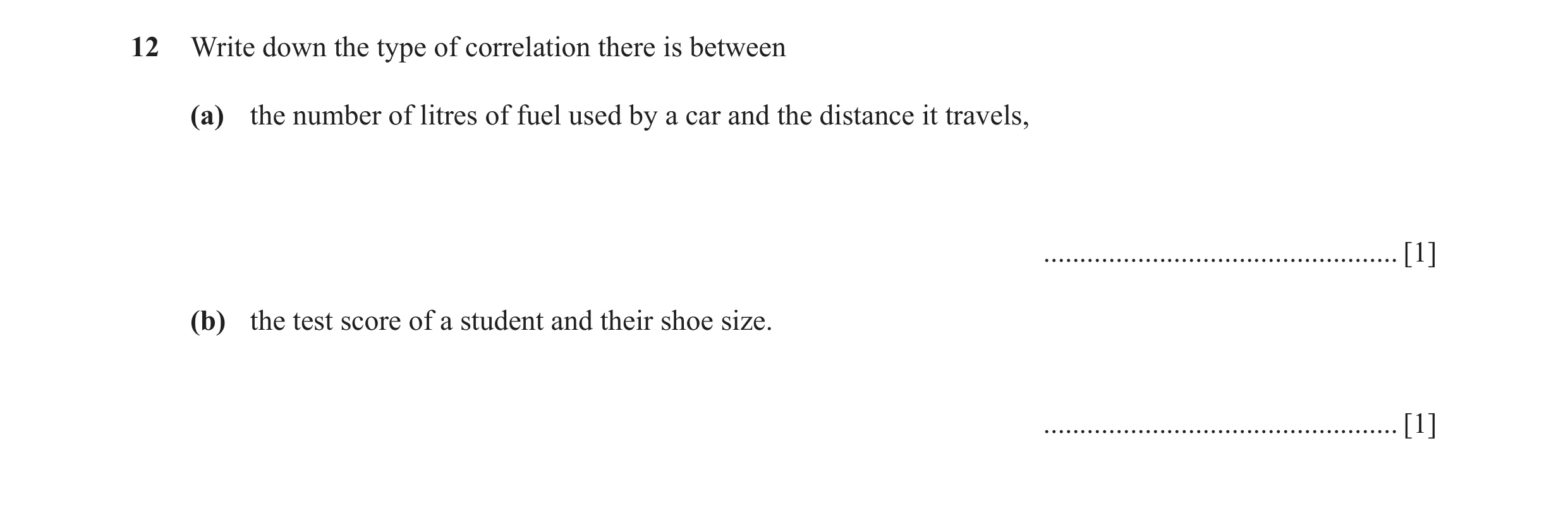
Q14 · Write down the type of correlation there is between (a) the number of litres of fuel used… 0580/11 Oct/Nov 2016
12 Write down the type of correlation there is between (a) the number of litres of fuel used by a car and the distance it travels, … [1] (b) the test score of a student and their shoe size. … [1]
2 marks
Mark scheme: 12 (a) Positive 1 (b) Zero oe 1
This question in 0580/11 Oct/Nov 2016
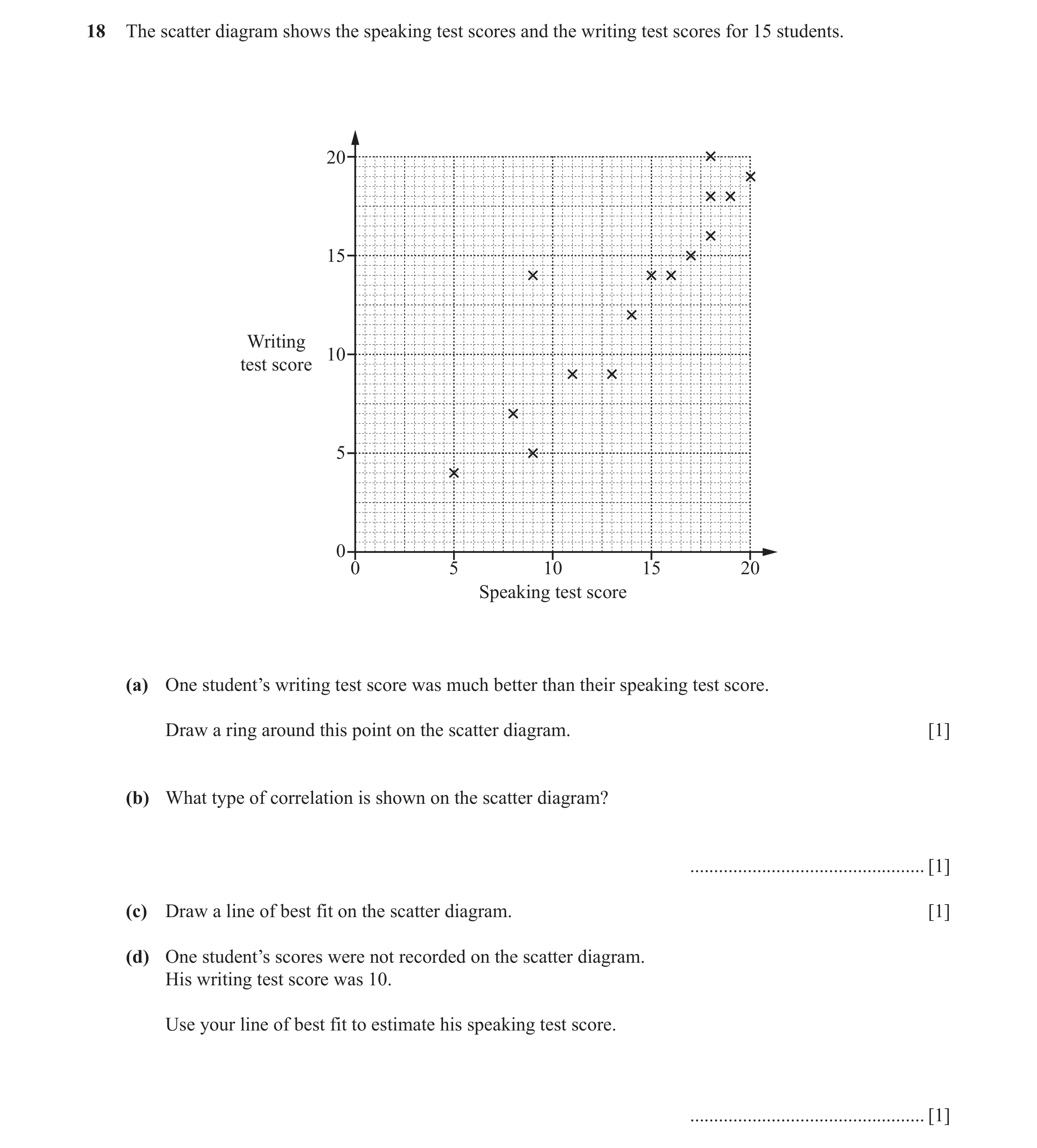
Q15 · The scatter diagram shows the speaking test scores and the writing test scores for 15… 0580/12 Oct/Nov 2016
18 The scatter diagram shows the speaking test scores and the writing test scores for 15 students. 20 15 Writing 10 test score 5 0 0 5 10 15 20 Speaking test score (a) One student’s writing test score was much better than their speaking test score. Draw a ring around this point on the scatter diagram. [1] (b) What type of correlation is shown on the scatter diagram? … [1] (c) Draw a line of best fit on the scatter diagram. [1] (d) One student’s scores were not recorded on the scatter diagram. His writing test score was 10. Use your line of best fit to estimate his speaking test score. … [1]
4 marks
Mark scheme: 18 (a) (9, 14) identified 1 (b) Positive 1 (c) Ruled line of best fit 1 (d) Speaking test score 1FT Strict FT their straight line of best fit
This question in 0580/12 Oct/Nov 2016
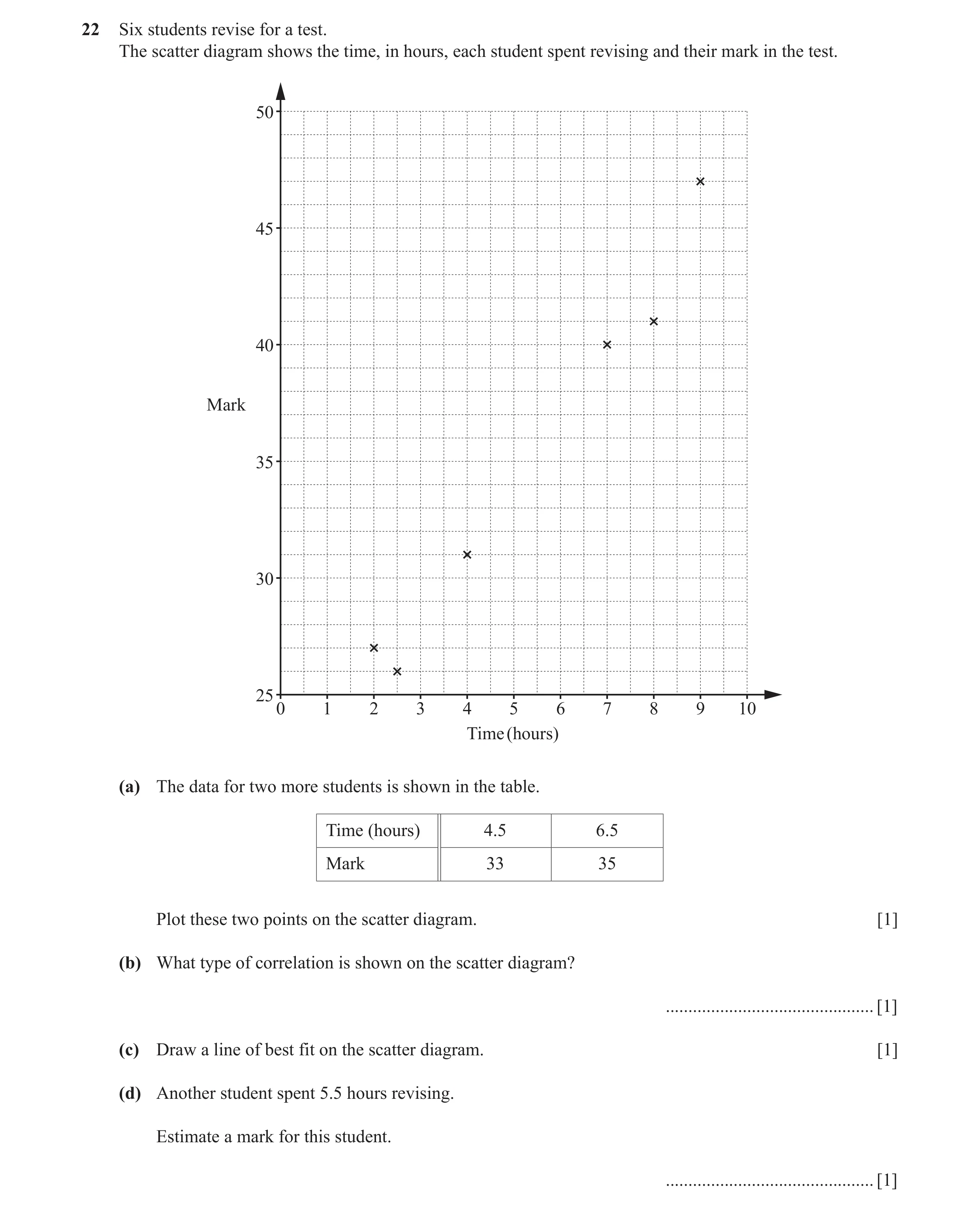
Q16 · Six students revise for a test 0580/11 May/June 2017
22 Six students revise for a test. The scatter diagram shows the time, in hours, each student spent revising and their mark in the test. 50 45 40 Mark 35 30 25 0 1 2 3 4 5 6 7 8 9 10 Time (hours) (a) The data for two more students is shown in the table. Time (hours) 4.5 6.5 Mark 33 35 Plot these two points on the scatter diagram. [1] (b) What type of correlation is shown on the scatter diagram? … [1] (c) Draw a line of best fit on the scatter diagram. [1] (d) Another student spent 5.5 hours revising. Estimate a mark for this student. … [1]
4 marks
Mark scheme: 22(a) Points plotted at 1 (4.5, 33) and (6.5, 35) 22(b) Positive 1 22(c) Correct ruled line 1 22(d) 33.5 to 37.5 1FT FT from their line provided positive gradient
This question in 0580/11 May/June 2017
Q17 · A café owner records the number of hours of sunshine and the number of ice-creams sold… 0580/13 May/June 2017
19 A café owner records the number of hours of sunshine and the number of ice-creams sold for 10 days. The results are shown in the table. Day 1 2 3 4 5 6 7 8 9 10 Hours of 12 0 3 6.5 6 4.5 4 8 10 5 sunshine Number of 150 5 35 86 72 56 38 120 127 74 ice-creams sold 160 140 120 100 Number of ice-creams 80 sold 60 40 20 0 2 4 6 8 10 12 14 16 Hours of sunshine (a) Complete the scatter diagram. The first 8 points have been plotted for you. [1] (b) What type of correlation is shown on the scatter diagram? … [1] (c) On the scatter diagram, draw a line of best fit. [1] (d) The weather forecast predicts 7 hours of sunshine for tomorrow. Use your line of best fit to estimate the number of ice-creams that will be sold tomorrow. … [1]
4 marks
Mark scheme: 19(a) 2 points correctly plotted 1 19(b) positive 1 19(c) ruled line of best fit 1 19(d) 80 to 92 1
This question in 0580/13 May/June 2017
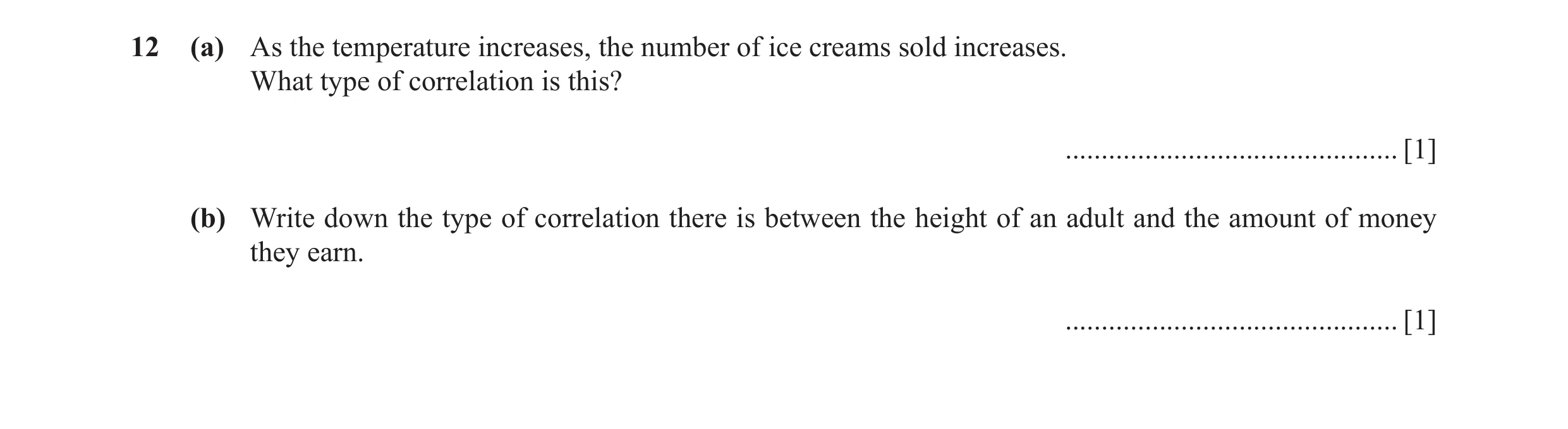
Q18 · As the temperature increases, the number of ice creams sold increases 0580/12 Oct/Nov 2017
12 (a) As the temperature increases, the number of ice creams sold increases. What type of correlation is this? … [1] (b) Write down the type of correlation there is between the height of an adult and the amount of money they earn. … [1]
2 marks
Mark scheme: 12(a) Positive 1 12(b) No correlation oe 1
This question in 0580/12 Oct/Nov 2017
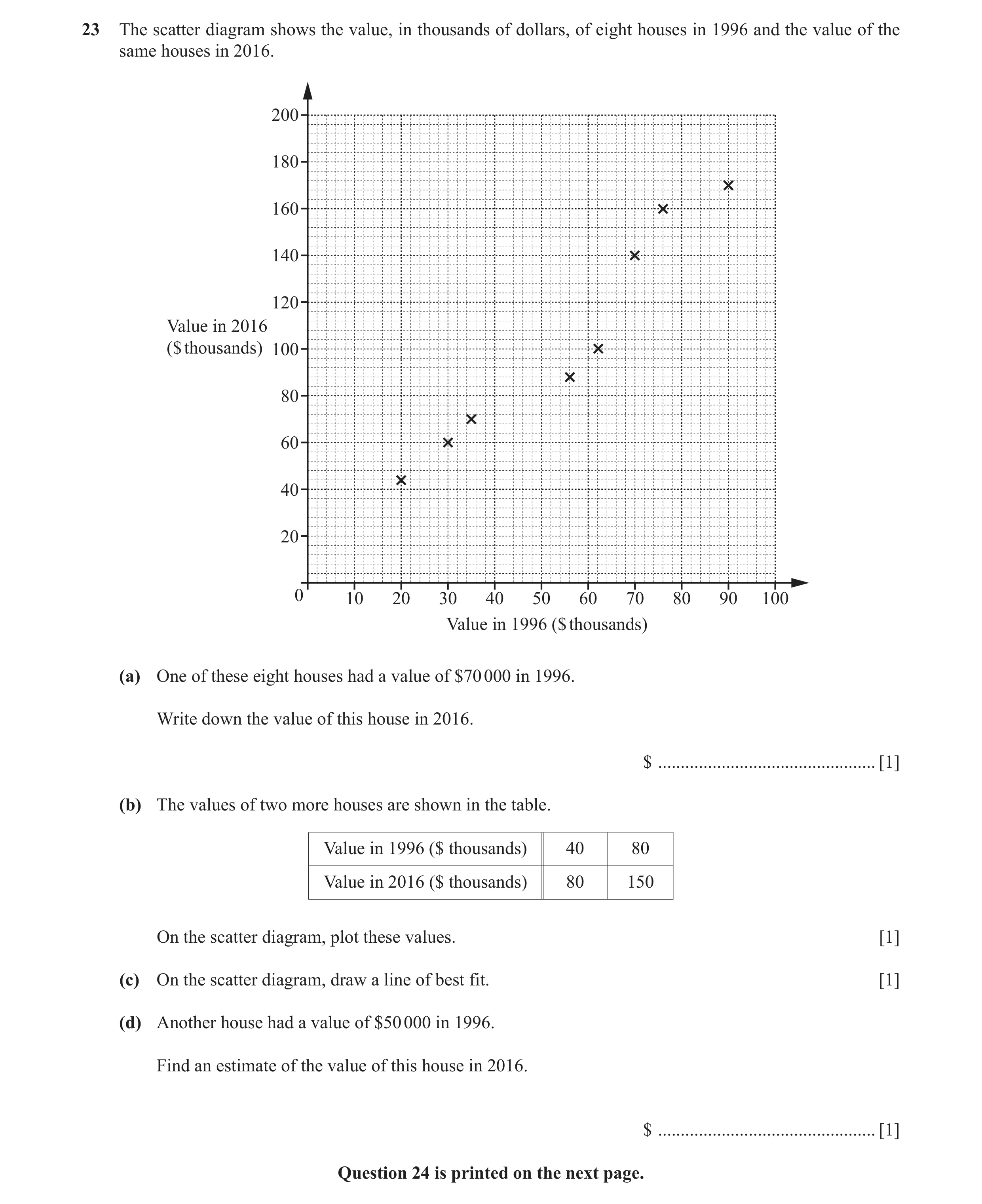
Q19 · The scatter diagram shows the value, in thousands of dollars, of eight houses in 1996 and… 0580/12 May/June 2018
23 The scatter diagram shows the value, in thousands of dollars, of eight houses in 1996 and the value of the same houses in 2016. 200 180 160 140 120 Value in 2016 ($ thousands) 100 80 60 40 20 0 10 20 30 40 50 60 70 80 90 100 Value in 1996 ($ thousands) (a) One of these eight houses had a value of $70 000 in 1996. Write down the value of this house in 2016. $ … [1] (b) The values of two more houses are shown in the table. Value in 1996 ($ thousands) 40 80 Value in 2016 ($ thousands) 80 150 On the scatter diagram, plot these values. [1] (c) On the scatter diagram, draw a line of best fit. [1] (d) Another house had a value of $50 000 in 1996. Find an estimate of the value of this house in 2016. $ … [1] Question 24 is printed on the next page.
4 marks
Mark scheme: 23(a) 140 000 1 23(b) Points correctly plotted at 1 (40, 80) and (80, 150) 23(c) Correct ruled line of best fit 1 23(d) 80 000 to 110 000 1 FT their straight line provided it has positive gradient
This question in 0580/12 May/June 2018
Q20 · A teacher gives her Spanish students a test each week 0580/11 Oct/Nov 2018
17 A teacher gives her Spanish students a test each week. Some of the students’ marks for two weeks are shown in the scatter diagram. 40 35 30 25 Mark in week 2 20 15 10 5 0 0 5 10 15 20 25 30 35 40 Mark in week 1 (a) Leo scored 28 marks in week 1 and 30 marks in week 2. On the scatter diagram, plot a point to show Leo’s marks. [1] (b) On the scatter diagram, draw a line of best fit. [1] (c) Sonia scored 20 marks in week 1 but was absent in week 2. Use your line of best fit to estimate a mark for Sonia in week 2. … [1]
3 marks
Mark scheme: 17(a) Point (28 , 30) marked 1 17(b) Ruled line of best fit 1 17(c) 22 to 26 1 FT their ruled line of best fit with positive gradient
This question in 0580/11 Oct/Nov 2018
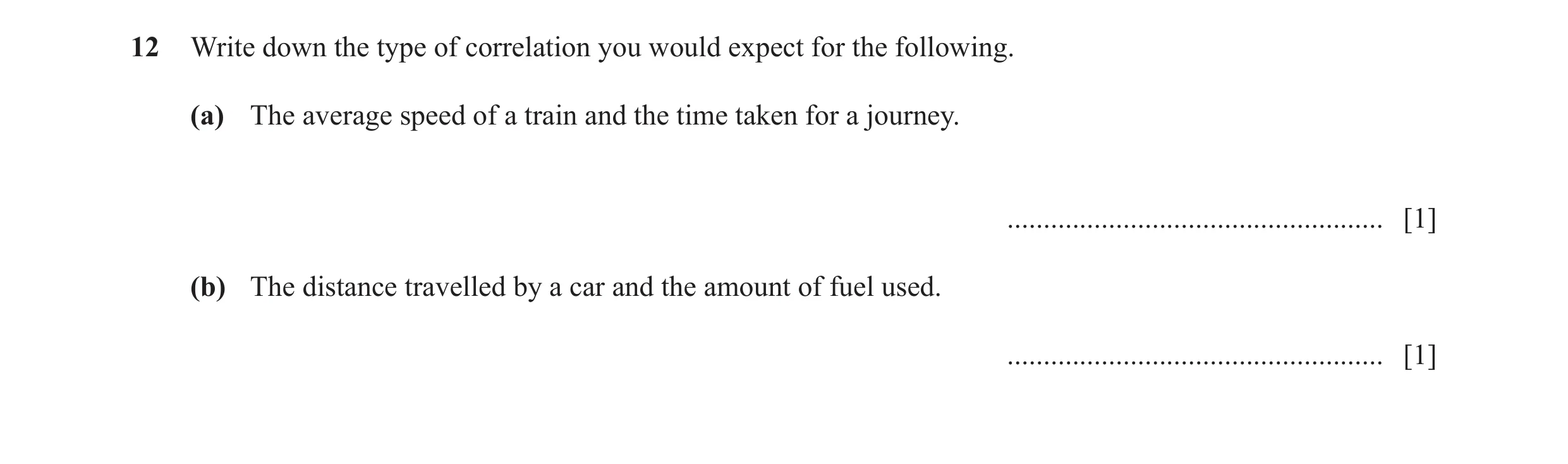
Q21 · Write down the type of correlation you would expect for the following 0580/13 May/June 2019
12 Write down the type of correlation you would expect for the following. (a) The average speed of a train and the time taken for a journey. … [1] (b) The distance travelled by a car and the amount of fuel used. … [1]
2 marks
Mark scheme: 12(a) Negative 1 12(b) Positive 1
This question in 0580/13 May/June 2019
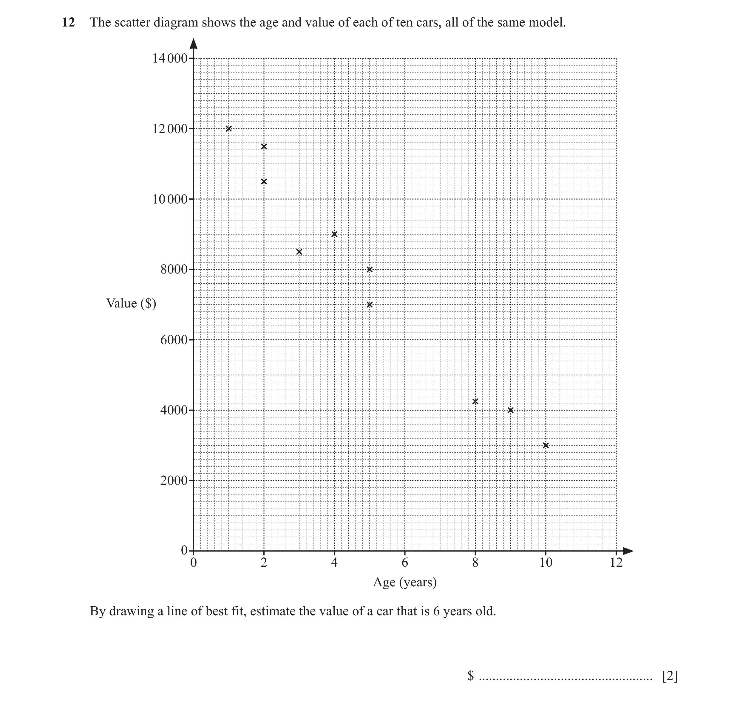
Q22 · The scatter diagram shows the age and value of each of ten cars, all of the same model 0580/12 Oct/Nov 2019
12 The scatter diagram shows the age and value of each of ten cars, all of the same model. 14 000 12 000 10 000 8000 Value ($) 6000 4000 2000 0 0 2 4 6 8 10 12 Age (years) By drawing a line of best fit, estimate the value of a car that is 6 years old. $ … [2]
2 marks
Mark scheme: 12 Ruled line of best fit B1 6400 to 7400 B1 FT their straight line of best fit with negative gradient if answer is not in range
This question in 0580/12 Oct/Nov 2019
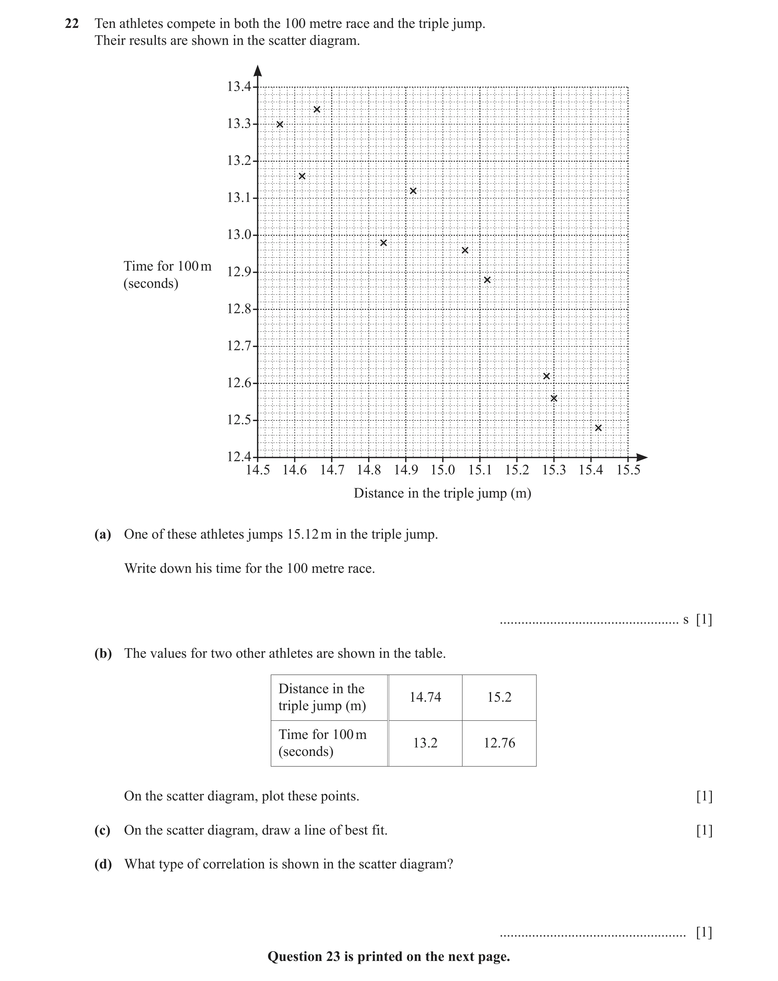
Q23 · Ten athletes compete in both the 100 metre race and the triple jump 0580/13 Oct/Nov 2019
22 Ten athletes compete in both the 100 metre race and the triple jump. Their results are shown in the scatter diagram. 13.4 13.3 13.2 13.1 13.0 Time for 100 m 12.9 (seconds) 12.8 12.7 12.6 12.5 12.4 14.5 14.6 14.7 14.8 14.9 15.0 15.1 15.2 15.3 15.4 15.5 Distance in the triple jump (m) (a) One of these athletes jumps 15.12 m in the triple jump. Write down his time for the 100 metre race. … s [1] (b) The values for two other athletes are shown in the table. Distance in the 14.74 15.2 triple jump (m) Time for 100 m 13.2 12.76 (seconds) On the scatter diagram, plot these points. [1] (c) On the scatter diagram, draw a line of best fit. [1] (d) What type of correlation is shown in the scatter diagram? … [1] Question 23 is printed on the next page.
4 marks
Mark scheme: 22(a) 12.88 1 22(b) two correct points plotted 1 22 (c) ruled line of best fit 1 22(d) negative 1
This question in 0580/13 Oct/Nov 2019
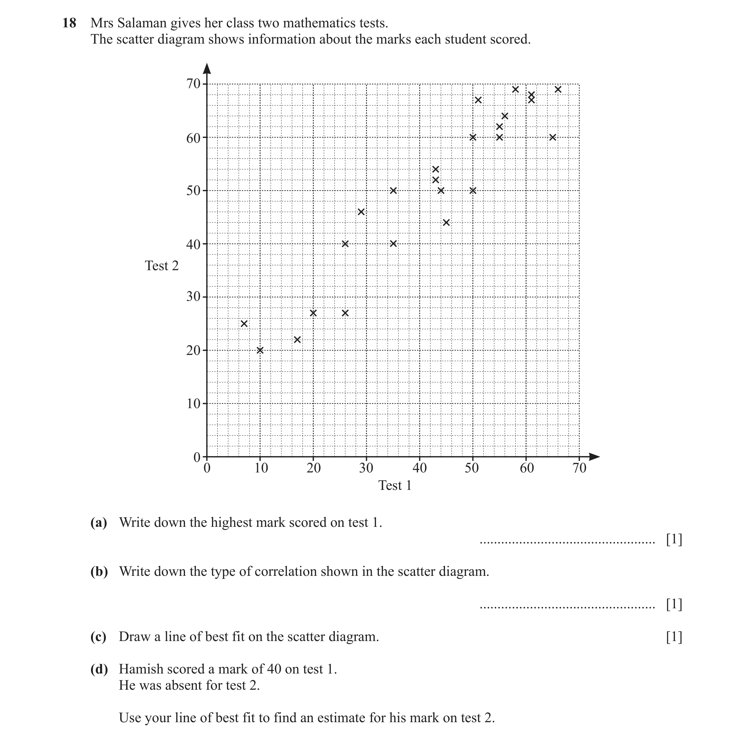
Q24 · Mrs Salaman gives her class two mathematics tests 0580/11 May/June 2020
18 Mrs Salaman gives her class two mathematics tests. The scatter diagram shows information about the marks each student scored. 70 60 50 40 Test 2 30 20 10 0 0 10 20 30 40 50 60 70 Test 1 (a) Write down the highest mark scored on test 1. … [1] (b) Write down the type of correlation shown in the scatter diagram. … [1] (c) Draw a line of best fit on the scatter diagram. [1] (d) Hamish scored a mark of 40 on test 1. He was absent for test 2. Use your line of best fit to find an estimate for his mark on test 2.
4 marks
Mark scheme: 18(a) 66 1 18(b) Positive 1 18(c) Ruled line of best fit 1 18(d) 46 to 50 1 FT their line of best fit if a positive gradient 2 B1 for each 19 29.65 29.75 If 0 scored, SC1 for both correct but reversed
This question in 0580/11 May/June 2020
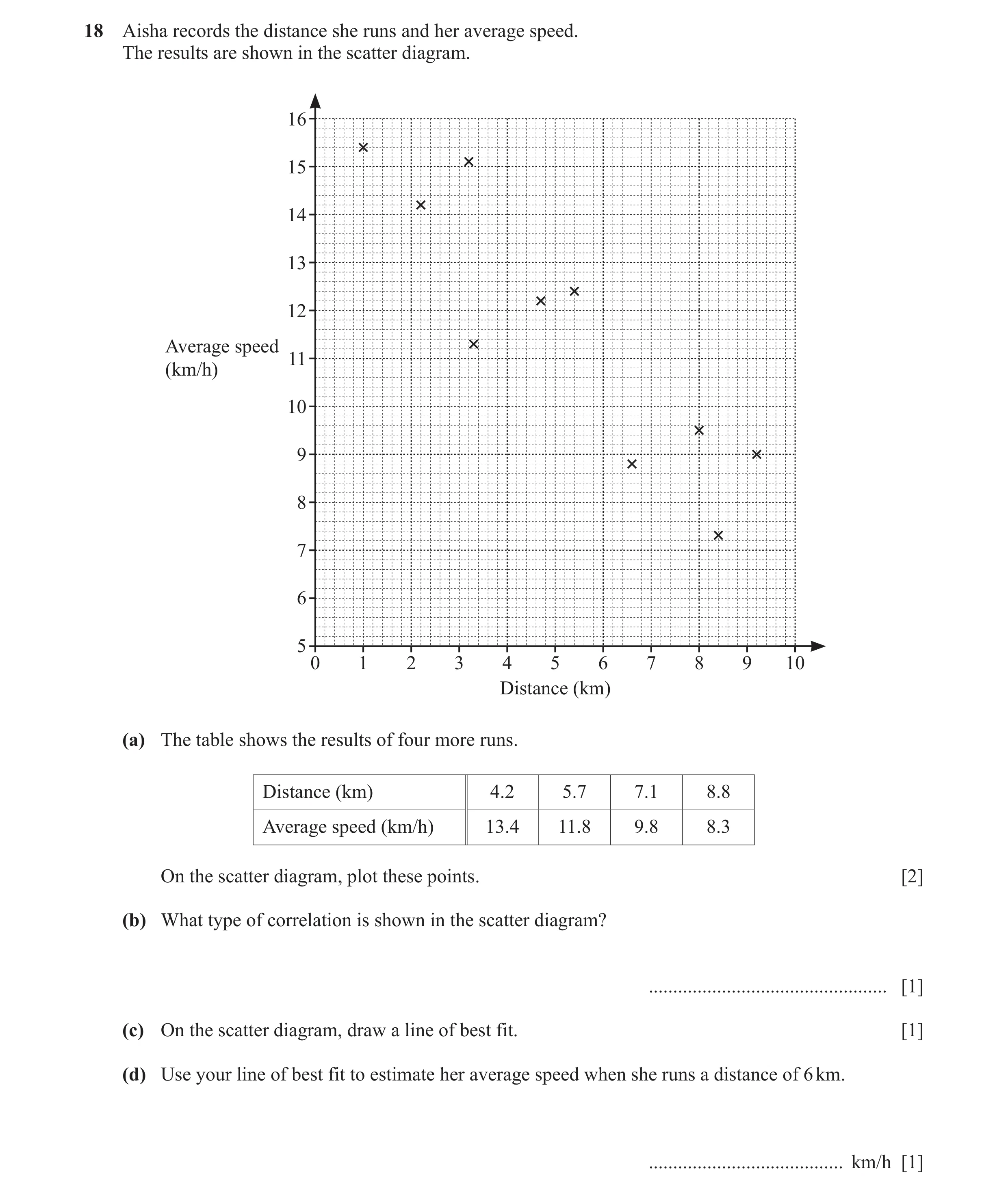
Q25 · Aisha records the distance she runs and her average speed 0580/11 Oct/Nov 2020
18 Aisha records the distance she runs and her average speed. The results are shown in the scatter diagram. 16 15 14 13 12 Average speed 11 (km/h) 10 9 8 7 6 5 0 1 2 3 4 5 6 7 8 9 10 Distance (km) (a) The table shows the results of four more runs. Distance (km) 4.2 5.7 7.1 8.8 Average speed (km/h) 13.4 11.8 9.8 8.3 On the scatter diagram, plot these points. [2] (b) What type of correlation is shown in the scatter diagram? … [1] (c) On the scatter diagram, draw a line of best fit. [1] (d) Use your line of best fit to estimate her average speed when she runs a distance of 6 km. … km/h [1]
5 marks
Mark scheme: 18(a) 4 points correctly plotted 2 B1 for 2 or 3 points correctly plotted 18(b) Negative 1 18(c) Correct ruled line of best fit 1 18(d) 10 to 12 1 FT their straight line of best fit
This question in 0580/11 Oct/Nov 2020
Q26 · Henrik draws this scatter diagram 0580/12 May/June 2021
15 (a) Henrik draws this scatter diagram. Put a ring around the one correct statement about this scatter diagram. It shows It is not possible to tell if It shows negative It shows positive no correlation. there is correlation as there correlation. correlation. are not enough points. [1] (b) Each of the four scatter diagrams shows the same set of data. A line has been drawn on each diagram. Diagram A Diagram B Diagram C Diagram D Complete the statement. The line in Diagram … is the most appropriate line of best fit. [1]
2 marks
Mark scheme: 15(a) It is not possible to tell if there is 1 correlation as there are not enough points 15(b) C 1
This question in 0580/12 May/June 2021
Q27 · As the temperature increases, people eat more ice cream 0580/12 Feb/March 2022
16 As the temperature increases, people eat more ice cream. What type of correlation does this statement describe? … [1]
1 marks
Mark scheme: 16 Positive 1
This question in 0580/12 Feb/March 2022
Q28 · The scatter diagram shows information about the time spent in a shop and the number of… 0580/13 May/June 2023
14 The scatter diagram shows information about the time spent in a shop and the number of items bought. 16 14 12 10 Number of items 8 bought 6 4 2 0 0 10 20 30 40 50 60 70 80 Time (min) (a) What type of correlation is shown on the scatter diagram? … [1] (b) Describe the relationship between the time spent in the shop and the number of items bought. … … [1] (c) Draw a line of best fit on the scatter diagram. [1]
3 marks
Mark scheme: 14(a) Positive 1 14(b) Correct description e.g. The longer 1 people spend in the shop the more items they buy 14(c) Correct ruled line 1
This question in 0580/13 May/June 2023
Q29 · As the age of a car increases, the selling price decreases 0580/12 Oct/Nov 2023
14 (a) As the age of a car increases, the selling price decreases. What type of correlation is this? … [1] (b) Write down the type of correlation there is between the height of a driver and the value of their car. … [1]
2 marks
Mark scheme: 14(a) Negative 1 14(b) No correlation 1
This question in 0580/12 Oct/Nov 2023
Q30 · Describe the type of correlation between the speed of runners and the time taken to… 0580/12 May/June 2024
15 Describe the type of correlation between the speed of runners and the time taken to complete a race. … [1]
1 marks
Mark scheme: 15 Negative 1
This question in 0580/12 May/June 2024
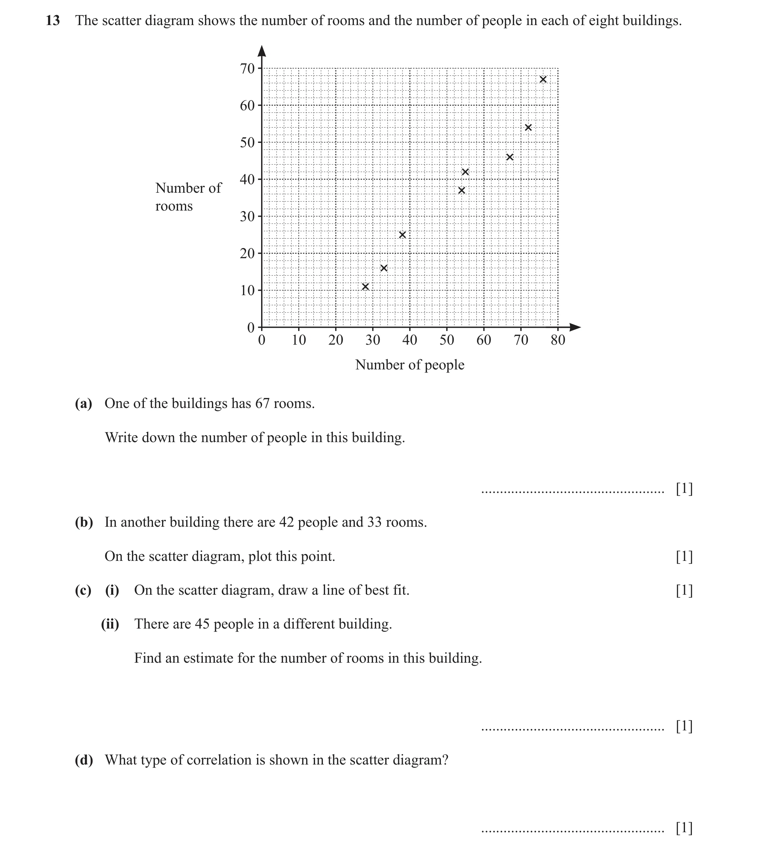
Q31 · The scatter diagram shows the number of rooms and the number of people in each of eight… 0580/12 Oct/Nov 2024
13 The scatter diagram shows the number of rooms and the number of people in each of eight buildings. 70 60 50 40 Number of rooms 30 20 10 0 0 10 20 30 40 50 60 70 80 Number of people (a) One of the buildings has 67 rooms. Write down the number of people in this building. … [1] (b) In another building there are 42 people and 33 rooms. On the scatter diagram, plot this point. [1] (c) (i) On the scatter diagram, draw a line of best fit. [1] (ii) There are 45 people in a different building. Find an estimate for the number of rooms in this building. … [1] (d) What type of correlation is shown in the scatter diagram? … [1]
5 marks
Mark scheme: 13(a) 76 1 13(b) Point correctly plotted at 1 (42, 33) 13(c)(i) Correct ruled line of best fit 1 13(c)(ii) 27 to 33 1 FT their line of best fit provided line shows positive correlation and answer is an integer. 13(d) positive 1
This question in 0580/12 Oct/Nov 2024
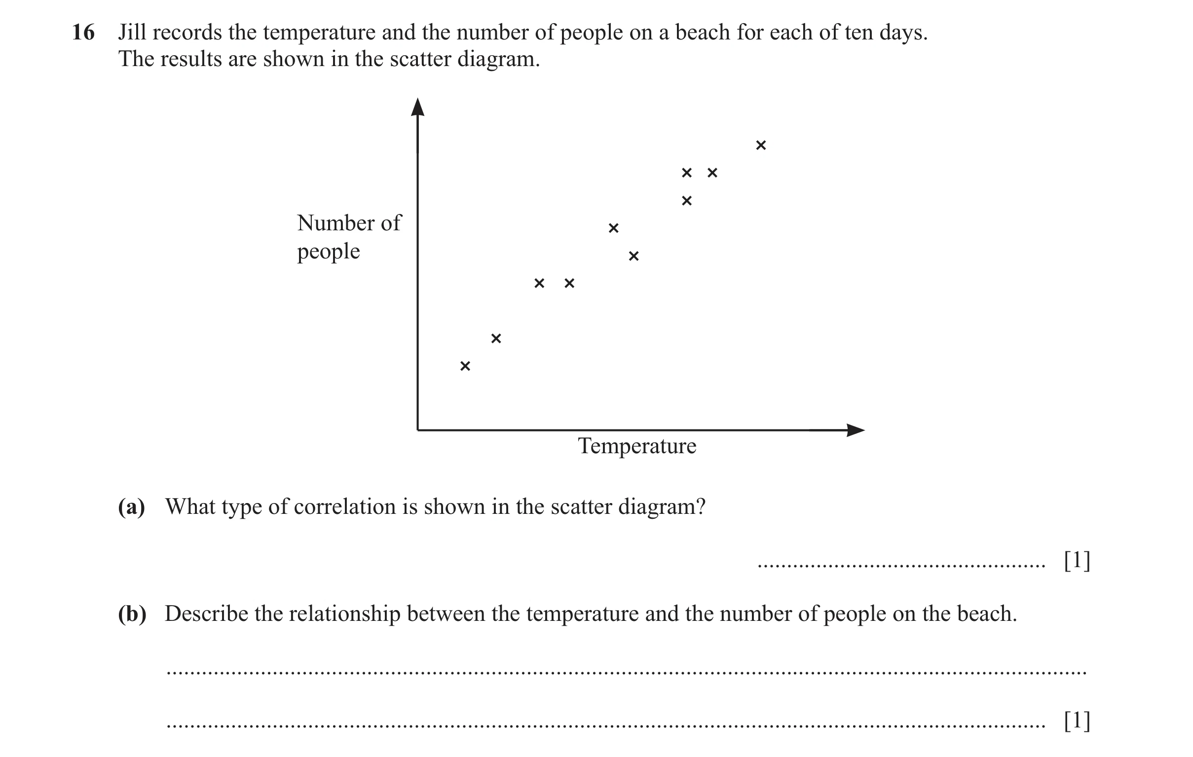
Q32 · Jill records the temperature and the number of people on a beach for each of ten days 0580/12 Feb/March 2025
16 Jill records the temperature and the number of people on a beach for each of ten days. The results are shown in the scatter diagram. Number of people Temperature (a) What type of correlation is shown in the scatter diagram? … [1] (b) Describe the relationship between the temperature and the number of people on the beach. … … [1]
2 marks
Mark scheme: 16(a) positive 1 16(b) the higher the temperature the higher 1 the number of people oe
This question in 0580/12 Feb/March 2025
![Question 1: Which word describes the correlation in the scatter graph below? positive negative none Answer [1]](https://img.pastlit.com/crops/1de5a75f-f1cc-453c-bf73-80412ef3629e/q3.webp) 1 / 26
1 / 26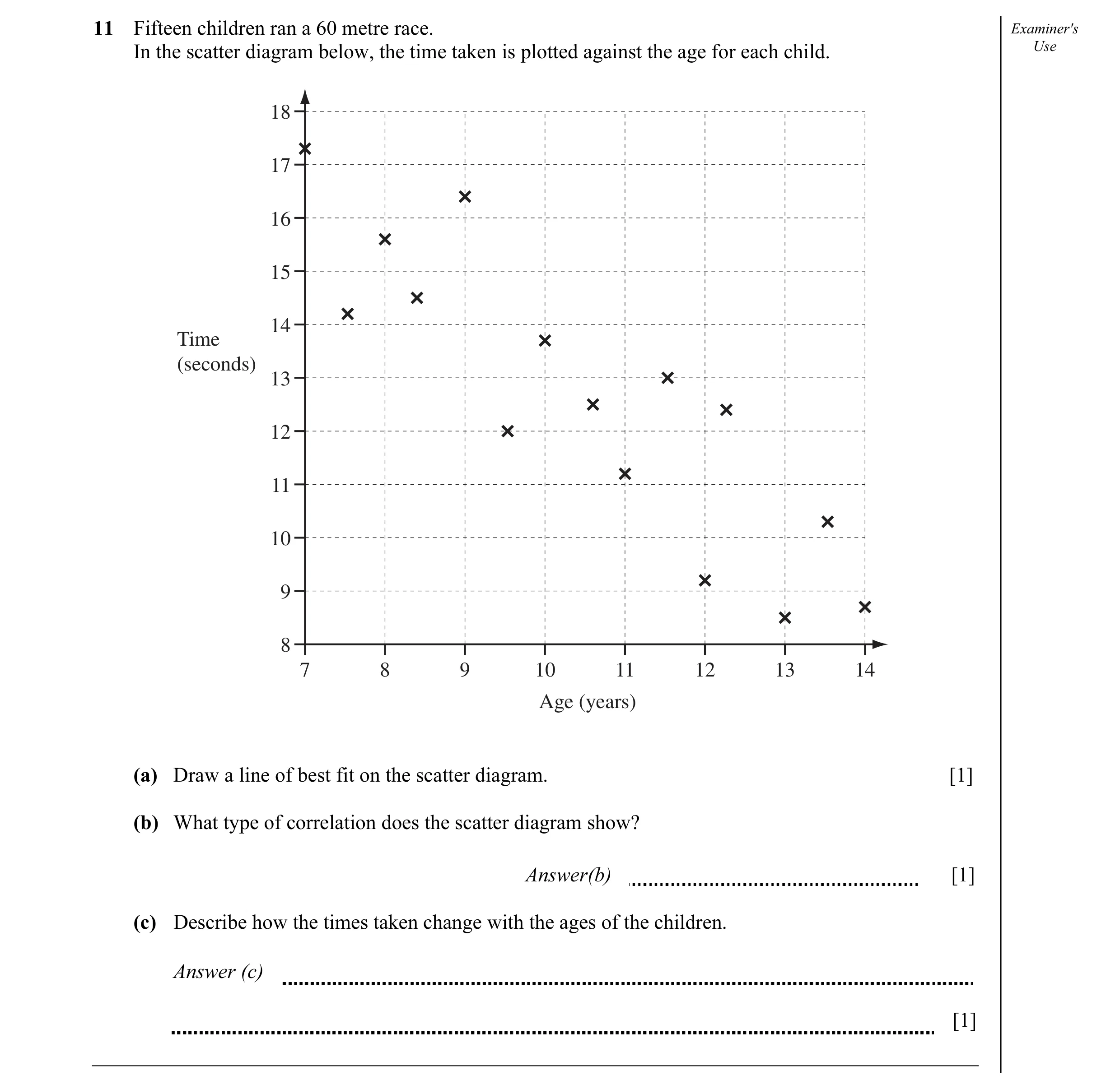 2 / 26
 3 / 26
 4 / 26
 5 / 26
 6 / 26
 7 / 26
 8 / 26
 9 / 26
 10 / 26
 11 / 26
 12 / 26
![Question 13: What type of correlation is shown by the scatter diagram? .................................................. [1]](https://img.pastlit.com/crops/21169036-4e1d-4ee8-bdff-d6a1824ab661/q4.webp)
 13 / 26
 14 / 26
 15 / 26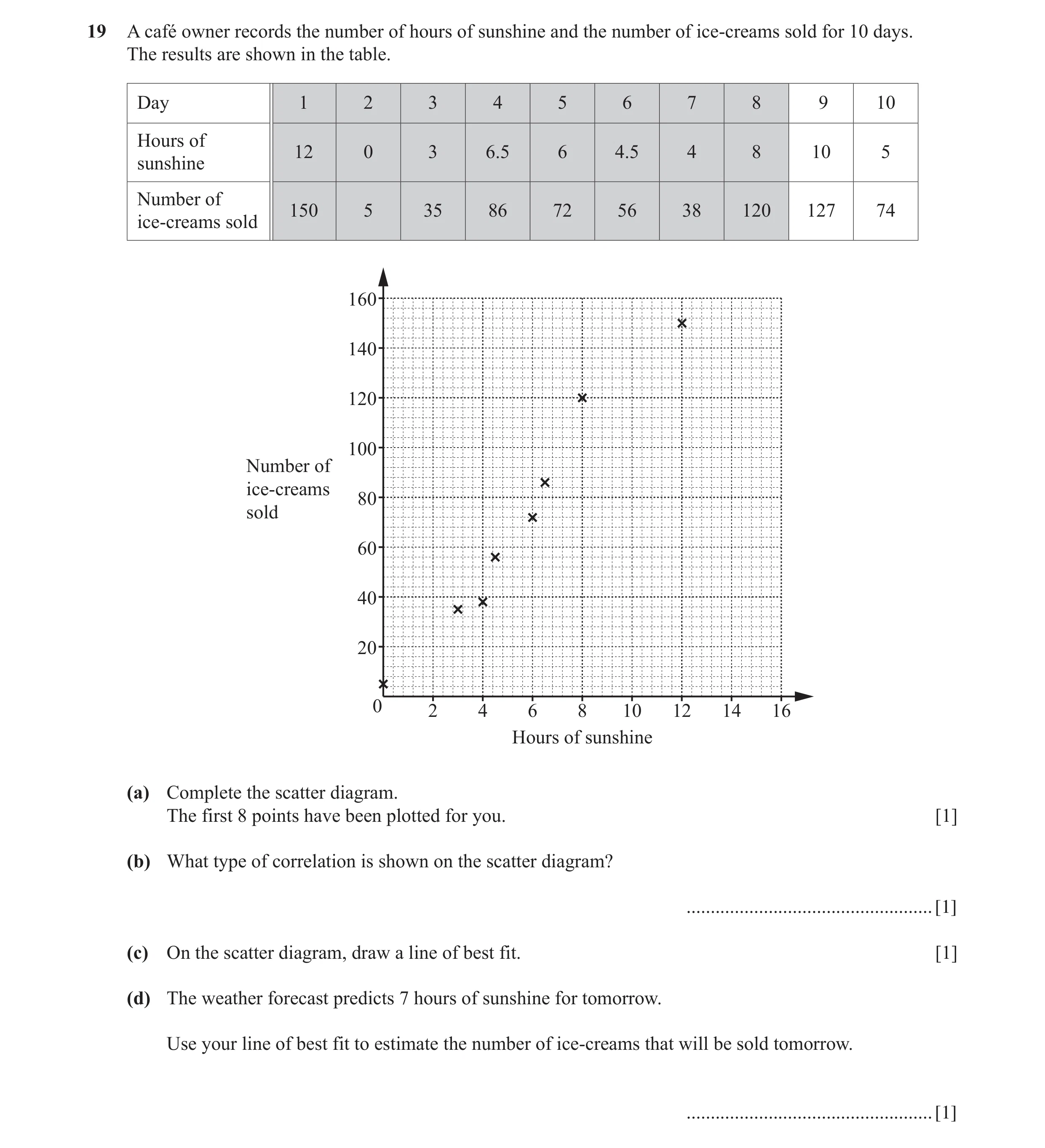
 16 / 26
 17 / 26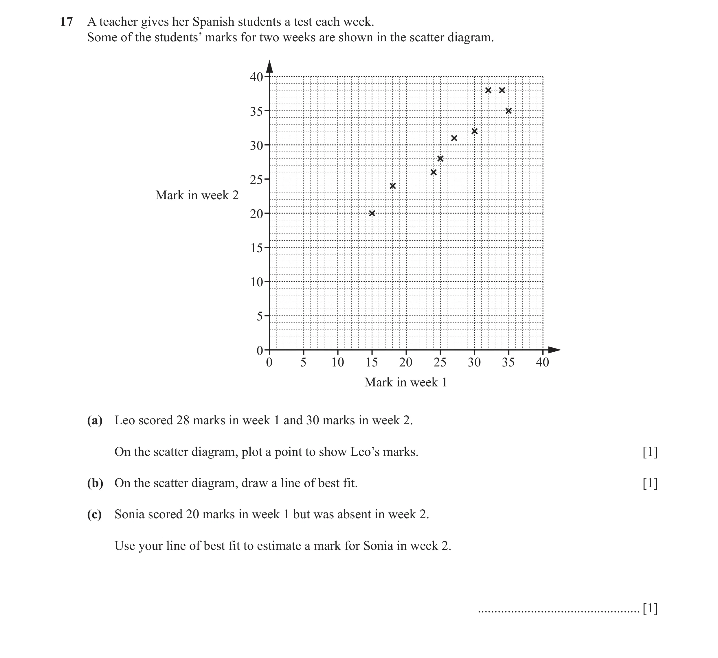
 18 / 26
 19 / 26
 20 / 26
 21 / 26
 22 / 26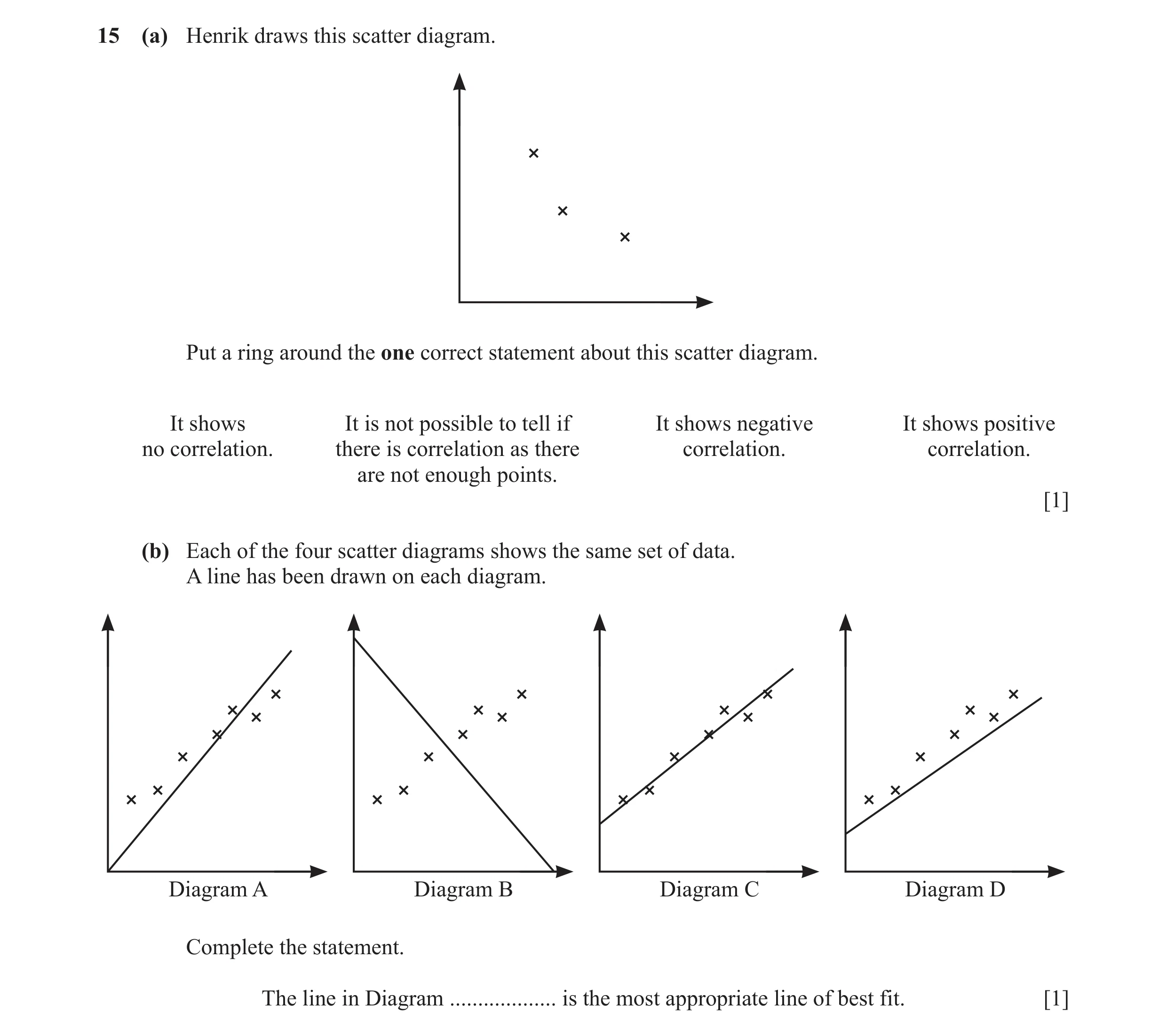
 23 / 26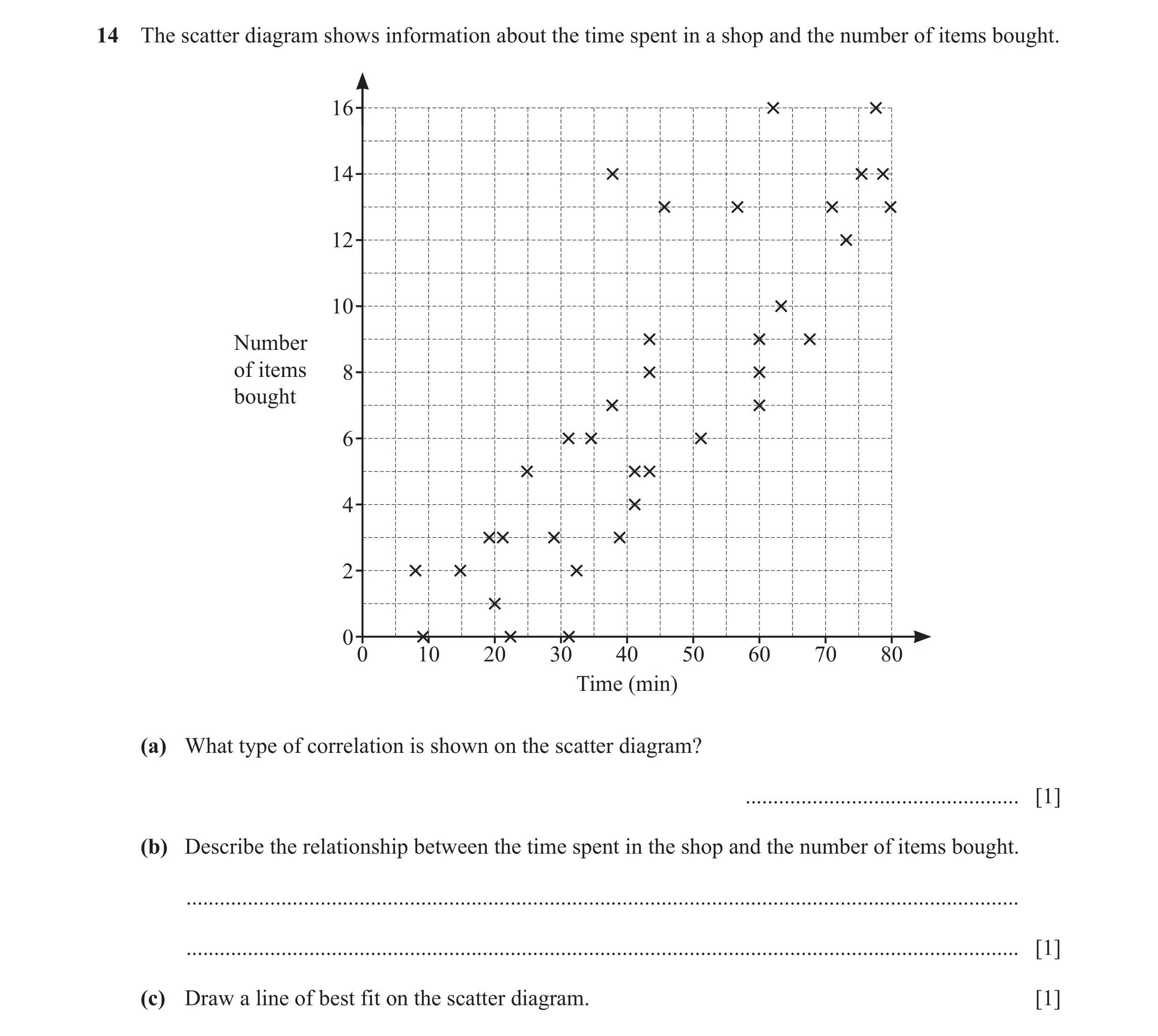
 24 / 26
 25 / 26
 26 / 26
 1
1 3
3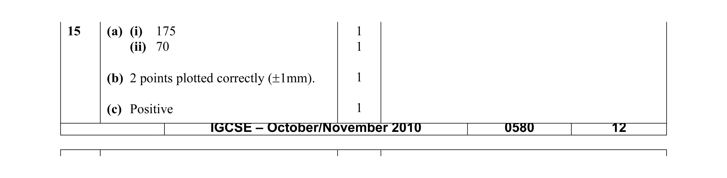 4
4 4
4 4
4 4
4 2
2 4
4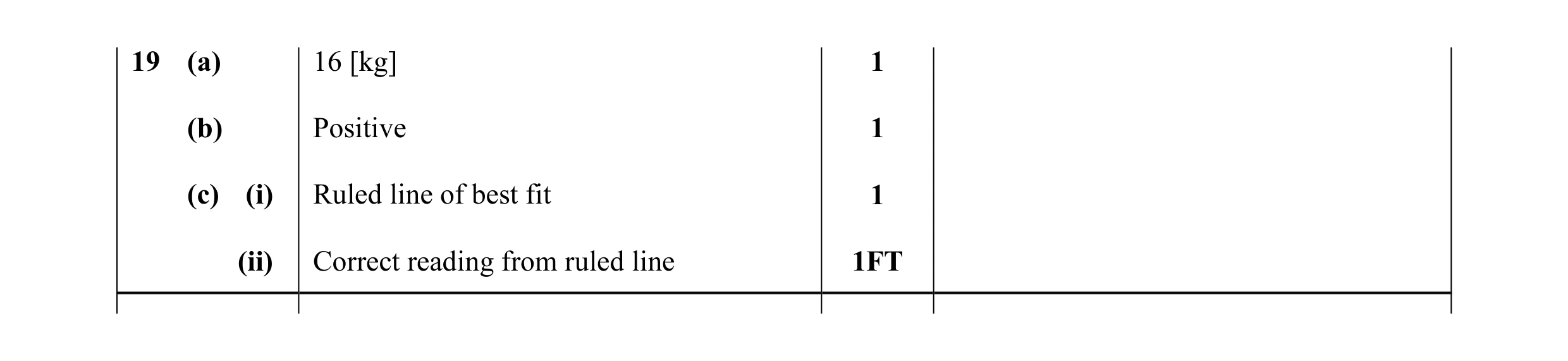 4
4 2
2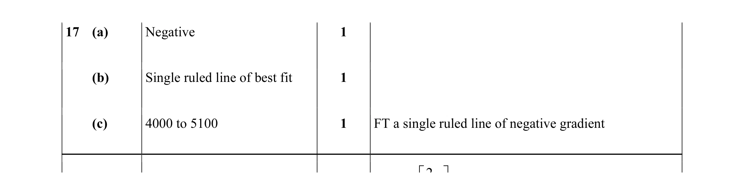 3
3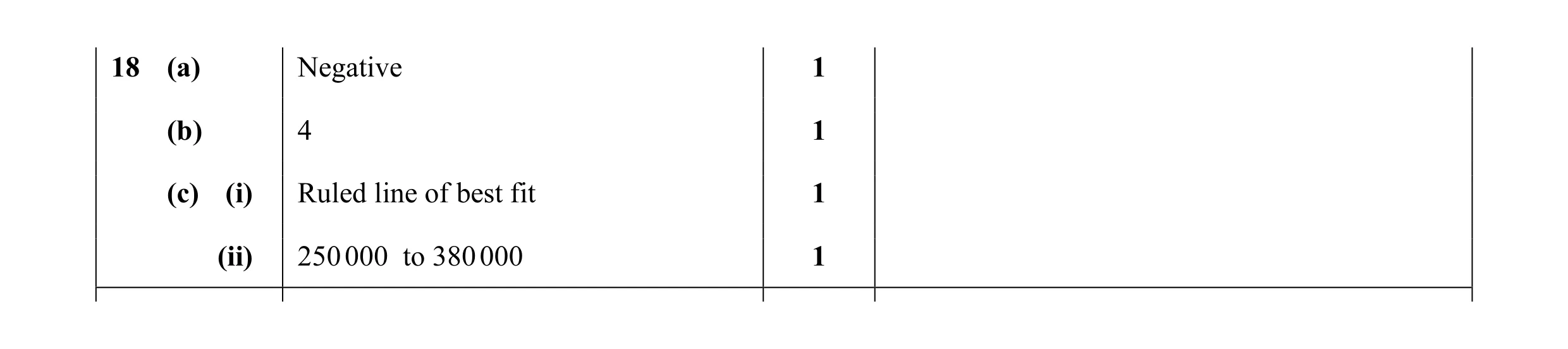 4
4 1
1 2
2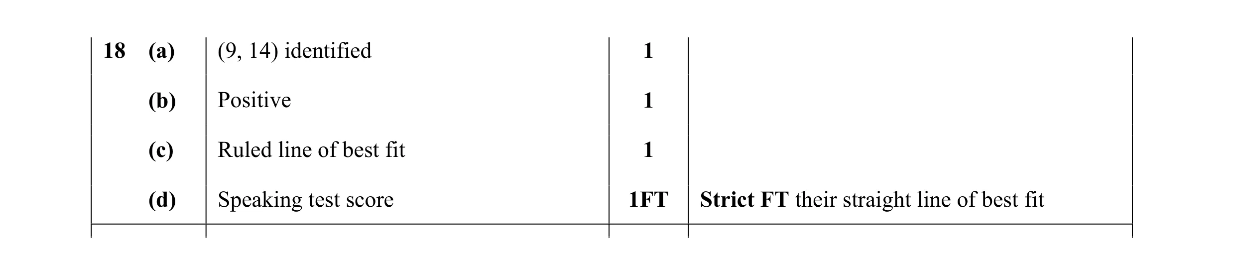 4
4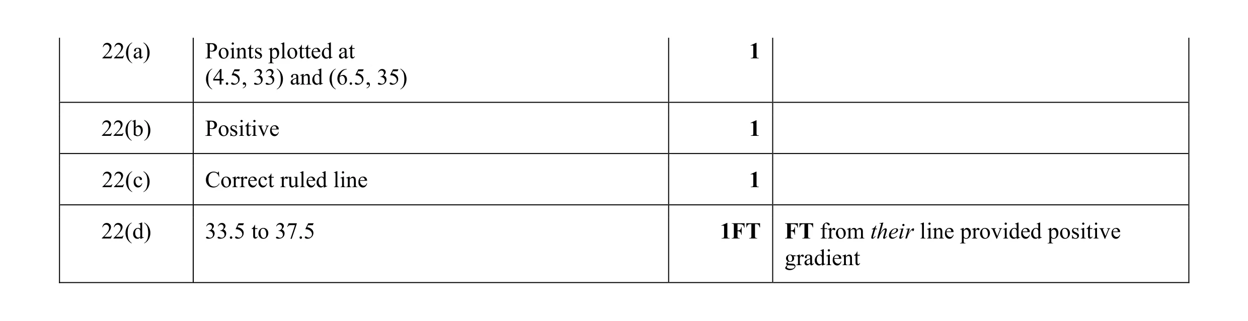 4
4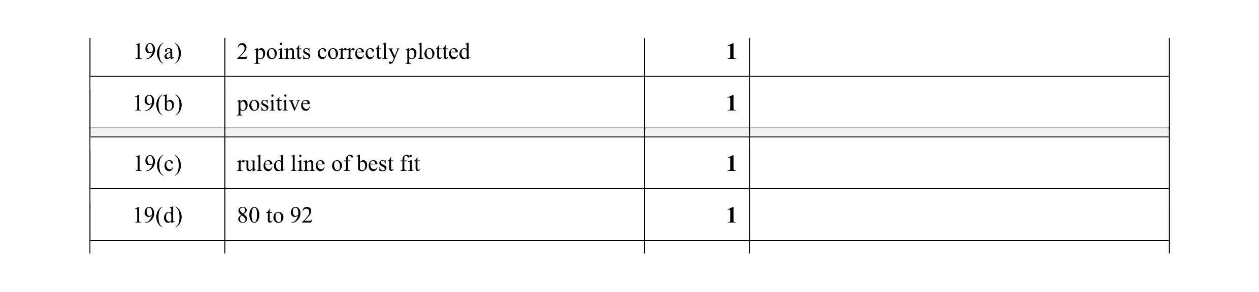 4
4 2
2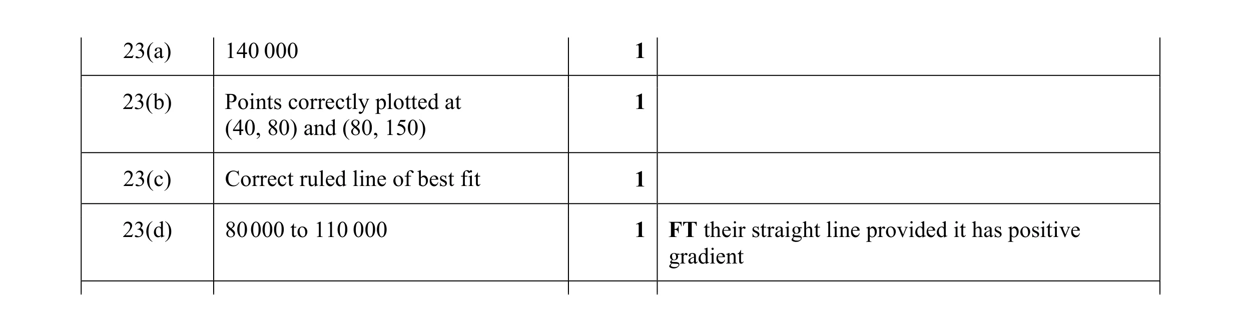 4
4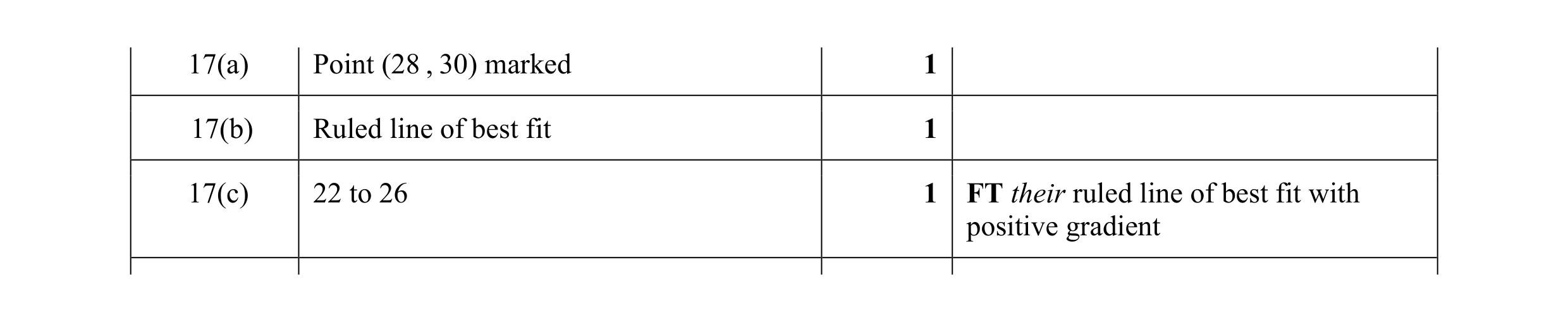 3
3 2
2 2
2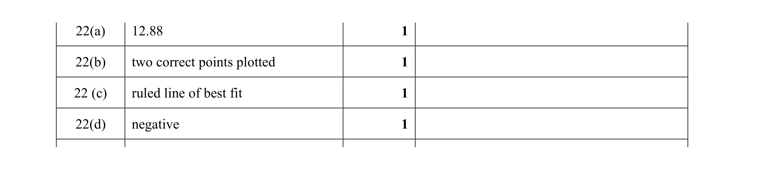 4
4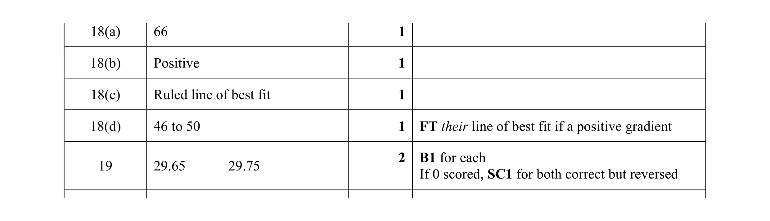 4
4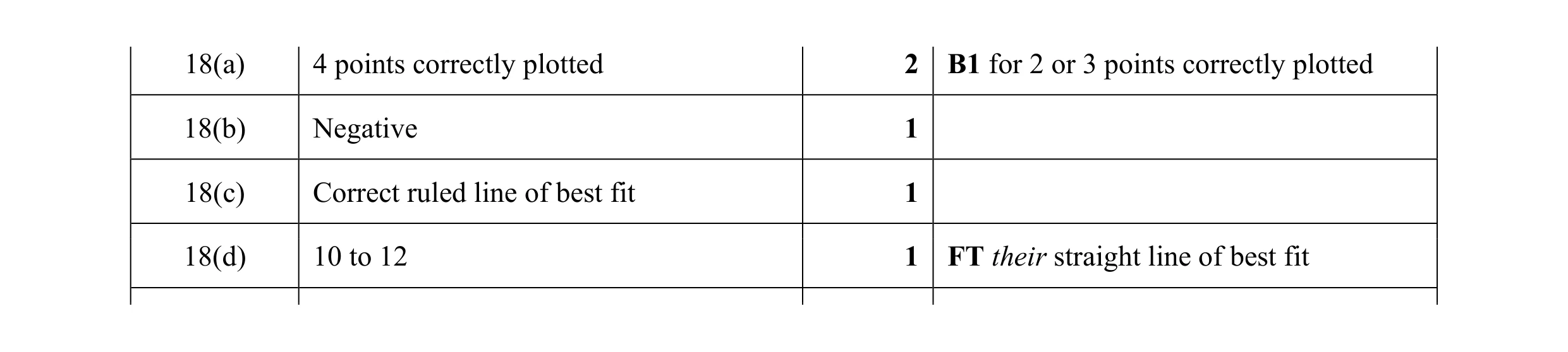 5
5 2
2 1
1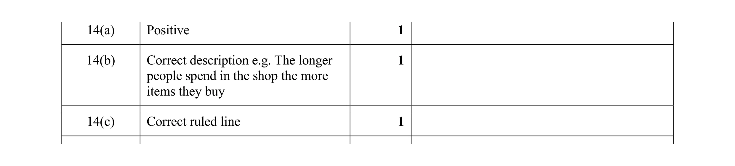 3
3 2
2 1
1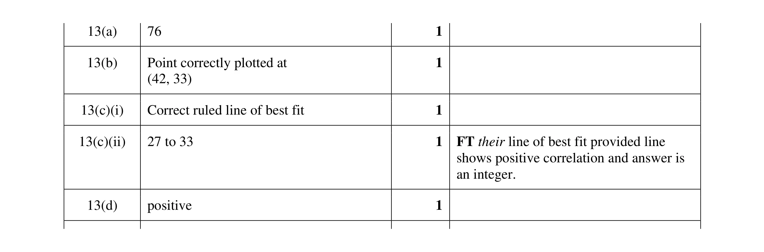 5
5 2
2