Questions as text
Question 1 0460/23 May/June 2017
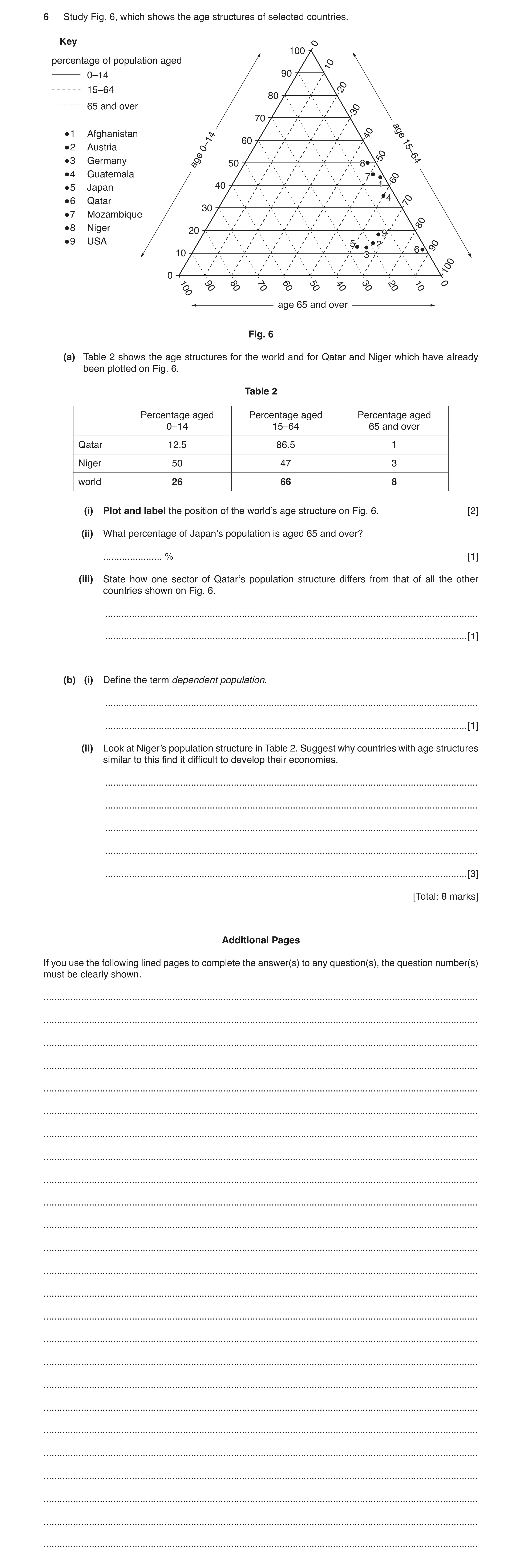
6 Study Fig. 6, which shows the age structures of selected countries. Key 0 100 percentage of population aged 10 0–14 90 15–64 20 80 65 and over 30 70 1 Afghanistan 40 age 60 2 Austria 0–14 15–64 3 Germany age 50 8 50 4 Guatemala 7 60 5 Japan 40 1 4 6 Qatar 70 30 7 Mozambique 80 8 Niger 20 9 9 USA 5 2 90 6 10 3 100 0 100 90 80 70 60 50 40 30 20 10 0 age 65 and over Fig. 6 (a) Table 2 shows the age structures for the world and for Qatar and Niger which have already been plotted on Fig. 6. Table 2 Percentage aged Percentage aged Percentage aged 0–14 15–64 65 and over Qatar 12.5 86.5 1 Niger 50 47 3 world 26 66 8 (i) Plot and label the position of the world’s age structure on Fig. 6. [2] (ii) What percentage of Japan’s population is aged 65 and over? … % [1] (iii) State how one sector of Qatar’s population structure differs from that of all the other countries shown on Fig. 6. … … [1] (b) (i) Define the term dependent population. … … [1] (ii) Look at Niger’s population structure in Table 2. Suggest why countries with age structures similar to this find it difficult to develop their economies. … … … … … [3] [Total: 8 marks] Additional Pages If you use the following lined pages to complete the answer(s) to any question(s), the question number(s) must be clearly shown. … … … … … … … … … … … … … … … … … … … … … … … … …
8 marks
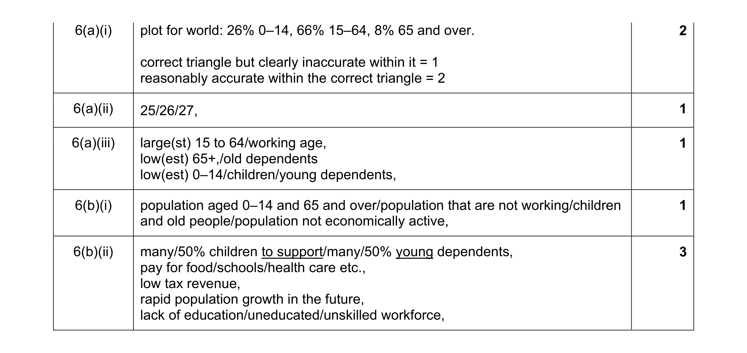
Mark scheme: 6(a)(i) plot for world: 26% 0–14, 66% 15–64, 8% 65 and over. 2 correct triangle but clearly inaccurate within it = 1 reasonably accurate within the correct triangle = 2 6(a)(ii) 25/26/27, 1 6(a)(iii) large(st) 15 to 64/working age, 1 low(est) 65+,/old dependents low(est) 0–14/children/young dependents, 6(b)(i) population aged 0–14 and 65 and over/population that are not working/children 1 and old people/population not economically active, 6(b)(ii) many/50% children to support/many/50% young dependents, 3 pay for food/schools/health care etc., low tax revenue, rapid population growth in the future, lack of education/uneducated/unskilled workforce,
This question in 0460/23 May/June 2017
Q2 · The population structure of Angola, an LEDC 0460/21 Oct/Nov 2017
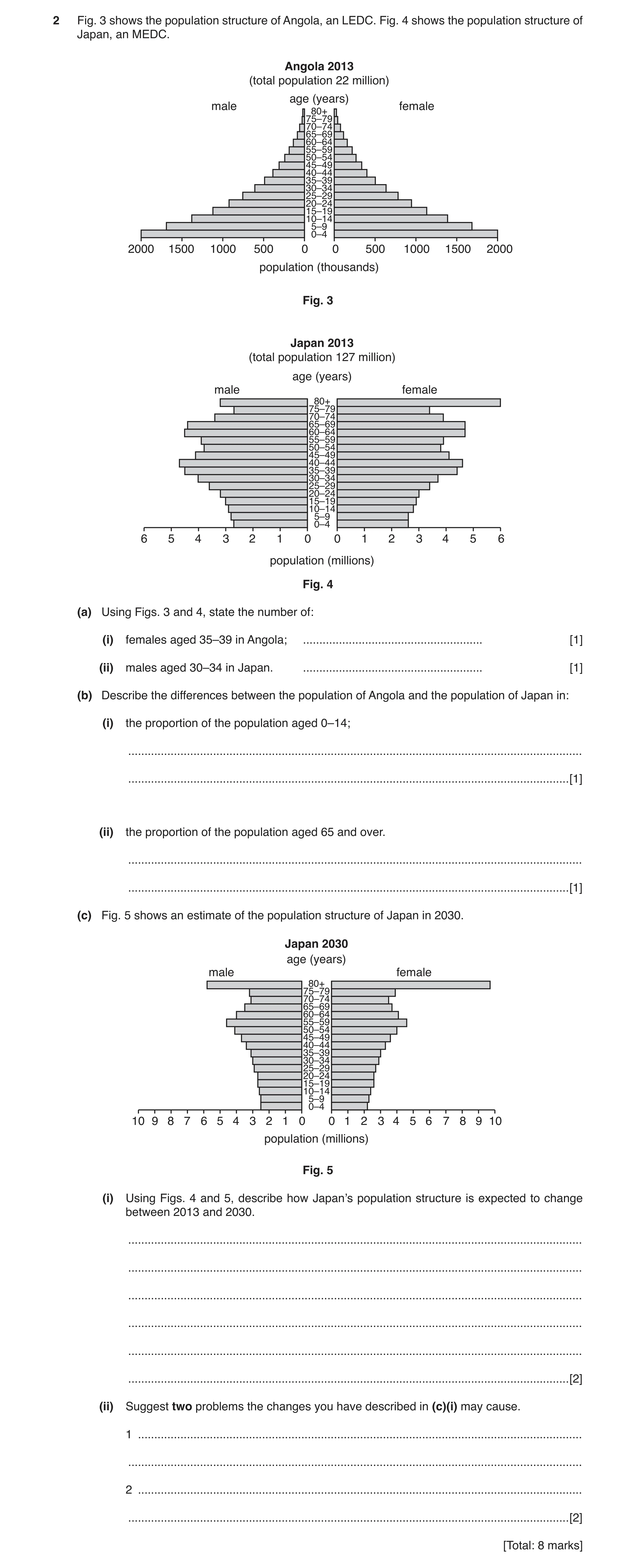
2 Fig. 3 shows the population structure of Angola, an LEDC. Fig. 4 shows the population structure of Japan, an MEDC. Angola 2013 (total population 22 million) age (years) male female 80+ 75–79 70–74 65–69 60–64 55–59 50–54 45–49 40–44 35–39 30–34 25–29 20–24 15–19 10–14 5–9 0–4 2000 1500 1000 500 0 0 500 1000 1500 2000 population (thousands) Fig. 3 Japan 2013 (total population 127 million) age (years) male female 80+ 75–79 70–74 65–69 60–64 55–59 50–54 45–49 40–44 35–39 30–34 25–29 20–24 15–19 10–14 5–9 0–4 6 5 4 3 2 1 0 0 1 2 3 4 5 6 population (millions) Fig. 4 (a) Using Figs. 3 and 4, state the number of: (i) females aged 35–39 in Angola; … [1] (ii) males aged 30–34 in Japan. … [1] (b) Describe the differences between the population of Angola and the population of Japan in: (i) the proportion of the population aged 0–14; … … [1] (ii) the proportion of the population aged 65 and over. … … [1] (c) Fig. 5 shows an estimate of the population structure of Japan in 2030. Japan 2030 age (years) male female 80+ 75–79 70–74 65–69 60–64 55–59 50–54 45–49 40–44 35–39 30–34 25–29 20–24 15–19 10–14 5–9 0–4 10 9 8 7 6 5 4 3 2 1 0 0 1 2 3 4 5 6 7 8 9 10 population (millions) Fig. 5 (i) Using Figs. 4 and 5, describe how Japan’s population structure is expected to change between 2013 and 2030. … … … … … … [2] (ii) Suggest two problems the changes you have described in (c)(i) may cause. 1 … … 2 … … [2] [Total: 8 marks]
8 marks
Mark scheme: 2(a)(i) 500 thousand, 1 2(a)(ii) 4 million, 1 2(b)(i) Angola more/Japan less, 1 2(b)(ii) Japan more/Angola less, 1 2(c)(i) ageing population/more old/old dependents/more >80, 2 decreased numbers of young/middle age/working age, 2(c)(ii) increased of care costs, 2 increased medical costs, increased pension costs, greater financial burden on young, lack of workforce, decrease in tax income, difficult to staff armed forces, less innovation,
This question in 0460/21 Oct/Nov 2017
Q3 · Qatar is a country in the Middle East 0460/23 Oct/Nov 2017
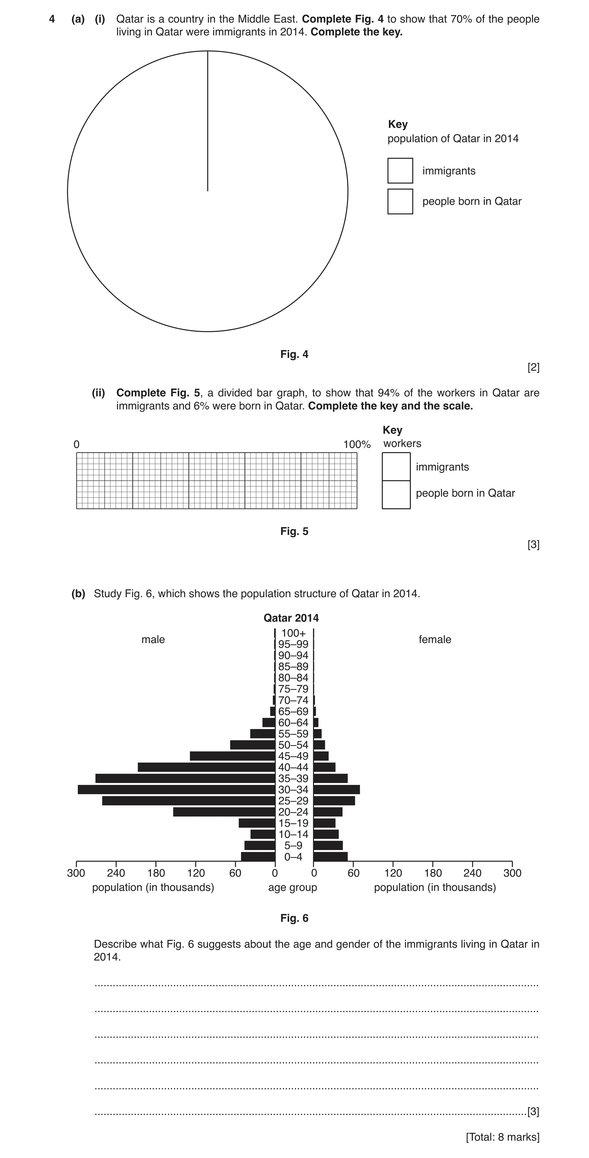
4 (a) (i) Qatar is a country in the Middle East. Complete Fig. 4 to show that 70% of the people living in Qatar were immigrants in 2014. Complete the key. Key population of Qatar in 2014 immigrants people born in Qatar Fig. 4 [2] (ii) Complete Fig. 5, a divided bar graph, to show that 94% of the workers in Qatar are immigrants and 6% were born in Qatar. Complete the key and the scale. Key 0 100% workers immigrants people born in Qatar Fig. 5 [3] (b) Study Fig. 6, which shows the population structure of Qatar in 2014. Qatar 2014 100+ male female 95–99 90–94 85–89 80–84 75–79 70–74 65–69 60–64 55–59 50–54 45–49 40–44 35–39 30–34 25–29 20–24 15–19 10–14 5–9 0–4 300 240 180 120 60 0 0 60 120 180 240 300 population (in thousands) age group population (in thousands) Fig. 6 Describe what Fig. 6 suggests about the age and gender of the immigrants living in Qatar in 2014. … … … … … … [3] [Total: 8 marks]
8 marks
Mark scheme: 4(a)(i) smaller segment 107–109°, 2 completion of a key with immigrants the larger segment, 4(a)(ii) line at 94%, 3 completion of key with immigrants the larger portion, completion of scale at minimum 20% intervals, 4(b) many males/few females/mainly males/more males than females, 3 middle aged/working age/independent age group, mainly 20–54 years old, no/few/young, no/few/old,
This question in 0460/23 Oct/Nov 2017
Question 4 0460/22 May/June 2018
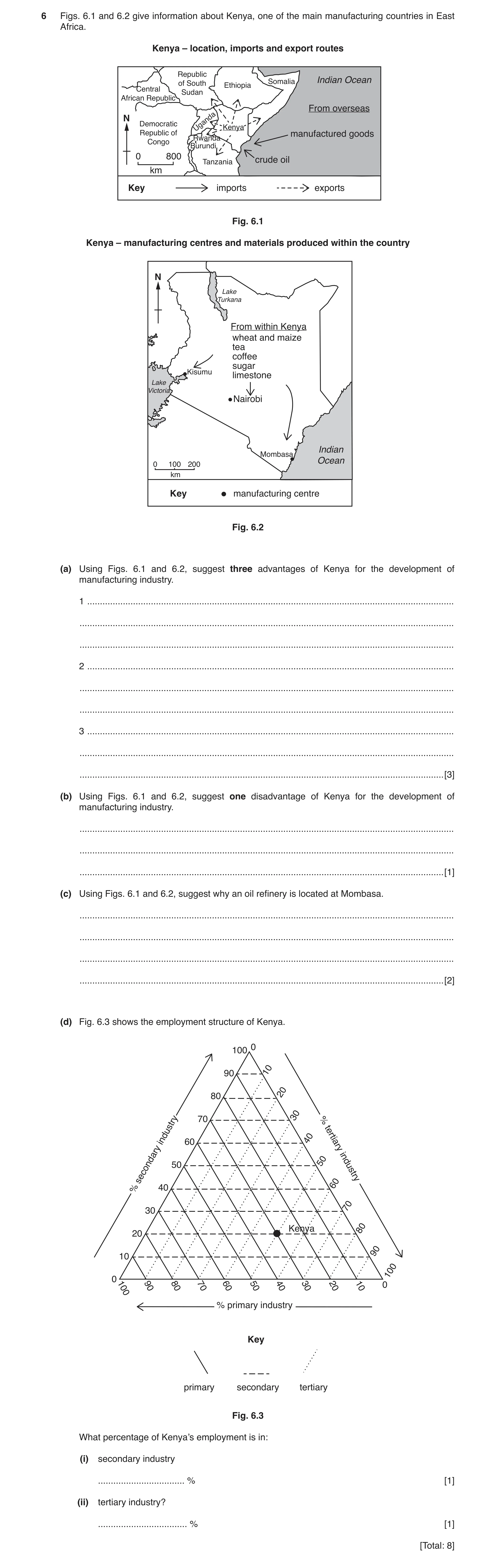
6 Figs. 6.1 and 6.2 give information about Kenya, one of the main manufacturing countries in East Africa. Kenya – location, imports and export routes Republic Indian Ocean of South Ethiopia Somalia Central Sudan African Republic From overseas N Democratic Uganda Kenya Republic of manufactured goods Rwanda Congo Burundi 0 800 Tanzania crude oil km Key imports exports Fig. 6.1 Kenya – manufacturing centres and materials produced within the country N Lake Turkana From within Kenya wheat and maize tea coffee sugar Kisumu limestone Lake Victoria Nairobi Indian Mombasa 0 100 200 Ocean km Key manufacturing centre Fig. 6.2 (a) Using Figs. 6.1 and 6.2, suggest three advantages of Kenya for the development of manufacturing industry. 1 … … … 2 … … … 3 … … … [3] (b) Using Figs. 6.1 and 6.2, suggest one disadvantage of Kenya for the development of manufacturing industry. … … … [1] (c) Using Figs. 6.1 and 6.2, suggest why an oil refinery is located at Mombasa. … … … … [2] (d) Fig. 6.3 shows the employment structure of Kenya. 0 100 90 10 20 80 30 40 industry 60 70 % tertiary 50 50 secondary industry 60 % 40 70 30 Kenya 80 20 90 10 100 0 100 90 80 70 60 50 40 30 20 10 0 % primary industry Key primary secondary tertiary Fig. 6.3 What percentage of Kenya’s employment is in: (i) secondary industry … % [1] (ii) tertiary industry? … % [1] [Total: 8]
8 marks
Mark scheme: 6(a) coast/ports/lake for import/export, 3 export market in surrounding countries/named surrounding country, raw materials local/within country, lakes for water supply, limestone therefore cement/steel, agricultural materials therefore food processing (or example.) 6(b) competition from imported manufactured goods, 1 needs to import oil, lacks mineral resources, large distances between places. 6(c) port/coastal, allow near the sea 2 receive (crude oil) imports, no further transport (of crude oil) needed. 6(d)(i) 20%. 1 6(d)(ii) 50%, 1 Allow a tolerance of ± 2% in each part of (d).
This question in 0460/22 May/June 2018
Q5 · Eight countries located next to the Mediterranean Sea 0460/22 Oct/Nov 2018
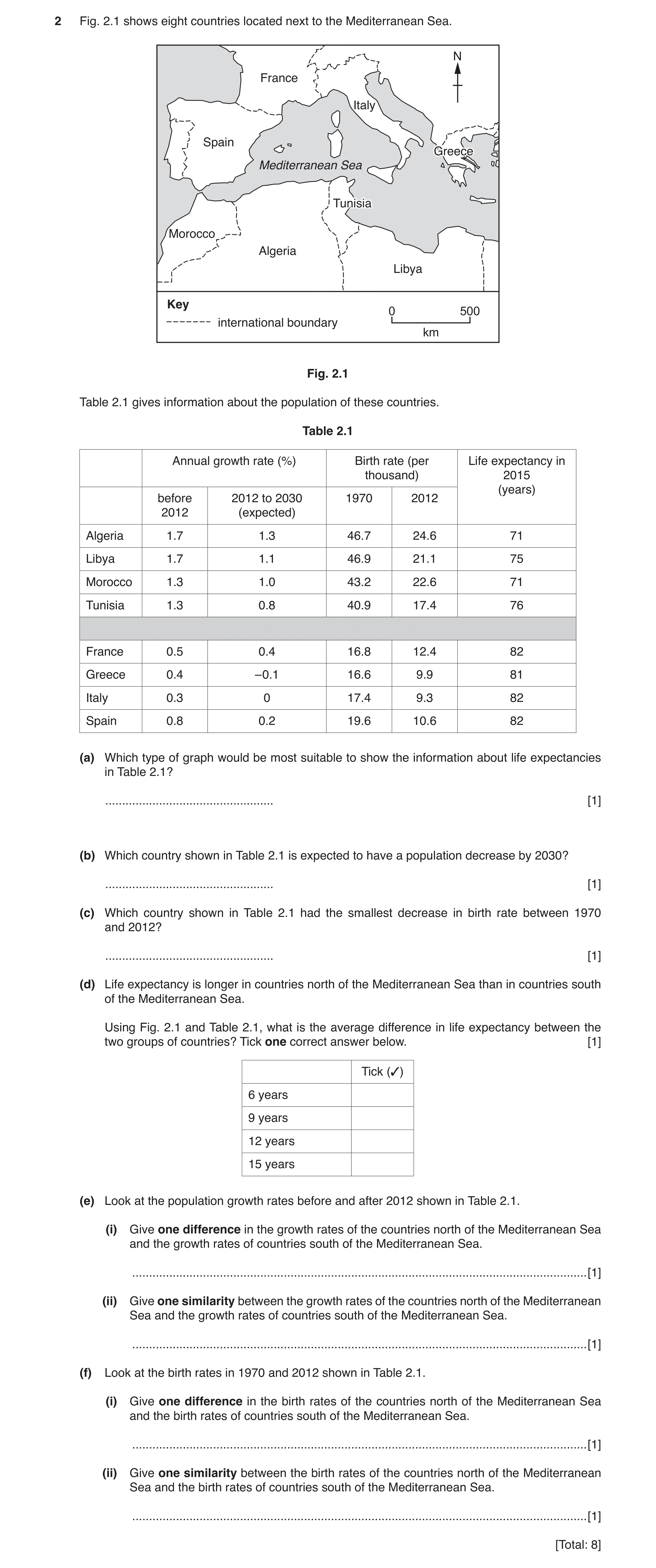
2 Fig. 2.1 shows eight countries located next to the Mediterranean Sea. N France Italy Spain Greece Mediterranean Sea TunisiaTunisia Morocco Algeria Libya Key 0 500 international boundary km Fig. 2.1 Table 2.1 gives information about the population of these countries. Table 2.1 Annual growth rate (%) Birth rate (per Life expectancy in thousand) 2015 (years) before 2012 to 2030 1970 2012 2012 (expected) Algeria 1.7 1.3 46.7 24.6 71 Libya 1.7 1.1 46.9 21.1 75 Morocco 1.3 1.0 43.2 22.6 71 Tunisia 1.3 0.8 40.9 17.4 76 France 0.5 0.4 16.8 12.4 82 Greece 0.4 –0.1 16.6 9.9 81 Italy 0.3 0 17.4 9.3 82 Spain 0.8 0.2 19.6 10.6 82 (a) Which type of graph would be most suitable to show the information about life expectancies in Table 2.1? … [1] (b) Which country shown in Table 2.1 is expected to have a population decrease by 2030? … [1] (c) Which country shown in Table 2.1 had the smallest decrease in birth rate between 1970 and 2012? … [1] (d) Life expectancy is longer in countries north of the Mediterranean Sea than in countries south of the Mediterranean Sea. Using Fig. 2.1 and Table 2.1, what is the average difference in life expectancy between the two groups of countries? Tick one correct answer below. [1] Tick (✓) 6 years 9 years 12 years 15 years (e) Look at the population growth rates before and after 2012 shown in Table 2.1. (i) Give one difference in the growth rates of the countries north of the Mediterranean Sea and the growth rates of countries south of the Mediterranean Sea. … [1] (ii) Give one similarity between the growth rates of the countries north of the Mediterranean Sea and the growth rates of countries south of the Mediterranean Sea. … [1] (f) Look at the birth rates in 1970 and 2012 shown in Table 2.1. (i) Give one difference in the birth rates of the countries north of the Mediterranean Sea and the birth rates of countries south of the Mediterranean Sea. … [1] (ii) Give one similarity between the birth rates of the countries north of the Mediterranean Sea and the birth rates of countries south of the Mediterranean Sea. … [1] [Total: 8]
8 marks
Mark scheme: 2(a) bar (graph/chart) 1 2(b) Greece 1 2(c) France 1 2(d) 9 years 1 2(e)(i) growth rates lower in north/higher in south 1 Answer must refer to north or south. Allow if referring to one period only. 2(e)(ii) (both) decrease 1 2(f)(i) birth rates lower in north/higher in south 1 greater decrease in south/smaller decrease in north Answer must refer to north or south. Allow if referring to one period only. 2(f)(ii) (both) decrease 1 In (e) and (f) comparisons of a single pair of countries and figures from Table 2.1 = 0. However, allow general expressions using figures e.g. ‘In 1970 birth rates were over 40 per thousand in the south but less than 20 per thousand in the north’. These need to be checked for accuracy using Table 2.1.
This question in 0460/22 Oct/Nov 2018
Question 6 0460/21 May/June 2019
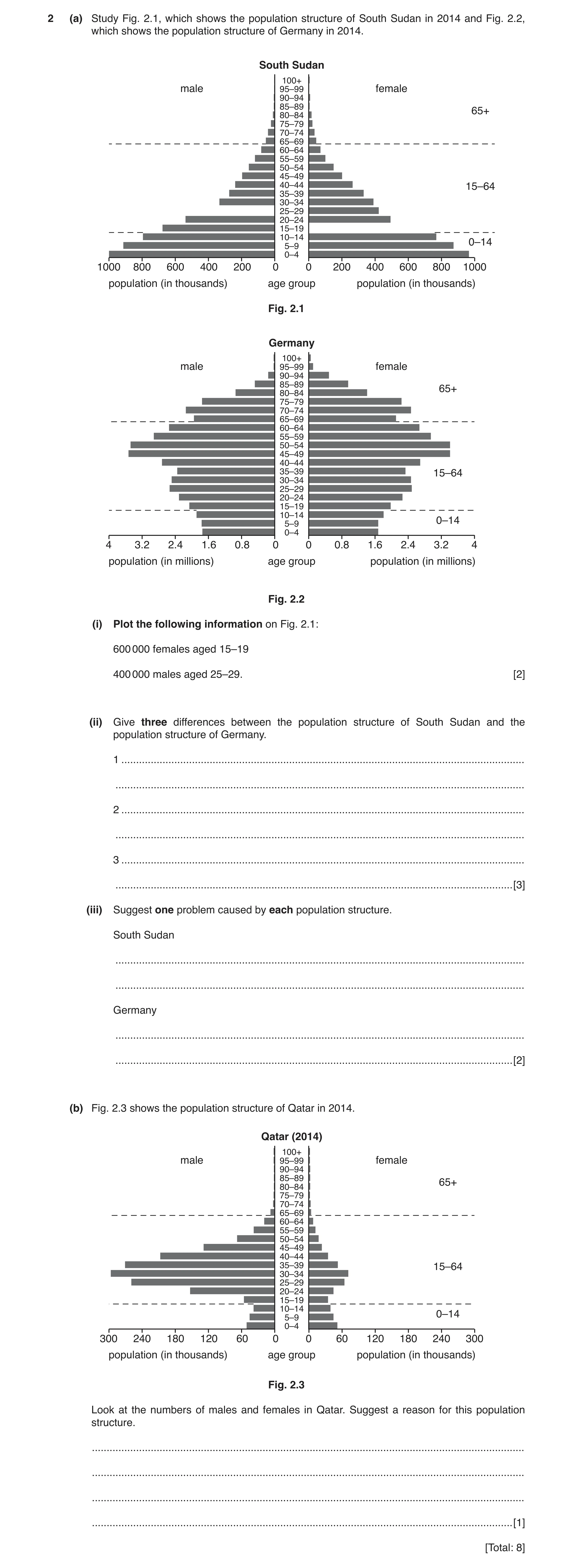
2 (a) Study Fig. 2.1, which shows the population structure of South Sudan in 2014 and Fig. 2.2, which shows the population structure of Germany in 2014. South Sudan 100+ male 95–99 female 90–94 85–89 65+ 80–84 75–79 70–74 65–69 60–64 55–59 50–54 45–49 40–44 15–64 35–39 30–34 25–29 20–24 15–19 10–14 5–9 0–14 0–4 1000 800 600 400 200 0 0 200 400 600 800 1000 population (in thousands) age group population (in thousands) Fig. 2.1 Germany 100+ male 95–99 female 90–94 85–89 65+ 80–84 75–79 70–74 65–69 60–64 55–59 50–54 45–49 40–44 35–39 15–64 30–34 25–29 20–24 15–19 10–14 5–9 0–14 0–4 4 3.2 2.4 1.6 0.8 0 0 0.8 1.6 2.4 3.2 4 population (in millions) age group population (in millions) Fig. 2.2 (i) Plot the following information on Fig. 2.1: 600 000 females aged 15–19 400 000 males aged 25–29. [2] (ii) Give three differences between the population structure of South Sudan and the population structure of Germany. 1 … … 2 … … 3 … … [3] (iii) Suggest one problem caused by each population structure. South Sudan … … Germany … … [2] (b) Fig. 2.3 shows the population structure of Qatar in 2014. Qatar (2014) 100+ male 95–99 female 90–94 85–89 65+ 80–84 75–79 70–74 65–69 60–64 55–59 50–54 45–49 40–44 35–39 15–64 30–34 25–29 20–24 15–19 10–14 5–9 0–14 0–4 300 240 180 120 60 0 0 60 120 180 240 300 population (in thousands) age group population (in thousands) Fig. 2.3 Look at the numbers of males and females in Qatar. Suggest a reason for this population structure. … … … … [1] [Total: 8]
8 marks
Mark scheme: 2(a)(i) Correct plot of females 15–19 600 000, 2 Correct plot of males 25–29 400 000 2(a)(ii) South Sudan more young / 0–14, 3 South Sudan fewer middle aged / economically active / 15–64, South Sudan fewer old / 65+, South Sudan fewer older women, (or emphasis on Germany) Allow age ranges within those above but not single bars. Allow single points on South Sudan. Wide base / BR / DR etc. = 0. 2(a)(iii) South Sudan 2 large numbers of young to feed / educate / support, small number of productive / economically active people, Germany large numbers of old people to support / care for, many more elderly in the future, fewer younger workers, lack of army in the future Allow ‘dependence’ once in either section without full explanation. 2(b) male migrant labour, 1
This question in 0460/21 May/June 2019
Question 7 0460/21 Oct/Nov 2019
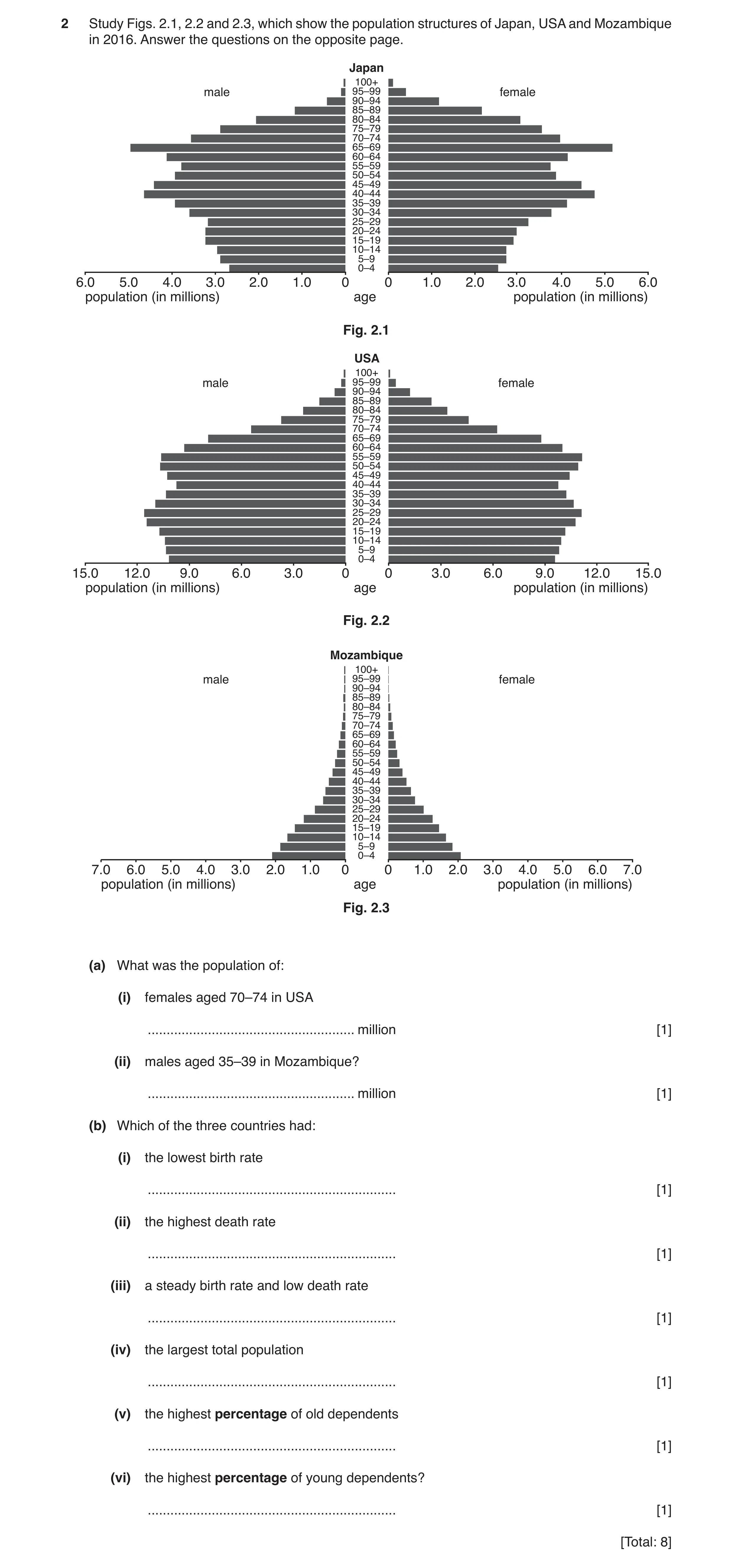
2 Study Figs. 2.1, 2.2 and 2.3, which show the population structures of Japan, USA and Mozambique in 2016. Answer the questions on the opposite page. Japan 100+ male 95–99 female 90–94 85–89 80–84 75–79 70–74 65–69 60–64 55–59 50–54 45–49 40–44 35–39 30–34 25–29 20–24 15–19 10–14 5–9 0–4 6.0 5.0 4.0 3.0 2.0 1.0 0 0 1.0 2.0 3.0 4.0 5.0 6.0 population (in millions) age population (in millions) Fig. 2.1 USA 100+ male 95–99 female 90–94 85–89 80–84 75–79 70–74 65–69 60–64 55–59 50–54 45–49 40–44 35–39 30–34 25–29 20–24 15–19 10–14 5–9 0–4 15.0 12.0 9.0 6.0 3.0 0 0 3.0 6.0 9.0 12.0 15.0 population (in millions) age population (in millions) Fig. 2.2 Mozambique 100+ male 95–99 female 90–94 85–89 80–84 75–79 70–74 65–69 60–64 55–59 50–54 45–49 40–44 35–39 30–34 25–29 20–24 15–19 10–14 5–9 0–4 7.0 6.0 5.0 4.0 3.0 2.0 1.0 0 0 1.0 2.0 3.0 4.0 5.0 6.0 7.0 population (in millions) age population (in millions) Fig. 2.3 (a) What was the population of: (i) females aged 70–74 in USA … million [1] (ii) males aged 35–39 in Mozambique? … million [1] (b) Which of the three countries had: (i) the lowest birth rate … [1] (ii) the highest death rate … [1] (iii) a steady birth rate and low death rate … [1] (iv) the largest total population … [1] (v) the highest percentage of old dependents … [1] (vi) the highest percentage of young dependents? … [1] [Total: 8]
8 marks
Mark scheme: 2(a)(i) 6.0–6.3 (million), 1 2(a)(ii) 0.5–0.7 (million), 1 2(b)(i) Japan, 1 2(b)(ii) Mozambique, 1 2(b)(iii) USA, 1 2(b)(iv) USA, 1 2(b)(v) Japan, 1 2(b)(vi) Mozambique, 1
This question in 0460/21 Oct/Nov 2019
Q8 · Information about the population of Costa Rica, a country in Central America, in 1990 and… 0460/23 May/June 2020
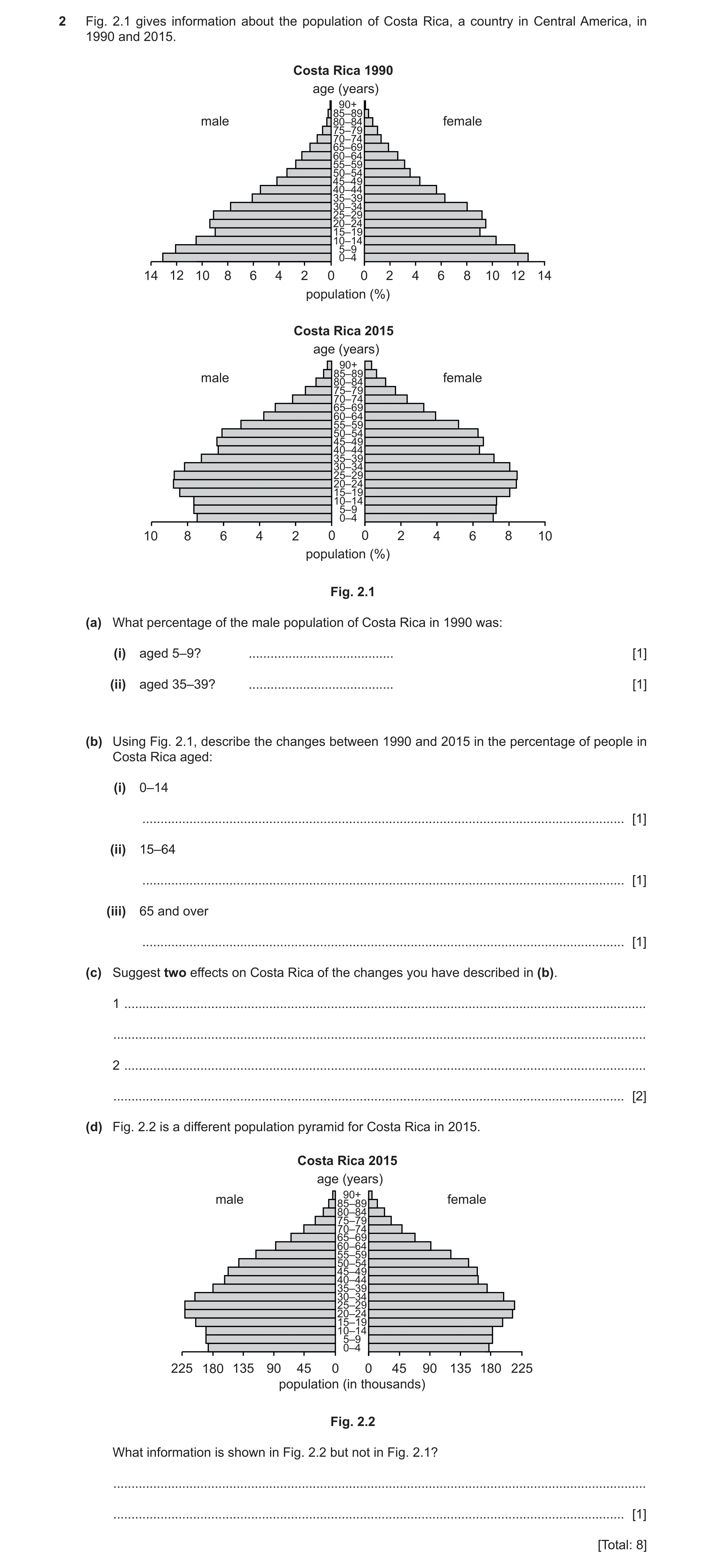
2 Fig. 2.1 gives information about the population of Costa Rica, a country in Central America, in 1990 and 2015. Costa Rica 1990 age (years) 90+ 85–89 male 80–84 female 75–79 70–74 65–69 60–64 55–59 50–54 45–49 40–44 35–39 30–34 25–29 20–24 15–19 10–14 5–9 0–4 14 12 10 8 6 4 2 0 0 2 4 6 8 10 12 14 population (%) Costa Rica 2015 age (years) 90+ male 85–8980–84 female 75–79 70–74 65–69 60–64 55–59 50–54 45–49 40–44 35–39 30–34 25–29 20–24 15–19 10–14 5–9 0–4 10 8 6 4 2 0 0 2 4 6 8 10 population (%) Fig. 2.1 (a) What percentage of the male population of Costa Rica in 1990 was: (i) aged 5–9? … [1] (ii) aged 35–39? … [1] (b) Using Fig. 2.1, describe the changes between 1990 and 2015 in the percentage of people in Costa Rica aged: (i) 0–14 … [1] (ii) 15–64 … [1] (iii) 65 and over … [1] (c) Suggest two effects on Costa Rica of the changes you have described in (b). 1 … … 2 … … [2] (d) Fig. 2.2 is a different population pyramid for Costa Rica in 2015. Costa Rica 2015 age (years) male 85–8990+ female 80–84 75–79 70–74 65–69 60–64 55–59 50–54 45–49 40–44 35–39 30–34 25–29 20–24 15–19 10–14 5–9 0–4 225 180 135 90 45 0 0 45 90 135 180 225 population (in thousands) Fig. 2.2 What information is shown in Fig. 2.2 but not in Fig. 2.1? … … [1] [Total: 8]
8 marks
Mark scheme: 2(a)(i) 12(%) 1 2(a)(ii) 6(%) 1 2(b)(i) decrease, 1 2(b)(ii) increase, 1 2(b)(iii) increase, 1 2(c) less spent on schools/child care, 2 larger workforce, greater economic output, more spent on care for elderly, 2(d) shows number of people/total population, 1
This question in 0460/23 May/June 2020
Q9 · The population of the world in 2017 and Fig 0460/22 Oct/Nov 2020
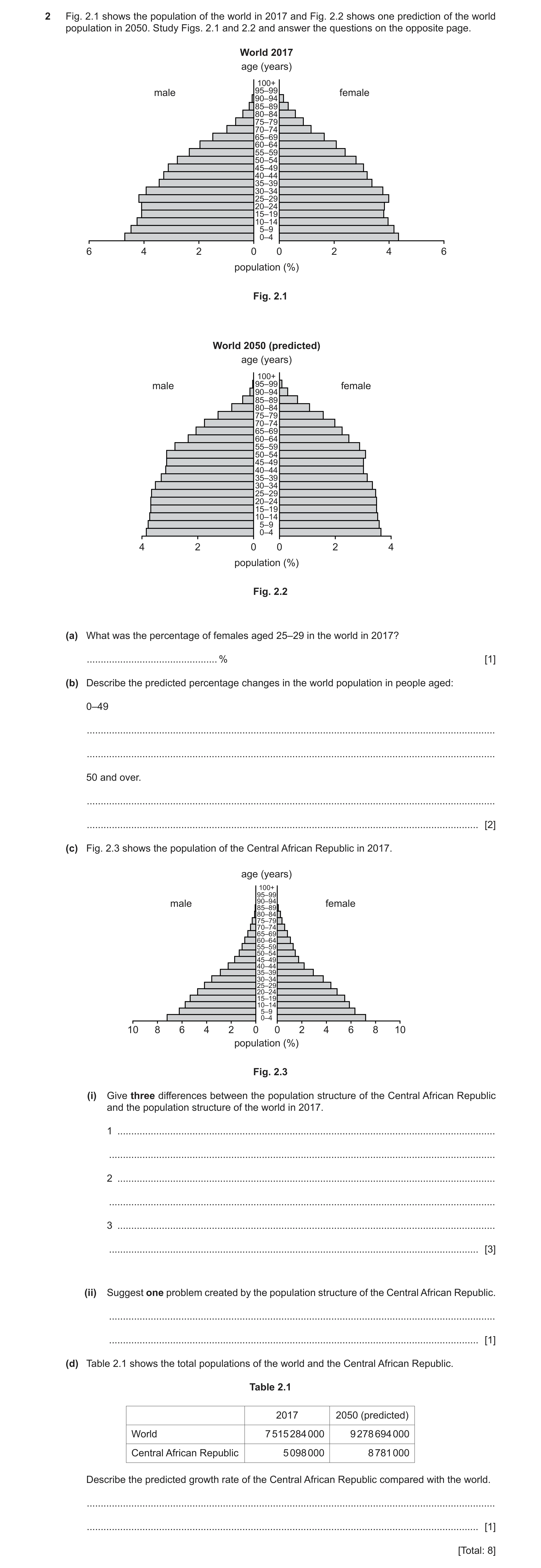
2 Fig. 2.1 shows the population of the world in 2017 and Fig. 2.2 shows one prediction of the world population in 2050. Study Figs. 2.1 and 2.2 and answer the questions on the opposite page. World 2017 age (years) 100+ male 95–99 female 90–94 85–89 80–84 75–79 70–74 65–69 60–64 55–59 50–54 45–49 40–44 35–39 30–34 25–29 20–24 15–19 10–14 5–9 0–4 6 4 2 0 0 2 4 6 population (%) Fig. 2.1 World 2050 (predicted) age (years) 100+ male 95–99 female 90–94 85–89 80–84 75–79 70–74 65–69 60–64 55–59 50–54 45–49 40–44 35–39 30–34 25–29 20–24 15–19 10–14 5–9 0–4 4 2 0 0 2 4 population (%) Fig. 2.2 (a) What was the percentage of females aged 25–29 in the world in 2017? … % [1] (b) Describe the predicted percentage changes in the world population in people aged: 0–49 … … 50 and over. … … [2] (c) Fig. 2.3 shows the population of the Central African Republic in 2017. age (years) 100+ 95–99 male 90–9485–89 female 80–84 75–79 70–74 65–69 60–64 55–59 50–54 45–49 40–44 35–39 30–34 25–29 20–24 15–19 10–14 5–9 0–4 10 8 6 4 2 0 0 2 4 6 8 10 population (%) Fig. 2.3 (i) Give three differences between the population structure of the Central African Republic and the population structure of the world in 2017. 1 … … 2 … … 3 … … [3] (ii) Suggest one problem created by the population structure of the Central African Republic. … … [1] (d) Table 2.1 shows the total populations of the world and the Central African Republic. Table 2.1 2017 2050 (predicted) World 7 515 284 000 9 278 694 000 Central African Republic 5 098 000 8 781 000 Describe the predicted growth rate of the Central African Republic compared with the world. … … [1] [Total: 8]
8 marks
Mark scheme: 2(a) 4(%) 1 2(b) 0 – 49 decrease, 2 50 and over increase, Must state changes. 2(c)(i) CAR more young/young dependents/0 – 29, 3 CAR fewer middle aged/working age/15 – 54, CAR fewer old/old dependents/50 – 100, Or emphasis on the world. 2(c)(ii) small(er) working population/great(er) dependent population, 1 cost of/demand for education, cost of/demand for health services, cost of/demand for food, future high unemployment, future high birth rate/population growth, 2(d) CAR increasing at a faster rate/CAR 72% World 23%, 1 Comparison needed.
This question in 0460/22 Oct/Nov 2020
Q10 · A population pyramid for Pakistan for 1998 and a projected pyramid for 2025 0460/23 Oct/Nov 2021
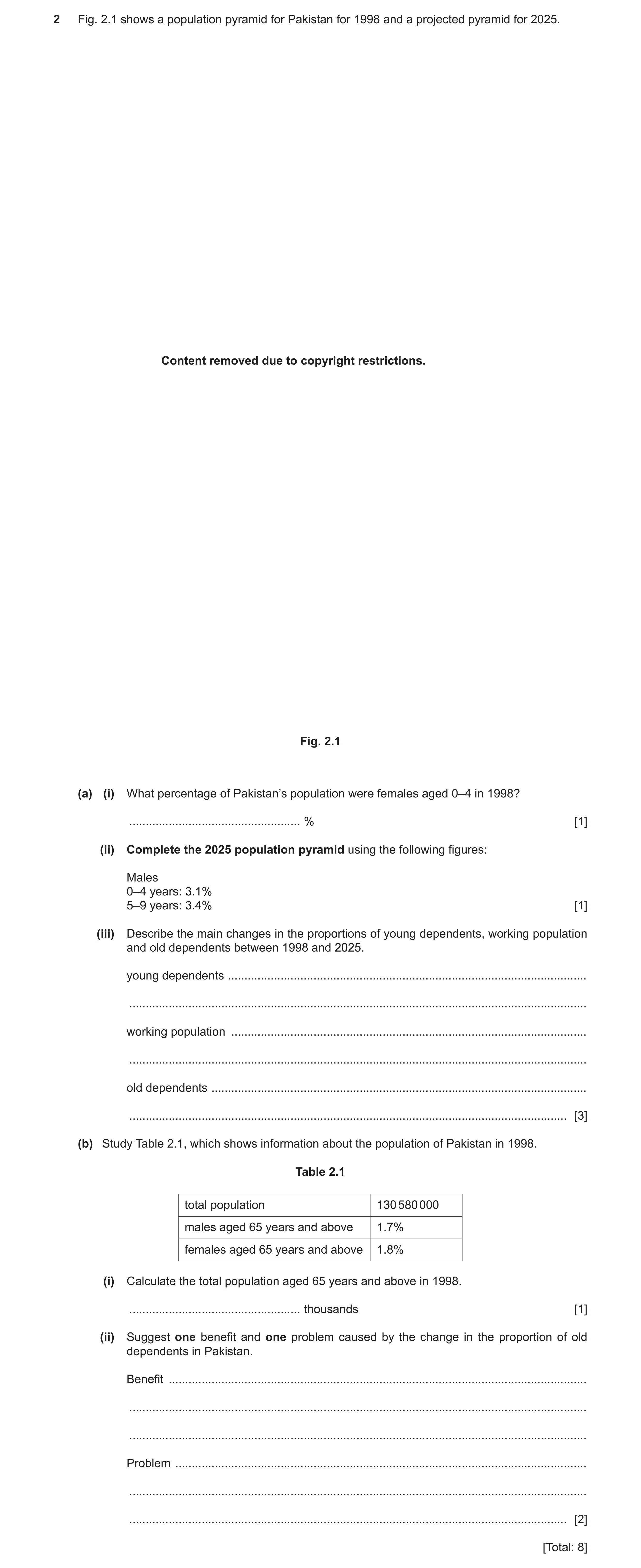
2 Fig. 2.1 shows a population pyramid for Pakistan for 1998 and a projected pyramid for 2025. Content removed due to copyright restrictions. Fig. 2.1 (a) (i) What percentage of Pakistan’s population were females aged 0–4 in 1998? … % [1] (ii) Complete the 2025 population pyramid using the following figures: Males 0–4 years: 3.1% 5–9 years: 3.4% [1] (iii) Describe the main changes in the proportions of young dependents, working population and old dependents between 1998 and 2025. young dependents … … working population … … old dependents … … [3] (b) Study Table 2.1, which shows information about the population of Pakistan in 1998. Table 2.1 total population 130 580 000 males aged 65 years and above 1.7% females aged 65 years and above 1.8% (i) Calculate the total population aged 65 years and above in 1998. … thousands [1] (ii) Suggest one benefit and one problem caused by the change in the proportion of old dependents in Pakistan. Benefit … … … Problem … … … [2] [Total: 8]
8 marks
Mark scheme: 2(a)(i) 7.6/7.7(%), 1 2(a)(ii) 0 -14 3.1 and 5–9 3.4, 1 2(a)(iii) young: decreased, 3 working: increased/younger working population decreased and older working population increased, old: increased, 2(b)(i) 4 570 300/4570.3/4570, 1 2(b)(ii) Benefit: 2 experience and wisdom of elderly, can look after grandchildren, Problem: pressure on health services, increased need for pensions, need for social care, less labour supply, greater tax burden on young, pressure on family finances,
This question in 0460/23 Oct/Nov 2021
Q11 · The countries in the world which had an average life expectancy of more than 74 years in… 0460/22 Feb/March 2022
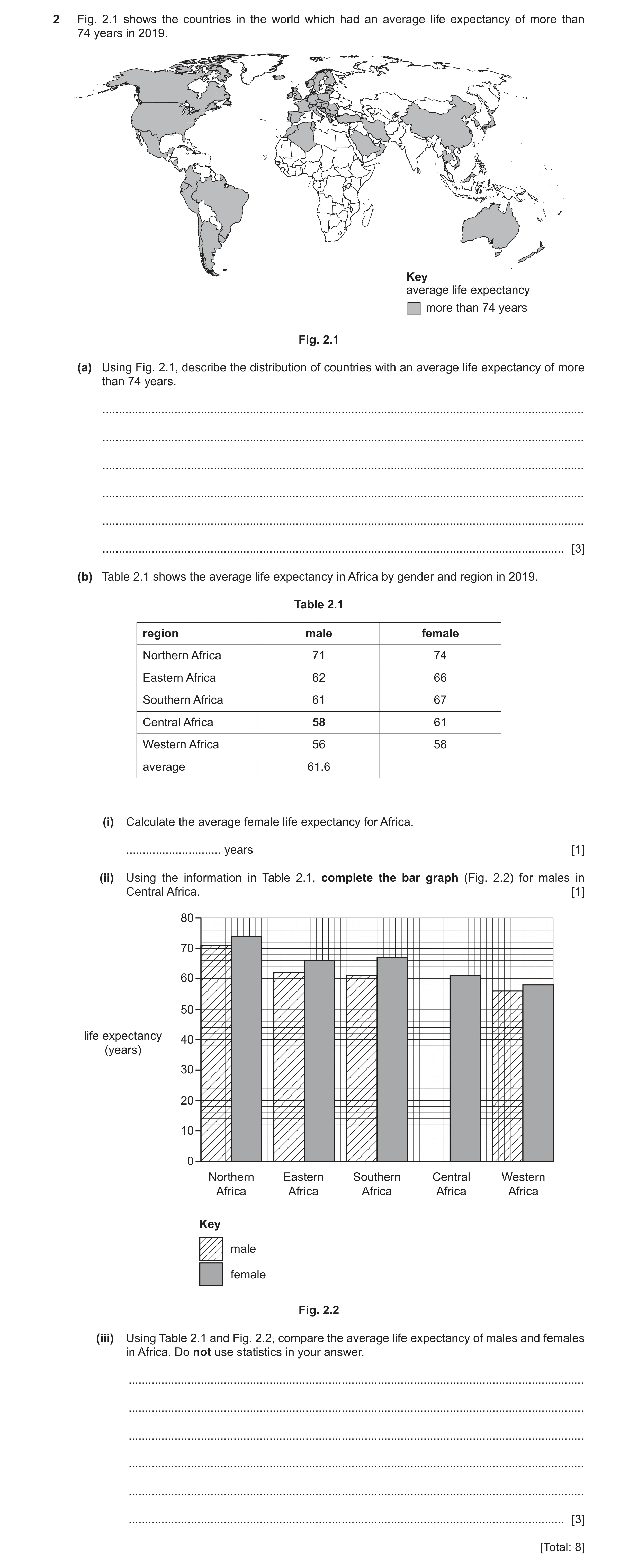
2 Fig. 2.1 shows the countries in the world which had an average life expectancy of more than 74 years in 2019. Key average life expectancy more than 74 years Fig. 2.1 (a) Using Fig. 2.1, describe the distribution of countries with an average life expectancy of more than 74 years. … … … … … … [3] (b) Table 2.1 shows the average life expectancy in Africa by gender and region in 2019. Table 2.1 region male female Northern Africa 71 74 Eastern Africa 62 66 Southern Africa 61 67 Central Africa 58 61 Western Africa 56 58 average 61.6 (i) Calculate the average female life expectancy for Africa. … years [1] (ii) Using the information in Table 2.1, complete the bar graph (Fig. 2.2) for males in Central Africa. [1] 80 70 60 50 life expectancy 40 (years) 30 20 10 0 Northern Eastern Southern Central Western Africa Africa Africa Africa Africa Key male female Fig. 2.2 (iii) Using Table 2.1 and Fig. 2.2, compare the average life expectancy of males and females in Africa. Do not use statistics in your answer. … … … … … … [3] [Total: 8]
8 marks
Mark scheme: 2(a) North America, 3 South America, America alone = 1 Europe, North Africa, Middle East, S/E/SE/SW Asia/China, Australia/Australasia, uneven, in north/northern hemisphere, 2(b)(i) 65.2, 1 2(b)(ii) 58 plotted, 1 2(b)(iii) females longer, 3 in every region, Southern Africa biggest difference (between males and females), Western Africa smallest difference (between males and females), Northern Africa longest for both, Western Africa shortest for both,
This question in 0460/22 Feb/March 2022
Question 12 0460/22 May/June 2022
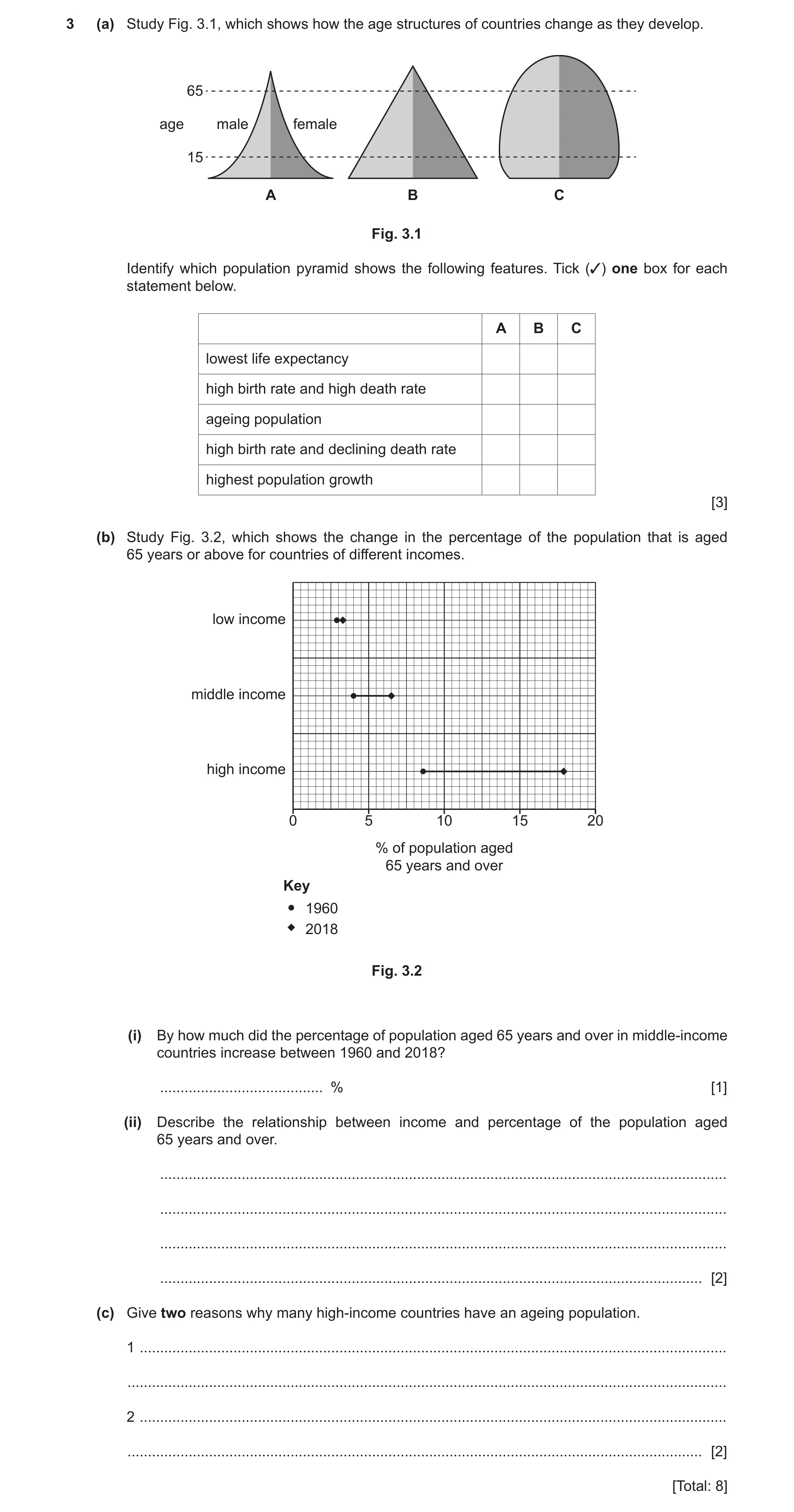
3 (a) Study Fig. 3.1, which shows how the age structures of countries change as they develop. 65 age male female 15 A B C Fig. 3.1 Identify which population pyramid shows the following features. Tick (✓) one box for each statement below. A B C lowest life expectancy high birth rate and high death rate ageing population high birth rate and declining death rate highest population growth [3] (b) Study Fig. 3.2, which shows the change in the percentage of the population that is aged 65 years or above for countries of different incomes. low income middle income high income 0 5 10 15 20 % of population aged 65 years and over Key 1960 2018 Fig. 3.2 (i) By how much did the percentage of population aged 65 years and over in middle-income countries increase between 1960 and 2018? … % [1] (ii) Describe the relationship between income and percentage of the population aged 65 years and over. … … … … [2] (c) Give two reasons why many high-income countries have an ageing population. 1 … … 2 … … [2] [Total: 8]
8 marks
Mark scheme: 3(a) A 3 A C B B All 5 correct = 3 marks 3 or 4 correct = 2 marks 1 or 2 correct = 1 mark 3(b)(i) 2.5 (%) 1 3(b)(ii) positive/direct relationship / high(er) income the greater % population 65+ / 2 low(er) income the less % population 65+; strong relationship; higher the income the greater the increase or vice versa/low income has a low increase and high income has a large increase; 3(c) Pensions; 2 better/good healthcare/medicine/greater amount of money spent on disease prevention; better/good sanitation/clean water supply; old people’s homes; better/good diet/better knowledge of dietary requirements/balanced diet/better/good food supply; (education about) healthy lifestyle/exercise; low(er) birth rate/less children;
This question in 0460/22 May/June 2022
Q13 · How the employment structure of Bangladesh (an LEDC) has changed over time 0460/22 May/June 2022
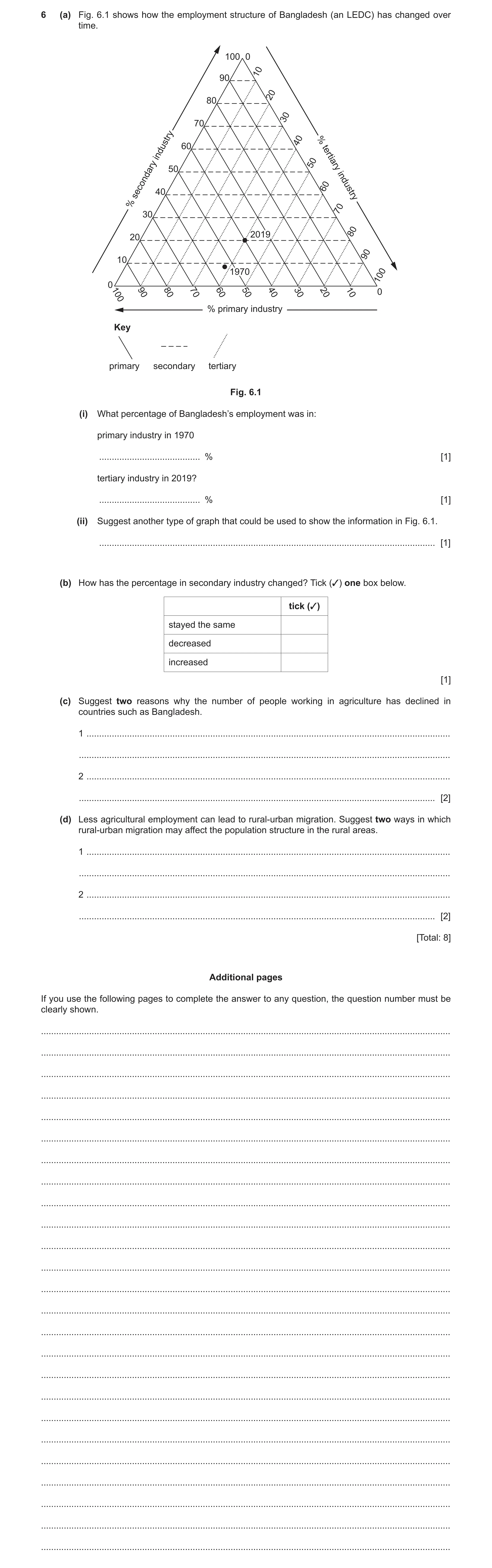
6 (a) Fig. 6.1 shows how the employment structure of Bangladesh (an LEDC) has changed over time. 100 0 10 90 20 80 30 70 40 % 60 industry 50 50 tertiary 60 40 secondary industry % 70 30 2019 80 20 90 10 1970 100 0 100 90 80 70 60 50 40 30 20 10 0 % primary industry Key primary secondary tertiary Fig. 6.1 (i) What percentage of Bangladesh’s employment was in: primary industry in 1970 … % [1] tertiary industry in 2019? … % [1] (ii) Suggest another type of graph that could be used to show the information in Fig. 6.1. … [1] (b) How has the percentage in secondary industry changed? Tick (✓) one box below. tick (✓) stayed the same decreased increased [1] (c) Suggest two reasons why the number of people working in agriculture has declined in countries such as Bangladesh. 1 … … 2 … … [2] (d) Less agricultural employment can lead to rural-urban migration. Suggest two ways in which rural-urban migration may affect the population structure in the rural areas. 1 … … 2 … … [2] [Total: 8] Additional pages If you use the following pages to complete the answer to any question, the question number must be clearly shown. … … … … … … … … … … … … … … … … … … … … … … … … …
8 marks
Mark scheme: 6(a)(i) 52–54 (%) 1 40 (%) 1 6(a)(ii) bar/divided/compound bar graph/pie graph 1 6(b) increased 1 6(c) import of food; 2 mechanisation; labour force more educated/skilled/prefer/more manufacturing jobs/tertiary jobs/less primary sector jobs/better paid jobs/poorly paid in countryside/ moved to towns for work/less physical jobs; land degradation/soil erosion/exhaustion/overcultivation; flooding/cyclones/drought; land taken for expansion of cities/build houses/urban sprawl; 6(d) loss of working age/less economically active/less 16–65 (or ages in 2 between)/ageing workforce; ageing population/older dependents remain/more older dependent population; less children born/lower BR/less young(er) people; less males/more females/gender imbalance;
This question in 0460/22 May/June 2022
Question 14 0460/23 May/June 2022
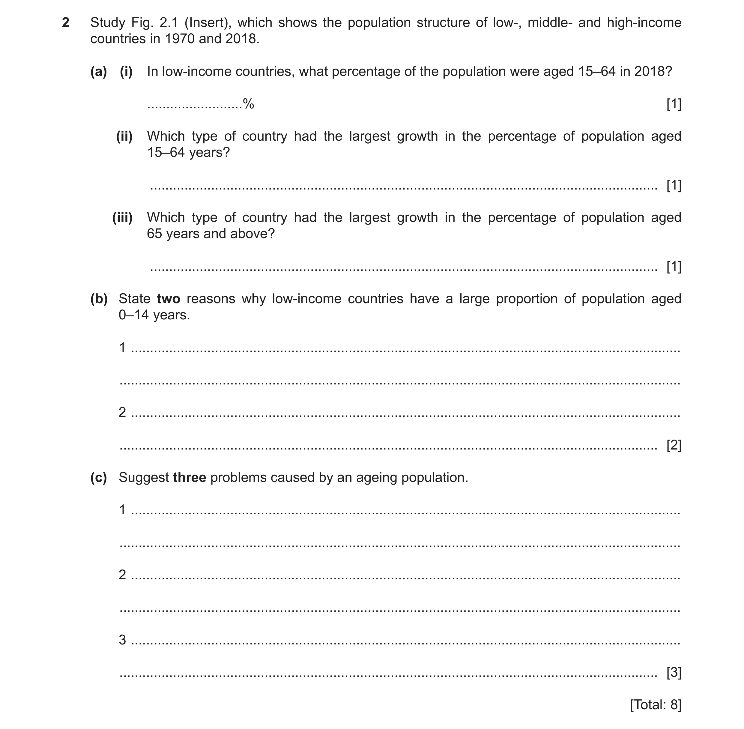
2 Study Fig. 2.1 (Insert), which shows the population structure of low-, middle- and high-income countries in 1970 and 2018. (a) (i) In low-income countries, what percentage of the population were aged 15–64 in 2018? … % [1] (ii) Which type of country had the largest growth in the percentage of population aged 15–64 years? … [1] (iii) Which type of country had the largest growth in the percentage of population aged 65 years and above? … [1] (b) State two reasons why low-income countries have a large proportion of population aged 0–14 years. 1 … … 2 … … [2] (c) Suggest three problems caused by an ageing population. 1 … … 2 … … 3 … … [3] [Total: 8]
8 marks
Mark scheme: 2(a)(i) 52–58 (200 degrees) = 55.55 1 2(a)(ii) middle income countries 1 2(a)(iii) high income countries 1 2(b) high birth rates; 2 can’t afford/unavailability of contraceptives; need children to work; desire for a son; need children to look after them in later years; lack of education on family planning; high level of infant mortality; culture/religion prohibits use of contraceptives; early marriage; lack of education for women so do not pursue a career; 2(c) need more care homes; 3 drain on/more money spent on health services/hospitals understaffed; more money needed for pensions; labour force shortages/carers not available; burden on economically active; government raises taxes to pay; rise in the amount of chronic disease and disability;
This question in 0460/23 May/June 2022
Question 15 0460/21 May/June 2023
2 Study Fig. 2.1, which shows the population structure of selected countries in 2019. %0 Key 100 1 Germany 10 2 South Africa 90 3 Guatemala 20 80 30 70 40 65 years 60 and above 50 15–64 years 50 60 40 70 30 1 80 20 90 10 3 2 100 0% 100 90 80 70 60 50 40 30 20 10 0% 0–14 years Fig. 2.1 (a) What percentage of Germany’s population is aged 0–14 years? … % [1] (b) (i) Using Table 2.1, plot and label the position of the world’s population structure on Fig. 2.1 with a number 4. Table 2.1 0–14 years 15–64 years 65 years and above world 25% 65% 10% [1] (ii) Suggest another type of graph which could be used to show the world’s population structure. … [1] (iii) How do the percentages of Germany’s and the world’s population aged 0–14 years differ? Do not use statistics in your answer. … … [1] (c) Suggest four problems caused by an ageing population. 1 … … 2 … … 3 … … 4 … … [4] [Total: 8]
8 marks
Mark scheme: 2(a) 15 (%). 1 2(b)(i) Correctly plotted and labelled. 1 2(b)(ii) Population pyramid/(divided/compound) bar graph/pie graph/pie chart/donut 1 graph. 2(b)(iii) Germany is lower/the world is higher. 1 2(c) Need more care/nursing homes; 4 Pressure/strain/higher spending on health services; More money needed for pensions; Less economically active/smaller workforce; Less tax payers/workforce need to pay higher taxes; Increased proportion not contributing to economy; Less money for other services e.g., education; More difficult to defend country/recruit to forces; Immigration to fill jobs; Lower birth rate.
This question in 0460/21 May/June 2023
Question 16 0460/22 Oct/Nov 2023
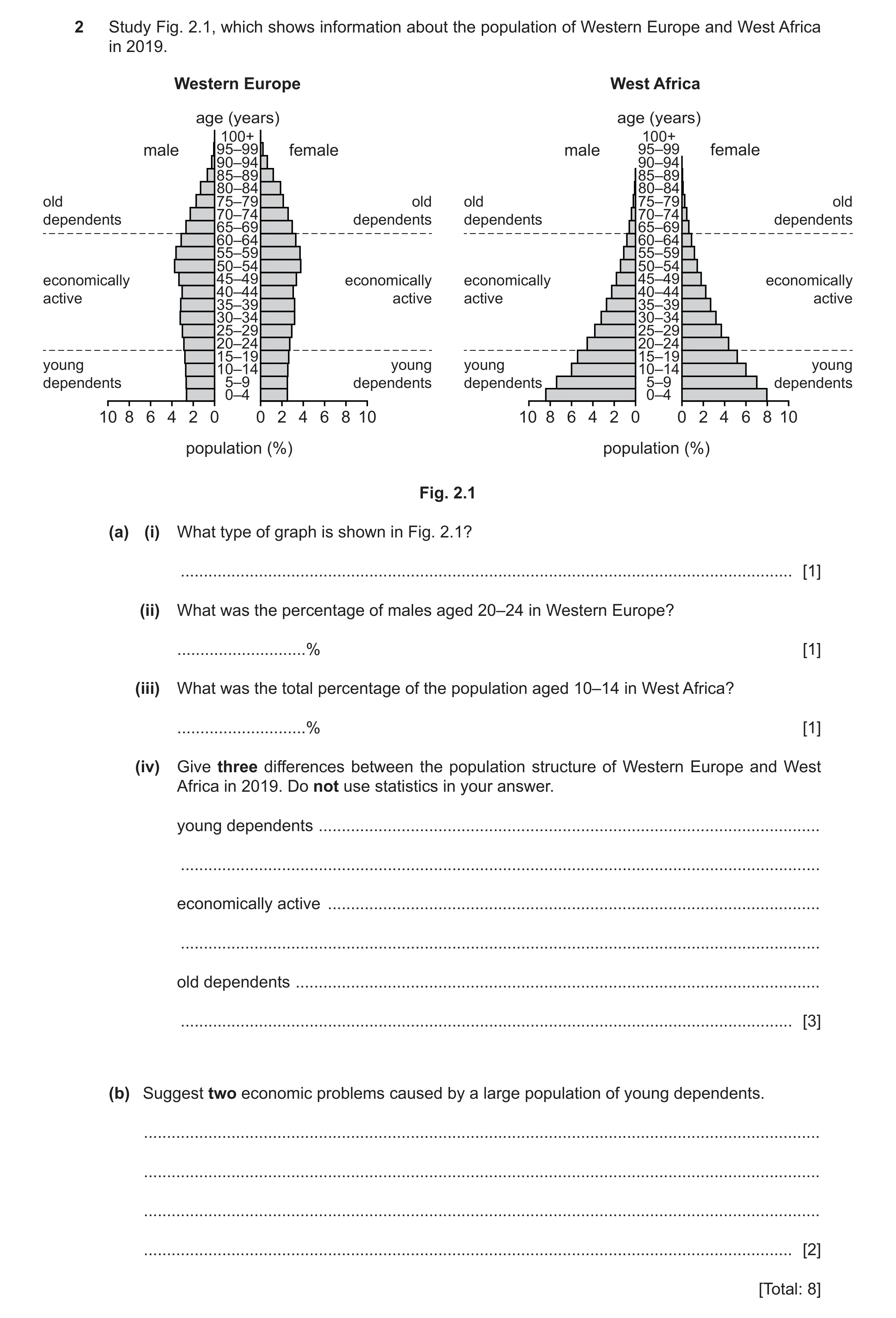
2 Study Fig. 2.1, which shows information about the population of Western Europe and West Africa in 2019. Western Europe West Africa age (years) age (years) 100+ 100+ male 95–99 female male 95–99 female 90–94 90–94 85–89 85–89 80–84 80–84 old 75–79 old old 75–79 old 70–74 70–74dependents dependents dependents dependents 65–69 65–69 60–64 60–64 55–59 55–59 50–54 50–54 economically 45–49 economically economically 45–49 economically 40–44 40–44active active active active 35–39 35–39 30–34 30–34 25–29 25–29 20–24 20–24 15–19 15–19 young 10–14 young young 10–14 young dependents 5–9 dependents dependents 5–9 dependents 0–4 0–4 10 8 6 4 2 0 0 2 4 6 8 10 10 8 6 4 2 0 0 2 4 6 8 10 population (%) population (%) Fig. 2.1 (a) (i) What type of graph is shown in Fig. 2.1? … [1] (ii) What was the percentage of males aged 20–24 in Western Europe? … % [1] (iii) What was the total percentage of the population aged 10–14 in West Africa? … % [1] (iv) Give three differences between the population structure of Western Europe and West Africa in 2019. Do not use statistics in your answer. young dependents … … economically active … … old dependents … … [3] (b) Suggest two economic problems caused by a large population of young dependents. … … … … [2] [Total: 8]
8 marks
Mark scheme: 2(a)(i) Age / sex / population pyramid 1 2(a)(ii) 2.8–3% 1 2(a)(iii) 12(%) 1 2(a)(iv) Young dependents: 3 • W. Europe is lower / W. Africa is higher; Economically active: • W. Europe is higher / W. Africa is lower; Old dependents: • W. Europe is higher / W. Africa is lower. Accept majority / minority instead of higher / lower. Accept separate statements e.g. Western Europe is high, W. Africa is low. 2(b) • Needs more / more money to be spent on / strain on 2 schools / education / teachers / resources for lessons; • More money spent on education / health services neglecting other areas of the economy; • Need more / more money spent on / strain on health services / hospitals / maternity care; • Cost of supplying food / food shortages / water supplies; • Lack of / strain on available housing; • Lack of future jobs; • Women / carers less able to work.
This question in 0460/22 Oct/Nov 2023
Question 17 0460/23 Oct/Nov 2023
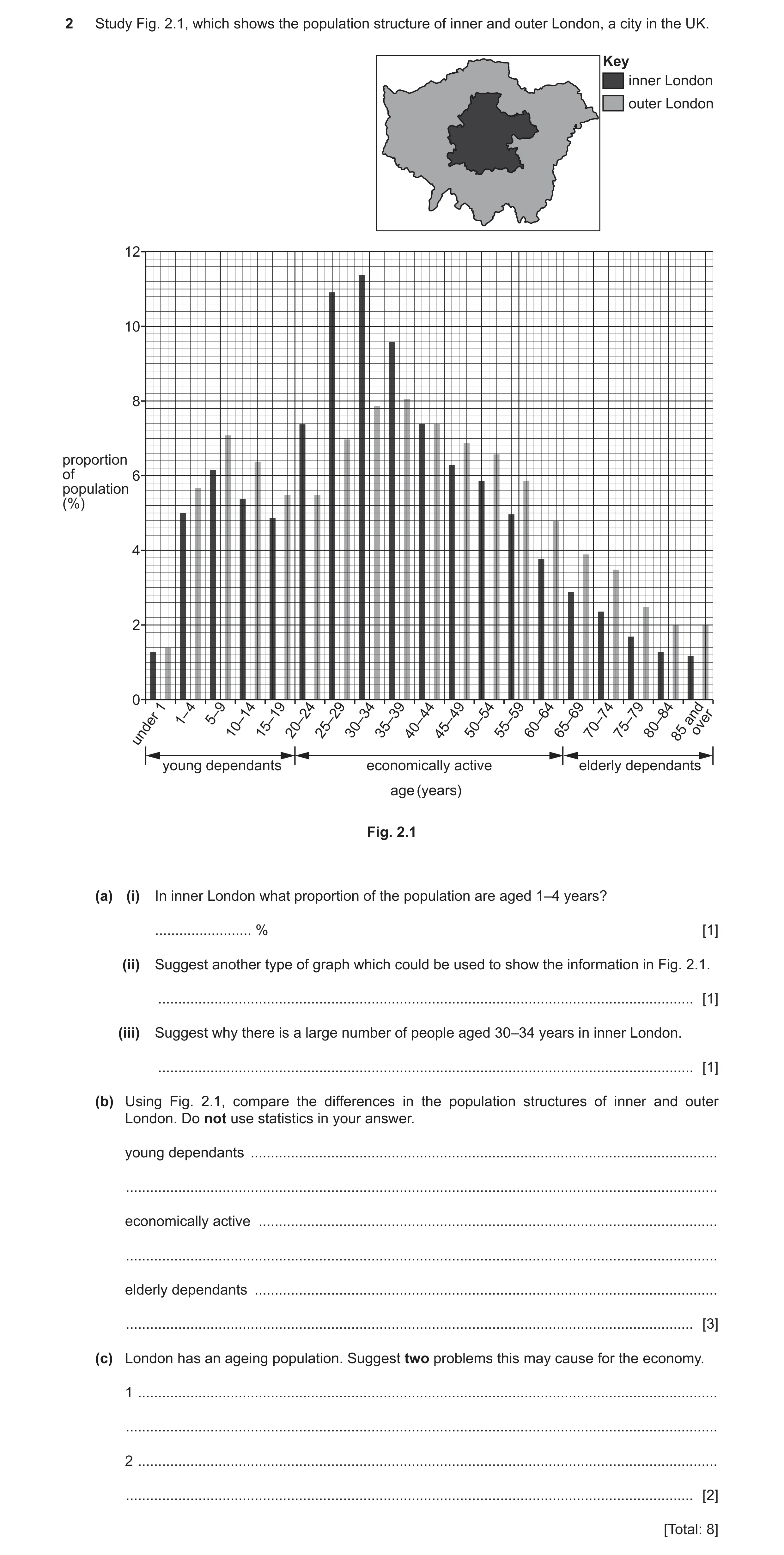
2 Study Fig. 2.1, which shows the population structure of inner and outer London, a city in the UK. Key inner London outer London 12 10 8 proportion of 6 population (%) 4 2 0 1 4 5–9 44 49 and 1– over 10–1415–1920–2425–2930–3435–3940– 45– 50–5455–5960–6465–6970–7475–7980–8485 under young dependants economically active elderly dependants age (years) Fig. 2.1 (a) (i) In inner London what proportion of the population are aged 1–4 years? … % [1] (ii) Suggest another type of graph which could be used to show the information in Fig. 2.1. … [1] (iii) Suggest why there is a large number of people aged 30–34 years in inner London. … [1] (b) Using Fig. 2.1, compare the differences in the population structures of inner and outer London. Do not use statistics in your answer. young dependants … … economically active … … elderly dependants … … [3] (c) London has an ageing population. Suggest two problems this may cause for the economy. 1 … … 2 … … [2] [Total: 8]
8 marks
Mark scheme: 2(a)(i) 5(%) 1 2(a)(ii) Age/sex/population pyramid/histogram/compound bar graph 1 2(a)(iii) Seeking/moving in for work/work there/wide variety of jobs available/industry 1 needs a workforce. 2(b) Young dependents: 3 Higher in outer London/lower in inner London; Economically active: Higher in inner London/lower in outer London; Higher in inner London from 20 to 39 but higher in outer London from 45– 64/same in both areas for 40–44 age group. Elderly dependents: Higher in outer London/lower in inner London; Note: 1 mark reserve for each category. 2(c) Need more care homes; 2 Drain on health services/more money needed for healthcare services; Working age people pay more to support the elderly; More money needed for pensions/benefits/costs government more; Fewer workers; Workers can demand higher wages; Lower tax revenue/fewer taxpayers; Fewer jobs available for younger generation as older people still working.
This question in 0460/23 Oct/Nov 2023
Question 18 0460/22 Feb/March 2024
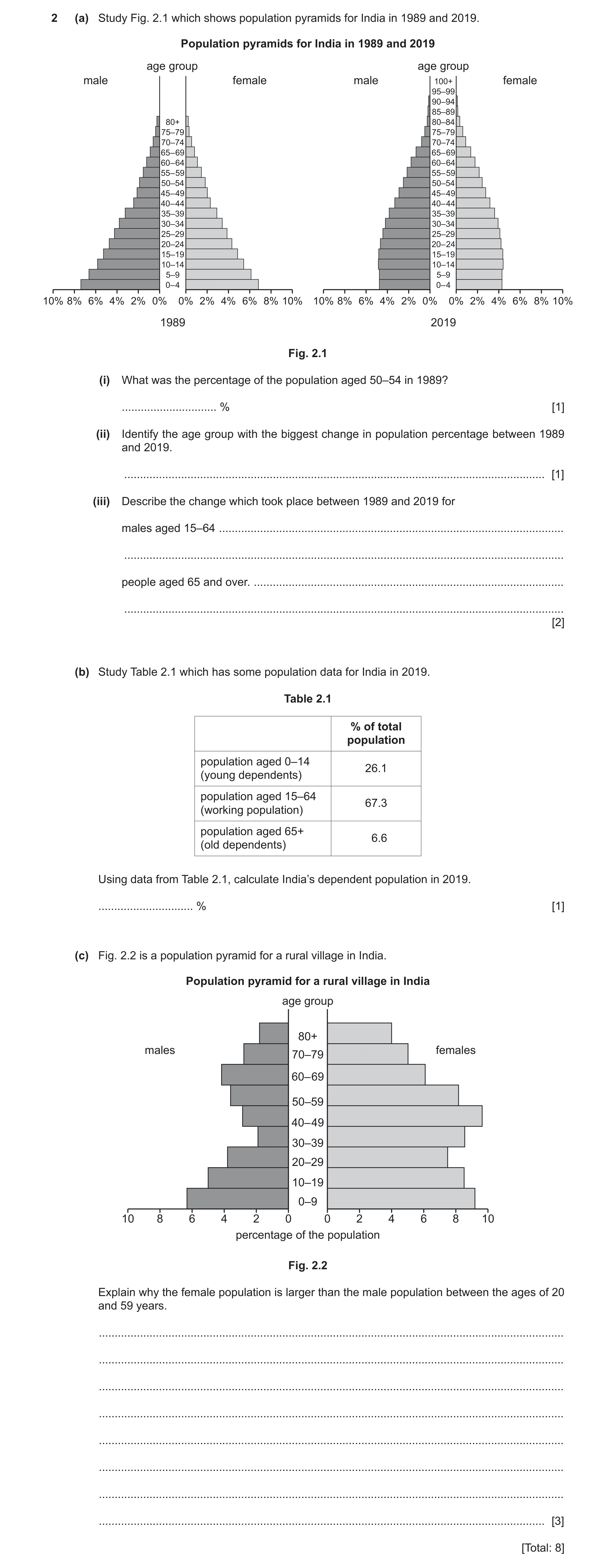
2 (a) Study Fig. 2.1 which shows population pyramids for India in 1989 and 2019. Population pyramids for India in 1989 and 2019 age group age group male female male 100+ female 95–99 90–94 85–89 80+ 80–84 75–79 75–79 70–74 70–74 65– 69 65– 69 60– 64 60– 64 55– 59 55– 59 50–54 50–54 45– 49 45– 49 40– 44 40– 44 35–39 35–39 30–34 30–34 25–29 25–29 20–24 20– 24 15–19 15–19 10–14 10–14 5–9 5–9 0– 4 0– 4 10% 8% 6% 4% 2% 0% 0% 2% 4% 6% 8% 10% 10% 8% 6% 4% 2% 0% 0% 2% 4% 6% 8% 10% 1989 2019 Fig. 2.1 (i) What was the percentage of the population aged 50–54 in 1989? … % [1] (ii) Identify the age group with the biggest change in population percentage between 1989 and 2019. … [1] (iii) Describe the change which took place between 1989 and 2019 for males aged 15–64 … … people aged 65 and over. … … [2] (b) Study Table 2.1 which has some population data for India in 2019. Table 2.1 % of total population population aged 0–14 26.1 (young dependents) population aged 15–64 67.3 (working population) population aged 65+ 6.6 (old dependents) Using data from Table 2.1, calculate India’s dependent population in 2019. … % [1] (c) Fig. 2.2 is a population pyramid for a rural village in India. Population pyramid for a rural village in India age group 80+ males females 70–79 60– 69 50–59 40– 49 30–39 20–29 10–19 0–9 10 8 6 4 2 0 0 2 4 6 8 10 percentage of the population Fig. 2.2 Explain why the female population is larger than the male population between the ages of 20 and 59 years. … … … … … … … … [3] [Total: 8]
8 marks
Mark scheme: 2(a)(i) 3.8% (tolerance) 3.6–3.9%. 1 2(a)(ii) 0–4 (yrs). 1 2(a)(iii) males 15–64: (small/moderate) increase/decrease or remains the same then 2 increase; people aged 65+: live longer/(small) increase. 2(b) 32.7(%). 1 2(c) males most likely to migrate/females most likely to stay at home; 3 crop failure; to find a job; (men leave village to find a job = 2) to earn more money; (men leave village to find a better paying job = 3) mechanisation in agriculture; unemployment; males go away to study; women stay behind to look after the family/tend the house. ^ tradition forbids woman from working. =0 men do harder/more dangerous jobs so are more likely to die men more likely to get sick working in bad conditions females required to give birth female mortality rate is lower than males females are less educated reference to males in the military/wars lack of contraception/birth rates.
This question in 0460/22 Feb/March 2024
Question 19 0460/22 Oct/Nov 2024
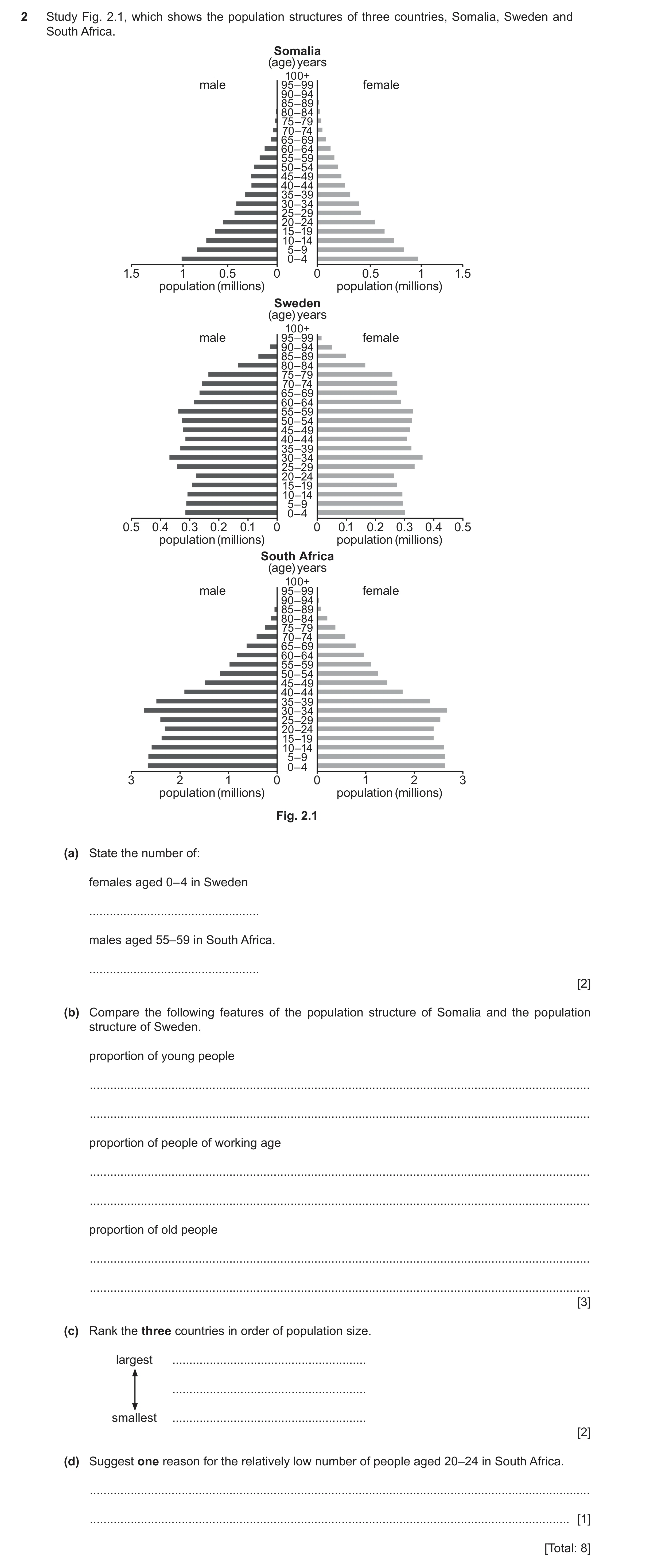
2 Study Fig. 2.1, which shows the population structures of three countries, Somalia, Sweden and South Africa. Somalia (age) years 100+ male 95–99 female 90–94 85–89 80–84 75–79 70–74 65–69 60–64 55–59 50–54 45–49 40–44 35–39 30–34 25–29 20–24 15–19 10–14 5–9 0–4 1.5 1 0.5 0 0 0.5 1 1.5 population (millions) population (millions) Sweden (age) years 100+ male 95–99 female 90–94 85–89 80–84 75–79 70–74 65–69 60–64 55–59 50–54 45–49 40–44 35–39 30–34 25–29 20–24 15–19 10–14 5–9 0–4 0.5 0.4 0.3 0.2 0.1 0 0 0.1 0.2 0.3 0.4 0.5 population (millions) population (millions) South Africa (age) years 100+ male 95–99 female 90–94 85–89 80–84 75–79 70–74 65–69 60–64 55–59 50–54 45–49 40–44 35–39 30–34 25–29 20–24 15–19 10–14 5–9 0–4 3 2 1 0 0 1 2 3 population (millions) population (millions) Fig. 2.1 (a) State the number of: females aged 0– 4 in Sweden … males aged 55–59 in South Africa. … [2] (b) Compare the following features of the population structure of Somalia and the population structure of Sweden. proportion of young people … … proportion of people of working age … … proportion of old people … … [3] (c) Rank the three countries in order of population size. largest … … smallest … [2] (d) Suggest one reason for the relatively low number of people aged 20–24 in South Africa. … … [1] [Total: 8]
8 marks
Mark scheme: 2(a) 300 thousand/300 000/0.3 million; 2 950 thousand/950 000/0.95 million/1 million/1 000 000. 2(b) Young – Somalia more/Sweden less; 3 Working – Somalia less/Sweden more; Old – Somalia less/Sweden more. NOTE: Allow higher/lower/highest/lowest etc. Only credit reference to the whole group. Not part e.g. 20–29-year-olds. 2(c) South Africa 2 Somalia Sweden 3 correct = 2, 1 correct = 1 2(d) Low birth rate; 1 High infant mortality rate; Emigration; Famine; Disease; War; Natural disaster.
This question in 0460/22 Oct/Nov 2024
Q20 · The population structure of three countries between 1950 and 2020 0460/21 May/June 2025
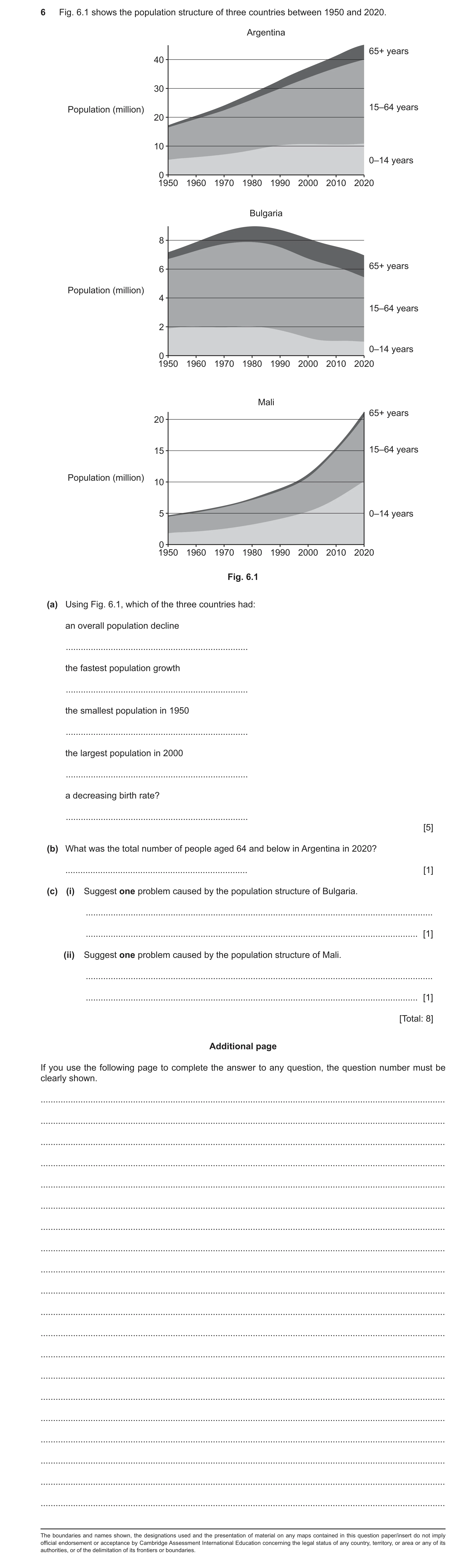
6 Fig. 6.1 shows the population structure of three countries between 1950 and 2020. Argentina 65+ years 40 30 Population (million) 15–64 years 20 10 0–14 years 0 1950 1960 1970 1980 1990 2000 2010 2020 Bulgaria 8 65+ years 6 Population (million) 4 15–64 years 2 0–14 years 0 1950 1960 1970 1980 1990 2000 2010 2020 Mali 65+ years 20 15 15–64 years Population (million) 10 5 0–14 years 0 1950 1960 1970 1980 1990 2000 2010 2020 Fig. 6.1 (a) Using Fig. 6.1, which of the three countries had: an overall population decline … the fastest population growth … the smallest population in 1950 … the largest population in 2000 … a decreasing birth rate? … [5] (b) What was the total number of people aged 64 and below in Argentina in 2020? … [1] (c) (i) Suggest one problem caused by the population structure of Bulgaria. … … [1] (ii) Suggest one problem caused by the population structure of Mali. … … [1] [Total: 8] Additional page If you use the following page to complete the answer to any question, the question number must be clearly shown. … … … … … … … … … … … … … … … … … … … … The boundaries and names shown, the designations used and the presentation of material on any maps contained in this question paper/insert do not imply official endorsement or acceptance by Cambridge Assessment International Education concerning the legal status of any country, territory, or area or any of its authorities, or of the delimitation of its frontiers or boundaries.
8 marks
Mark scheme: 6(a) • Bulgaria 5 • Mali • Mali • Argentina • Bulgaria 6(b) 40 million 1 6(c)(i) • Workers taxes increase; 1 • Government receives less taxes; • Health provision/care for elderly needed; • Shortage of workers; • Underuse of resources; • Less military. 6(c)(ii) • Large numbers of young to feed/educate/support; 1 • Small numbers of economically active; • Future unemployment.
This question in 0460/21 May/June 2025
Question 21 0460/23 Oct/Nov 2025
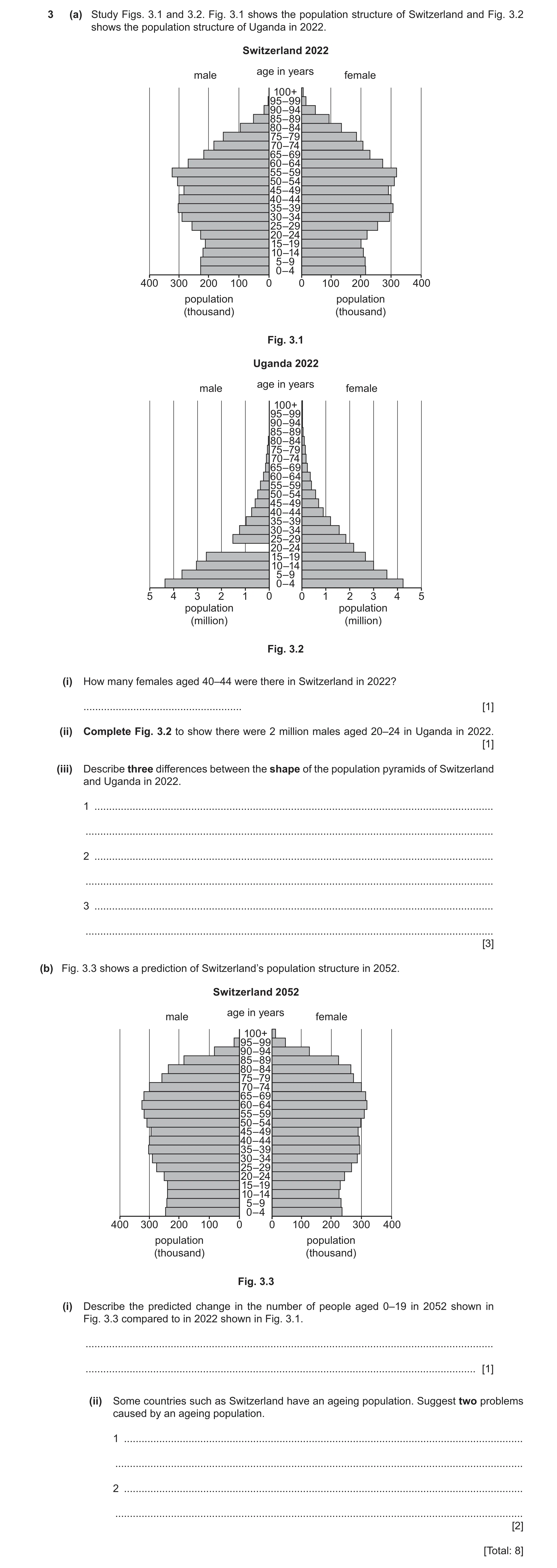
3 (a) Study Figs. 3.1 and 3.2. Fig. 3.1 shows the population structure of Switzerland and Fig. 3.2 shows the population structure of Uganda in 2022. Switzerland 2022 age in years male female 100+ 95–99 90–94 85–89 80–84 75–79 70–74 65–69 60–64 55–59 50–54 45–49 40–44 35–39 30–34 25–29 20–24 15–19 10–14 5–9 0–4 400 300 200 100 0 0 100 200 300 400 population population (thousand) (thousand) Fig. 3.1 Uganda 2022 age in years male female 100+ 95–99 90–94 85–89 80–84 75–79 70–74 65–69 60–64 55–59 50–54 45–49 40–44 35–39 30–34 25–29 20–24 15–19 10–14 5–9 0–4 5 4 3 2 1 0 0 1 2 3 4 5 population population (million) (million) Fig. 3.2 (i) How many females aged 40–44 were there in Switzerland in 2022? … [1] (ii) Complete Fig. 3.2 to show there were 2 million males aged 20–24 in Uganda in 2022. [1] (iii) Describe three differences between the shape of the population pyramids of Switzerland and Uganda in 2022. 1 … … 2 … … 3 … … [3] (b) Fig. 3.3 shows a prediction of Switzerland’s population structure in 2052. Switzerland 2052 age in years male female 100+ 95–99 90–94 85–89 80–84 75–79 70–74 65–69 60–64 55–59 50–54 45–49 40–44 35–39 30–34 25–29 20–24 15–19 10–14 5–9 0–4 400 300 200 100 0 0 100 200 300 400 population population (thousand) (thousand) Fig. 3.3 (i) Describe the predicted change in the number of people aged 0–19 in 2052 shown in Fig. 3.3 compared to in 2022 shown in Fig. 3.1. … … [1] (ii) Some countries such as Switzerland have an ageing population. Suggest two problems caused by an ageing population. 1 … … 2 … … [2] [Total: 8]
8 marks
Mark scheme: 3(a)(i) 300 000 1 3(a)(ii) Bar drawn to 2 million males 1 3(a)(iii) wider at bottom / young age groups in Ug / narrower at bottom in Sw 3 wider in middle / working age groups in Sw / narrower in middle in Ug wider at top / old age groups in Sw / narrower at top in Ug taller in Sw / shorter in Ug constrictive in Sw v expansive in Ug / Sw convex v Ug concave / Sw widest in middle v Ug widest at bottom Answer must be comparative and refer only to shape. 3(b)(i) increase 1 3(b)(ii) large numbers of old people to support/care for 2 strain on health services/social care need for pensions/benefits need for old people’s homes shortage of workers/ decreased working population higher tax / burden on working population less tax revenue (government) underuse of resources less military
This question in 0460/23 Oct/Nov 2025
 27 / 40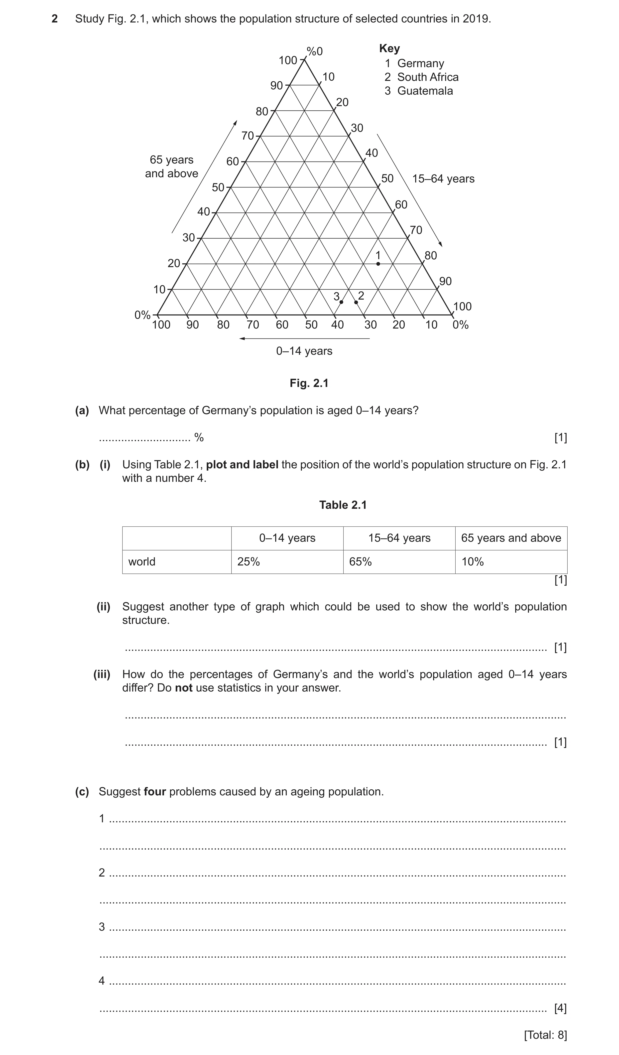
 8
8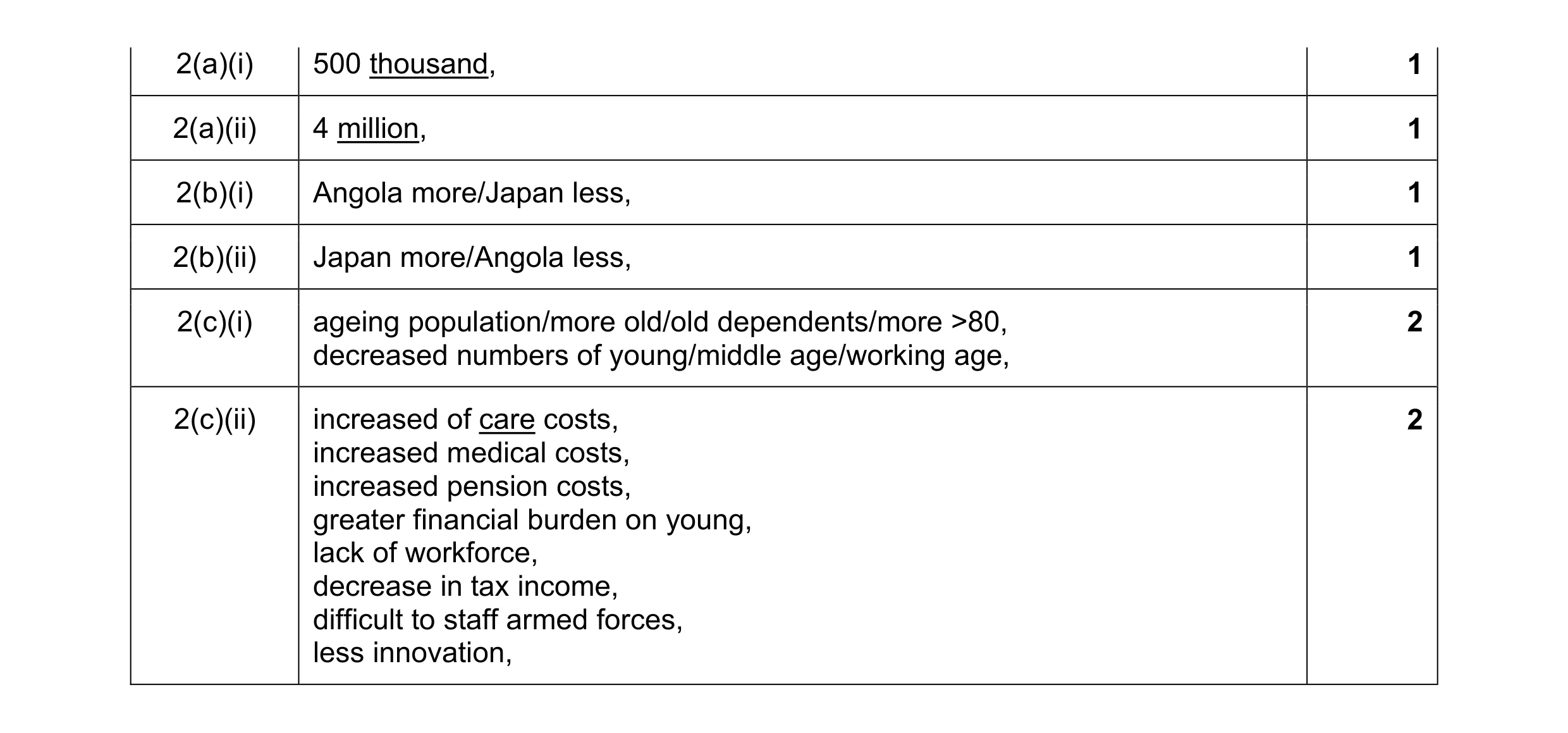 8
8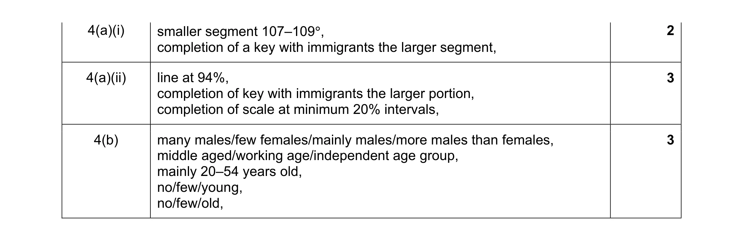 8
8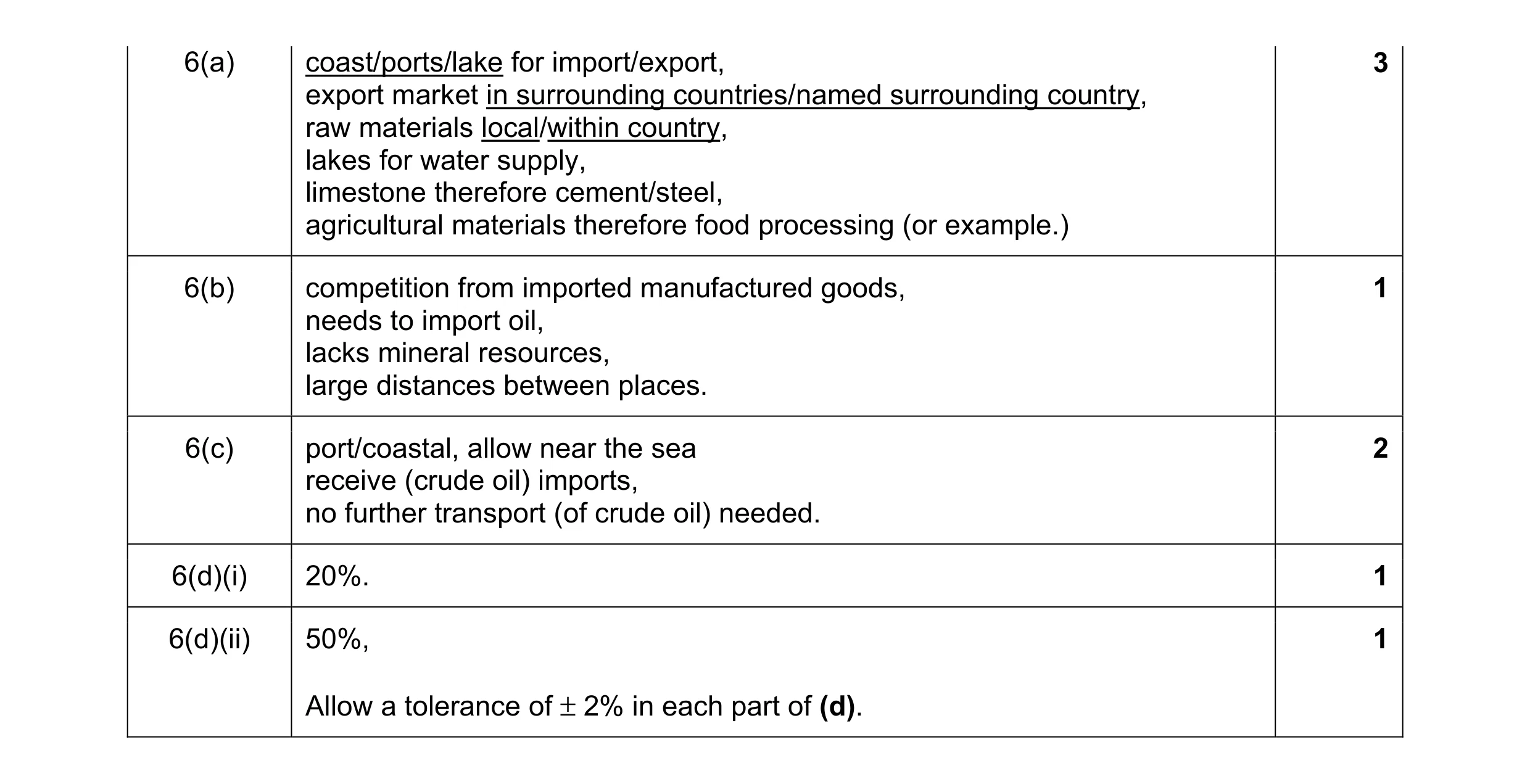 8
8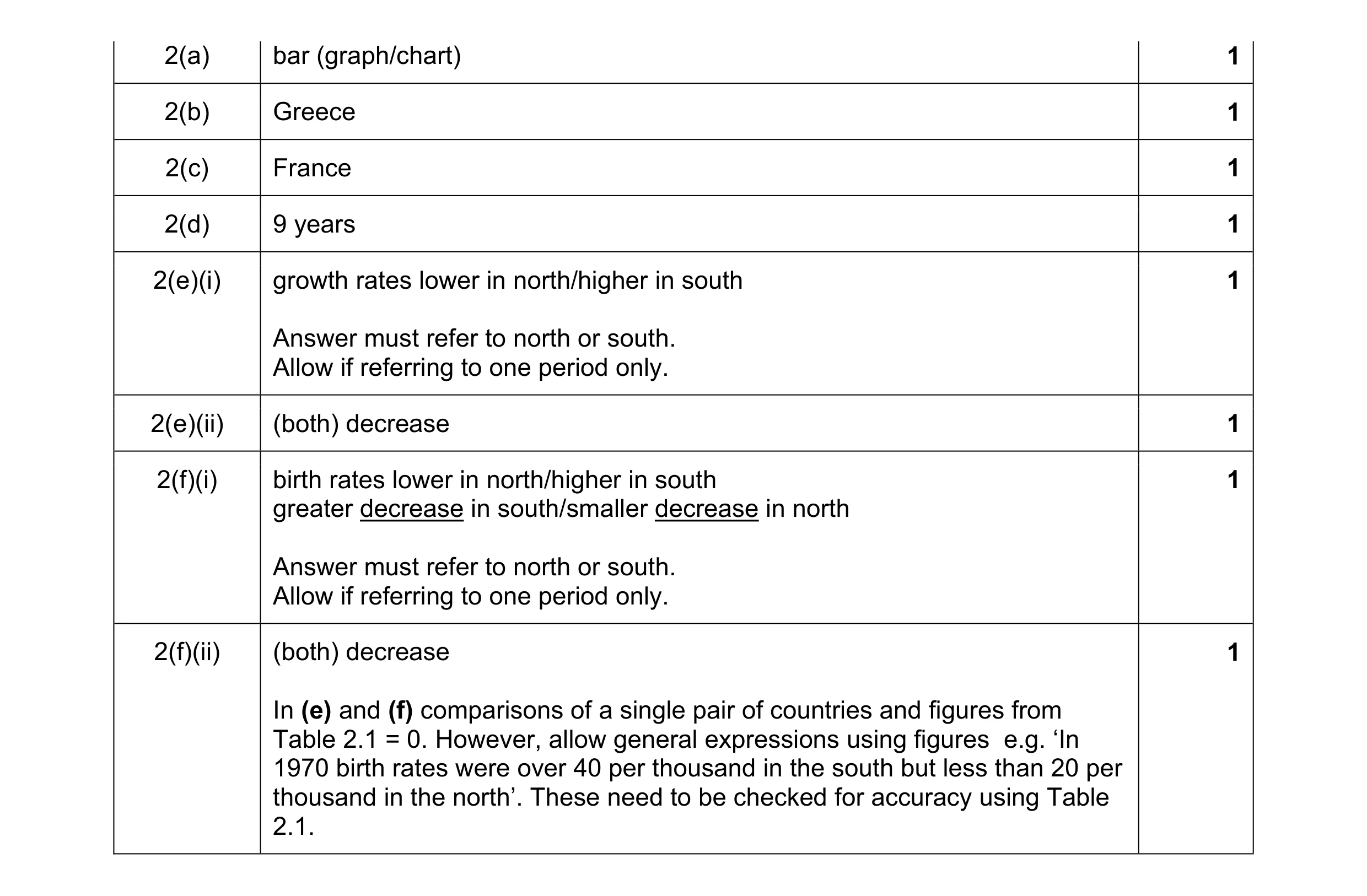 8
8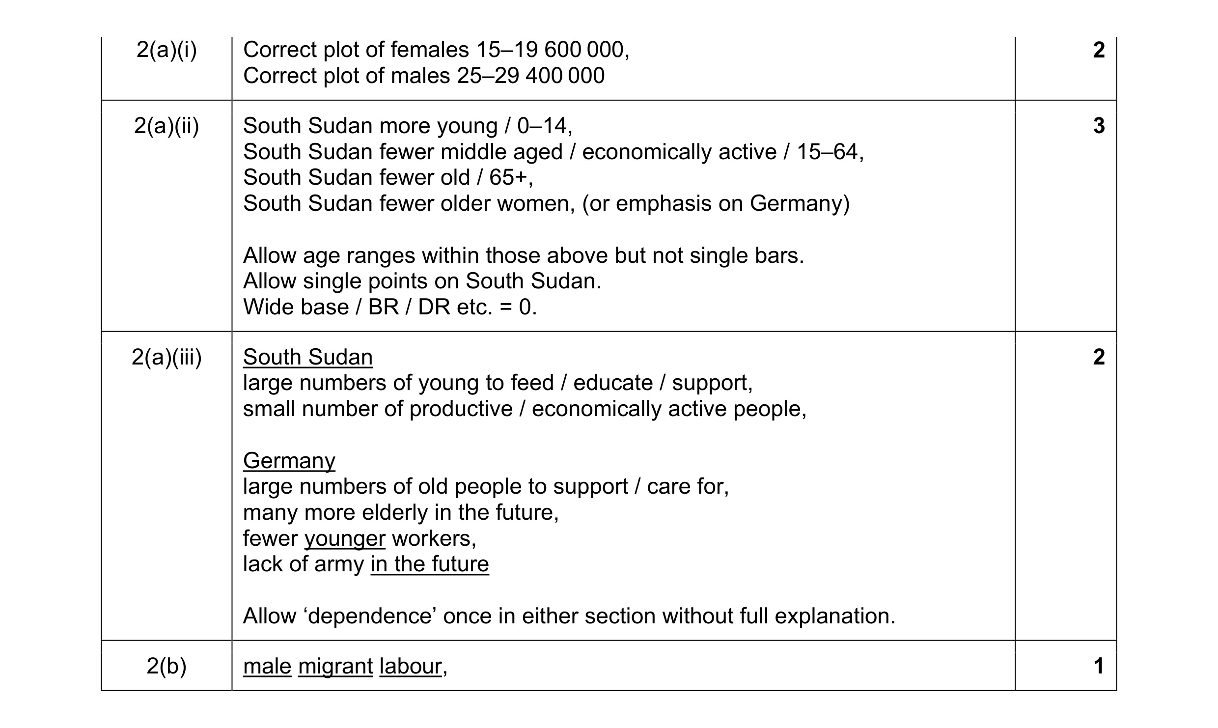 8
8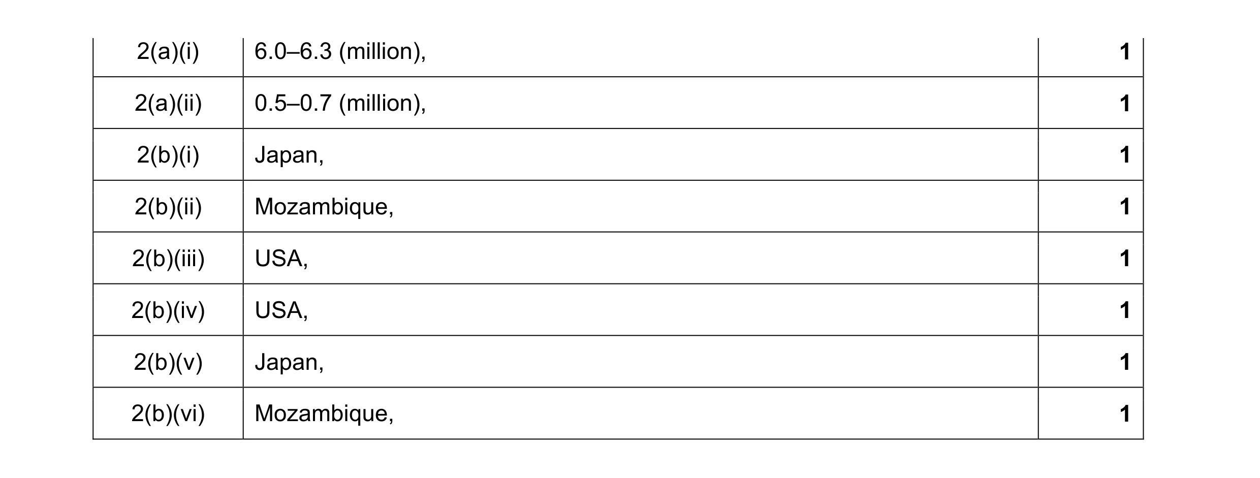 8
8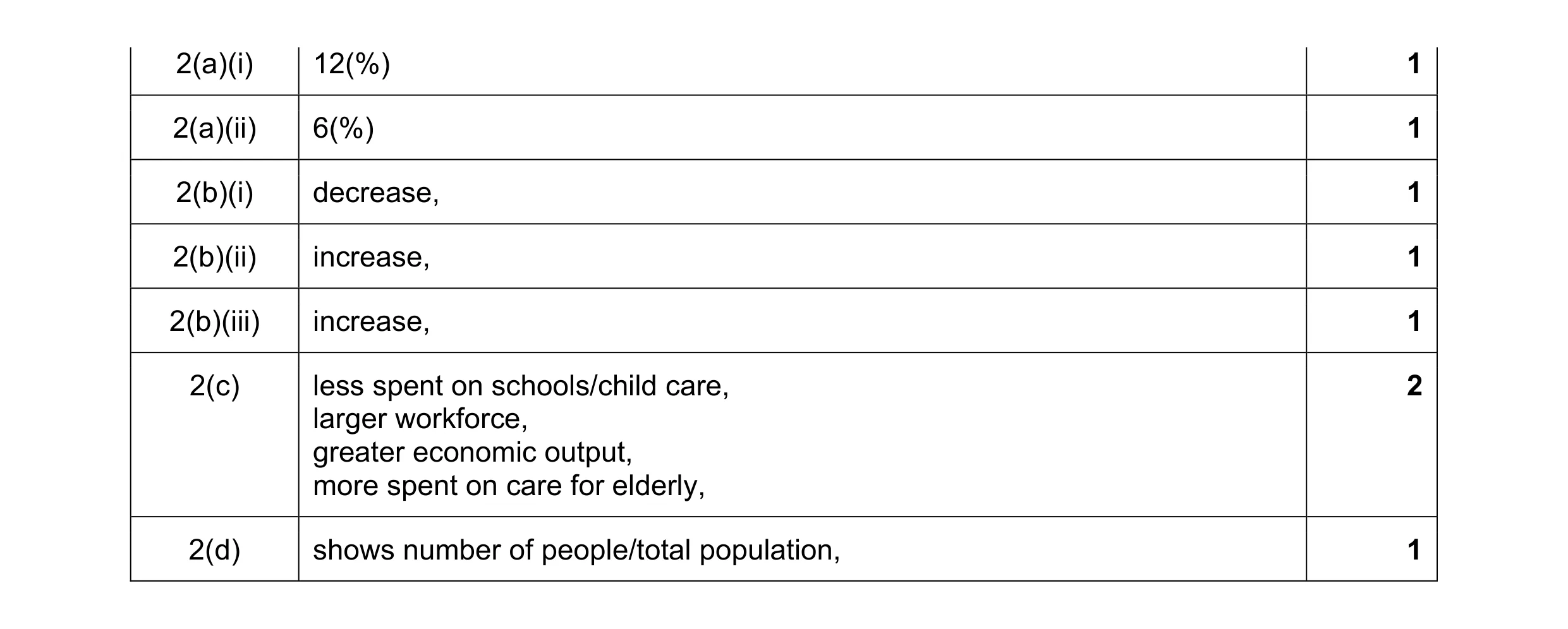 8
8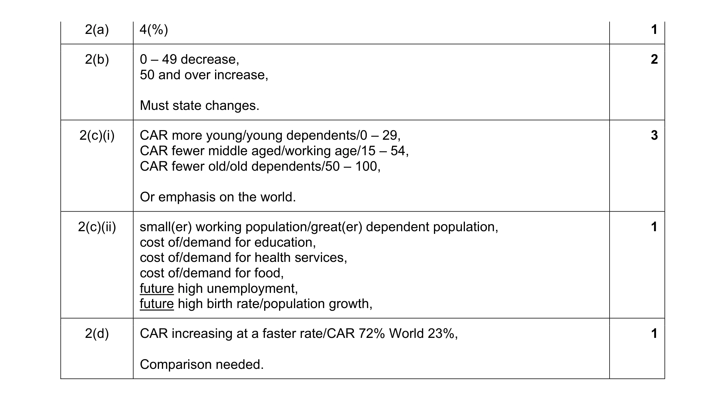 8
8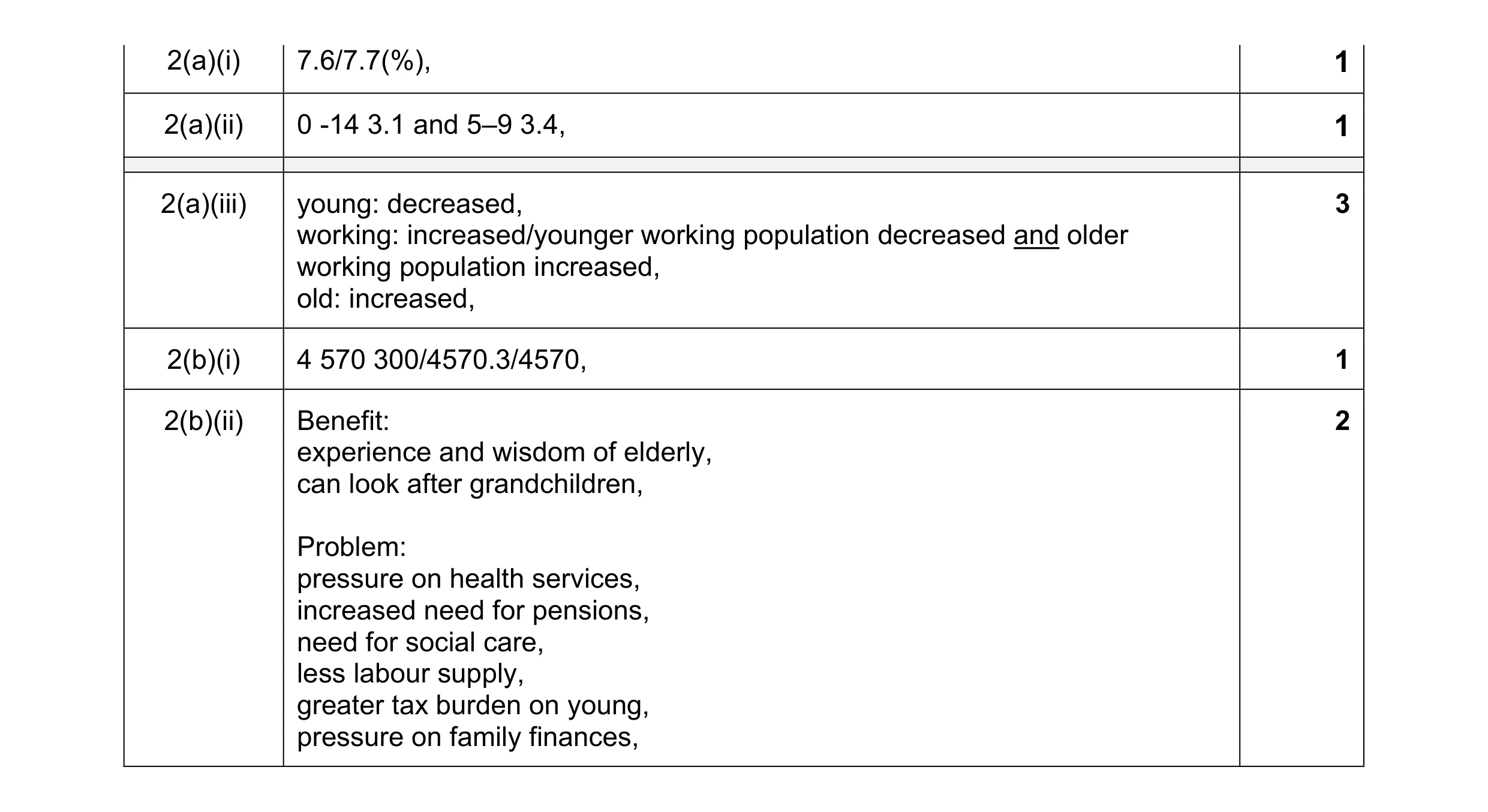 8
8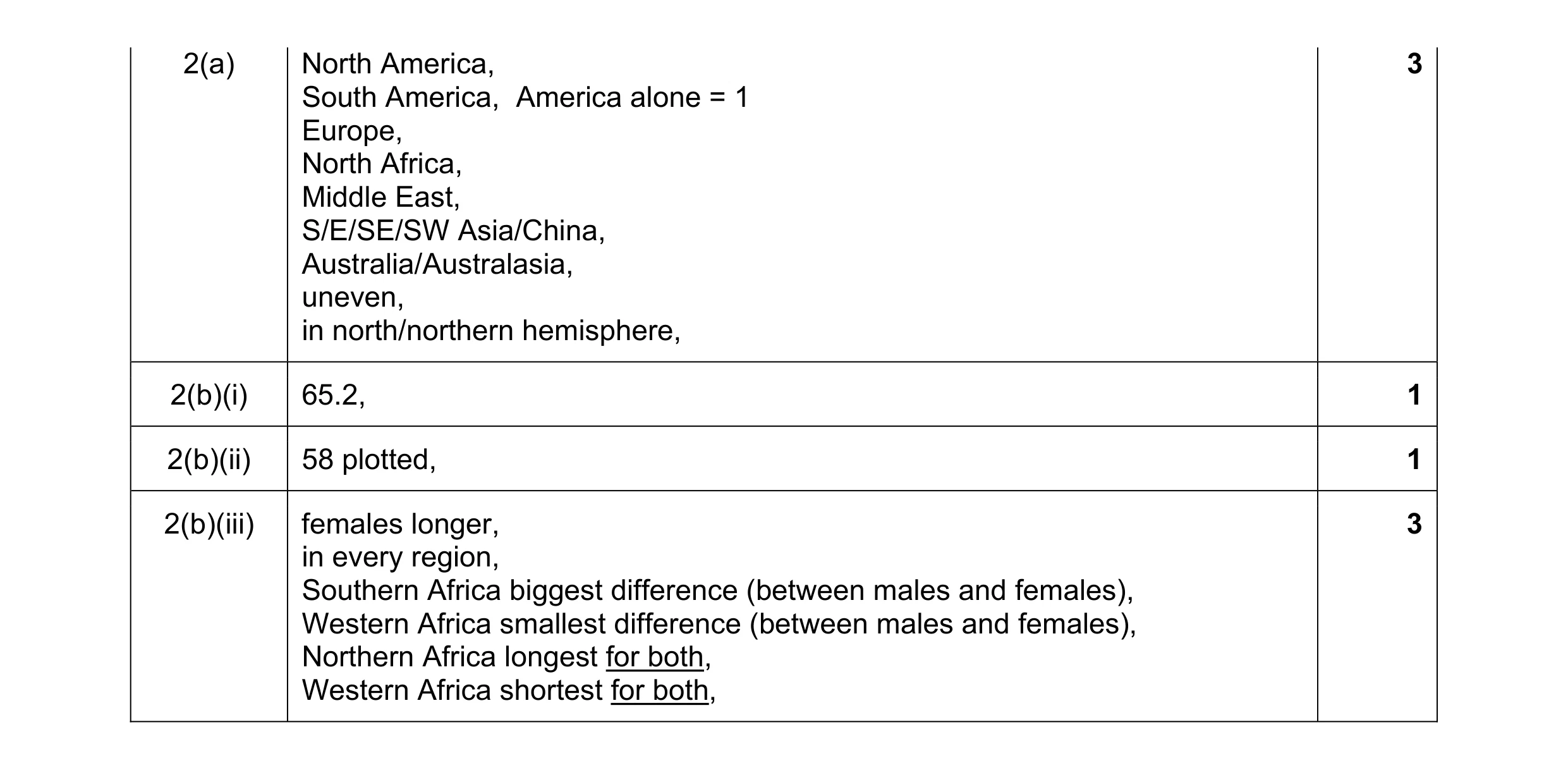 8
8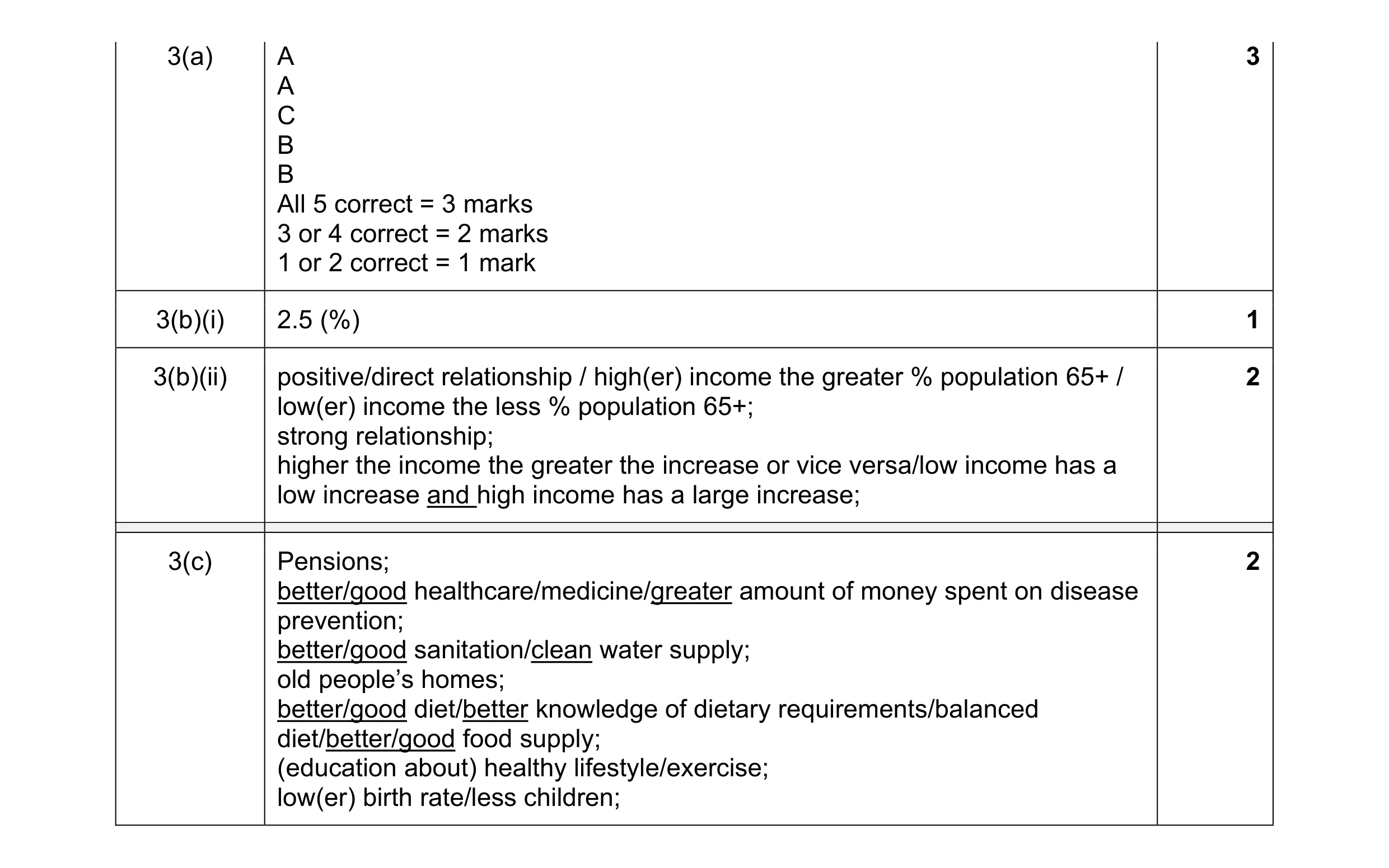 8
8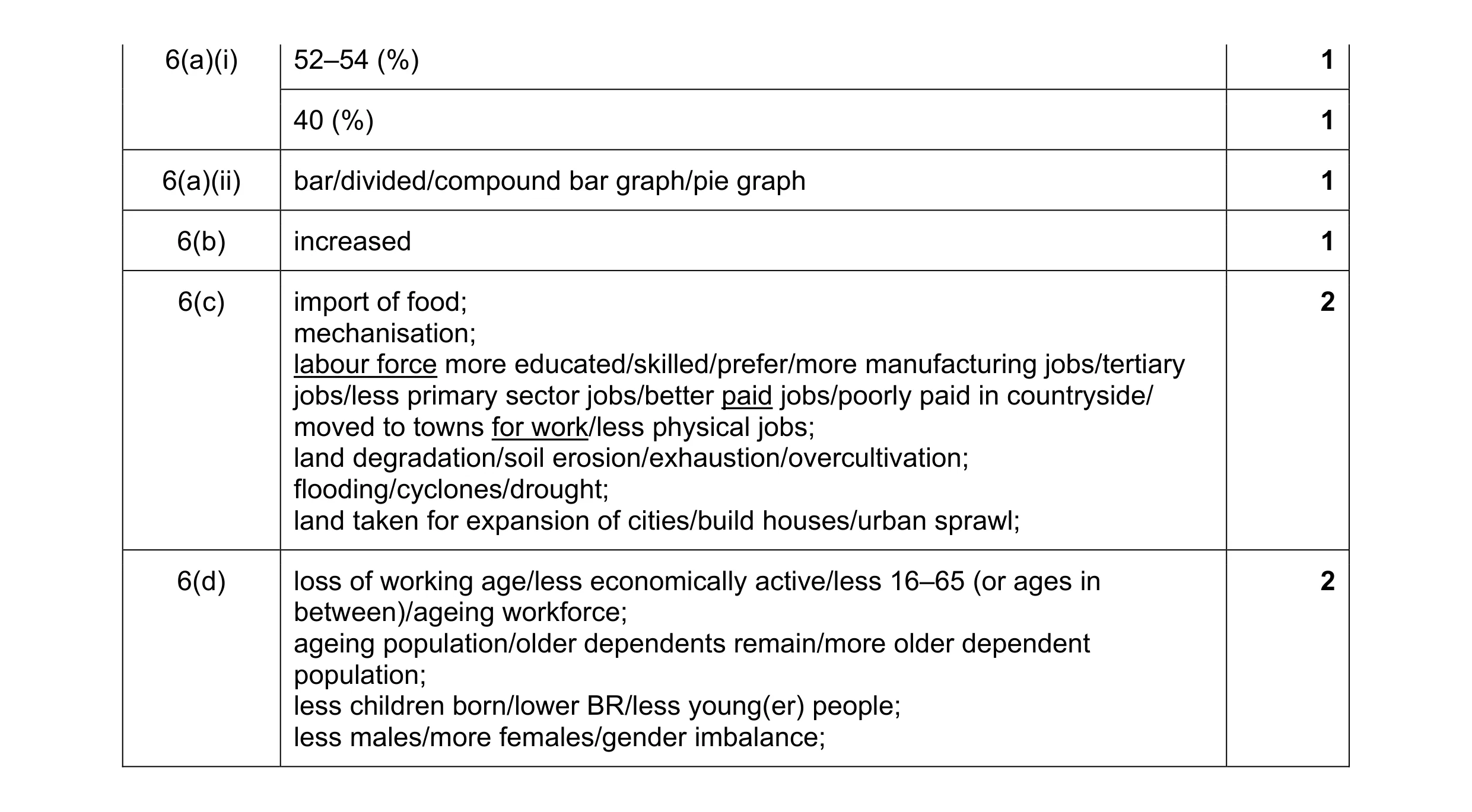 8
8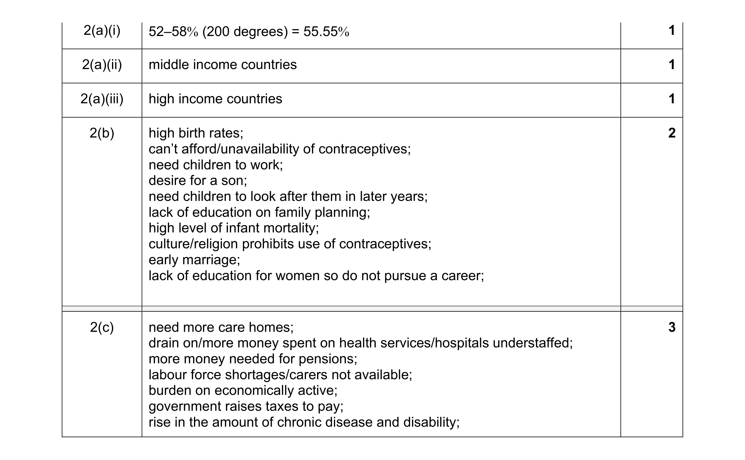 8
8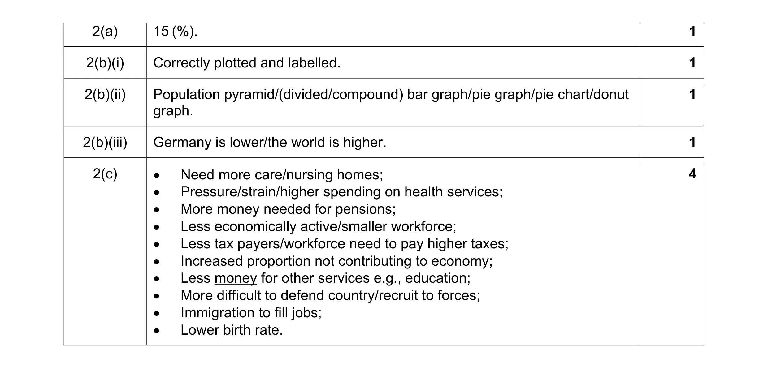 8
8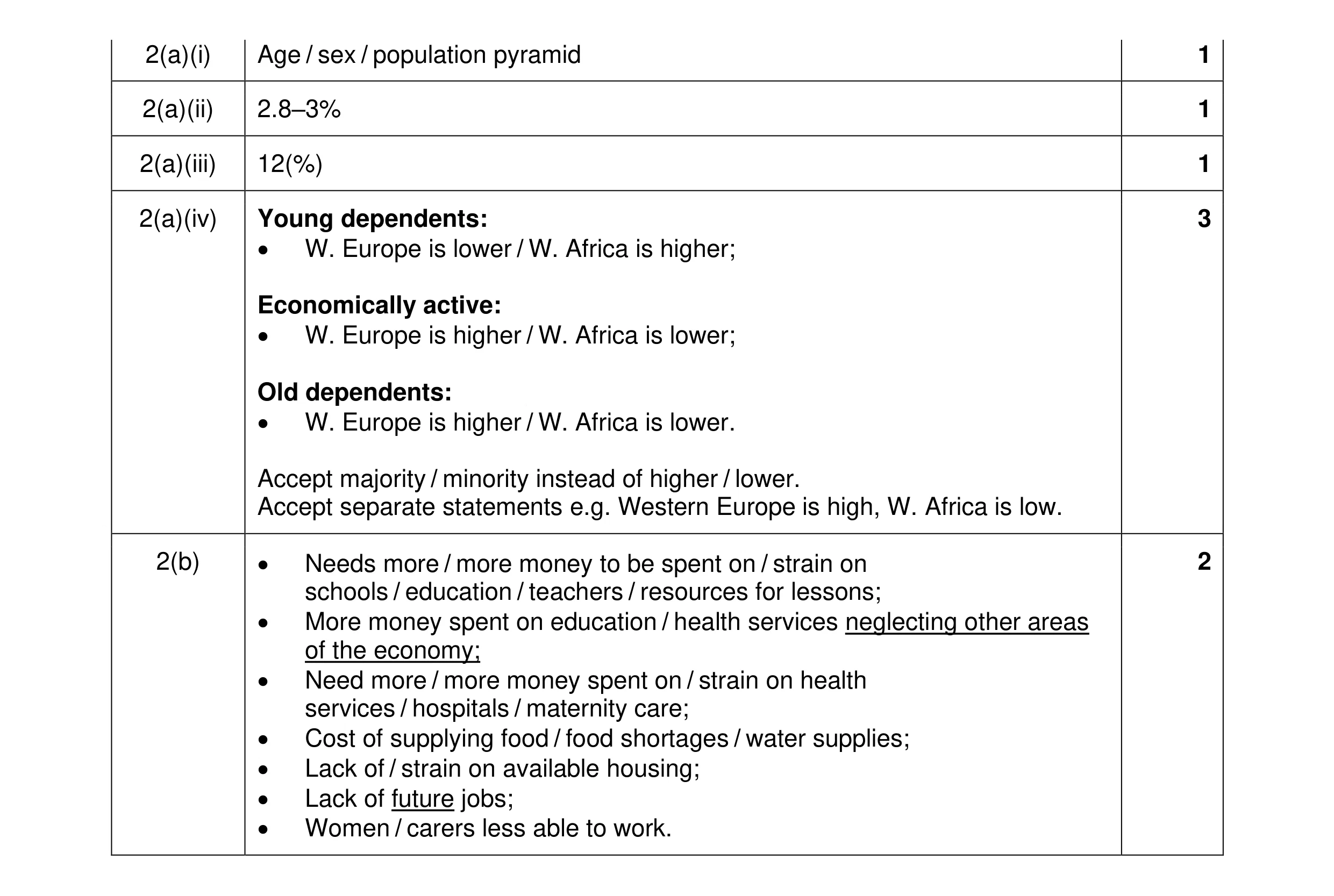 8
8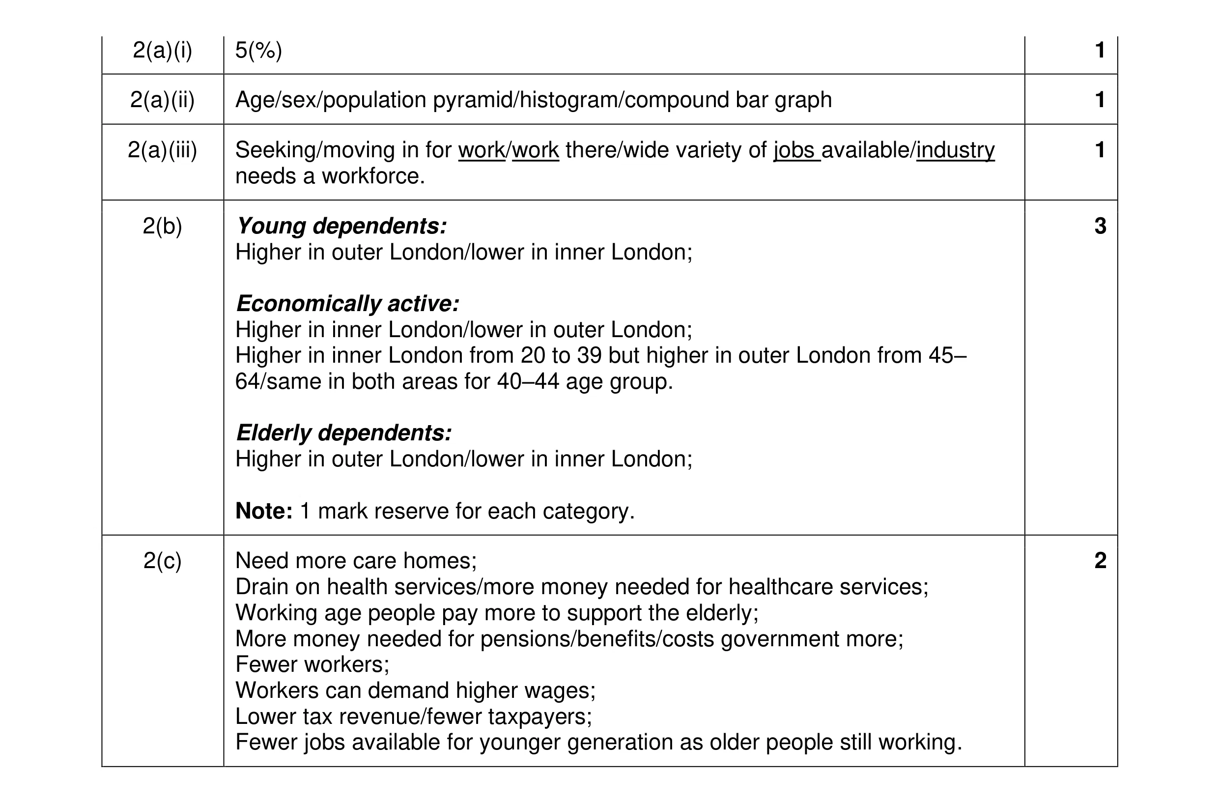 8
8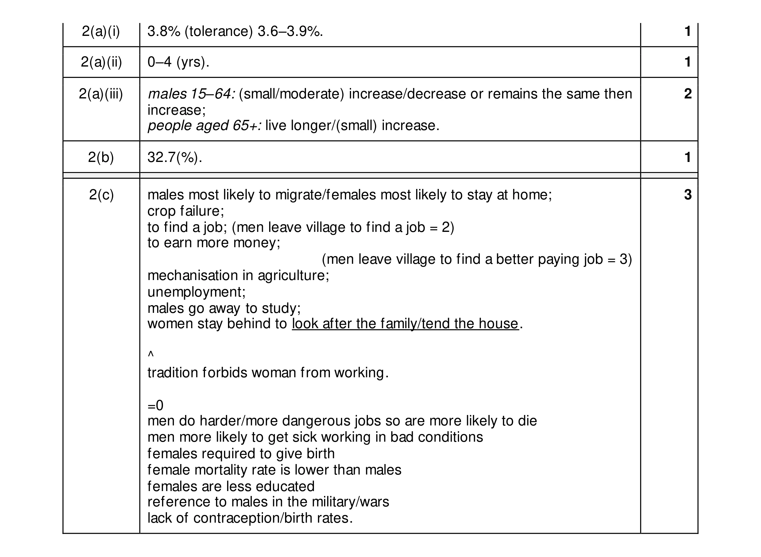 8
8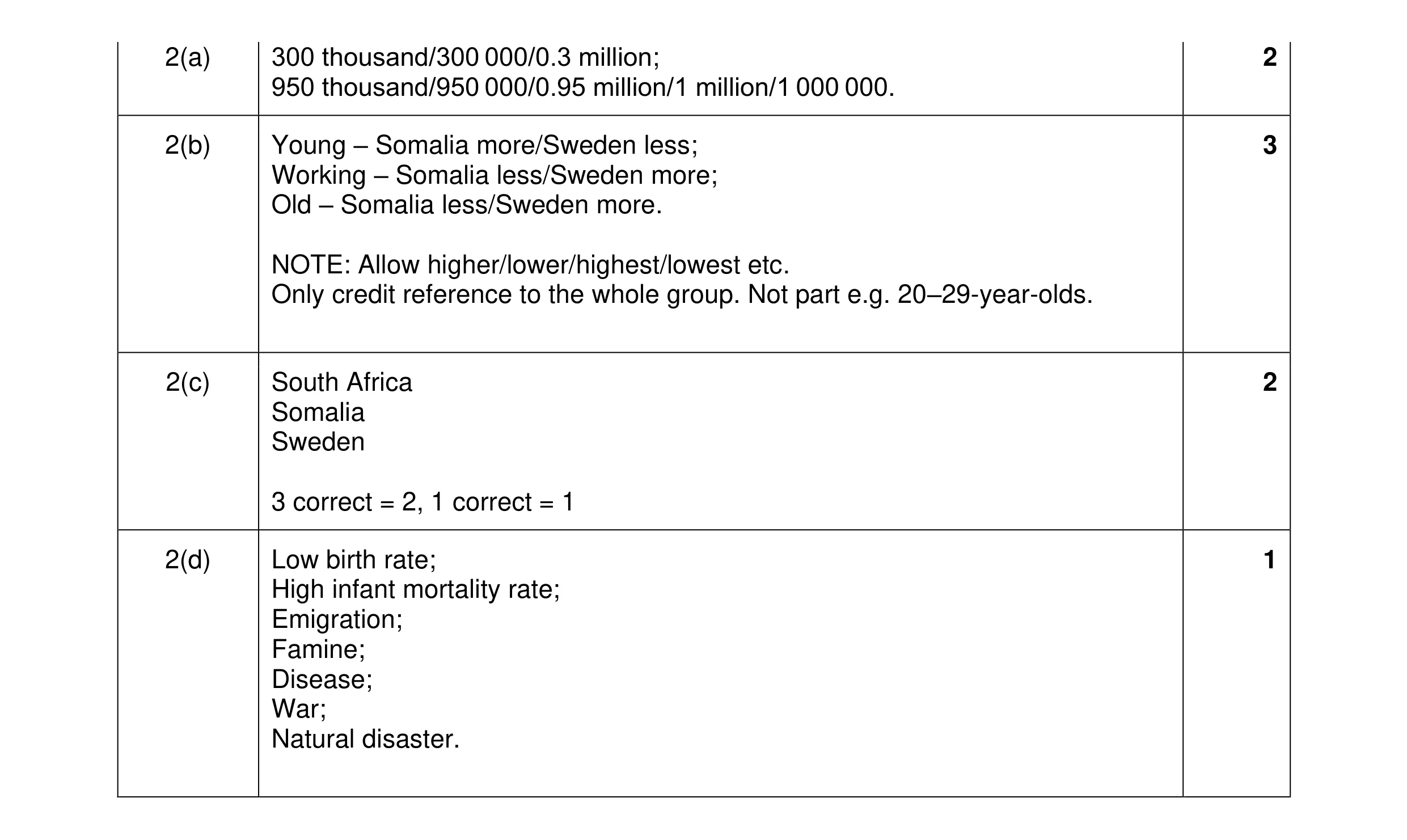 8
8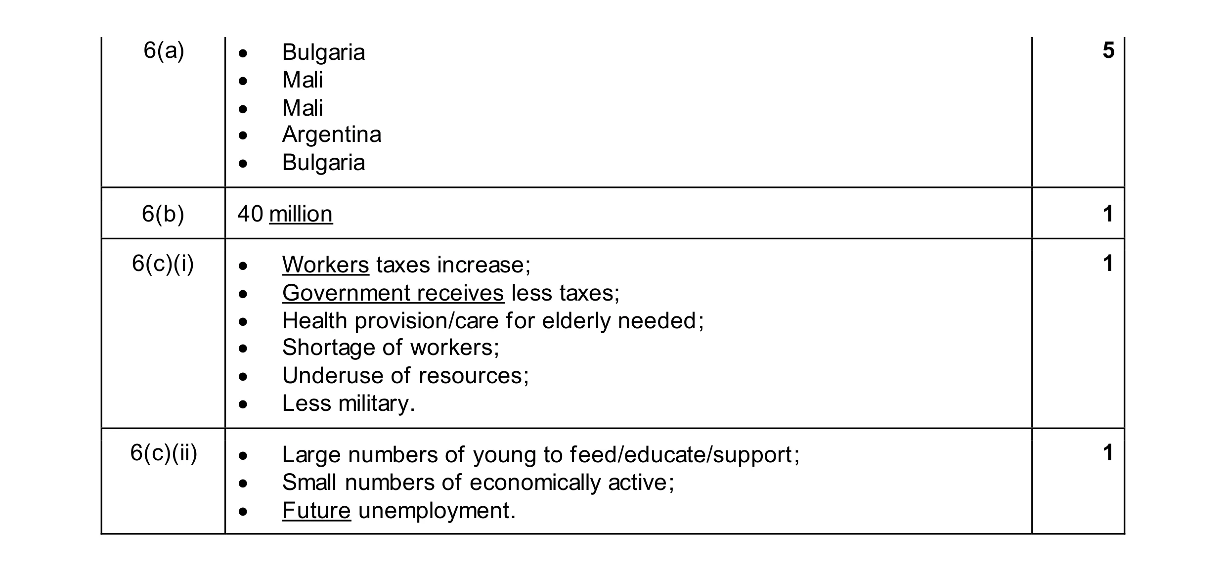 8
8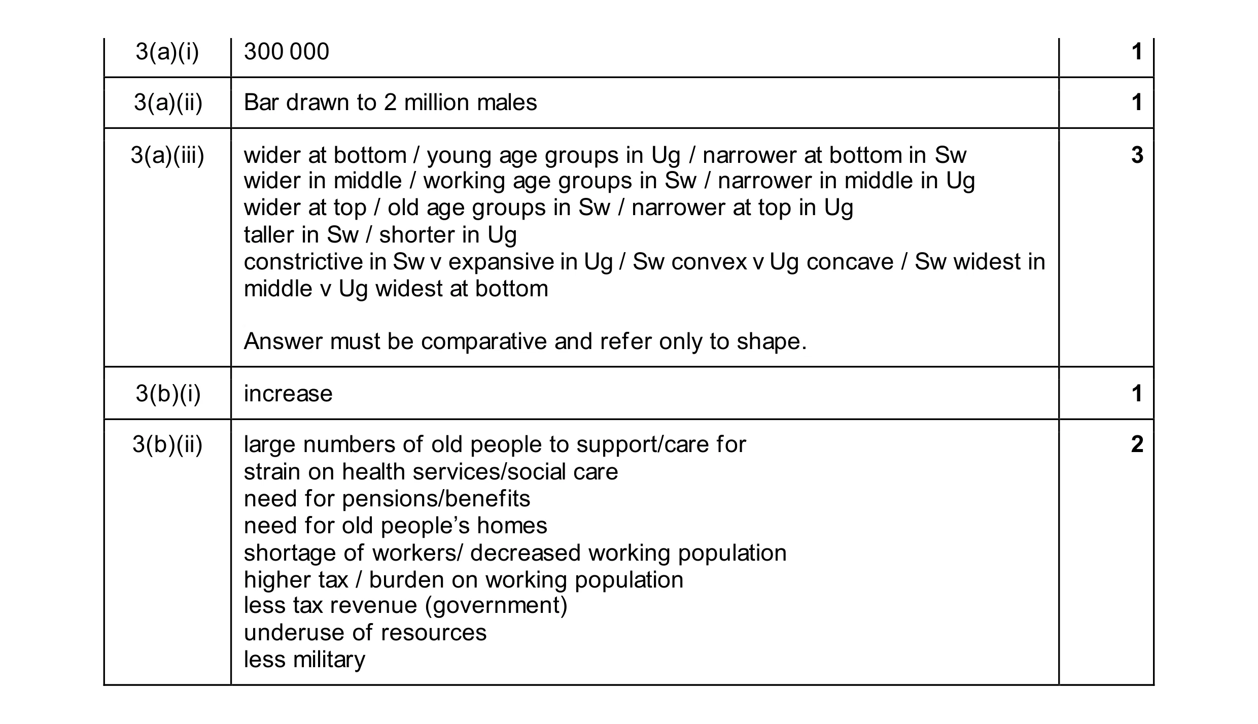 8
8