Questions as text
Q1 · Information about population change and population migration in four urban areas in the… 0460/22 Oct/Nov 2017
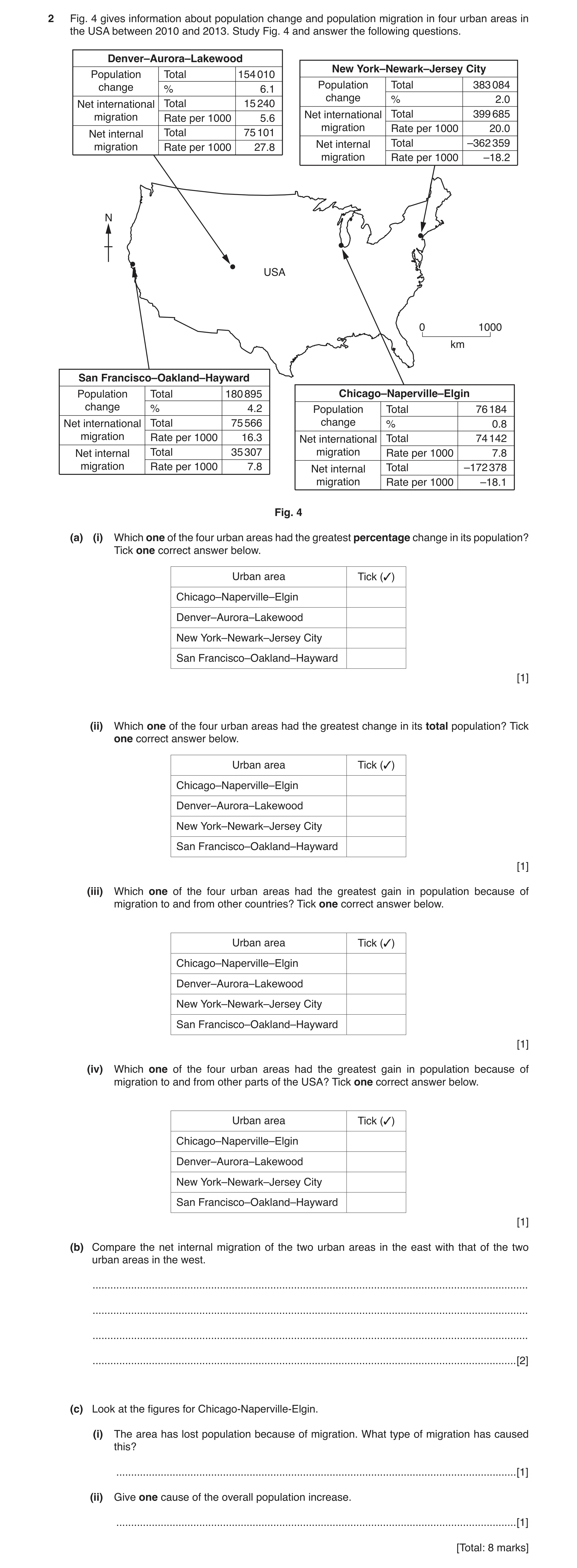
2 Fig. 4 gives information about population change and population migration in four urban areas in the USA between 2010 and 2013. Study Fig. 4 and answer the following questions. Denver–Aurora–Lakewood New York–Newark–Jersey City Population Total 154 010 change % 6.1 Population Total 383 084 change % 2.0 Net international Total 15 240 migration Rate per 1000 5.6 Net international Total 399 685 migration Rate per 1000 20.0 Net internal Total 75 101 migration Rate per 1000 27.8 Net internal Total –362 359 migration Rate per 1000 –18.2 N USA 0 1000 km San Francisco–Oakland–Hayward Population Total 180 895 Chicago–Naperville–Elgin change % 4.2 Population Total 76 184 Net international Total 75 566 change % 0.8 migration Rate per 1000 16.3 Net international Total 74 142 Net internal Total 35 307 migration Rate per 1000 7.8 migration Rate per 1000 7.8 Net internal Total –172 378 migration Rate per 1000 –18.1 Fig. 4 (a) (i) Which one of the four urban areas had the greatest percentage change in its population? Tick one correct answer below. Urban area Tick (3) Chicago–Naperville–Elgin Denver–Aurora–Lakewood New York–Newark–Jersey City San Francisco–Oakland–Hayward [1] (ii) Which one of the four urban areas had the greatest change in its total population? Tick one correct answer below. Urban area Tick (3) Chicago–Naperville–Elgin Denver–Aurora–Lakewood New York–Newark–Jersey City San Francisco–Oakland–Hayward [1] (iii) Which one of the four urban areas had the greatest gain in population because of migration to and from other countries? Tick one correct answer below. Urban area Tick (3) Chicago–Naperville–Elgin Denver–Aurora–Lakewood New York–Newark–Jersey City San Francisco–Oakland–Hayward [1] (iv) Which one of the four urban areas had the greatest gain in population because of migration to and from other parts of the USA? Tick one correct answer below. Urban area Tick (3) Chicago–Naperville–Elgin Denver–Aurora–Lakewood New York–Newark–Jersey City San Francisco–Oakland–Hayward [1] (b) Compare the net internal migration of the two urban areas in the east with that of the two urban areas in the west. … … … … [2] (c) Look at the figures for Chicago-Naperville-Elgin. (i) The area has lost population because of migration. What type of migration has caused this? … [1] (ii) Give one cause of the overall population increase. … [1] [Total: 8 marks]
8 marks
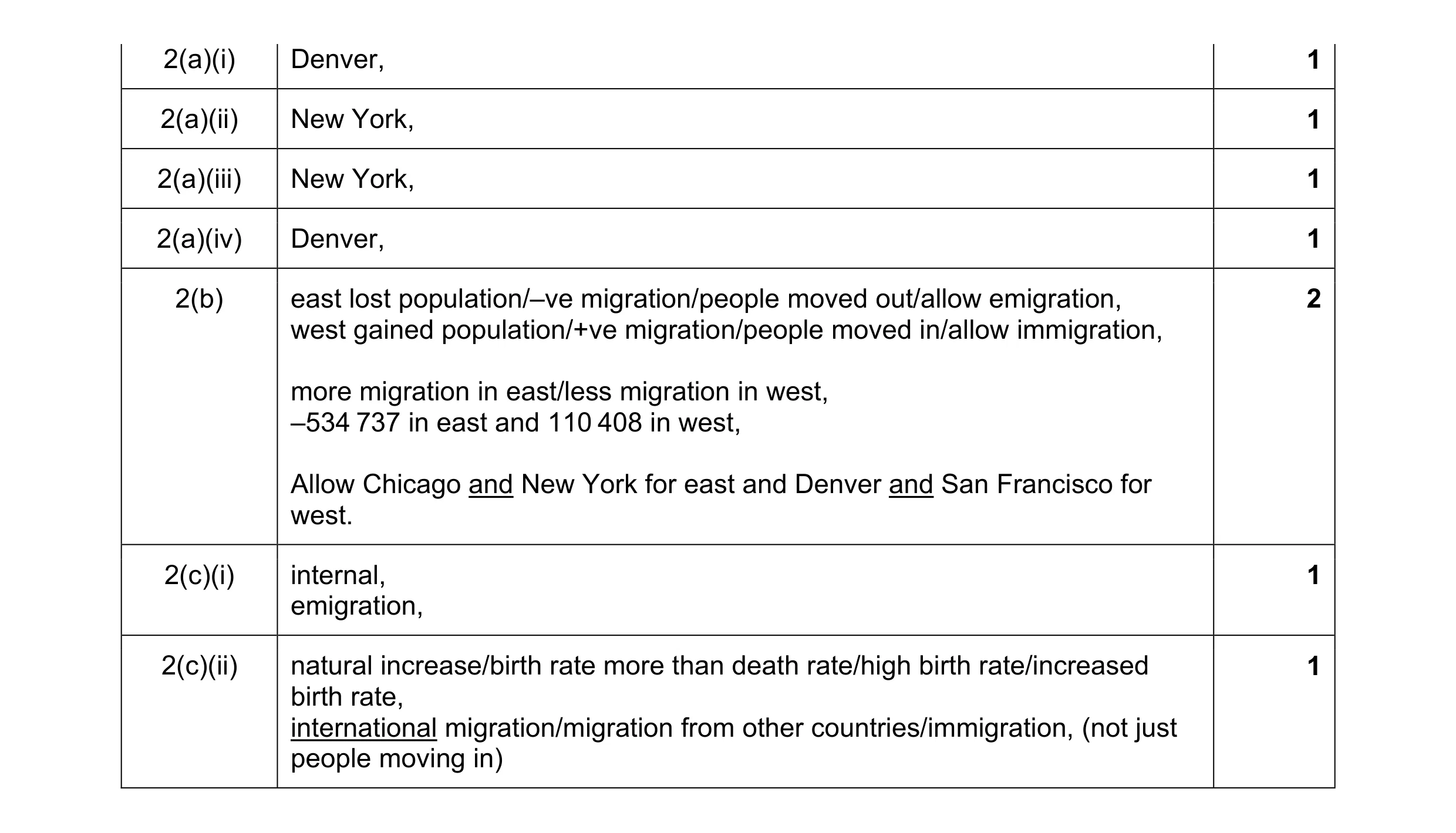
Mark scheme: 2(a)(i) Denver, 1 2(a)(ii) New York, 1 2(a)(iii) New York, 1 2(a)(iv) Denver, 1 2(b) east lost population/–ve migration/people moved out/allow emigration, 2 west gained population/+ve migration/people moved in/allow immigration, more migration in east/less migration in west, –534 737 in east and 110 408 in west, Allow Chicago and New York for east and Denver and San Francisco for west. 2(c)(i) internal, 1 emigration, 2(c)(ii) natural increase/birth rate more than death rate/high birth rate/increased 1 birth rate, international migration/migration from other countries/immigration, (not just people moving in)
This question in 0460/22 Oct/Nov 2017
Q2 · Qatar is a country in the Middle East 0460/23 Oct/Nov 2017
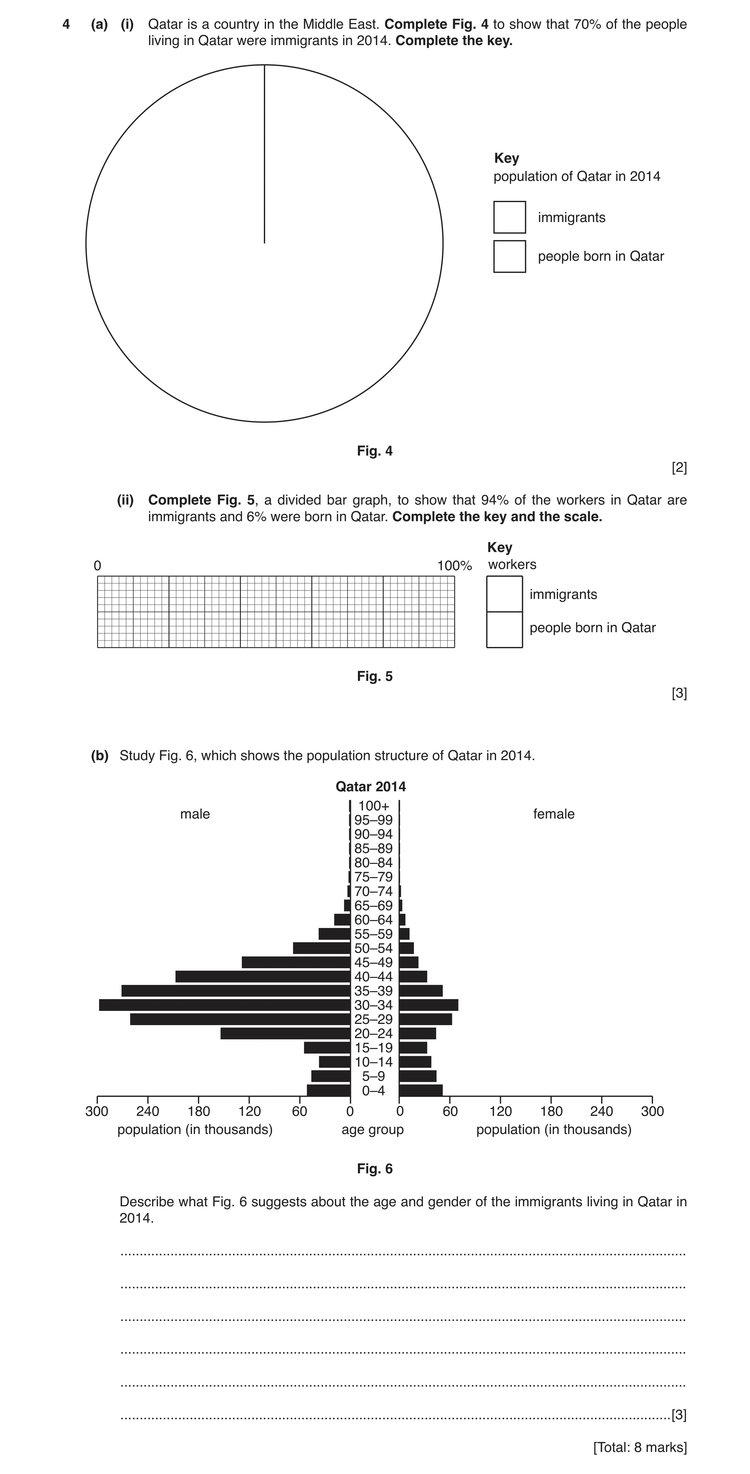
4 (a) (i) Qatar is a country in the Middle East. Complete Fig. 4 to show that 70% of the people living in Qatar were immigrants in 2014. Complete the key. Key population of Qatar in 2014 immigrants people born in Qatar Fig. 4 [2] (ii) Complete Fig. 5, a divided bar graph, to show that 94% of the workers in Qatar are immigrants and 6% were born in Qatar. Complete the key and the scale. Key 0 100% workers immigrants people born in Qatar Fig. 5 [3] (b) Study Fig. 6, which shows the population structure of Qatar in 2014. Qatar 2014 100+ male female 95–99 90–94 85–89 80–84 75–79 70–74 65–69 60–64 55–59 50–54 45–49 40–44 35–39 30–34 25–29 20–24 15–19 10–14 5–9 0–4 300 240 180 120 60 0 0 60 120 180 240 300 population (in thousands) age group population (in thousands) Fig. 6 Describe what Fig. 6 suggests about the age and gender of the immigrants living in Qatar in 2014. … … … … … … [3] [Total: 8 marks]
8 marks
Mark scheme: 4(a)(i) smaller segment 107–109°, 2 completion of a key with immigrants the larger segment, 4(a)(ii) line at 94%, 3 completion of key with immigrants the larger portion, completion of scale at minimum 20% intervals, 4(b) many males/few females/mainly males/more males than females, 3 middle aged/working age/independent age group, mainly 20–54 years old, no/few/young, no/few/old,
This question in 0460/23 Oct/Nov 2017
Question 3 0460/23 May/June 2018
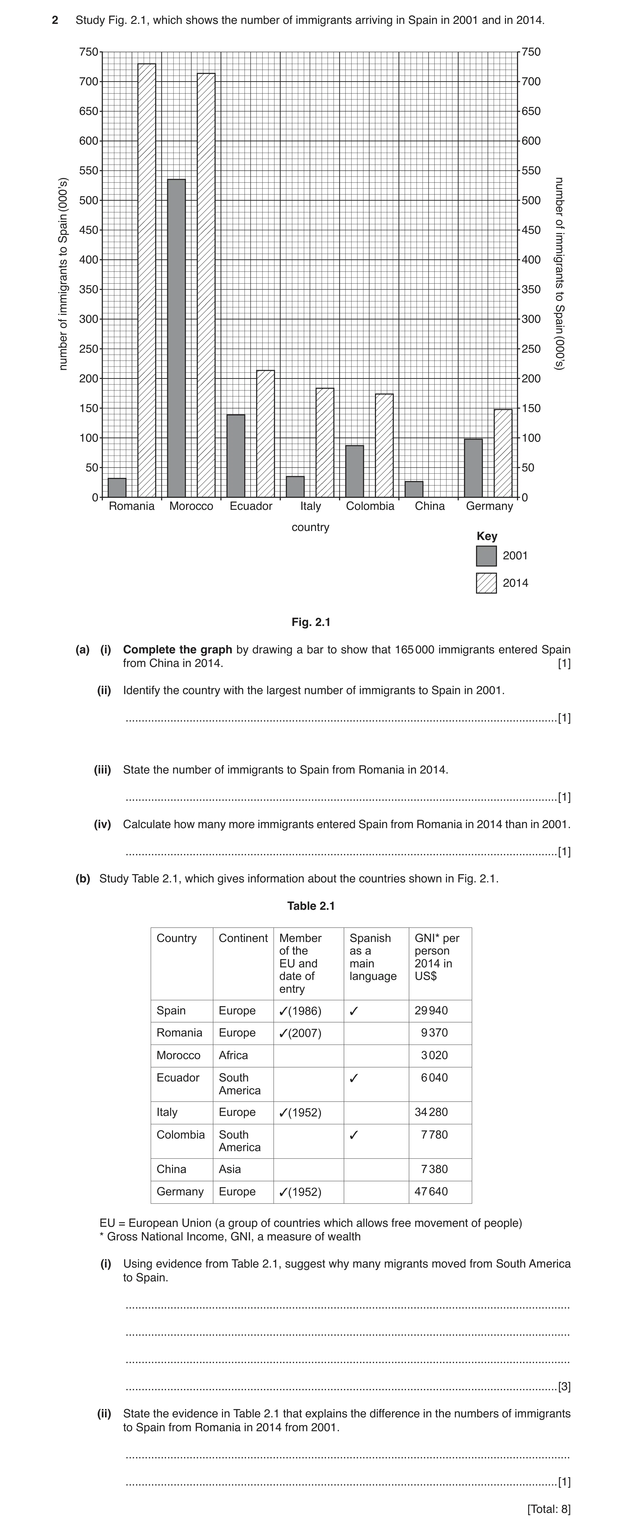
2 Study Fig. 2.1, which shows the number of immigrants arriving in Spain in 2001 and in 2014. 750 750 700 700 650 650 600 600 550 550 (000’s) 500 500 number 450 450 ofSpain to 400 400 immigrants 350 350 to immigrants of 300 300 Spain 250 250 number (000’s) 200 200 150 150 100 100 50 50 0 0 Romania Morocco Ecuador Italy Colombia China Germany country Key 2001 2014 Fig. 2.1 (a) (i) Complete the graph by drawing a bar to show that 165 000 immigrants entered Spain from China in 2014. [1] (ii) Identify the country with the largest number of immigrants to Spain in 2001. … [1] (iii) State the number of immigrants to Spain from Romania in 2014. … [1] (iv) Calculate how many more immigrants entered Spain from Romania in 2014 than in 2001. … [1] (b) Study Table 2.1, which gives information about the countries shown in Fig. 2.1. Table 2.1 Country Continent Member Spanish GNI* per of the as a person EU and main 2014 in date of language US$ entry Spain Europe 3(1986) 3 29 940 Romania Europe 3(2007) 9 370 Morocco Africa 3 020 Ecuador South 3 6 040 America Italy Europe 3(1952) 34 280 Colombia South 3 7 780 America China Asia 7 380 Germany Europe 3(1952) 47 640 EU = European Union (a group of countries which allows free movement of people) * Gross National Income, GNI, a measure of wealth (i) Using evidence from Table 2.1, suggest why many migrants moved from South America to Spain. … … … … [3] (ii) State the evidence in Table 2.1 that explains the difference in the numbers of immigrants to Spain from Romania in 2014 from 2001. … … [1] [Total: 8]
8 marks
Mark scheme: 2(a)(i) bar drawn to 165 000 and shaded, 1 2(a)(ii) Morocco, 1 2(a)(iii) 730 000, 1 2(a)(iv) 698 000–700 000, 1 Carry error from part (iii) forward. Subtract 30 000 to 32 000 from the answer to (iii). 2(b)(i) from a low(er) income country/to a high(er) income country, 3 comparative data to illustrate difference in incomes between Ecuador/Colombia and Spain, E.g. 29 940 + 6040 or 7780, or 29 940 + 6910, or 29 940 + 6000–8000, or over 20 000 difference, etc. Units don’t matter. common language/Spanish speaking, 2(b)(ii) was not a member of the EU in 2001, 1 member of EU in 2014 but not 2001, joined EU in 2007,
This question in 0460/23 May/June 2018
Q4 · A prediction of how the population of some countries in Europe might change by the year… 0460/21 Oct/Nov 2018
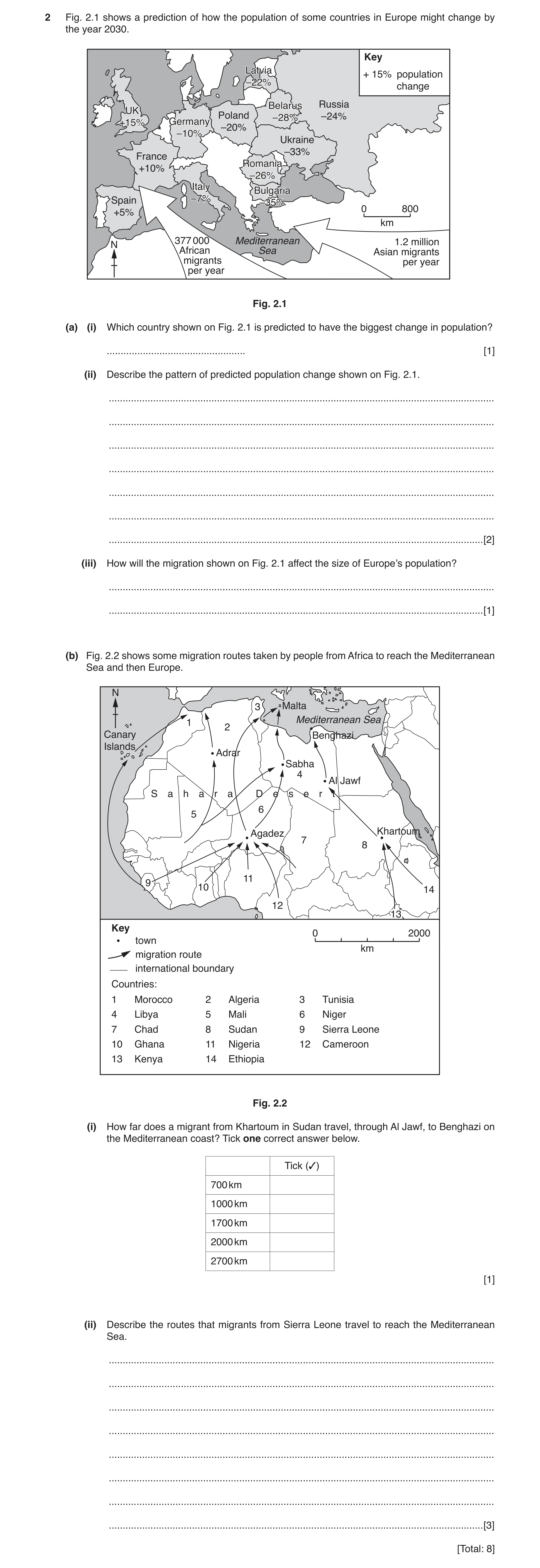
2 Fig. 2.1 shows a prediction of how the population of some countries in Europe might change by the year 2030. Key LatviaLatvia + 15% population –22%–22% change BelarusBelarus Russia UKUK Poland –28%–28% –24% +15%+15% GermanyGermany –20% –10%–10% Ukraine –33% France RomaniaRomania +10% –26%–26% ItalyItaly BulgariaBulgaria Spain –7%–7% –35%–35% 0 800 +5% km 377 000 Mediterranean 1.2 million N African Sea Asian migrants migrants per year per year Fig. 2.1 (a) (i) Which country shown on Fig. 2.1 is predicted to have the biggest change in population? … [1] (ii) Describe the pattern of predicted population change shown on Fig. 2.1. … … … … … … … [2] (iii) How will the migration shown on Fig. 2.1 affect the size of Europe’s population? … … [1] (b) Fig. 2.2 shows some migration routes taken by people from Africa to reach the Mediterranean Sea and then Europe. N 3 Malta Mediterranean Sea 1 2 Canary Benghazi Islands Adrar Sabha 4 Al Jawf S a h a r a D e s e r t 6 5 Agadez Khartoum 7 8 11 9 10 14 12 13 Key 0 2000 town km migration route international boundary Countries: 1 Morocco 2 Algeria 3 Tunisia 4 Libya 5 Mali 6 Niger 7 Chad 8 Sudan 9 Sierra Leone 10 Ghana 11 Nigeria 12 Cameroon 13 Kenya 14 Ethiopia Fig. 2.2 (i) How far does a migrant from Khartoum in Sudan travel, through Al Jawf, to Benghazi on the Mediterranean coast? Tick one correct answer below. Tick (3) 700 km 1000 km 1700 km 2000 km 2700 km [1] (ii) Describe the routes that migrants from Sierra Leone travel to reach the Mediterranean Sea. … … … … … … … … [3] [Total: 8]
8 marks
Mark scheme: 2(a)(i) Bulgaria 1 2(a)(ii) increase/positive in west 2 decrease/negative in east (and centre) more countries decrease than increase/most countries decrease/only UK France and Spain increase/3 increase + 9 decrease decreases greater than increases biggest change in east/smallest change in west 2(a)(iii) cause (overall) increase 1 2(b)(i) 2700 km 1 2(b)(ii) via Agadez/Niger 3 across desert through many countries/across many borders two routes to Mediterranean/via Sabha/Libya and Tunisia/Algeria ocean/sea route/boat via Canary Islands
This question in 0460/21 Oct/Nov 2018
Q5 · Population migration to and from California, USA, between 2001 and 2013 0460/22 Feb/March 2019
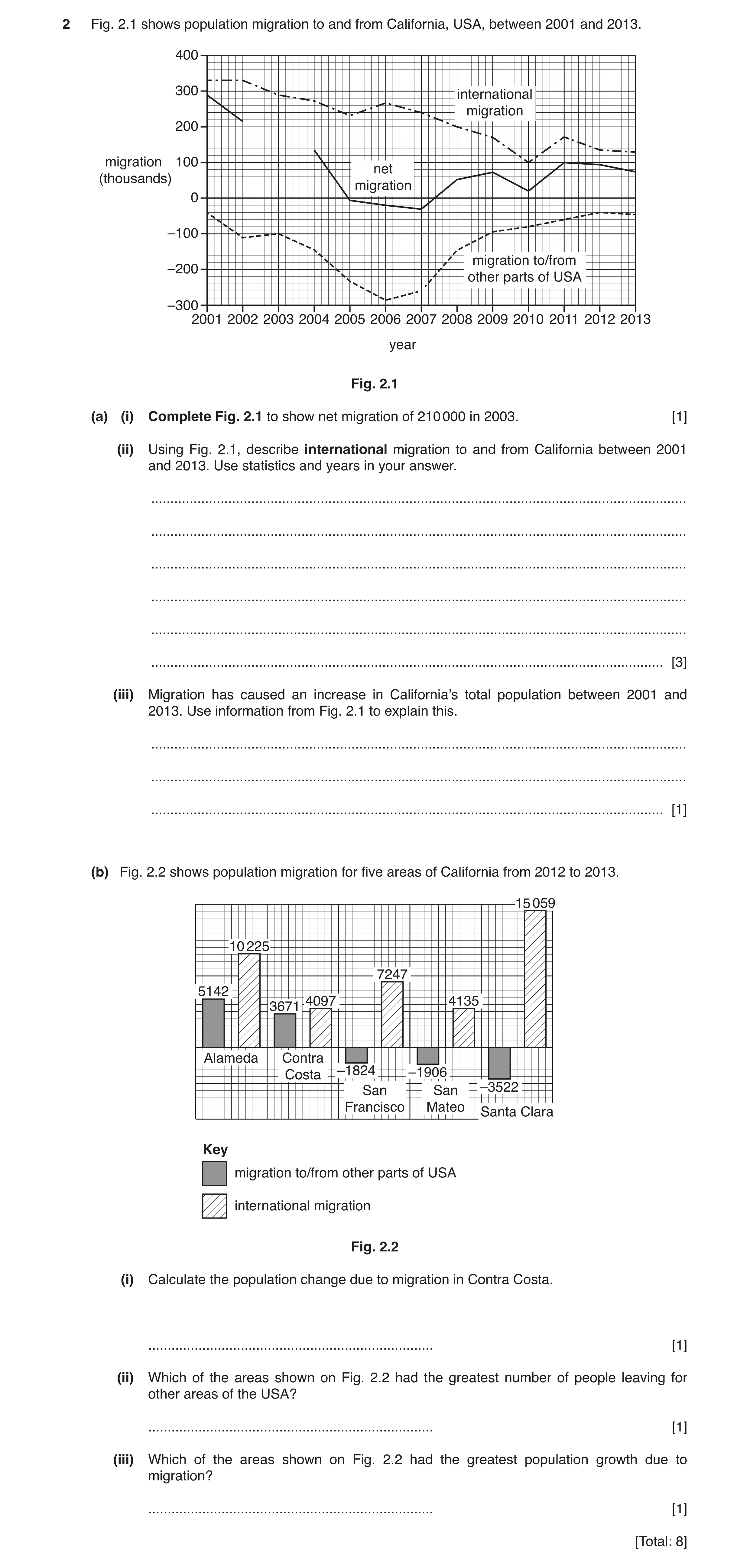
2 Fig. 2.1 shows population migration to and from California, USA, between 2001 and 2013. 400 300 international migration 200 migration 100 net (thousands) migration 0 –100 migration to/from –200 other parts of USA –300 2001 2002 2003 2004 2005 2006 2007 2008 2009 2010 2011 2012 2013 year Fig. 2.1 (a) (i) Complete Fig. 2.1 to show net migration of 210 000 in 2003. [1] (ii) Using Fig. 2.1, describe international migration to and from California between 2001 and 2013. Use statistics and years in your answer. … … … … … … [3] (iii) Migration has caused an increase in California’s total population between 2001 and 2013. Use information from Fig. 2.1 to explain this. … … … [1] (b) Fig. 2.2 shows population migration for five areas of California from 2012 to 2013. 15 059 10 225 7247 5142 4097 4135 3671 Alameda Contra –1824 –1906 Costa San San –3522 Francisco Mateo Santa Clara Key migration to/from other parts of USA international migration Fig. 2.2 (i) Calculate the population change due to migration in Contra Costa. … [1] (ii) Which of the areas shown on Fig. 2.2 had the greatest number of people leaving for other areas of the USA? … [1] (iii) Which of the areas shown on Fig. 2.2 had the greatest population growth due to migration? … [1] [Total: 8]
8 marks
Mark scheme: 2(a)(i) correct plot of 210 thousand 1 2(a)(ii) (overall) decrease, 3 from 330 thousand to 130 thousand, by more than half/by 200 thousand least in 2010, 100 thousand in 2010 most in 2001/2 increase/higher 2005/6, increase/higher 2010/11 always positive 2(a)(iii) total/net migration (mostly) positive, 1 international immigration greater than domestic emigration, positive migration greater than negative migration 2(b)(i) 7768 1 2(b)(ii) Santa Clara 1 2(b)(iii) Alameda 1
This question in 0460/22 Feb/March 2019
Question 6 0460/21 May/June 2019
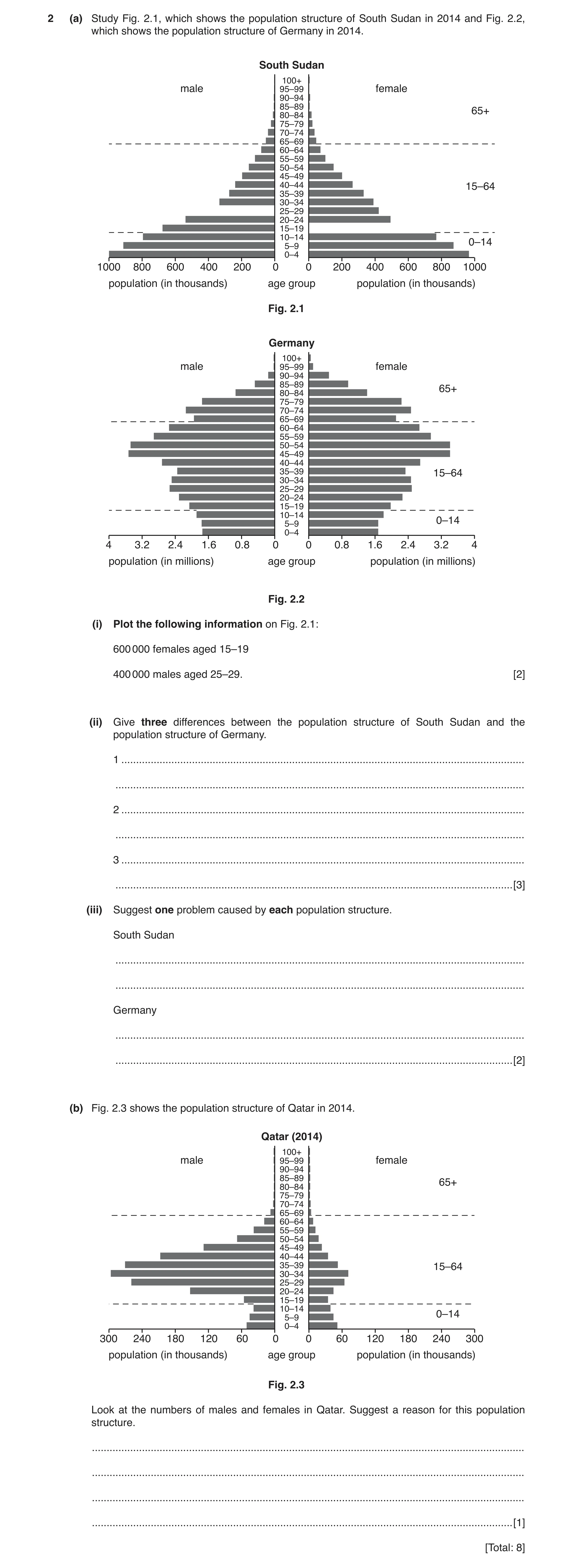
2 (a) Study Fig. 2.1, which shows the population structure of South Sudan in 2014 and Fig. 2.2, which shows the population structure of Germany in 2014. South Sudan 100+ male 95–99 female 90–94 85–89 65+ 80–84 75–79 70–74 65–69 60–64 55–59 50–54 45–49 40–44 15–64 35–39 30–34 25–29 20–24 15–19 10–14 5–9 0–14 0–4 1000 800 600 400 200 0 0 200 400 600 800 1000 population (in thousands) age group population (in thousands) Fig. 2.1 Germany 100+ male 95–99 female 90–94 85–89 65+ 80–84 75–79 70–74 65–69 60–64 55–59 50–54 45–49 40–44 35–39 15–64 30–34 25–29 20–24 15–19 10–14 5–9 0–14 0–4 4 3.2 2.4 1.6 0.8 0 0 0.8 1.6 2.4 3.2 4 population (in millions) age group population (in millions) Fig. 2.2 (i) Plot the following information on Fig. 2.1: 600 000 females aged 15–19 400 000 males aged 25–29. [2] (ii) Give three differences between the population structure of South Sudan and the population structure of Germany. 1 … … 2 … … 3 … … [3] (iii) Suggest one problem caused by each population structure. South Sudan … … Germany … … [2] (b) Fig. 2.3 shows the population structure of Qatar in 2014. Qatar (2014) 100+ male 95–99 female 90–94 85–89 65+ 80–84 75–79 70–74 65–69 60–64 55–59 50–54 45–49 40–44 35–39 15–64 30–34 25–29 20–24 15–19 10–14 5–9 0–14 0–4 300 240 180 120 60 0 0 60 120 180 240 300 population (in thousands) age group population (in thousands) Fig. 2.3 Look at the numbers of males and females in Qatar. Suggest a reason for this population structure. … … … … [1] [Total: 8]
8 marks
Mark scheme: 2(a)(i) Correct plot of females 15–19 600 000, 2 Correct plot of males 25–29 400 000 2(a)(ii) South Sudan more young / 0–14, 3 South Sudan fewer middle aged / economically active / 15–64, South Sudan fewer old / 65+, South Sudan fewer older women, (or emphasis on Germany) Allow age ranges within those above but not single bars. Allow single points on South Sudan. Wide base / BR / DR etc. = 0. 2(a)(iii) South Sudan 2 large numbers of young to feed / educate / support, small number of productive / economically active people, Germany large numbers of old people to support / care for, many more elderly in the future, fewer younger workers, lack of army in the future Allow ‘dependence’ once in either section without full explanation. 2(b) male migrant labour, 1
This question in 0460/21 May/June 2019
Question 7 0460/23 May/June 2019
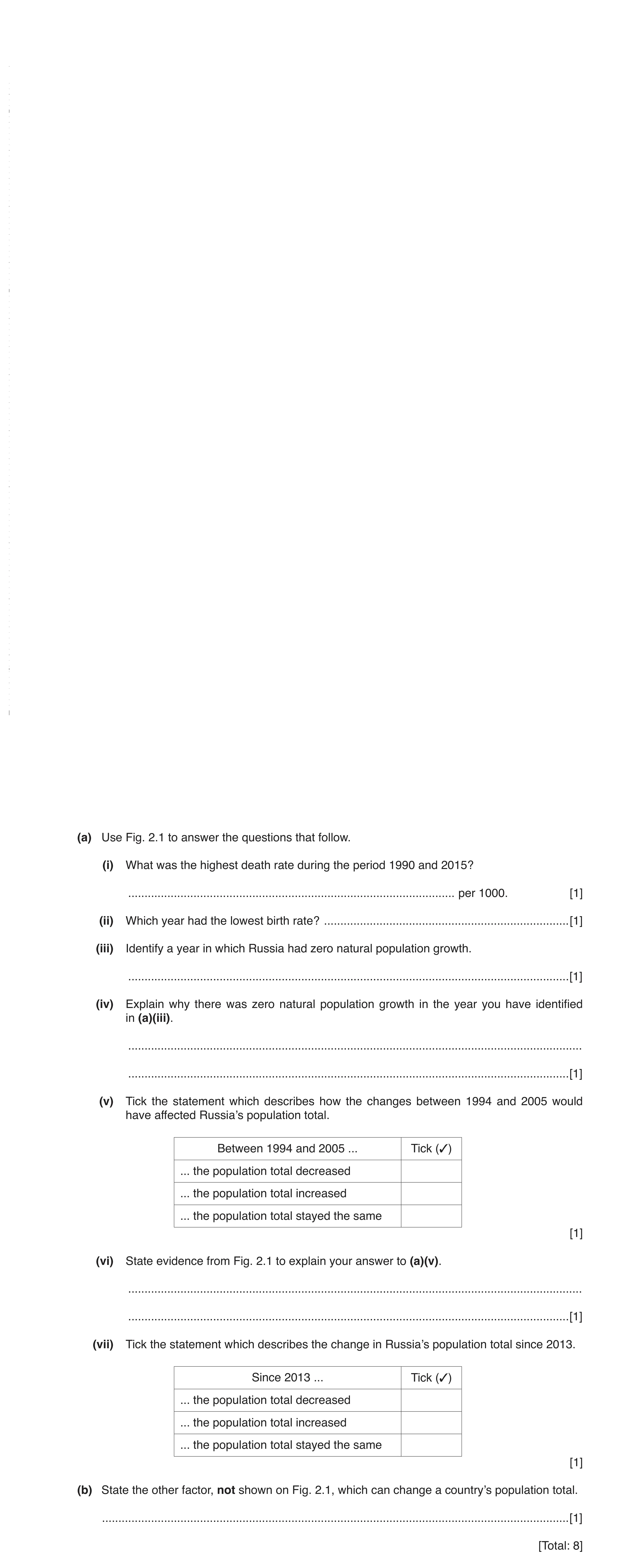
(a) Use Fig. 2.1 to answer the questions that follow. (i) What was the highest death rate during the period 1990 and 2015? … per 1000. [1] (ii) Which year had the lowest birth rate? … [1] (iii) Identify a year in which Russia had zero natural population growth. … [1] (iv) Explain why there was zero natural population growth in the year you have identified in (a)(iii). … … [1] (v) Tick the statement which describes how the changes between 1994 and 2005 would have affected Russia’s population total. Between 1994 and 2005 ... Tick (3) ... the population total decreased ... the population total increased ... the population total stayed the same [1] (vi) State evidence from Fig. 2.1 to explain your answer to (a)(v). … … [1] (vii) Tick the statement which describes the change in Russia’s population total since 2013. Since 2013 ... Tick (3) ... the population total decreased ... the population total increased ... the population total stayed the same [1] (b) State the other factor, not shown on Fig. 2.1, which can change a country’s population total. … [1] [Total: 8]
8 marks
Mark scheme: 2(a)(i) 16.4, 1 2(a)(ii) 1999, 1 2(a)(iii) 2012 (accept also 1991), 1 2(a)(iv) birth rate and death rate were the same, 1 2(a)(v) the population total decreased, 1 2(a)(vi) death rate was higher than birth rate, 1 the growth rate was negative, 2(a)(vii) the population total increased, 1 2(b) (net) migration / immigration / emigration, 1
This question in 0460/23 May/June 2019
Q8 · The change in the percentage of the rural population in the world between 1960 and 2015 0460/22 Feb/March 2021
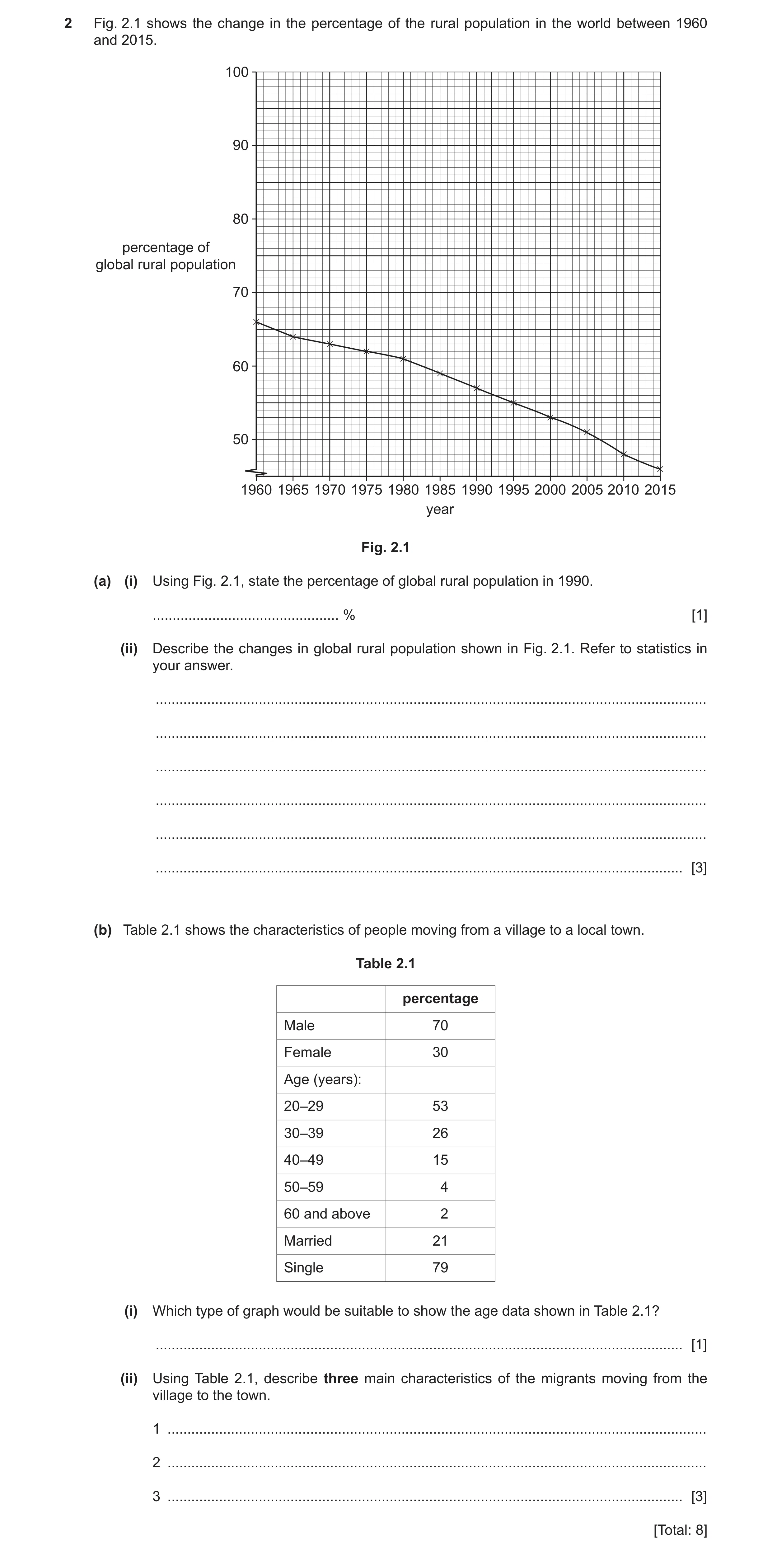
2 Fig. 2.1 shows the change in the percentage of the rural population in the world between 1960 and 2015. 100 90 80 percentage of global rural population 70 60 50 1960 1965 1970 1975 1980 1985 1990 1995 2000 2005 2010 2015 year Fig. 2.1 (a) (i) Using Fig. 2.1, state the percentage of global rural population in 1990. … % [1] (ii) Describe the changes in global rural population shown in Fig. 2.1. Refer to statistics in your answer. … … … … … … [3] (b) Table 2.1 shows the characteristics of people moving from a village to a local town. Table 2.1 percentage Male 70 Female 30 Age (years): 20–29 53 30–39 26 40–49 15 50–59 4 60 and above 2 Married 21 Single 79 (i) Which type of graph would be suitable to show the age data shown in Table 2.1? … [1] (ii) Using Table 2.1, describe three main characteristics of the migrants moving from the village to the town. 1 … 2 … 3 … [3] [Total: 8]
8 marks
Mark scheme: 2(a)(i) 57(%), 1 2(a)(ii) decrease, 3 constant/slower then faster, 66 to 46/by 20%, 2(b)(i) pie/bar(s)/divided bar, 1 2(b)(ii) male, 3 young/working age/decrease with age/under 40/20–29, single,
This question in 0460/22 Feb/March 2021
Q9 · What is the correct term for the growth in the percentage of people living in towns and… 0460/22 Feb/March 2021
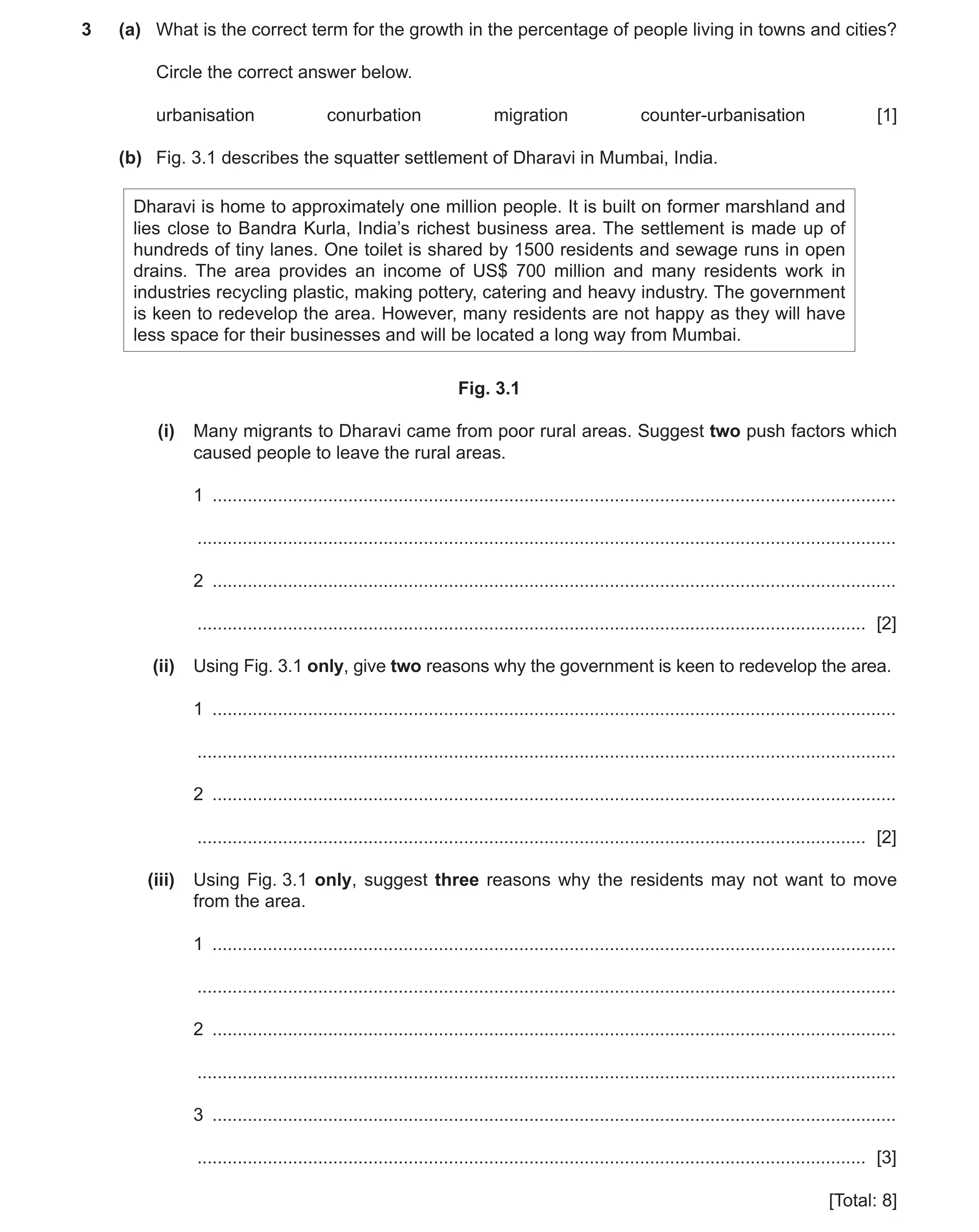
3 (a) What is the correct term for the growth in the percentage of people living in towns and cities? Circle the correct answer below. urbanisation conurbation migration counter-urbanisation [1] (b) Fig. 3.1 describes the squatter settlement of Dharavi in Mumbai, India. Dharavi is home to approximately one million people. It is built on former marshland and lies close to Bandra Kurla, India’s richest business area. The settlement is made up of hundreds of tiny lanes. One toilet is shared by 1500 residents and sewage runs in open drains. The area provides an income of US$ 700 million and many residents work in industries recycling plastic, making pottery, catering and heavy industry. The government is keen to redevelop the area. However, many residents are not happy as they will have less space for their businesses and will be located a long way from Mumbai. Fig. 3.1 (i) Many migrants to Dharavi came from poor rural areas. Suggest two push factors which caused people to leave the rural areas. 1 … … 2 … … [2] (ii) Using Fig. 3.1 only, give two reasons why the government is keen to redevelop the area. 1 … … 2 … … [2] (iii) Using Fig. 3.1 only, suggest three reasons why the residents may not want to move from the area. 1 … … 2 … … 3 … … [3] [Total: 8]
8 marks
Mark scheme: 3(a) urbanisation, 1 3(b)(i) lack of jobs/low income, 2 famine/failure of crops, small plots of land/lack of opportunity in agriculture, lack of education, disease/lack of medical facilities, lack of water supply/electricity/sanitation natural disaster/drought/flood/earthquake/cyclone, war, remoteness, lack of entertainment/recreation/shops, 3(b)(ii) close to business district/Bandra Kurla, 2 insanitary conditions, visual pollution, 3(b)(iii) close community/near friends/family, 3 business will close/have jobs there/lose jobs/need to find new jobs, less new space for business, moved a long way away/away from Mumbai, away from amenities of CBD,
This question in 0460/22 Feb/March 2021
Q10 · The percentage of the popula ion who were born out ide the country, in the different… 0460/21 May/June 2021
2 Fig. 2.1 shows the percentage of the popula ion who were born out ide the country, in the different regions of Italy in 2017. N Key % of population born outside the country Tuscany more than 10 8 – 10 5 – 7 less than 5 Calabria Riace 0 150 km Fig. 2.1 (a) (i) The percentage of the population in Tuscany who were born outside the country was 10.9%. Complete Fig. 2.1 using the key provided. [1] (ii) Describe the general pattern shown in Fig. 2.1. Do not use statistics in your answer. … … … … [2] (b) Fig. 2.2 gives information about the town of Riace in the southern region of Calabria. The town of Riace saw its population decline from 2500 to 400 between 1945 and 1956, with many locals heading to northern Italy in search of jobs. It became a village of old people. The local council decided to invite migrants and refugees to live and work in the town. Since then migrants from more than 20 nations have arrived and set up businesses and their children go to the local school. Fig. 2.2 (i) Using Fig. 2.2, state how much the population of Riace declined between 1945 and 1956. … [1] (ii) Using Fig. 2.2, suggest two reasons why the population declined. 1 … … 2 … … [2] (iii) Using Fig. 2.2, identify one advantage of attracting migrants and refugees to Riace. … [1] (iv) Suggest one problem the arrival of the migrants might cause in the town. … … [1] [Total: 8]
8 marks
Mark scheme: 2(a)(ii) more in north/less in south, 2 more in centre, fewer on islands, anomalous low in NW, more on west coast, 2(b)(i) 2100/84%, 1 2(b)(ii) left for jobs/lack of jobs, 2 old people therefore high death rate/die and not replaced, old people therefore low birth rate/no growth, 2(b)(iii) school kept open, 1 new businesses, more workers, arrival of new cultures, 2(b)(iv) competition for jobs, 1 racial tension, migrants may not speak local language, loss of culture,
This question in 0460/21 May/June 2021
Q11 · Information about population change in four regions in Italy (an MEDC) in 2017 0460/23 May/June 2021
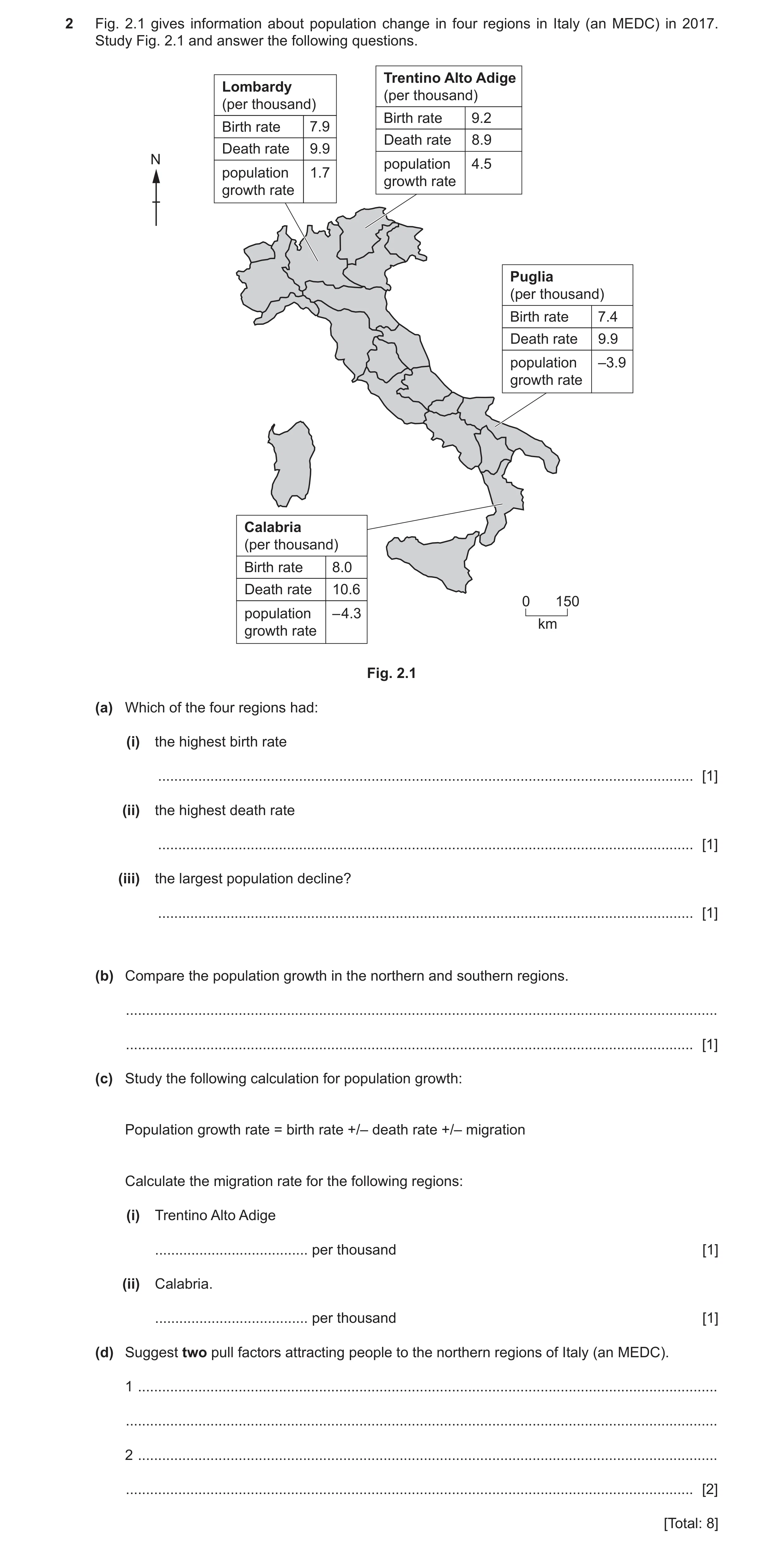
2 Fig. 2.1 gives information about population change in four regions in Italy (an MEDC) in 2017. Study Fig. 2.1 and answer the following questions. Trentino Alto Adige Lombardy (per thousand) (per thousand) Birth rate 9.2 Birth rate 7.9 Death rate 8.9 Death rate 9.9 N population 4.5 population 1.7 growth rate growth rate Puglia (per thousand) Birth rate 7.4 Death rate 9.9 population –3.9 growth rate Calabria (per thousand) Birth rate 8.0 Death rate 10.6 0 150 population – 4.3 km growth rate Fig. 2.1 (a) Which of the four regions had: (i) the highest birth rate … [1] (ii) the highest death rate … [1] (iii) the largest population decline? … [1] (b) Compare the population growth in the northern and southern regions. … … [1] (c) Study the following calculation for population growth: Population growth rate = birth rate +/– death rate +/– migration Calculate the migration rate for the following regions: (i) Trentino Alto Adige … per thousand [1] (ii) Calabria. … per thousand [1] (d) Suggest two pull factors attracting people to the northern regions of Italy (an MEDC). 1 … … 2 … … [2] [Total: 8]
8 marks
Mark scheme: 2(a)(i) Trentino Alto Adige, 1 2(a)(ii) Calabria, 1 2(a)(iii) Calabria, 1 2(b) higher in the north/lower in the south, 1 increases to the north/decreases to the south, positive in the north and negative in the south, 2(c)(i) 4.2 (per thousand) 1 2(c)(ii) –1.7 (per thousand) 1 2(d) jobs/higher wages, 2 family/friends live there, shops, leisure/entertainment, medical care, education, wealthy area/higher GDP/higher standard of living,
This question in 0460/23 May/June 2021
Q12 · Information about the population of the nine provinces of South Africa 0460/22 Oct/Nov 2021
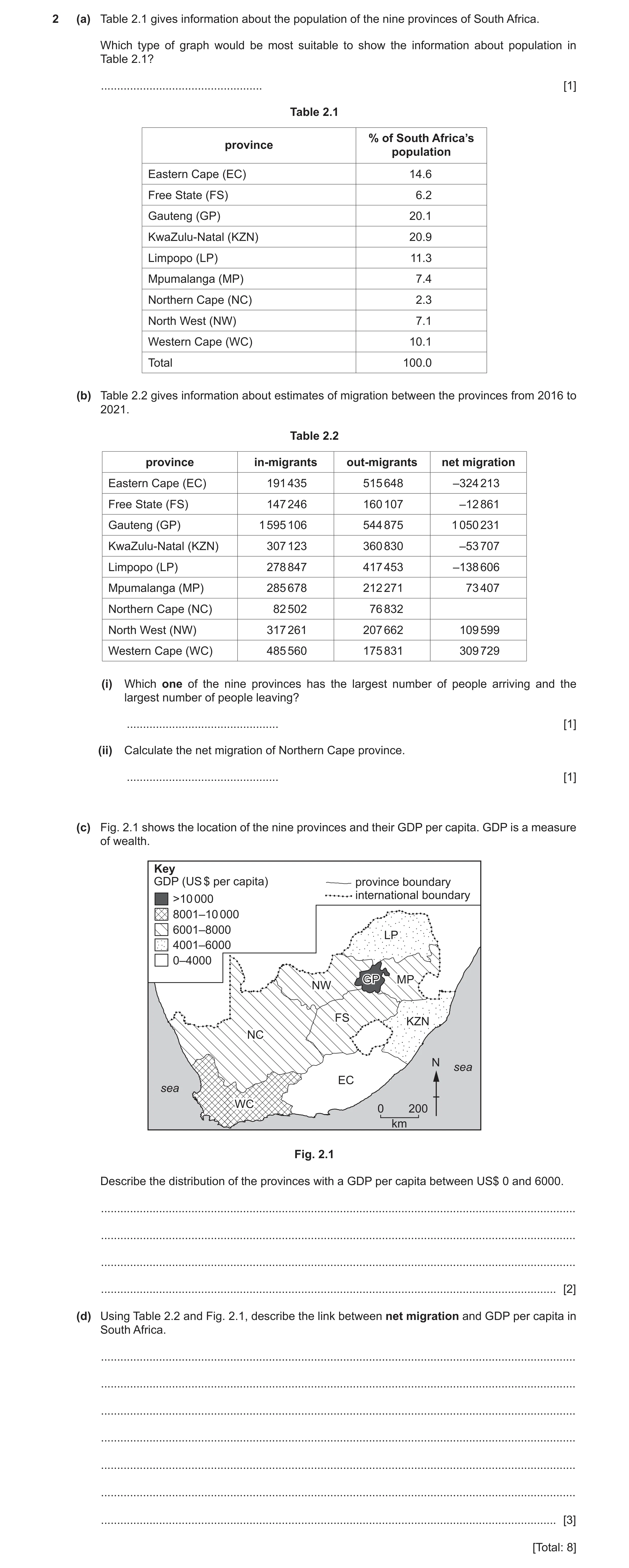
2 (a) Table 2.1 gives information about the population of the nine provinces of South Africa. Which type of graph would be most suitable to show the information about population in Table 2.1? … [1] Table 2.1 % of South Africa’s province population Eastern Cape (EC) 14.6 Free State (FS) 6.2 Gauteng (GP) 20.1 KwaZulu-Natal (KZN) 20.9 Limpopo (LP) 11.3 Mpumalanga (MP) 7.4 Northern Cape (NC) 2.3 North West (NW) 7.1 Western Cape (WC) 10.1 Total 100.0 (b) Table 2.2 gives information about estimates of migration between the provinces from 2016 to 2021. Table 2.2 province in-migrants out-migrants net migration Eastern Cape (EC) 191 435 515 648 –324 213 Free State (FS) 147 246 160 107 –12 861 Gauteng (GP) 1 595 106 544 875 1 050 231 KwaZulu-Natal (KZN) 307 123 360 830 –53 707 Limpopo (LP) 278 847 417 453 –138 606 Mpumalanga (MP) 285 678 212 271 73 407 Northern Cape (NC) 82 502 76 832 North West (NW) 317 261 207 662 109 599 Western Cape (WC) 485 560 175 831 309 729 (i) Which one of the nine provinces has the largest number of people arriving and the largest number of people leaving? … [1] (ii) Calculate the net migration of Northern Cape province. … [1] (c) Fig. 2.1 shows the location of the nine provinces and their GDP per capita. GDP is a measure of wealth. Key GDP (US $ per capita) province boundary international boundary >10 000 8001–10 000 6001–8000 LPLP 4001–6000 0–4000 GPGP MP NW FSFS KZN NC N sea EC sea WC 0 200 km Fig. 2.1 Describe the distribution of the provinces with a GDP per capita between US$ 0 and 6000. … … … … [2] (d) Using Table 2.2 and Fig. 2.1, describe the link between net migration and GDP per capita in South Africa. … … … … … … … [3] [Total: 8]
8 marks
Mark scheme: 2(a) pie/divided bar/bar, 1 2(b)(i) Gauteng, 1 2(b)(ii) 5 670 1 2(c) in east, 2 in north/north east and south/south east, on edge/borders/coast, 2(d) poor(er,est)/low(er,est) GDP provinces lose population/emigration/low 3 (er,est) net migration/negative migration, e.g. EC/KZN/LP, (development point) rich(er,est)/high(er,est)/GDP provinces gain population/immigration/high (er,est) net migration/positive migration, e.g. GP/WC, (development point)
This question in 0460/22 Oct/Nov 2021
Q13 · Many migrants travel to Shanghai, China each year 0460/22 May/June 2022
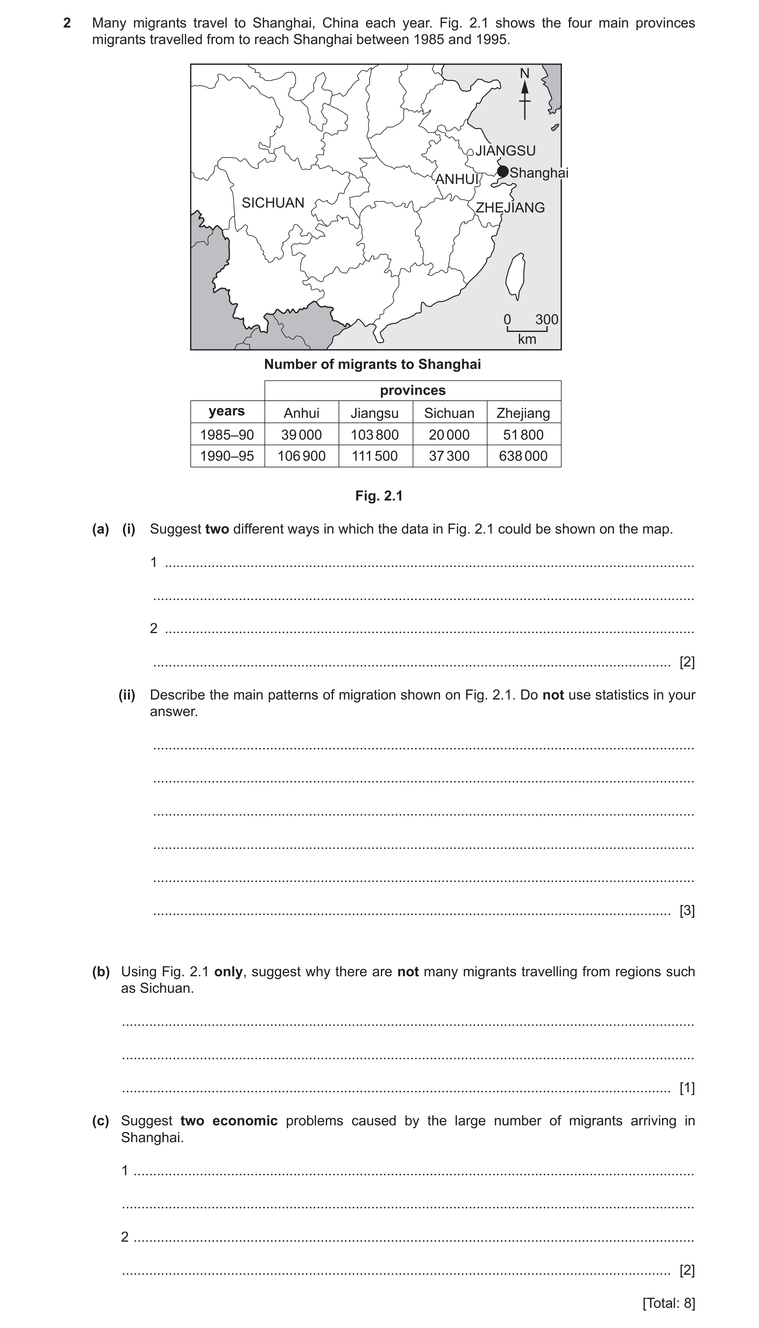
2 Many migrants travel to Shanghai, China each year. Fig. 2.1 shows the four main provinces migrants travelled from to reach Shanghai between 1985 and 1995. N JIANGSU Shanghai ANHUI SICHUAN ZHEJIANG 0 300 km Number of migrants to Shanghai provinces years Anhui Jiangsu Sichuan Zhejiang 1985–90 39 000 103 800 20 000 51 800 1990–95 106 900 111 500 37 300 638 000 Fig. 2.1 (a) (i) Suggest two different ways in which the data in Fig. 2.1 could be shown on the map. 1 … … 2 … … [2] (ii) Describe the main patterns of migration shown on Fig. 2.1. Do not use statistics in your answer. … … … … … … [3] (b) Using Fig. 2.1 only, suggest why there are not many migrants travelling from regions such as Sichuan. … … … [1] (c) Suggest two economic problems caused by the large number of migrants arriving in Shanghai. 1 … … 2 … … [2] [Total: 8]
8 marks
Mark scheme: 2(a)(i) flow line maps/proportional arrows/lines; 2 (located) bar graphs; choropleth map/colour coded/map with different colours/different intensities of the same colour/heat map; different shading/patterns of shading; dot distribution map/proportional circles; 2(a)(ii) increase (over time)/all provinces increase; 3 Sichuan loses fewest/least/smallest migrants/less than the others/from that area; Zhejiang loses largest/most number overall; Jiangsu loses most in 1985–90, but Zhejiang loses most in 1990–95; Jiangsu has smallest increase/does not vary much; Zhejiang has biggest increase; coastal provinces lose the most migrants/more from the east than west; the longer the distance the less the number of migrants or vice-versa / more come from nearby/bordering provinces or vice-versa; 2(b) long(er) distance to travel/1200–1800 km away/not near/cost of travel is 1 more 2(c) unemployment/not enough jobs; 2 cost of healthcare/hospitals; cost of schools/education; cost of sanitation/sewerage/clean water/food/energy/transport; cost of housing/rent increase; Accept ‘lack of’ / ’need for’ / ‘pressure on’ / ‘not enough’ / ‘shortage of’ instead of ‘cost of’. Answers must refer to problems in Shanghai.
This question in 0460/22 May/June 2022
Q14 · Information about migration in the nine provinces of South Africa 0460/23 Oct/Nov 2022
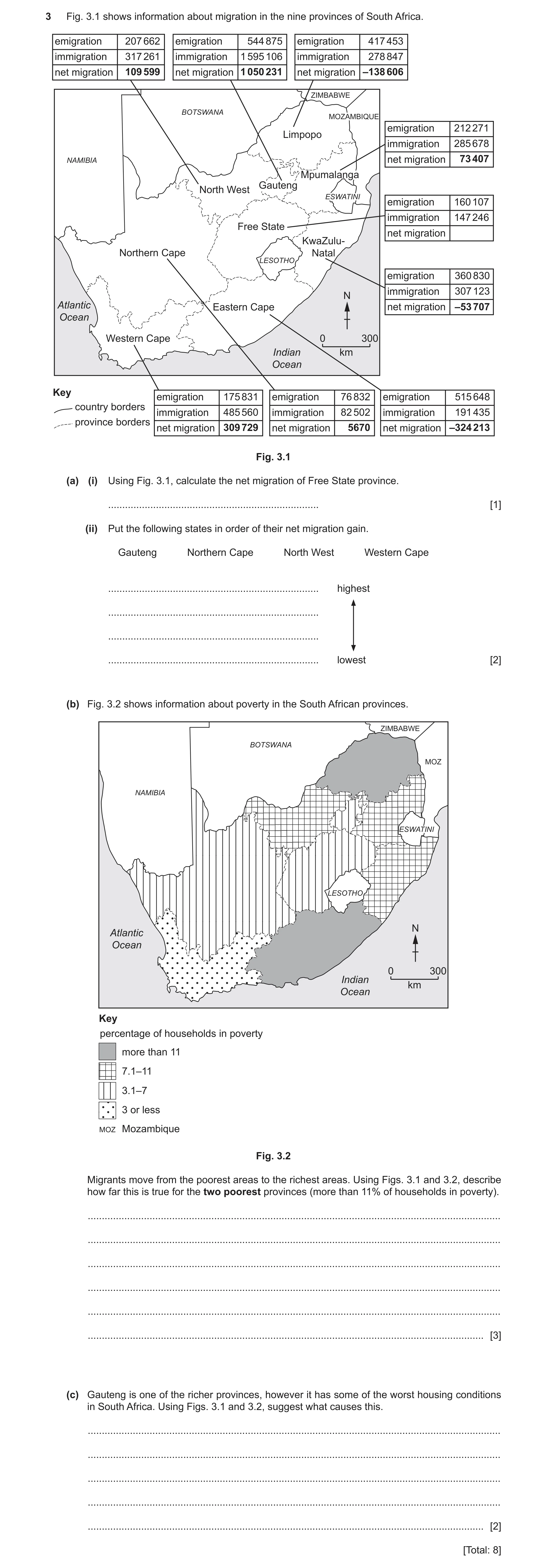
3 Fig. 3.1 shows information about migration in the nine provinces of South Africa. emigration 207 662 emigration 544 875 emigration 417 453 immigration 317 261 immigration 1 595 106 immigration 278 847 net migration 109 599 net migration 1 050 231 net migration –138 606 ZIMBABWE BOTSWANA MOZAMBIQUE emigration 212 271 Limpopo immigration 285 678 NAMIBIA net migration 73 407 Mpumalanga Gauteng North West ESWATINI emigration 160 107 immigration 147 246 Free State net migration KwaZulu- Northern Cape Natal LESOTHO emigration 360 830 immigration 307 123 N Atlantic Eastern Cape net migration –53 707 Ocean Western Cape 0 300 Indian km Ocean Key emigration 175 831 emigration 76 832 emigration 515 648 country borders immigration 485 560 immigration 82 502 immigration 191 435 province borders net migration 309 729 net migration 5670 net migration –324 213 Fig. 3.1 (a) (i) Using Fig. 3.1, calculate the net migration of Free State province. … [1] (ii) Put the following states in order of their net migration gain. Gauteng Northern Cape North West Western Cape … highest … … … lowest [2] (b) Fig. 3.2 shows information about poverty in the South African provinces. ZIMBABWE BOTSWANA MOZ NAMIBIA ESWATINI LESOTHO N Atlantic Ocean 0 300 Indian km Ocean Key percentage of households in poverty more than 11 7.1–11 3.1–7 3 or less MOZ Mozambique Fig. 3.2 Migrants move from the poorest areas to the richest areas. Using Figs. 3.1 and 3.2, describe how far this is true for the two poorest provinces (more than 11% of households in poverty). … … … … … … [3] (c) Gauteng is one of the richer provinces, however it has some of the worst housing conditions in South Africa. Using Figs. 3.1 and 3.2, suggest what causes this. … … … … … [2] [Total: 8]
8 marks
Mark scheme: 3(a)(i) 12 861 1 3(a)(ii) Gauteng 2 Western Cape Northwest Northern Cape 3(b) Both (Limpopo and Eastern Cape) have negative net migration/higher 3 number of emigrants than immigrants; Both have high numbers of emigrants/people moving away; However, Limpopo also has a large number/proportion of immigrants. 3(c) Large numbers of immigrants/too many migrants/high(est) net migration; 2 Lack of space to build housing/Gauteng small(est) province/high population density; Who live in informal/squatter settlements/overcrowded housing; Shortage of housing/only poor-quality housing available/can’t build housing fast enough/authorities cannot afford to provide housing for them/provides low quality cheap housing; Lack of services e.g., running water/schools etc.
This question in 0460/23 Oct/Nov 2022
Question 15 0460/22 Feb/March 2024
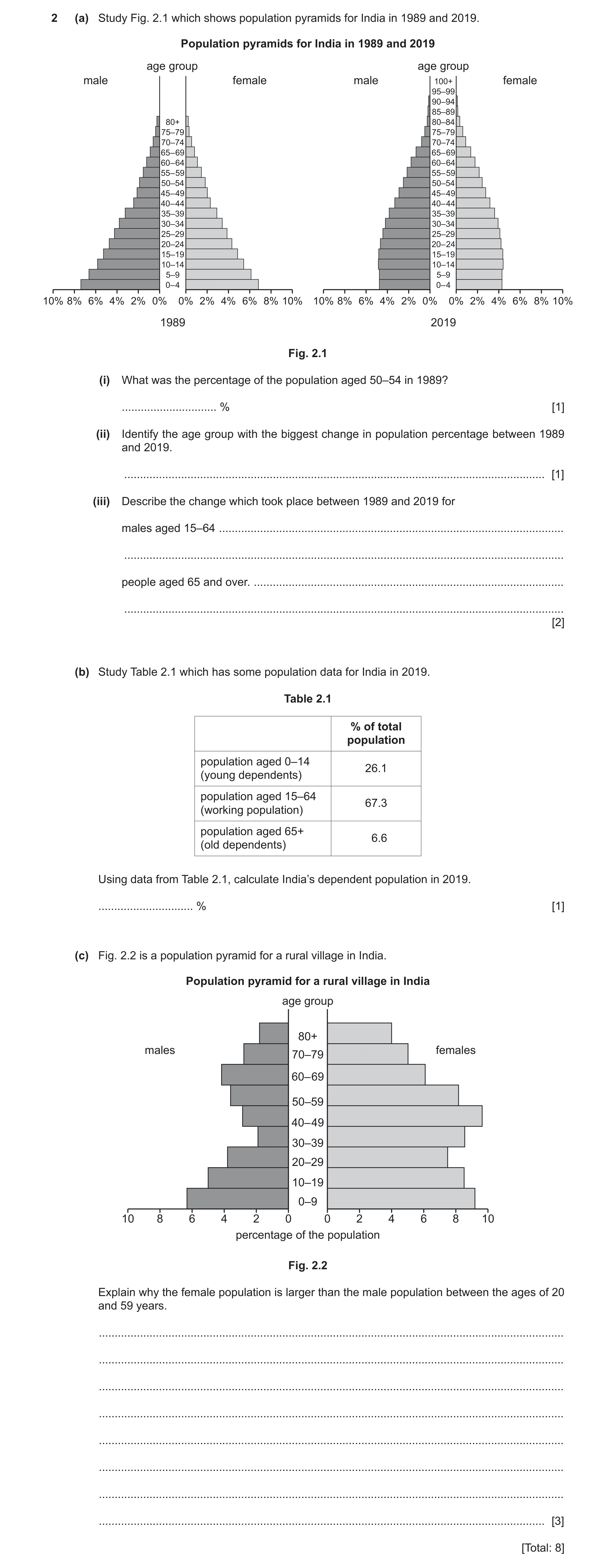
2 (a) Study Fig. 2.1 which shows population pyramids for India in 1989 and 2019. Population pyramids for India in 1989 and 2019 age group age group male female male 100+ female 95–99 90–94 85–89 80+ 80–84 75–79 75–79 70–74 70–74 65– 69 65– 69 60– 64 60– 64 55– 59 55– 59 50–54 50–54 45– 49 45– 49 40– 44 40– 44 35–39 35–39 30–34 30–34 25–29 25–29 20–24 20– 24 15–19 15–19 10–14 10–14 5–9 5–9 0– 4 0– 4 10% 8% 6% 4% 2% 0% 0% 2% 4% 6% 8% 10% 10% 8% 6% 4% 2% 0% 0% 2% 4% 6% 8% 10% 1989 2019 Fig. 2.1 (i) What was the percentage of the population aged 50–54 in 1989? … % [1] (ii) Identify the age group with the biggest change in population percentage between 1989 and 2019. … [1] (iii) Describe the change which took place between 1989 and 2019 for males aged 15–64 … … people aged 65 and over. … … [2] (b) Study Table 2.1 which has some population data for India in 2019. Table 2.1 % of total population population aged 0–14 26.1 (young dependents) population aged 15–64 67.3 (working population) population aged 65+ 6.6 (old dependents) Using data from Table 2.1, calculate India’s dependent population in 2019. … % [1] (c) Fig. 2.2 is a population pyramid for a rural village in India. Population pyramid for a rural village in India age group 80+ males females 70–79 60– 69 50–59 40– 49 30–39 20–29 10–19 0–9 10 8 6 4 2 0 0 2 4 6 8 10 percentage of the population Fig. 2.2 Explain why the female population is larger than the male population between the ages of 20 and 59 years. … … … … … … … … [3] [Total: 8]
8 marks
Mark scheme: 2(a)(i) 3.8% (tolerance) 3.6–3.9%. 1 2(a)(ii) 0–4 (yrs). 1 2(a)(iii) males 15–64: (small/moderate) increase/decrease or remains the same then 2 increase; people aged 65+: live longer/(small) increase. 2(b) 32.7(%). 1 2(c) males most likely to migrate/females most likely to stay at home; 3 crop failure; to find a job; (men leave village to find a job = 2) to earn more money; (men leave village to find a better paying job = 3) mechanisation in agriculture; unemployment; males go away to study; women stay behind to look after the family/tend the house. ^ tradition forbids woman from working. =0 men do harder/more dangerous jobs so are more likely to die men more likely to get sick working in bad conditions females required to give birth female mortality rate is lower than males females are less educated reference to males in the military/wars lack of contraception/birth rates.
This question in 0460/22 Feb/March 2024
Q16 · International population migration data to and from the Republic of Ireland for selected… 0460/21 May/June 2024
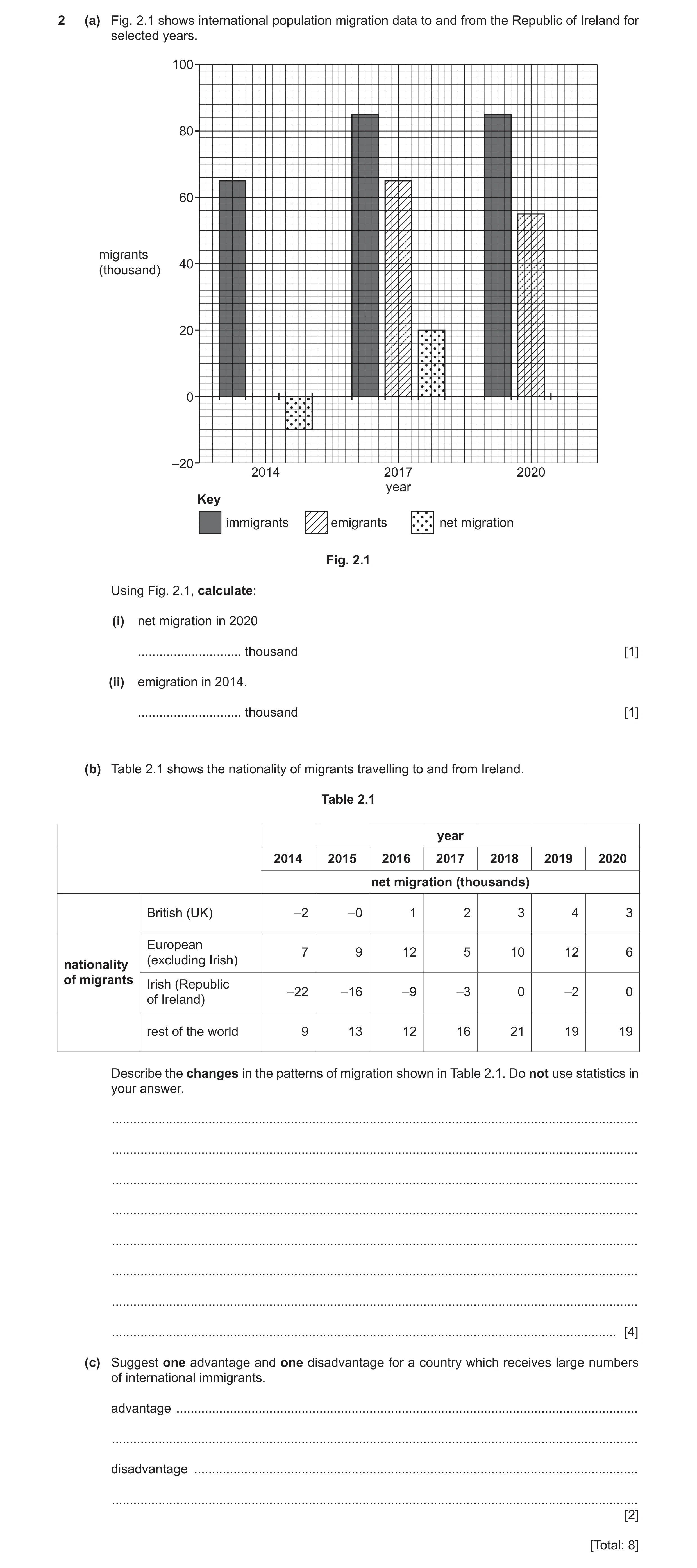
2 (a) Fig. 2.1 shows international population migration data to and from the Republic of Ireland for selected years. 100 80 60 migrants 40 (thousand) 20 0 –20 2014 2017 2020 year Key immigrants emigrants net migration Fig. 2.1 Using Fig. 2.1, calculate: (i) net migration in 2020 … thousand [1] (ii) emigration in 2014. … thousand [1] (b) Table 2.1 shows the nationality of migrants travelling to and from Ireland. Table 2.1 year 2014 2015 2016 2017 2018 2019 2020 net migration (thousands) British (UK) –2 –0 1 2 3 4 3 European 7 9 12 5 10 12 6 (excluding Irish)nationality of migrants Irish (Republic –22 –16 –9 –3 0 –2 0 of Ireland) rest of the world 9 13 12 16 21 19 19 Describe the changes in the patterns of migration shown in Table 2.1. Do not use statistics in your answer. … … … … … … … … [4] (c) Suggest one advantage and one disadvantage for a country which receives large numbers of international immigrants. advantage … … disadvantage … … [2] [Total: 8]
8 marks
Mark scheme: 2(a)(i) 30 (thousand). 1 Note: Allow mark if candidates have drawn the bar accurately on the graph. If graph drawn incorrectly but correct answer written in answer space give credit. 2(a)(ii) 75 (thousand). 1 Note:Allow mark if candidates have drawn the bar accurately on the graph. If graph drawn incorrectly but correct answer written in answer space give credit. 2(b) British (UK) increase/increase to 2019 then decrease; 4 British (UK) has changed from negative to positive; European fluctuates/no pattern/increase to 2019 then decrease/(overall) decrease/drops in 2017 and 2020; Irish (RoI) increase/decrease in emigration; Rest of world increase/doubled/increase then levelled out/increase to 2018 then decrease; British (UK) least change/range/Irish (RoI) most change/range. Note: Look for patterns not a year-by-year description. 2(c) Advantage 2 More/many (skilled) workers/boost workforce/more taxpayers/younger population; Can fill shortfalls in particular types of jobs or named example e.g. more doctors or nurses; Cultural diversity e.g. food, music, religion/new language; Disadvantage Increased competition for jobs; Wages sent to home country; Racial tensions; Increased pressure on housing/healthcare/schools; Increased pressure on food/water/energy. Note: Reserve 1 mark for advantage and 1 mark for disadvantage Must be in correct section.
This question in 0460/21 May/June 2024
Question 17 0460/23 May/June 2024
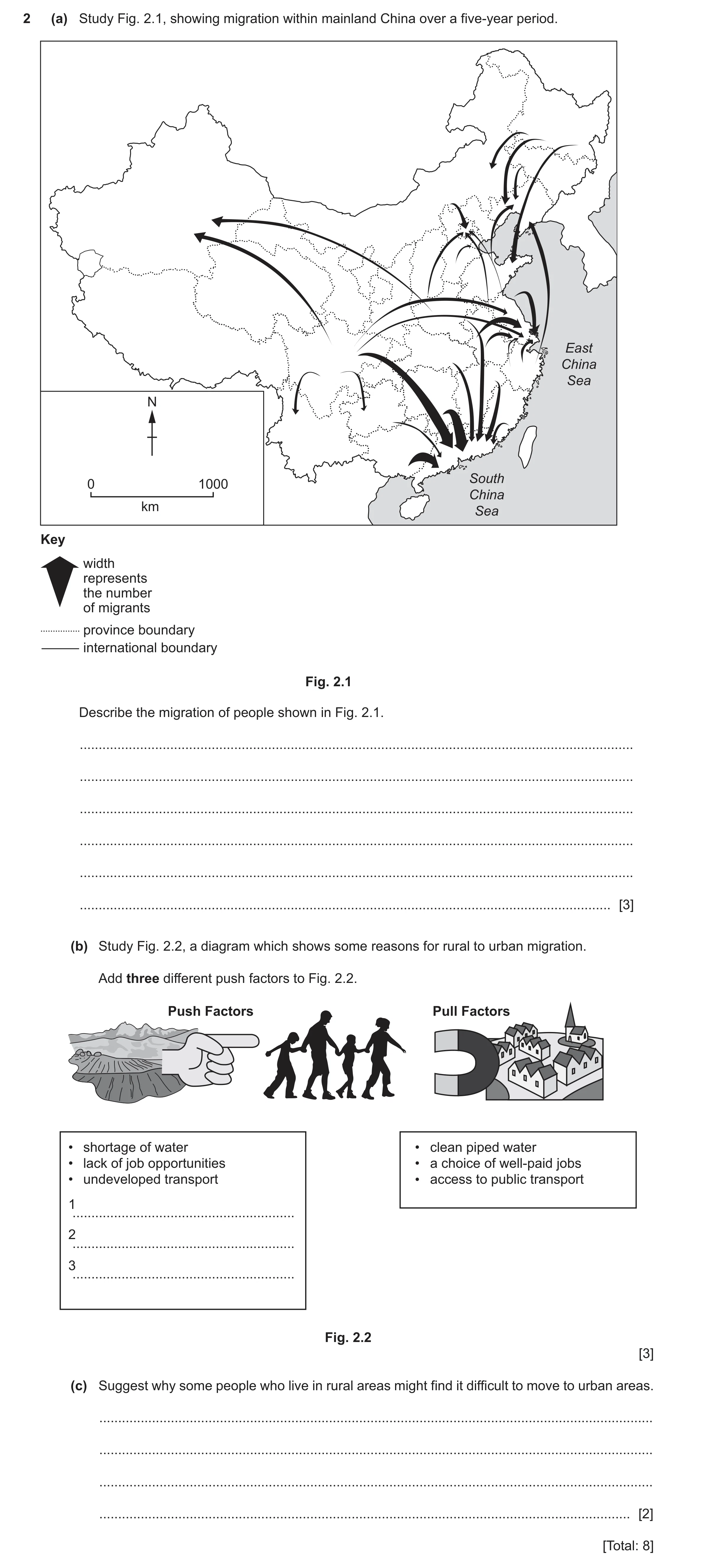
2 (a) Study Fig. 2.1, showing migration within mainland China over a five-year period. East China Sea N South 0 1000 China km Sea Key width represents the number of migrants province boundary international boundary Fig. 2.1 Describe the migration of people shown in Fig. 2.1. … … … … … … [3] (b) Study Fig. 2.2, a diagram which shows some reasons for rural to urban migration. Add three different push factors to Fig. 2.2. Push Factors Pull Factors • shortage of water • clean piped water • lack of job opportunities • a choice of well-paid jobs • undeveloped transport • access to public transport 1 … 2 … 3 … Fig. 2.2 [3] (c) Suggest why some people who live in rural areas might find it difficult to move to urban areas. … … … … [2] [Total: 8]
8 marks
Mark scheme: 2(a) Movements are uneven; 3 Big variation in distance travelled; Few migrate inland; Many/most people move towards the coast/coastal provinces gain most migrants; (Especially) the South China Sea coast; Some movements along coast/ cross East China Sea; Moving out from inland/central China; Many/most moving to south/south-east/east; Some/a few moving to west-north-west/north-west/north; Longest movements /to the west-north-west/north-west/1400 km–2000 km; Shortest movements to the coast/200–240 km/from neighbouring provinces; Province at/on/north of South China Sea gains most migrants; One area/province at/on/north of South China Sea gains migrants from 8 (different) provinces. 2(b) Poverty; 3 Basic/poor housing/overcrowding/(rural) housing too expensive for locals; Infertile/poor soils/soil erosion/steep slopes; Food shortage/poor harvests/crops/low yields/famine/starvation/locusts; Mechanisation (in agriculture); Cyclone/earthquake/volcanic eruption/natural hazard; Lack of rainfall/drought/floods; Wars/persecution/lack of law and order/lack of security; Eviction by landlord/division of inherited land/land consolidation; Lack of entertainment/leisure facilities/shopping/variety of goods available/theatres/cinemas; Lack of healthcare/medicines/vaccines/few doctors/clinics/hospitals; Lack of schools/education; Lack of/unreliable electricity/gas supplies; Lack of telecommunications/internet/mobile network; Lack of sewage system/poor hygiene/sanitation; Rural areas remote/cut-off/inaccessible/trade limited. 2(c) Transport may be too expensive/cannot afford the transport costs/lack of 2 money; Journey too dangerous/too far to travel; Lack of/have no means of transport/difficult to move belongings; Trauma of leaving family behind/family responsibilities/attached to their local community; Need permission to cross boundaries/permit/hukou (government permission to move into the cities in China); Too old/elderly/disabled to travel.
This question in 0460/23 May/June 2024
Q18 · Data about the destination countries of Indian migrants in 1990 and 2020 0460/23 Oct/Nov 2025
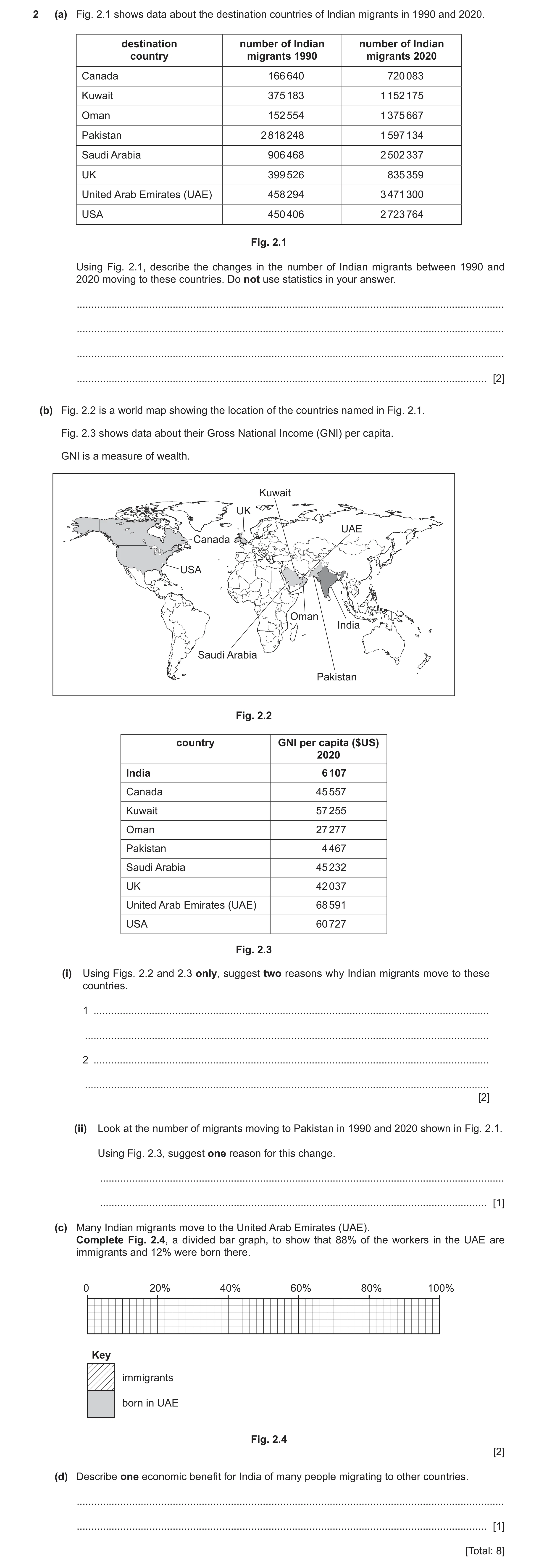
2 (a) Fig. 2.1 shows data about the destination countries of Indian migrants in 1990 and 2020. destination number of Indian number of Indian country migrants 1990 migrants 2020 Canada 166 640 720 083 Kuwait 375 183 1 152 175 Oman 152 554 1 375 667 Pakistan 2 818 248 1 597 134 Saudi Arabia 906 468 2 502 337 UK 399 526 835 359 United Arab Emirates (UAE) 458 294 3 471 300 USA 450 406 2 723 764 Fig. 2.1 Using Fig. 2.1, describe the changes in the number of Indian migrants between 1990 and 2020 moving to these countries. Do not use statistics in your answer. … … … … [2] (b) Fig. 2.2 is a world map showing the location of the countries named in Fig. 2.1. Fig. 2.3 shows data about their Gross National Income (GNI) per capita. GNI is a measure of wealth. Kuwait UK UAE Canada USA Oman India Saudi Arabia Pakistan Fig. 2.2 country GNI per capita ($US) 2020 India 6 107 Canada 45 557 Kuwait 57 255 Oman 27 277 Pakistan 4 467 Saudi Arabia 45 232 UK 42 037 United Arab Emirates (UAE) 68 591 USA 60 727 Fig. 2.3 (i) Using Figs. 2.2 and 2.3 only, suggest two reasons why Indian migrants move to these countries. 1 … … 2 … … [2] (ii) Look at the number of migrants moving to Pakistan in 1990 and 2020 shown in Fig. 2.1. Using Fig. 2.3, suggest one reason for this change. … … [1] (c) Many Indian migrants move to the United Arab Emirates (UAE). Complete Fig. 2.4, a divided bar graph, to show that 88% of the workers in the UAE are immigrants and 12% were born there. 0 20% 40% 60% 80% 100% Key immigrants born in UAE Fig. 2.4 [2] (d) Describe one economic benefit for India of many people migrating to other countries. … … [1] [Total: 8]
8 marks
Mark scheme: 2(a) increase in migrants (in most countries) 2 decrease/anomaly in Pakistan In 1990 Pakistan had most migrants and in 2020 UAE had most. In 1990 Oman had least migrants and in 2020 Canada had least. greatest increase to the United Arab Emirates (in absolute terms) greatest % increase to Oman 2(b)(i) high(er) GNI (per capita)/income/wages/pay/wealthy countries 2 close to India/same continent 2(b)(ii) GNI/income/wages/pay/wealth lower than India/lowest 1 2(c) Line drawn at 88% 2 Shaded correctly 2(d) migrants send remittances home 1 fewer benefits to pay less pressure on housing/healthcare/services less unemployment migrants learn new skills (to benefit India on their return)
This question in 0460/23 Oct/Nov 2025
 17 / 33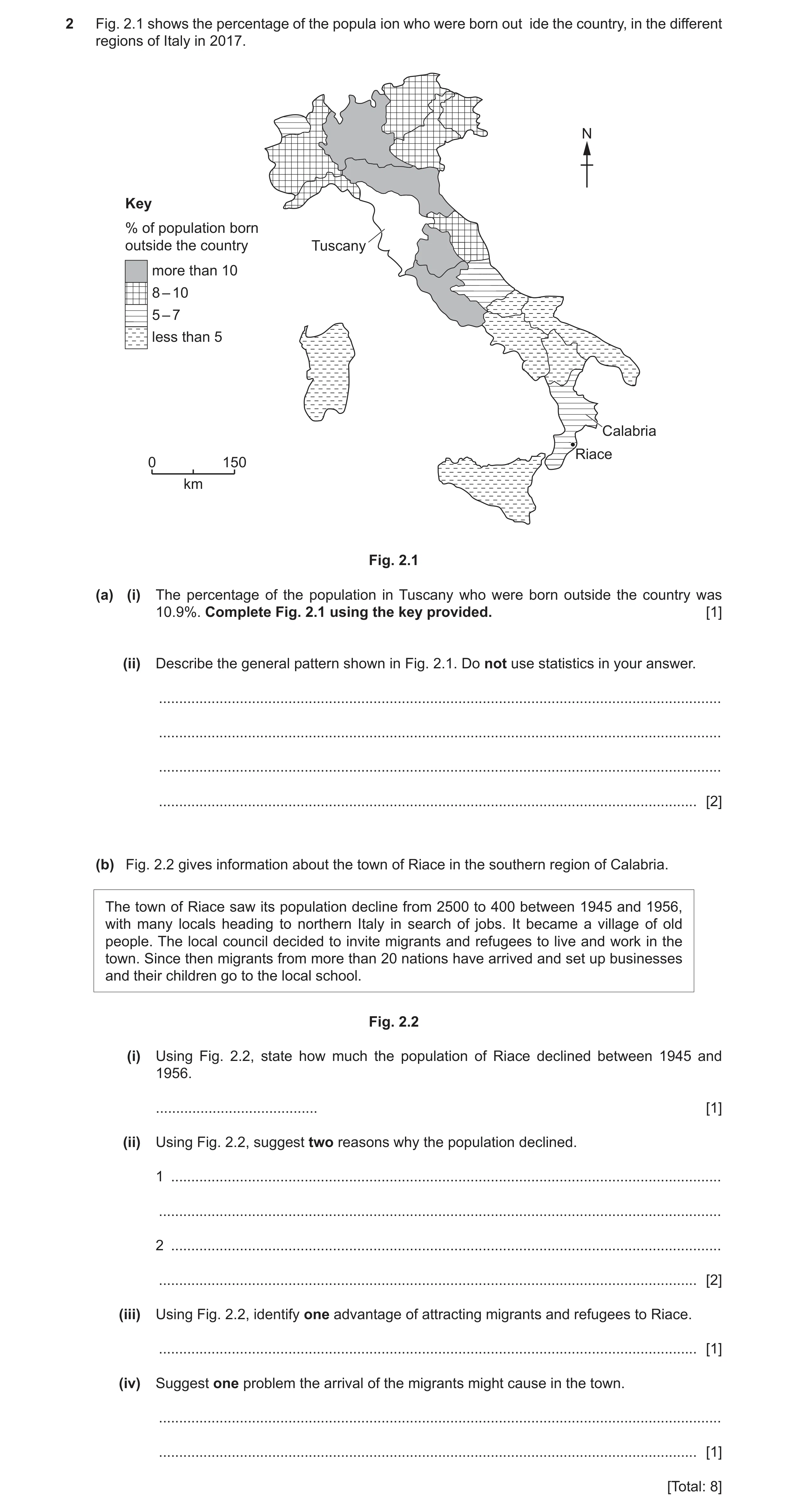
 8
8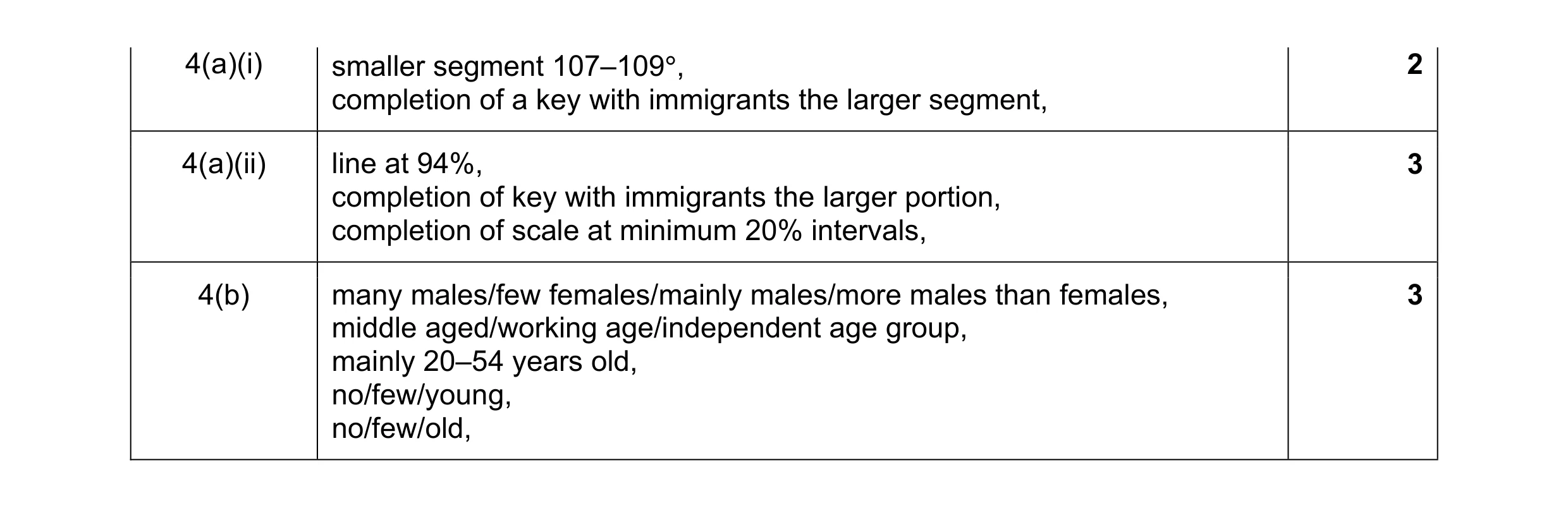 8
8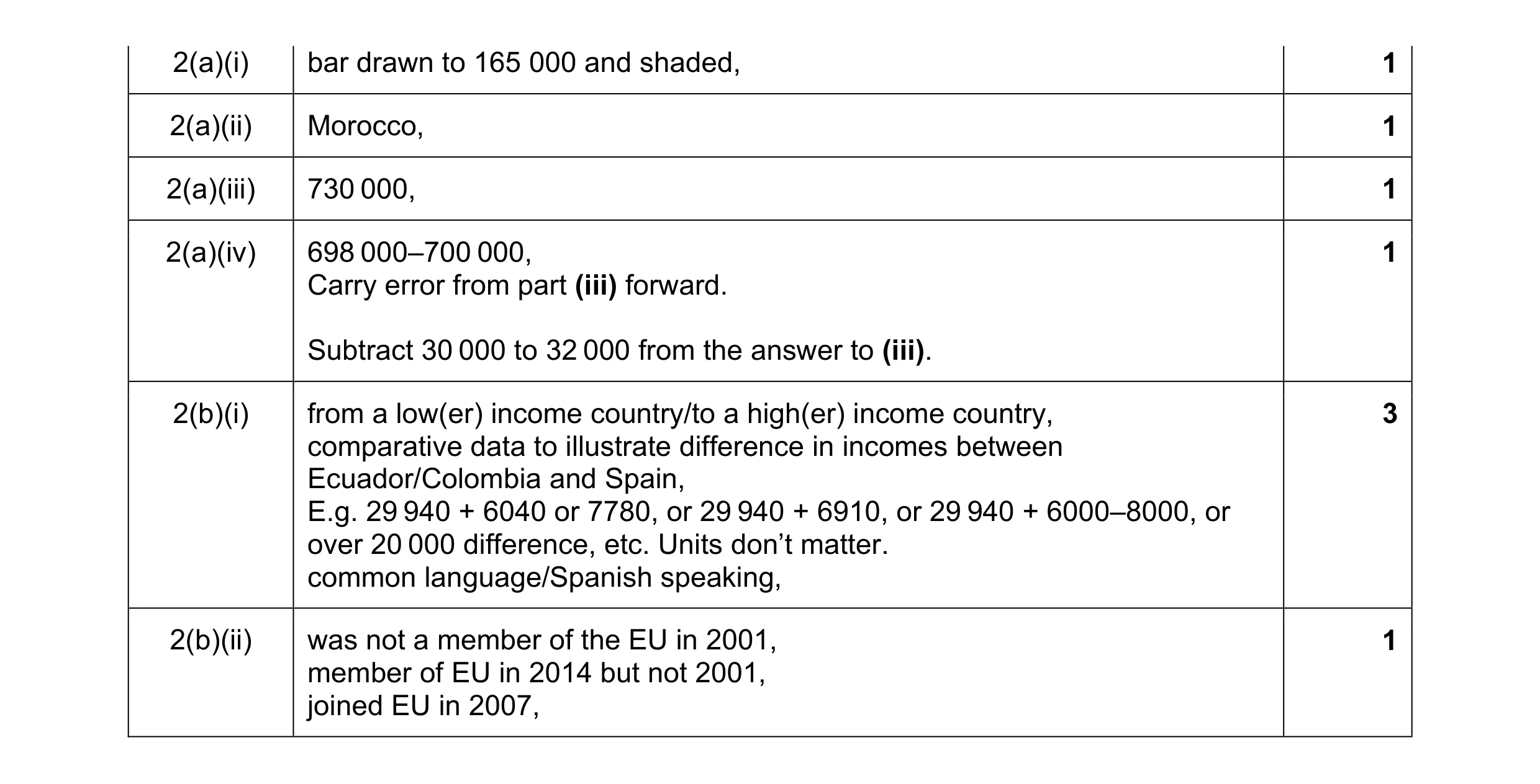 8
8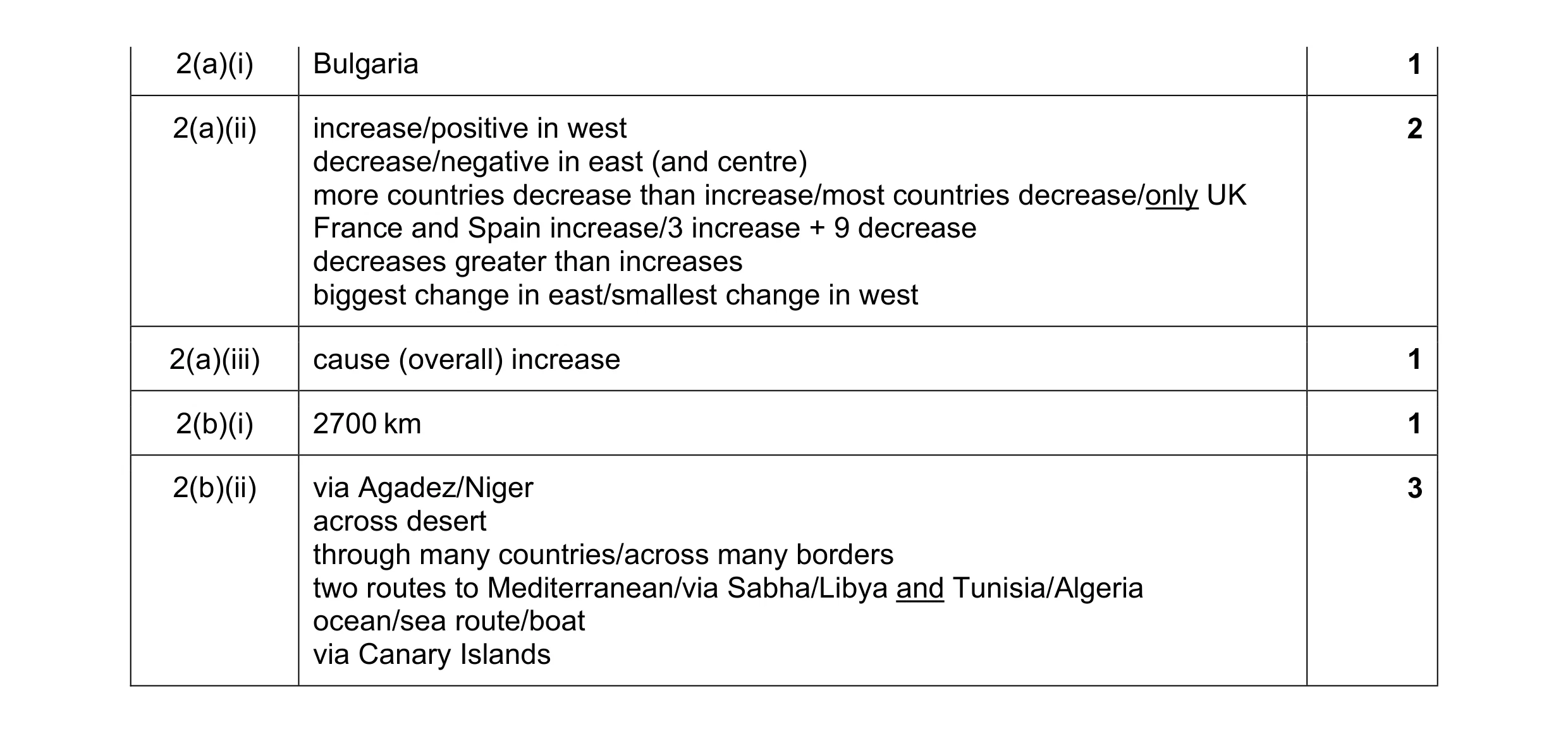 8
8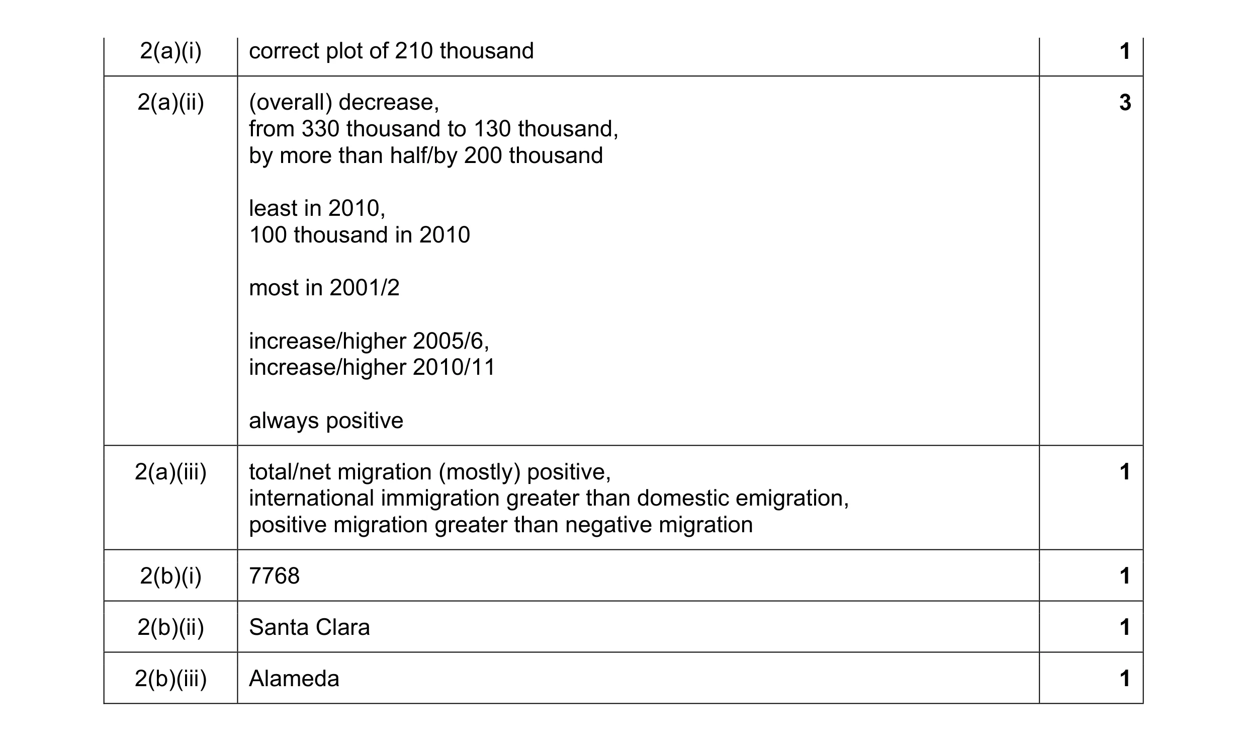 8
8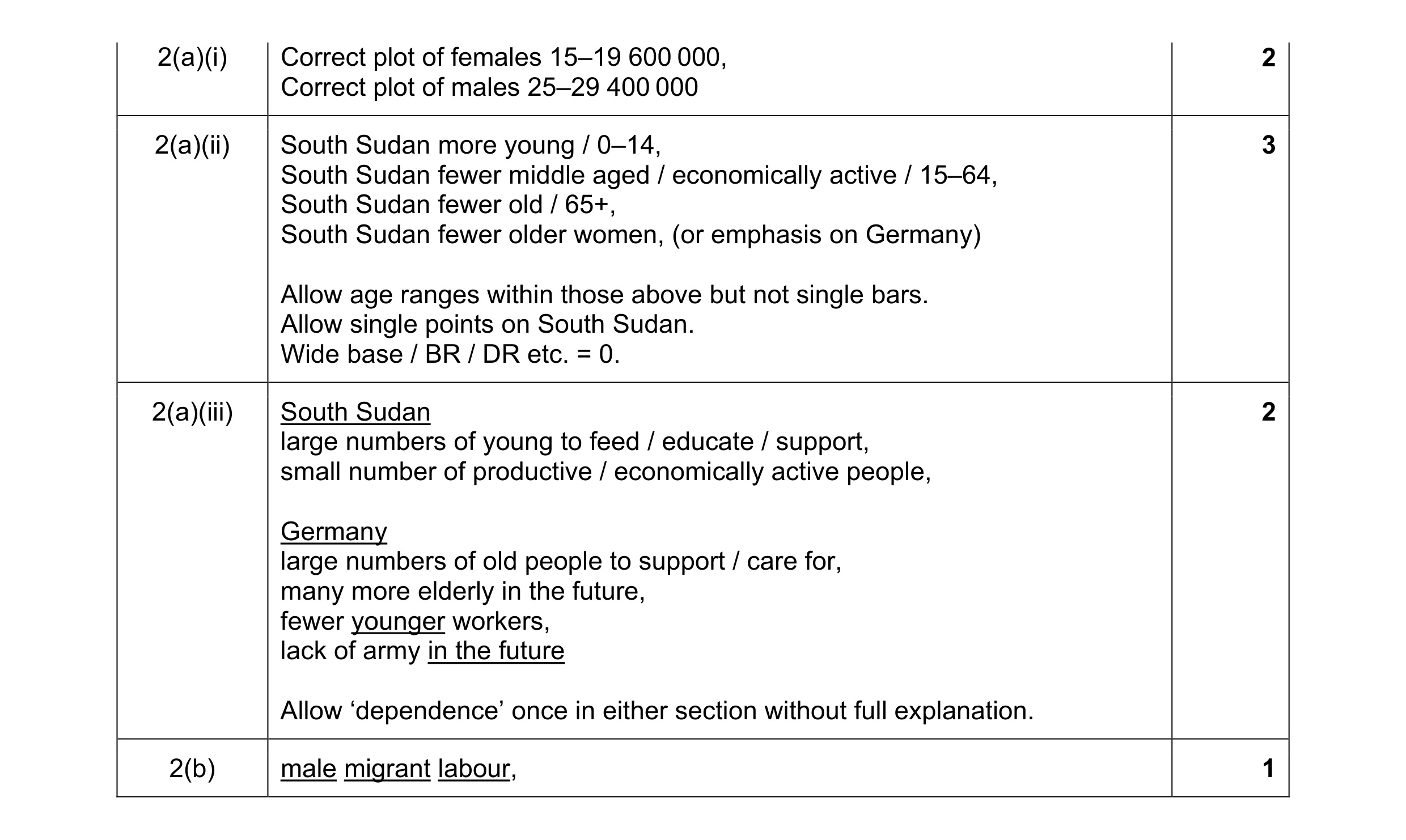 8
8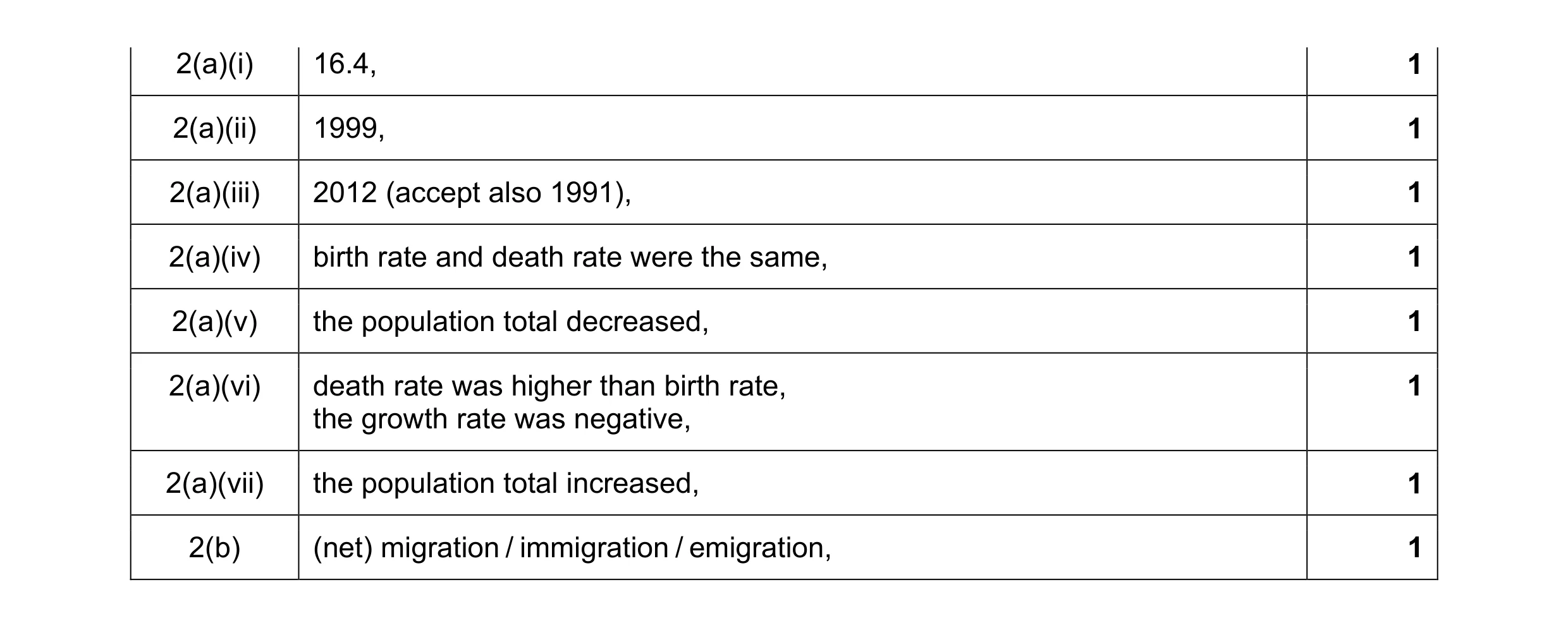 8
8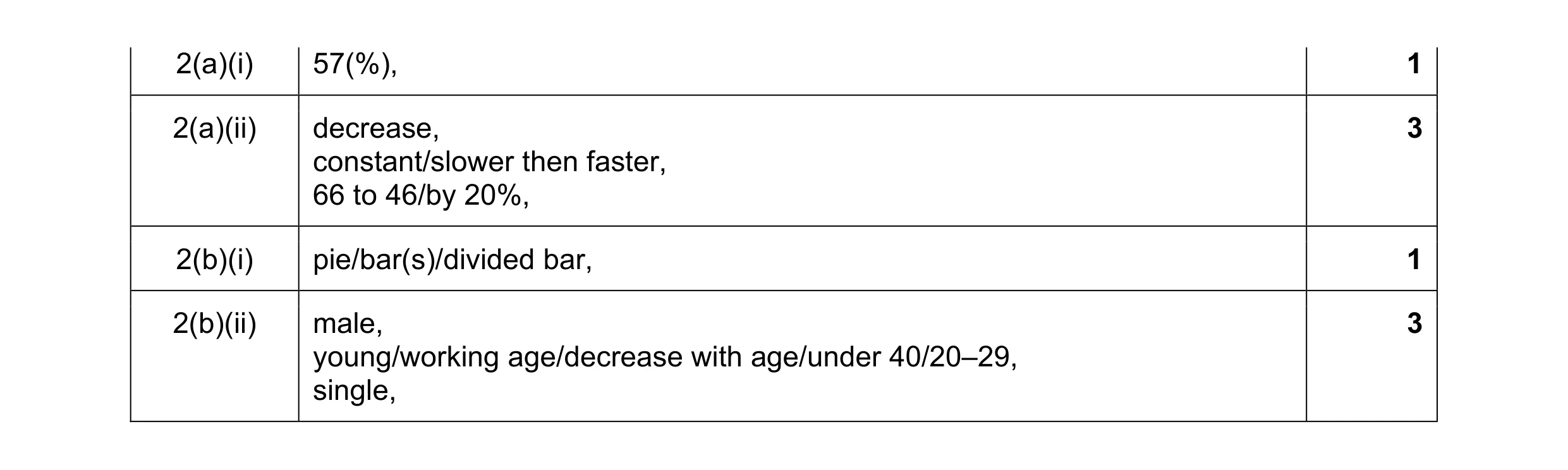 8
8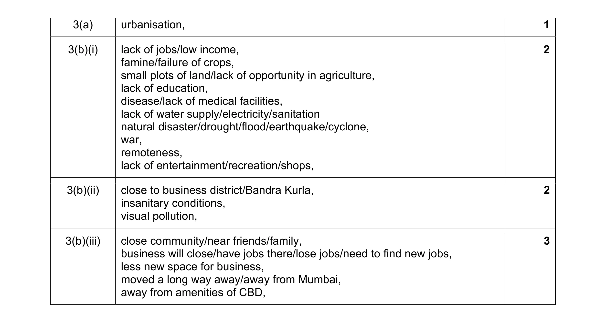 8
8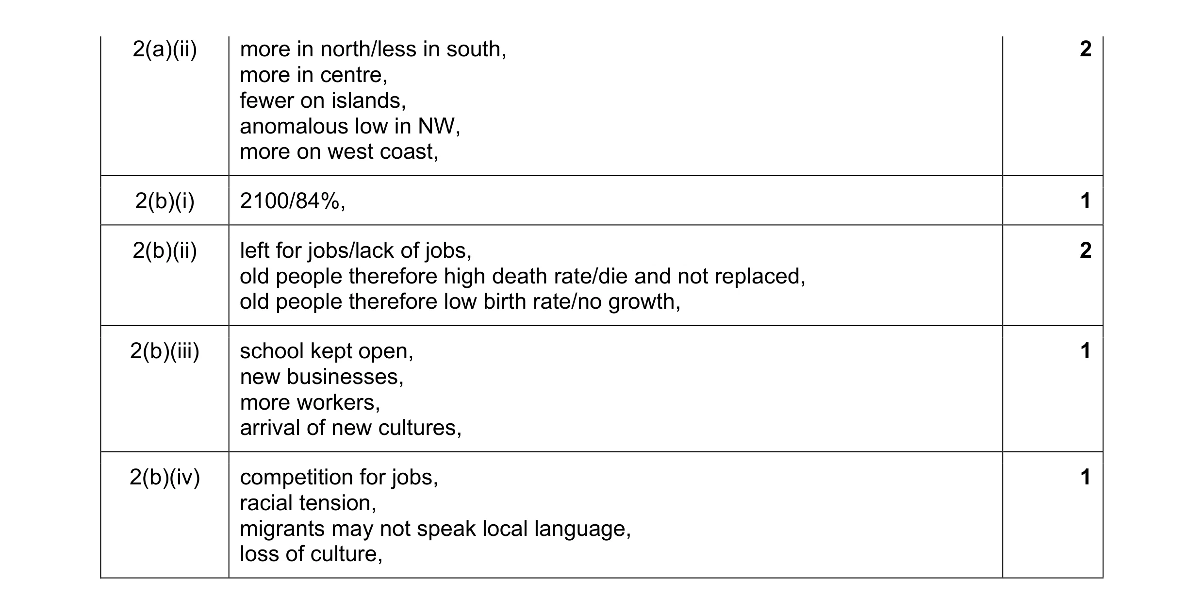 8
8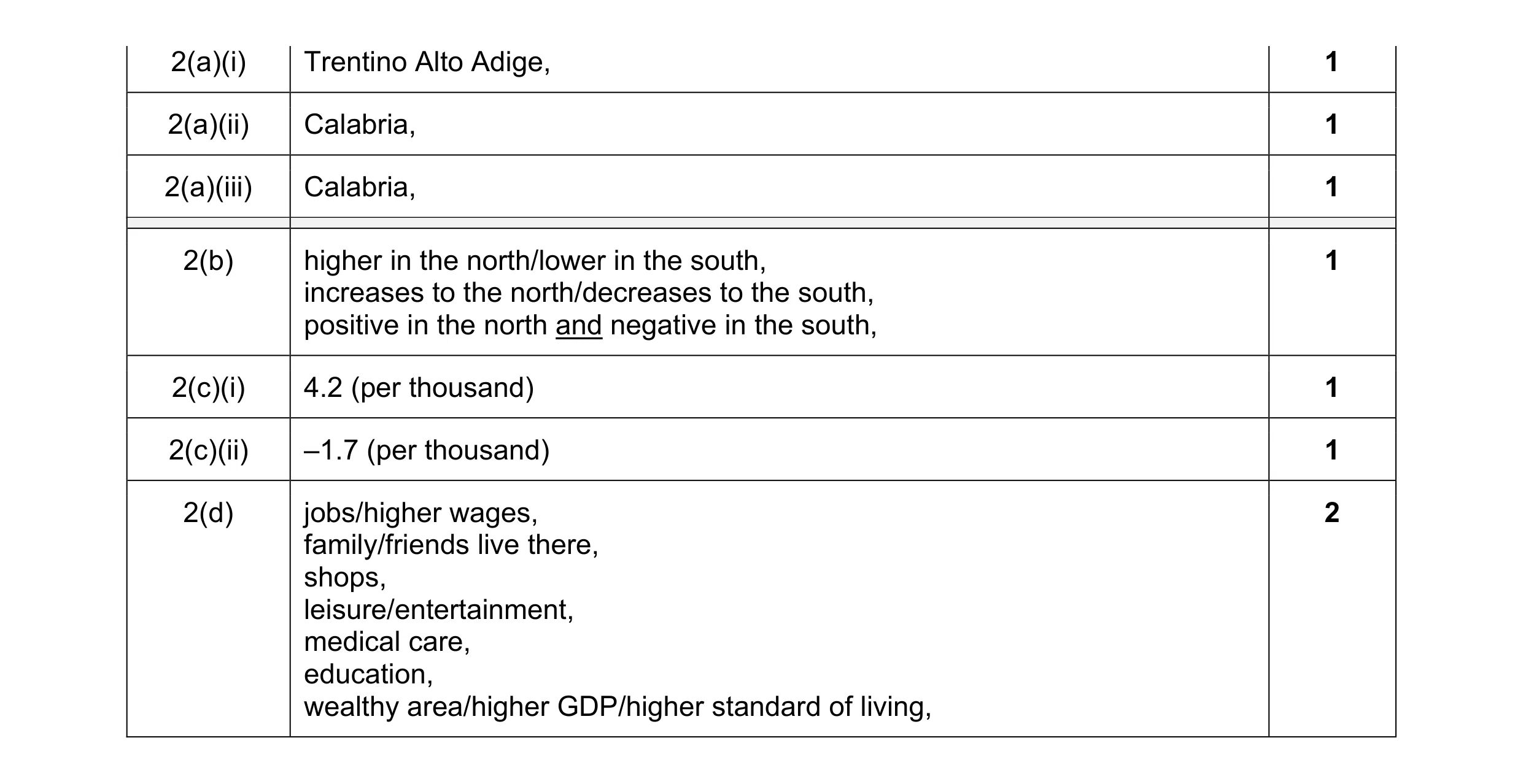 8
8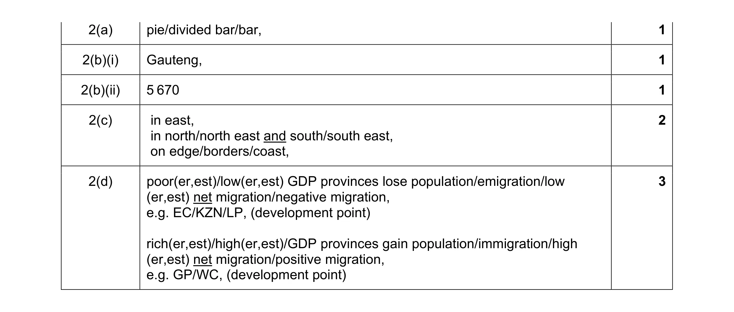 8
8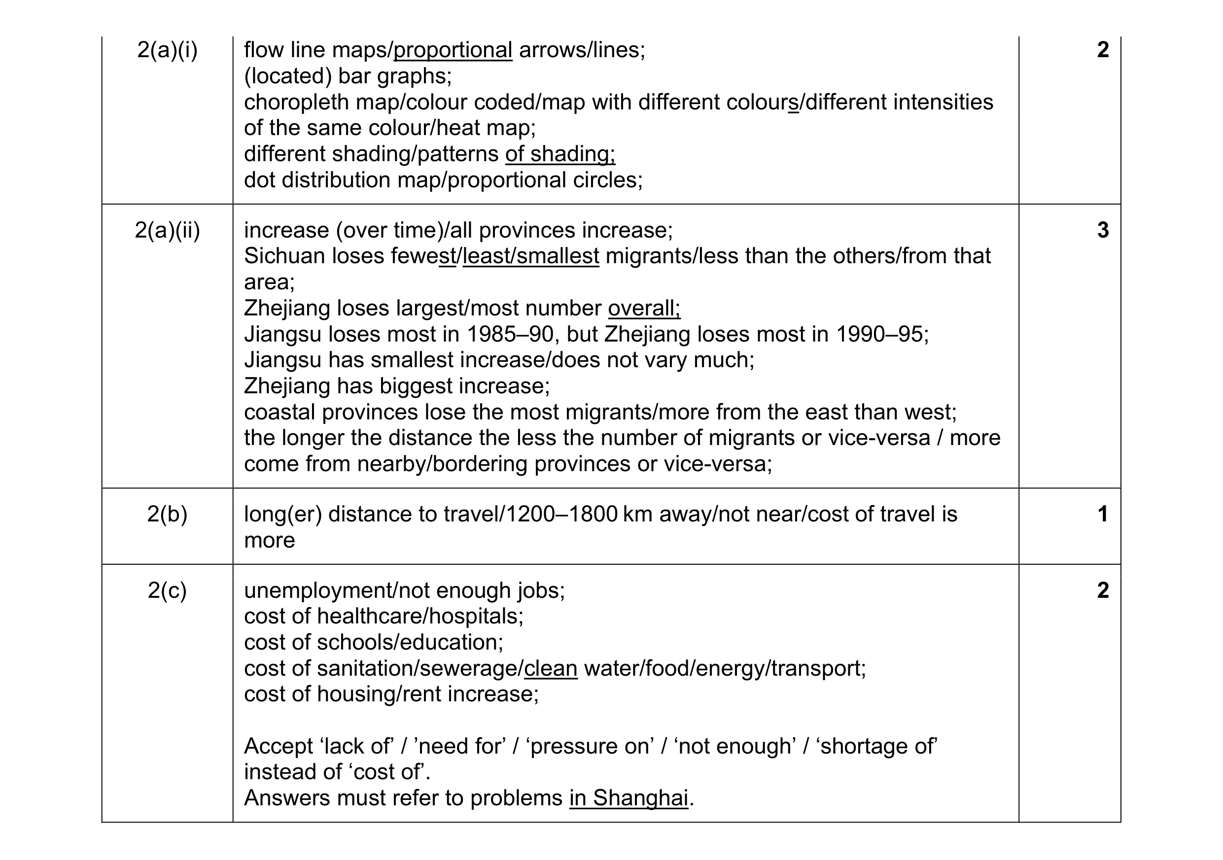 8
8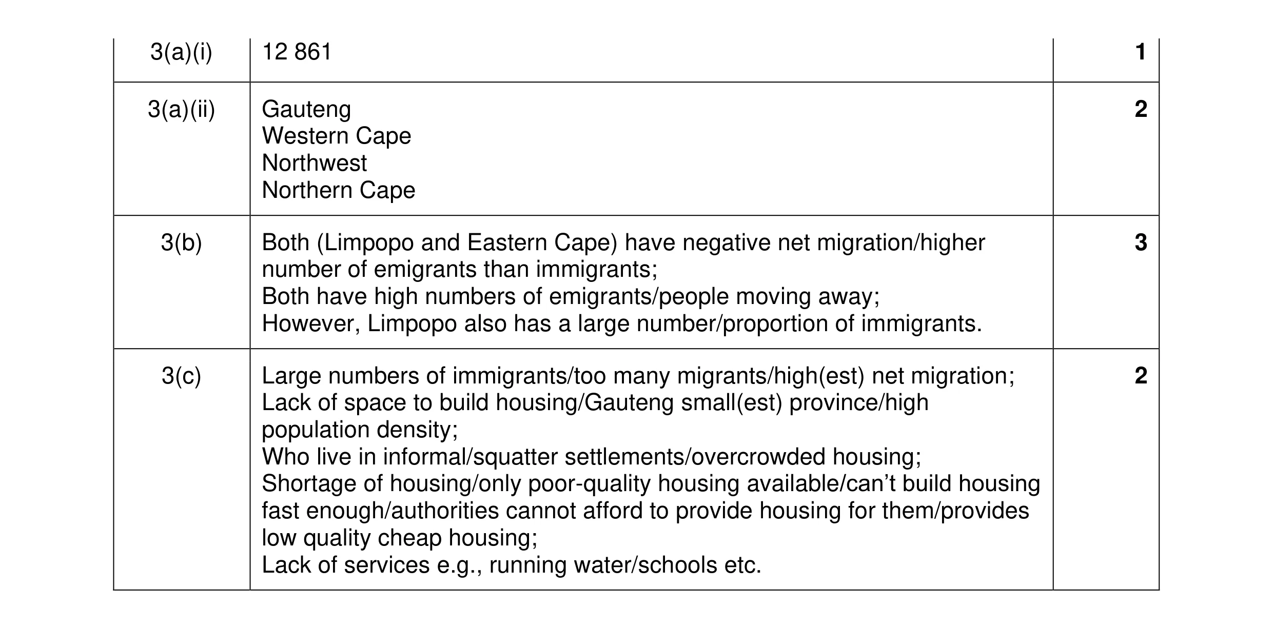 8
8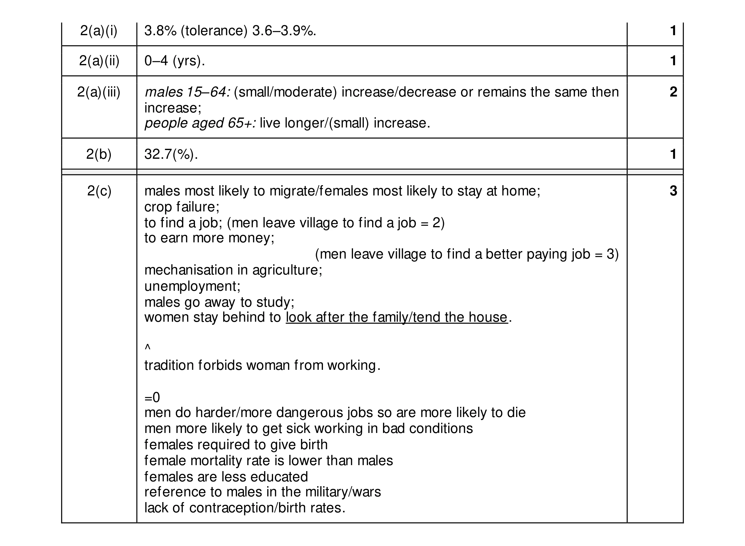 8
8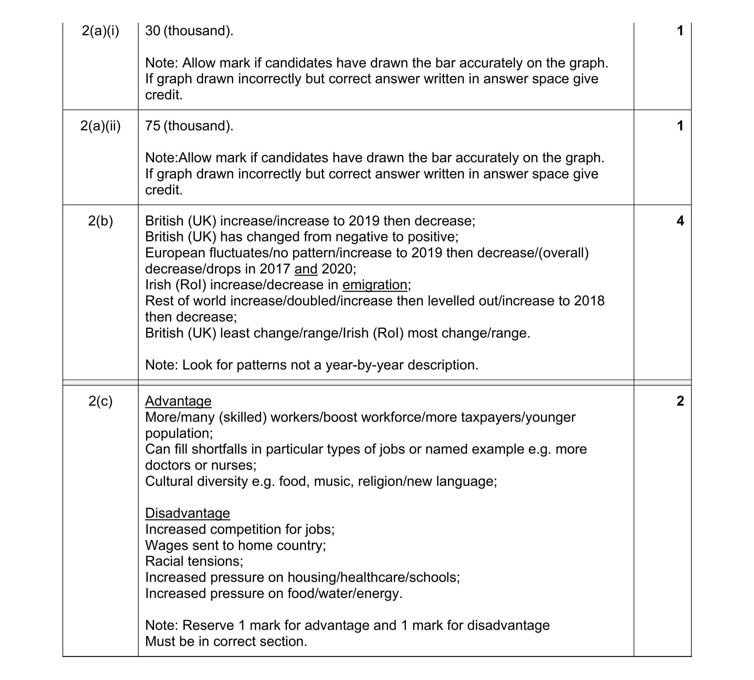 8
8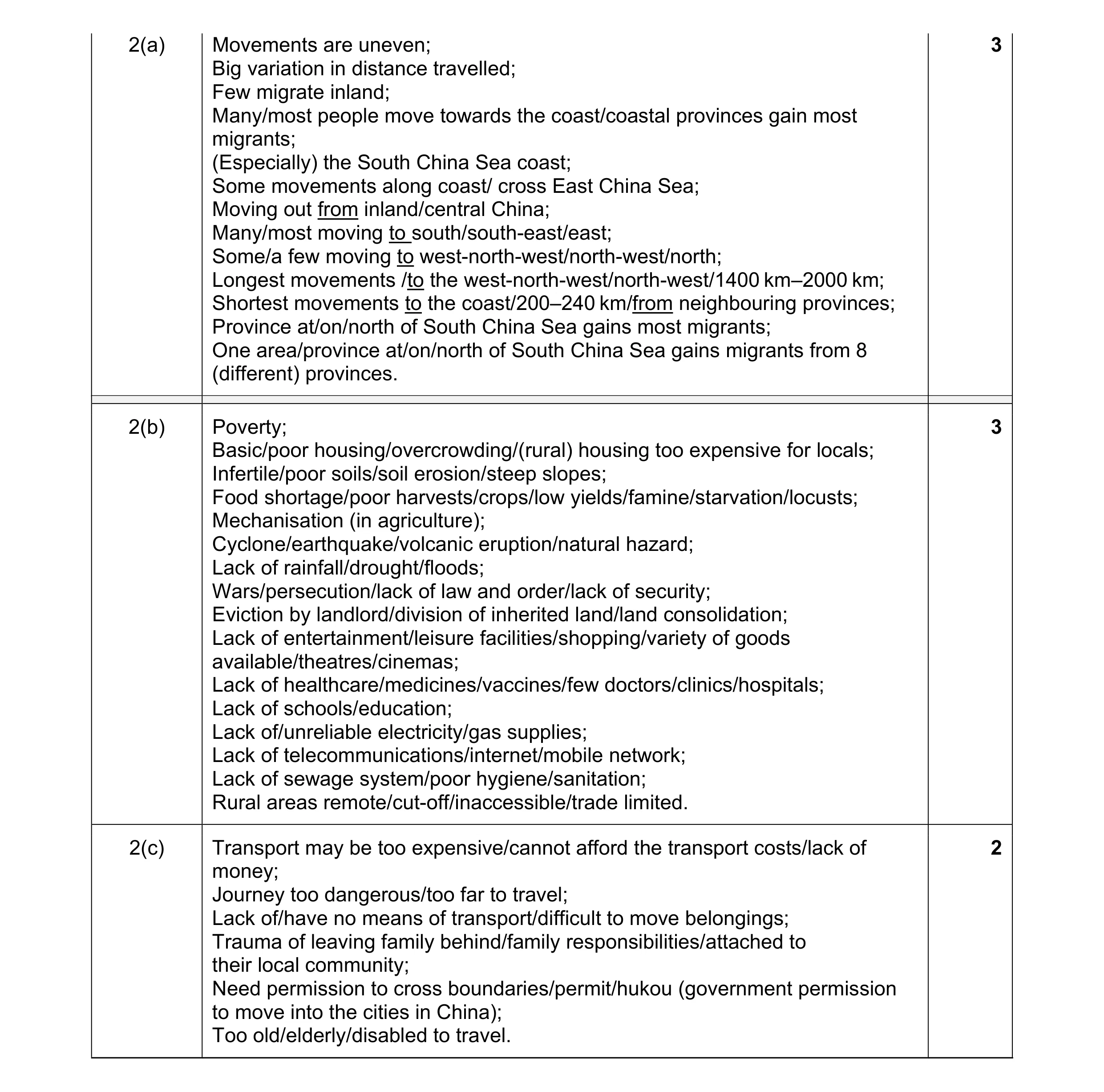 8
8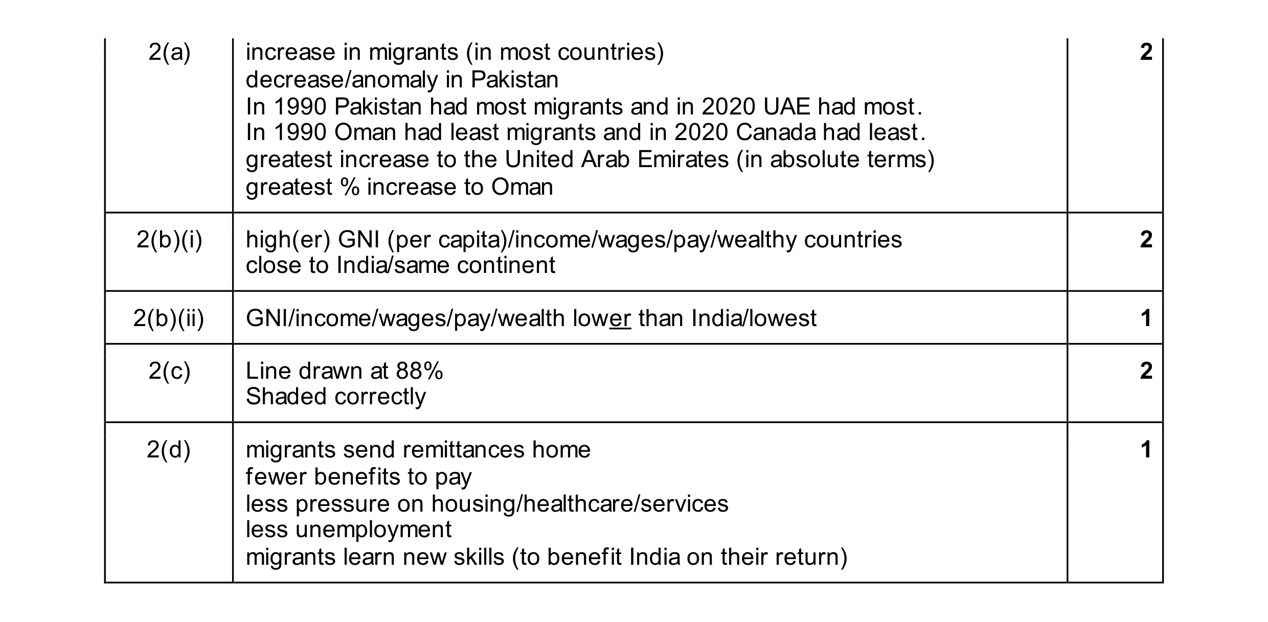 8
8