Questions as text
Question 1 0460/22 May/June 2017
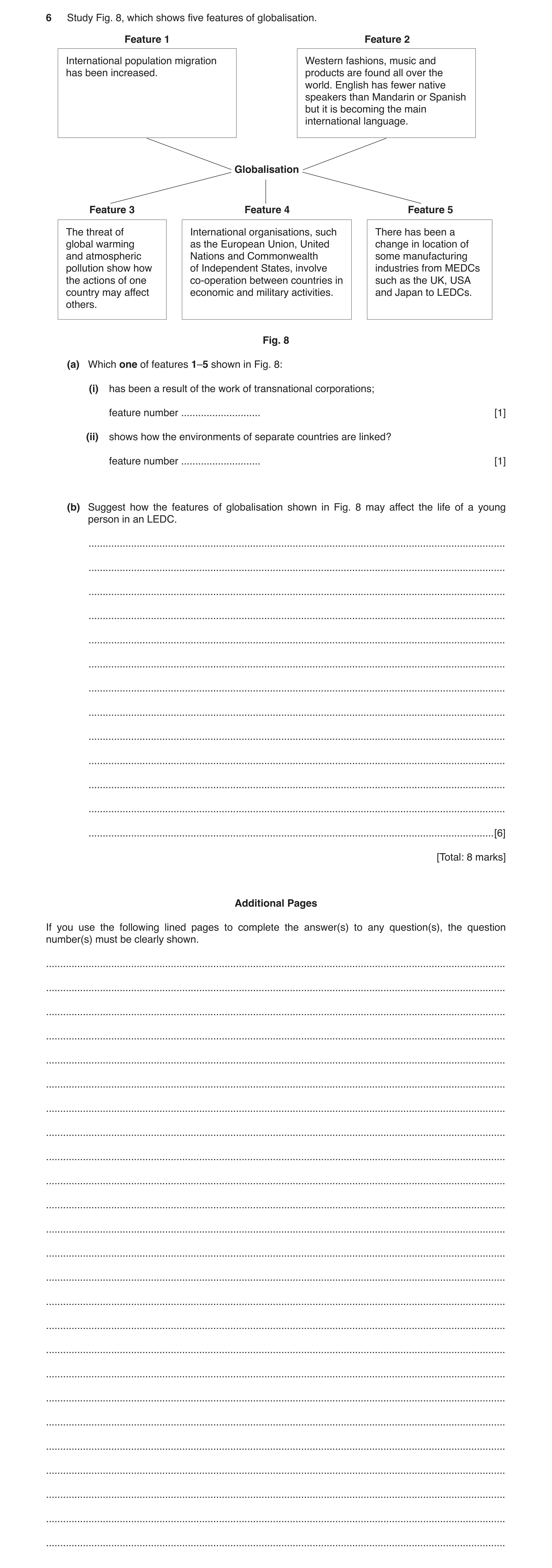
6 Study Fig. 8, which shows five features of globalisation. Feature 1 Feature 2 International population migration Western fashions, music and has been increased. products are found all over the world. English has fewer native speakers than Mandarin or Spanish but it is becoming the main international language. Globalisation Feature 3 Feature 4 Feature 5 The threat of International organisations, such There has been a global warming as the European Union, United change in location of and atmospheric Nations and Commonwealth some manufacturing pollution show how of Independent States, involve industries from MEDCs the actions of one co-operation between countries in such as the UK, USA country may affect economic and military activities. and Japan to LEDCs. others. Fig. 8 (a) Which one of features 1–5 shown in Fig. 8: (i) has been a result of the work of transnational corporations; feature number … [1] (ii) shows how the environments of separate countries are linked? feature number … [1] (b) Suggest how the features of globalisation shown in Fig. 8 may affect the life of a young person in an LEDC. … … … … … … … … … … … … … [6] [Total: 8 marks] Additional Pages If you use the following lined pages to complete the answer(s) to any question(s), the question number(s) must be clearly shown. … … … … … … … … … … … … … … … … … … … … … … … … …
8 marks
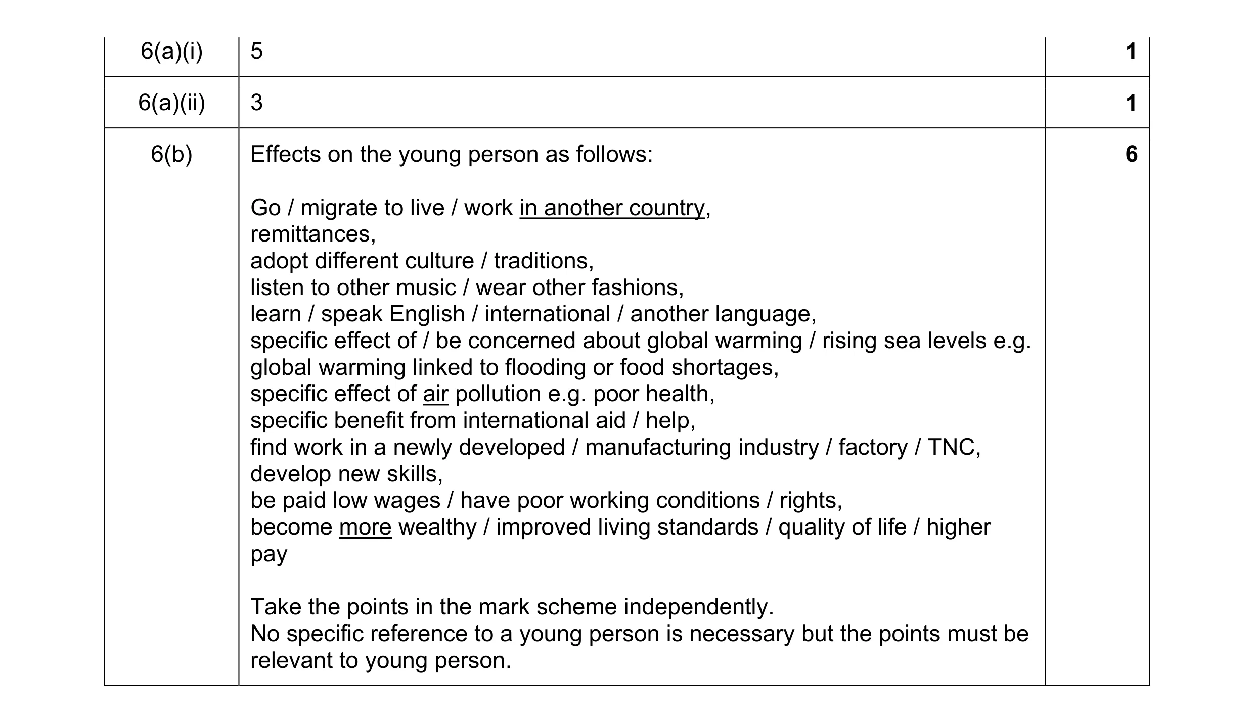
Mark scheme: 6(a)(i) 5 1 6(a)(ii) 3 1 6(b) Effects on the young person as follows: 6 Go / migrate to live / work in another country, remittances, adopt different culture / traditions, listen to other music / wear other fashions, learn / speak English / international / another language, specific effect of / be concerned about global warming / rising sea levels e.g. global warming linked to flooding or food shortages, specific effect of air pollution e.g. poor health, specific benefit from international aid / help, find work in a newly developed / manufacturing industry / factory / TNC, develop new skills, be paid low wages / have poor working conditions / rights, become more wealthy / improved living standards / quality of life / higher pay Take the points in the mark scheme independently. No specific reference to a young person is necessary but the points must be relevant to young person.
This question in 0460/22 May/June 2017
Q2 · In recent years people have become more concerned about global warming 0460/22 Oct/Nov 2018
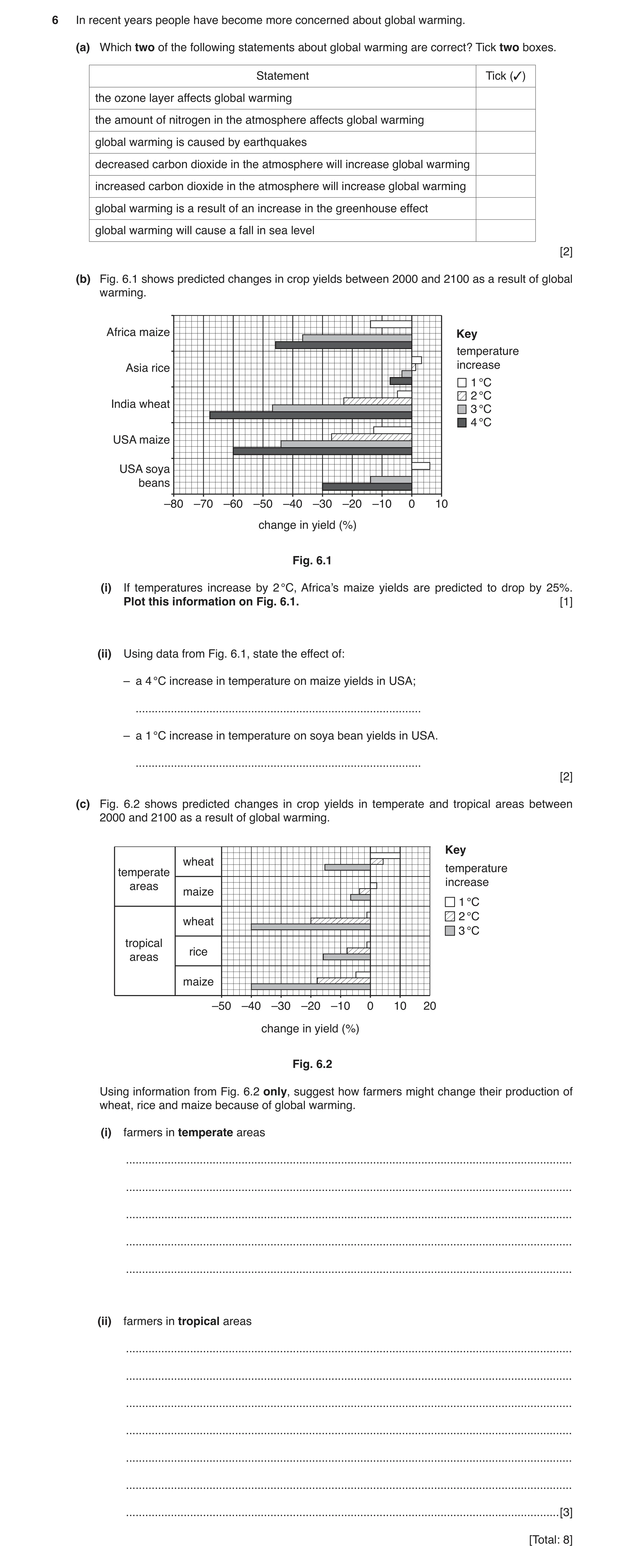
6 In recent years people have become more concerned about global warming. (a) Which two of the following statements about global warming are correct? Tick two boxes. Statement Tick (✓) the ozone layer affects global warming the amount of nitrogen in the atmosphere affects global warming global warming is caused by earthquakes decreased carbon dioxide in the atmosphere will increase global warming increased carbon dioxide in the atmosphere will increase global warming global warming is a result of an increase in the greenhouse effect global warming will cause a fall in sea level [2] (b) Fig. 6.1 shows predicted changes in crop yields between 2000 and 2100 as a result of global warming. Africa maize Key temperature Asia rice increase 1 °C 2 °C India wheat 3 °C 4 °C USA maize USA soya beans –80 –70 –60 –50 –40 –30 –20 –10 0 10 change in yield (%) Fig. 6.1 (i) If temperatures increase by 2 °C, Africa’s maize yields are predicted to drop by 25%. Plot this information on Fig. 6.1. [1] (ii) Using data from Fig. 6.1, state the effect of: – a 4 °C increase in temperature on maize yields in USA; … – a 1 °C increase in temperature on soya bean yields in USA. … [2] (c) Fig. 6.2 shows predicted changes in crop yields in temperate and tropical areas between 2000 and 2100 as a result of global warming. Key wheat temperature temperate increase areas maize 1 °C 2 °C wheat 3 °C tropical rice areas maize –50 –40 –30 –20 –10 0 10 20 change in yield (%) Fig. 6.2 Using information from Fig. 6.2 only, suggest how farmers might change their production of wheat, rice and maize because of global warming. (i) farmers in temperate areas … … … … … (ii) farmers in tropical areas … … … … … … … [3] [Total: 8]
8 marks
Mark scheme: 6(a) increased carbon dioxide in the atmosphere will increase global warming 2 global warming is a result of an increase in the greenhouse effect 6(b)(i) 25% drop correctly plotted on Fig. 10 1 6(b)(ii) 60% decrease 2 6% increase 6(c)(i) grow (more)/increase wheat if temperature increases low/1 °C/2 °C 3 grow (more)/increase maize if temperature increase high/3 °C 6(c)(ii) grow less maize/more wheat and rice if temperature increase low/1 °C grow less wheat and maize grow (more)/increase rice Answers must be describing farmers’ decisions and not just repeating data about yields from Fig. 6.2. Allow ‘move to other crops (apart from wheat, rice and maize)’ once. No marks for other farming practices.
This question in 0460/22 Oct/Nov 2018
Q3 · Air pollution by fine particles in the area around Delhi for one day 0460/22 Feb/March 2019
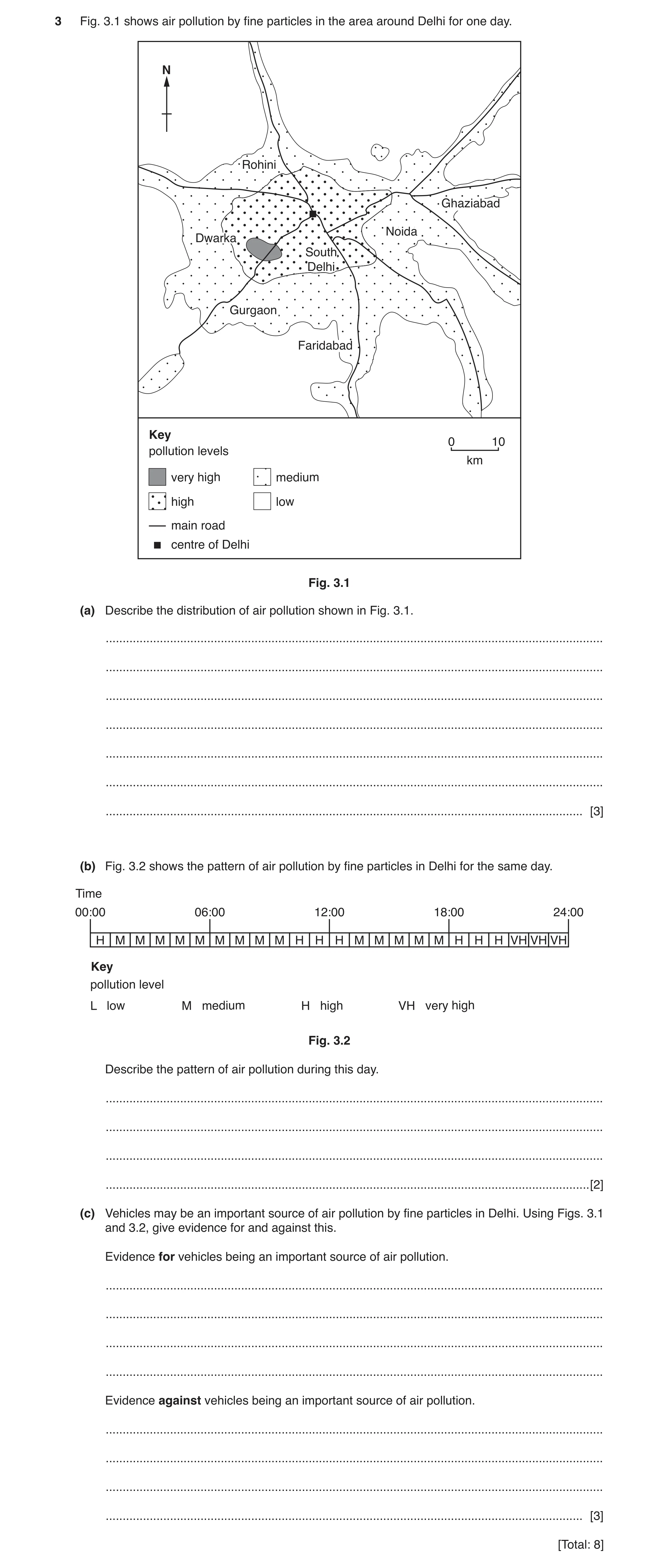
3 Fig. 3.1 shows air pollution by fine particles in the area around Delhi for one day. N Rohini Ghaziabad Noida Dwarka South Delhi Gurgaon Faridabad Key 0 10 pollution levels km very high medium high low main road centre of Delhi Fig. 3.1 (a) Describe the distribution of air pollution shown in Fig. 3.1. … … … … … … … [3] (b) Fig. 3.2 shows the pattern of air pollution by fine particles in Delhi for the same day. Time 00:00 06:00 12:00 18:00 24:00 H M M M M M M M M M H H H M M M M M H H H VH VH VH Key pollution level L low M medium H high VH very high Fig. 3.2 Describe the pattern of air pollution during this day. … … … … [2] (c) Vehicles may be an important source of air pollution by fine particles in Delhi. Using Figs. 3.1 and 3.2, give evidence for and against this. Evidence for vehicles being an important source of air pollution. … … … … Evidence against vehicles being an important source of air pollution. … … … … [3] [Total: 8]
8 marks
Mark scheme: 3(a) high(er) in centre, 3 low(er)/medium further away, very high/most in Dwarka/SW of centre/between Dwarka and South Delhi/near Dwarka, higher/medium along roads/low(er) away from roads 3(b) 01:00–10:00/night/early morning medium, 2 10:00–13:00/midday high, 13:00–18:00/afternoon medium, 18:00–21:00/evening high, 21:00–24:00/late evening/end of day/night very high, never low/always at least medium/average is medium 3(c) For 3 higher along roads/road junction/lower away from roads, high in evening/rush hour/18:00 Against highest area not in centre/not all along road, only medium for morning rush hour/journey to work, highest in the night when few cars/people asleep, medium/lower at Ghaziabad rod junction, high in centre is not just along roads Reserve one mark for each.
This question in 0460/22 Feb/March 2019
Question 4 0460/23 May/June 2019
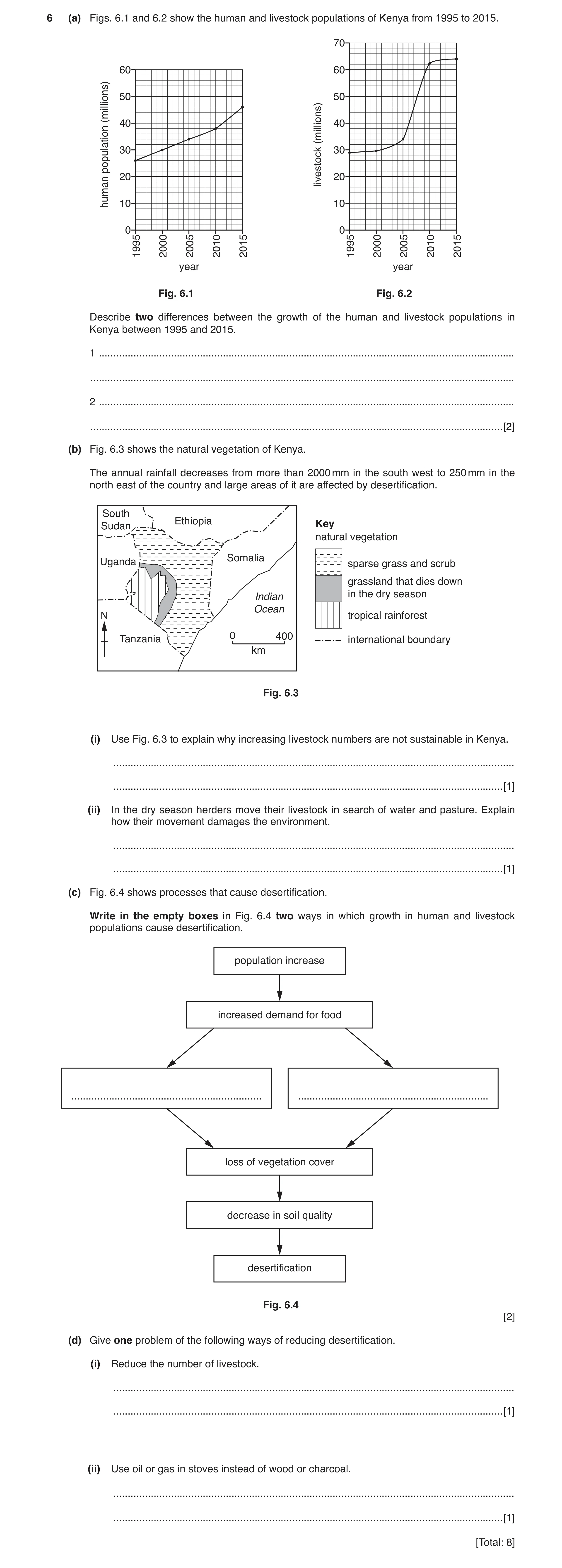
6 (a) Figs. 6.1 and 6.2 show the human and livestock populations of Kenya from 1995 to 2015. 70 60 60 50 50 (millions) 40 40 (millions) 30 30 population 20 livestock 20 human 10 10 0 0 1995 2000 2005 2010 2015 1995 2000 2005 2010 2015 year year Fig. 6.1 Fig. 6.2 Describe two differences between the growth of the human and livestock populations in Kenya between 1995 and 2015. 1 … … 2 … … [2] (b) Fig. 6.3 shows the natural vegetation of Kenya. The annual rainfall decreases from more than 2000 mm in the south west to 250 mm in the north east of the country and large areas of it are affected by desertification. South Ethiopia Key Sudan natural vegetation Somalia Uganda sparse grass and scrub grassland that dies down Indian in the dry season Ocean N tropical rainforest 0 400 Tanzania international boundary km Fig. 6.3 (i) Use Fig. 6.3 to explain why increasing livestock numbers are not sustainable in Kenya. … … [1] (ii) In the dry season herders move their livestock in search of water and pasture. Explain how their movement damages the environment. … … [1] (c) Fig. 6.4 shows processes that cause desertification. Write in the empty boxes in Fig. 6.4 two ways in which growth in human and livestock populations cause desertification. population increase increased demand for food … … loss of vegetation cover decrease in soil quality desertification Fig. 6.4 [2] (d) Give one problem of the following ways of reducing desertification. (i) Reduce the number of livestock. … … [1] (ii) Use oil or gas in stoves instead of wood or charcoal. … … [1] [Total: 8]
8 marks
Mark scheme: 6(a) livestock more growth/figures: 26 to 46 c/w 29 to 64 million /20 c/w 35 2 million, livestock slower (rate of) growth at first, livestock more rapid growth after 2005, livestock more irregular rate of growth Allow emphasis on human population change. 6(b)(i) small area of grassland, 1 large area of sparse grass/scrub, little grass in dry season, desertification reduces grazing/grass, 6(b)(ii) trampling kills vegetation, 1 trampling compacts the soil leading to surface run-off / erosion, trampling breaks the soil to dust / fine particles, trampling causes movement trails, 6(c) overgrazing / overstocking, 2 overcultivation / extension of cultivation, deforestation, Allow descriptions for terms e.g. ‘all plants eaten’ for overgrazing. 6(d)(i) lack of food/needed for food/would need to find another food source, 1 6(d)(ii) cost / more expensive, 1 need to change / adapt stoves, difficulty of accessing oil/gas (in rural areas),
This question in 0460/23 May/June 2019
Q5 · France, in north west Europe, is the most popular international tourist destination in… 0460/21 Oct/Nov 2019
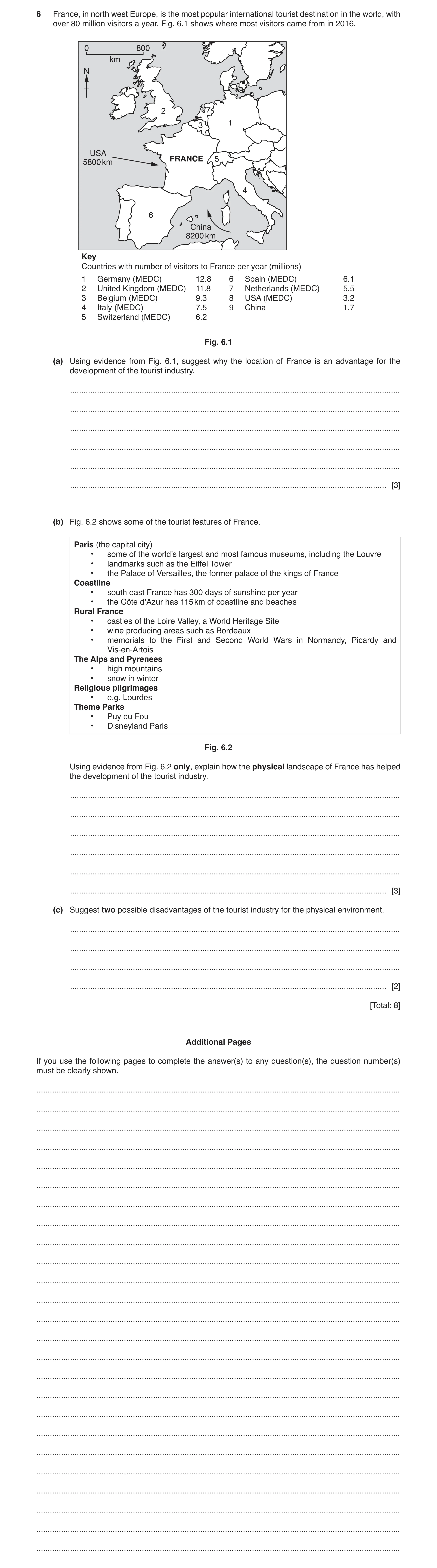
6 France, in north west Europe, is the most popular international tourist destination in the world, with over 80 million visitors a year. Fig. 6.1 shows where most visitors came from in 2016. 0 800 km N 2 7 1 3 USA FRANCE 5 5800 km 4 6 China 8200 km Key Countries with number of visitors to France per year (millions) 1 Germany (MEDC) 12.8 6 Spain (MEDC) 6.1 2 United Kingdom (MEDC) 11.8 7 Netherlands (MEDC) 5.5 3 Belgium (MEDC) 9.3 8 USA (MEDC) 3.2 4 Italy (MEDC) 7.5 9 China 1.7 5 Switzerland (MEDC) 6.2 Fig. 6.1 (a) Using evidence from Fig. 6.1, suggest why the location of France is an advantage for the development of the tourist industry. … … … … … … [3] (b) Fig. 6.2 shows some of the tourist features of France. Paris (the capital city) • some of the world’s largest and most famous museums, including the Louvre • landmarks such as the Eiffel Tower • the Palace of Versailles, the former palace of the kings of France Coastline • south east France has 300 days of sunshine per year • the Côte d’Azur has 115 km of coastline and beaches Rural France • castles of the Loire Valley, a World Heritage Site • wine producing areas such as Bordeaux • memorials to the First and Second World Wars in Normandy, Picardy and Vis-en-Artois The Alps and Pyrenees • high mountains • snow in winter Religious pilgrimages • e.g. Lourdes Theme Parks • Puy du Fou • Disneyland Paris Fig. 6.2 Using evidence from Fig. 6.2 only, explain how the physical landscape of France has helped the development of the tourist industry. … … … … … … [3] (c) Suggest two possible disadvantages of the tourist industry for the physical environment. … … … … [2] [Total: 8] Additional Pages If you use the following pages to complete the answer(s) to any question(s), the question number(s) must be clearly shown. … … … … … … … … … … … … … … … … … … … … … … … … …
8 marks
Mark scheme: 6(a) nearby MEDCs, 3 wealthy people can afford foreign holidays / spend more, (many) shared borders / neighbouring countries / surrounding countries / France between countries, (not just near) quantification of distance, (e.g. within 1000 km) travel by land / car / no air travel, coastal location for beach tourism / beaches, 6(b) Development of any of the following: 3 beaches, (e.g. swimming) mountains, (e.g. climbing / beautiful scenery) winter snow, (e.g. ski-ing) sunny climate, (e.g. all year / most days / sunbathing) 6(c) loss of fauna / flora/ecosystems/habitats/deforestation, 2 water pollution from sewage / litter/plastic etc., air pollution from motor vehicles etc., visual pollution from litter, buildings etc., erosion by walking,
This question in 0460/21 Oct/Nov 2019
Question 6 0460/21 Oct/Nov 2020
4 Figs. 4.1 and 4.2 (Insert) show part of a desert in southern Africa. (a) Describe the vegetation shown in Figs. 4.1 and 4.2. … … … … … … … … … … … [5] (b) Fig. 4.2 also shows a waste heap produced by the mining of copper ore. Suggest how this may pose a threat to the natural environment. … … … … … … … [3] [Total: 8]
8 marks
Mark scheme: 4(a) sparse/scattered/dispersed/bare, 5 trees, scrub/bushes, small leaves, some green, some without leaves, hills (almost) bare, (Fig. 4.1) some vegetation in lines, small/short/low (trees or bushes), 4(b) loss of vegetation, 3 loss of animal habitats, covers a large area, waste could be toxic/toxic leachate, affecting rivers/groundwater (dev.), visual pollution,
This question in 0460/21 Oct/Nov 2020
Question 7 0460/22 Feb/March 2021
6 Fig. 6.1 (Insert) shows a power station generating electricity in Germany. (a) Name one fossil fuel that is used in power stations. … [1] (b) Using Fig. 6.1, describe the power station and its location. Refer to buildings and location. buildings … … … location … … … [3] (c) Using evidence from Fig. 6.1, explain the reasons for the location of the power station. … … … … [2] (d) Using evidence from Fig. 6.1, suggest two problems that the power station might cause for the local natural environment. 1 … … 2 … … [2] [Total: 8] Additional Pages If you use the following lined pages to complete the answer(s) to any question(s), the question number(s) must be clearly shown. … … … … … … … … … … … … … … … … … … … … … … … … … … … … … … … … … … … … … … … … … … … … … … … … … … … … …
8 marks
Mark scheme: 6(a) coal/oil/gas, 1 6(b) Buildings 3 chimneys, (cooling) towers, rectangular/cylindrical, tall/multi-storey buildings, flat roofs, cover a large area, close to each other, Location near river, near road/railway, flat, near agricultural land/fields, Reserve one mark for each. 6(c) space/flat land for large buildings/room for expansion/ease of construction, 2 river for water/transport/waste disposal, railway/road for raw materials/transport, settlement for labour, 6(d) heating/pollution of river water, 2 reduce aquatic life/fish, acid rain/air pollution/smoke, visual pollution,
This question in 0460/22 Feb/March 2021
Q8 · Urbanisation causes many problems, including air pollution 0460/23 May/June 2021
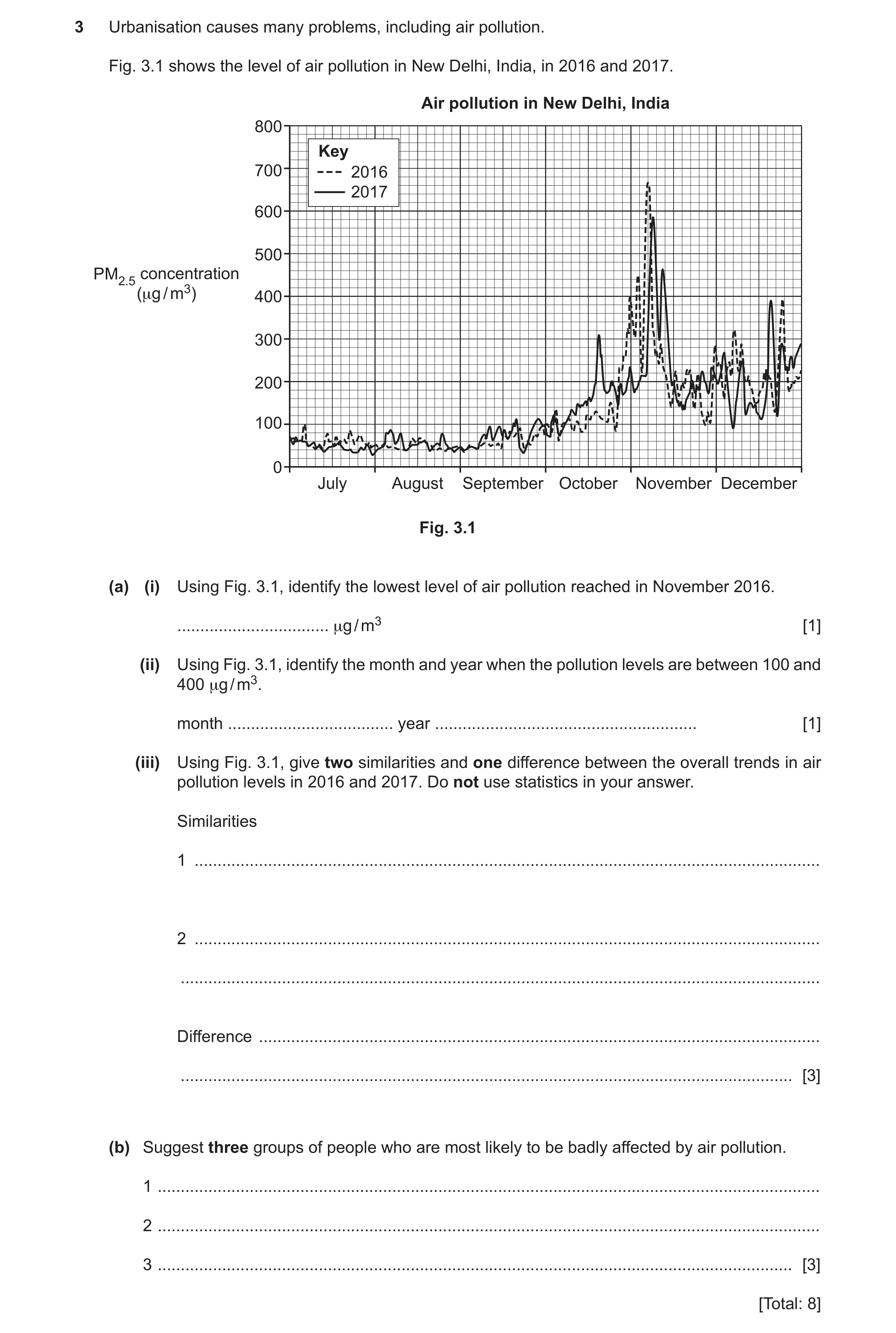
3 Urbanisation causes many problems, including air pollution. Fig. 3.1 shows the level of air pollution in New Delhi, India, in 2016 and 2017. Air pollution in New Delhi, India 800 Key 700 2016 2017 600 500 PM2.5 concentration (μg / m3) 400 300 200 100 0 July August September October November December Fig. 3.1 (a) (i) Using Fig. 3.1, identify the lowest level of air pollution reached in November 2016. … μg / m3 [1] (ii) Using Fig. 3.1, identify the month and year when the pollution levels are between 100 and 400 μg / m3. month … year … [1] (iii) Using Fig. 3.1, give two similarities and one difference between the overall trends in air pollution levels in 2016 and 2017. Do not use statistics in your answer. Similarities 1 … 2 … … Difference … … [3] (b) Suggest three groups of people who are most likely to be badly affected by air pollution. 1 … 2 … 3 … [3] [Total: 8]
8 marks
Mark scheme: 3(a)(i) 100 (μg/m3), 1 3(a)(ii) December 2016 (both needed), 1 3(a)(iii) Similarities: = 2 3 low July/August/September, similar July/August/September, rise in October/November, high(est) in November, fluctuate, increase overall/towards the end of the year, Differences: = 1 higher overall peak in 2016, lower overall trough in 2017, October: 2017 higher/2016 lower/2017 increases but not 2016, November: 2016 higher/2017 lower, 3(b) young/babies/children/infants/young dependents, 3 elderly/old dependents, people with asthma/lung conditions, people who spend time outside or an example, commuters, people who live beside main roads, work in certain industries,
This question in 0460/23 May/June 2021
Q9 · The United Nations Global Assessment Report (2019) showed that many species of plants and… 0460/23 Oct/Nov 2021
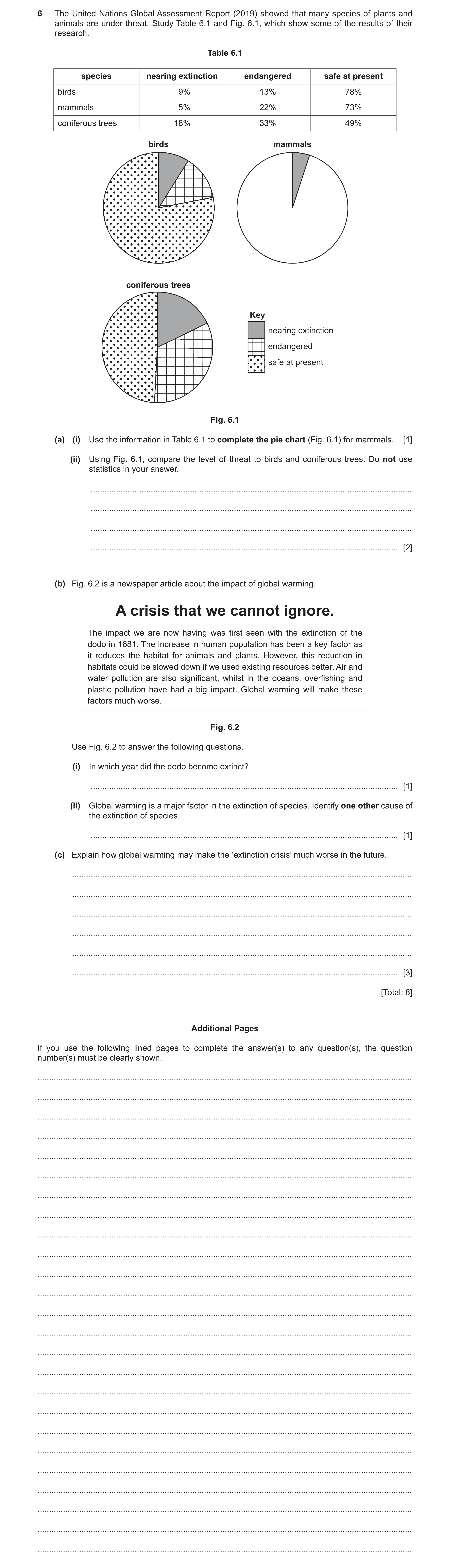
6 The United Nations Global Assessment Report (2019) showed that many species of plants and animals are under threat. Study Table 6.1 and Fig. 6.1, which show some of the results of their research. Table 6.1 species nearing extinction endangered safe at present birds 9% 13% 78% mammals 5% 22% 73% coniferous trees 18% 33% 49% birds mammals coniferous trees Key nearing extinction endangered safe at present Fig. 6.1 (a) (i) Use the information in Table 6.1 to complete the pie chart (Fig. 6.1) for mammals. [1] (ii) Using Fig. 6.1, compare the level of threat to birds and coniferous trees. Do not use statistics in your answer. … … … … [2] (b) Fig. 6.2 is a newspaper article about the impact of global warming. A crisis that we cannot ignore. The impact we are now having was first seen with the extinction of the dodo in 1681. The increase in human population has been a key factor as it reduces the habitat for animals and plants. However, this reduction in habitats could be slowed down if we used existing resources better. Air and water pollution are also significant, whilst in the oceans, overfishing and plastic pollution have had a big impact. Global warming will make these factors much worse. Fig. 6.2 Use Fig. 6.2 to answer the following questions. (i) In which year did the dodo become extinct? … [1] (ii) Global warming is a major factor in the extinction of species. Identify one other cause of the extinction of species. … [1] (c) Explain how global warming may make the ‘extinction crisis’ much worse in the future. … … … … … … [3] [Total: 8] Additional Pages If you use the following lined pages to complete the answer(s) to any question(s), the question number(s) must be clearly shown. … … … … … … … … … … … … … … … … … … … … … … … … …
8 marks
Mark scheme: 6(a)(i) smaller segment 78–80° with either smaller segment cross hatched or larger 1 segment dotted, 6(a)(ii) birds more safe/conifers less safe/birds less threatened/conifers more 2 threatened, birds less endangered/conifers more endangered, birds less nearing extinction/conifers more nearing extinction, 6(b)(i) 1681, 1 6(b)(ii) increase in human population, 1 reduction in habitats, air pollution, water pollution, overfishing, plastic pollution, 6(b)(iv) loss of habitats, 3 food chains disrupted, migration patterns disrupted, plants/animals fail to adapt, changing rainfall/drought, changing seasons, rising sea levels/floods, temperature sensitive organisms, reduced oxygen levels in sea water, fires,
This question in 0460/23 Oct/Nov 2021
Q10 · The main sources of two air pollutants, carbon monoxide and nitrogen oxides, in Hong Kong… 0460/21 Oct/Nov 2022
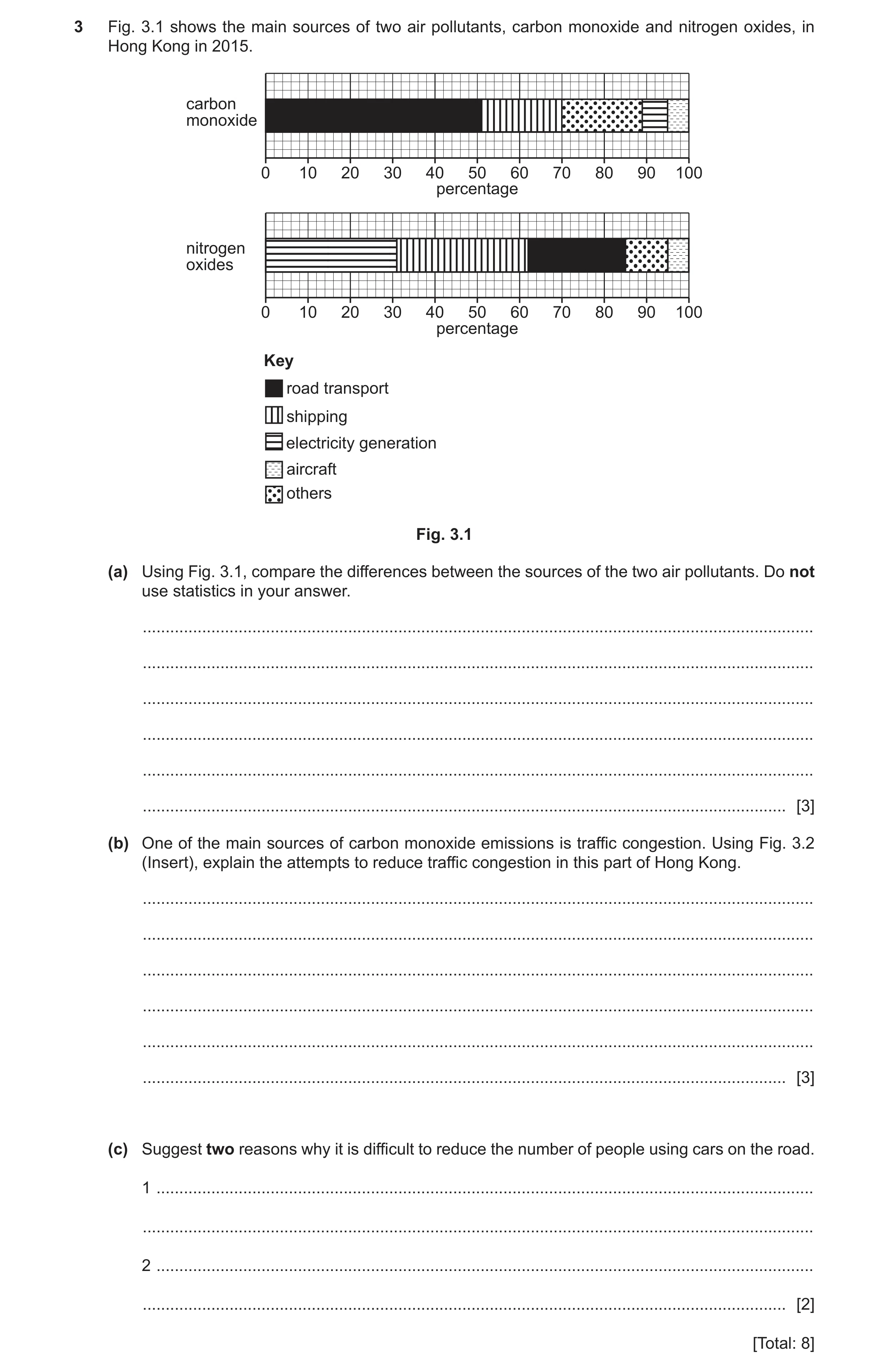
3 Fig. 3.1 shows the main sources of two air pollutants, carbon monoxide and nitrogen oxides, in Hong Kong in 2015. carbon monoxide 0 10 20 30 40 50 60 70 80 90 100 percentage nitrogen oxides 0 10 20 30 40 50 60 70 80 90 100 percentage Key road transport shipping electricity generation aircraft others Fig. 3.1 (a) Using Fig. 3.1, compare the differences between the sources of the two air pollutants. Do not use statistics in your answer. … … … … … … [3] (b) One of the main sources of carbon monoxide emissions is traffic congestion. Using Fig. 3.2 (Insert), explain the attempts to reduce traffic congestion in this part of Hong Kong. … … … … … … [3] (c) Suggest two reasons why it is difficult to reduce the number of people using cars on the road. 1 … … 2 … … [2] [Total: 8]
8 marks
Mark scheme: 3(a) Main source of carbon monoxide is road transport however for nitrogen 3 oxides it is shipping and electricity generation; Road transport contributes more carbon monoxide than nitrogen oxide; Shipping contributes more nitrogen oxide than carbon monoxide; Electricity generation contributes more nitrogen oxides than carbon monoxide; Aircraft produce the least proportion of air pollutants; ‘Others’ make up a larger % for carbon monoxide than nitrogen oxides; Road transport (and shipping) are the main source of pollutants. Must be comparative. 3(b) Wider roads/dual carriageways/more roads so more traffic can travel; 3 Underpass/subway to allow traffic to flow/create additional road; Public transport to reduce number of cars; Pedestrian bridge to stop traffic being held up/separating pedestrians from traffic; Yellow lines to prevent parking which would slow traffic; Bus stops off road to prevent holding up traffic; Plants on side of road take in CO2; Large pavements so people are encouraged to walk. Must explain how solutions prevent traffic congestion. Explanation cannot be ‘congestion’. Two ways listed above only–1 max, if no other marks awarded. 3(c) People need to travel to work/shopping/leisure; 2 Journeys are made at different times; Fastest way to travel/saves people time; Public transport system is not extensive enough; Allows travel to exact destination; Gives people independence/freedom to travel when they want/flexibility; Public transport expensive; Safest way to travel (e.g., in a pandemic)/people feel safer than travelling with people they don’t know; More privacy compared with public transport.
This question in 0460/21 Oct/Nov 2022
Question 11 0460/22 May/June 2023
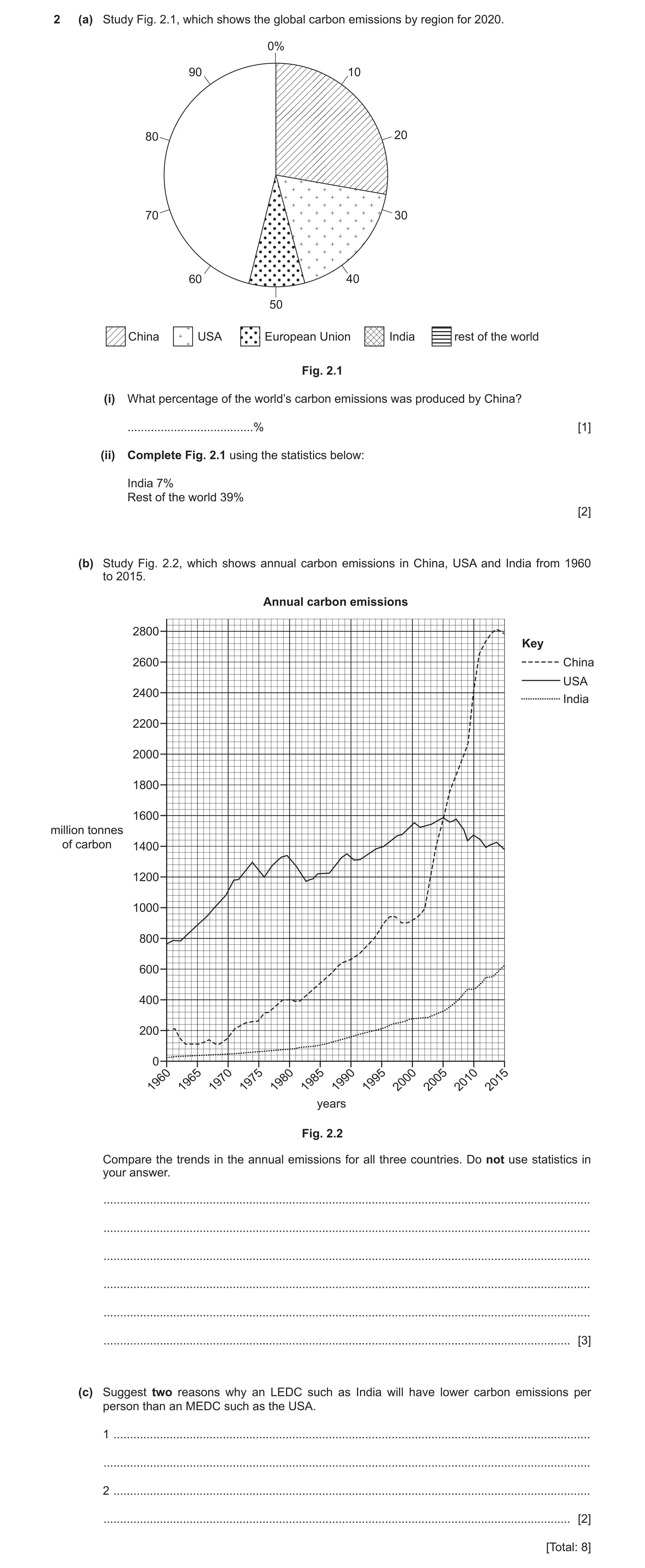
2 (a) Study Fig. 2.1, which shows the global carbon emissions by region for 2020. 0% 90 10 80 20 70 30 60 40 50 China USA European Union India rest of the world Fig. 2.1 (i) What percentage of the world’s carbon emissions was produced by China? … % [1] (ii) Complete Fig. 2.1 using the statistics below: India 7% Rest of the world 39% [2] (b) Study Fig. 2.2, which shows annual carbon emissions in China, USA and India from 1960 to 2015. Annual carbon emissions 2800 Key 2600 China USA 2400 India 2200 2000 1800 1600 million tonnes of carbon 1400 1200 1000 800 600 400 200 0 196019651970197519801985199019952000200520102015 years Fig. 2.2 Compare the trends in the annual emissions for all three countries. Do not use statistics in your answer. … … … … … … [3] (c) Suggest two reasons why an LEDC such as India will have lower carbon emissions per person than an MEDC such as the USA. 1 … … 2 … … [2] [Total: 8]
8 marks
Mark scheme: 2(a)(i) 27.5–28 (%). 1 2(a)(ii) Line correctly drawn at 139–142; 2 Both sectors correctly shaded. 2(b) All increased; (or increase in each country for whole period stated 3 separately.) China increased the most/has the most rapid increase/highest % increase; Especially after/since any date between 2000 and 2005/in the last 10–15 years; India increased the least/increased more gradually/USA lowest % increase; India lowest/always lower; China overtook USA (in 2005)/USA produced the most until 2005 but China produced the most after 2005/China second biggest in 1960 but largest in 2015; China and USA beginning to fall but India still increasing; USA falling more quickly; USA fluctuates the most/India fluctuates the least. Note: All statements must be comparative and refer to trends. 2(c) Less car/vehicle ownership/more walking/cycling; 2 Less central heating; Less air-conditioned buildings; Less use of (household) appliances (or example, e.g., washing machines); Less use of computers/mobile phones/games consoles; Less use of machinery/equipment (can be in industry or agriculture); Fewer flights/air travel/planes (into and out of the country); Less developed secondary industry/industrial sector/manufacturing sector/ few(er) industries/factories (that produce carbon emissions); LEDCs make greater use of locally produced products (which require less long-distance transport). Note: Accept ‘can’t afford’ instead of ‘less/fewer’. If not stated, assume the answer is from LEDC point of view. Can be answered from MEDC point of view if stated.
This question in 0460/22 May/June 2023
Question 12 0460/23 May/June 2023
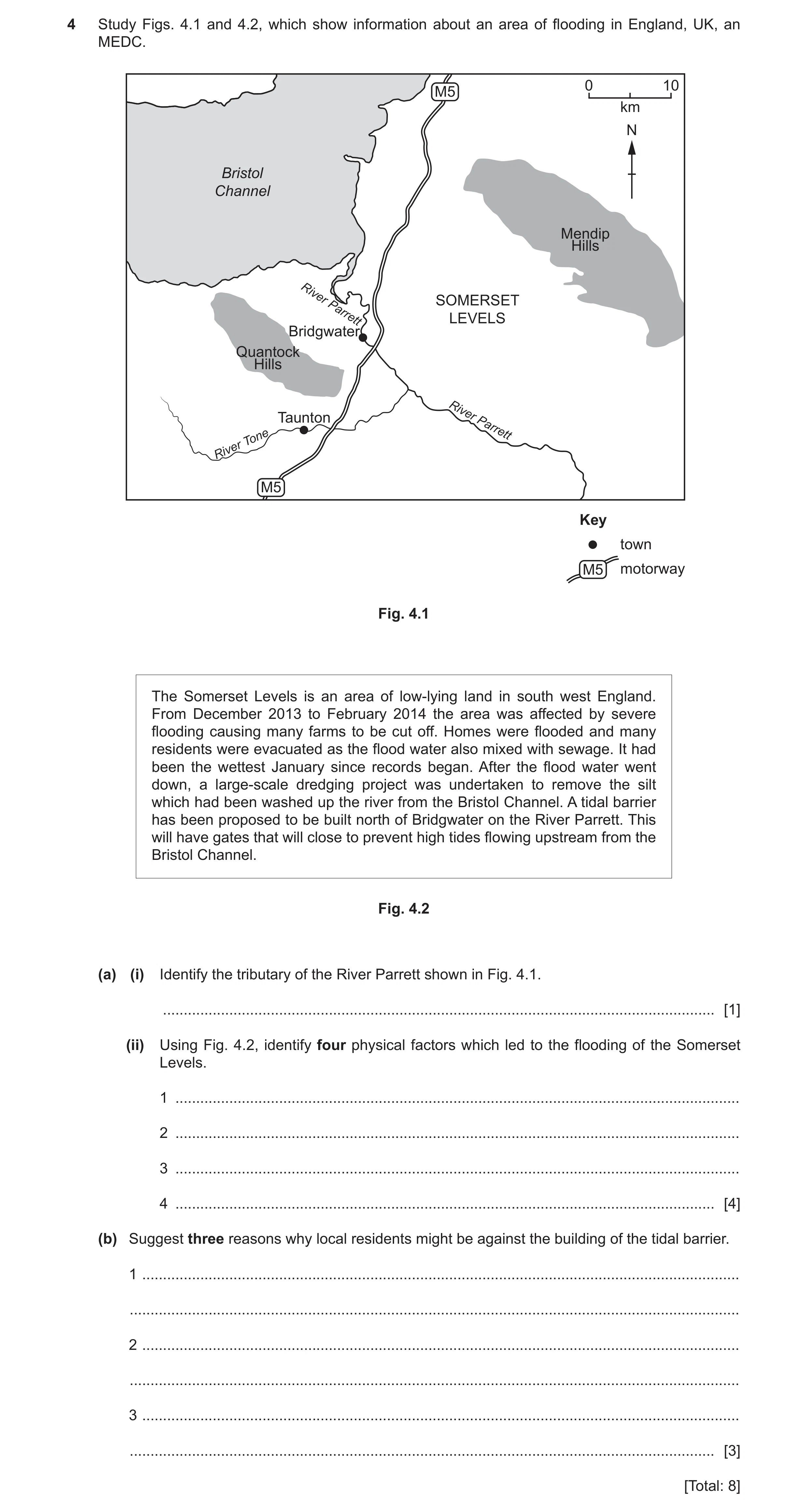
4 Study Figs. 4.1 and 4.2, which show information about an area of flooding in England, UK, an MEDC. 0 10 M5 km N Bristol Channel Mendip Hills River SOMERSET Parrett LEVELS Bridgwater Quantock Hills Taunton River Parrett Tone River M5 Key town M5 motorway Fig. 4.1 The Somerset Levels is an area of low‑lying land in south west England. From December 2013 to February 2014 the area was affected by severe flooding causing many farms to be cut off. Homes were flooded and many residents were evacuated as the flood water also mixed with sewage. It had been the wettest January since records began. After the flood water went down, a large‑scale dredging project was undertaken to remove the silt which had been washed up the river from the Bristol Channel. A tidal barrier has been proposed to be built north of Bridgwater on the River Parrett. This will have gates that will close to prevent high tides flowing upstream from the Bristol Channel. Fig. 4.2 (a) (i) Identify the tributary of the River Parrett shown in Fig. 4.1. … [1] (ii) Using Fig. 4.2, identify four physical factors which led to the flooding of the Somerset Levels. 1 … 2 … 3 … 4 … [4] (b) Suggest three reasons why local residents might be against the building of the tidal barrier. 1 … … 2 … … 3 … … [3] [Total: 8]
8 marks
Mark scheme: 4(a)(i) (River) Tone. 1 4(a)(ii) Low lying land; 4 Silted rivers; High tides; Wettest January/high rainfall/heavy rain (in January). 4(b) Expensive; 3 Takes a long time to build; Visual pollution/eyesore; Noise pollution during construction; Stops river traffic/boating; Kills wildlife/affects habitat/prevents migration of fish; Interferes with natural river flows; May be placed on their property.
This question in 0460/23 May/June 2023
Question 13 0460/23 May/June 2023
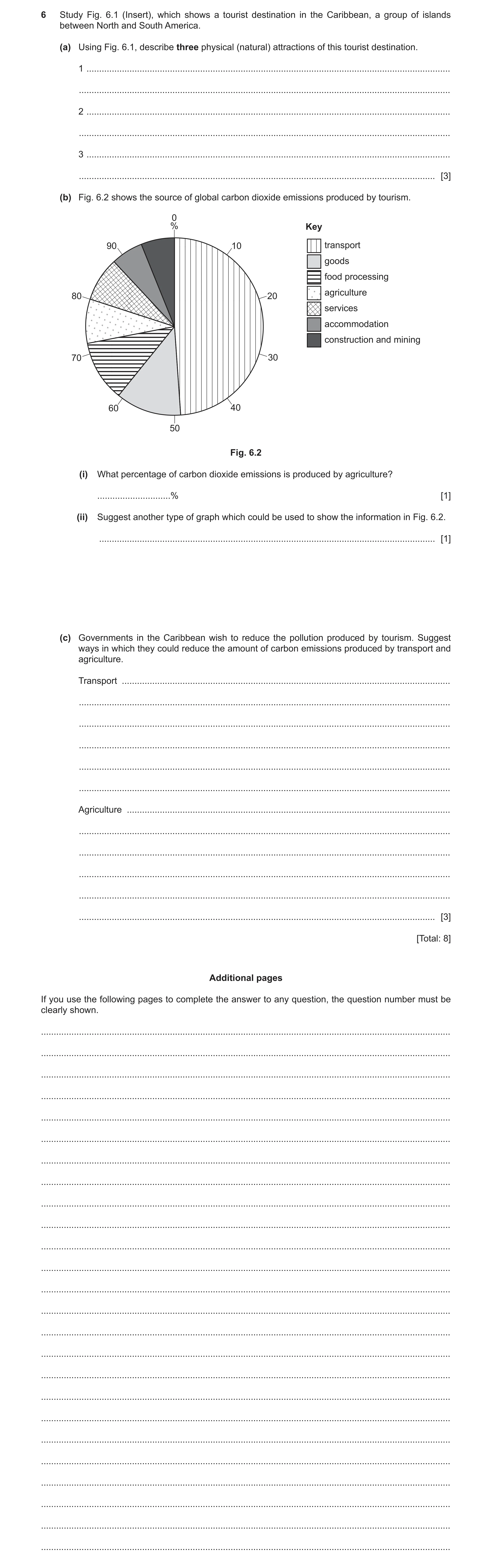
6 Study Fig. 6.1 (Insert), which shows a tourist destination in the Caribbean, a group of islands between North and South America. (a) Using Fig. 6.1, describe three physical (natural) attractions of this tourist destination. 1 … … 2 … … 3 … … [3] (b) Fig. 6.2 shows the source of global carbon dioxide emissions produced by tourism. 0 % Key 90 10 transport goods food processing agriculture 80 20 services accommodation construction and mining 70 30 60 40 50 Fig. 6.2 (i) What percentage of carbon dioxide emissions is produced by agriculture? … % [1] (ii) Suggest another type of graph which could be used to show the information in Fig. 6.2. … [1] (c) Governments in the Caribbean wish to reduce the pollution produced by tourism. Suggest ways in which they could reduce the amount of carbon emissions produced by transport and agriculture. Transport … … … … … … Agriculture … … … … … … [3] [Total: 8] Additional pages If you use the following pages to complete the answer to any question, the question number must be clearly shown. … … … … … … … … … … … … … … … … … … … … … … … … …
8 marks
Mark scheme: 6(a)(i) Clear/clean/blue/calm sea/water; 3 Sand/ beach; Clear/blue skies/sunny; Palm/coconuts trees/tropical vegetation. 6(b)(i) 8(%) (allow 8.05/8.06/8.1% based on measurement of 29 degrees). 1 6(b)(ii) (Divided/compound) bar graph/chart/donut graph. 1 6(c) Transport: 3 Use animal power; Promote walking/cycling/more cycle paths/free public bikes; Electric vehicles; Restrict/ban vehicles on island; Develop public transport; Restrict visitor numbers/number of international flights/cruise ships to the island; Tax on car hire/increase tax on fuel/buying cars. Agriculture: Promote locally sourced food; Prohibit deforestation/burning woods; Reduce use of chemical fertilisers/use natural fertilisers; Discourage the use of machinery such as tractors; Encourage farmers to use renewable energy/solar power or wind turbines; Reduce rice production;(due to production of methane). Less animals raised (e.g., beef cattle)/more vegetables grown. 1 reserve for each category.
This question in 0460/23 May/June 2023
Question 14 0460/21 Oct/Nov 2023
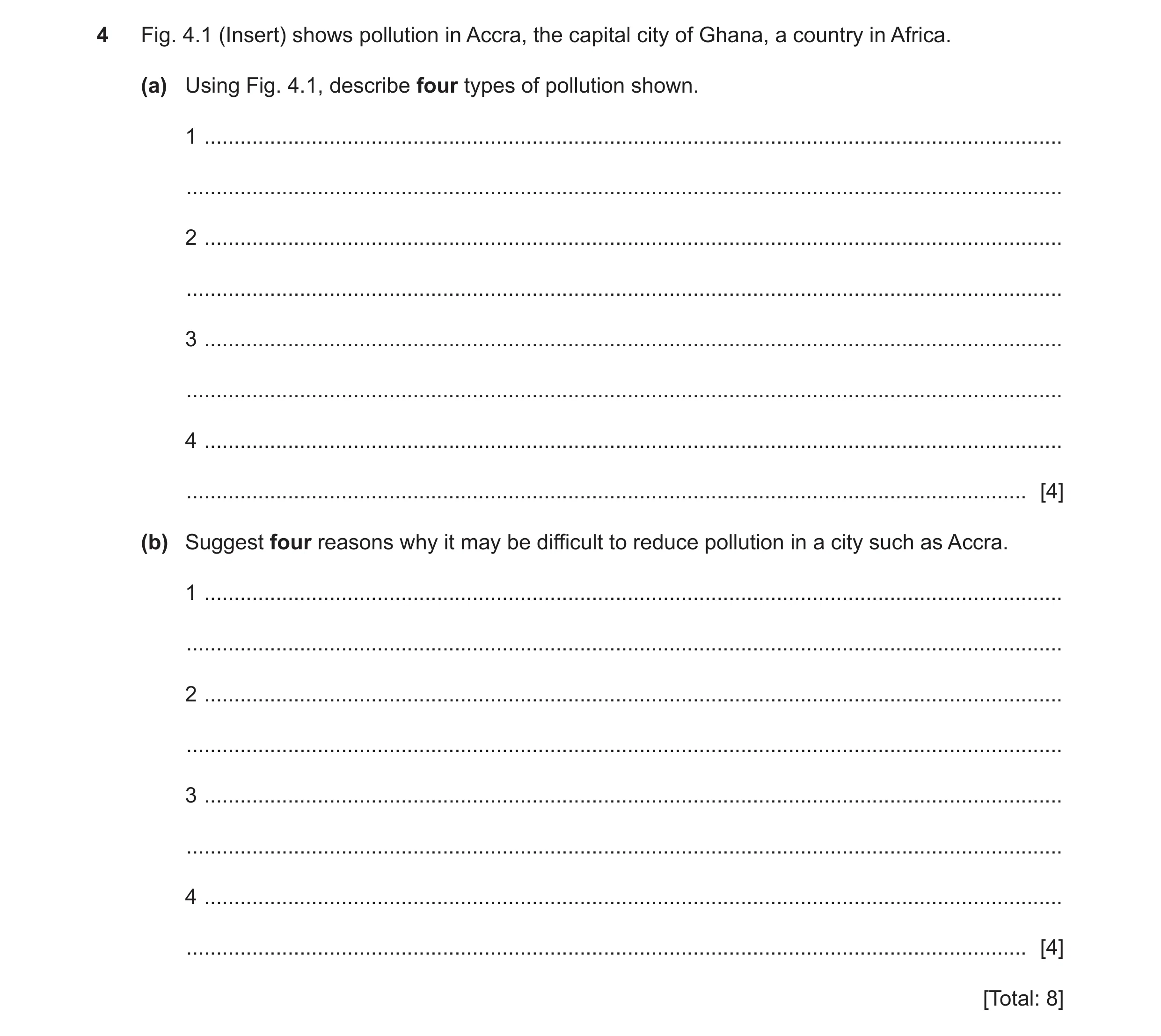
4 Fig. 4.1 (Insert) shows pollution in Accra, the capital city of Ghana, a country in Africa. (a) Using Fig. 4.1, describe four types of pollution shown. 1 … … 2 … … 3 … … 4 … … [4] (b) Suggest four reasons why it may be difficult to reduce pollution in a city such as Accra. 1 … … 2 … … 3 … … 4 … … [4] [Total: 8]
8 marks
Mark scheme: 4(a) Land pollution/litter/waste/rubbish; 4 Visual pollution from litter/waste/rubbish/derelict building/smoke/fire/smoulder; Water pollution in river/stream/pond/from litter/waste/rubbish/sewage/oil; Air pollution from smoke/fire/smoulder. Note: Max 1. For four named types of pollution. 4(b) Large/growing population means more litter/waste/rubbish produced; 4 Lack of/too expensive (for government) to provide regular litter/waste/rubbish collection/bins/tips/recycling facilities; People with nowhere to properly dispose of litter/waste/rubbish; Lack of regulation/enforcement/policing for illegal dumping of litter/waste/rubbish; Lack of sewage/water/drainage systems; Many/growth of industries/factories; More cars on the road/public transport; Burning resources for domestic purposes e.g. heating/cooking; Too expensive to filter pollution from chimneys/develop less polluting industry; Lack of education about recycling/consequences of pollution; Cannot afford to produce/buy environmentally friendly goods/excessive production of plastic.
This question in 0460/21 Oct/Nov 2023
Question 15 0460/23 Oct/Nov 2023
4 Study Fig. 4.1, which shows the main causes of global deforestation between 2001 and 2015. Content removed due to copyright restrictions. Fig. 4.1 (a) (i) Which region has the largest area of deforestation? … [1] (ii) Identify the main cause of deforestation in Russia, China and South Asia. … [1] (iii) Which cause of deforestation affects all regions? … [1] (b) Study Fig. 4.2 (Insert), which shows an area of Brazil that has been partially deforested. (i) Identify the type of farming shown in Fig. 4.2. … [1] (ii) Describe the vegetation shown in Fig. 4.2. … … … … … … … … [4] [Total: 8]
8 marks
Mark scheme: 4(a)(i) South and Central America 1 4(a)(ii) Wildfire 1 4(a)(iii) Logging for timber 1 4(b)(i) Pastoral/livestock/animal/cattle/beef/extensive/commercial; 1 4(b)(ii) Tall trees: 4 Palms/coconut trees; Isolated/separated/scattered/sparse/dispersed/spread; Straight/thin/branchless(trunks); Leaves/branches at top; Some dead trees/don’t have leaves/stripped of leaves/burnt/dying leaves/palms; Some trunks cut off/stump/lower part remains; Grass; Yellow/brown/dried(grass); Bushes/shrubs/ferns.
This question in 0460/23 Oct/Nov 2023
Q16 · Information about four drainage basins which provide most of the water supply for the… 0460/22 May/June 2024
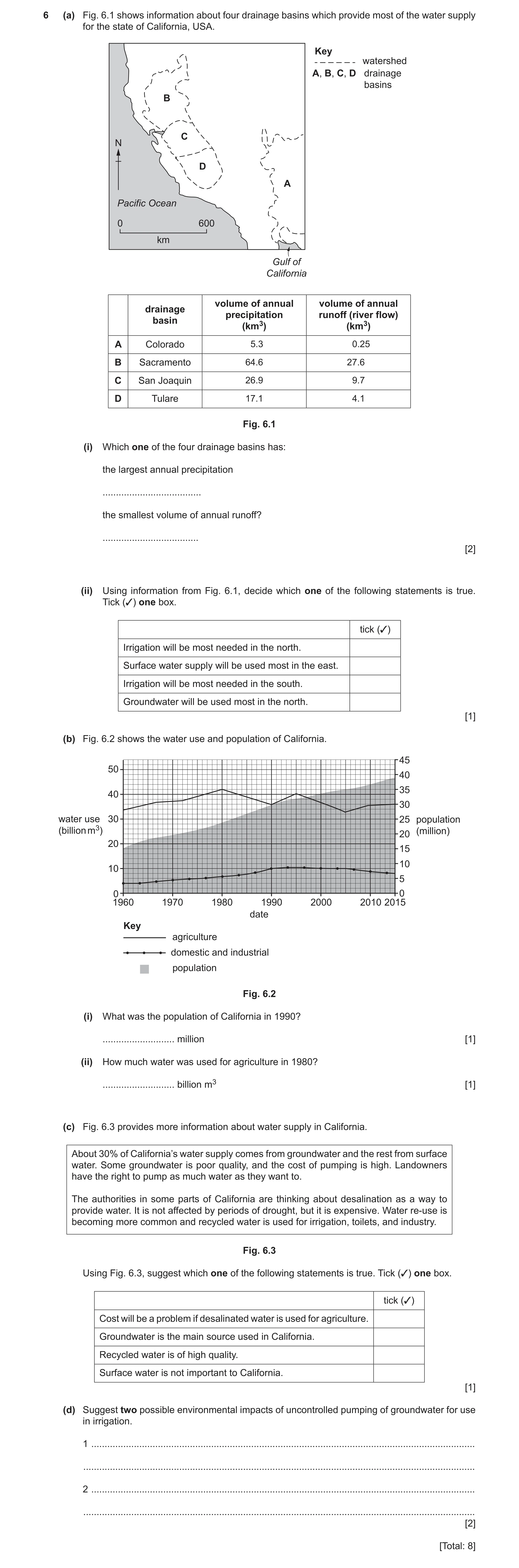
6 (a) Fig. 6.1 shows information about four drainage basins which provide most of the water supply for the state of California, USA. Key watershed A, B, C, D drainage basins B C N D A Pacific Ocean 0 600 km Gulf of California volume of annual volume of annual drainage precipitation runoff (river flow) basin (km3) (km3) A Colorado 5.3 0.25 B Sacramento 64.6 27.6 C San Joaquin 26.9 9.7 D Tulare 17.1 4.1 Fig. 6.1 (i) Which one of the four drainage basins has: the largest annual precipitation … the smallest volume of annual runoff? … [2] (ii) Using information from Fig. 6.1, decide which one of the following statements is true. Tick (3) one box. tick (3) Irrigation will be most needed in the north. Surface water supply will be used most in the east. Irrigation will be most needed in the south. Groundwater will be used most in the north. [1] (b) Fig. 6.2 shows the water use and population of California. 45 50 40 35 40 30 water use 30 25 population (billion m3) (million) 20 20 15 10 10 5 0 0 1960 1970 1980 1990 2000 2010 2015 date Key agriculture domestic and industrial population Fig. 6.2 (i) What was the population of California in 1990? … million [1] (ii) How much water was used for agriculture in 1980? … billion m3 [1] (c) Fig. 6.3 provides more information about water supply in California. About 30% of California’s water supply comes from groundwater and the rest from surface water. Some groundwater is poor quality, and the cost of pumping is high. Landowners have the right to pump as much water as they want to. The authorities in some parts of California are thinking about desalination as a way to provide water. It is not affected by periods of drought, but it is expensive. Water re‑use is becoming more common and recycled water is used for irrigation, toilets, and industry. Fig. 6.3 Using Fig. 6.3, suggest which one of the following statements is true. Tick (3) one box. tick (3) Cost will be a problem if desalinated water is used for agriculture. Groundwater is the main source used in California. Recycled water is of high quality. Surface water is not important to California. [1] (d) Suggest two possible environmental impacts of uncontrolled pumping of groundwater for use in irrigation. 1 … … 2 … … [2] [Total: 8]
8 marks
Mark scheme: 6(a)(i) B/Sacramento 2 A/Colorado 6(a)(ii) Irrigation will be most needed in the south 1 6(b)(i) 30 (million) 1 6(b)(ii) 42 (billion m3) 1 6(c) Cost will be a problem if desalinated water is used for agriculture 1 6(d) Run out of water/ground water; 2 Plants/animals may die/loss of habitat/reduction in biodiversity/extinction/plant roots die/decay/photosynthesis is hindered; Lowering of water table/plants can’t access groundwater; Rivers/streams/lakes dry up (flows to groundwater reservoir)/reduced river flow/less surface runoff (more rainfall percolates into the ground); Soil erosion/soils washed away/reduced soil fertility/soils dry out/desertification/(soil) leaching; Decomposition of dead vegetation/matter to produce methane; Poor quality/contaminated water/water pollution; Land may subside/sink/lower/sink holes; Soils become saline/incursion of seawater/salinisation; Waterlogging/flooding.
This question in 0460/22 May/June 2024
Question 17 0460/23 May/June 2024
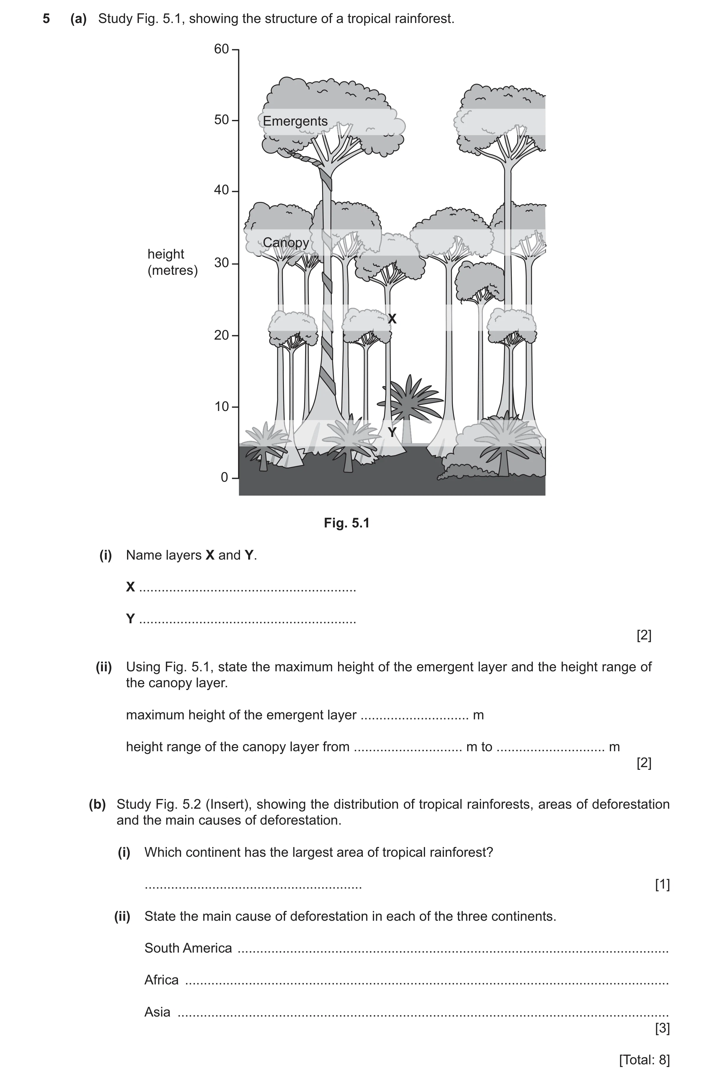
5 (a) Study Fig. 5.1, showing the structure of a tropical rainforest. 60 50 Emergents 40 Canopy height 30 (metres) X 20 10 Y 0 Fig. 5.1 (i) Name layers X and Y. X … Y … [2] (ii) Using Fig. 5.1, state the maximum height of the emergent layer and the height range of the canopy layer. maximum height of the emergent layer … m height range of the canopy layer from … m to … m [2] (b) Study Fig. 5.2 (Insert), showing the distribution of tropical rainforests, areas of deforestation and the main causes of deforestation. (i) Which continent has the largest area of tropical rainforest? … [1] (ii) State the main cause of deforestation in each of the three continents. South America … Africa … Asia … [3] [Total: 8]
8 marks
Mark scheme: 5(a)(i) X = under canopy/under storey/lower canopy. 2 Y = shrub (layer)/forest floor/ground (layer)/undergrowth. 5(a)(ii) Max. height of emergent layer = 56 (m) (Allow 55–57 m). 2 Height range of the canopy from 30/31 (m) to 38/39/40 (m). Note: Height range can be in any order. 5(b)(i) South America 1 5(b)(ii) South America – cattle ranching. 3 Africa – smallholder farming. Asia – large scale agriculture.
This question in 0460/23 May/June 2024
Question 18 0460/21 Oct/Nov 2025
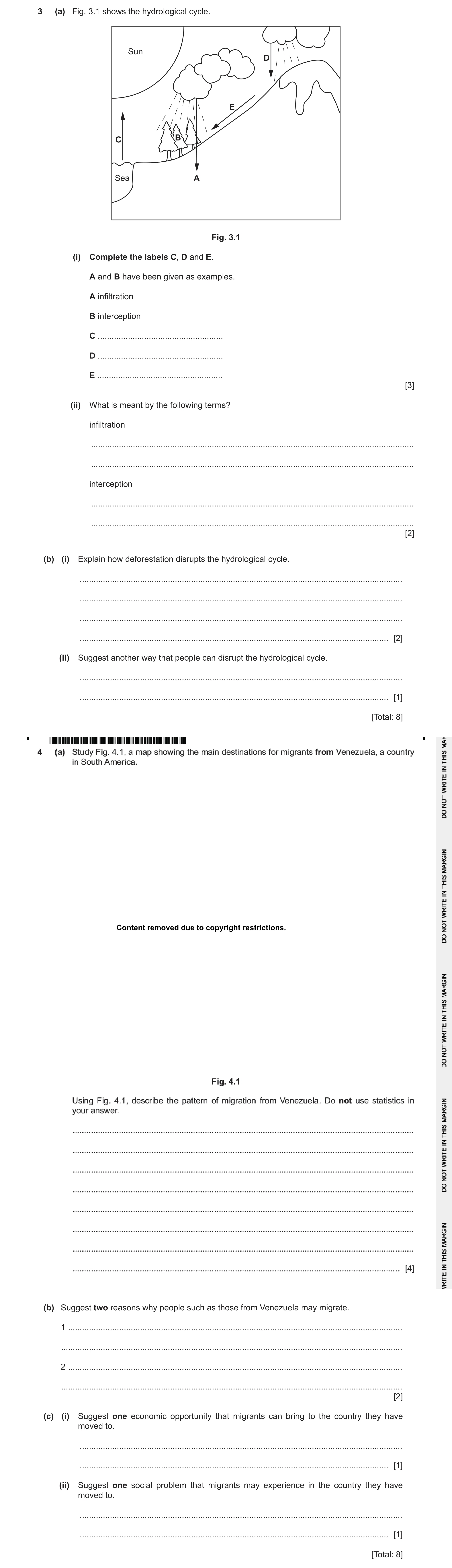
3 (a) Fig. 3.1 shows the hydrological cycle. Sun D E C B Sea A Fig. 3.1 (i) Complete the labels C, D and E. A and B have been given as examples. A infiltration B interception C … D … E … [3] (ii) What is meant by the following terms? infiltration … … interception … … [2] (b) (i) Explain how deforestation disrupts the hydrological cycle. … … … … [2] (ii) Suggest another way that people can disrupt the hydrological cycle. … … [1] [Total: 8] Content removed due to copyright restrictions. (b) Suggest two reasons why people such as those from Venezuela may migrate. 1 … … 2 … … [2] (c) (i) Suggest one economic opportunity that migrants can bring to the country they have moved to. … … [1] (ii) Suggest one social problem that migrants may experience in the country they have moved to. … … [1] [Total: 8]
12 marks
Mark scheme: 3(a)(i) C – evaporation 3 D – precipitation/rain(fall) E – overland flow/(surface) run-off 3(a)(ii) Infiltration 2 water enters/absorbed into the soil/rock/ground. Interception water collected/trapped by vegetation 3(b)(i) less interception/transpiration/evapotranspiration 2 more overland flow/(surface) run-off/infiltration/saturated soil increased risk of flooding/inundation less water stored in biosphere less precipitation/rain(fall) (due to less transpiration/evapotranspiration) 3(b)(ii) hydroelectricity/dams 1 agriculture/irrigation urbanisation/industrialisation/building named infrastructure e.g. roads climate change/global warming
This question in 0460/21 Oct/Nov 2025
 12 / 35
 26 / 35
 8
8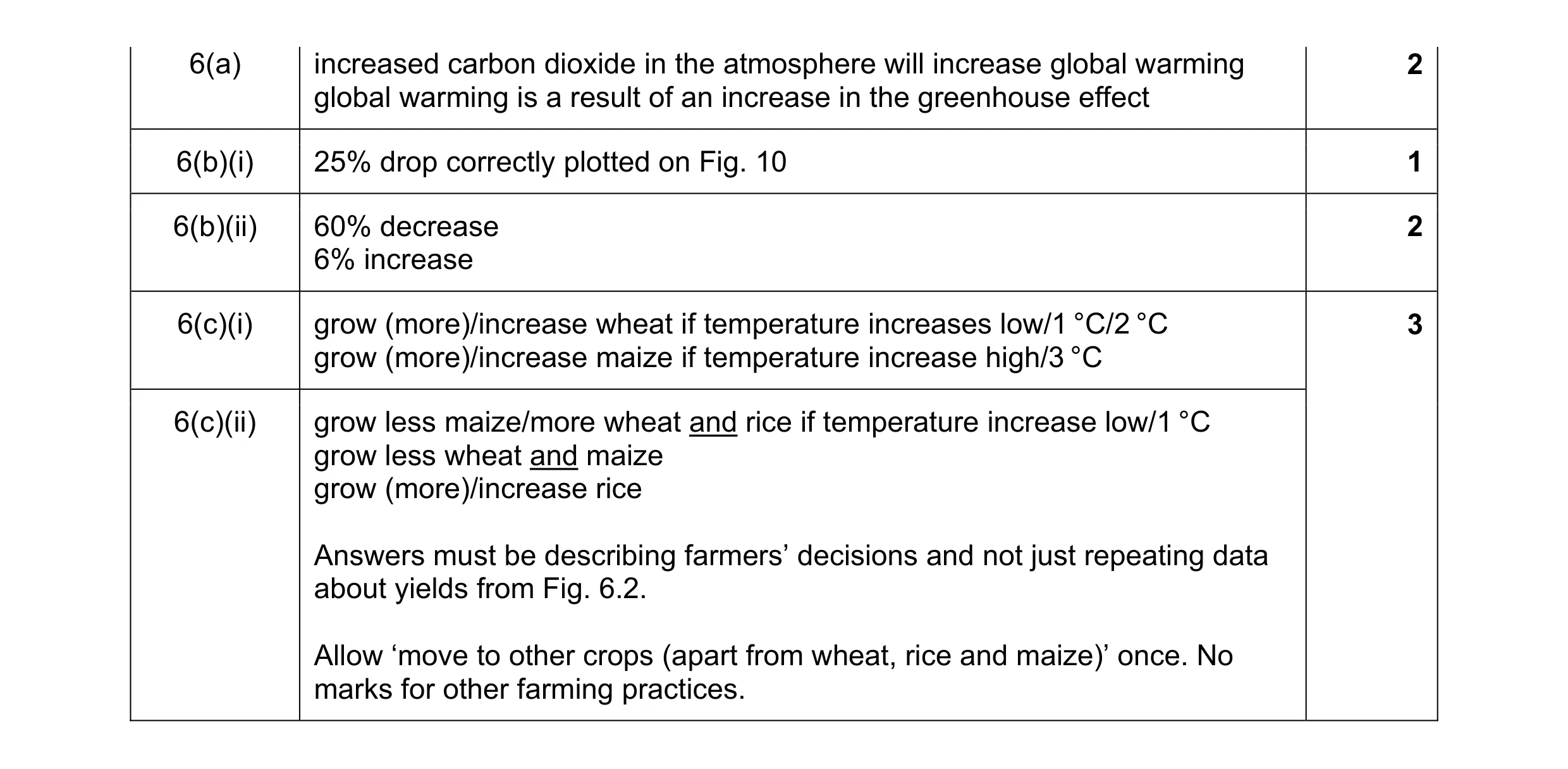 8
8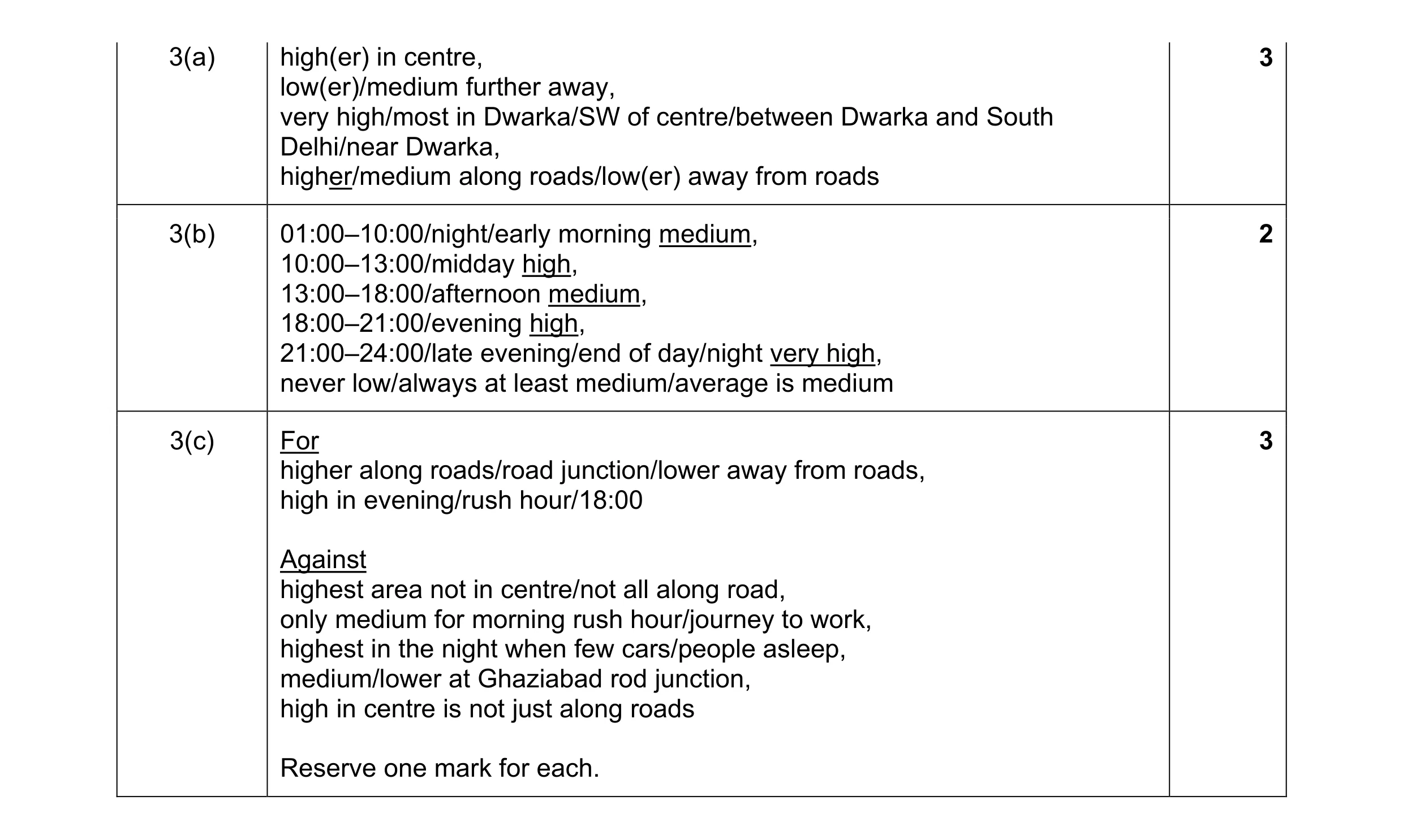 8
8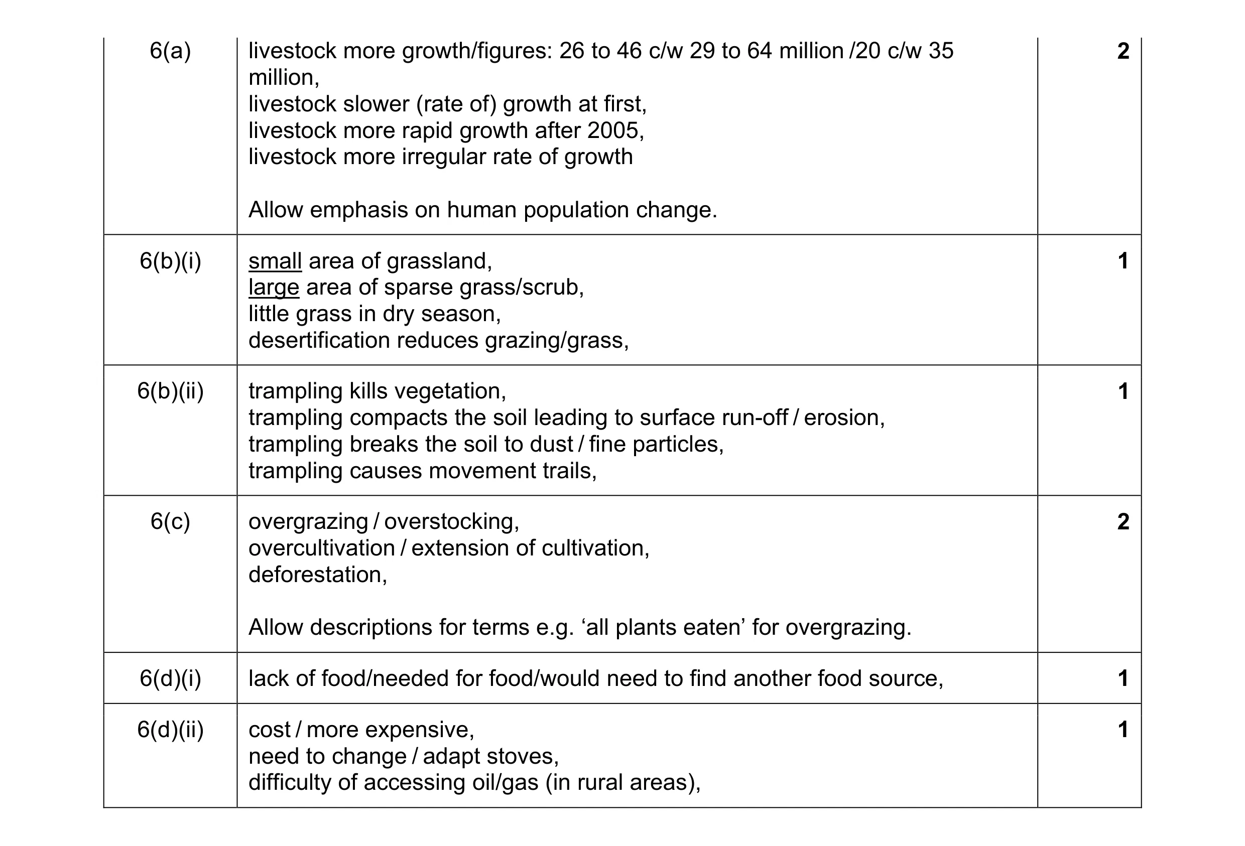 8
8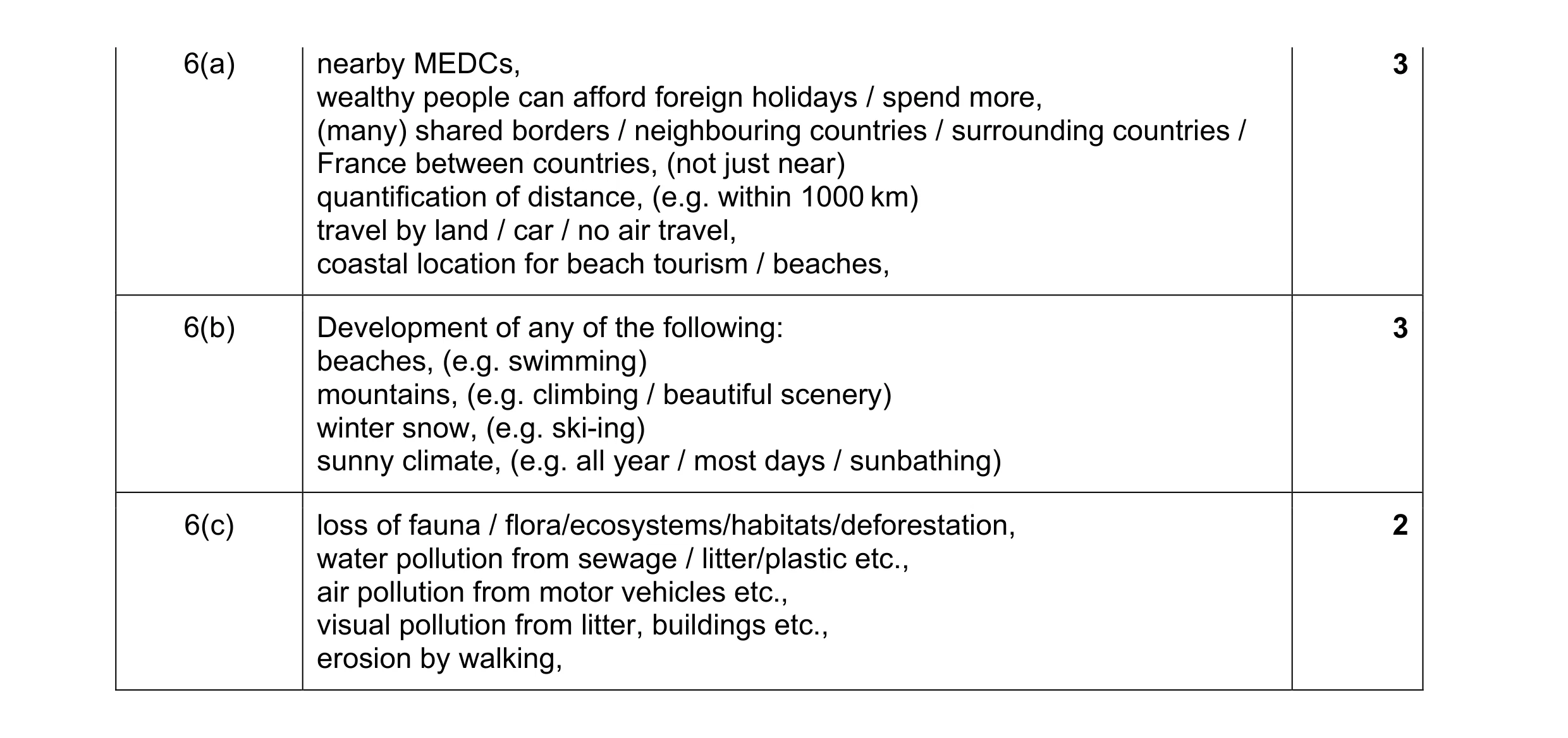 8
8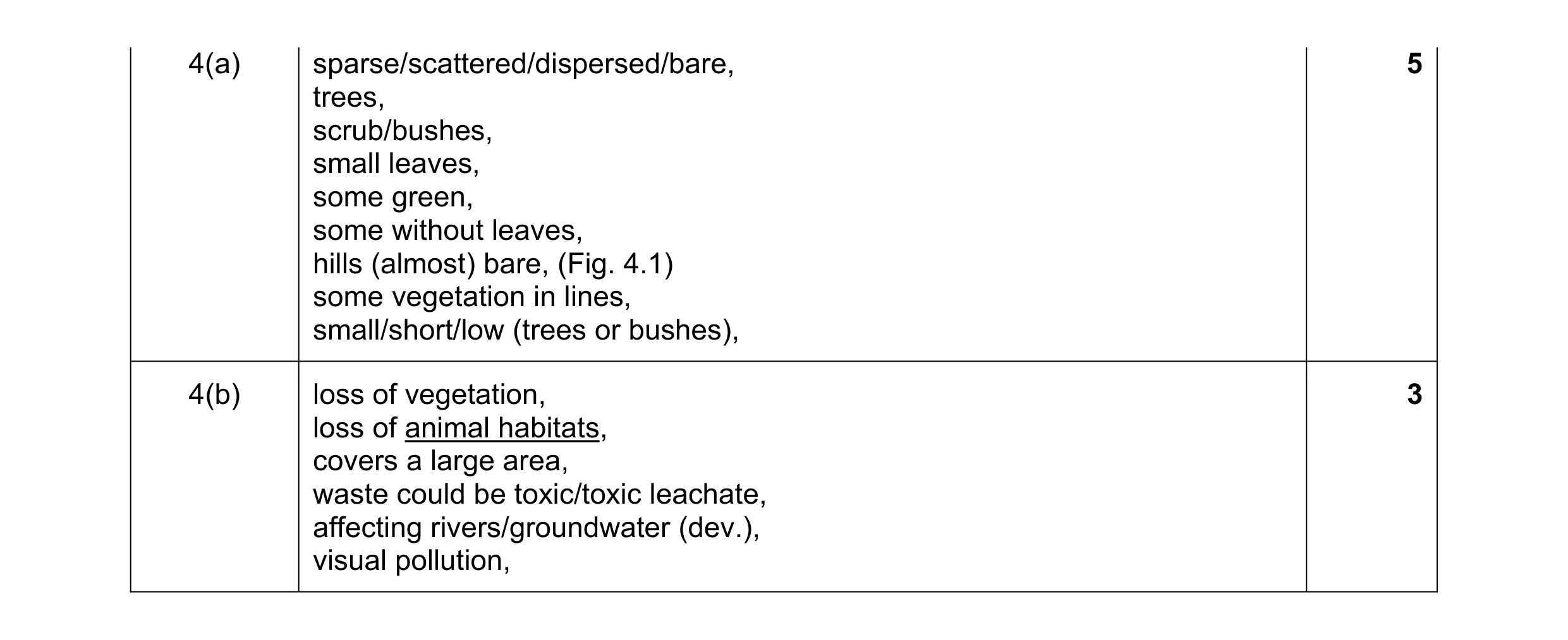 8
8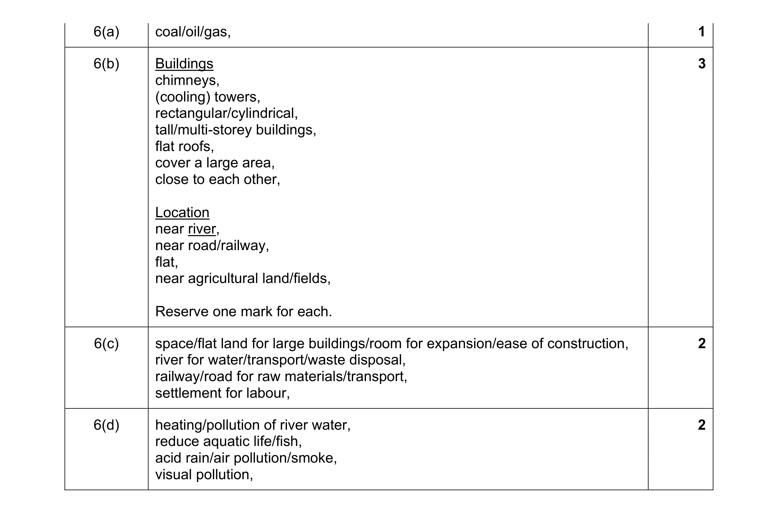 8
8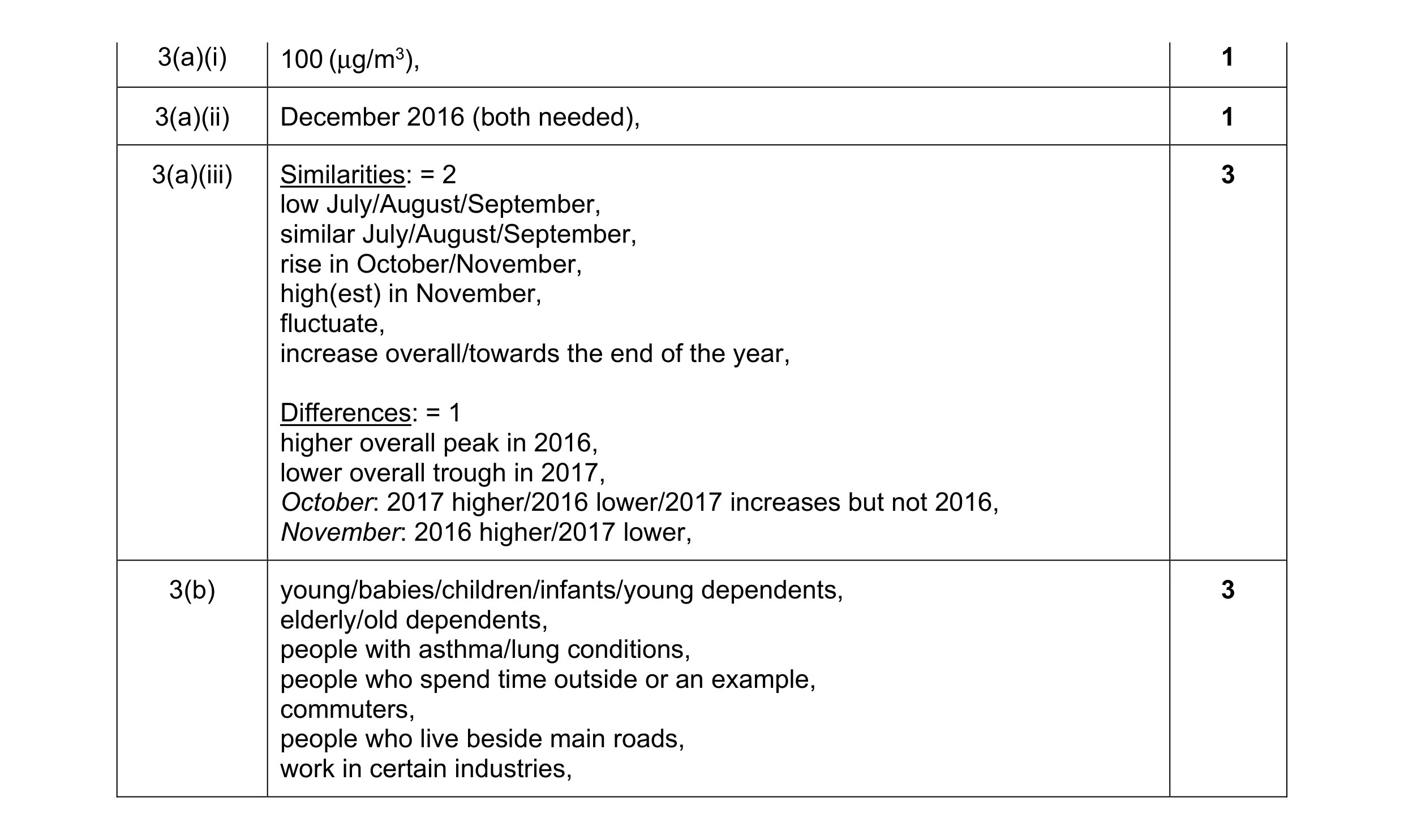 8
8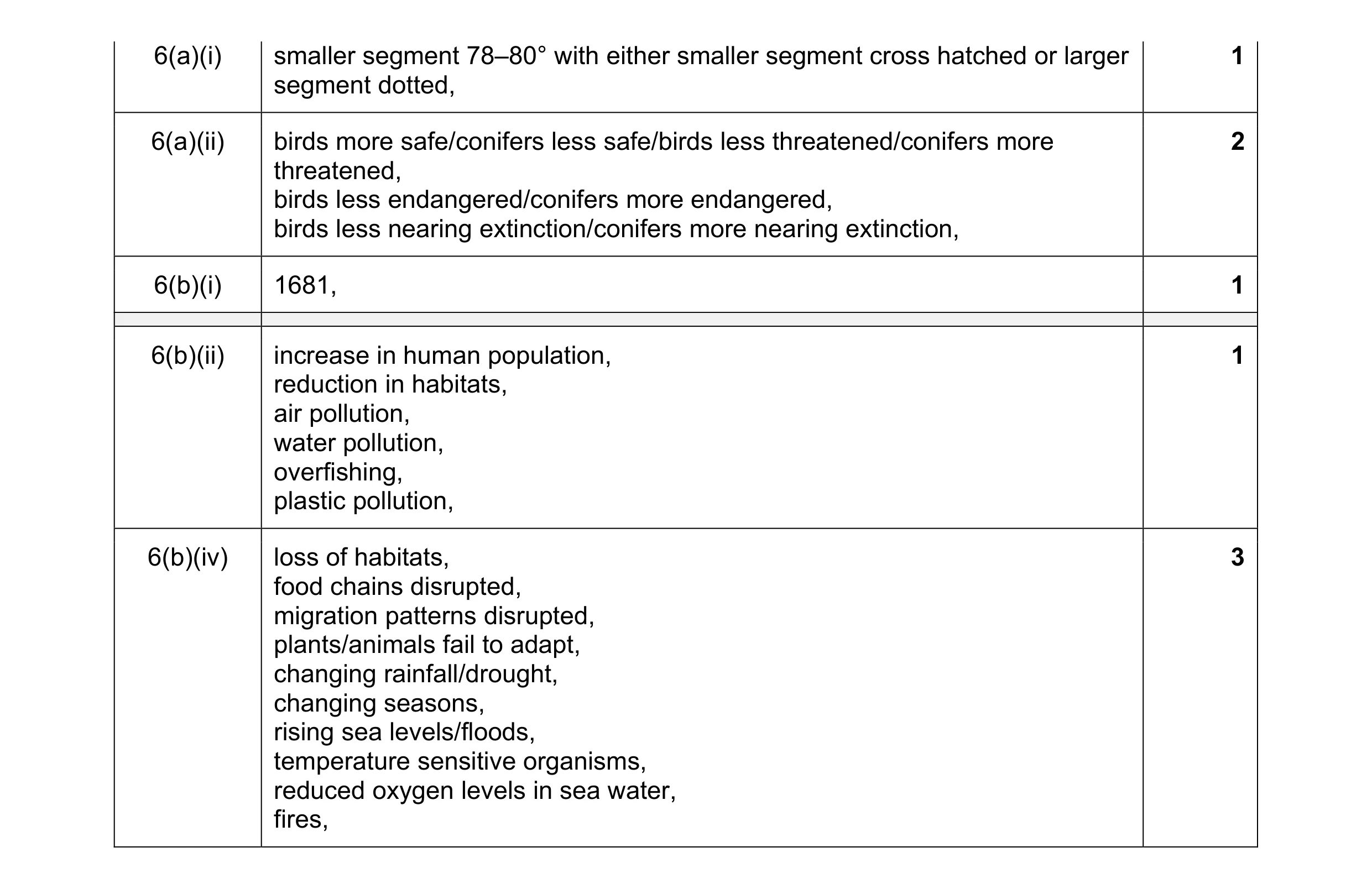 8
8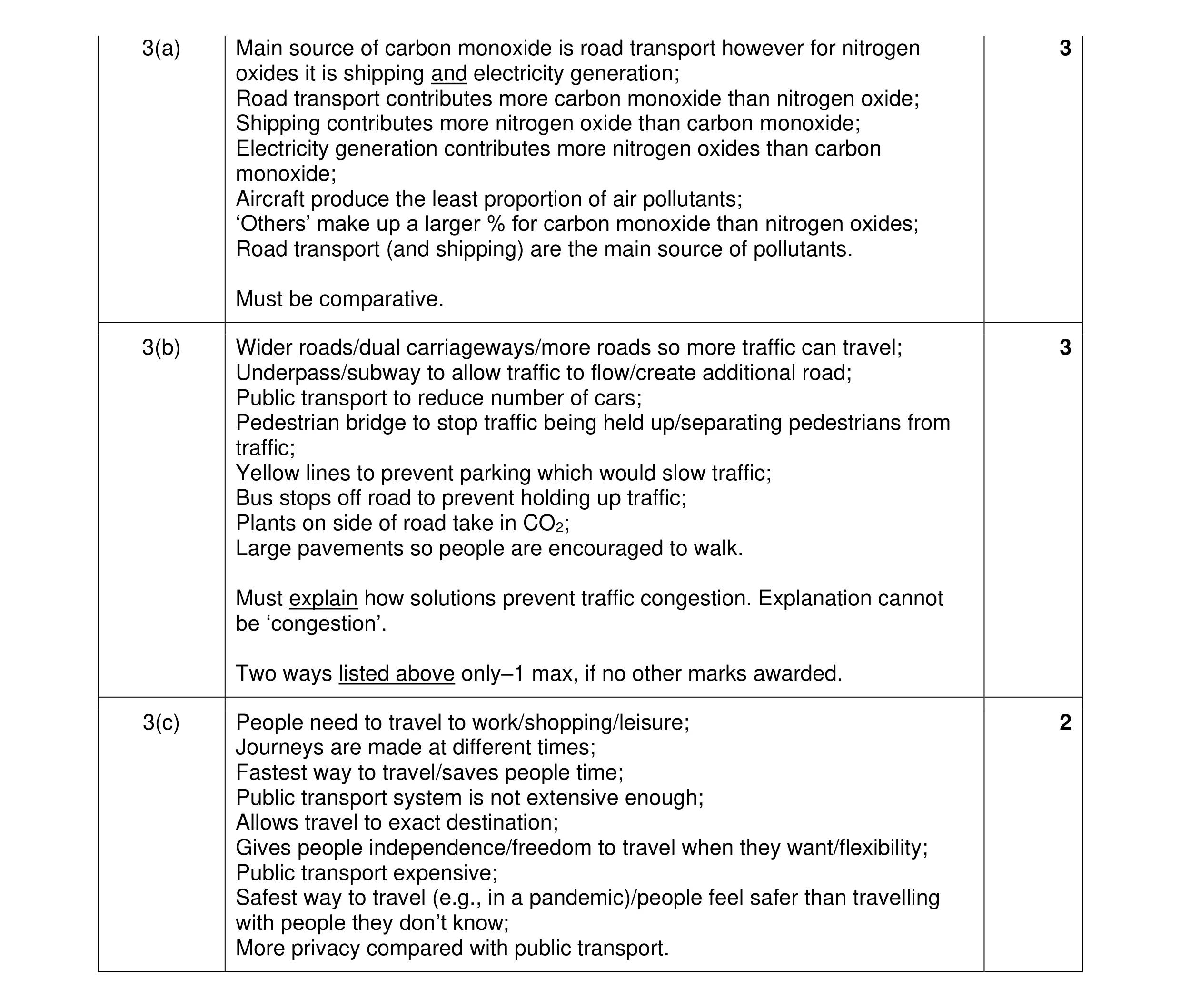 8
8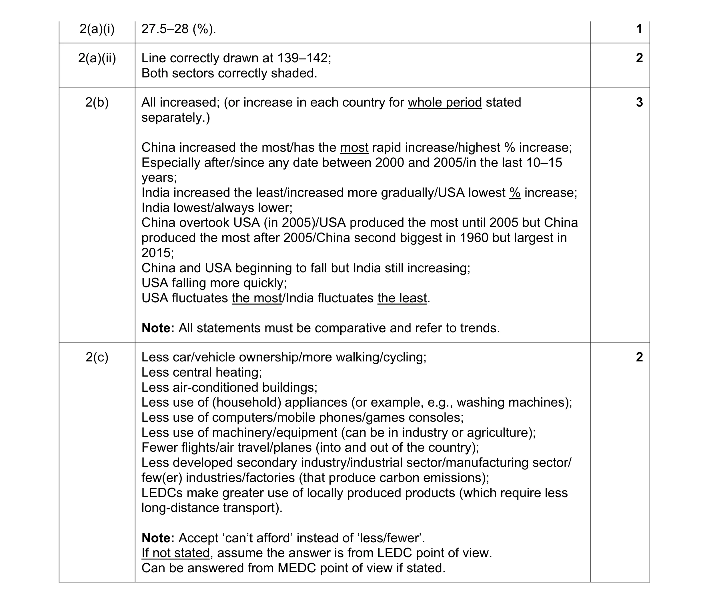 8
8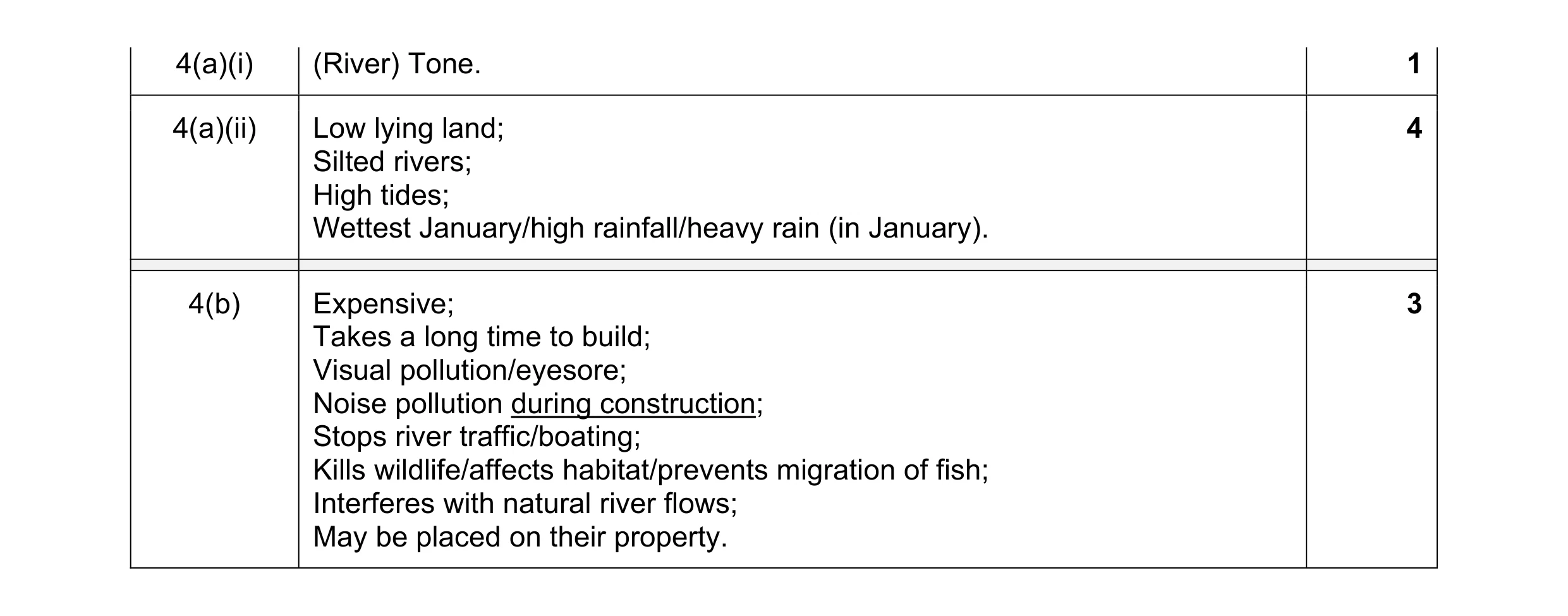 8
8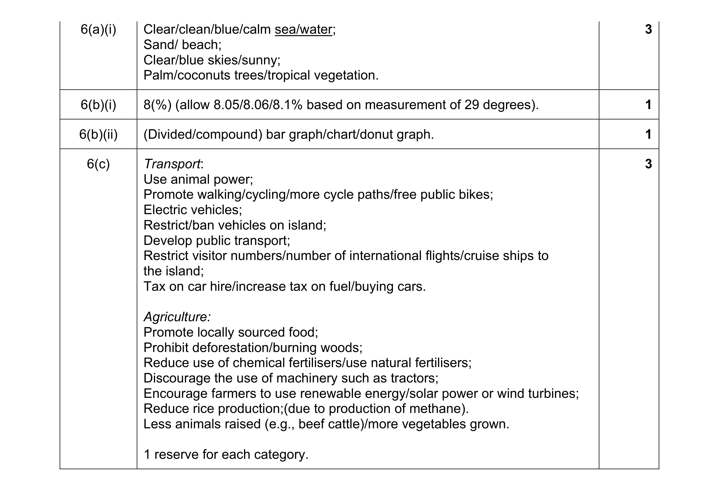 8
8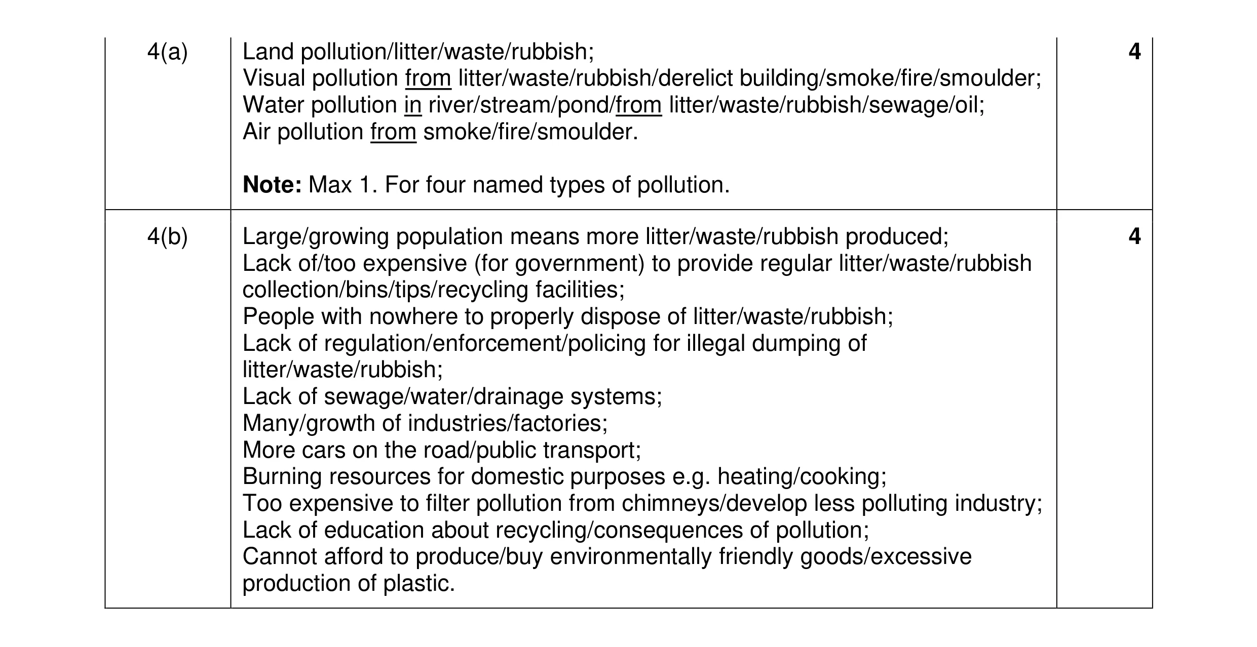 8
8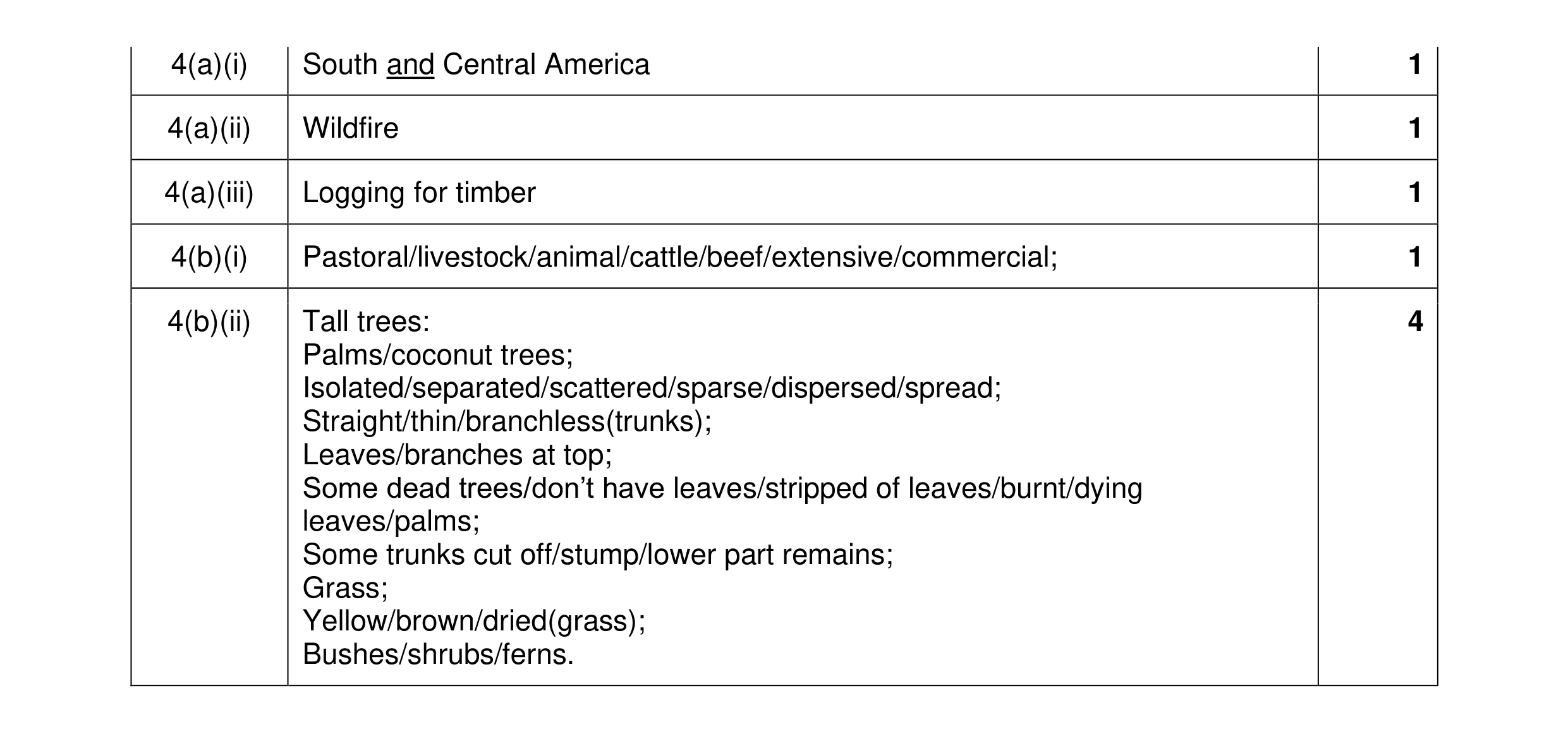 8
8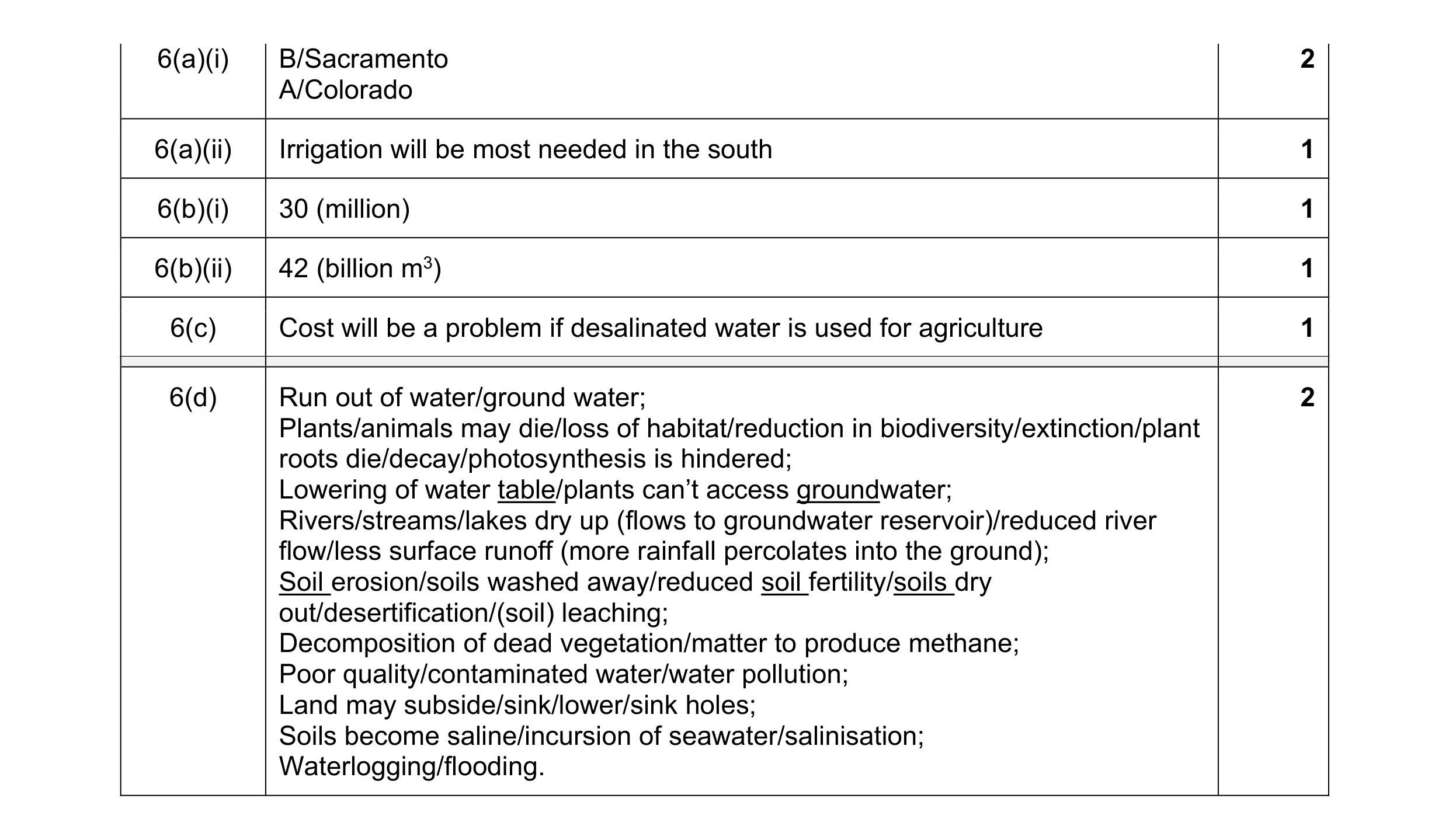 8
8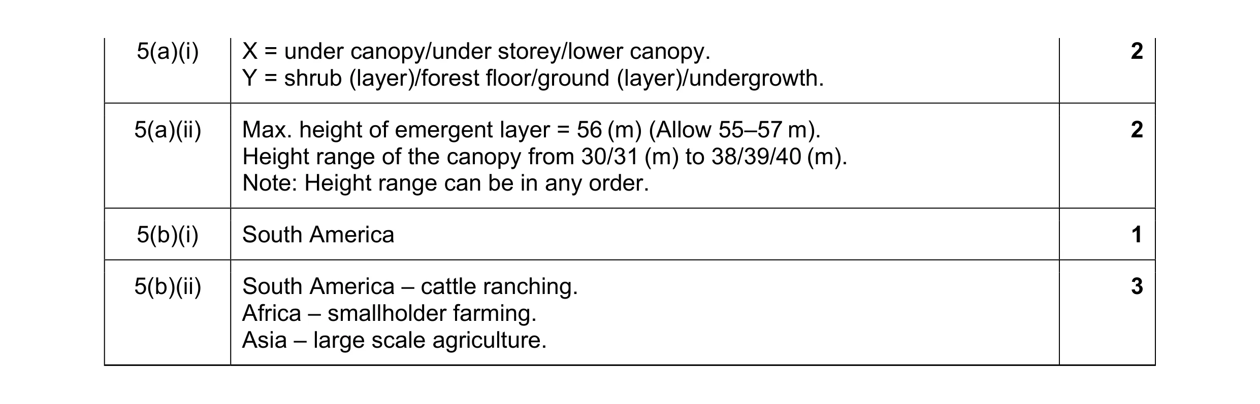 8
8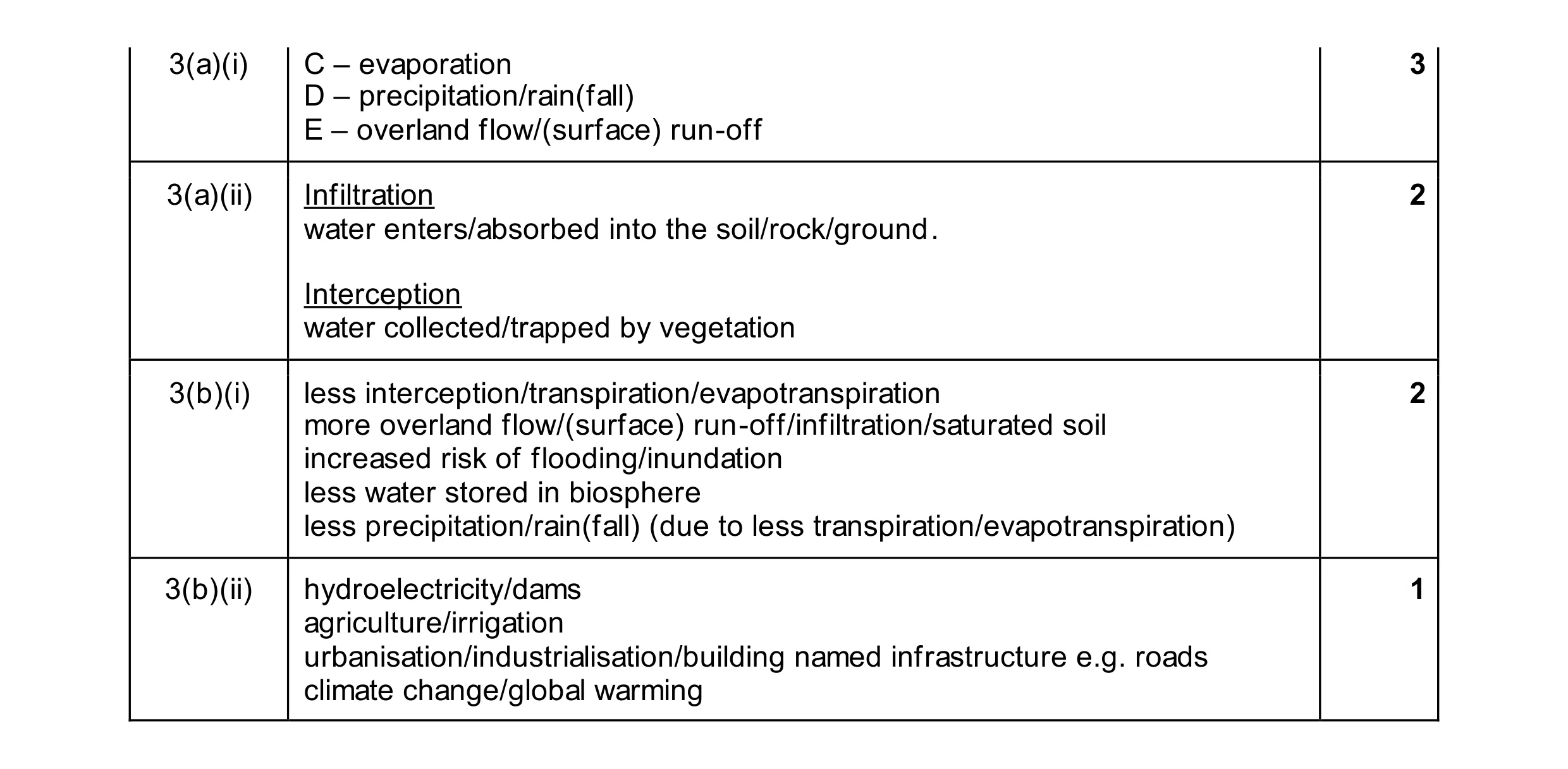 12
12