Questions as text
Question 1 0460/22 Feb/March 2017
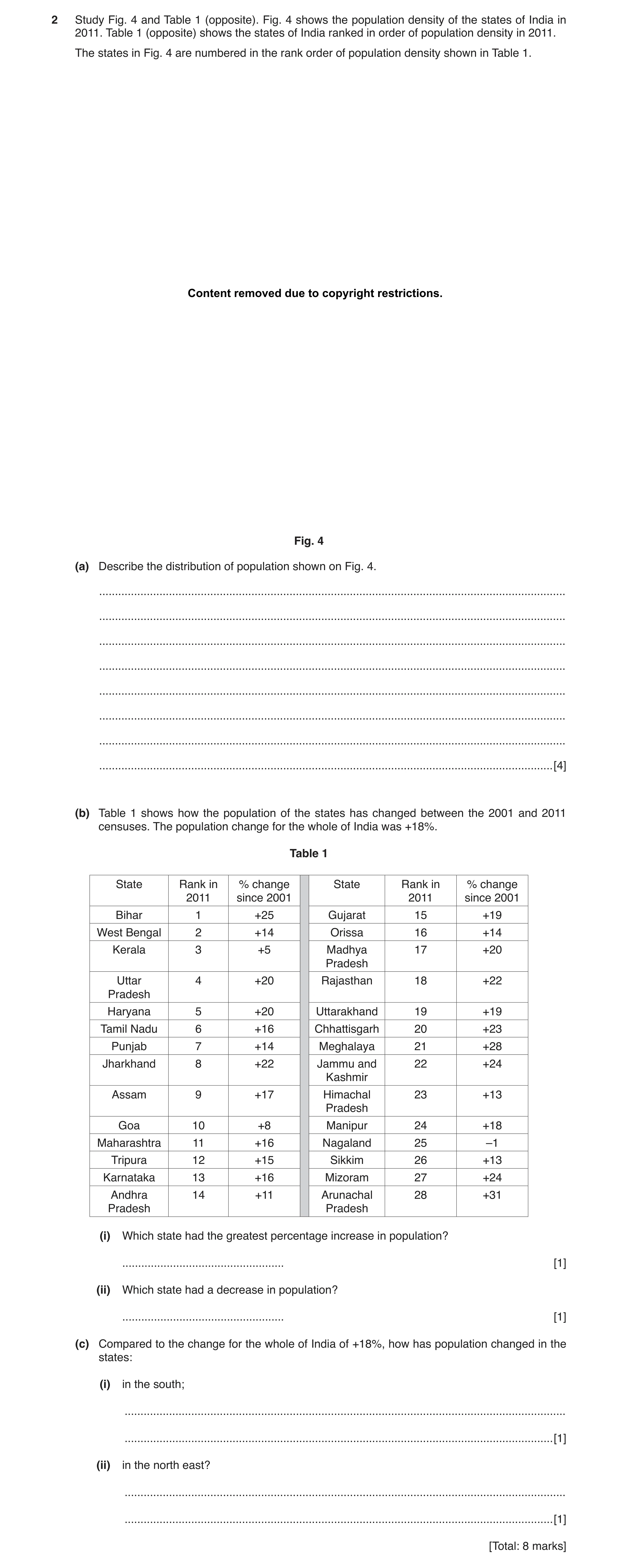
2 Study Fig. 4 and Table 1 (opposite). Fig. 4 shows the population density of the states of India in 2011. Table 1 (opposite) shows the states of India ranked in order of population density in 2011. The states in Fig. 4 are numbered in the rank order of population density shown in Table 1. Content removed due to copyright restrictions. Fig. 4 (a) Describe the distribution of population shown on Fig. 4. … … … … … … … … [4] (b) Table 1 shows how the population of the states has changed between the 2001 and 2011 censuses. The population change for the whole of India was +18%. Table 1 State Rank in % change State Rank in % change 2011 since 2001 2011 since 2001 Bihar 1 +25 Gujarat 15 +19 West Bengal 2 +14 Orissa 16 +14 Kerala 3 +5 Madhya 17 +20 Pradesh Uttar 4 +20 Rajasthan 18 +22 Pradesh Haryana 5 +20 Uttarakhand 19 +19 Tamil Nadu 6 +16 Chhattisgarh 20 +23 Punjab 7 +14 Meghalaya 21 +28 Jharkhand 8 +22 Jammu and 22 +24 Kashmir Assam 9 +17 Himachal 23 +13 Pradesh Goa 10 +8 Manipur 24 +18 Maharashtra 11 +16 Nagaland 25 –1 Tripura 12 +15 Sikkim 26 +13 Karnataka 13 +16 Mizoram 27 +24 Andhra 14 +11 Arunachal 28 +31 Pradesh Pradesh (i) Which state had the greatest percentage increase in population? … [1] (ii) Which state had a decrease in population? … [1] (c) Compared to the change for the whole of India of +18%, how has population changed in the states: (i) in the south; … … [1] (ii) in the north east? … … [1] [Total: 8 marks]
8 marks
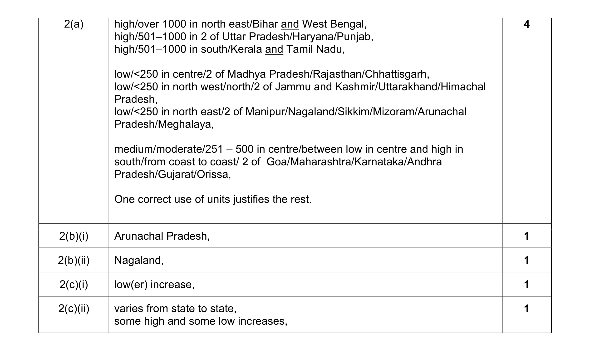
Mark scheme: 2(a) high/over 1000 in north east/Bihar and West Bengal, 4 high/501–1000 in 2 of Uttar Pradesh/Haryana/Punjab, high/501–1000 in south/Kerala and Tamil Nadu, low/<250 in centre/2 of Madhya Pradesh/Rajasthan/Chhattisgarh, low/<250 in north west/north/2 of Jammu and Kashmir/Uttarakhand/Himachal Pradesh, low/<250 in north east/2 of Manipur/Nagaland/Sikkim/Mizoram/Arunachal Pradesh/Meghalaya, medium/moderate/251 – 500 in centre/between low in centre and high in south/from coast to coast/ 2 of Goa/Maharashtra/Karnataka/Andhra Pradesh/Gujarat/Orissa, One correct use of units justifies the rest. 2(b)(i) Arunachal Pradesh, 1 2(b)(ii) Nagaland, 1 2(c)(i) low(er) increase, 1 2(c)(ii) varies from state to state, 1 some high and some low increases,
This question in 0460/22 Feb/March 2017
Question 2 0460/22 May/June 2017
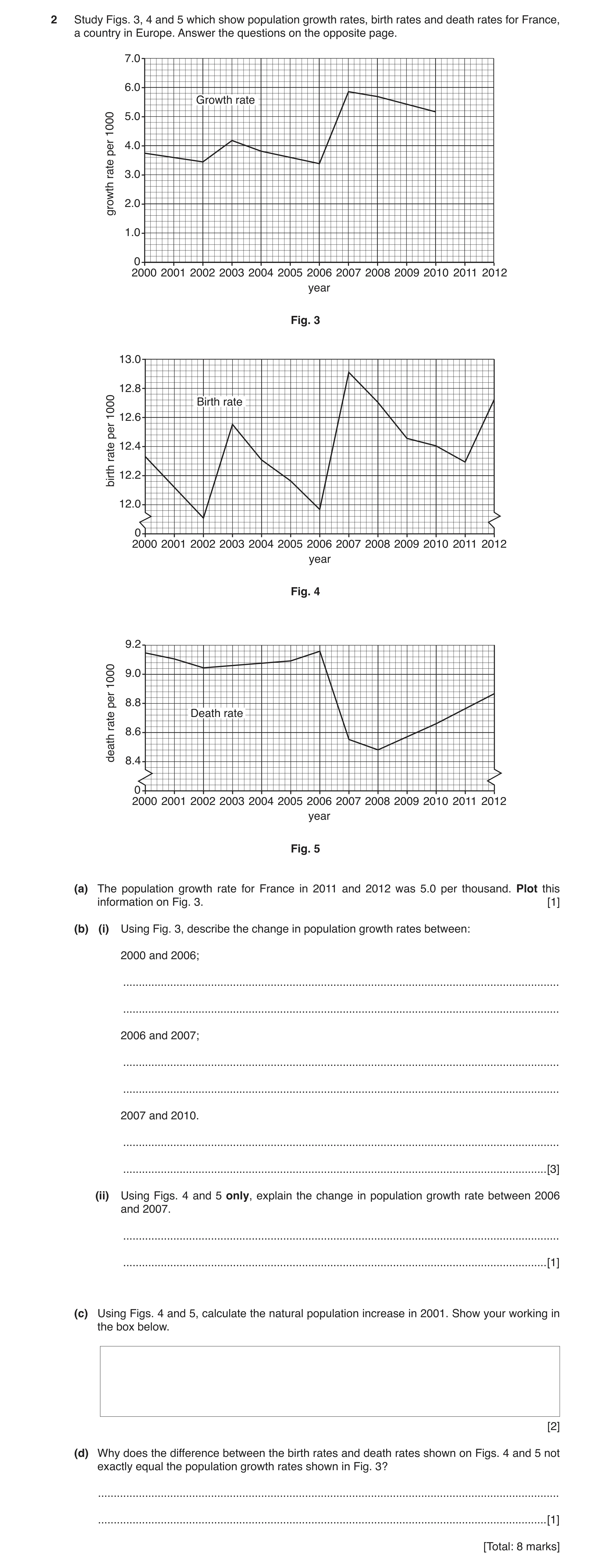
2 Study Figs. 3, 4 and 5 which show population growth rates, birth rates and death rates for France, a country in Europe. Answer the questions on the opposite page. 7.0 6.0 Growth rate 5.0 1000 per 4.0 rate 3.0 2.0 growth 1.0 0 2000 2001 2002 2003 2004 2005 2006 2007 2008 2009 2010 2011 2012 year Fig. 3 13.0 12.8 1000 Birth rate 12.6 per 12.4 rate birth12.2 12.0 0 2000 2001 2002 2003 2004 2005 2006 2007 2008 2009 2010 2011 2012 year Fig. 4 9.2 1000 9.0 per 8.8 Death rate rate 8.6 death 8.4 0 2000 2001 2002 2003 2004 2005 2006 2007 2008 2009 2010 2011 2012 year Fig. 5 (a) The population growth rate for France in 2011 and 2012 was 5.0 per thousand. Plot this information on Fig. 3. [1] (b) (i) Using Fig. 3, describe the change in population growth rates between: 2000 and 2006; … … 2006 and 2007; … … 2007 and 2010. … … [3] (ii) Using Figs. 4 and 5 only, explain the change in population growth rate between 2006 and 2007. … … [1] (c) Using Figs. 4 and 5, calculate the natural population increase in 2001. Show your working in the box below. [2] (d) Why does the difference between the birth rates and death rates shown on Figs. 4 and 5 not exactly equal the population growth rates shown in Fig. 3? … … [1] [Total: 8 marks]
8 marks
Mark scheme: 2(a) Correct plot of 5.0 in 2011 and 2012 with lines drawn correctly, 1 2(b)(i) 2000 and 2006 3 fall-rise-fall / little change / (fairly) steady / fluctuates / overall decrease / small decrease, 2006 and 2007 increase, 2007–2010 decrease, Must stress change. 2(c)(ii) BR increased and DR decreased / high BR and low DR, 1 2(c) 3.00–3.09 (carry errors forward from BR – DR) 2 per thousand, or 0.30–0.39 (carry errors forward from BR – DR) %, 2(d) migration is also a factor 1
This question in 0460/22 May/June 2017
Q3 · Information about population change and population migration in four urban areas in the… 0460/22 Oct/Nov 2017
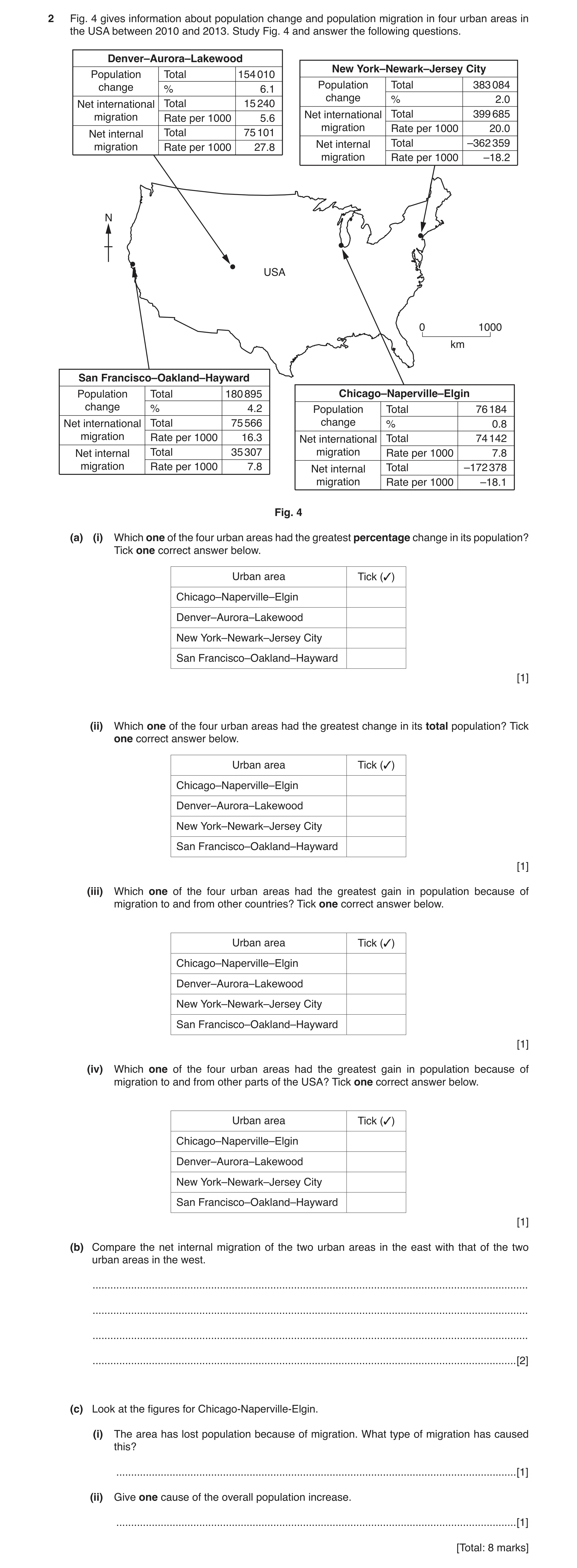
2 Fig. 4 gives information about population change and population migration in four urban areas in the USA between 2010 and 2013. Study Fig. 4 and answer the following questions. Denver–Aurora–Lakewood New York–Newark–Jersey City Population Total 154 010 change % 6.1 Population Total 383 084 change % 2.0 Net international Total 15 240 migration Rate per 1000 5.6 Net international Total 399 685 migration Rate per 1000 20.0 Net internal Total 75 101 migration Rate per 1000 27.8 Net internal Total –362 359 migration Rate per 1000 –18.2 N USA 0 1000 km San Francisco–Oakland–Hayward Population Total 180 895 Chicago–Naperville–Elgin change % 4.2 Population Total 76 184 Net international Total 75 566 change % 0.8 migration Rate per 1000 16.3 Net international Total 74 142 Net internal Total 35 307 migration Rate per 1000 7.8 migration Rate per 1000 7.8 Net internal Total –172 378 migration Rate per 1000 –18.1 Fig. 4 (a) (i) Which one of the four urban areas had the greatest percentage change in its population? Tick one correct answer below. Urban area Tick (3) Chicago–Naperville–Elgin Denver–Aurora–Lakewood New York–Newark–Jersey City San Francisco–Oakland–Hayward [1] (ii) Which one of the four urban areas had the greatest change in its total population? Tick one correct answer below. Urban area Tick (3) Chicago–Naperville–Elgin Denver–Aurora–Lakewood New York–Newark–Jersey City San Francisco–Oakland–Hayward [1] (iii) Which one of the four urban areas had the greatest gain in population because of migration to and from other countries? Tick one correct answer below. Urban area Tick (3) Chicago–Naperville–Elgin Denver–Aurora–Lakewood New York–Newark–Jersey City San Francisco–Oakland–Hayward [1] (iv) Which one of the four urban areas had the greatest gain in population because of migration to and from other parts of the USA? Tick one correct answer below. Urban area Tick (3) Chicago–Naperville–Elgin Denver–Aurora–Lakewood New York–Newark–Jersey City San Francisco–Oakland–Hayward [1] (b) Compare the net internal migration of the two urban areas in the east with that of the two urban areas in the west. … … … … [2] (c) Look at the figures for Chicago-Naperville-Elgin. (i) The area has lost population because of migration. What type of migration has caused this? … [1] (ii) Give one cause of the overall population increase. … [1] [Total: 8 marks]
8 marks
Mark scheme: 2(a)(i) Denver, 1 2(a)(ii) New York, 1 2(a)(iii) New York, 1 2(a)(iv) Denver, 1 2(b) east lost population/–ve migration/people moved out/allow emigration, 2 west gained population/+ve migration/people moved in/allow immigration, more migration in east/less migration in west, –534 737 in east and 110 408 in west, Allow Chicago and New York for east and Denver and San Francisco for west. 2(c)(i) internal, 1 emigration, 2(c)(ii) natural increase/birth rate more than death rate/high birth rate/increased 1 birth rate, international migration/migration from other countries/immigration, (not just people moving in)
This question in 0460/22 Oct/Nov 2017
Q4 · The five countries expected to have the largest populations by the year 2100 0460/22 May/June 2018
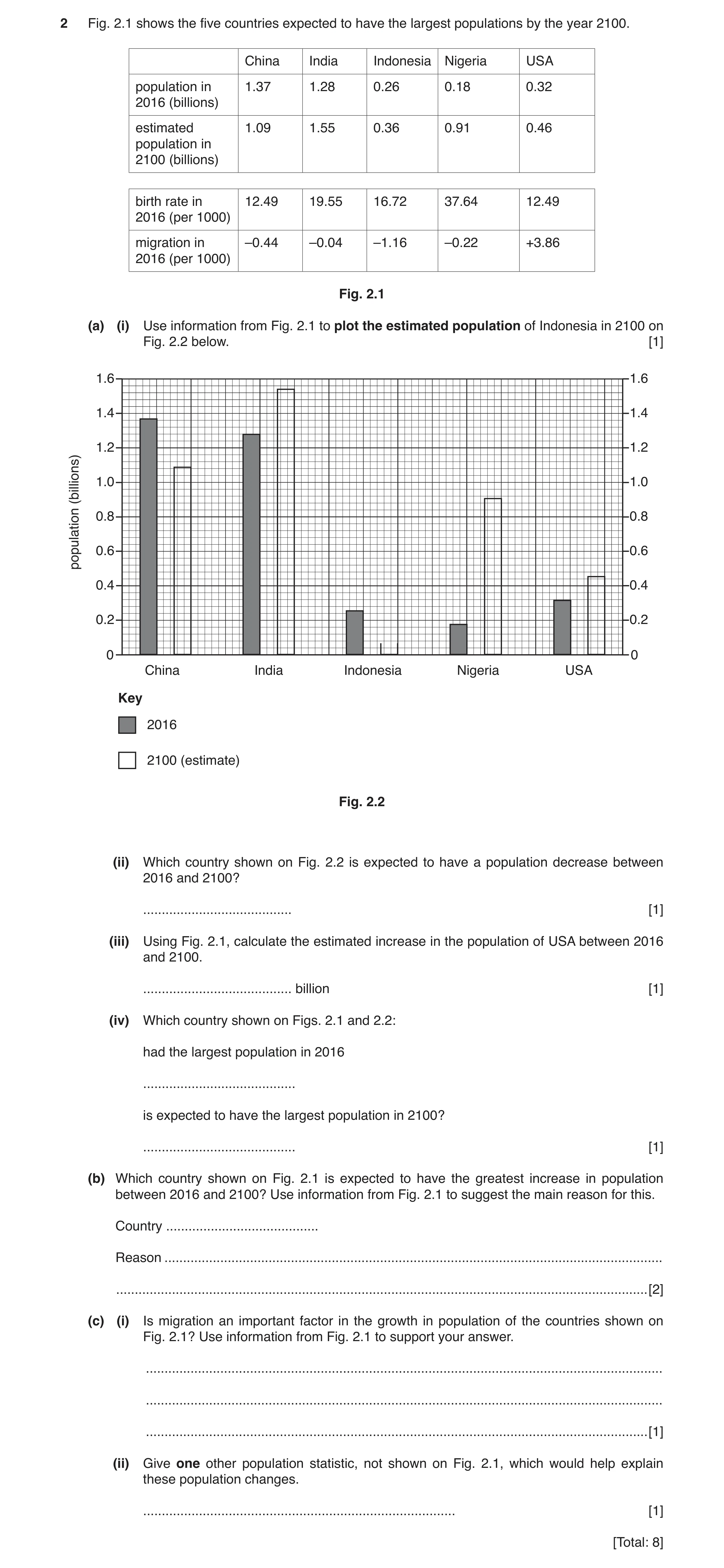
2 Fig. 2.1 shows the five countries expected to have the largest populations by the year 2100. China India Indonesia Nigeria USA population in 1.37 1.28 0.26 0.18 0.32 2016 (billions) estimated 1.09 1.55 0.36 0.91 0.46 population in 2100 (billions) birth rate in 12.49 19.55 16.72 37.64 12.49 2016 (per 1000) migration in –0.44 –0.04 –1.16 –0.22 +3.86 2016 (per 1000) Fig. 2.1 (a) (i) Use information from Fig. 2.1 to plot the estimated population of Indonesia in 2100 on Fig. 2.2 below. [1] 1.6 1.6 1.4 1.4 1.2 1.2 1.0 1.0 (billions) 0.8 0.8 0.6 0.6 population 0.4 0.4 0.2 0.2 0 0 China India Indonesia Nigeria USA Key 2016 2100 (estimate) Fig. 2.2 (ii) Which country shown on Fig. 2.2 is expected to have a population decrease between 2016 and 2100? … [1] (iii) Using Fig. 2.1, calculate the estimated increase in the population of USA between 2016 and 2100. … billion [1] (iv) Which country shown on Figs. 2.1 and 2.2: had the largest population in 2016 … is expected to have the largest population in 2100? … [1] (b) Which country shown on Fig. 2.1 is expected to have the greatest increase in population between 2016 and 2100? Use information from Fig. 2.1 to suggest the main reason for this. Country … Reason … … [2] (c) (i) Is migration an important factor in the growth in population of the countries shown on Fig. 2.1? Use information from Fig. 2.1 to support your answer. … … … [1] (ii) Give one other population statistic, not shown on Fig. 2.1, which would help explain these population changes. … [1] [Total: 8]
8 marks
Mark scheme: 2(a)(i) Correct plot of 0.36 billion in 2100, At the 9th subdivisions up from the base. 1 Ignore position and shading. 2(a)(ii) China. 1 2(a)(iii) 0.14 (billion.) 1 2(a)(iv) 2016 China and 2100 India. 1 2(b) Nigeria, 2 high(est) birth rate, 2(c)(i) no – countries lose through migration/only USA will gain through migration, 1 no – countries have negative migration, no – migration figures low/much lower than growth, no – countries with negative migration increase their populations, Don’t allow if for a single country. 2(c)(ii) death rate, 1 infant mortality rate, life expectancy, natural population change,
This question in 0460/22 May/June 2018
Q5 · A prediction of how the population of some countries in Europe might change by the year… 0460/21 Oct/Nov 2018
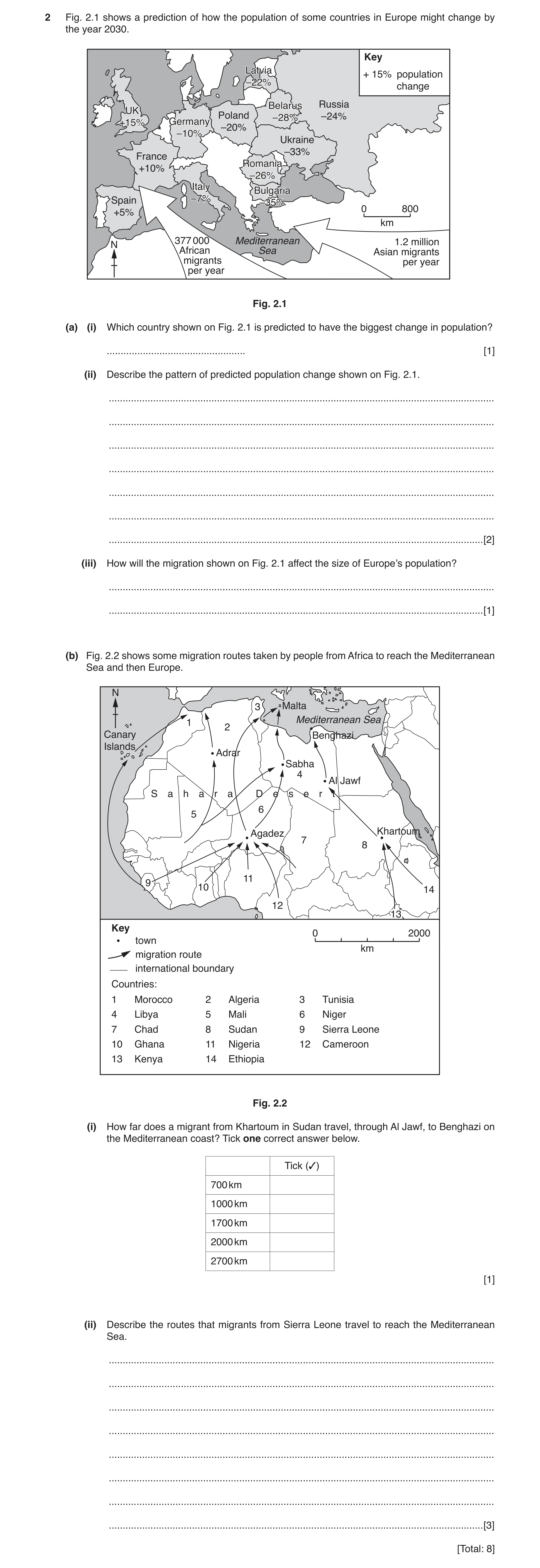
2 Fig. 2.1 shows a prediction of how the population of some countries in Europe might change by the year 2030. Key LatviaLatvia + 15% population –22%–22% change BelarusBelarus Russia UKUK Poland –28%–28% –24% +15%+15% GermanyGermany –20% –10%–10% Ukraine –33% France RomaniaRomania +10% –26%–26% ItalyItaly BulgariaBulgaria Spain –7%–7% –35%–35% 0 800 +5% km 377 000 Mediterranean 1.2 million N African Sea Asian migrants migrants per year per year Fig. 2.1 (a) (i) Which country shown on Fig. 2.1 is predicted to have the biggest change in population? … [1] (ii) Describe the pattern of predicted population change shown on Fig. 2.1. … … … … … … … [2] (iii) How will the migration shown on Fig. 2.1 affect the size of Europe’s population? … … [1] (b) Fig. 2.2 shows some migration routes taken by people from Africa to reach the Mediterranean Sea and then Europe. N 3 Malta Mediterranean Sea 1 2 Canary Benghazi Islands Adrar Sabha 4 Al Jawf S a h a r a D e s e r t 6 5 Agadez Khartoum 7 8 11 9 10 14 12 13 Key 0 2000 town km migration route international boundary Countries: 1 Morocco 2 Algeria 3 Tunisia 4 Libya 5 Mali 6 Niger 7 Chad 8 Sudan 9 Sierra Leone 10 Ghana 11 Nigeria 12 Cameroon 13 Kenya 14 Ethiopia Fig. 2.2 (i) How far does a migrant from Khartoum in Sudan travel, through Al Jawf, to Benghazi on the Mediterranean coast? Tick one correct answer below. Tick (3) 700 km 1000 km 1700 km 2000 km 2700 km [1] (ii) Describe the routes that migrants from Sierra Leone travel to reach the Mediterranean Sea. … … … … … … … … [3] [Total: 8]
8 marks
Mark scheme: 2(a)(i) Bulgaria 1 2(a)(ii) increase/positive in west 2 decrease/negative in east (and centre) more countries decrease than increase/most countries decrease/only UK France and Spain increase/3 increase + 9 decrease decreases greater than increases biggest change in east/smallest change in west 2(a)(iii) cause (overall) increase 1 2(b)(i) 2700 km 1 2(b)(ii) via Agadez/Niger 3 across desert through many countries/across many borders two routes to Mediterranean/via Sabha/Libya and Tunisia/Algeria ocean/sea route/boat via Canary Islands
This question in 0460/21 Oct/Nov 2018
Q6 · Eight countries located next to the Mediterranean Sea 0460/22 Oct/Nov 2018
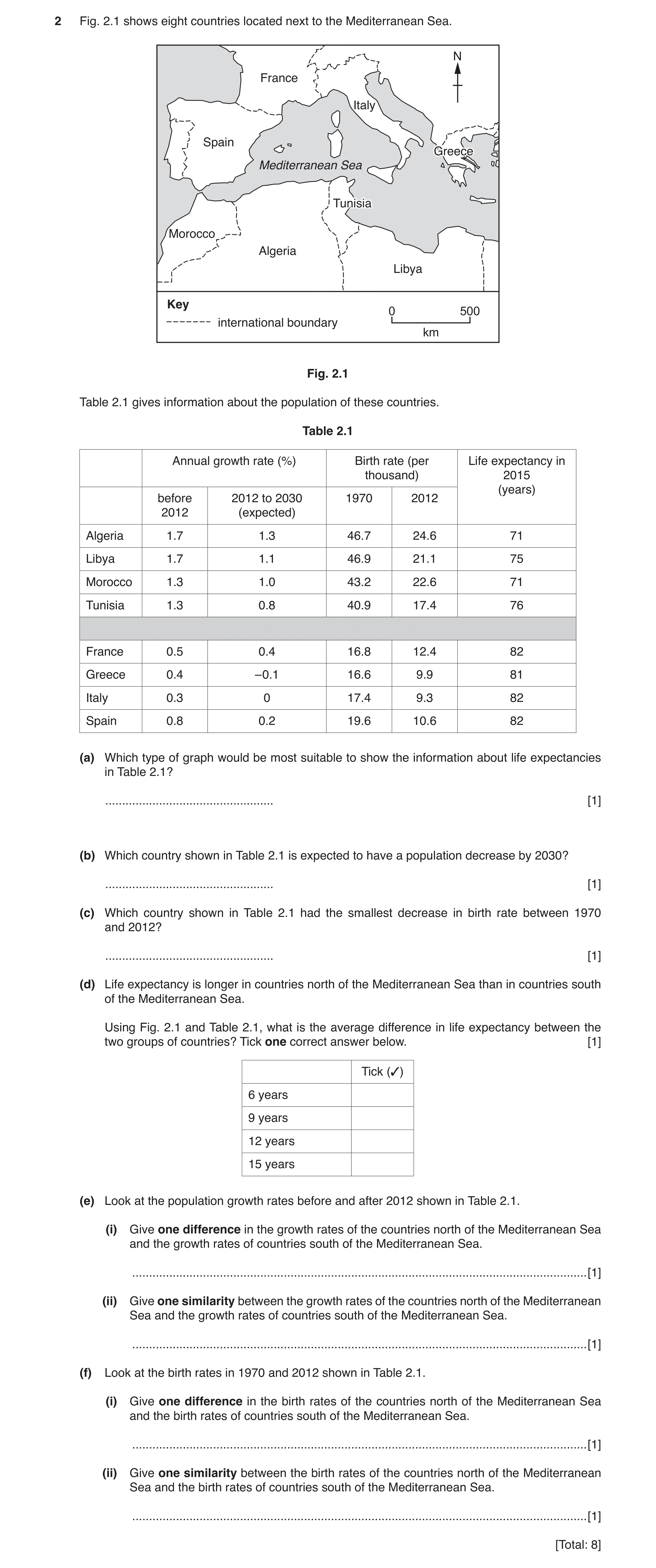
2 Fig. 2.1 shows eight countries located next to the Mediterranean Sea. N France Italy Spain Greece Mediterranean Sea TunisiaTunisia Morocco Algeria Libya Key 0 500 international boundary km Fig. 2.1 Table 2.1 gives information about the population of these countries. Table 2.1 Annual growth rate (%) Birth rate (per Life expectancy in thousand) 2015 (years) before 2012 to 2030 1970 2012 2012 (expected) Algeria 1.7 1.3 46.7 24.6 71 Libya 1.7 1.1 46.9 21.1 75 Morocco 1.3 1.0 43.2 22.6 71 Tunisia 1.3 0.8 40.9 17.4 76 France 0.5 0.4 16.8 12.4 82 Greece 0.4 –0.1 16.6 9.9 81 Italy 0.3 0 17.4 9.3 82 Spain 0.8 0.2 19.6 10.6 82 (a) Which type of graph would be most suitable to show the information about life expectancies in Table 2.1? … [1] (b) Which country shown in Table 2.1 is expected to have a population decrease by 2030? … [1] (c) Which country shown in Table 2.1 had the smallest decrease in birth rate between 1970 and 2012? … [1] (d) Life expectancy is longer in countries north of the Mediterranean Sea than in countries south of the Mediterranean Sea. Using Fig. 2.1 and Table 2.1, what is the average difference in life expectancy between the two groups of countries? Tick one correct answer below. [1] Tick (✓) 6 years 9 years 12 years 15 years (e) Look at the population growth rates before and after 2012 shown in Table 2.1. (i) Give one difference in the growth rates of the countries north of the Mediterranean Sea and the growth rates of countries south of the Mediterranean Sea. … [1] (ii) Give one similarity between the growth rates of the countries north of the Mediterranean Sea and the growth rates of countries south of the Mediterranean Sea. … [1] (f) Look at the birth rates in 1970 and 2012 shown in Table 2.1. (i) Give one difference in the birth rates of the countries north of the Mediterranean Sea and the birth rates of countries south of the Mediterranean Sea. … [1] (ii) Give one similarity between the birth rates of the countries north of the Mediterranean Sea and the birth rates of countries south of the Mediterranean Sea. … [1] [Total: 8]
8 marks
Mark scheme: 2(a) bar (graph/chart) 1 2(b) Greece 1 2(c) France 1 2(d) 9 years 1 2(e)(i) growth rates lower in north/higher in south 1 Answer must refer to north or south. Allow if referring to one period only. 2(e)(ii) (both) decrease 1 2(f)(i) birth rates lower in north/higher in south 1 greater decrease in south/smaller decrease in north Answer must refer to north or south. Allow if referring to one period only. 2(f)(ii) (both) decrease 1 In (e) and (f) comparisons of a single pair of countries and figures from Table 2.1 = 0. However, allow general expressions using figures e.g. ‘In 1970 birth rates were over 40 per thousand in the south but less than 20 per thousand in the north’. These need to be checked for accuracy using Table 2.1.
This question in 0460/22 Oct/Nov 2018
Question 7 0460/23 May/June 2019
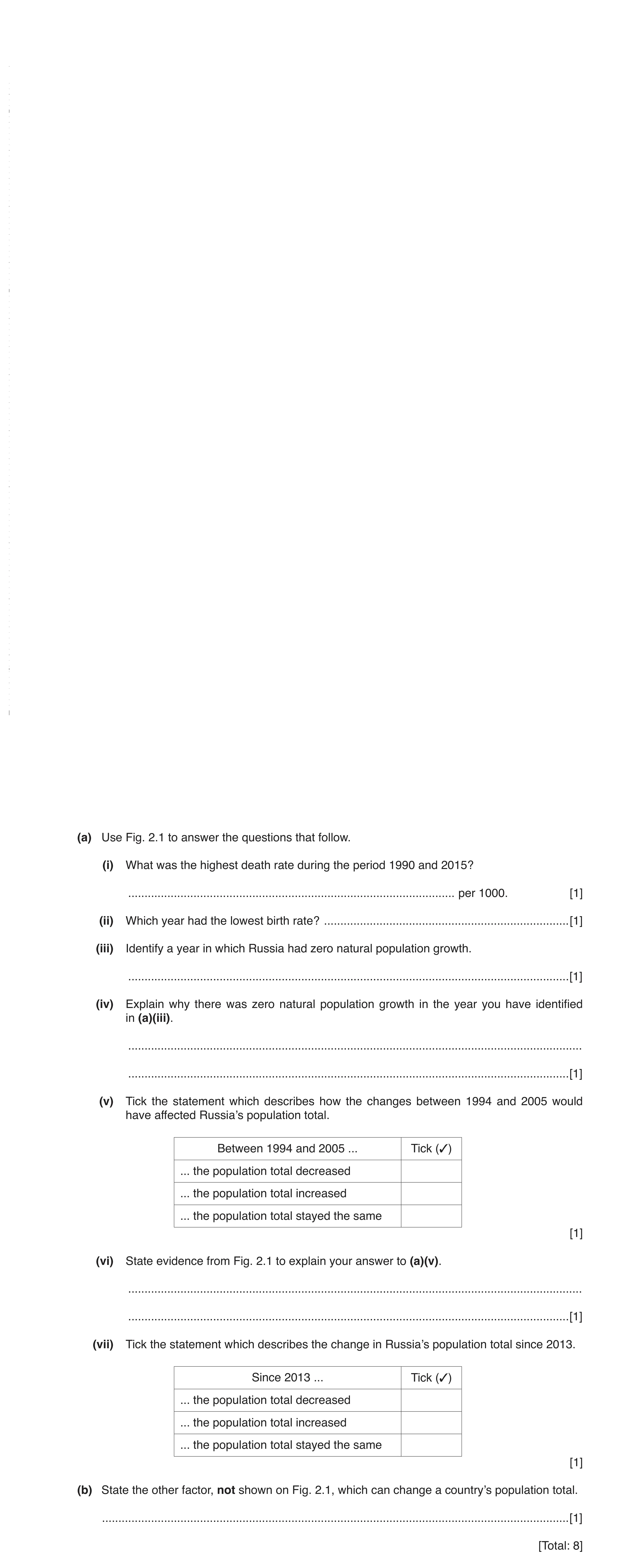
(a) Use Fig. 2.1 to answer the questions that follow. (i) What was the highest death rate during the period 1990 and 2015? … per 1000. [1] (ii) Which year had the lowest birth rate? … [1] (iii) Identify a year in which Russia had zero natural population growth. … [1] (iv) Explain why there was zero natural population growth in the year you have identified in (a)(iii). … … [1] (v) Tick the statement which describes how the changes between 1994 and 2005 would have affected Russia’s population total. Between 1994 and 2005 ... Tick (3) ... the population total decreased ... the population total increased ... the population total stayed the same [1] (vi) State evidence from Fig. 2.1 to explain your answer to (a)(v). … … [1] (vii) Tick the statement which describes the change in Russia’s population total since 2013. Since 2013 ... Tick (3) ... the population total decreased ... the population total increased ... the population total stayed the same [1] (b) State the other factor, not shown on Fig. 2.1, which can change a country’s population total. … [1] [Total: 8]
8 marks
Mark scheme: 2(a)(i) 16.4, 1 2(a)(ii) 1999, 1 2(a)(iii) 2012 (accept also 1991), 1 2(a)(iv) birth rate and death rate were the same, 1 2(a)(v) the population total decreased, 1 2(a)(vi) death rate was higher than birth rate, 1 the growth rate was negative, 2(a)(vii) the population total increased, 1 2(b) (net) migration / immigration / emigration, 1
This question in 0460/23 May/June 2019
Question 8 0460/23 May/June 2019
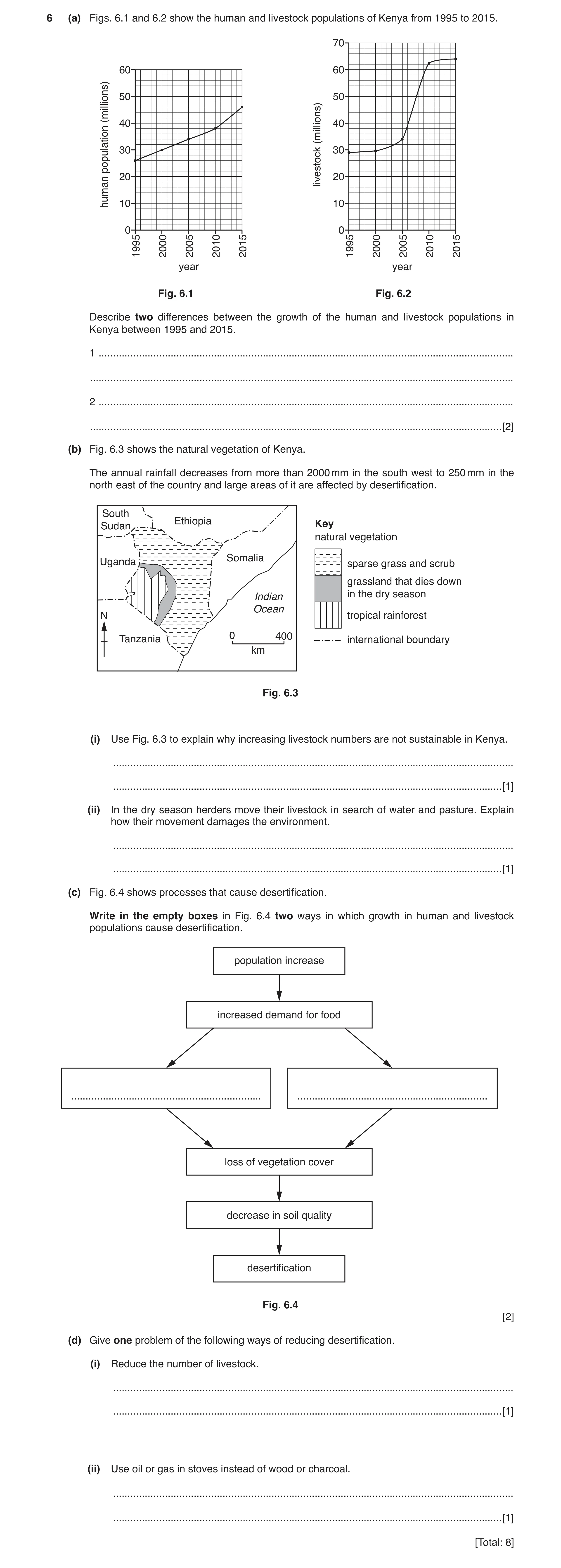
6 (a) Figs. 6.1 and 6.2 show the human and livestock populations of Kenya from 1995 to 2015. 70 60 60 50 50 (millions) 40 40 (millions) 30 30 population 20 livestock 20 human 10 10 0 0 1995 2000 2005 2010 2015 1995 2000 2005 2010 2015 year year Fig. 6.1 Fig. 6.2 Describe two differences between the growth of the human and livestock populations in Kenya between 1995 and 2015. 1 … … 2 … … [2] (b) Fig. 6.3 shows the natural vegetation of Kenya. The annual rainfall decreases from more than 2000 mm in the south west to 250 mm in the north east of the country and large areas of it are affected by desertification. South Ethiopia Key Sudan natural vegetation Somalia Uganda sparse grass and scrub grassland that dies down Indian in the dry season Ocean N tropical rainforest 0 400 Tanzania international boundary km Fig. 6.3 (i) Use Fig. 6.3 to explain why increasing livestock numbers are not sustainable in Kenya. … … [1] (ii) In the dry season herders move their livestock in search of water and pasture. Explain how their movement damages the environment. … … [1] (c) Fig. 6.4 shows processes that cause desertification. Write in the empty boxes in Fig. 6.4 two ways in which growth in human and livestock populations cause desertification. population increase increased demand for food … … loss of vegetation cover decrease in soil quality desertification Fig. 6.4 [2] (d) Give one problem of the following ways of reducing desertification. (i) Reduce the number of livestock. … … [1] (ii) Use oil or gas in stoves instead of wood or charcoal. … … [1] [Total: 8]
8 marks
Mark scheme: 6(a) livestock more growth/figures: 26 to 46 c/w 29 to 64 million /20 c/w 35 2 million, livestock slower (rate of) growth at first, livestock more rapid growth after 2005, livestock more irregular rate of growth Allow emphasis on human population change. 6(b)(i) small area of grassland, 1 large area of sparse grass/scrub, little grass in dry season, desertification reduces grazing/grass, 6(b)(ii) trampling kills vegetation, 1 trampling compacts the soil leading to surface run-off / erosion, trampling breaks the soil to dust / fine particles, trampling causes movement trails, 6(c) overgrazing / overstocking, 2 overcultivation / extension of cultivation, deforestation, Allow descriptions for terms e.g. ‘all plants eaten’ for overgrazing. 6(d)(i) lack of food/needed for food/would need to find another food source, 1 6(d)(ii) cost / more expensive, 1 need to change / adapt stoves, difficulty of accessing oil/gas (in rural areas),
This question in 0460/23 May/June 2019
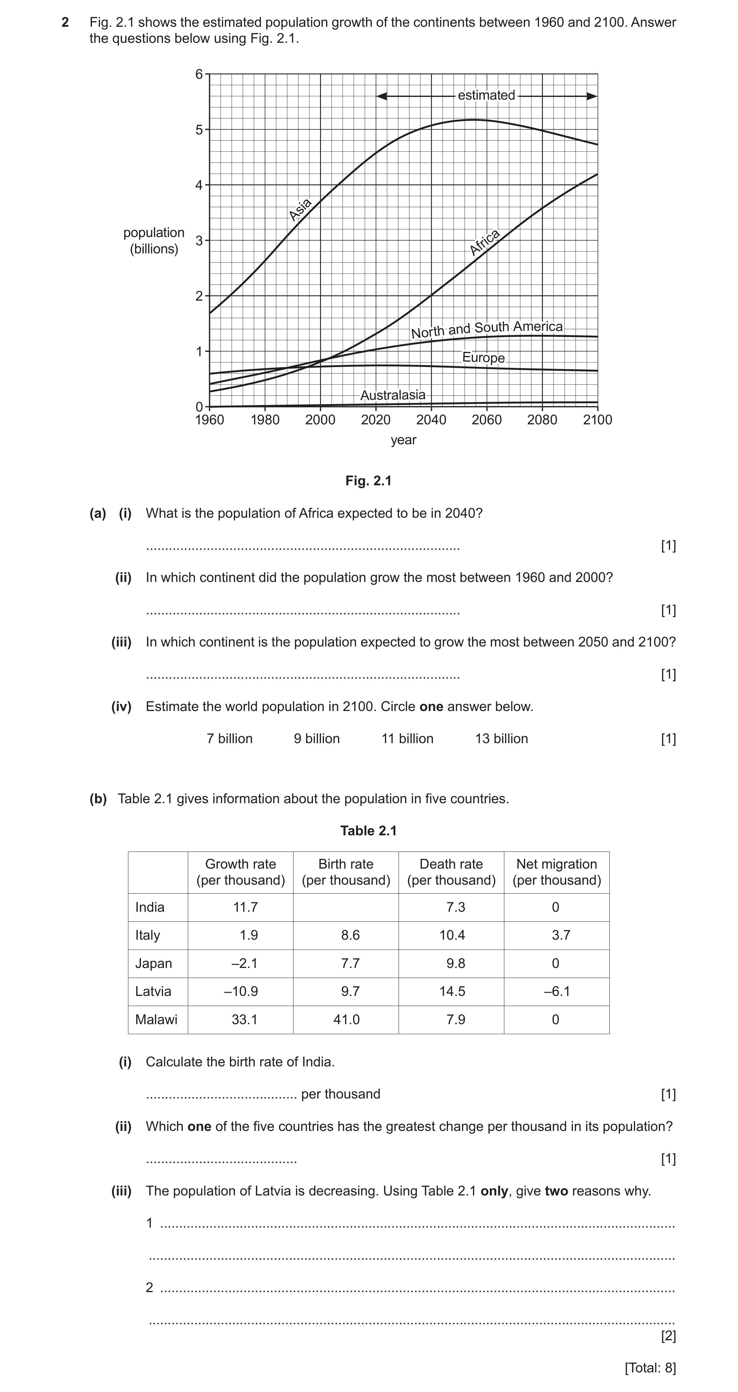
Q9 · The estimated population growth of the continents between 1960 and 2100 0460/21 May/June 2020
2 Fig. 2.1 shows the estimated population growth of the continents between 1960 and 2100. Answer the questions below using Fig. 2.1. 6 estimated 5 4 Asia population 3 (billions) Africa 2 and South America North 1 Europe Australasia 0 1960 1980 2000 2020 2040 2060 2080 2100 year Fig. 2.1 (a) (i) What is the population of Africa expected to be in 2040? … [1] (ii) In which continent did the population grow the most between 1960 and 2000? … [1] (iii) In which continent is the population expected to grow the most between 2050 and 2100? … [1] (iv) Estimate the world population in 2100. Circle one answer below. 7 billion 9 billion 11 billion 13 billion [1] (b) Table 2.1 gives information about the population in five countries. Table 2.1 Growth rate Birth rate Death rate Net migration (per thousand) (per thousand) (per thousand) (per thousand) India 11.7 7.3 0 Italy 1.9 8.6 10.4 3.7 Japan –2.1 7.7 9.8 0 Latvia –10.9 9.7 14.5 –6.1 Malawi 33.1 41.0 7.9 0 (i) Calculate the birth rate of India. … per thousand [1] (ii) Which one of the five countries has the greatest change per thousand in its population? … [1] (iii) The population of Latvia is decreasing. Using Table 2.1 only, give two reasons why. 1 … … 2 … … [2] [Total: 8]
8 marks
Mark scheme: 2(a)(i) 2 billion, 1 2(a)(ii) Asia, 1 2(a)(iii) Africa, 1 2(a)(iv) 11 billion, 1 2(b)(i) 19.0 1 2(b)(ii) Malawi, 1 2(b)(iii) emigration, 2 low birth rate/death rate > birth rate,
This question in 0460/21 May/June 2020
Question 10 0460/22 May/June 2020
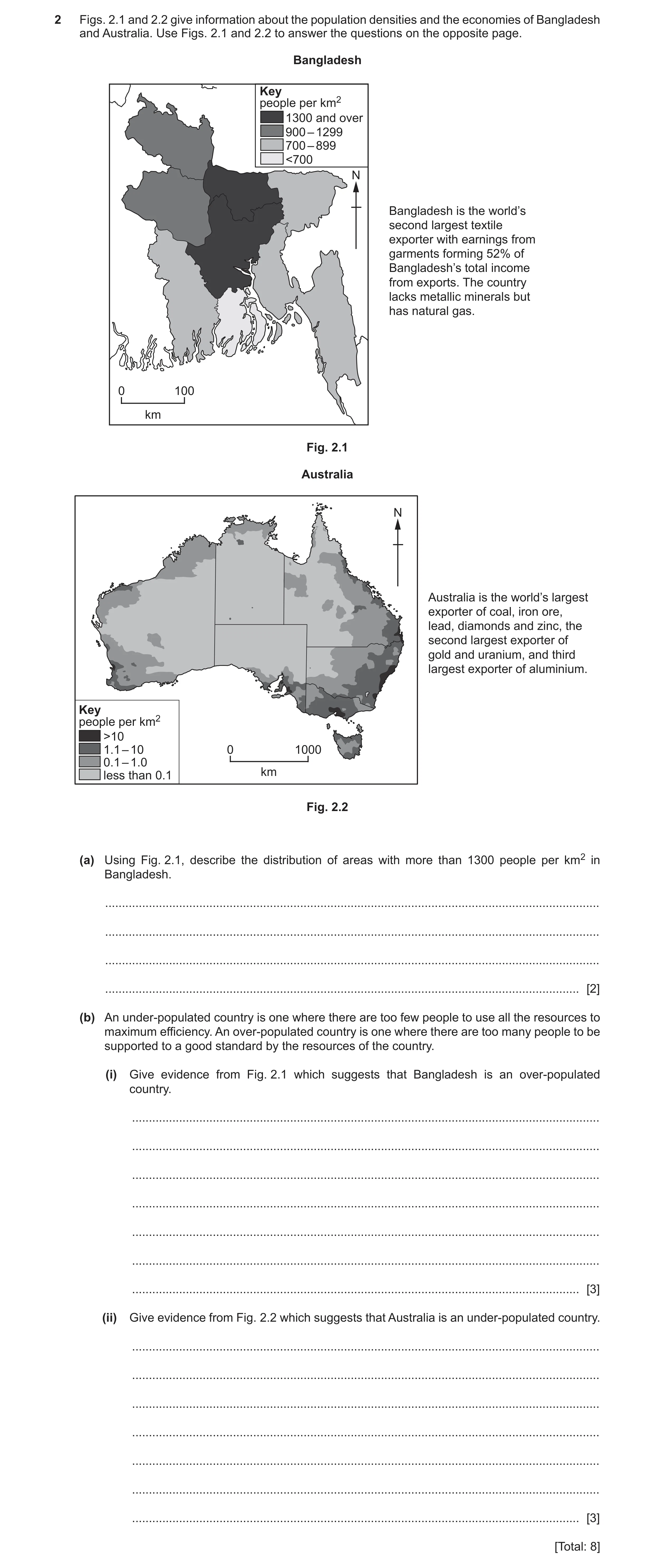
2 Figs. 2.1 and 2.2 give information about the population densities and the economies of Bangladesh and Australia. Use Figs. 2.1 and 2.2 to answer the questions on the opposite page. Bangladesh Key people per km2 1300 and over 900 – 1299 700 – 899 <700 N Bangladesh is the world’s second largest textile exporter with earnings from garments forming 52% of Bangladesh’s total income from exports. The country lacks metallic minerals but has natural gas. 0 100 km Fig. 2.1 Australia N Australia is the world’s largest exporter of coal, iron ore, lead, diamonds and zinc, the second largest exporter of gold and uranium, and third largest exporter of aluminium. Key people per km2 >10 1.1 – 10 0 1000 0.1 – 1.0 km less than 0.1 Fig. 2.2 (a) Using Fig. 2.1, describe the distribution of areas with more than 1300 people per km2 in Bangladesh. … … … … [2] (b) An under-populated country is one where there are too few people to use all the resources to maximum efficiency. An over-populated country is one where there are too many people to be supported to a good standard by the resources of the country. (i) Give evidence from Fig. 2.1 which suggests that Bangladesh is an over-populated country. … … … … … … … [3] (ii) Give evidence from Fig. 2.2 which suggests that Australia is an under-populated country. … … … … … … … [3] [Total: 8]
8 marks
Mark scheme: 2(a) in north, 2 in centre, inland, 2(b)(i) dense population, 3 no sparse areas, no/few minerals, relies on manufacturing, 2(b)(ii) sparse population, 3 centre very sparse/<0.1/ km2, very large area, rich in minerals but exports,
This question in 0460/22 May/June 2020
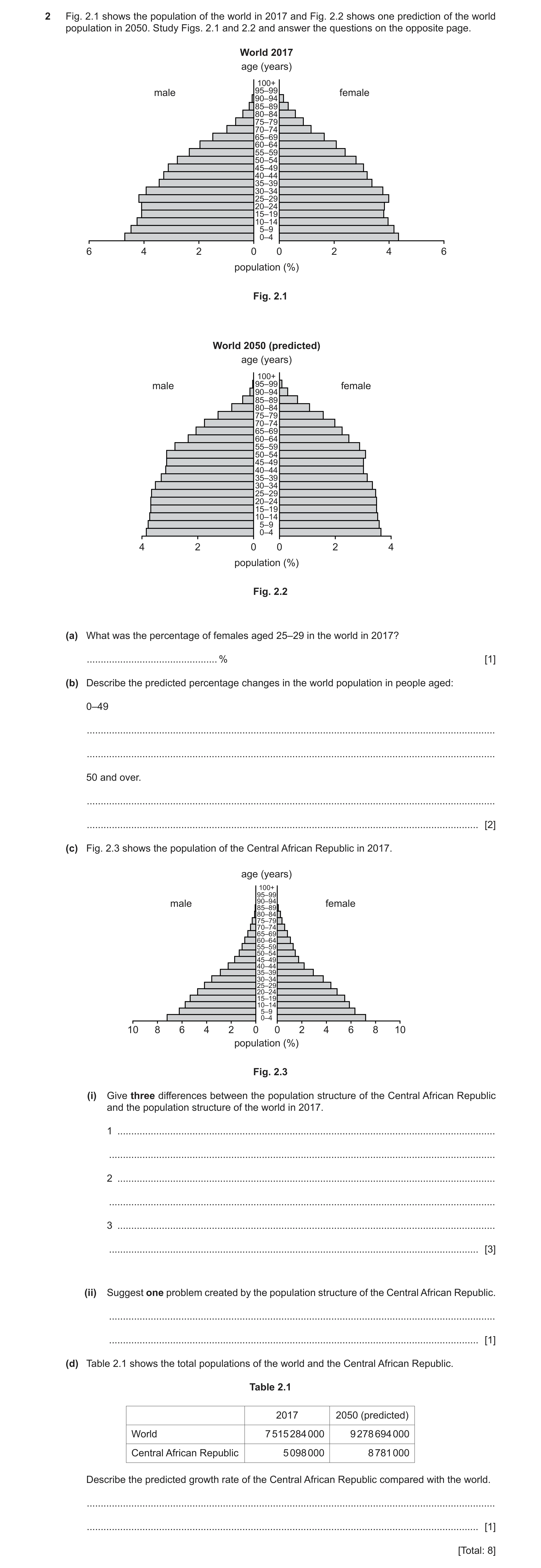
Q11 · The population of the world in 2017 and Fig 0460/22 Oct/Nov 2020
2 Fig. 2.1 shows the population of the world in 2017 and Fig. 2.2 shows one prediction of the world population in 2050. Study Figs. 2.1 and 2.2 and answer the questions on the opposite page. World 2017 age (years) 100+ male 95–99 female 90–94 85–89 80–84 75–79 70–74 65–69 60–64 55–59 50–54 45–49 40–44 35–39 30–34 25–29 20–24 15–19 10–14 5–9 0–4 6 4 2 0 0 2 4 6 population (%) Fig. 2.1 World 2050 (predicted) age (years) 100+ male 95–99 female 90–94 85–89 80–84 75–79 70–74 65–69 60–64 55–59 50–54 45–49 40–44 35–39 30–34 25–29 20–24 15–19 10–14 5–9 0–4 4 2 0 0 2 4 population (%) Fig. 2.2 (a) What was the percentage of females aged 25–29 in the world in 2017? … % [1] (b) Describe the predicted percentage changes in the world population in people aged: 0–49 … … 50 and over. … … [2] (c) Fig. 2.3 shows the population of the Central African Republic in 2017. age (years) 100+ 95–99 male 90–9485–89 female 80–84 75–79 70–74 65–69 60–64 55–59 50–54 45–49 40–44 35–39 30–34 25–29 20–24 15–19 10–14 5–9 0–4 10 8 6 4 2 0 0 2 4 6 8 10 population (%) Fig. 2.3 (i) Give three differences between the population structure of the Central African Republic and the population structure of the world in 2017. 1 … … 2 … … 3 … … [3] (ii) Suggest one problem created by the population structure of the Central African Republic. … … [1] (d) Table 2.1 shows the total populations of the world and the Central African Republic. Table 2.1 2017 2050 (predicted) World 7 515 284 000 9 278 694 000 Central African Republic 5 098 000 8 781 000 Describe the predicted growth rate of the Central African Republic compared with the world. … … [1] [Total: 8]
8 marks
Mark scheme: 2(a) 4(%) 1 2(b) 0 – 49 decrease, 2 50 and over increase, Must state changes. 2(c)(i) CAR more young/young dependents/0 – 29, 3 CAR fewer middle aged/working age/15 – 54, CAR fewer old/old dependents/50 – 100, Or emphasis on the world. 2(c)(ii) small(er) working population/great(er) dependent population, 1 cost of/demand for education, cost of/demand for health services, cost of/demand for food, future high unemployment, future high birth rate/population growth, 2(d) CAR increasing at a faster rate/CAR 72% World 23%, 1 Comparison needed.
This question in 0460/22 Oct/Nov 2020
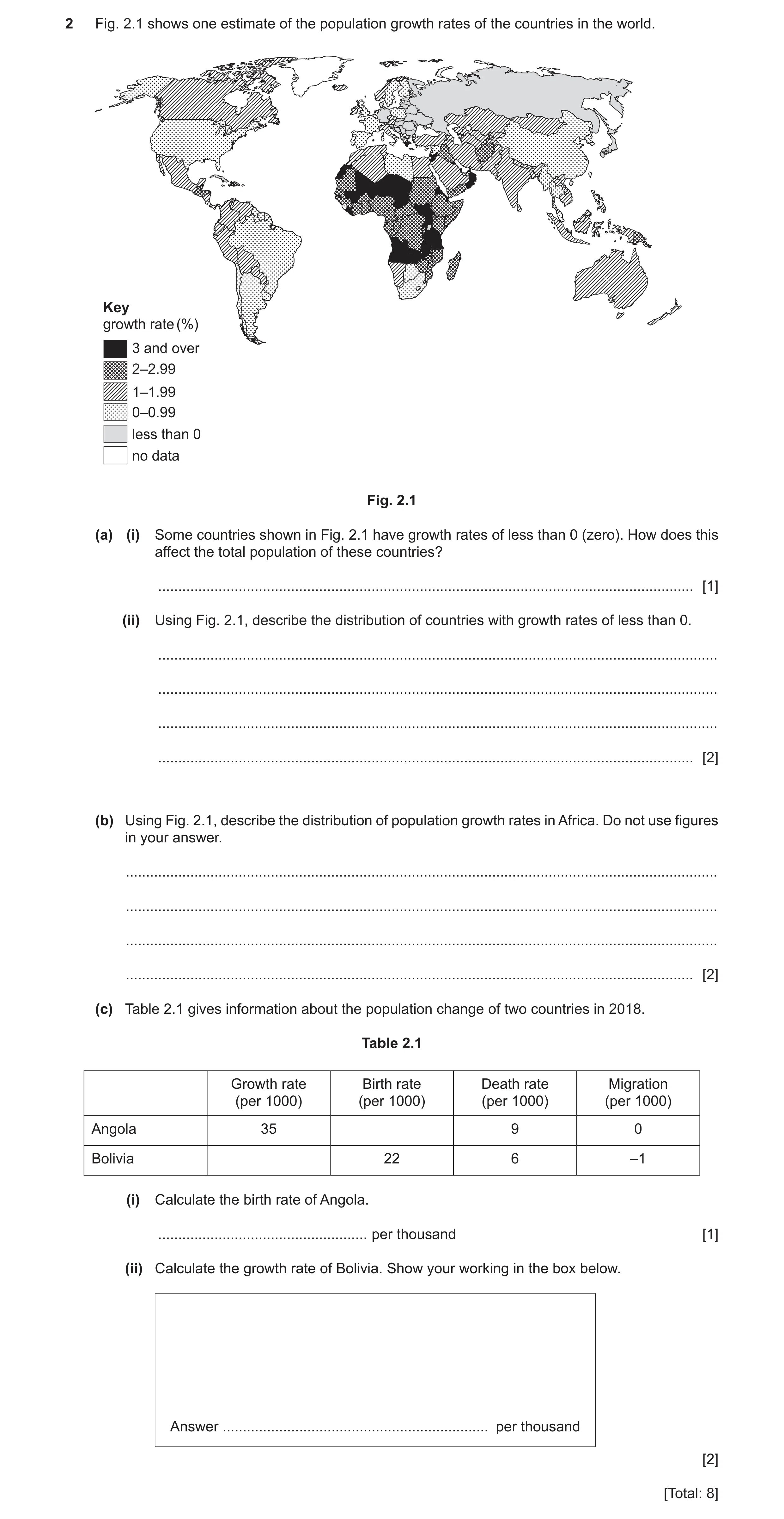
Q12 · One estimate of the population growth rates of the countries in the world 0460/23 Oct/Nov 2020
2 Fig. 2.1 shows one estimate of the population growth rates of the countries in the world. Key growth rate (%) 3 and over 2–2.99 1–1.99 0–0.99 less than 0 no data Fig. 2.1 (a) (i) Some countries shown in Fig. 2.1 have growth rates of less than 0 (zero). How does this affect the total population of these countries? … [1] (ii) Using Fig. 2.1, describe the distribution of countries with growth rates of less than 0. … … … … [2] (b) Using Fig. 2.1, describe the distribution of population growth rates in Africa. Do not use figures in your answer. … … … … [2] (c) Table 2.1 gives information about the population change of two countries in 2018. Table 2.1 Growth rate Birth rate Death rate Migration (per 1000) (per 1000) (per 1000) (per 1000) Angola 35 9 0 Bolivia 22 6 –1 (i) Calculate the birth rate of Angola. … per thousand [1] (ii) Calculate the growth rate of Bolivia. Show your working in the box below. Answer … per thousand [2] [Total: 8]
8 marks
Mark scheme: 2(a)(i) population is decreasing, 1 2(a)(ii) Asia/Russia/Eurasia, 2 Eastern Europe, in the north/north east, 2(b) high(er)(est) in the centre/nearer to equator/in tropics/subtropics, 2 low(er)(est) in north/south, slightly lower along equator, 2(c)(i) 44, 1 2(c)(ii) birth rate – death rate + or – migration, 2 or 22 – 6 – 1, (allow 22 – (6 + 1)) 15,
This question in 0460/23 Oct/Nov 2020
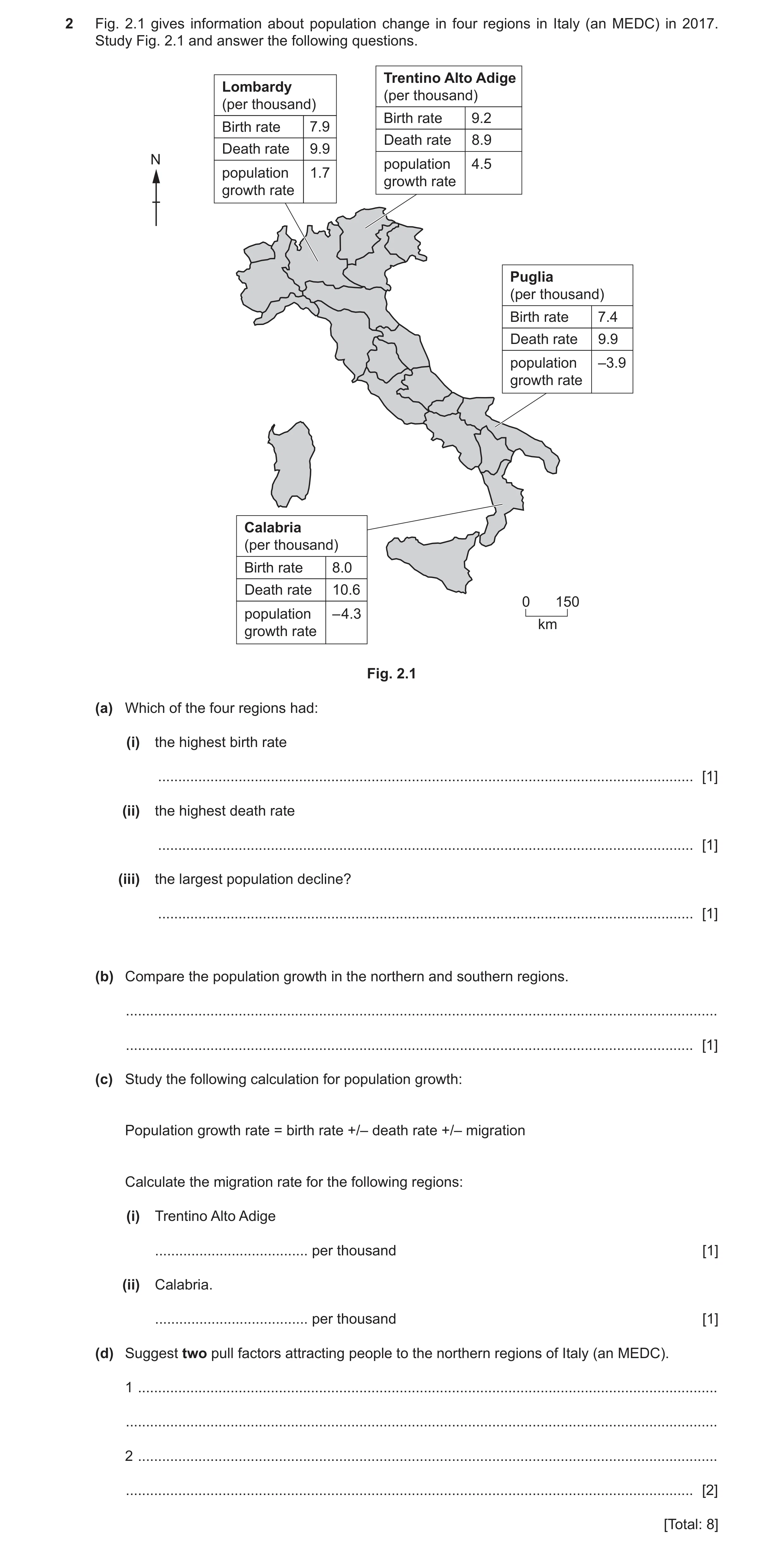
Q13 · Information about population change in four regions in Italy (an MEDC) in 2017 0460/23 May/June 2021
2 Fig. 2.1 gives information about population change in four regions in Italy (an MEDC) in 2017. Study Fig. 2.1 and answer the following questions. Trentino Alto Adige Lombardy (per thousand) (per thousand) Birth rate 9.2 Birth rate 7.9 Death rate 8.9 Death rate 9.9 N population 4.5 population 1.7 growth rate growth rate Puglia (per thousand) Birth rate 7.4 Death rate 9.9 population –3.9 growth rate Calabria (per thousand) Birth rate 8.0 Death rate 10.6 0 150 population – 4.3 km growth rate Fig. 2.1 (a) Which of the four regions had: (i) the highest birth rate … [1] (ii) the highest death rate … [1] (iii) the largest population decline? … [1] (b) Compare the population growth in the northern and southern regions. … … [1] (c) Study the following calculation for population growth: Population growth rate = birth rate +/– death rate +/– migration Calculate the migration rate for the following regions: (i) Trentino Alto Adige … per thousand [1] (ii) Calabria. … per thousand [1] (d) Suggest two pull factors attracting people to the northern regions of Italy (an MEDC). 1 … … 2 … … [2] [Total: 8]
8 marks
Mark scheme: 2(a)(i) Trentino Alto Adige, 1 2(a)(ii) Calabria, 1 2(a)(iii) Calabria, 1 2(b) higher in the north/lower in the south, 1 increases to the north/decreases to the south, positive in the north and negative in the south, 2(c)(i) 4.2 (per thousand) 1 2(c)(ii) –1.7 (per thousand) 1 2(d) jobs/higher wages, 2 family/friends live there, shops, leisure/entertainment, medical care, education, wealthy area/higher GDP/higher standard of living,
This question in 0460/23 May/June 2021
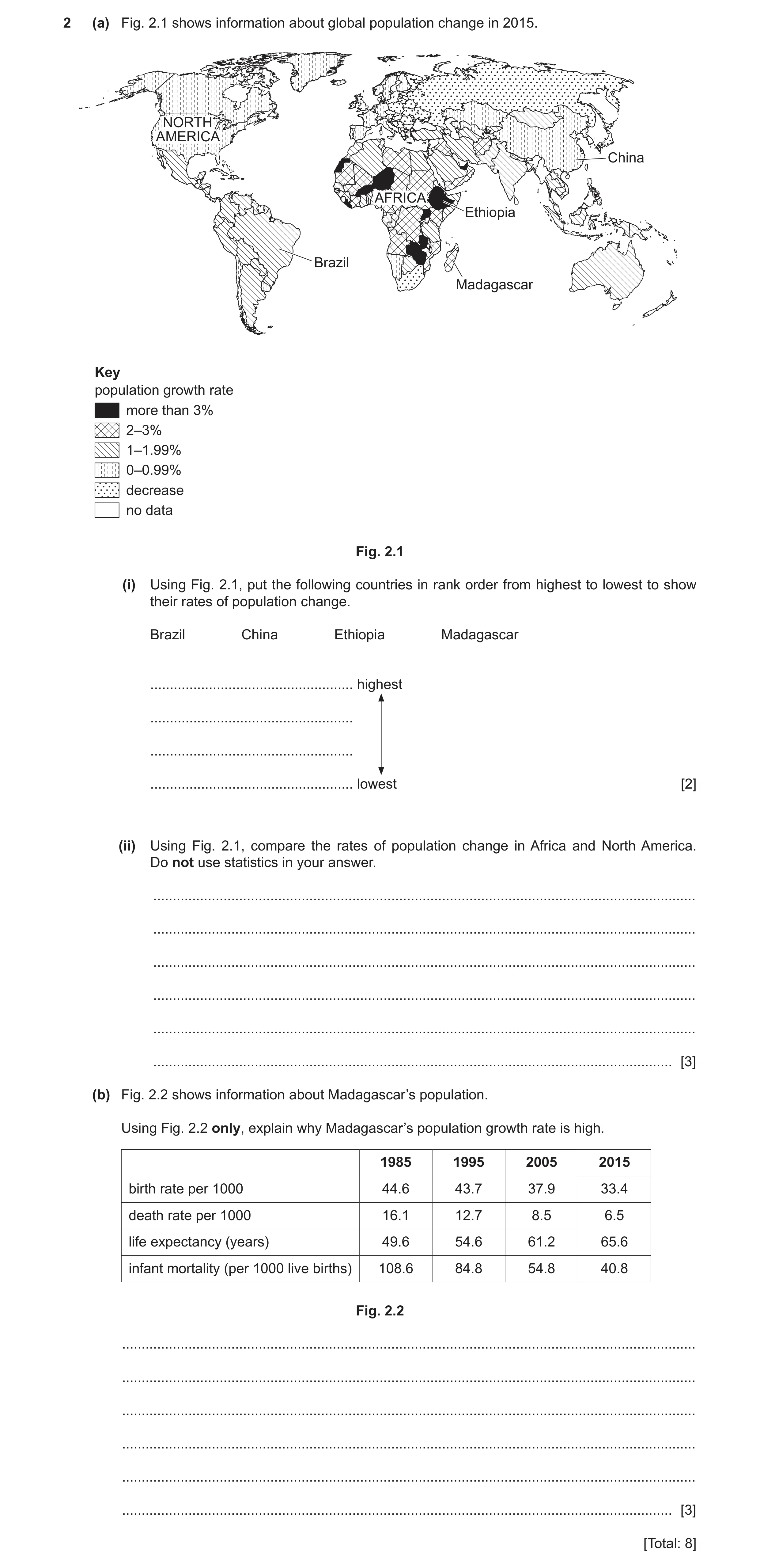
Q14 · Information about global population change in 2015 0460/22 Oct/Nov 2022
2 (a) Fig. 2.1 shows information about global population change in 2015. NORTH AMERICA China AFRICA Ethiopia Brazil Madagascar Key population growth rate more than 3% 2–3% 1–1.99% 0–0.99% decrease no data Fig. 2.1 (i) Using Fig. 2.1, put the following countries in rank order from highest to lowest to show their rates of population change. Brazil China Ethiopia Madagascar … highest … … … lowest [2] (ii) Using Fig. 2.1, compare the rates of population change in Africa and North America. Do not use statistics in your answer. … … … … … … [3] (b) Fig. 2.2 shows information about Madagascar’s population. Using Fig. 2.2 only, explain why Madagascar’s population growth rate is high. 1985 1995 2005 2015 birth rate per 1000 44.6 43.7 37.9 33.4 death rate per 1000 16.1 12.7 8.5 6.5 life expectancy (years) 49.6 54.6 61.2 65.6 infant mortality (per 1000 live births) 108.6 84.8 54.8 40.8 Fig. 2.2 … … … … … … [3] [Total: 8]
8 marks
Mark scheme: 2(a)(i) Ethiopia 2 Madagascar Brazil China 2(a)(ii) Higher in Africa/lower in N America; (can refer to growth rate or change) 3 (extract if separate sentences for Africa and N America) More variation/categories/differences in Africa/less variation/more consistent/in N America; Some parts/a part of Africa have/has same growth rate as N America; Part of Africa shows decrease whereas N America doesn’t. 2(b) Birth rate is higher than death rate/high birth rate vs. low death rate; 3 Death rate is falling; Life expectancy is increasing; Infant mortality is falling.
This question in 0460/22 Oct/Nov 2022
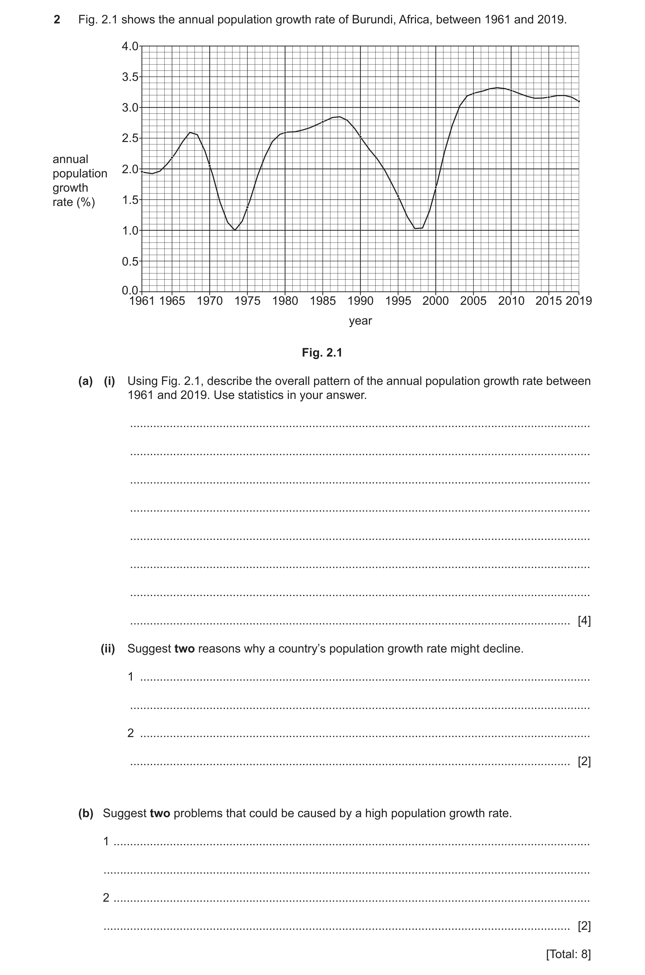
Q15 · The annual population growth rate of Burundi, Africa, between 1961 and 2019 0460/21 Oct/Nov 2023
2 Fig. 2.1 shows the annual population growth rate of Burundi, Africa, between 1961 and 2019. 4.0 3.5 3.0 2.5 annual 2.0population growth rate (%) 1.5 1.0 0.5 0.0 1961 1965 1970 1975 1980 1985 1990 1995 2000 2005 2010 2015 2019 year Fig. 2.1 (a) (i) Using Fig. 2.1, describe the overall pattern of the annual population growth rate between 1961 and 2019. Use statistics in your answer. … … … … … … … … [4] (ii) Suggest two reasons why a country’s population growth rate might decline. 1 … … 2 … … [2] (b) Suggest two problems that could be caused by a high population growth rate. 1 … … 2 … … [2] [Total: 8]
8 marks
Mark scheme: 2(a)(i) Overall increase; 4 Starts at/from 1.9% (allow up to 1.95%) and ends at/to 3.1%; Varies/fluctuates; Three peaks/2 troughs; Levelling from 2004/2005; Highest in 2008 and lowest in 1973; Highest 3.3% (allow up to 3.34%) and lowest 1.0%. Note: 1 mark reserve for statistics. 2(a)(ii) Out-migration; 2 Increase in death rate; Named death rate factor e.g. disease, war; Decrease in birth rate/fertility rate; Named birth rate factor e.g. increase in contraception use/abortions/women working/late(r) marriage/government policy. 2(b) Poverty/people poor/government poor; 2 Hunger/cannot get enough food/stress on agricultural land; Stress on water/electricity; Stress on hospitals/education; Disease spread more quickly; Political instability; Lack of jobs; Overcrowded housing/shortage of housing; Traffic congestion; Environmental degradation/litter/trash; Increase in air/water/noise pollution.
This question in 0460/21 Oct/Nov 2023
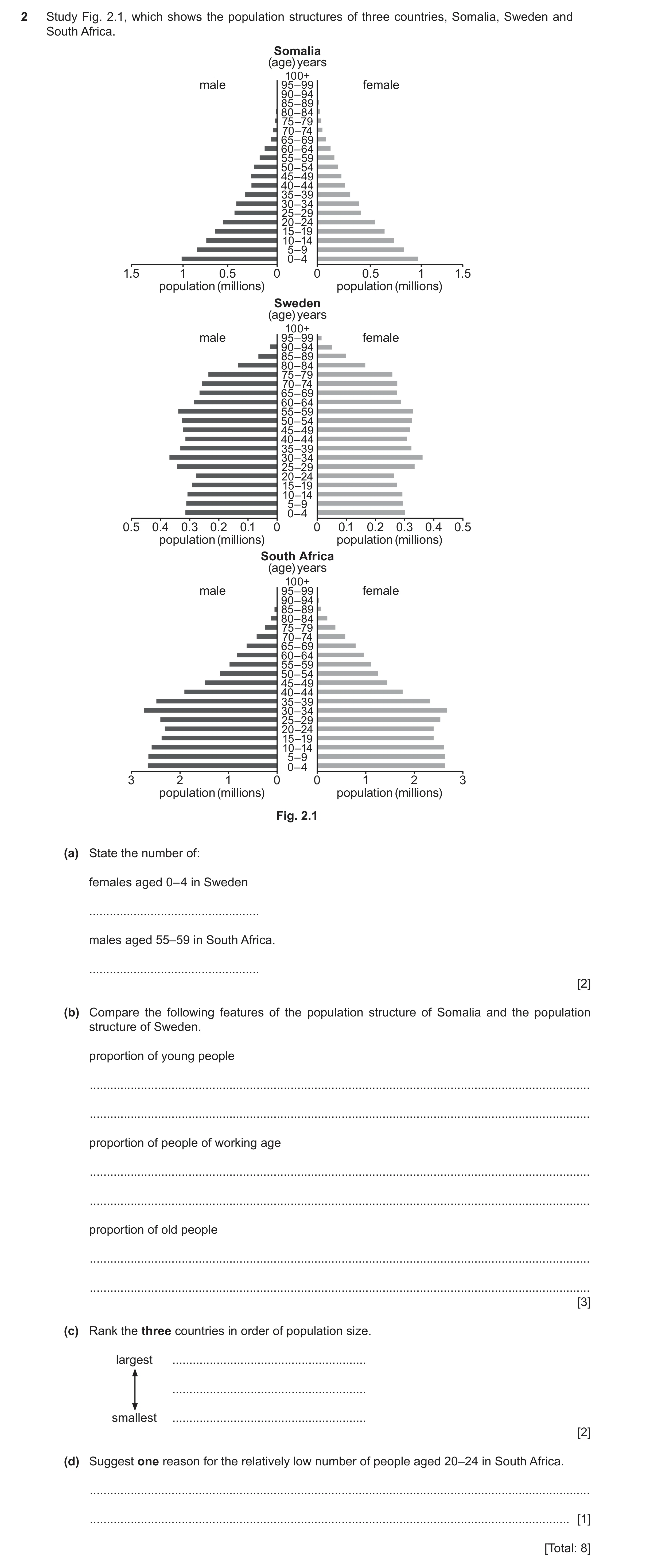
Question 16 0460/22 Oct/Nov 2024
2 Study Fig. 2.1, which shows the population structures of three countries, Somalia, Sweden and South Africa. Somalia (age) years 100+ male 95–99 female 90–94 85–89 80–84 75–79 70–74 65–69 60–64 55–59 50–54 45–49 40–44 35–39 30–34 25–29 20–24 15–19 10–14 5–9 0–4 1.5 1 0.5 0 0 0.5 1 1.5 population (millions) population (millions) Sweden (age) years 100+ male 95–99 female 90–94 85–89 80–84 75–79 70–74 65–69 60–64 55–59 50–54 45–49 40–44 35–39 30–34 25–29 20–24 15–19 10–14 5–9 0–4 0.5 0.4 0.3 0.2 0.1 0 0 0.1 0.2 0.3 0.4 0.5 population (millions) population (millions) South Africa (age) years 100+ male 95–99 female 90–94 85–89 80–84 75–79 70–74 65–69 60–64 55–59 50–54 45–49 40–44 35–39 30–34 25–29 20–24 15–19 10–14 5–9 0–4 3 2 1 0 0 1 2 3 population (millions) population (millions) Fig. 2.1 (a) State the number of: females aged 0– 4 in Sweden … males aged 55–59 in South Africa. … [2] (b) Compare the following features of the population structure of Somalia and the population structure of Sweden. proportion of young people … … proportion of people of working age … … proportion of old people … … [3] (c) Rank the three countries in order of population size. largest … … smallest … [2] (d) Suggest one reason for the relatively low number of people aged 20–24 in South Africa. … … [1] [Total: 8]
8 marks
Mark scheme: 2(a) 300 thousand/300 000/0.3 million; 2 950 thousand/950 000/0.95 million/1 million/1 000 000. 2(b) Young – Somalia more/Sweden less; 3 Working – Somalia less/Sweden more; Old – Somalia less/Sweden more. NOTE: Allow higher/lower/highest/lowest etc. Only credit reference to the whole group. Not part e.g. 20–29-year-olds. 2(c) South Africa 2 Somalia Sweden 3 correct = 2, 1 correct = 1 2(d) Low birth rate; 1 High infant mortality rate; Emigration; Famine; Disease; War; Natural disaster.
This question in 0460/22 Oct/Nov 2024
Question 17 0460/23 Oct/Nov 2024
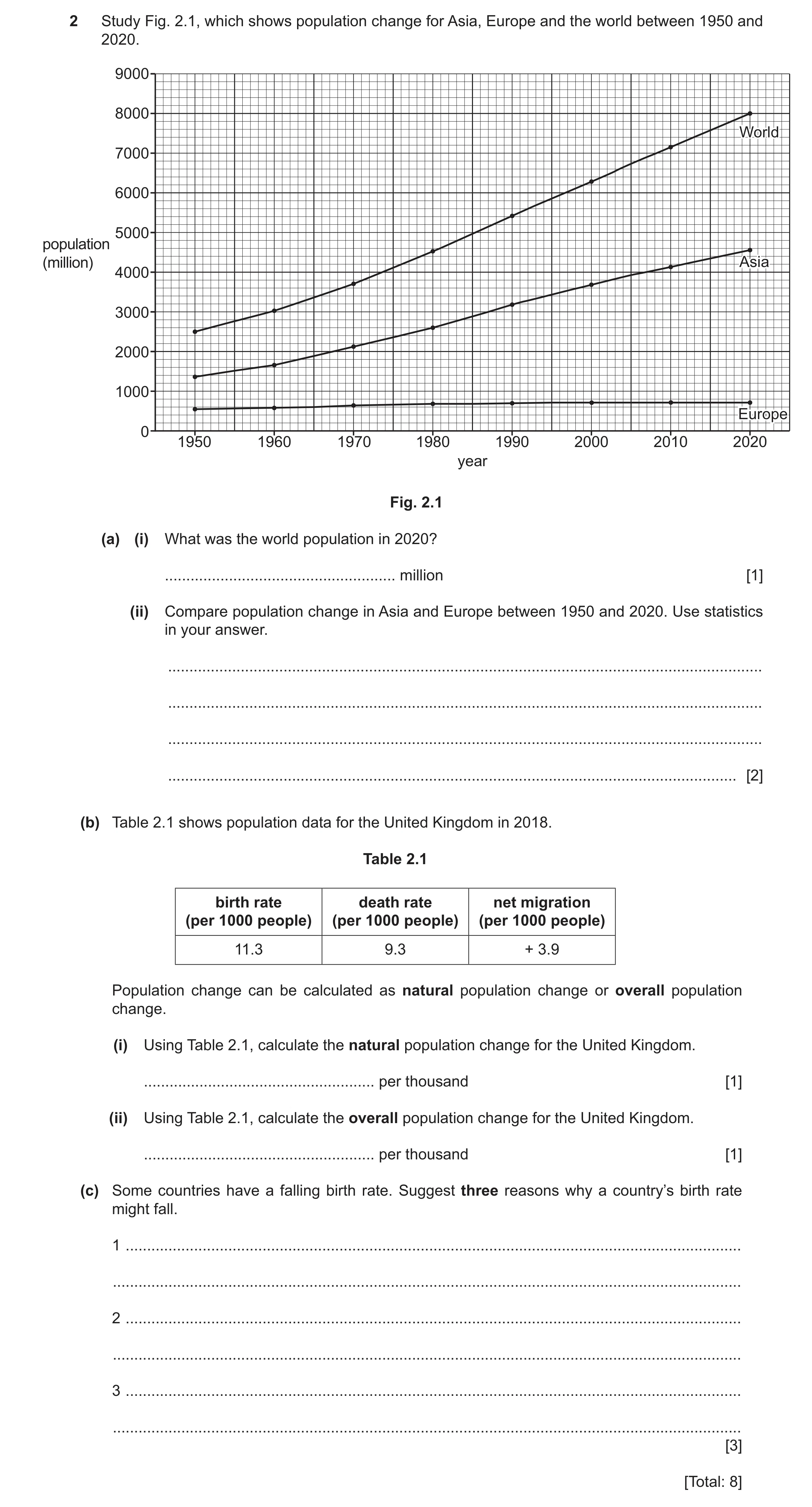
2 Study Fig. 2.1, which shows population change for Asia, Europe and the world between 1950 and 2020. 9000 8000 WorldWorld 7000 6000 5000 population (million) AsiaAsia 4000 3000 2000 1000 EuropeEurope 0 1950 1960 1970 1980 1990 2000 2010 2020 year Fig. 2.1 (a) (i) What was the world population in 2020? … million [1] (ii) Compare population change in Asia and Europe between 1950 and 2020. Use statistics in your answer. … … … … [2] (b) Table 2.1 shows population data for the United Kingdom in 2018. Table 2.1 birth rate death rate net migration (per 1000 people) (per 1000 people) (per 1000 people) 11.3 9.3 + 3.9 Population change can be calculated as natural population change or overall population change. (i) Using Table 2.1, calculate the natural population change for the United Kingdom. … per thousand [1] (ii) Using Table 2.1, calculate the overall population change for the United Kingdom. … per thousand [1] (c) Some countries have a falling birth rate. Suggest three reasons why a country’s birth rate might fall. 1 … … 2 … … 3 … … [3] [Total: 8]
8 marks
Mark scheme: 2(a)(i) 8000 1 2(a)(ii) Both increased (overall); 2 Bigger increase in Asia; Asia big increase/more than doubled and Europe slow/small increase /remained steady; Asia from 1300–1400 million to 4500–4600 million/ by 3100–3300 million and Europe from 500-600 million to 700–750 million/ by 100–250 million; NOTE 1 mark for statement, 1 mark for statistics. Million only needed once. Accept calculated difference in range. 2(b)(i) (+) 2 1 2(b)(ii) (+) 5.9 1 2(c) Contraception/birth control/family planning/knowledge of family planning; 3 (Greater access to) abortion; More female employment/career; Education of girls; Later marriage; Less infant mortality (or described); Less child labour/farm labour replaced by machinery; Children not needed for economic support/pensions; Children are expensive to bring up/increase in/high cost of living; Effect of government policies; War; Famine.
This question in 0460/23 Oct/Nov 2024
 8
8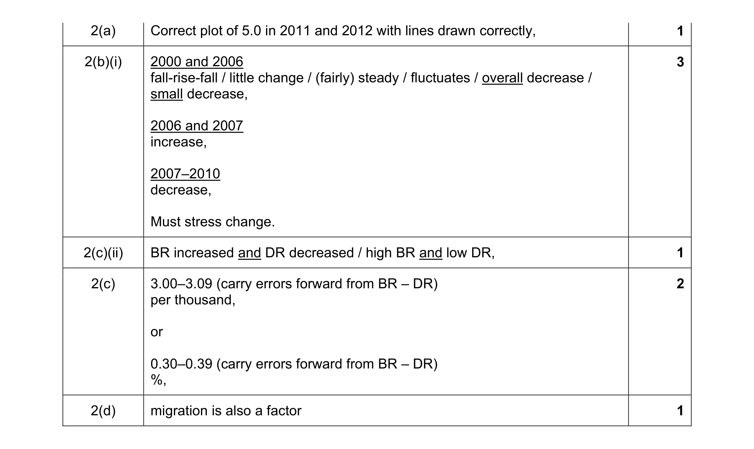 8
8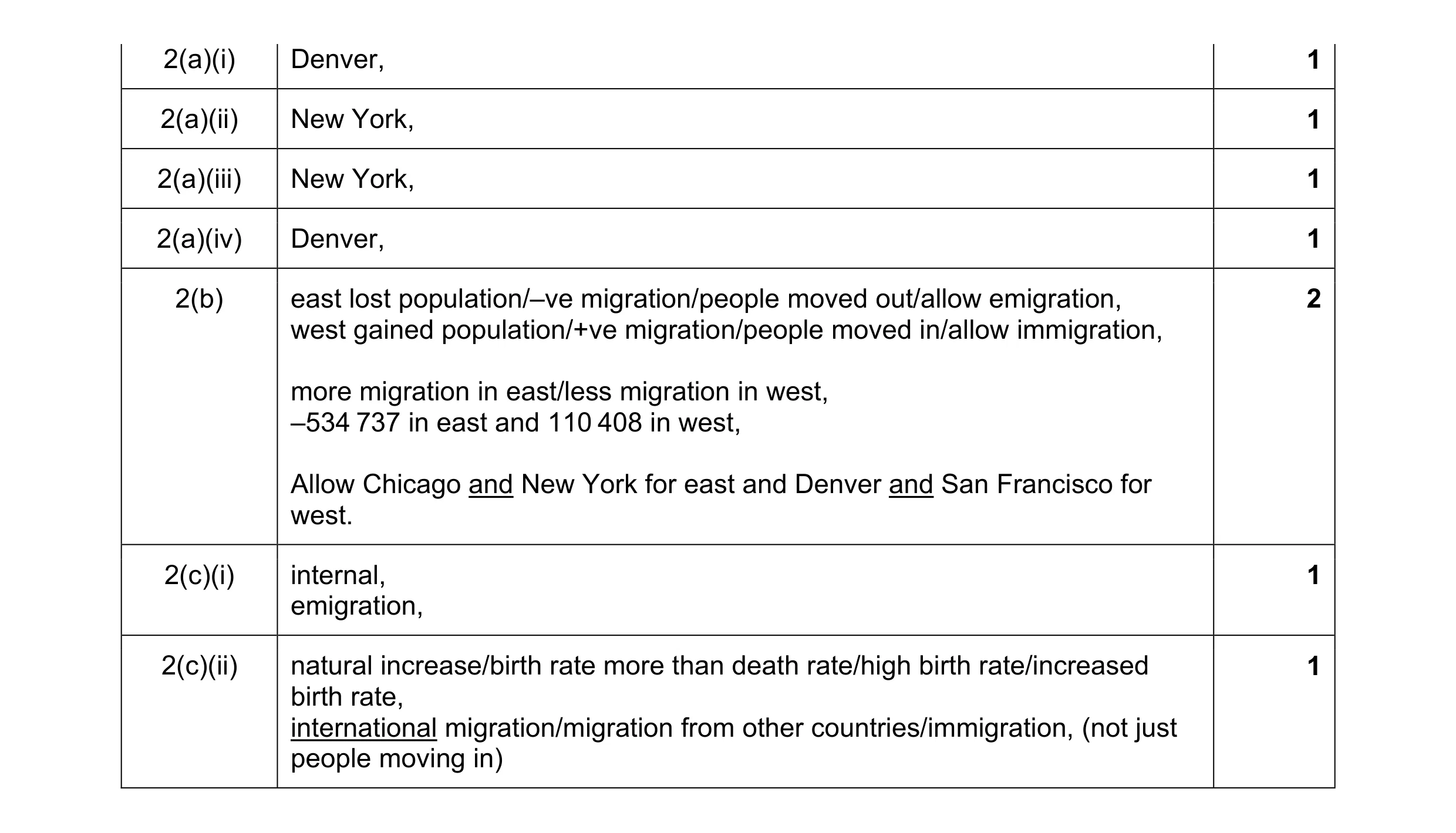 8
8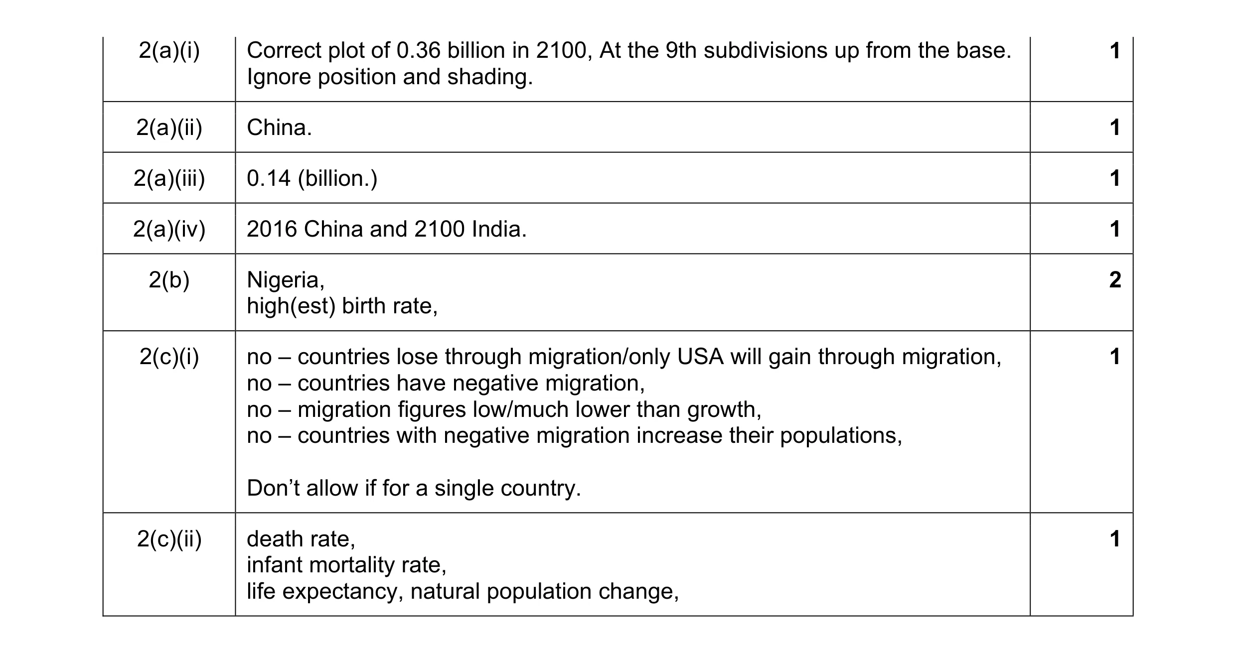 8
8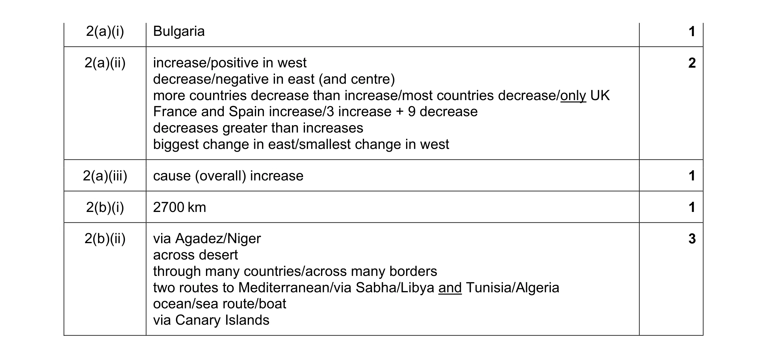 8
8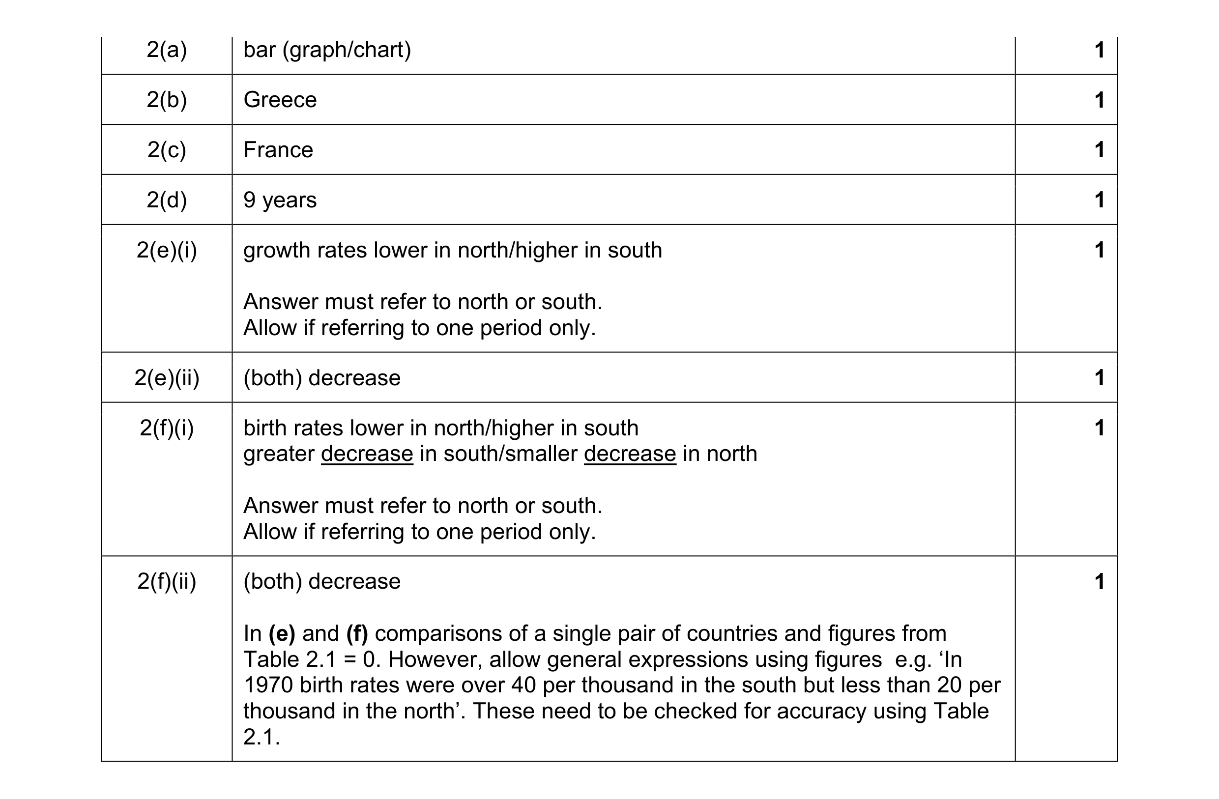 8
8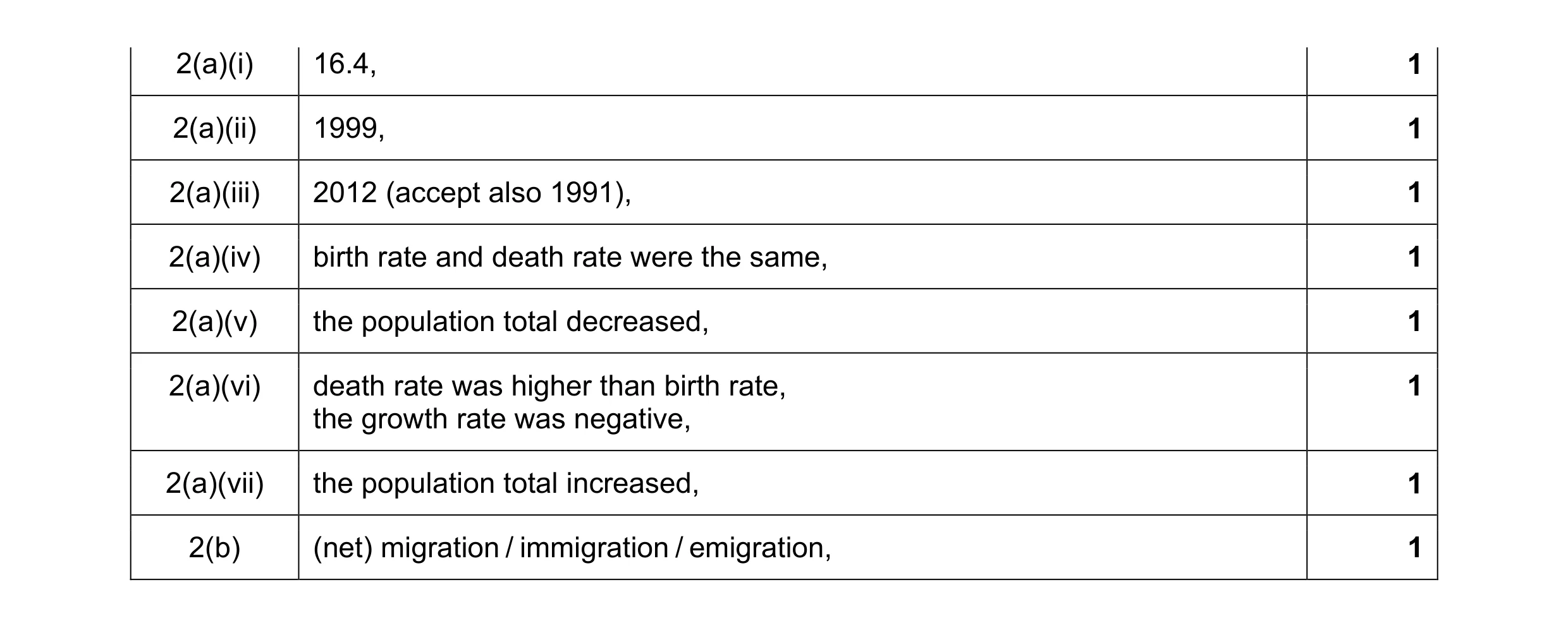 8
8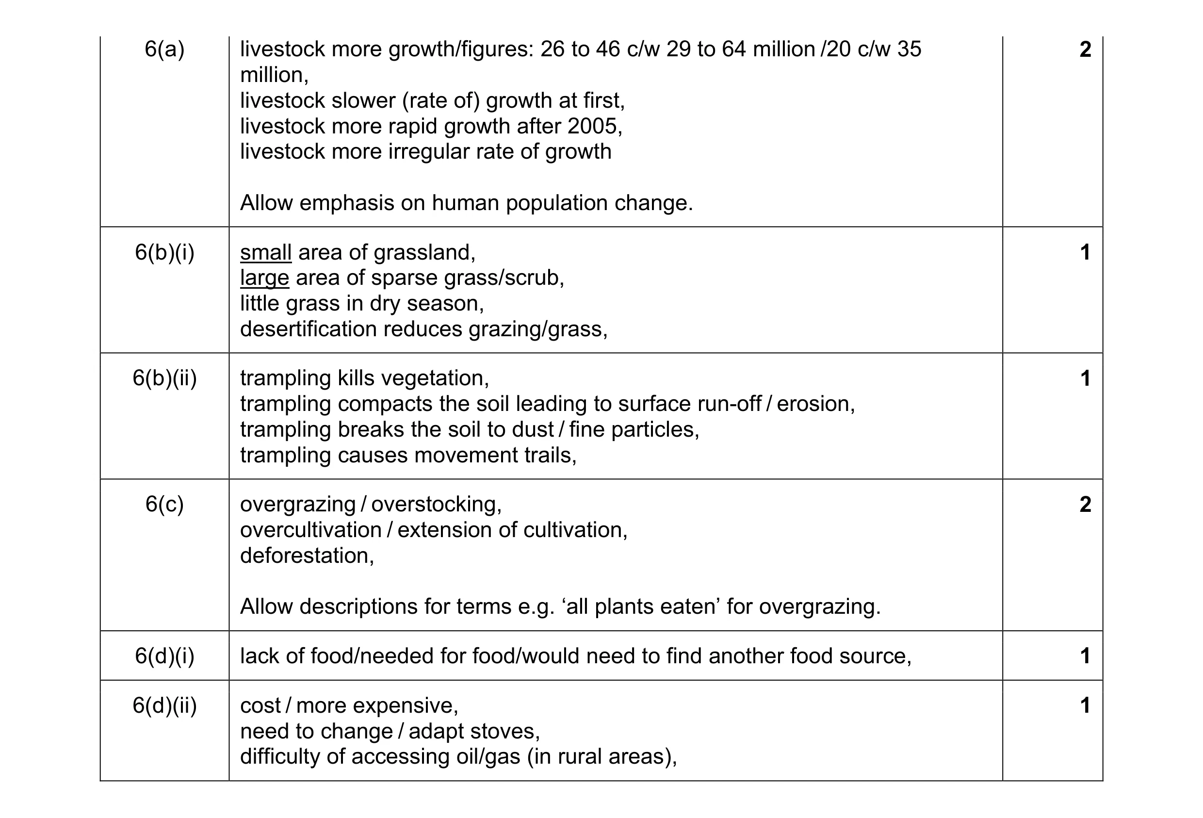 8
8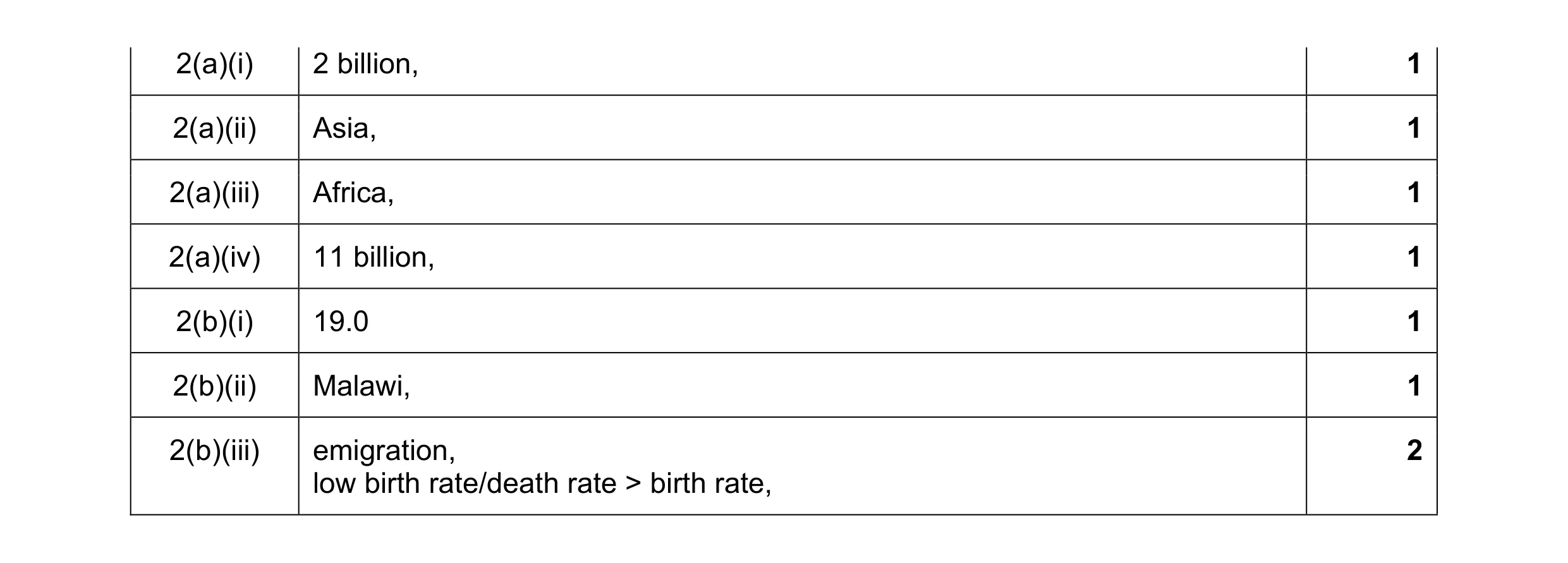 8
8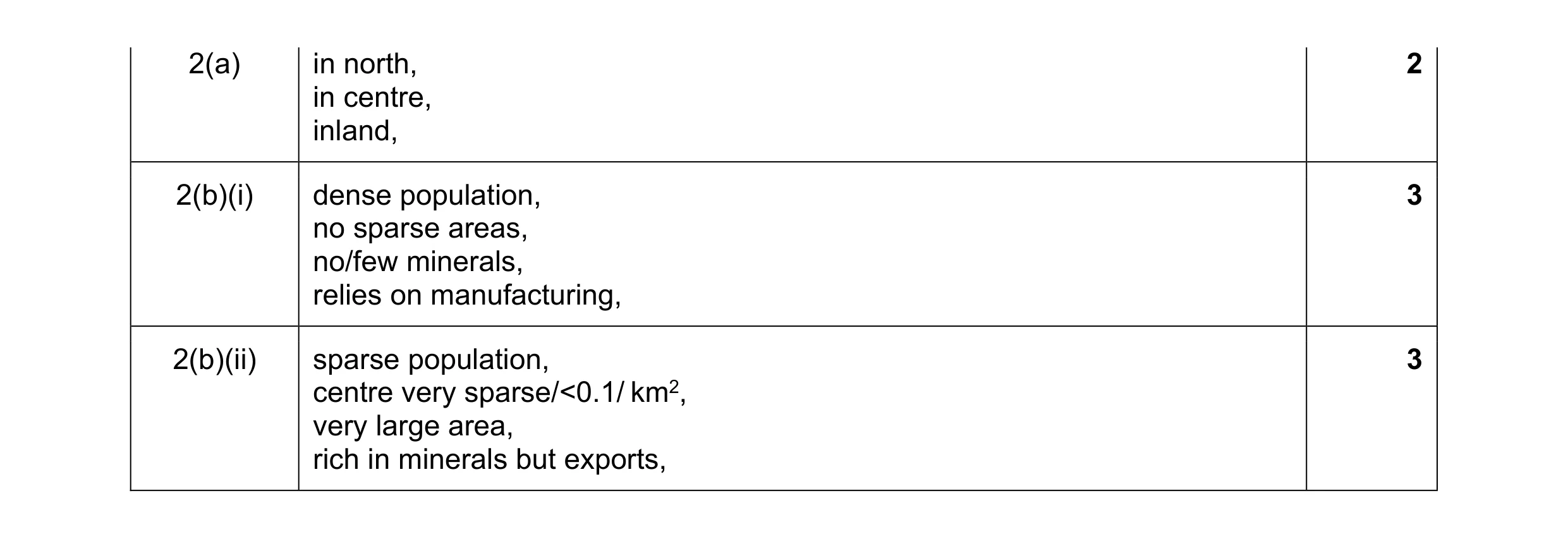 8
8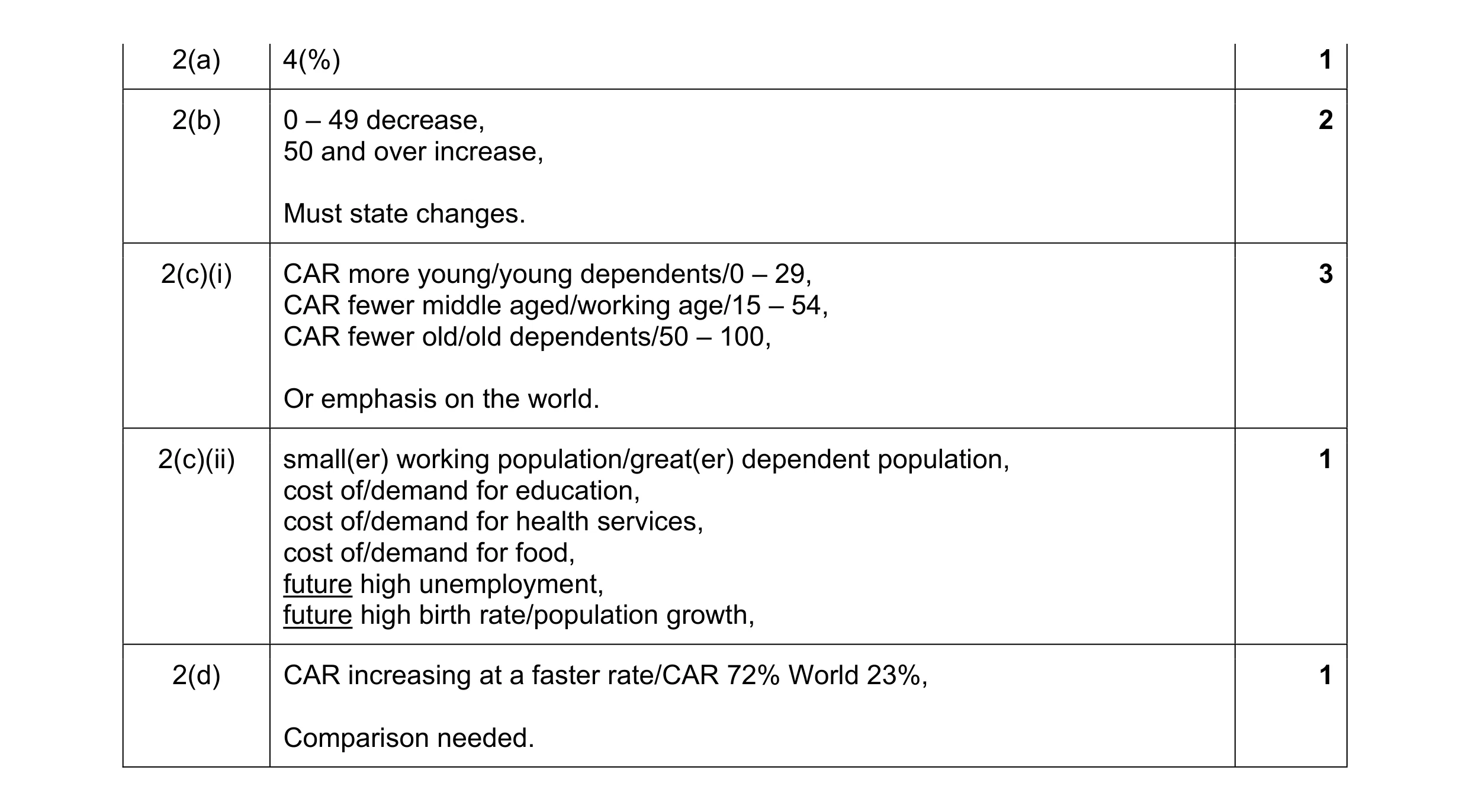 8
8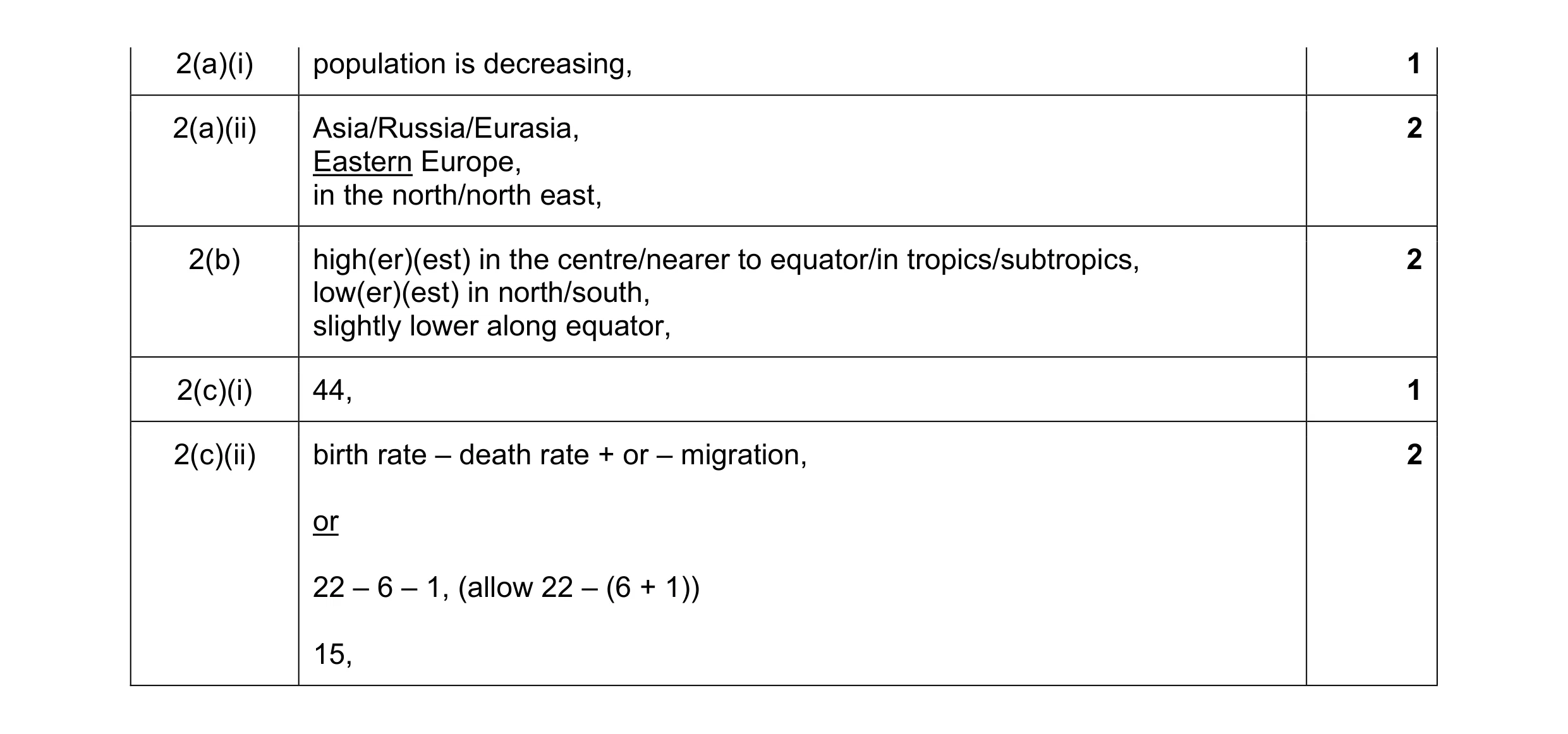 8
8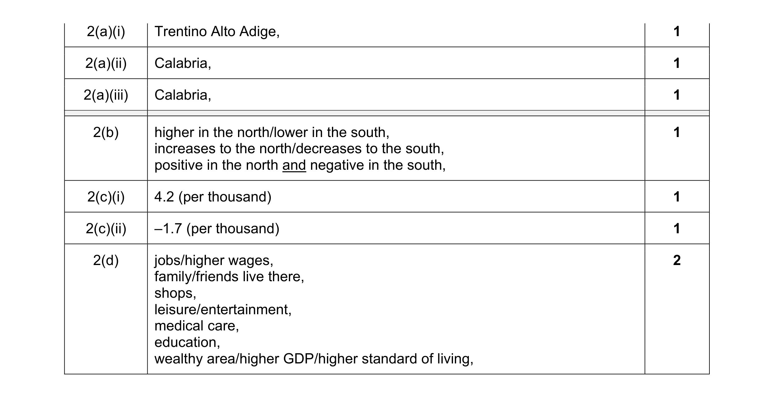 8
8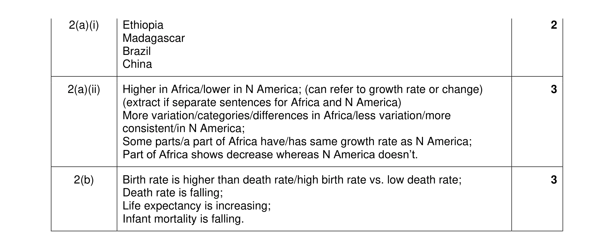 8
8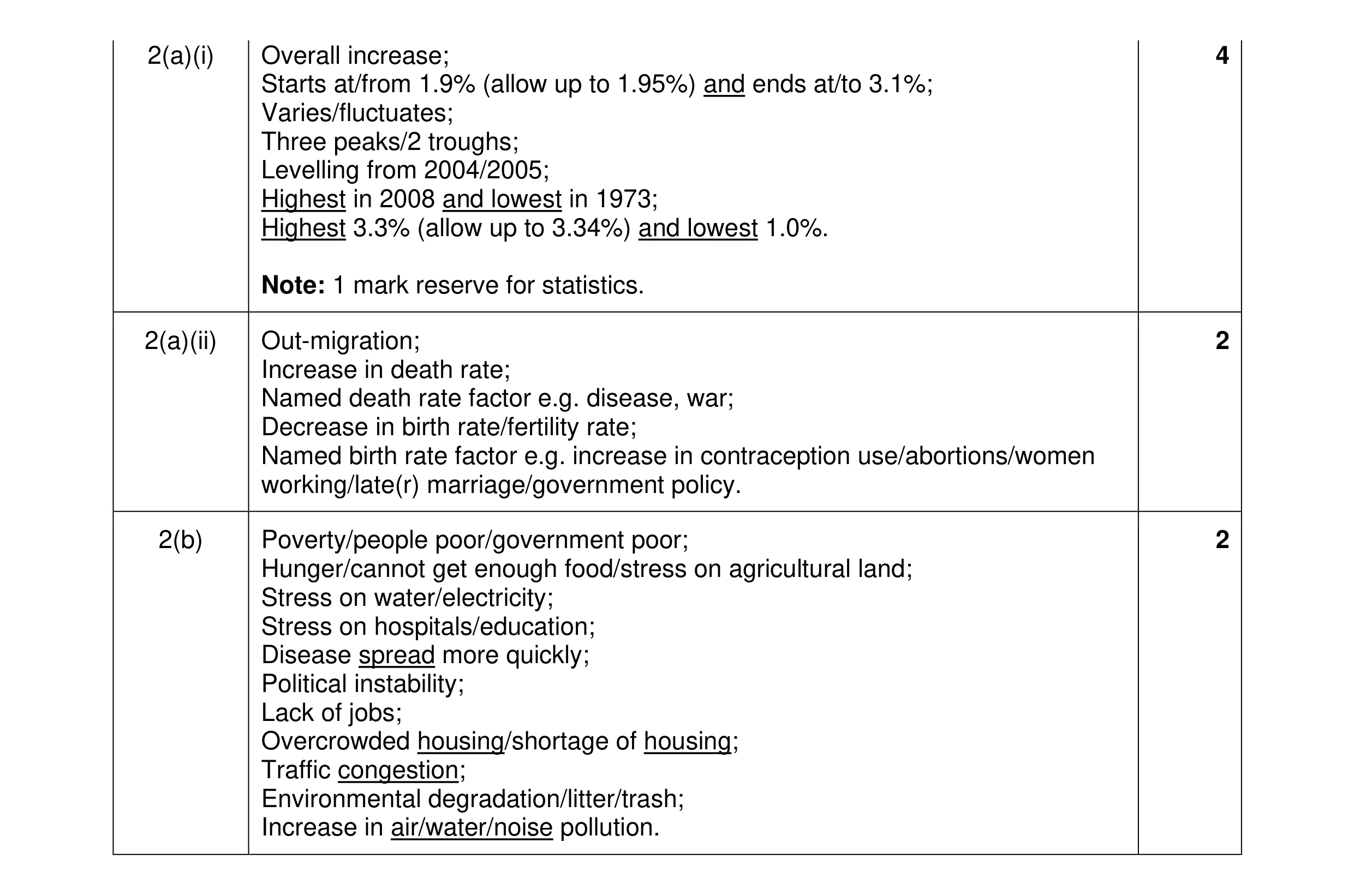 8
8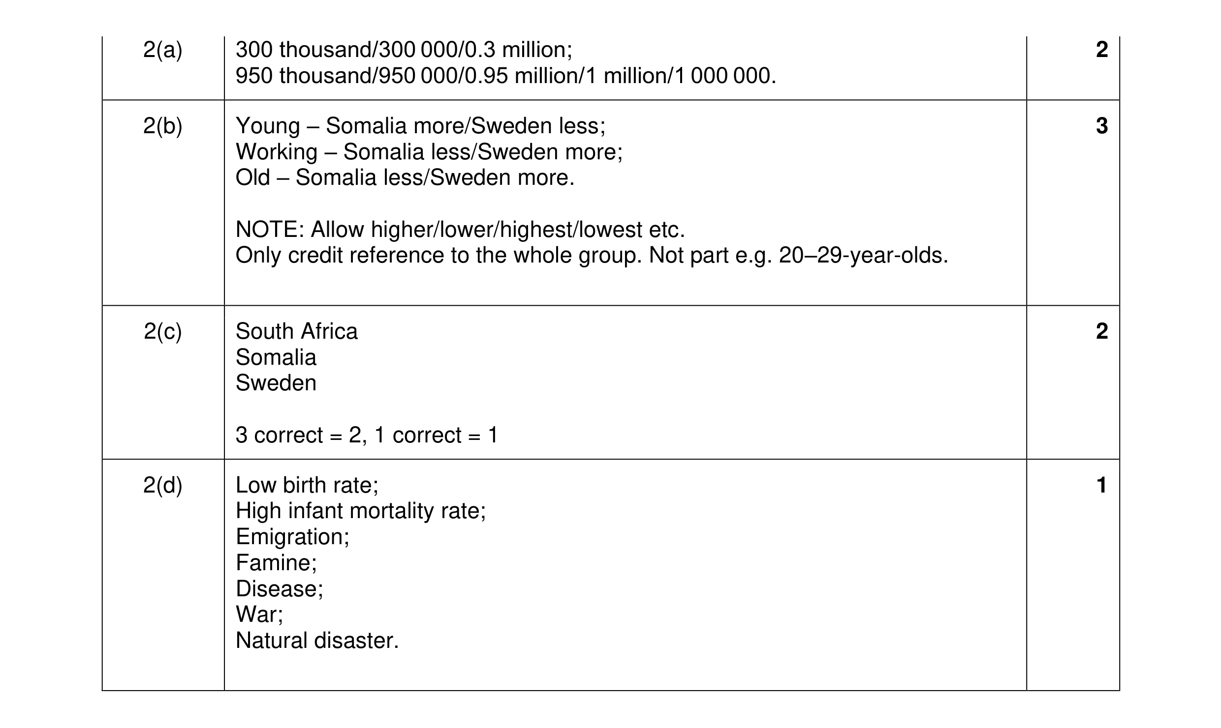 8
8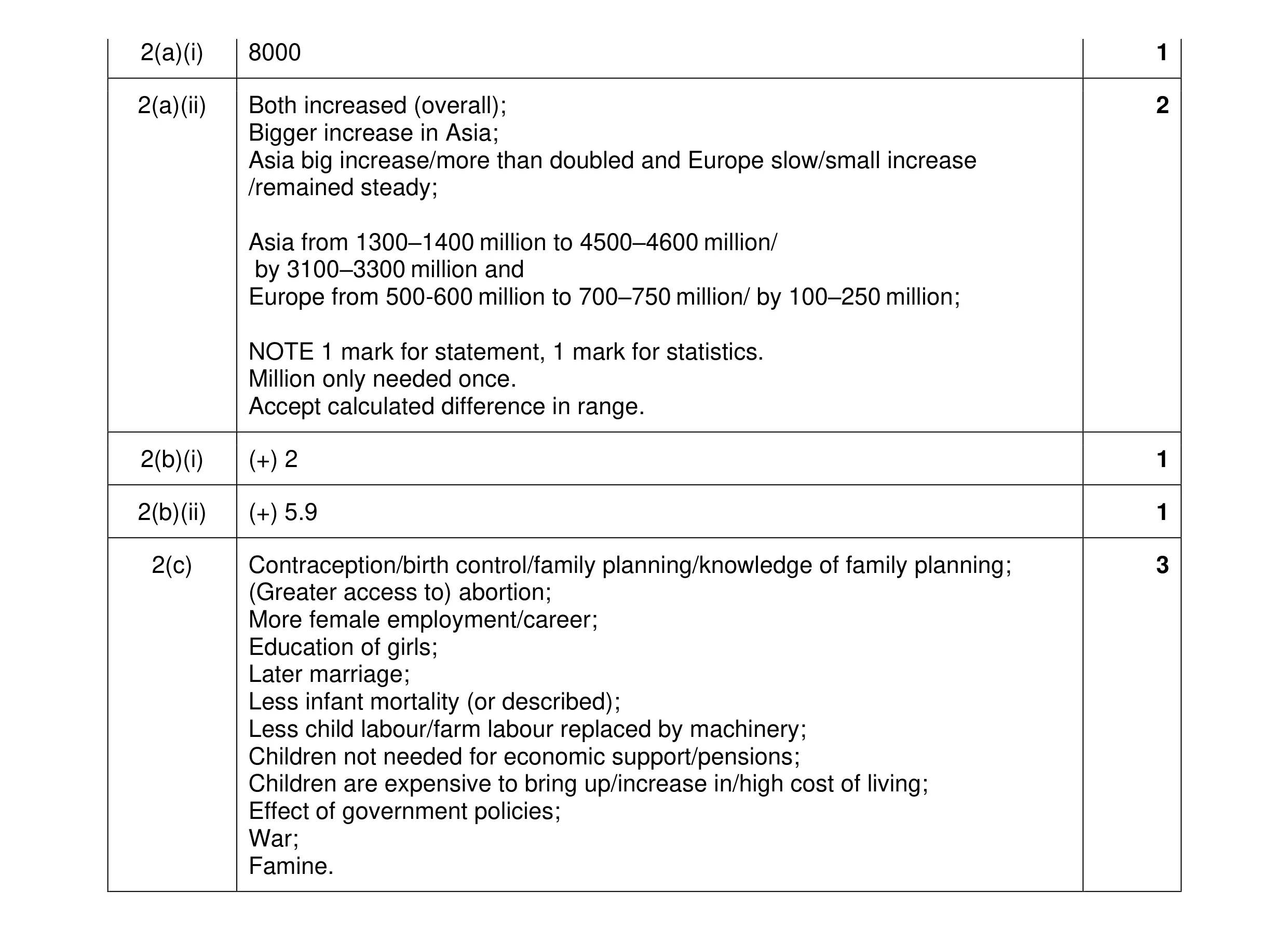 8
8