Questions as text
Q1 · Which one of the following statements describes a transnational corporation? 0460/22 May/June 2019
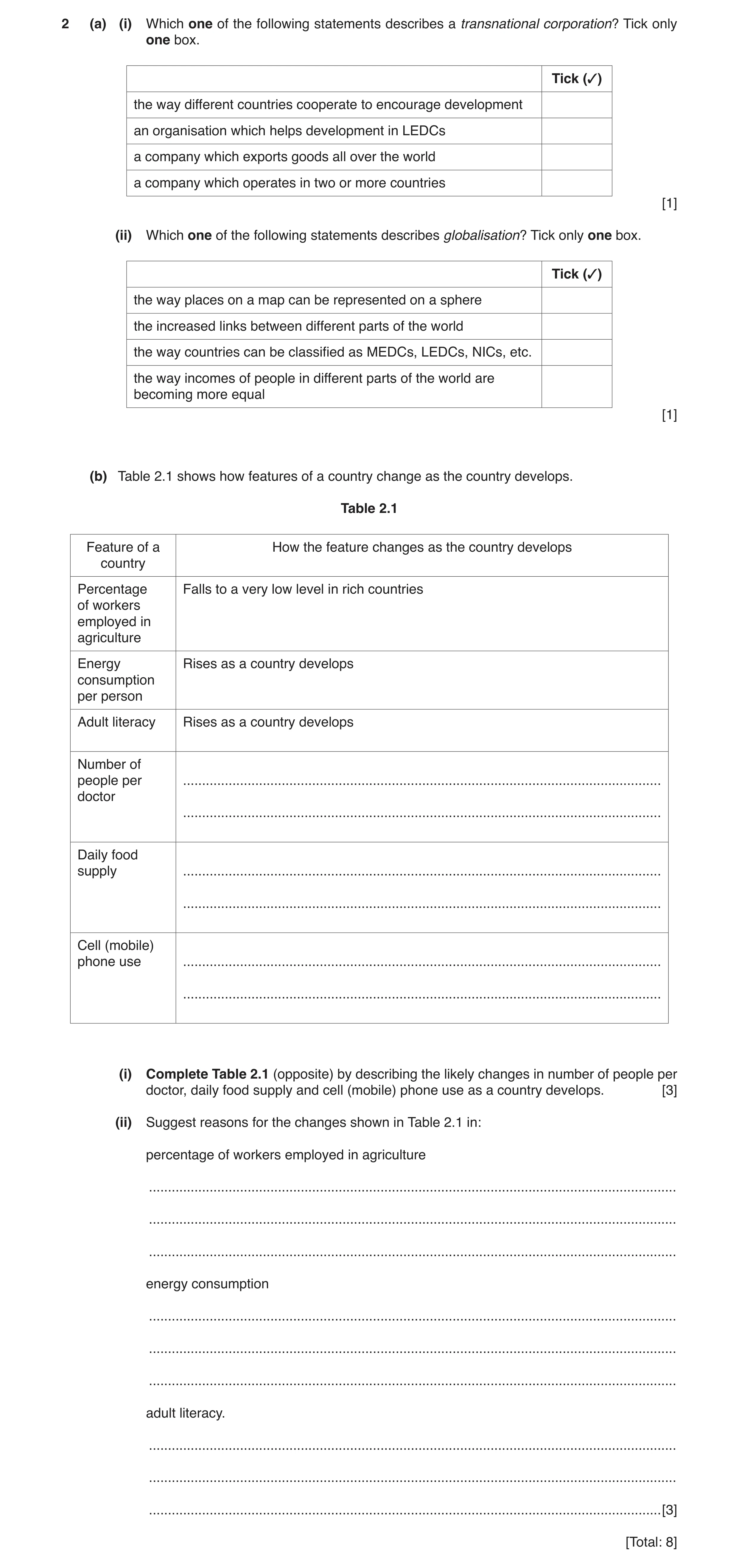
2 (a) (i) Which one of the following statements describes a transnational corporation? Tick only one box. Tick (✓) the way different countries cooperate to encourage development an organisation which helps development in LEDCs a company which exports goods all over the world a company which operates in two or more countries [1] (ii) Which one of the following statements describes globalisation? Tick only one box. Tick (✓) the way places on a map can be represented on a sphere the increased links between different parts of the world the way countries can be classified as MEDCs, LEDCs, NICs, etc. the way incomes of people in different parts of the world are becoming more equal [1] (b) Table 2.1 shows how features of a country change as the country develops. Table 2.1 Feature of a How the feature changes as the country develops country Percentage Falls to a very low level in rich countries of workers employed in agriculture Energy Rises as a country develops consumption per person Adult literacy Rises as a country develops Number of people per … doctor … Daily food supply … … Cell (mobile) phone use … … (i) Complete Table 2.1 (opposite) by describing the likely changes in number of people per doctor, daily food supply and cell (mobile) phone use as a country develops. [3] (ii) Suggest reasons for the changes shown in Table 2.1 in: percentage of workers employed in agriculture … … … energy consumption … … … adult literacy. … … … [3] [Total: 8]
8 marks
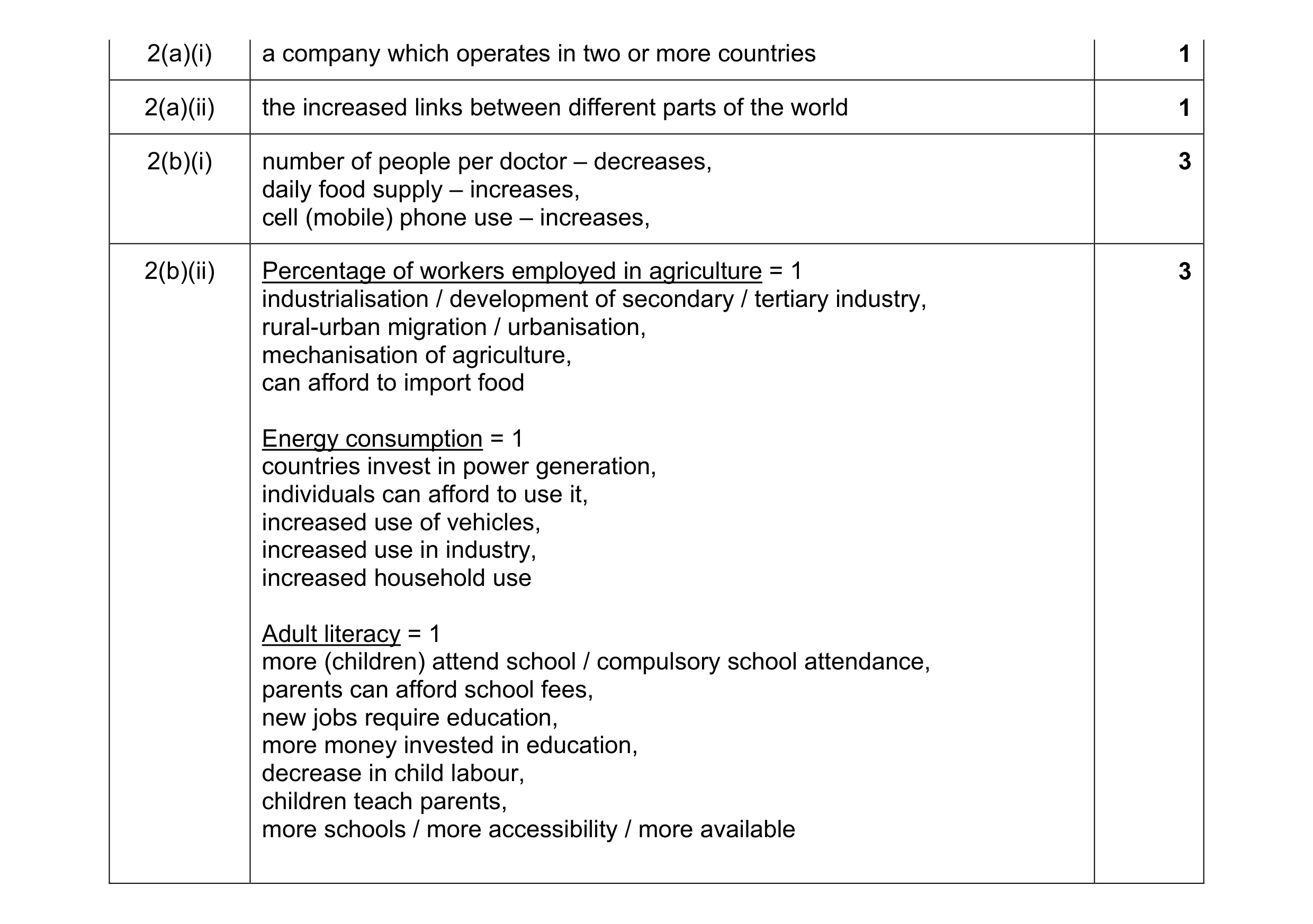
Mark scheme: 2(a)(i) a company which operates in two or more countries 1 2(a)(ii) the increased links between different parts of the world 1 2(b)(i) number of people per doctor – decreases, 3 daily food supply – increases, cell (mobile) phone use – increases, 2(b)(ii) Percentage of workers employed in agriculture = 1 3 industrialisation / development of secondary / tertiary industry, rural-urban migration / urbanisation, mechanisation of agriculture, can afford to import food Energy consumption = 1 countries invest in power generation, individuals can afford to use it, increased use of vehicles, increased use in industry, increased household use Adult literacy = 1 more (children) attend school / compulsory school attendance, parents can afford school fees, new jobs require education, more money invested in education, decrease in child labour, children teach parents, more schools / more accessibility / more available
This question in 0460/22 May/June 2019
Q2 · Changes in the share of world wealth production (GDP) in three world regions 0460/22 Oct/Nov 2019
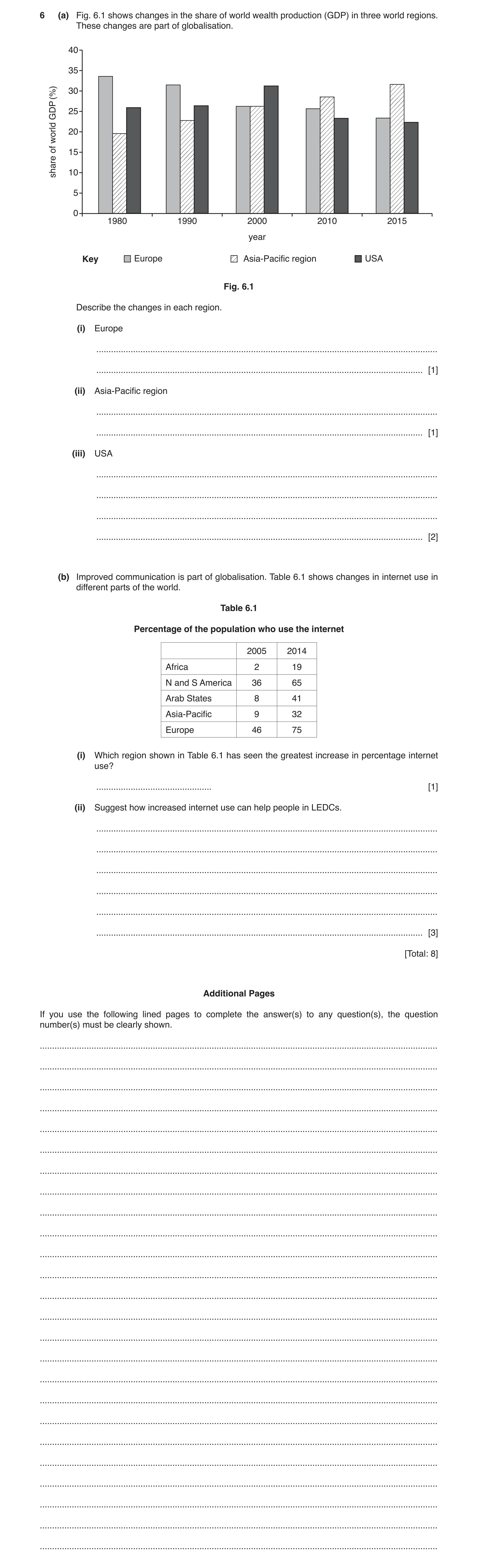
6 (a) Fig. 6.1 shows changes in the share of world wealth production (GDP) in three world regions. These changes are part of globalisation. 40 35 (%) 30 GDP 25 world 20 of 15 share 10 5 0 1980 1990 2000 2010 2015 year Key Europe Asia-Pacific region USA Fig. 6.1 Describe the changes in each region. (i) Europe … … [1] (ii) Asia-Pacific region … … [1] (iii) USA … … … … [2] (b) Improved communication is part of globalisation. Table 6.1 shows changes in internet use in different parts of the world. Table 6.1 Percentage of the population who use the internet 2005 2014 Africa 2 19 N and S America 36 65 Arab States 8 41 Asia-Pacific 9 32 Europe 46 75 (i) Which region shown in Table 6.1 has seen the greatest increase in percentage internet use? … [1] (ii) Suggest how increased internet use can help people in LEDCs. … … … … … … [3] [Total: 8] Additional Pages If you use the following lined pages to complete the answer(s) to any question(s), the question number(s) must be clearly shown. … … … … … … … … … … … … … … … … … … … … … … … … …
8 marks
Mark scheme: 6(a)(i) decreased/decrease-constant-decrease 1 6(a)(ii) increased 1 6(a)(iii) increased/1980–2000 increase/peak in 2000, 2 then decreased/2000–2015 decrease, overall decrease, fairly constant 6(b)(i) Arab States/Africa 1 6(b)(ii) communicate with friends/family/colleagues, 3 international communication/communicate with MEDCs/awareness of MEDCs, education/learn new ideas/health education/training/research/hear news/gain knowledge, stimulates economic development/increase GDP, provide jobs/increase incomes/work from home, in remote/inaccessible areas/poor road transport, no/poor land lines, buy/sell/trade goods/services/allow payments, advertise goods/services, (in either direction), entertainment
This question in 0460/22 Oct/Nov 2019
Q3 · The United Nations publishes the HDI which measures inequality between countries 0460/22 Feb/March 2020
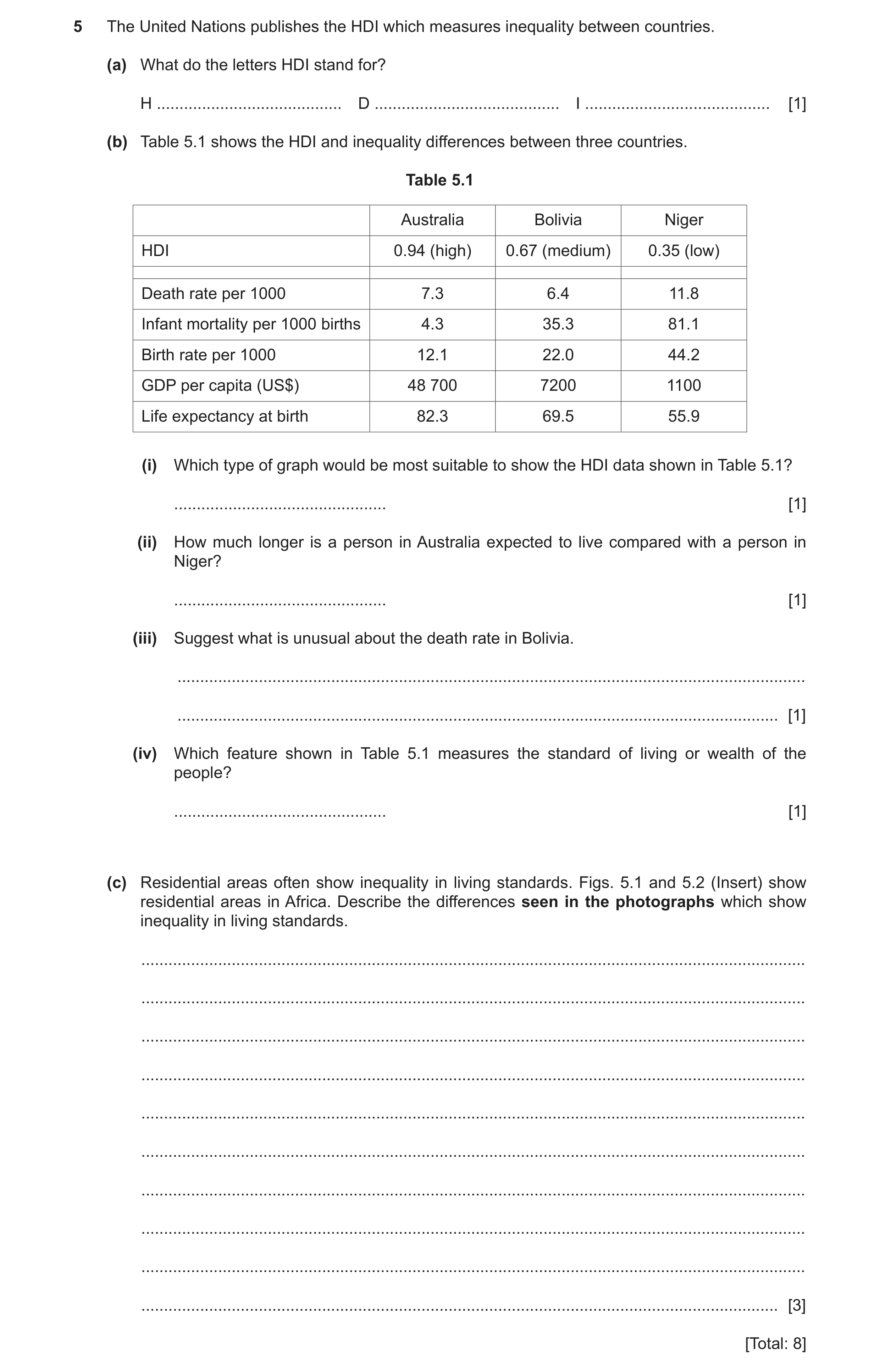
5 The United Nations publishes the HDI which measures inequality between countries. (a) What do the letters HDI stand for? H … D … I … [1] (b) Table 5.1 shows the HDI and inequality differences between three countries. Table 5.1 Australia Bolivia Niger HDI 0.94 (high) 0.67 (medium) 0.35 (low) Death rate per 1000 7.3 6.4 11.8 Infant mortality per 1000 births 4.3 35.3 81.1 Birth rate per 1000 12.1 22.0 44.2 GDP per capita (US$) 48 700 7200 1100 Life expectancy at birth 82.3 69.5 55.9 (i) Which type of graph would be most suitable to show the HDI data shown in Table 5.1? … [1] (ii) How much longer is a person in Australia expected to live compared with a person in Niger? … [1] (iii) Suggest what is unusual about the death rate in Bolivia. … … [1] (iv) Which feature shown in Table 5.1 measures the standard of living or wealth of the people? … [1] (c) Residential areas often show inequality in living standards. Figs. 5.1 and 5.2 (Insert) show residential areas in Africa. Describe the differences seen in the photographs which show inequality in living standards. … … … … … … … … … … [3] [Total: 8]
8 marks
Mark scheme: 5(a) Human Development Index, 1 5(b)(i) bar graph, 1 5(b)(ii) 26/26.4 (years) 1 5(b)(iii) low/lower than expected/lower than Australia, 1 5(b)(iv) GDP per capita, 1 5(c) low density v high density, 3 gardens v no gardens/greenery v no greenery, good condition v poor condition, (allow state of repair/quality)/well built v poorly built/good materials v poor materials/good paintwork v poor paintwork, etc. windows v few windows, space for cars v no/little space for cars, pool v no pool, wide roads v narrow/roads v no roads, garages v no garages, solar panels v no solar panels.
This question in 0460/22 Feb/March 2020
Q4 · The Human Development Index (HDI) measures levels of human development 0460/21 Oct/Nov 2021
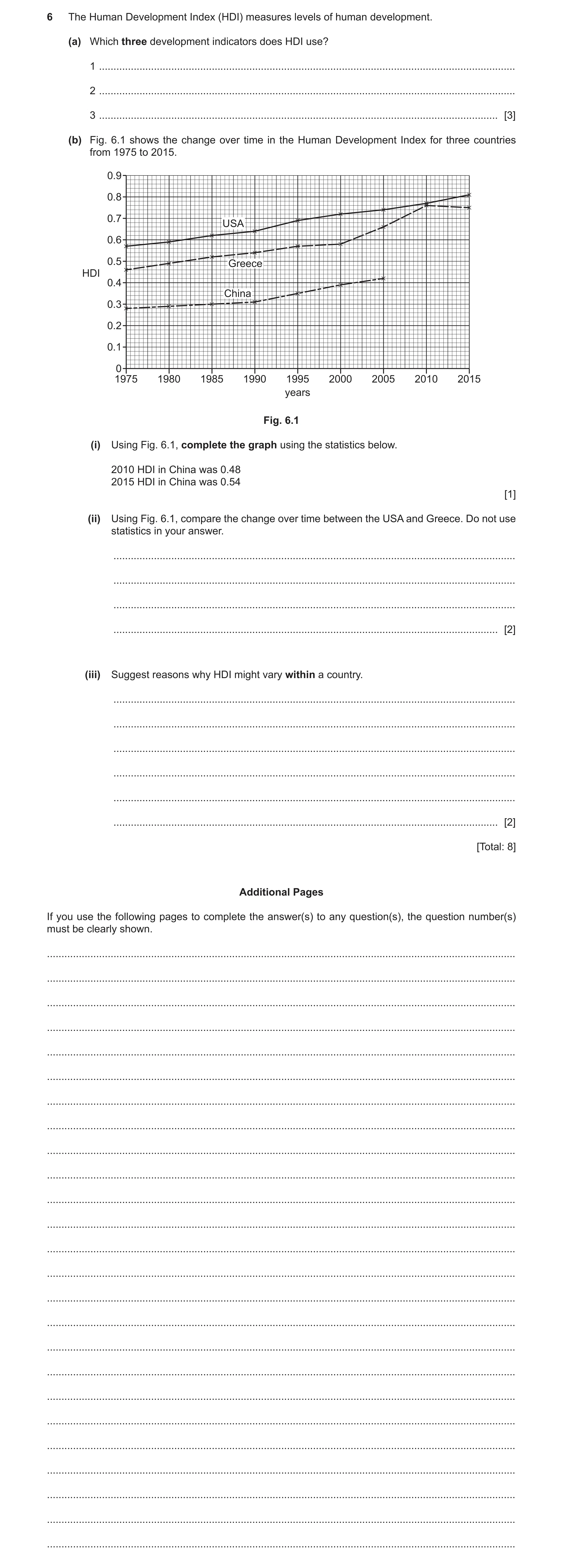
6 The Human Development Index (HDI) measures levels of human development. (a) Which three development indicators does HDI use? 1 … 2 … 3 … [3] (b) Fig. 6.1 shows the change over time in the Human Development Index for three countries from 1975 to 2015. 0.9 0.8 0.7 USA 0.6 0.5 Greece HDI 0.4 China 0.3 0.2 0.1 0 1975 1980 1985 1990 1995 2000 2005 2010 2015 years Fig. 6.1 (i) Using Fig. 6.1, complete the graph using the statistics below. 2010 HDI in China was 0.48 2015 HDI in China was 0.54 [1] (ii) Using Fig. 6.1, compare the change over time between the USA and Greece. Do not use statistics in your answer. … … … … [2] (iii) Suggest reasons why HDI might vary within a country. … … … … … … [2] [Total: 8] Additional Pages If you use the following pages to complete the answer(s) to any question(s), the question number(s) must be clearly shown. … … … … … … … … … … … … … … … … … … … … … … … … …
8 marks
Mark scheme: 6(a) life expectancy, 3 literacy/education, GNP (per capita), (Allow GNI/GDP) 6(b)(i) correct plots: 2010 0.48 and 2015 0.54, 1 6(b)(ii) both increased (overall), 2 Greece greater overall increase, 1975–1990/at first similar rate, 1990–2000 USA faster/Greece slower, 2000–2010 Greece faster/USA slower, 2010–2015/at end USA faster/Greece slower/USA increase but Greece decrease, 6(b)(iii) Life expectancy 2 food supply, medical facilities, disease, social services Literacy/education wealth/investment, level of education, GNP natural resources, climatic factors, soil quality, degree of industrialisation, stability of government/war, remoteness/accessibility, Answers must refer to within a country.
This question in 0460/21 Oct/Nov 2021
Q5 · Information about the population of the nine provinces of South Africa 0460/22 Oct/Nov 2021
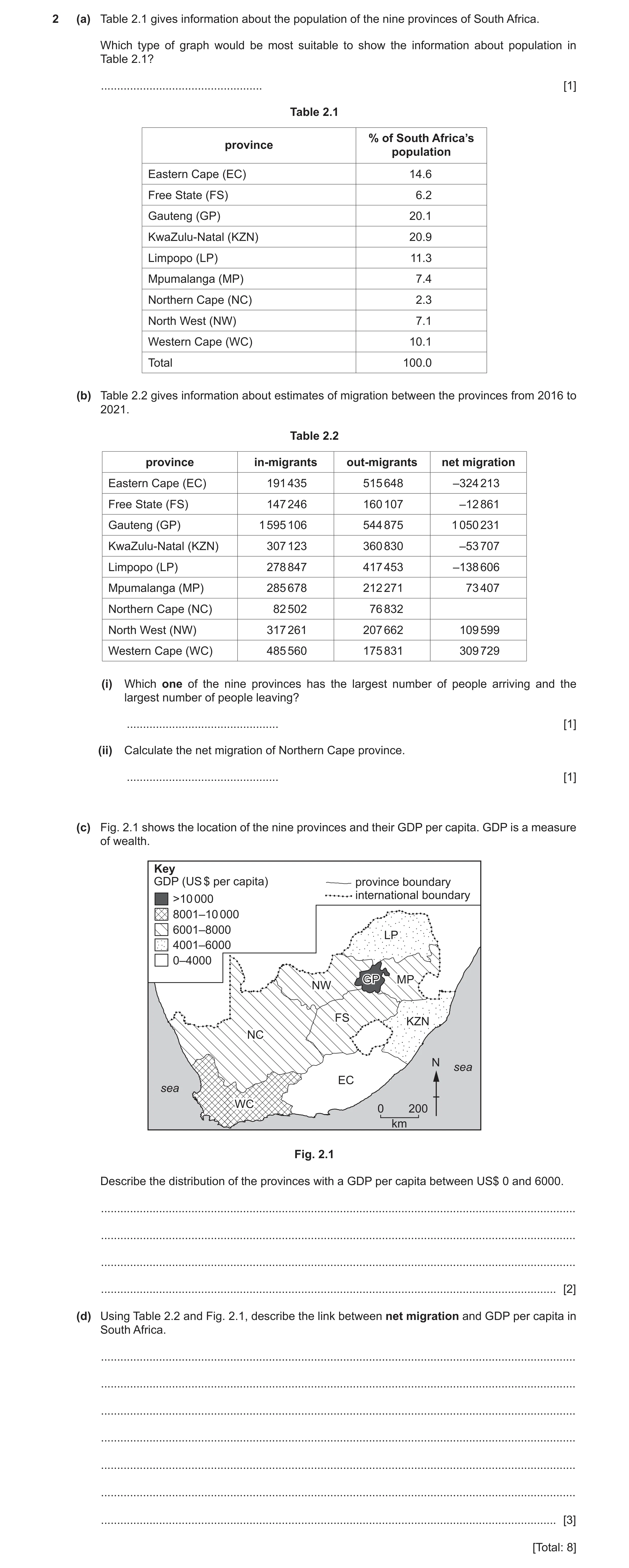
2 (a) Table 2.1 gives information about the population of the nine provinces of South Africa. Which type of graph would be most suitable to show the information about population in Table 2.1? … [1] Table 2.1 % of South Africa’s province population Eastern Cape (EC) 14.6 Free State (FS) 6.2 Gauteng (GP) 20.1 KwaZulu-Natal (KZN) 20.9 Limpopo (LP) 11.3 Mpumalanga (MP) 7.4 Northern Cape (NC) 2.3 North West (NW) 7.1 Western Cape (WC) 10.1 Total 100.0 (b) Table 2.2 gives information about estimates of migration between the provinces from 2016 to 2021. Table 2.2 province in-migrants out-migrants net migration Eastern Cape (EC) 191 435 515 648 –324 213 Free State (FS) 147 246 160 107 –12 861 Gauteng (GP) 1 595 106 544 875 1 050 231 KwaZulu-Natal (KZN) 307 123 360 830 –53 707 Limpopo (LP) 278 847 417 453 –138 606 Mpumalanga (MP) 285 678 212 271 73 407 Northern Cape (NC) 82 502 76 832 North West (NW) 317 261 207 662 109 599 Western Cape (WC) 485 560 175 831 309 729 (i) Which one of the nine provinces has the largest number of people arriving and the largest number of people leaving? … [1] (ii) Calculate the net migration of Northern Cape province. … [1] (c) Fig. 2.1 shows the location of the nine provinces and their GDP per capita. GDP is a measure of wealth. Key GDP (US $ per capita) province boundary international boundary >10 000 8001–10 000 6001–8000 LPLP 4001–6000 0–4000 GPGP MP NW FSFS KZN NC N sea EC sea WC 0 200 km Fig. 2.1 Describe the distribution of the provinces with a GDP per capita between US$ 0 and 6000. … … … … [2] (d) Using Table 2.2 and Fig. 2.1, describe the link between net migration and GDP per capita in South Africa. … … … … … … … [3] [Total: 8]
8 marks
Mark scheme: 2(a) pie/divided bar/bar, 1 2(b)(i) Gauteng, 1 2(b)(ii) 5 670 1 2(c) in east, 2 in north/north east and south/south east, on edge/borders/coast, 2(d) poor(er,est)/low(er,est) GDP provinces lose population/emigration/low 3 (er,est) net migration/negative migration, e.g. EC/KZN/LP, (development point) rich(er,est)/high(er,est)/GDP provinces gain population/immigration/high (er,est) net migration/positive migration, e.g. GP/WC, (development point)
This question in 0460/22 Oct/Nov 2021
Question 6 0460/22 Oct/Nov 2021
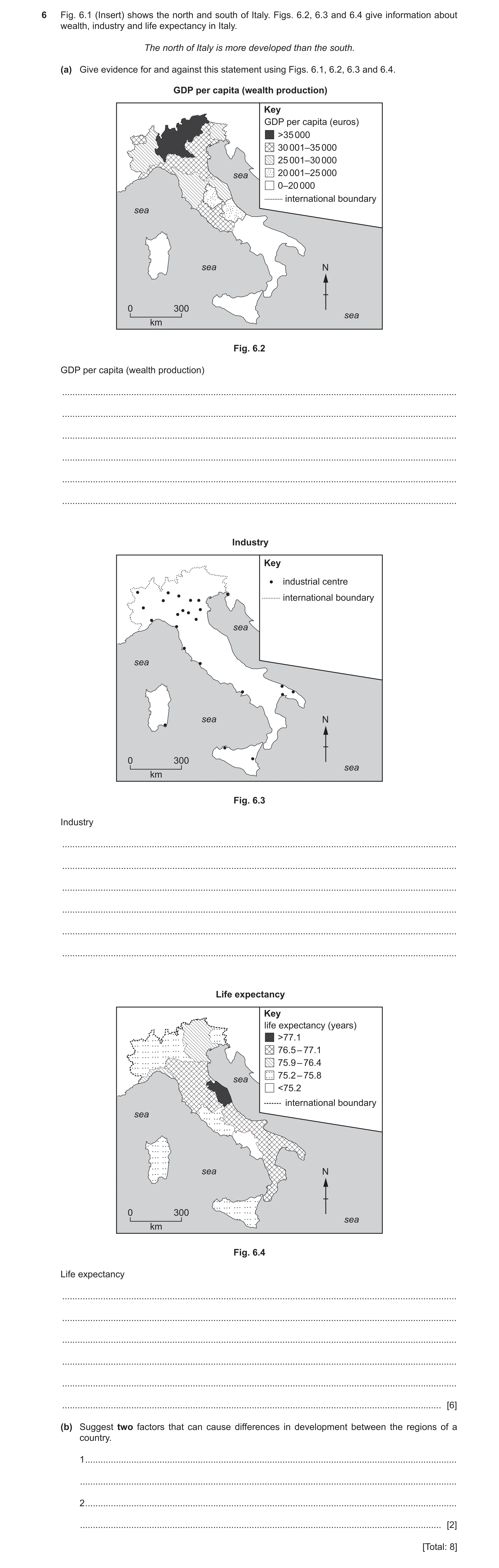
6 Fig. 6.1 (Insert) shows the north and south of Italy. Figs. 6.2, 6.3 and 6.4 give information about wealth, industry and life expectancy in Italy. The north of Italy is more developed than the south. (a) Give evidence for and against this statement using Figs. 6.1, 6.2, 6.3 and 6.4. GDP per capita (wealth production) Key GDP per capita (euros) >35 000 30 001–35 000 25 001–30 000 sea 20 001–25 000 0–20 000 international boundary sea sea N 0 300 sea km Fig. 6.2 GDP per capita (wealth production) … … … … … … Industry Key industrial centre international boundary sea sea sea N 0 300 sea km Fig. 6.3 Industry … … … … … … Life expectancy Key life expectancy (years) >77.1 76.5 – 77.1 75.9 – 76.4 75.2 – 75.8 sea <75.2 international boundary sea sea N 0 300 sea km Fig. 6.4 Life expectancy … … … … … … [6] (b) Suggest two factors that can cause differences in development between the regions of a country. 1 … … 2 … … [2] [Total: 8]
8 marks
Mark scheme: 6(a) Fig. 6.2 6 north high/rich(er,est)/south low/poor(er,est), south: allow any figure 25 000 or below, north: allow any figure above 25 000, (20 000 doesn’t spoil) Fig. 6.3 more/many in north/fewer in south, few in south, 7 in south/17 in north, south all coastal, Fig. 6.4 no clear correlation with north-south, high(er,est)/low(er,est) areas in both north and south, differences between north and south are small/all/both 75 – 77, Reserve one mark for each feature. 6(b) relief, 2 animal disease, pests, natural disasters/floods/earthquakes/tsunami, natural resources/minerals/water resources, climatic factors, soil quality/agricultural productivity, remoteness/accessibility/transport/landlocked, food supply, medical facilities, disease in humans, wealth/investment, level of education/skills, degree of industrialisation, stability of government/war/conflict, government focus/corruption, regional multiplier effect, migration, tourism,
This question in 0460/22 Oct/Nov 2021
Q7 · The three largest exports for four continents 0460/21 May/June 2022
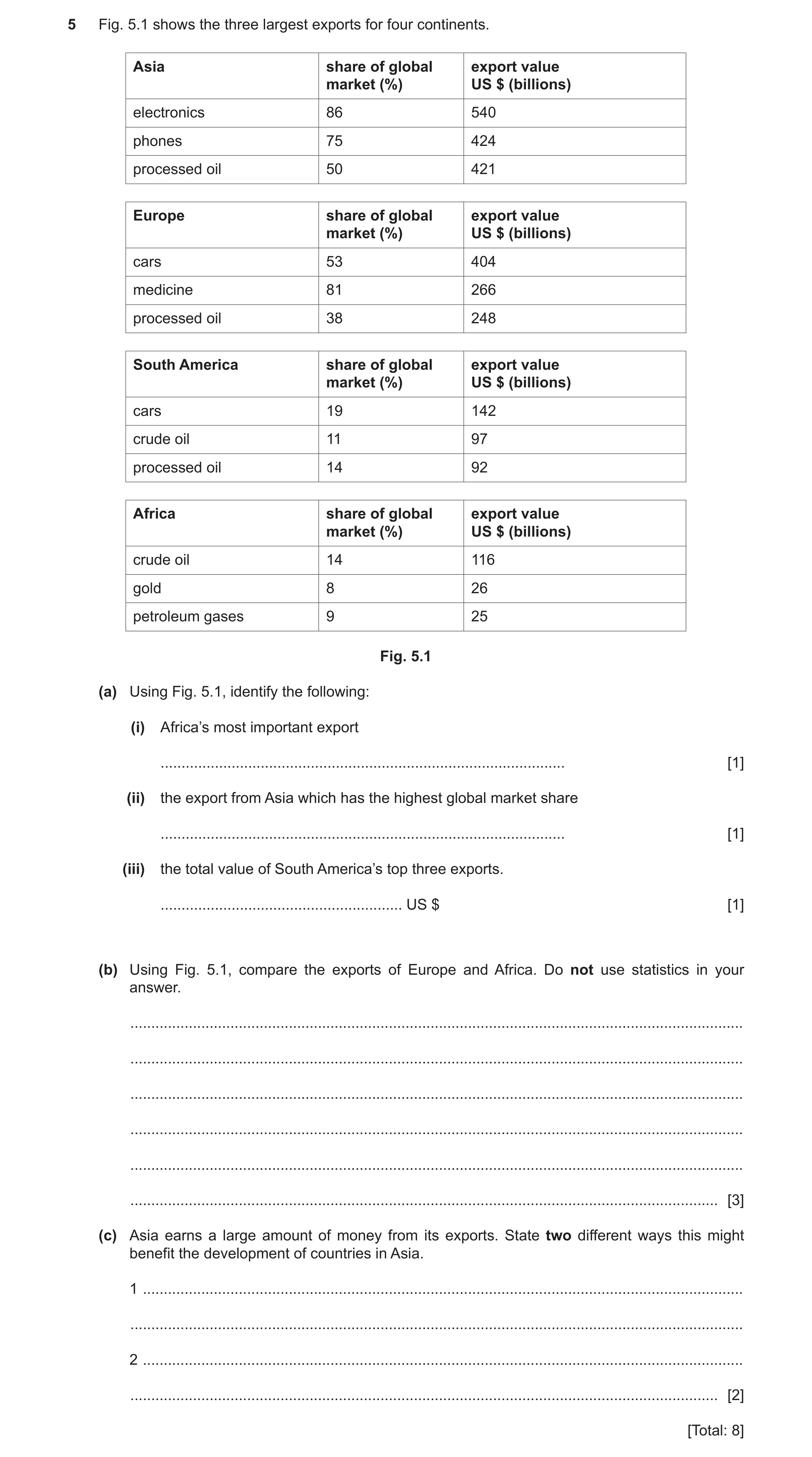
5 Fig. 5.1 shows the three largest exports for four continents. Asia share of global export value market (%) US $ (billions) electronics 86 540 phones 75 424 processed oil 50 421 Europe share of global export value market (%) US $ (billions) cars 53 404 medicine 81 266 processed oil 38 248 South America share of global export value market (%) US $ (billions) cars 19 142 crude oil 11 97 processed oil 14 92 Africa share of global export value market (%) US $ (billions) crude oil 14 116 gold 8 26 petroleum gases 9 25 Fig. 5.1 (a) Using Fig. 5.1, identify the following: (i) Africa’s most important export … [1] (ii) the export from Asia which has the highest global market share … [1] (iii) the total value of South America’s top three exports. … US $ [1] (b) Using Fig. 5.1, compare the exports of Europe and Africa. Do not use statistics in your answer. … … … … … … [3] (c) Asia earns a large amount of money from its exports. State two different ways this might benefit the development of countries in Asia. 1 … … 2 … … [2] [Total: 8]
8 marks
Mark scheme: 5(a)(i) crude oil 1 5(a)(ii) electronics 1 5(a)(iii) 331 billion (US dollars) 1 5(b) each produce different products; 3 more finished/manufactured/secondary/processed/tertiary (goods) in Europe; more natural resources/raw materials/primary/mined/mineral in Africa; (OR finished v. raw materials = 1) e.g., crude oil v. processed oil; most valuable is cars in Europe compared with crude oil in Africa; higher value of exports in Europe/lower value of exports in Africa; greater market share in Europe/lower market share in Africa. 5(c) pays for improvements/modernisation/more 2 schools/education/roads/airports/hospitals/healthcare telecommunications/sanitation/housing/electricity/water supply (named infrastructure); pays for automation/mechanisation/technology; increases wages (which increases taxes); pays for loans to industry; repayment of loans/reduces the balance of payments deficit; creates more jobs (in manufacturing/tertiary industry); pays for imports;
This question in 0460/21 May/June 2022
Q8 · Information about a global coffee shop company 0460/23 May/June 2022
6 Fig. 6.1 shows information about a global coffee shop company. Content removed due to copyright restrictions. Fig. 6.1 (a) Using Fig. 6.1 only, identify the evidence that this is a transnational company which has undergone globalisation. … … … … … … … … … … … … [5] (b) Fig. 6.2 shows the support the coffee company offers local coffee farmers. Explain how each of these types of support can help sustainable development. • education about soil management techniques • agreed prices for coffee beans • research into disease-resistant trees Fig. 6.2 … … … … … … … … [3] [Total: 8] Additional pages If you use the following pages to complete the answer to any question, the question number must be clearly shown. … … … … … … … … … … … … … … … … … … … … … … … … …
8 marks
Mark scheme: 6(a) majority of raw materials from LEDCs; 5 paper sourced from MEDCs/N America/Europe; raw materials/sugar/coffee beans from many/several continents/many countries/named examples (at least two); coffee shops in many/several continents/many countries/named examples (at least two); (Note: ‘number of coffee shops worldwide’ similar to graph Y axis, so look for context); Valid statistic from the map (1 mark max) e.g., over 1000 coffee shops in the US, 25–99 in Australia; number of shops has increased/rapid expansion of coffee shops; Valid statistic from the graph quoting years (1 mark max) e.g. the number of coffee shops has increased from 200 in 1987 to 5800(almost 6000) in 2003 (any two years); 6(b) Education about soil management techniques 3 ensures soil fertility/healthy soil; educates about contour ploughing/crop rotation/cover cropping /preventing/slowing down soil erosion/soil degradation /prevents overuse of fertilizer; Agreed prices for coffee beans ensure economic stability for farmers/stable/guaranteed /fair price/trade; means farmers can support their families adequately /afford goods and services; maintains farming as an occupation; enables forward planning/stimulates further economic development; Research into disease resistant trees ensure crops and farmers income can be maintained/increases or maintains yields; less need to clear land to plant new trees/yield more reliable /prevents loss of crop; reduces use of pesticides;
This question in 0460/23 May/June 2022
Q9 · The employment structure for countries with different incomes in 2019 0460/22 Oct/Nov 2022
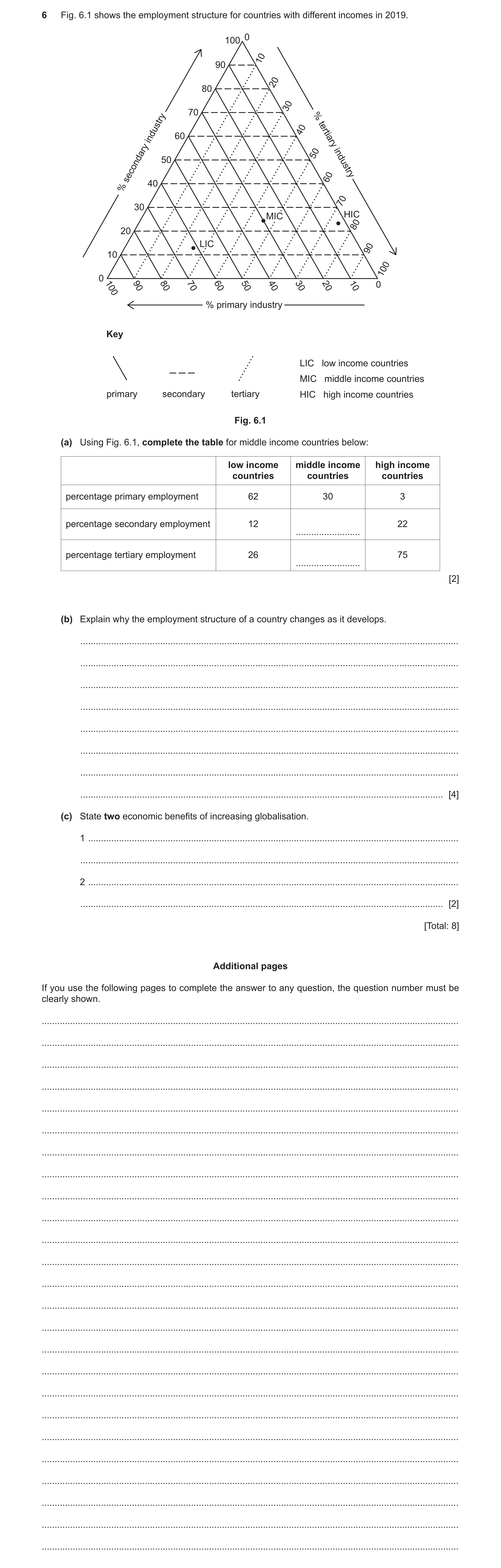
6 Fig. 6.1 shows the employment structure for countries with different incomes in 2019. 0 100 10 90 20 80 30 70 % 40 60 industry tertiary 50 50 industry secondary 60 40 % 70 30 MIC HIC 80 20 LIC 90 10 100 0 100 90 80 70 60 50 40 30 20 10 0 % primary industry Key LIC low income countries MIC middle income countries primary secondary tertiary HIC high income countries Fig. 6.1 (a) Using Fig. 6.1, complete the table for middle income countries below: low income middle income high income countries countries countries percentage primary employment 62 30 3 percentage secondary employment 12 22 … percentage tertiary employment 26 75 … [2] (b) Explain why the employment structure of a country changes as it develops. … … … … … … … … [4] (c) State two economic benefits of increasing globalisation. 1 … … 2 … … [2] [Total: 8] Additional pages If you use the following pages to complete the answer to any question, the question number must be clearly shown. … … … … … … … … … … … … … … … … … … … … … … … … …
8 marks
Mark scheme: 6(a) Secondary: 25 (%) accept 24%; 2 Tertiary: 45 (%) accept 46%. 6(b) Increasing mechanisation; 4 Depletion of (natural) resources/loss of agricultural land/urbanisation/increase in industry/housing/distribution centres; Increasing imports; (food, raw materials, and manufactured goods) Increasing demand for/increase in amount of services/named e.g., more (disposable) income to be spent on services/example (e.g., in the leisure industry); More leisure time available (so more jobs in tourism); People live longer so more need for services/example (e.g., medical care); advancements in high tech(nology)/ICT; Increase in research and development; Businesses/tertiary industry/companies/R&D requires more expertise/trained labour; Investment by multinationals; Higher level of education/skills/more people trained; Availability of higher paid jobs/fewer physical jobs (e.g., quaternary/tertiary); Tertiary/quaternary sectors/named example (e.g., tourism) earn more money/profit for a country. 6(c) Increasing choice of goods/more products available/access to more 2 resources; Lower cost of goods/economies of scale; More jobs (in some countries)/new jobs available/people gain skills; Increased flow of capital/more (international/MNC) investment/increased foreign exchange (forex)/currency/easier to set up MNCs; (allow ‘easier’ in place of ‘more’) Decreases cost of manufacturing; Increases GDP/GNP/GNI country’s output; Greater customer base for companies/more markets; Access to more varied workforce/skills; Remittances/workers send money back to own country; Higher levels of international tourism (brings in money to invest/jobs); Less barriers to trade/increased trade between countries/more imports/exports/trade agreements between countries/trade costs/tariffs reduced/cheaper trade.
This question in 0460/22 Oct/Nov 2022
Question 10 0460/23 Oct/Nov 2022
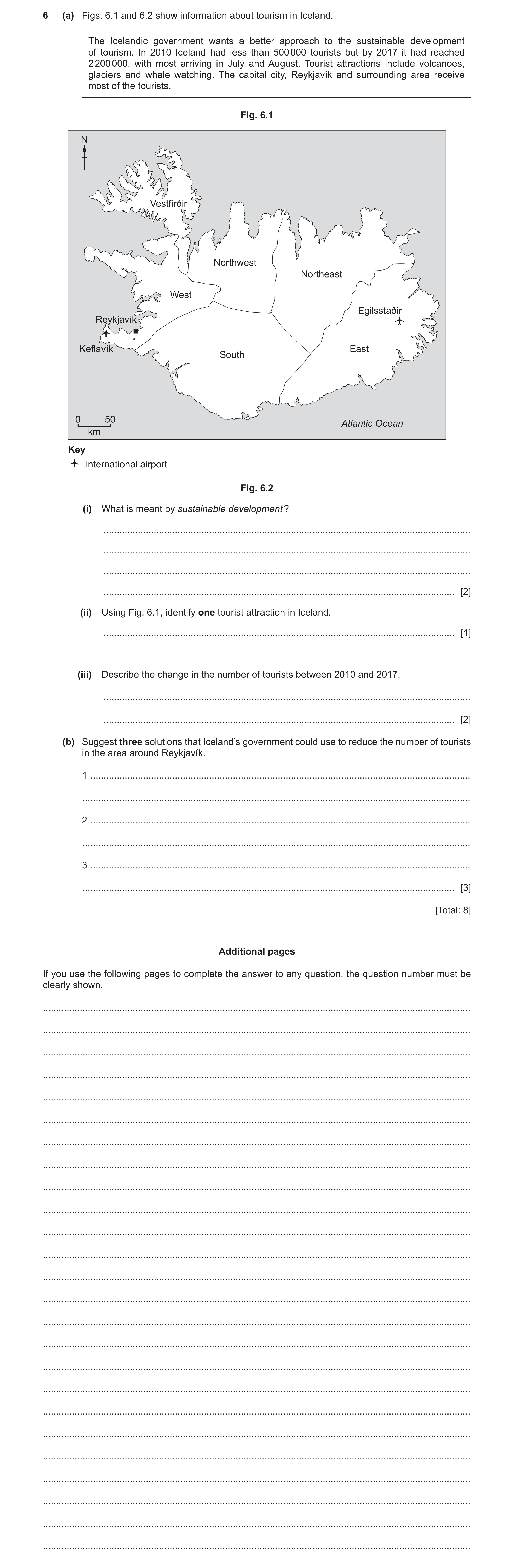
6 (a) Figs. 6.1 and 6.2 show information about tourism in Iceland. The Icelandic government wants a better approach to the sustainable development of tourism. In 2010 Iceland had less than 500 000 tourists but by 2017 it had reached 2 200 000, with most arriving in July and August. Tourist attractions include volcanoes, glaciers and whale watching. The capital city, Reykjavík and surrounding area receive most of the tourists. Fig. 6.1 N Vestfirðir Northwest Northeast West Egilsstaðir Reykjavík Keflavík East South 0 50 Atlantic Ocean km Key international airport Fig. 6.2 (i) What is meant by sustainable development ? … … … … [2] (ii) Using Fig. 6.1, identify one tourist attraction in Iceland. … [1] (iii) Describe the change in the number of tourists between 2010 and 2017. … … [2] (b) Suggest three solutions that Iceland’s government could use to reduce the number of tourists in the area around Reykjavík. 1 … … 2 … … 3 … … [3] [Total: 8] Additional pages If you use the following pages to complete the answer to any question, the question number must be clearly shown. … … … … … … … … … … … … … … … … … … … … … … … … …
8 marks
Mark scheme: 6(a)(i) Meets needs of present/allows development now; 2 Without compromising the needs of the future/don’t use up all the resources needed in the future/continues for a long time; OR Achieve economic development/maintain or improve people’s quality of life; Maintain the environment/don’t do damage to the environment. 6(a)(ii) Volcanoes/glaciers/whale watching/Reykjavik 1 6(a)(iii) Increased; 2 From (less than) 500 000 (in 2010) to 2 200 000 (in 2017) by 1.7 million/by 440%. 6(b) Limit number of flights/to Iceland; 3 Limit number/size of cruise ships to Iceland; Increase cost of holidays/tours/travel/flights/entrance fees/accommodation/tax on tourists; Decrease costs of holidays in low season; Increase number of flights to eastern Iceland/invest in new airport elsewhere; Advertise attractions outside Reykjavik; Increase tours/facilities/attractions in other parts of Iceland; Improve roads/methods of transport; Quotas/limits on number of tourists allowed in Reykjavik area; Building regulations/development controls.
This question in 0460/23 Oct/Nov 2022
Q11 · The HDI indicators for three countries in 2020 0460/22 May/June 2023
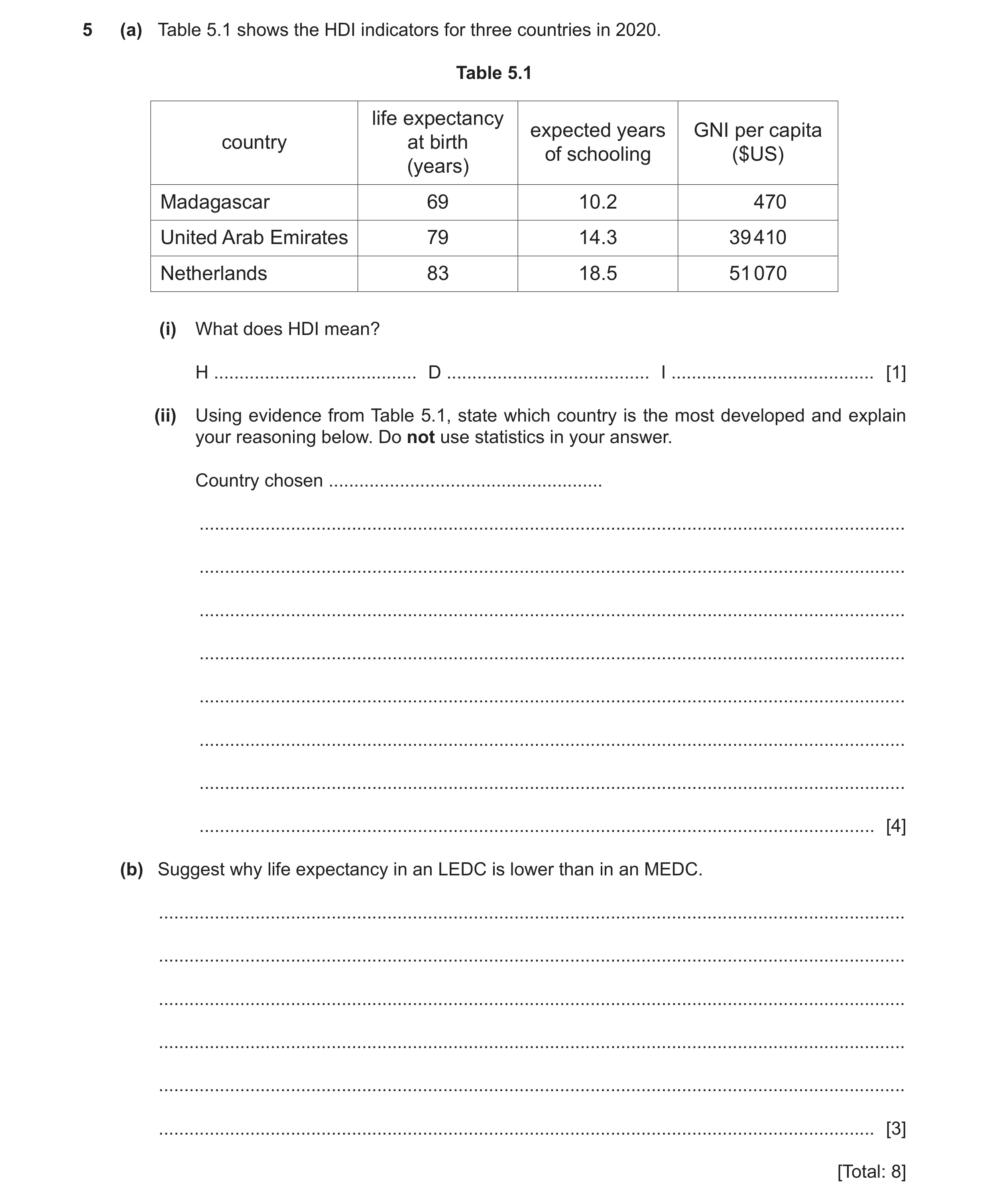
5 (a) Table 5.1 shows the HDI indicators for three countries in 2020. Table 5.1 life expectancy expected years GNI per capita country at birth of schooling ($US) (years) Madagascar 69 10.2 470 United Arab Emirates 79 14.3 39 410 Netherlands 83 18.5 51 070 (i) What does HDI mean? H … D … I … [1] (ii) Using evidence from Table 5.1, state which country is the most developed and explain your reasoning below. Do not use statistics in your answer. Country chosen … … … … … … … … … [4] (b) Suggest why life expectancy in an LEDC is lower than in an MEDC. … … … … … … [3] [Total: 8]
8 marks
Mark scheme: 5(a)(i) Human Development Index. 1 5(a)(ii) Netherlands = Reserve 1 mark. 4 Reasons Highest/longest life expectancy; Highest/most expected years of schooling; Highest/most GNI/richest. 5(b) Lack of (funding for/access to) hospitals/health care/vaccination 3 programmes /medicines; Fewer (trained) doctors/nurses; People have less ability to afford medicines/health care/nutritious diet; Food shortage/poor diet/malnutrition/famine; Fewer emergency services/lack of medical provision during natural hazards/ named example; Less preparation/mitigation for natural hazards/named example; Prone to named natural hazards such as flooding/tropical cyclones; High level of infant mortality; Lack of sanitation/clean water/sewerage/drainage/presence of contaminated water; More people suffer from/more vulnerable to diseases/cholera/typhoid/malaria/dengue/AIDS/diseases spread fast(er); Lack of education about health/handling food/importance of hygiene/spread of diseases/healthier lifestyle/how to take care of themselves; Lack of health and safety legislation/air and water pollution controls/ dangerous working conditions; More/many people living in poor/cramped housing conditions/shanty towns/squatter housing; Lack of/low provision for retirement/pensions/old people’s homes; Wars/civil conflict; More physical jobs e.g., in farming which ages the body. Note: If not stated, assume the answer is from LEDC point of view. Accept an answer written from the point of view of MEDCs, providing there is a clear link to the situation in LEDCs, or comparative statements are used.
This question in 0460/22 May/June 2023
Q12 · Levels of children’s learning in three regions of the world 0460/21 Oct/Nov 2023
6 Fig. 6.1 shows levels of children’s learning in three regions of the world. 100 90 80 70 60 Key 50 children not in school (%) 40 poor level of learning 30 good level of learning 20 10 0 East Asia South Asia Sub-Saharan Africa regions Fig. 6.1 (a) (i) Using Fig. 6.1, state the percentage of children who are not in school in Sub-Saharan Africa. … % [1] (ii) Complete Fig. 6.1 for Sub-Saharan Africa using the following statistics: poor level of learning: 65% good level of learning: 15%. [2] (b) Using Fig. 6.1, compare the levels of learning in East Asia and South Asia. Use statistics to support your answer. … … … … … … … … … … [5] [Total: 8] Additional pages If you use the following pages to complete the answer to any question, the question number must be clearly shown. … … … … … … … … … … … … … … … … … … … … … … … … …
8 marks
Mark scheme: 6(a)(i) 20 (%) 1 6(a)(ii) Dividing line drawn at 85%; 2 Shaded correctly according to the key. 6(b) Level of learning better in East Asia/worse in South Asia; 5 More poor learning in South Asia; 50% compared to 22% in East Asia; More good learning in East Asia; 78% compared to 45% in South Asia; More out of school in South Asia; 5% out of school in South Asia/0% out of school in East Asia.
This question in 0460/21 Oct/Nov 2023
Q13 · Information about the production of bread 0460/22 Oct/Nov 2024
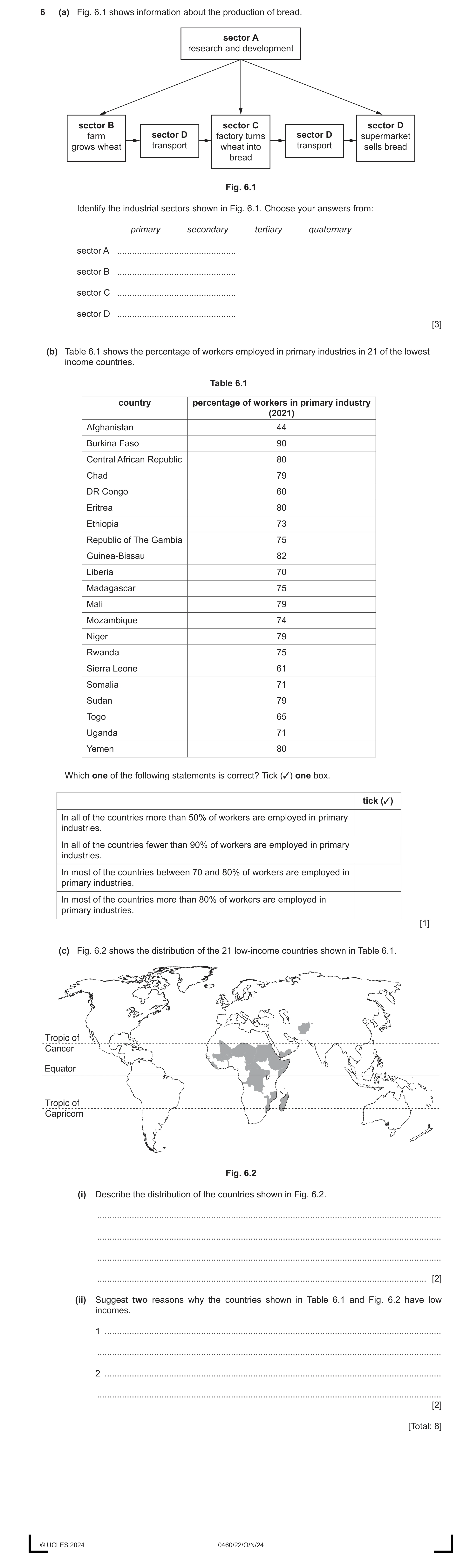
6 (a) Fig. 6.1 shows information about the production of bread. sector A research and development sector B sector C sector D farm sector D factory turns sector D supermarket grows wheat transport wheat into transport sells bread bread Fig. 6.1 Identify the industrial sectors shown in Fig. 6.1. Choose your answers from: primary secondary tertiary quaternary sector A … sector B … sector C … sector D … [3] (b) Table 6.1 shows the percentage of workers employed in primary industries in 21 of the lowest income countries. Table 6.1 country percentage of workers in primary industry (2021) Afghanistan 44 Burkina Faso 90 Central African Republic 80 Chad 79 DR Congo 60 Eritrea 80 Ethiopia 73 Republic of The Gambia 75 Guinea-Bissau 82 Liberia 70 Madagascar 75 Mali 79 Mozambique 74 Niger 79 Rwanda 75 Sierra Leone 61 Somalia 71 Sudan 79 Togo 65 Uganda 71 Yemen 80 Which one of the following statements is correct? Tick (✓) one box. tick (✓) In all of the countries more than 50% of workers are employed in primary industries. In all of the countries fewer than 90% of workers are employed in primary industries. In most of the countries between 70 and 80% of workers are employed in primary industries. In most of the countries more than 80% of workers are employed in primary industries. [1] (c) Fig. 6.2 shows the distribution of the 21 low-income countries shown in Table 6.1. Tropic of Cancer Equator Tropic of Capricorn Fig. 6.2 (i) Describe the distribution of the countries shown in Fig. 6.2. … … … … [2] (ii) Suggest two reasons why the countries shown in Table 6.1 and Fig. 6.2 have low incomes. 1 … … 2 … … [2] [Total: 8] © UCLES 2024 0460/22/O/N/24
8 marks
Mark scheme: 6(a) A quaternary 3 B primary C secondary D tertiary 4 correct = 3 2/3 correct = 2 1 correct = 1 6(b) In most of the countries between 70 and 80% of workers are employed in the 1 primary sector. 6(c)(i) African countries/centre of Africa/E/SE/W Africa; 2 Clustered/in a group/next/close to each other; Uneven: Only two non-African: Tropical/equatorial/between the tropics/close/near to the Equator/between either Tropic and the Equator; Majority are landlocked/inland. 6(c)(ii) Harsh climate/extreme heat/droughts/land dry/desertification; 2 Low food production/lack of food to sell; Crop disease/pests ruin crops; Poor soils; Lack of natural resources/minerals/energy reserves; Less working age people compared to proportion of young people/elderly/migration of highly educated/working age people/shortage of workers; Constraints on female employment; Lack of funds/investment for mechanisation/industry/businesses; Lack of education/low literacy rates/unskilled workforce; Poor medical facilities/spread of disease/reduced workforce due to illness; War/civil war/political instability; Overpopulation/high population leading to a lack of resources to go round/unemployment; Poorly paid jobs so not much money raised through taxes; Dominated by primary industry/little secondary or tertiary industry/few jobs in multi-nationals; Low level/lack of technology/mechanisation/industrialisation; Limited value added good produced/value of imports higher than exports; Poor transport/communications/land-locked make it difficult to trade/export/import goods.
This question in 0460/22 Oct/Nov 2024
Q14 · Study Table 6.1, which shows development indicators for seven countries in 2021 0460/21 Oct/Nov 2025
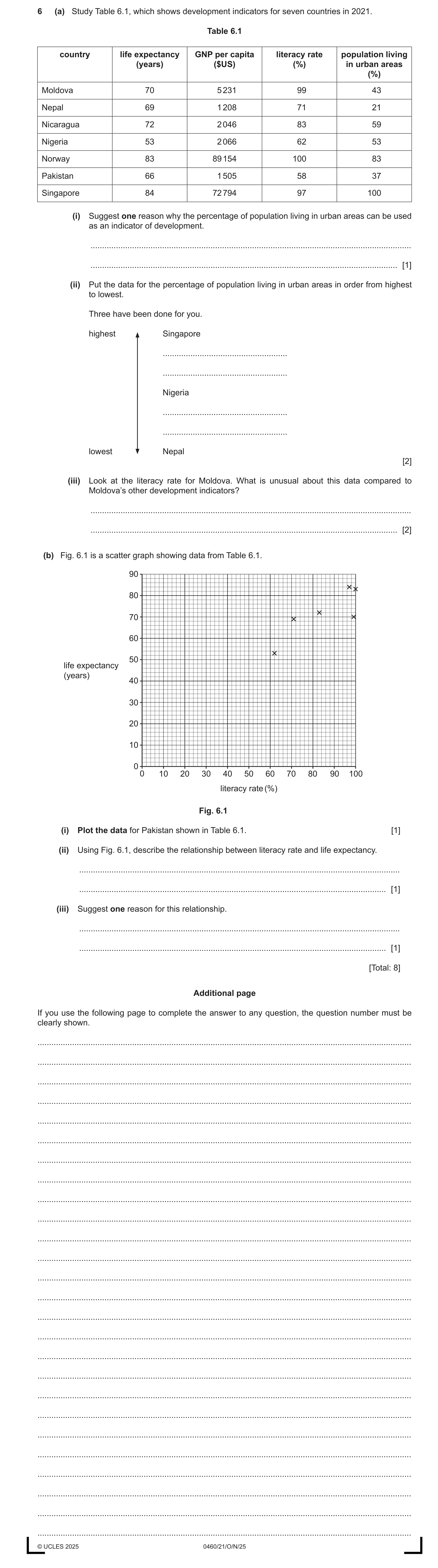
6 (a) Study Table 6.1, which shows development indicators for seven countries in 2021. Table 6.1 country life expectancy GNP per capita literacy rate population living (years) ($US) (%) in urban areas (%) Moldova 70 5 231 99 43 Nepal 69 1 208 71 21 Nicaragua 72 2 046 83 59 Nigeria 53 2 066 62 53 Norway 83 89 154 100 83 Pakistan 66 1 505 58 37 Singapore 84 72 794 97 100 (i) Suggest one reason why the percentage of population living in urban areas can be used as an indicator of development. … … [1] (ii) Put the data for the percentage of population living in urban areas in order from highest to lowest. Three have been done for you. highest Singapore … … Nigeria … … lowest Nepal [2] (iii) Look at the literacy rate for Moldova. What is unusual about this data compared to Moldova’s other development indicators? … … [2] (b) Fig. 6.1 is a scatter graph showing data from Table 6.1. 90 80 70 60 50 life expectancy (years) 40 30 20 10 0 0 10 20 30 40 50 60 70 80 90 100 literacy rate (%) Fig. 6.1 (i) Plot the data for Pakistan shown in Table 6.1. [1] (ii) Using Fig. 6.1, describe the relationship between literacy rate and life expectancy. … … [1] (iii) Suggest one reason for this relationship. … … [1] [Total: 8] Additional page If you use the following page to complete the answer to any question, the question number must be clearly shown. … … … … … … … … … … … … … … … … … … … … … … … … … … © UCLES 2025 0460/21/O/N/25
8 marks
Mark scheme: 6(a)(i) less agricultural work 1 more education more health care more sanitation more electricity wealthier 6(a)(ii) Highest: Singapore 2 Norway Nicaragua Nigeria Moldova Pakistan Nepal 3 or 4 correct = 2 marks 1 or 2 correct = 1 mark 6(a)(iii) high (literacy rate)/would expect it to be lower 2 compared to life expectancy/GNP/urban population mid/low for other indicators/life expectancy/GNP/urban population 6(b)(i) Correct plot of literacy rate 58 and life expectancy 66 1 Shown with ‘x’ or dot 6(b)(ii) positive correlation 1 the higher the literacy rate the higher the life expectancy the lower the literacy rate the lower the life expectancy 6(b)(iii) ability to read and write leads to less manual job 1 knowledge of diet/healthy lifestyle/how to care for yourself earn more money to spend on diet/healthy lifestyle more able to access health advice/health care better education will lead to more doctors
This question in 0460/21 Oct/Nov 2025
 22 / 30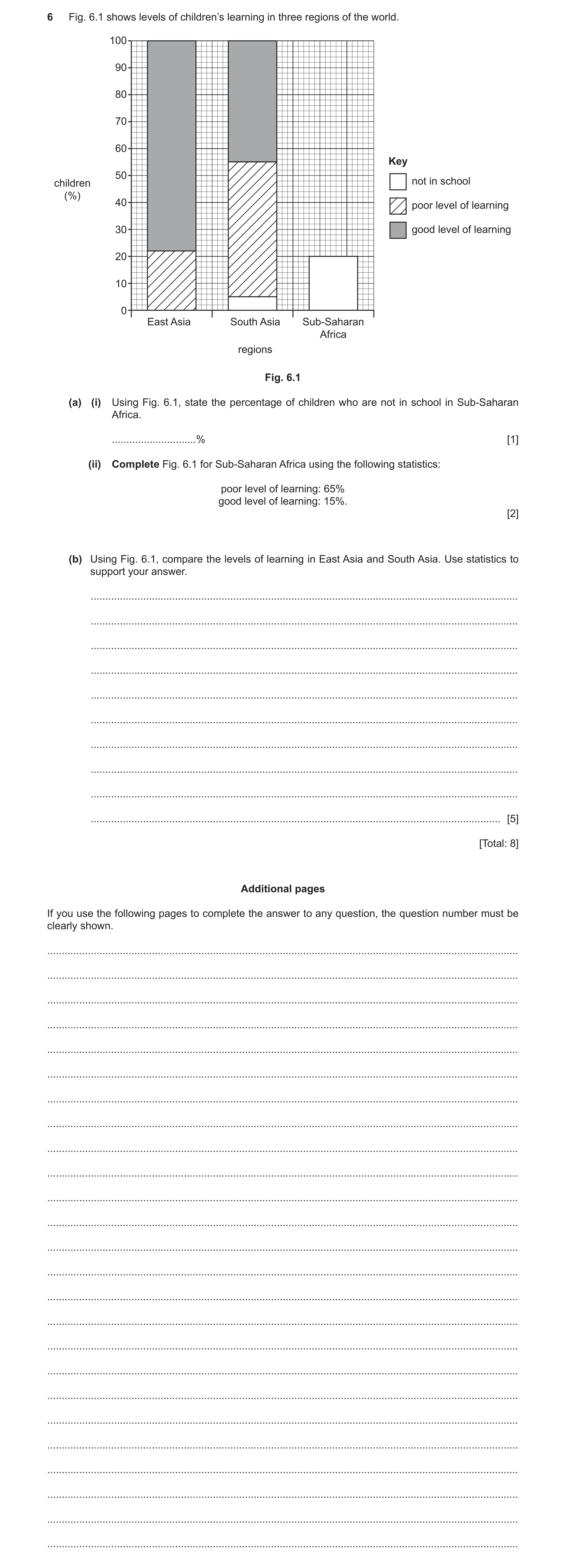
 8
8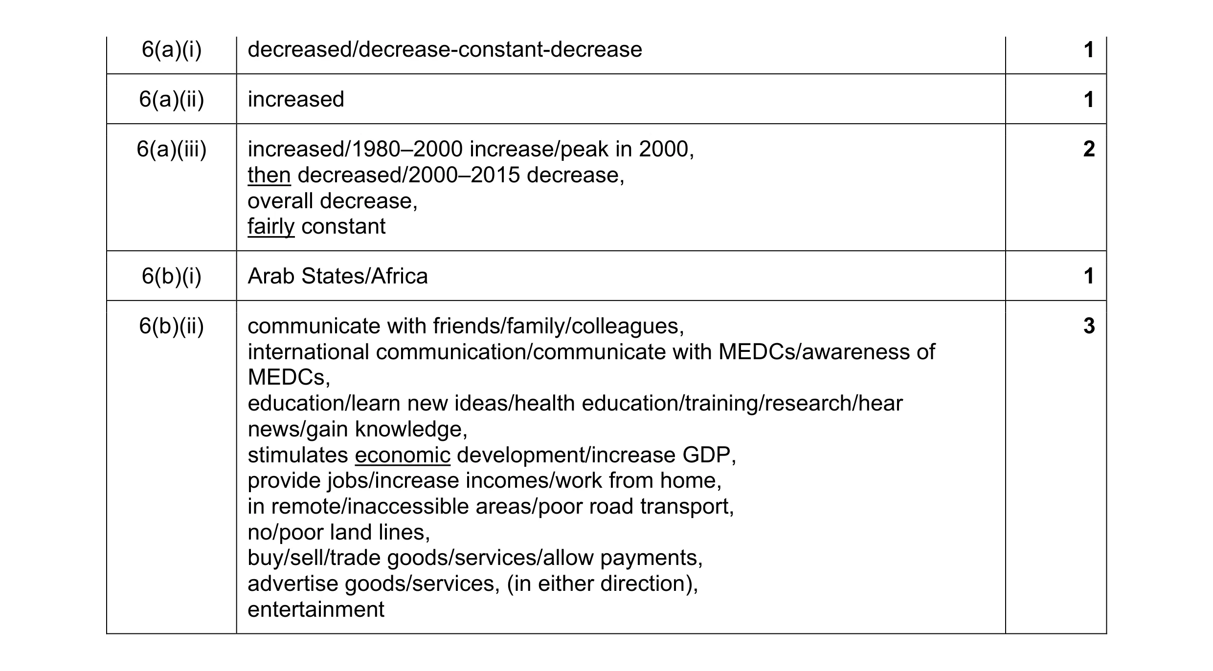 8
8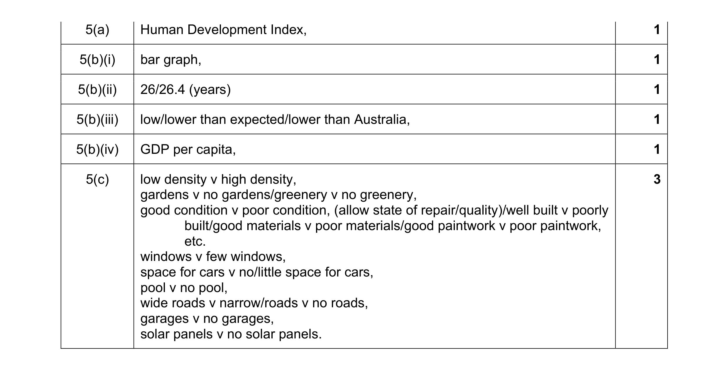 8
8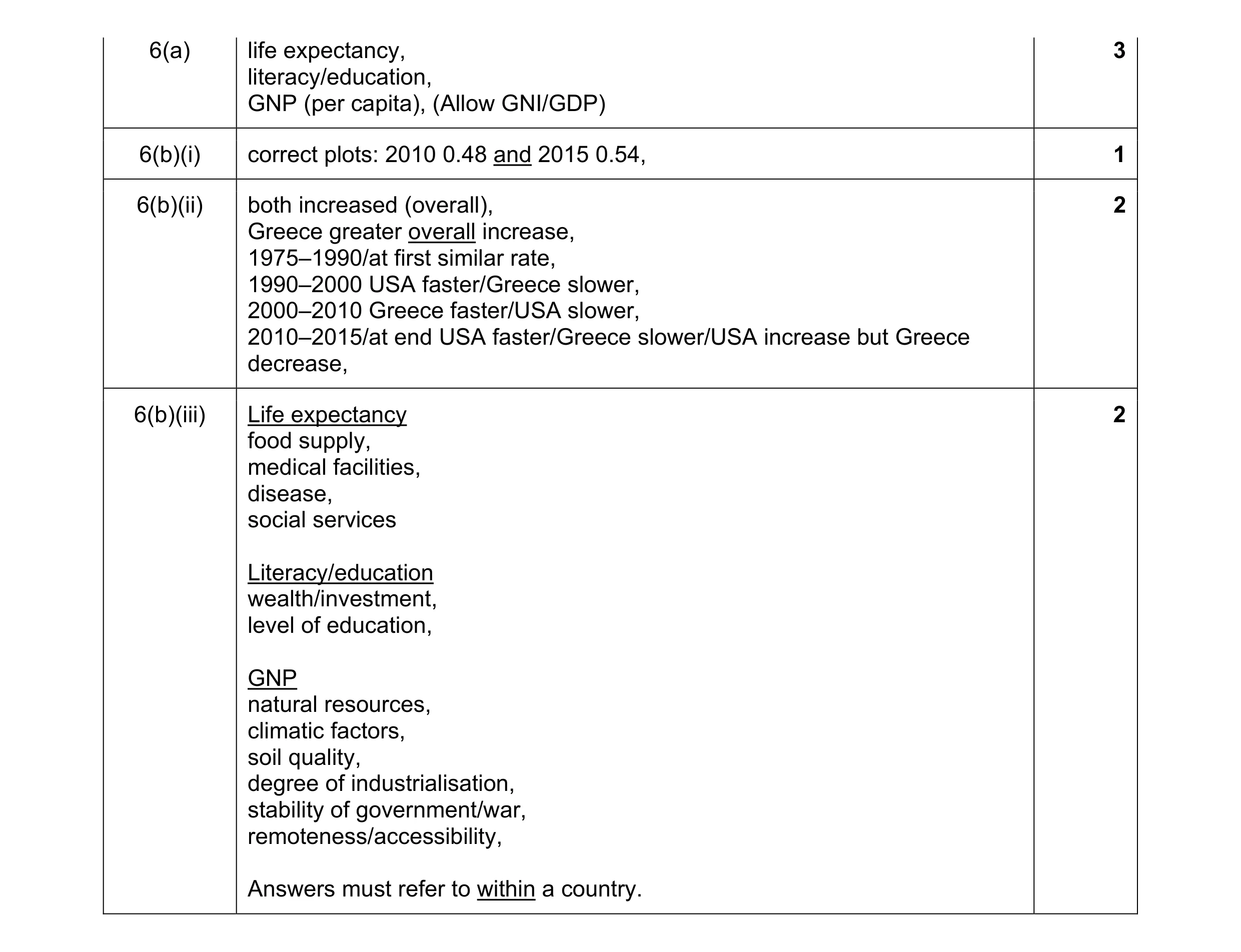 8
8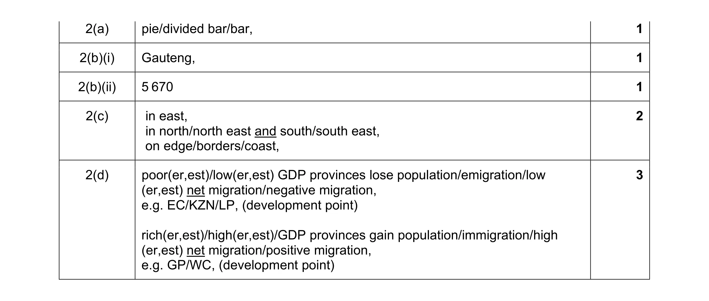 8
8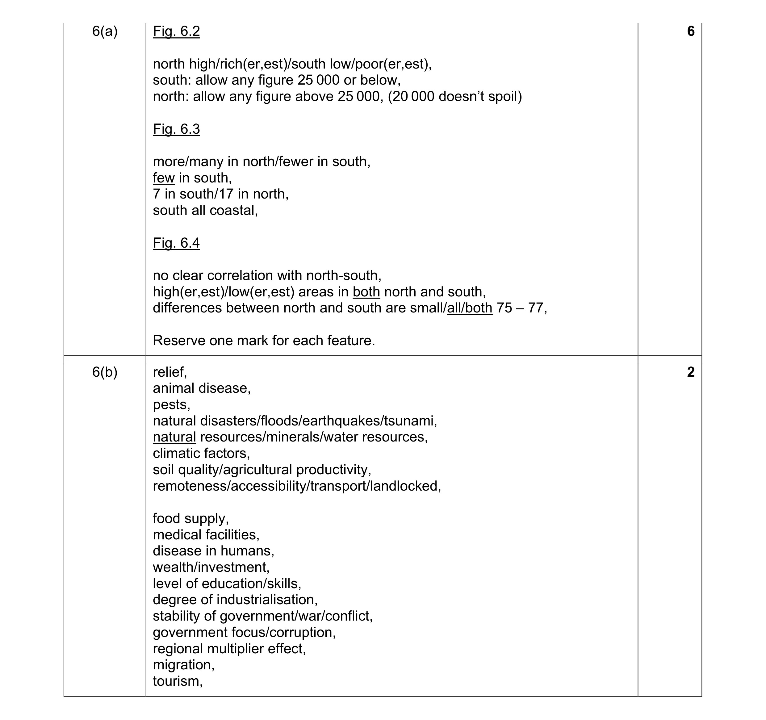 8
8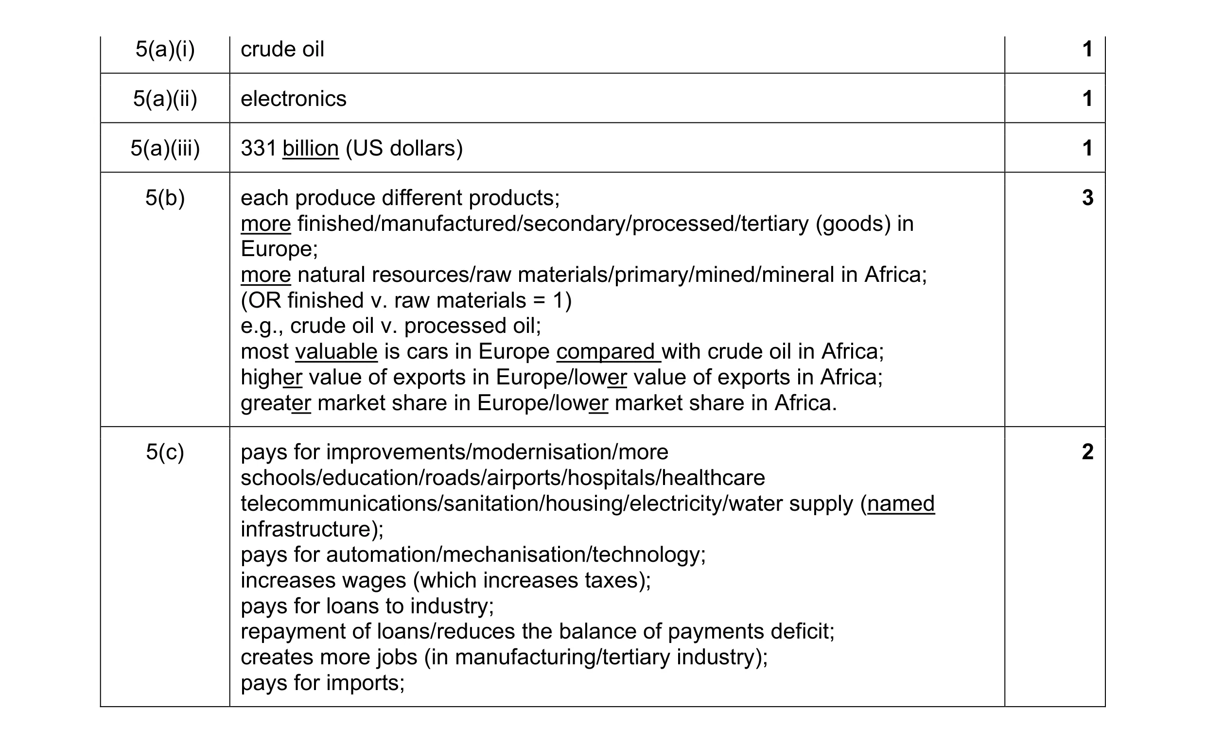 8
8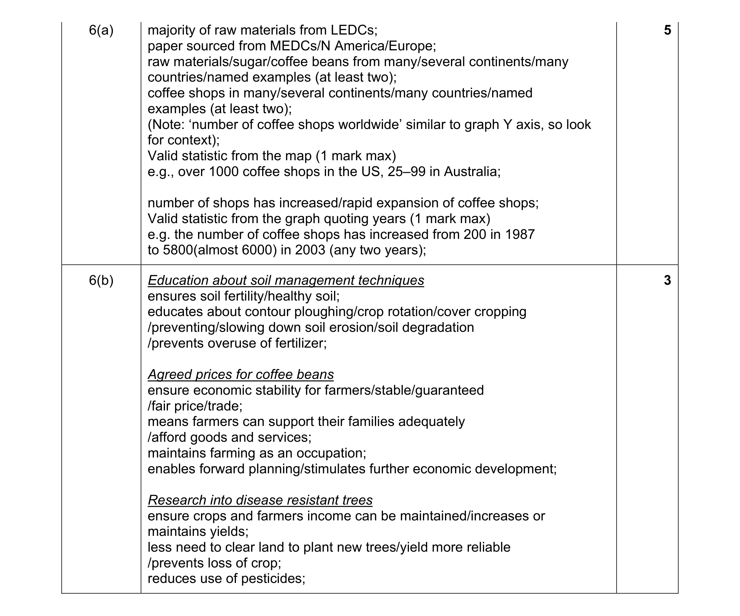 8
8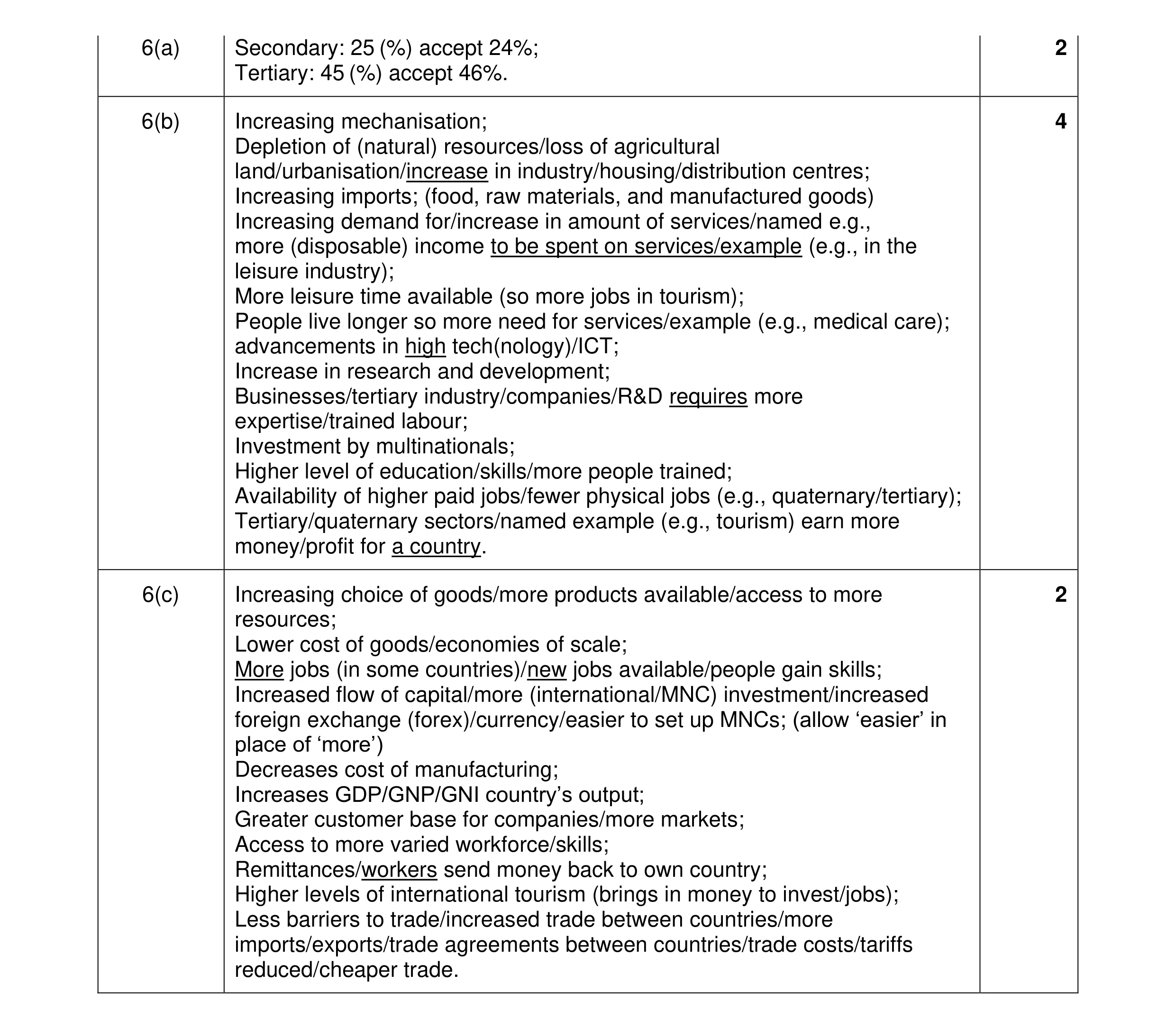 8
8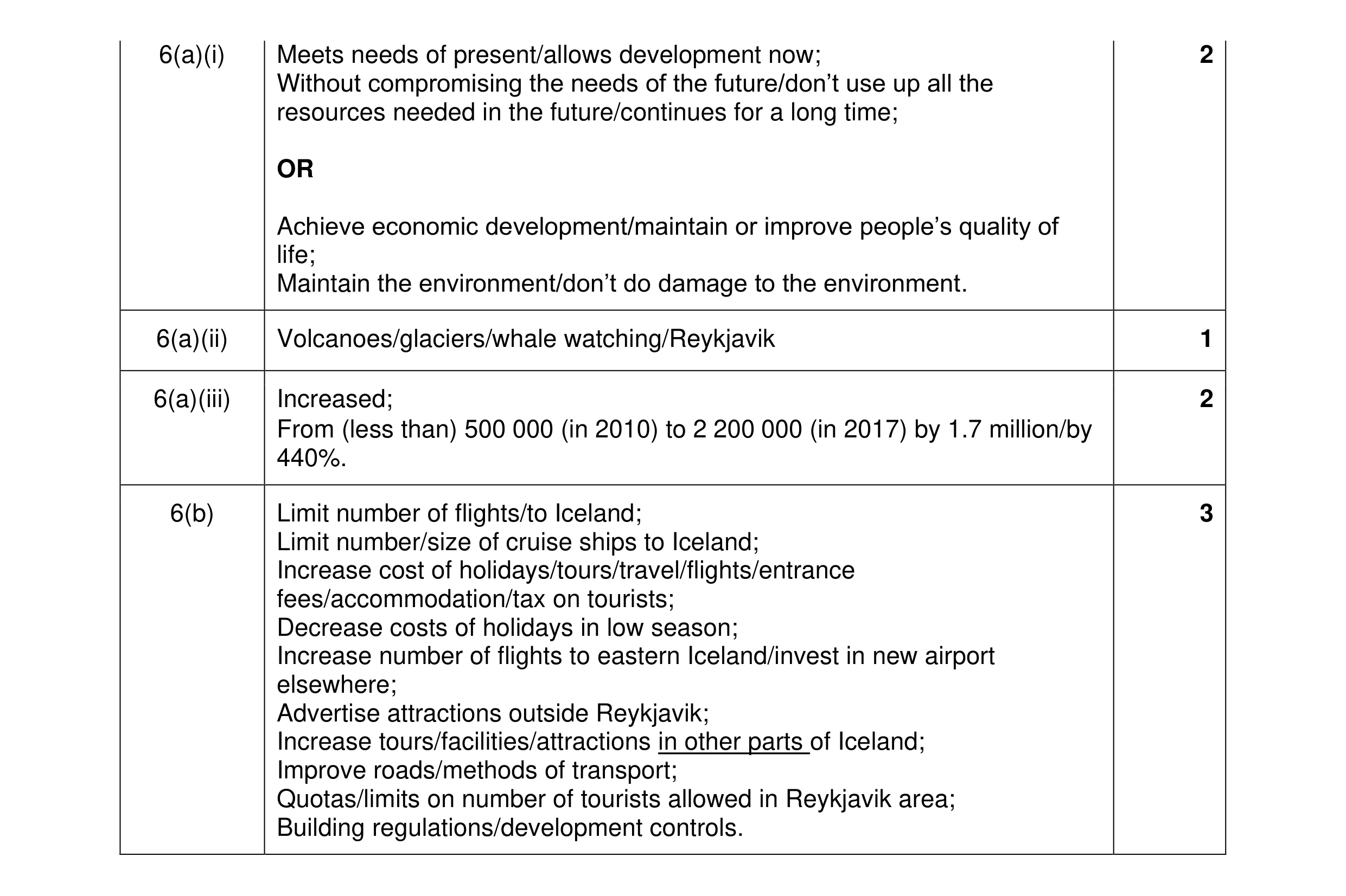 8
8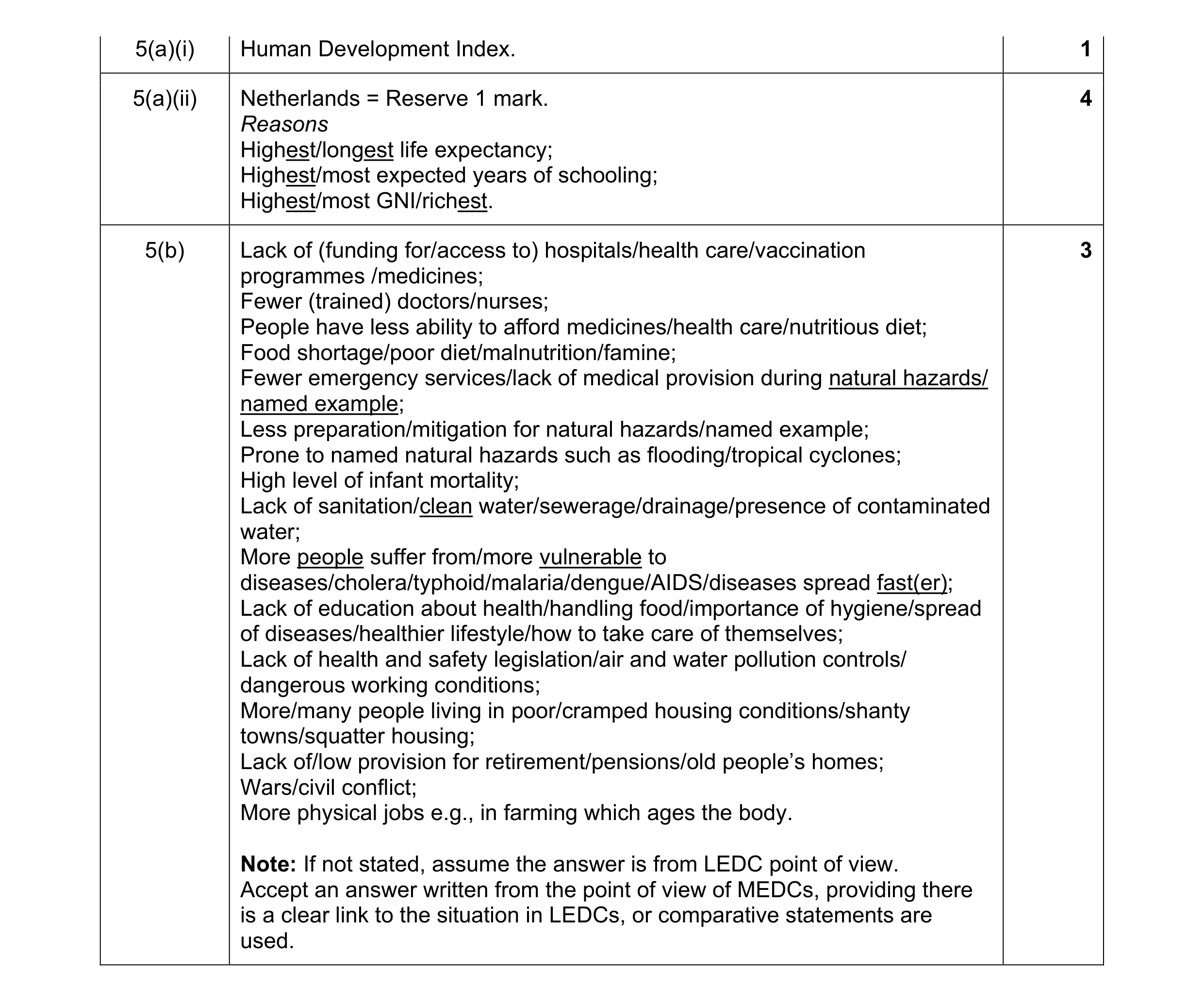 8
8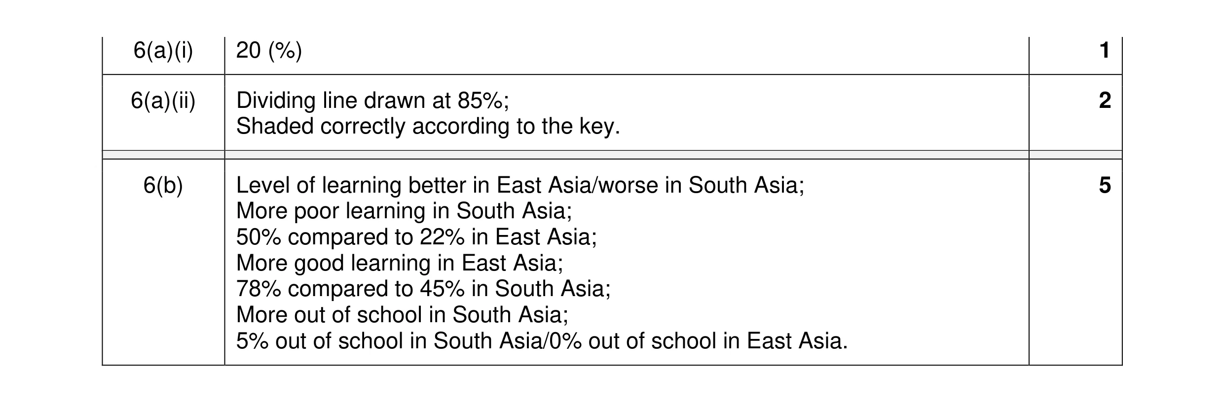 8
8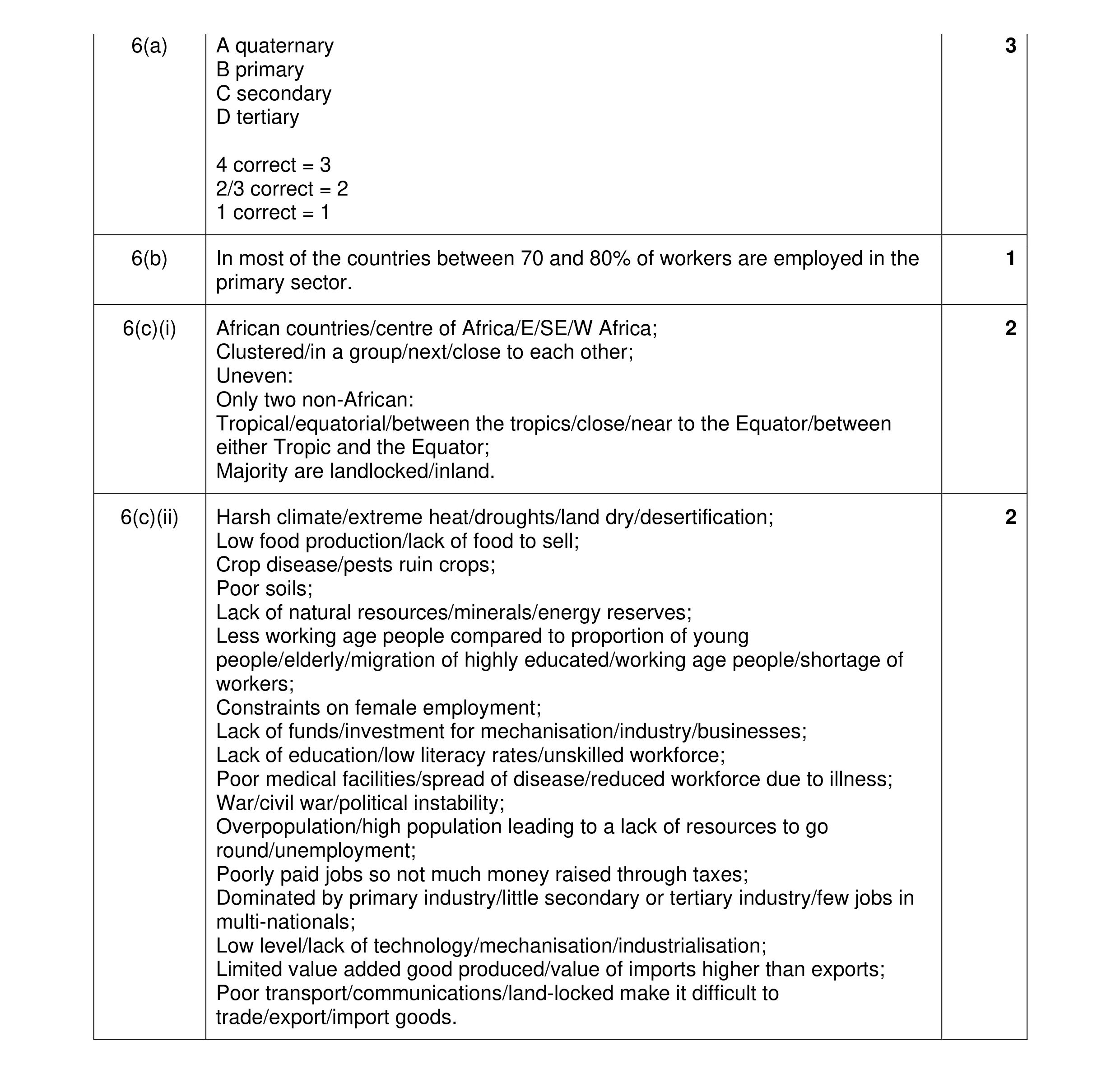 8
8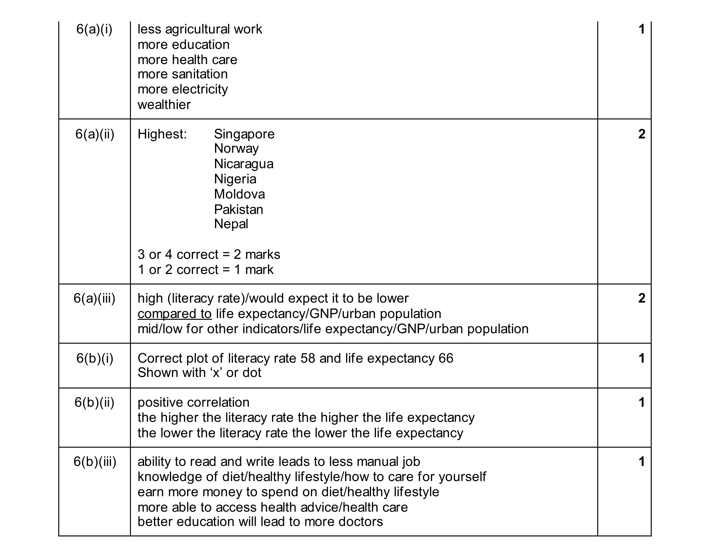 8
8