Questions as text
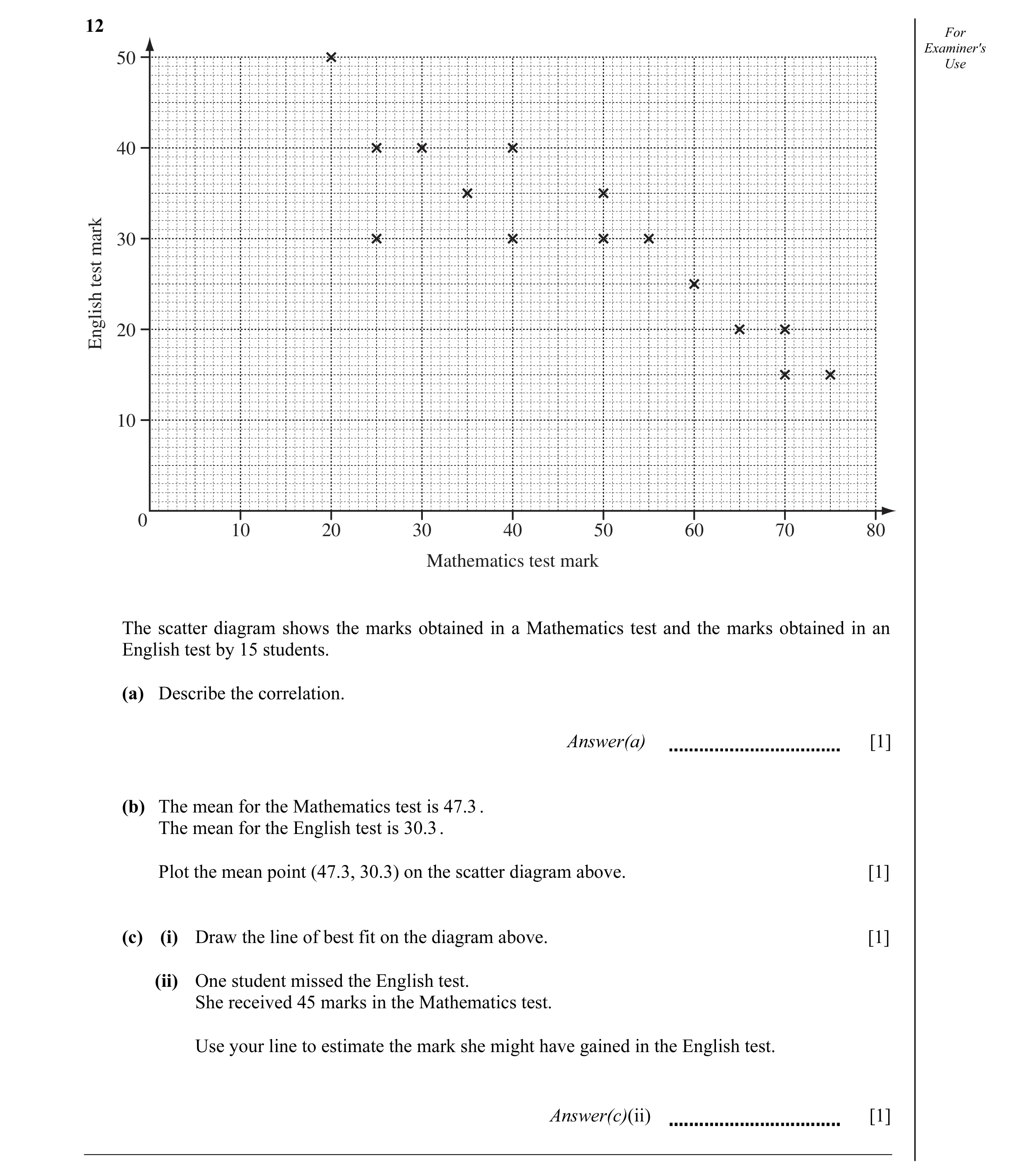
Q1 · For Examiner's 50 Use 40 30mark test 20English 10 0 10 20 30 40 50 60 70 80 Mathematics… 0580/21 Oct/Nov 2011
12 For Examiner's 50 Use 40 30mark test 20English 10 0 10 20 30 40 50 60 70 80 Mathematics test mark The scatter diagram shows the marks obtained in a Mathematics test and the marks obtained in an English test by 15 students. (a) Describe the correlation. Answer(a) [1] (b) The mean for the Mathematics test is 47.3 . The mean for the English test is 30.3 . Plot the mean point (47.3, 30.3) on the scatter diagram above. [1] (c) (i) Draw the line of best fit on the diagram above. [1] (ii) One student missed the English test. She received 45 marks in the Mathematics test. Use your line to estimate the mark she might have gained in the English test. Answer(c)(ii) [1]
4 marks
Mark scheme: 12 (a) Negative 1 Ignore embellishments (b) Correct point 1 (c) (i) Accurate ruled line 1 (ii) English mark 1ft Follow through their (c)(i) 1 1
This question in 0580/21 Oct/Nov 2011
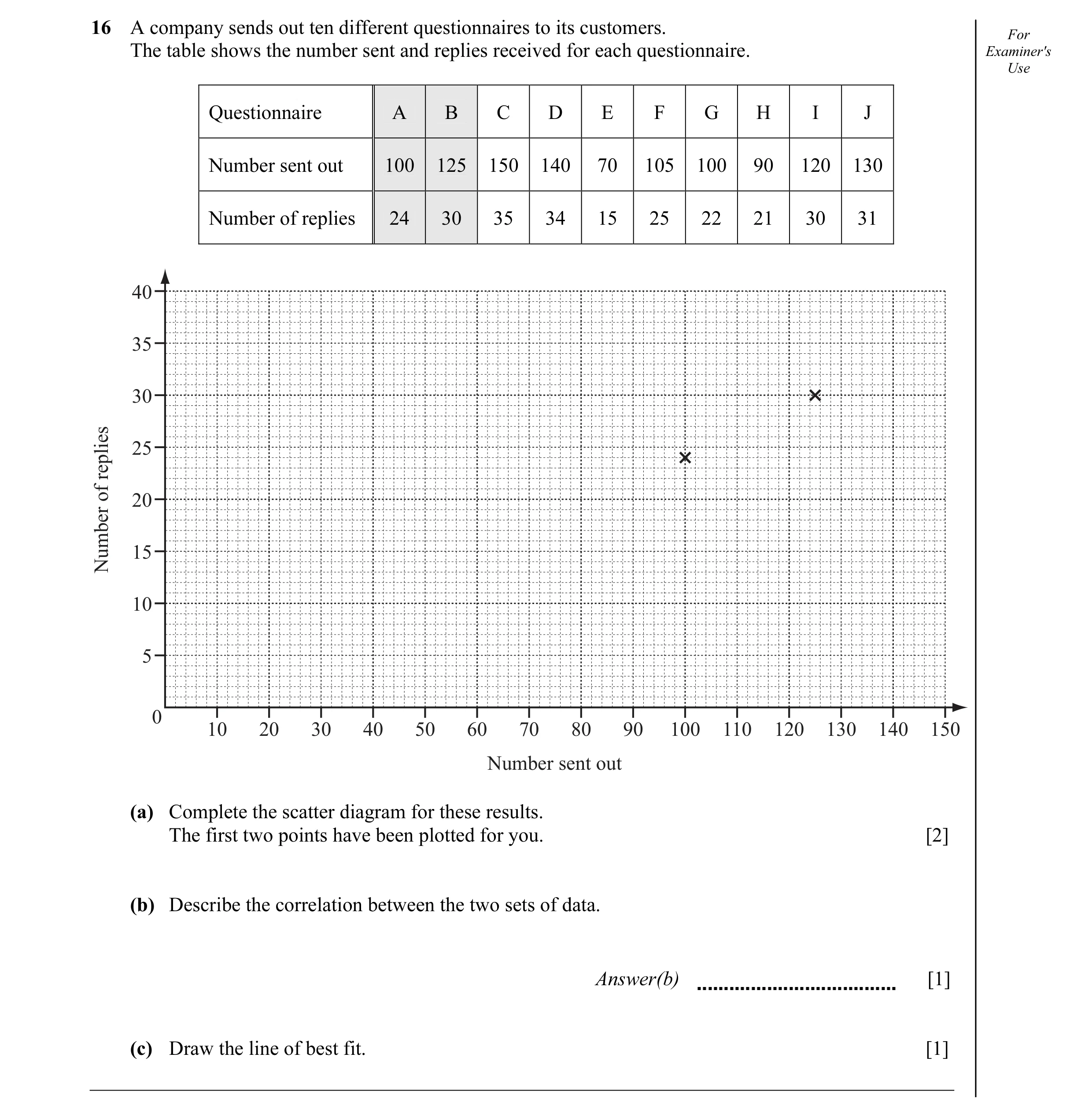
Q2 · A company sends out ten different questionnaires to its customers 0580/22 Oct/Nov 2012
16 A company sends out ten different questionnaires to its customers. For The table shows the number sent and replies received for each questionnaire. Examiner's Use Questionnaire A B C D E F G H I J Number sent out 100 125 150 140 70 105 100 90 120 130 Number of replies 24 30 35 34 15 25 22 21 30 31 40 35 30 25replies of 20 15Number 10 5 0 10 20 30 40 50 60 70 80 90 100 110 120 130 140 150 Number sent out (a) Complete the scatter diagram for these results. The first two points have been plotted for you. [2] (b) Describe the correlation between the two sets of data. Answer(b) [1] (c) Draw the line of best fit. [1]
4 marks
Mark scheme: 16 (a) Points plotted correctly 2 B1 6 or 7 points correct (b) Positive 1 (c) Line of best fit ruled 1
This question in 0580/22 Oct/Nov 2012
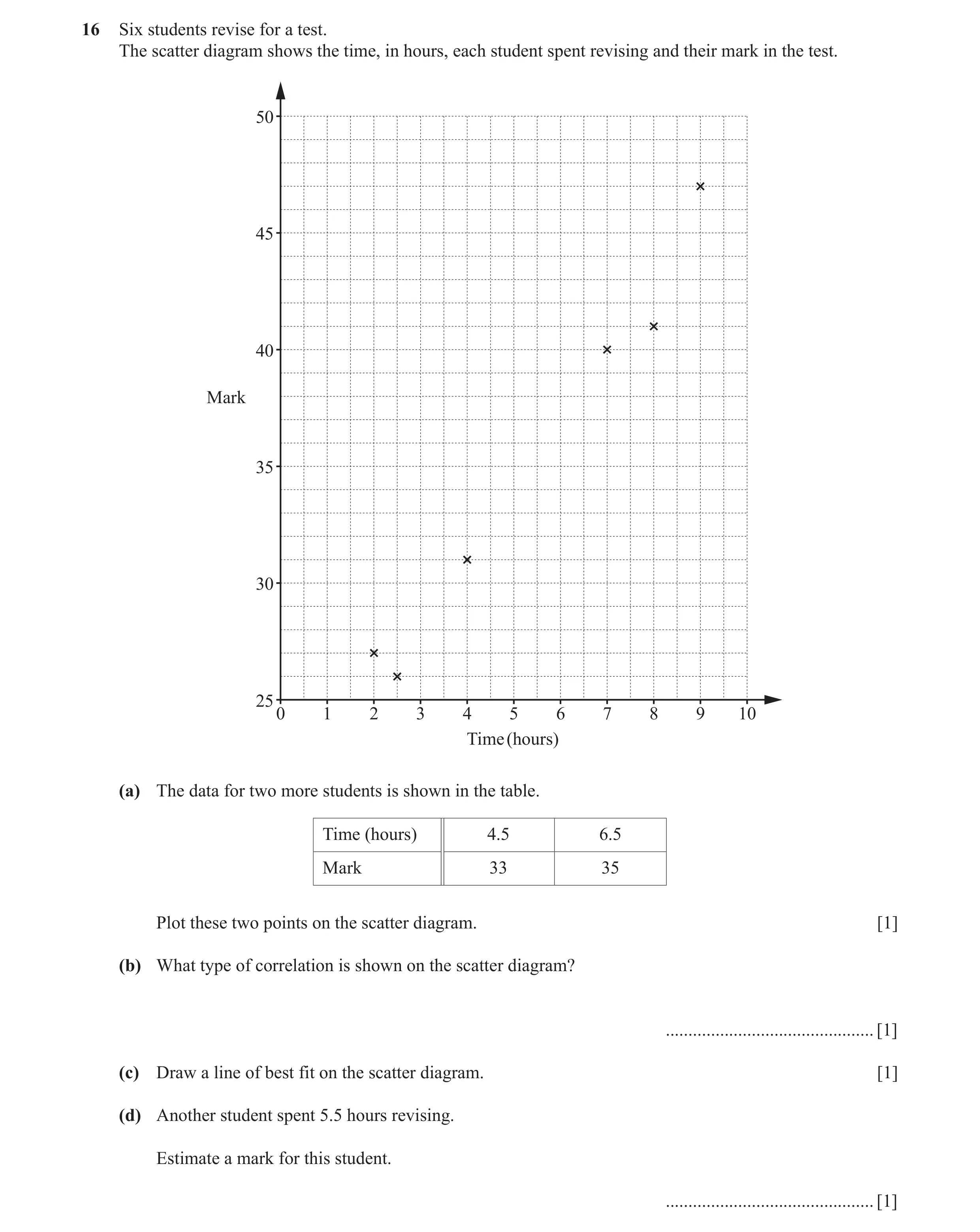
Q3 · Six students revise for a test 0580/21 May/June 2017
16 Six students revise for a test. The scatter diagram shows the time, in hours, each student spent revising and their mark in the test. 50 45 40 Mark 35 30 25 0 1 2 3 4 5 6 7 8 9 10 Time (hours) (a) The data for two more students is shown in the table. Time (hours) 4.5 6.5 Mark 33 35 Plot these two points on the scatter diagram. [1] (b) What type of correlation is shown on the scatter diagram? … [1] (c) Draw a line of best fit on the scatter diagram. [1] (d) Another student spent 5.5 hours revising. Estimate a mark for this student. … [1]
4 marks
Mark scheme: 16(b) Positive 1 16(c) Correct ruled line 1 16(d) 33.5 to 37.5 1FT FT from their line providing positive gradient
This question in 0580/21 May/June 2017
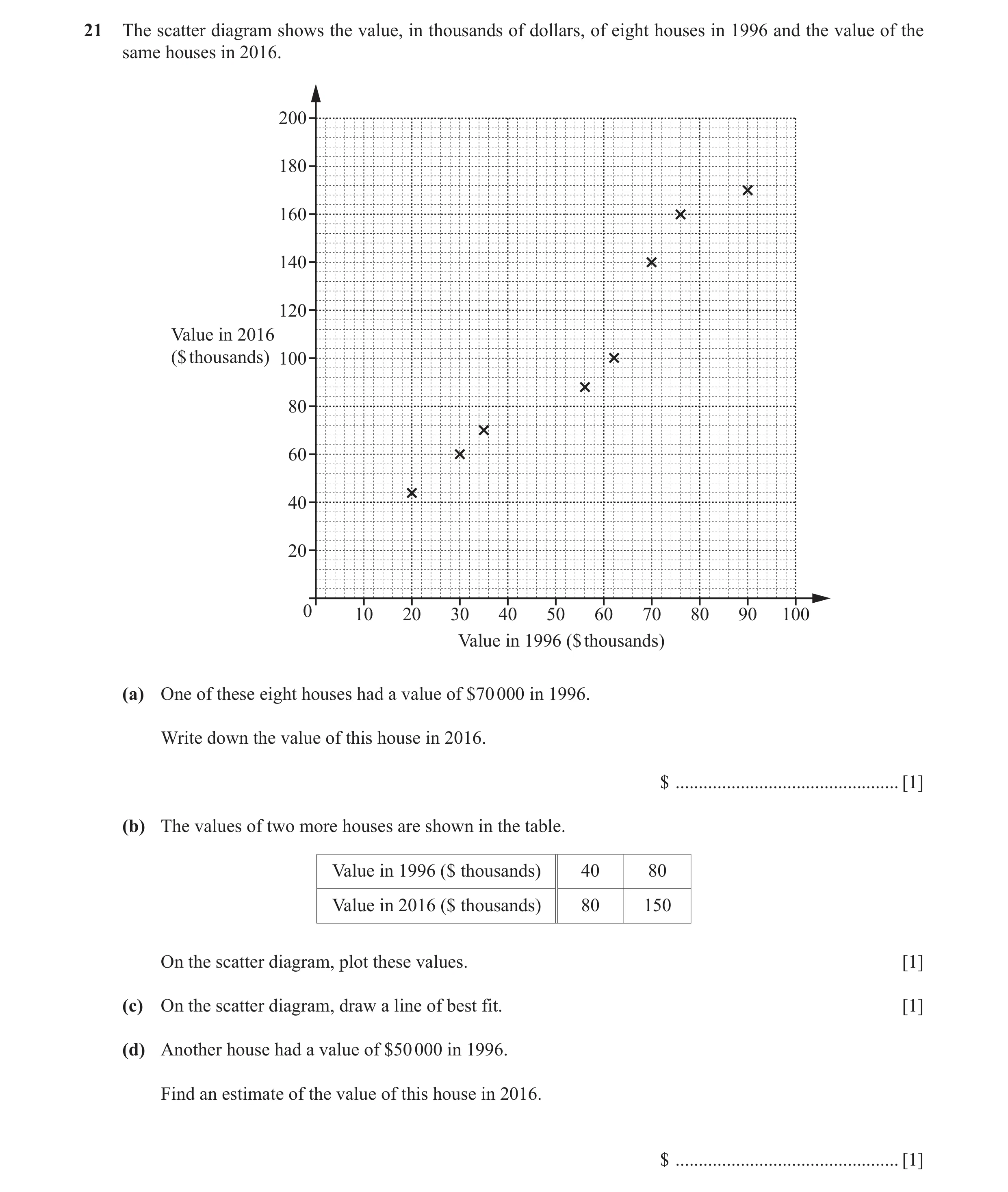
Q4 · The scatter diagram shows the value, in thousands of dollars, of eight houses in 1996 and… 0580/22 May/June 2018
21 The scatter diagram shows the value, in thousands of dollars, of eight houses in 1996 and the value of the same houses in 2016. 200 180 160 140 120 Value in 2016 ($ thousands) 100 80 60 40 20 0 10 20 30 40 50 60 70 80 90 100 Value in 1996 ($ thousands) (a) One of these eight houses had a value of $70 000 in 1996. Write down the value of this house in 2016. $ … [1] (b) The values of two more houses are shown in the table. Value in 1996 ($ thousands) 40 80 Value in 2016 ($ thousands) 80 150 On the scatter diagram, plot these values. [1] (c) On the scatter diagram, draw a line of best fit. [1] (d) Another house had a value of $50 000 in 1996. Find an estimate of the value of this house in 2016. $ … [1]
4 marks
Mark scheme: 21(a) 140 000 1 21(b) Points correctly plotted at 1 (40, 80) and (80, 150) 21(c) Correct ruled line of best fit 1 21(d) 80 000 to 110 000 1 FT their straight line provided it has positive gradient
This question in 0580/22 May/June 2018
Q5 · Energy O Time What type of correlation does the scatter diagram show? 0580/21 Oct/Nov 2018
3 Energy O Time What type of correlation does the scatter diagram show? … [1]
1 marks
Mark scheme: 3 Negative 1
This question in 0580/21 Oct/Nov 2018
Q6 · The scatter diagram shows the number of people and the number of phones in each of 8… 0580/23 May/June 2019
8 The scatter diagram shows the number of people and the number of phones in each of 8 buildings. 70 60 50 40 Number of phones 30 20 10 0 0 10 20 30 40 50 60 70 80 Number of people (a) One of the buildings contains 42 people. Write down the number of phones in this building. … [1] (b) What type of correlation is shown in the scatter diagram? … [1]
2 marks
Mark scheme: 8(a) 32 1 8(b) Positive 1
This question in 0580/23 May/June 2019
Q7 · Ten athletes compete in both the 100 metre race and the triple jump 0580/23 Oct/Nov 2019
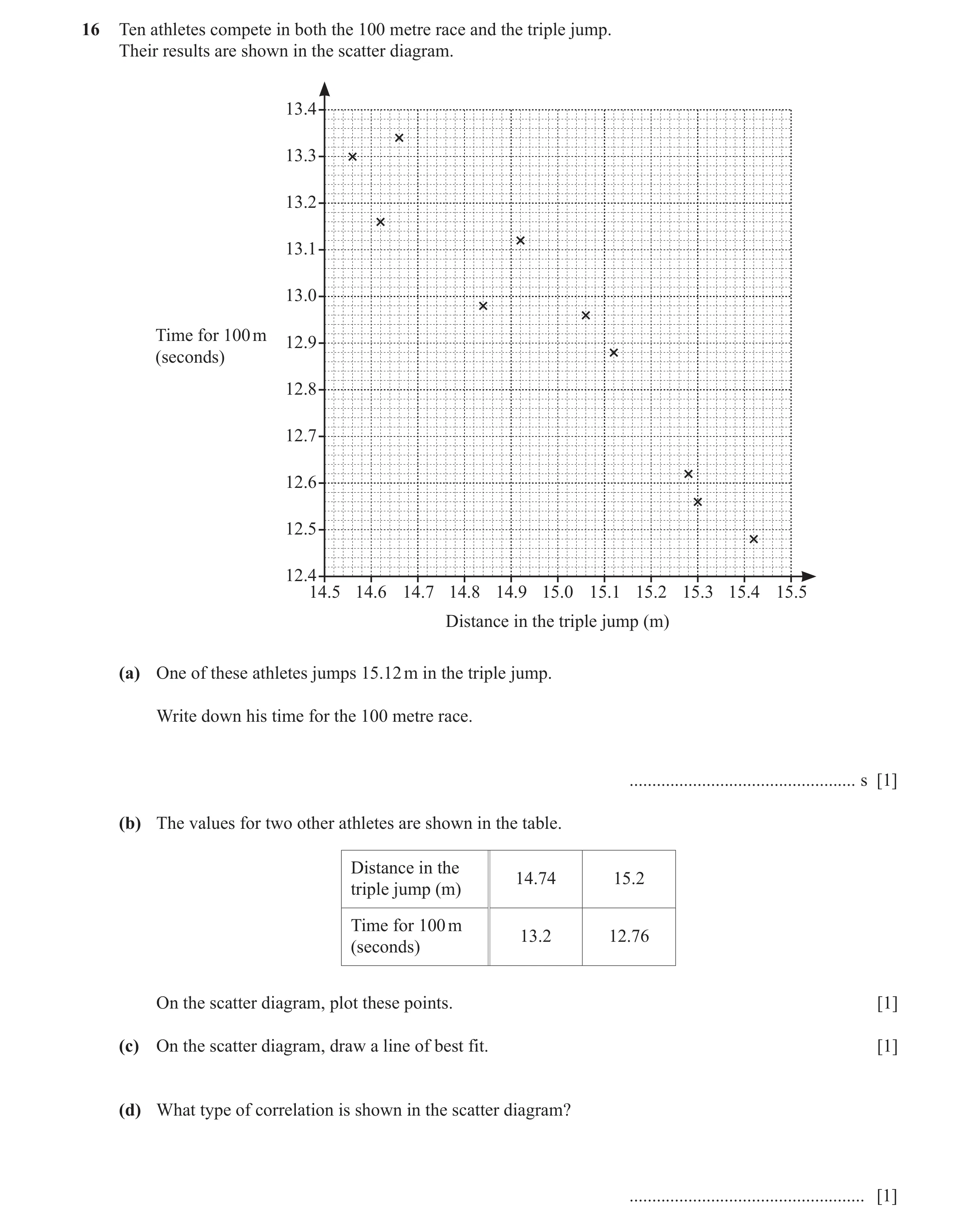
16 Ten athletes compete in both the 100 metre race and the triple jump. Their results are shown in the scatter diagram. 13.4 13.3 13.2 13.1 13.0 Time for 100 m 12.9 (seconds) 12.8 12.7 12.6 12.5 12.4 14.5 14.6 14.7 14.8 14.9 15.0 15.1 15.2 15.3 15.4 15.5 Distance in the triple jump (m) (a) One of these athletes jumps 15.12 m in the triple jump. Write down his time for the 100 metre race. … s [1] (b) The values for two other athletes are shown in the table. Distance in the 14.74 15.2 triple jump (m) Time for 100 m 13.2 12.76 (seconds) On the scatter diagram, plot these points. [1] (c) On the scatter diagram, draw a line of best fit. [1] (d) What type of correlation is shown in the scatter diagram? … [1]
4 marks
Mark scheme: 16(a) 12.88 1 16(b) two correct points plotted 1 16(c) ruled line of best fit 1 16(d) negative 1
This question in 0580/23 Oct/Nov 2019
Q8 · Mrs Salaman gives her class two mathematics tests 0580/21 May/June 2020
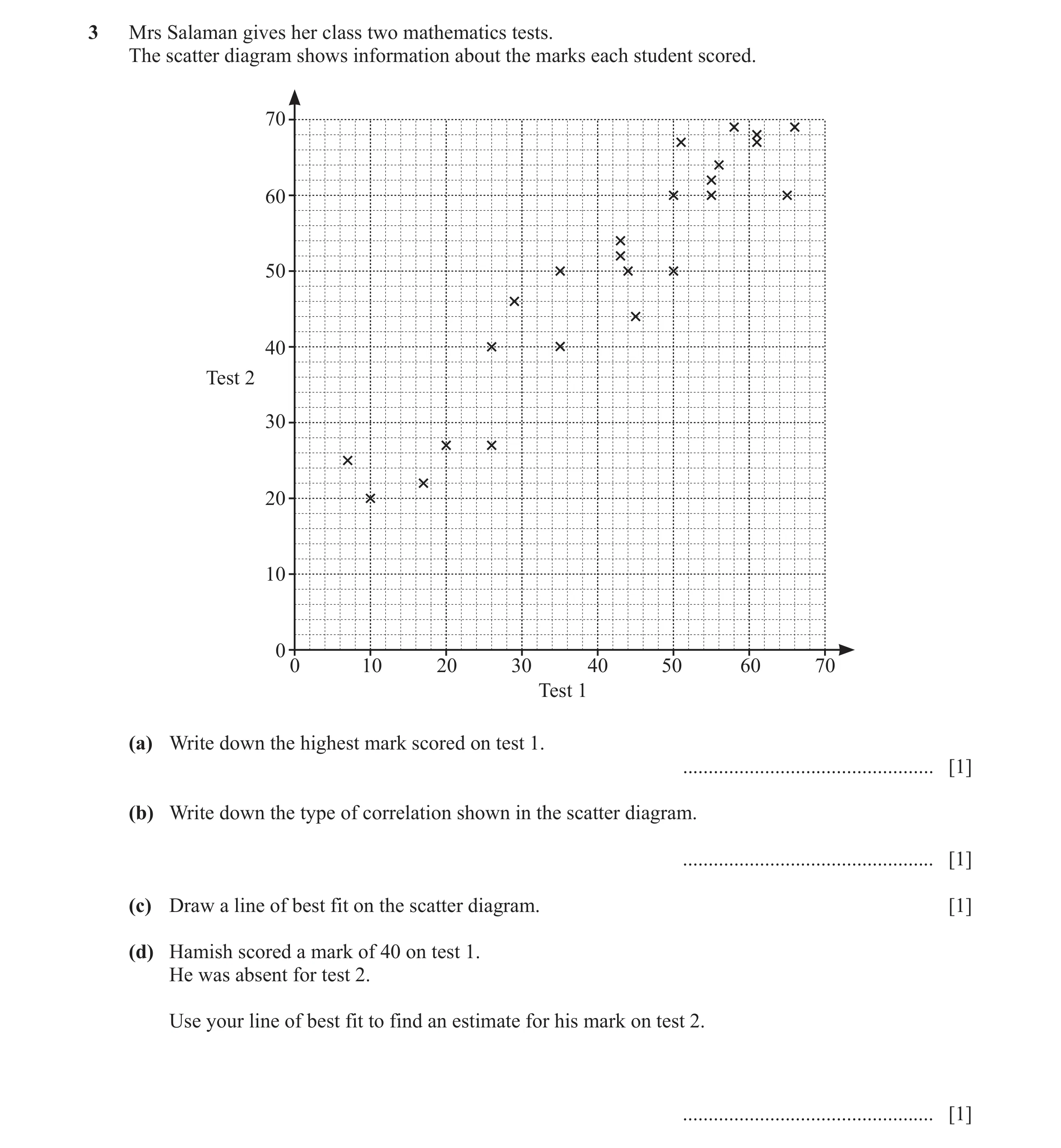
3 Mrs Salaman gives her class two mathematics tests. The scatter diagram shows information about the marks each student scored. 70 60 50 40 Test 2 30 20 10 0 0 10 20 30 40 50 60 70 Test 1 (a) Write down the highest mark scored on test 1. … [1] (b) Write down the type of correlation shown in the scatter diagram. … [1] (c) Draw a line of best fit on the scatter diagram. [1] (d) Hamish scored a mark of 40 on test 1. He was absent for test 2. Use your line of best fit to find an estimate for his mark on test 2. … [1]
4 marks
Mark scheme: 3(a) 66 1 3(b) Positive 1 3(c) Ruled line of best fit 1 3(d) 46 to 50 1 FT their line of best fit if a positive gradient
This question in 0580/21 May/June 2020
Q9 · Aisha records the distance she runs and her average speed 0580/21 Oct/Nov 2020
4 Aisha records the distance she runs and her average speed. The results are shown in the scatter diagram. 16 15 14 13 12 Average speed 11 (km/h) 10 9 8 7 6 5 0 1 2 3 4 5 6 7 8 9 10 Distance (km) (a) The table shows the results of four more runs. Distance (km) 4.2 5.7 7.1 8.8 Average speed (km/h) 13.4 11.8 9.8 8.3 On the scatter diagram, plot these points. [2] (b) What type of correlation is shown in the scatter diagram? … [1] (c) On the scatter diagram, draw a line of best fit. [1] (d) Use your line of best fit to estimate her average speed when she runs a distance of 6 km. … km/h [1]
5 marks
Mark scheme: 4(a) 4 points correctly plotted 2 B1 for 2 or 3 points correctly plotted 4(b) Negative 1 4(c) Correct ruled line of best fit 1 4(d) 10 to 12 1 FT their straight line of best fit
This question in 0580/21 Oct/Nov 2020
Q10 · The number of bowls of hot soup sold decreases when the temperature rises 0580/22 Feb/March 2021
5 The number of bowls of hot soup sold decreases when the temperature rises. What type of correlation does this statement describe? … [1]
1 marks
Mark scheme: 5 Negative 1
This question in 0580/22 Feb/March 2021
Q11 · Henrik draws this scatter diagram 0580/22 May/June 2021
5 (a) Henrik draws this scatter diagram. Put a ring around the one correct statement about this scatter diagram. It shows It is not possible to tell if It shows negative It shows positive no correlation. there is correlation as there correlation. correlation. are not enough points. [1] (b) Each of the four scatter diagrams shows the same set of data. A line has been drawn on each diagram. Diagram A Diagram B Diagram C Diagram D Complete the statement. The line in Diagram … is the most appropriate line of best fit. [1]
2 marks
Mark scheme: 5(a) It is not possible to tell if there is 1 correlation as there are not enough points. 5(b) C 1
This question in 0580/22 May/June 2021
Q12 · As the temperature increases, people eat more ice cream 0580/22 Feb/March 2022
11 As the temperature increases, people eat more ice cream. What type of correlation does this statement describe? … [1]
1 marks
Mark scheme: 11 Positive 1
This question in 0580/22 Feb/March 2022
Q13 · The scatter diagram shows the number of visitors and the total amount spent, in thousands… 0580/23 May/June 2022
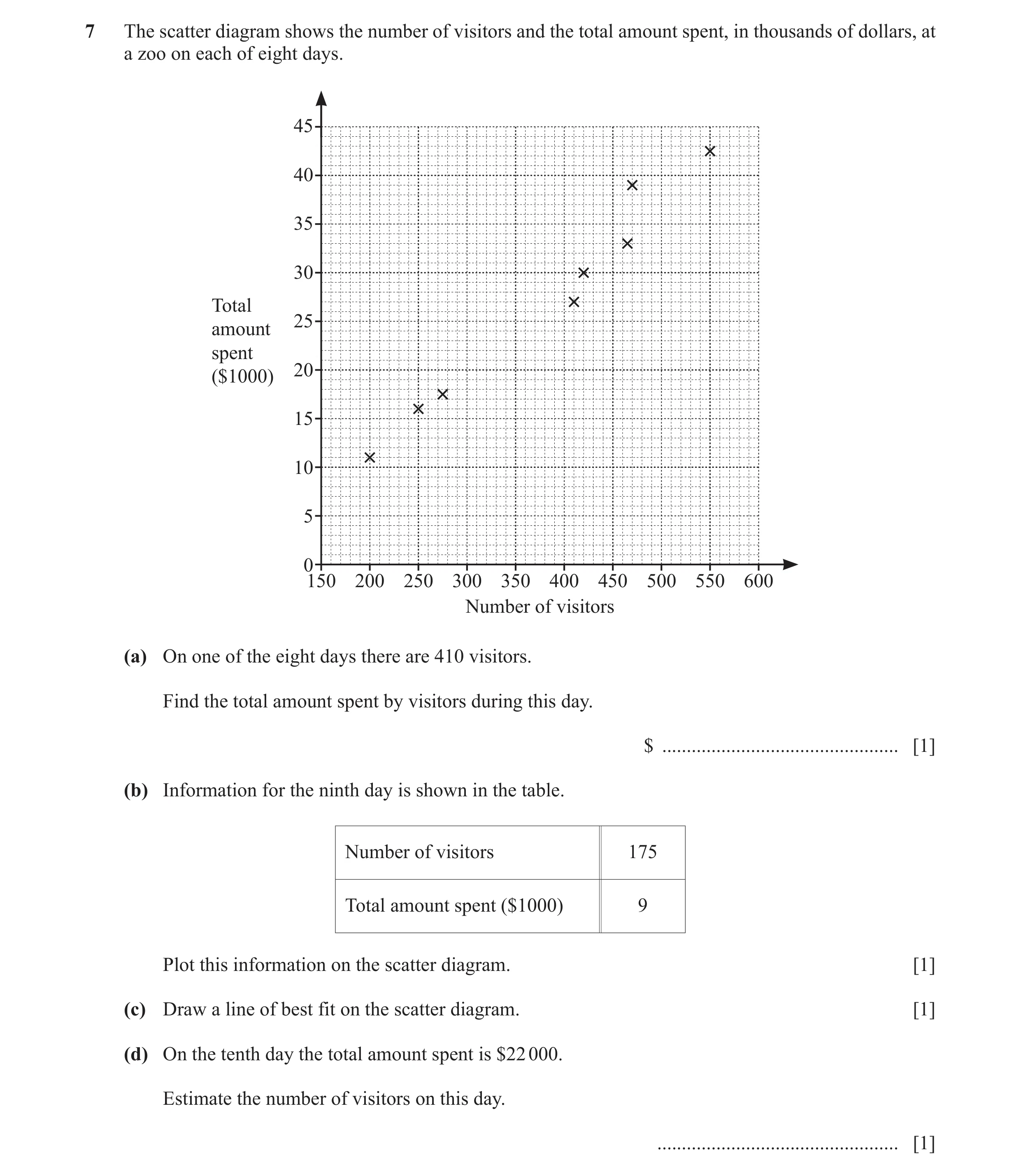
7 The scatter diagram shows the number of visitors and the total amount spent, in thousands of dollars, at a zoo on each of eight days. 45 40 35 30 Total 25 amount spent 20 ($1000) 15 10 5 0150 200 250 300 350 400 450 500 550 600 Number of visitors (a) On one of the eight days there are 410 visitors. Find the total amount spent by visitors during this day. $ … [1] (b) Information for the ninth day is shown in the table. Number of visitors 175 Total amount spent ($1000) 9 Plot this information on the scatter diagram. [1] (c) Draw a line of best fit on the scatter diagram. [1] (d) On the tenth day the total amount spent is $22 000. Estimate the number of visitors on this day. … [1]
4 marks
Mark scheme: 7(a) 27 000 1 7(b) Point plotted at (175, 9) 1 7(c) Correct single ruled line of best fit 1 7(d) 300 to 350 1 FT their straight line of best fit provided positive gradient
This question in 0580/23 May/June 2022
Q14 · For each of 10 people working in an office, the scatter diagram shows their salary and… 0580/21 Oct/Nov 2023
6 For each of 10 people working in an office, the scatter diagram shows their salary and the value of their car. 10 000 9000 8000 7000 6000 Value of 5000 car ($) 4000 3000 2000 1000 0 0 10 000 20 000 30 000 40 000 50 000 60 000 70 000 80 000 Salary ($) (a) One of these people has a salary of $28 000. Find the value of their car. $ … [1] (b) Another person starts to work in the office. Their salary is $54 000 and the value of their car is $6100. Plot this information on the scatter diagram. [1] (c) What type of correlation is shown in the scatter diagram? … [1]
3 marks
Mark scheme: 6(a) 4800 1 6(b) Point plotted at (54 000, 6100) 1 6(c) Positive 1
This question in 0580/21 Oct/Nov 2023
Q15 · As the temperature increases, the number of people who go swimming increases 0580/22 Feb/March 2024
7 As the temperature increases, the number of people who go swimming increases. Write down the type of correlation that this statement describes. … [1]
1 marks
Mark scheme: 7 Positive 1
This question in 0580/22 Feb/March 2024
Q16 · The scatter diagram shows the number of rooms and the number of people in each of eight… 0580/22 Oct/Nov 2024
4 The scatter diagram shows the number of rooms and the number of people in each of eight buildings. 70 60 50 40 Number of rooms 30 20 10 0 0 10 20 30 40 50 60 70 80 Number of people (a) One of the buildings has 67 rooms. Write down the number of people in this building. … [1] (b) In another building there are 42 people and 33 rooms. On the scatter diagram, plot this point. [1] (c) (i) On the scatter diagram, draw a line of best fit. [1] (ii) There are 45 people in a different building. Find an estimate for the number of rooms in this building. … [1] (d) What type of correlation is shown in the scatter diagram? … [1]
5 marks
Mark scheme: 4(a) 76 1 4(b) Point correctly plotted at 1 (42, 33) 4(c)(i) Correct ruled line of best fit 1 4(c)(ii) An integer in the range 1 27 to 33 FT their line of best fit provided line shows positive correlation and answer is an integer 4(d) Positive 1
This question in 0580/22 Oct/Nov 2024
Q17 · The number of ice creams sold increases as the temperature rises 0580/23 May/June 2025
4 The number of ice creams sold increases as the temperature rises. What type of correlation does this statement describe? … [1]
1 marks
Mark scheme: 4 Positive 1
This question in 0580/23 May/June 2025
Q18 · The scatter diagram shows the value, in thousands of dollars, of ten paintings in 2005… 0580/23 Oct/Nov 2025
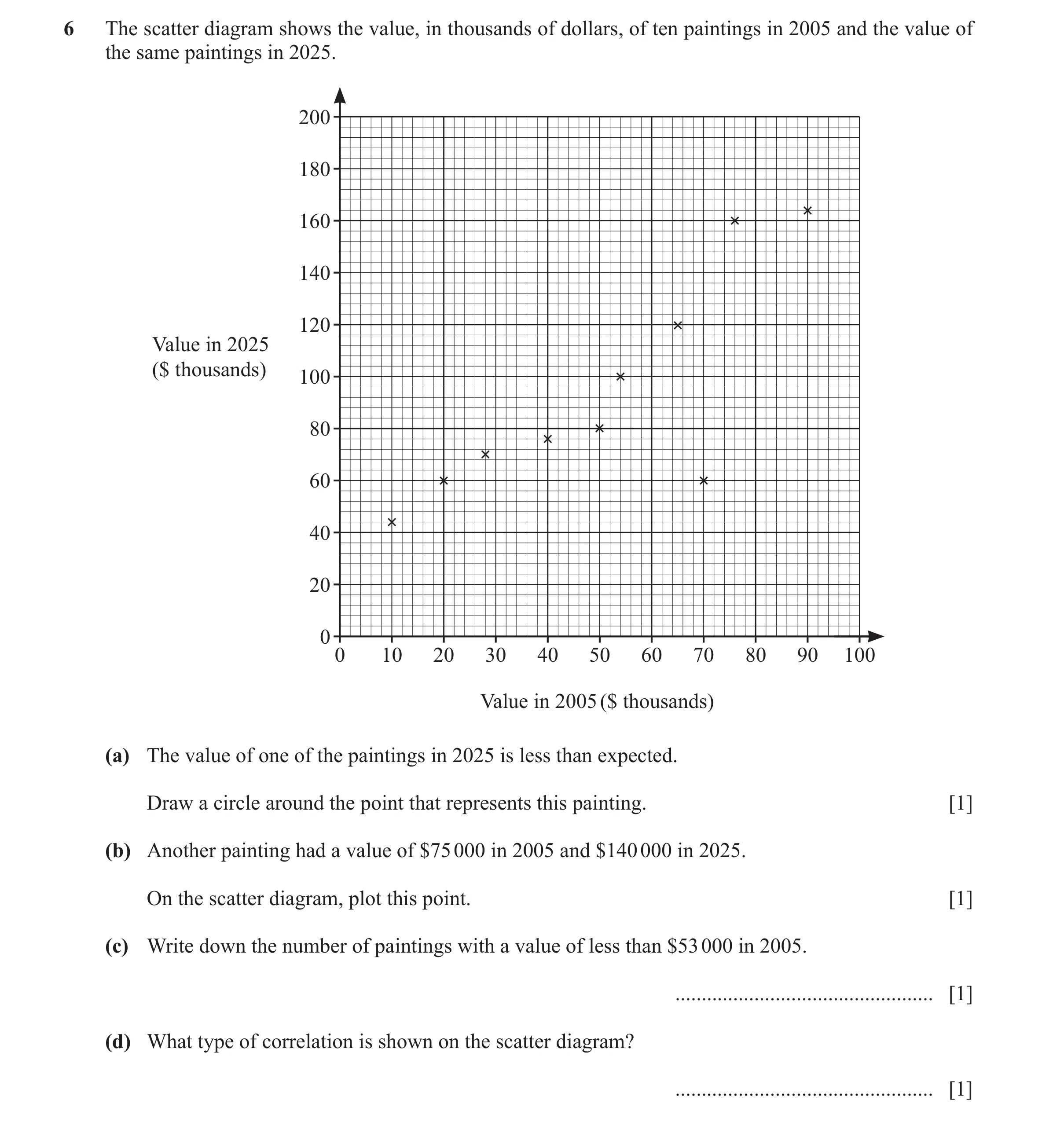
6 The scatter diagram shows the value, in thousands of dollars, of ten paintings in 2005 and the value of the same paintings in 2025. 200 180 160 140 120 Value in 2025 ($ thousands) 100 80 60 40 20 0 0 10 20 30 40 50 60 70 80 90 100 Value in 2005 ($ thousands) (a) The value of one of the paintings in 2025 is less than expected. Draw a circle around the point that represents this painting. [1] (b) Another painting had a value of $75 000 in 2005 and $140 000 in 2025. On the scatter diagram, plot this point. [1] (c) Write down the number of paintings with a value of less than $53 000 in 2005. … [1] (d) What type of correlation is shown on the scatter diagram? … [1]
4 marks
Mark scheme: 6(a) A ring around the point (70, 60) 1 6(b) Point correctly plotted at (75, 140) 1 6(c) 5 1 6(d) Positive 1
This question in 0580/23 Oct/Nov 2025
 1 / 14
 2 / 14
 3 / 14
 4 / 14
![Question 5: Energy O Time What type of correlation does the scatter diagram show? .................................................[1]](https://img.pastlit.com/crops/af298087-6708-4727-a500-b922ddfec1c6/q3.webp) 5 / 14
5 / 14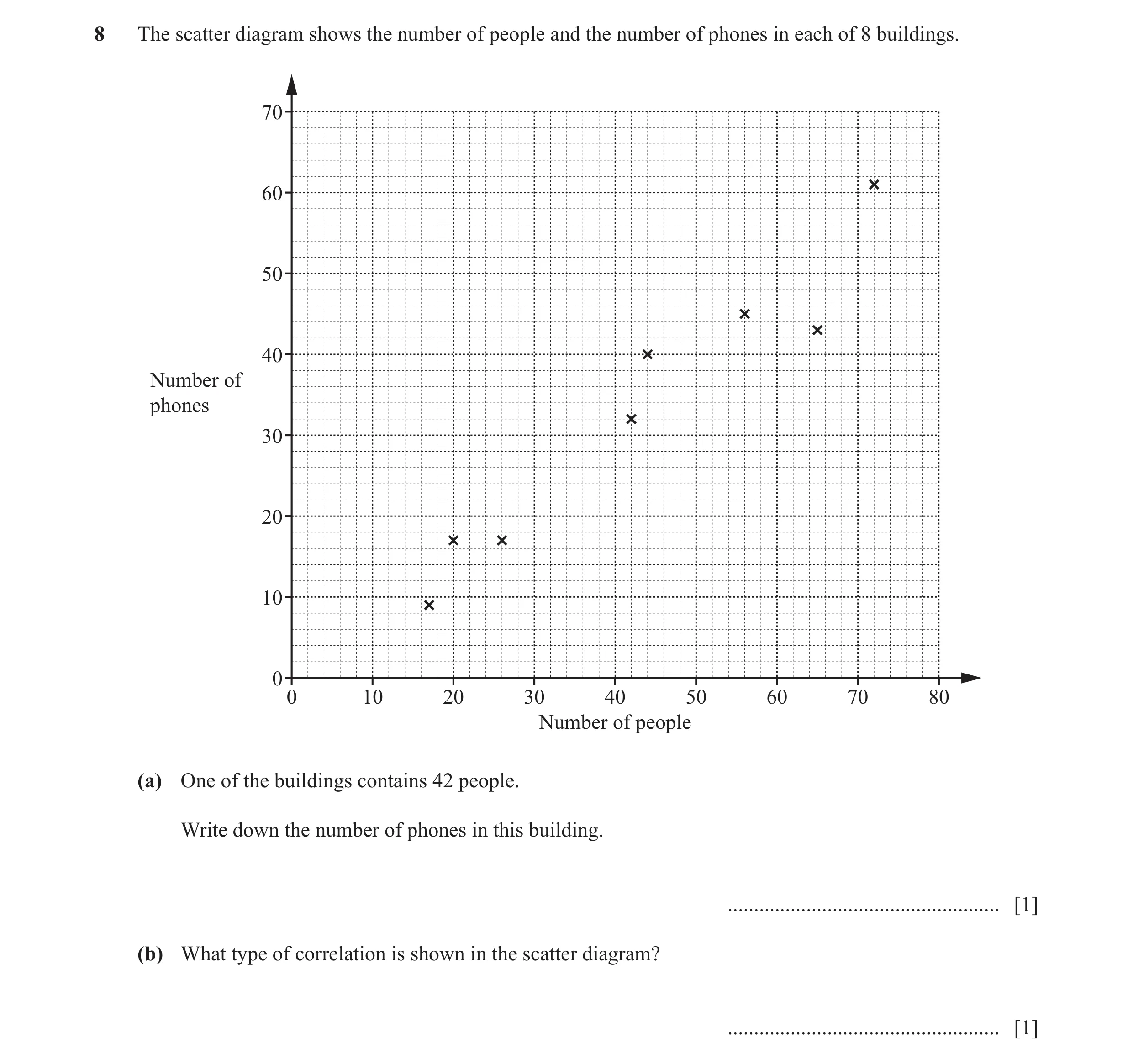 6 / 14
 7 / 14
 8 / 14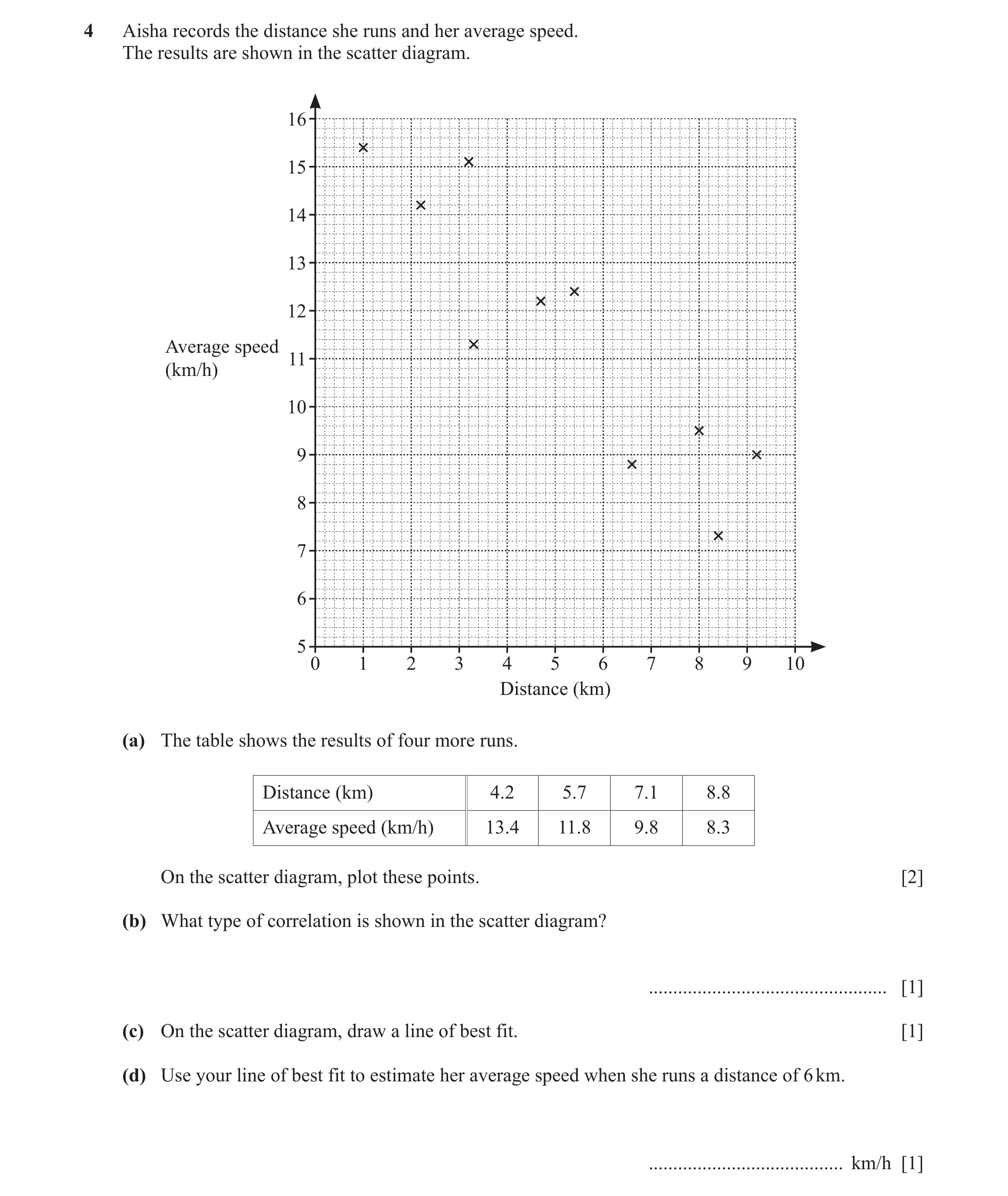
 9 / 14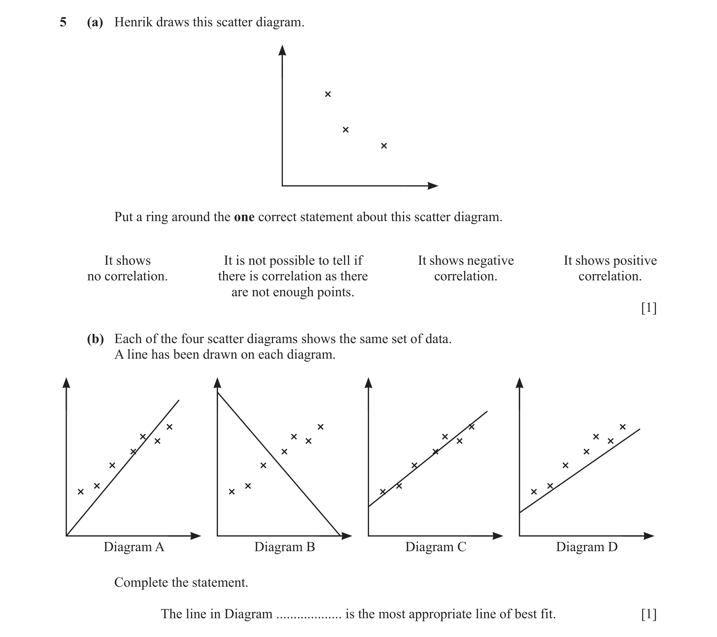
 10 / 14
 11 / 14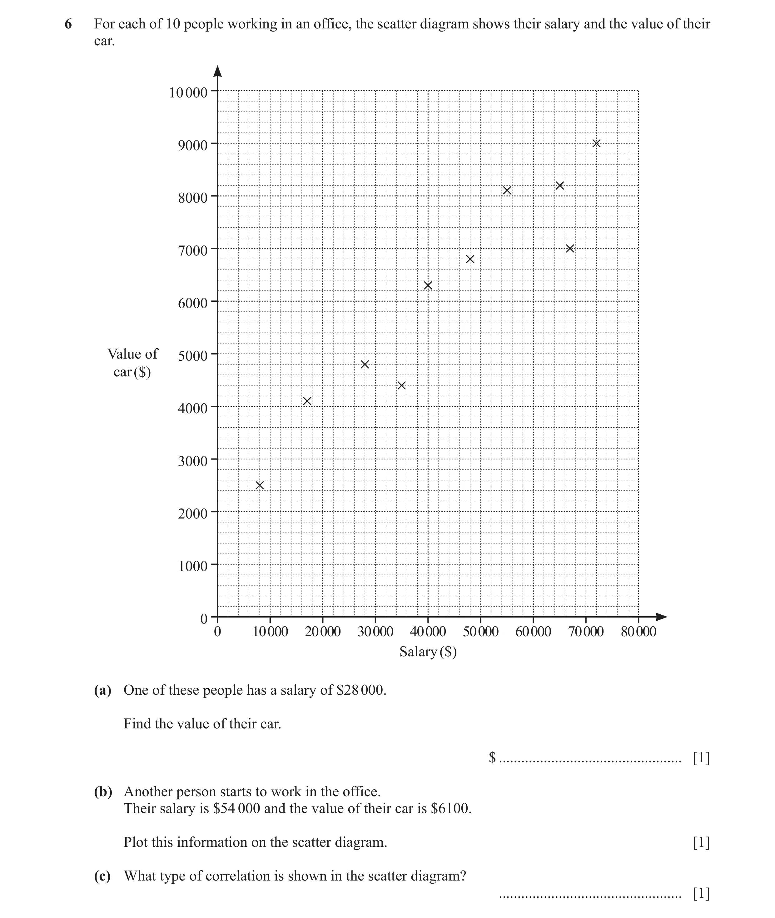
 12 / 14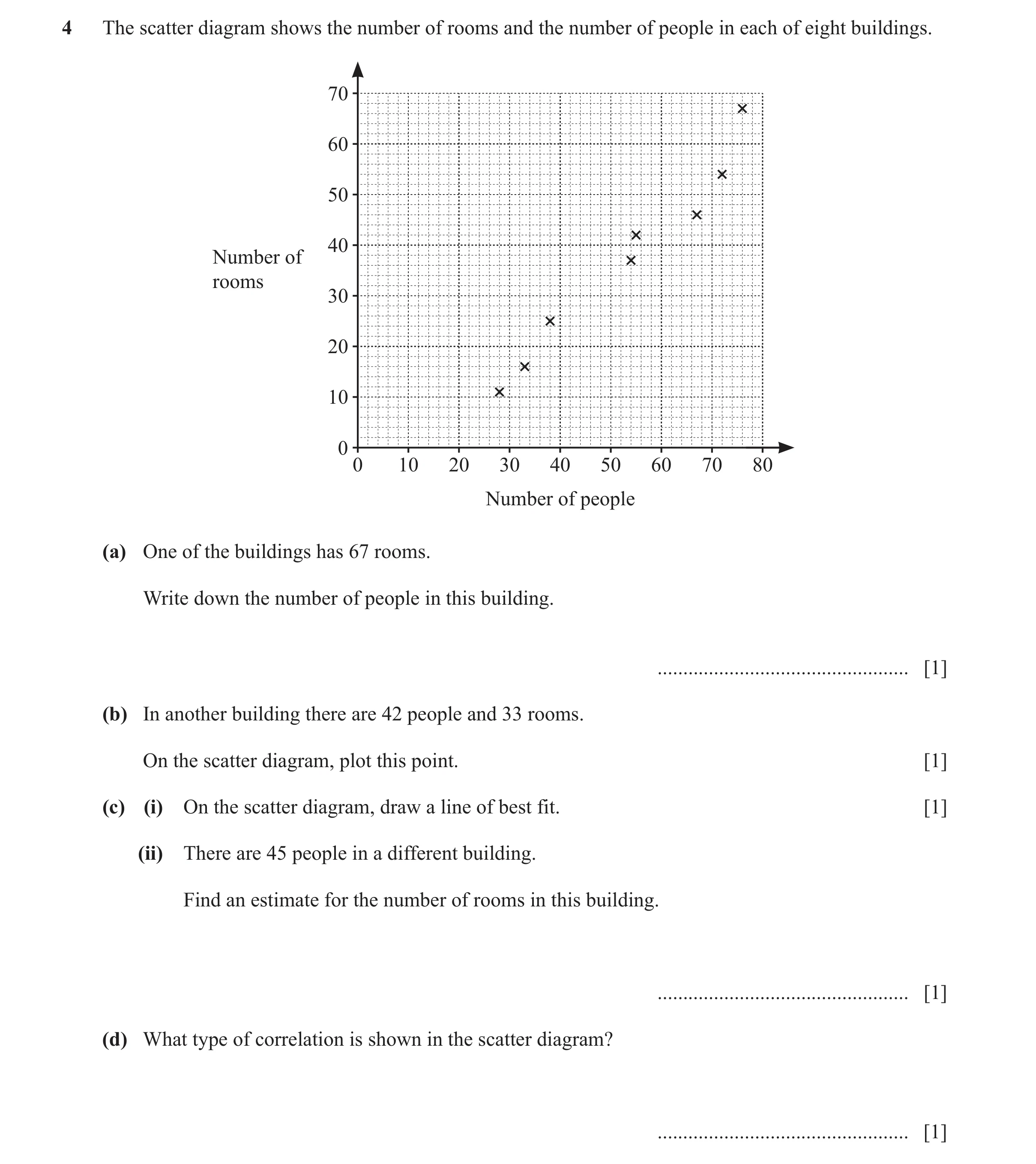
 13 / 14
 14 / 14
 4
4 4
4 4
4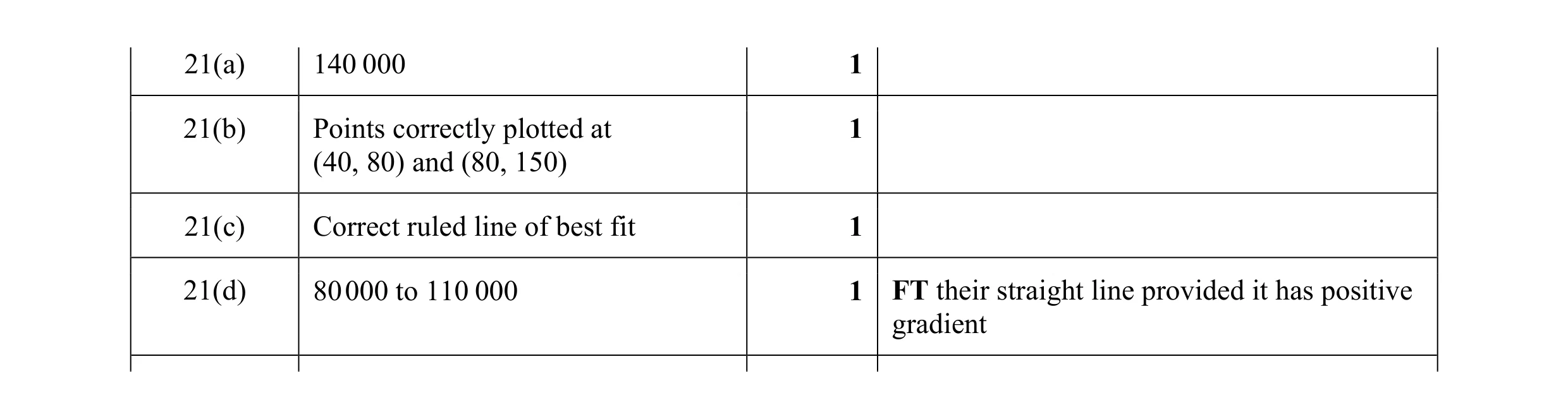 4
4 1
1 2
2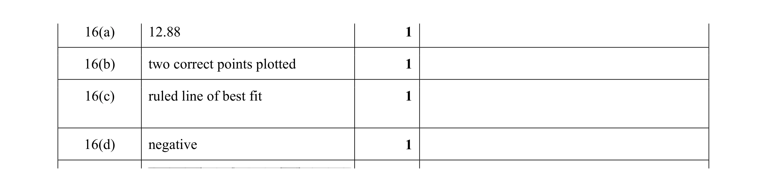 4
4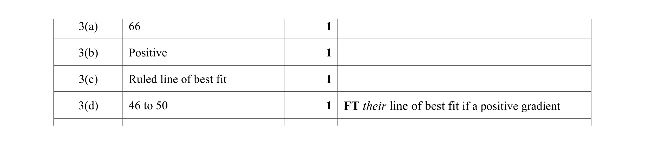 4
4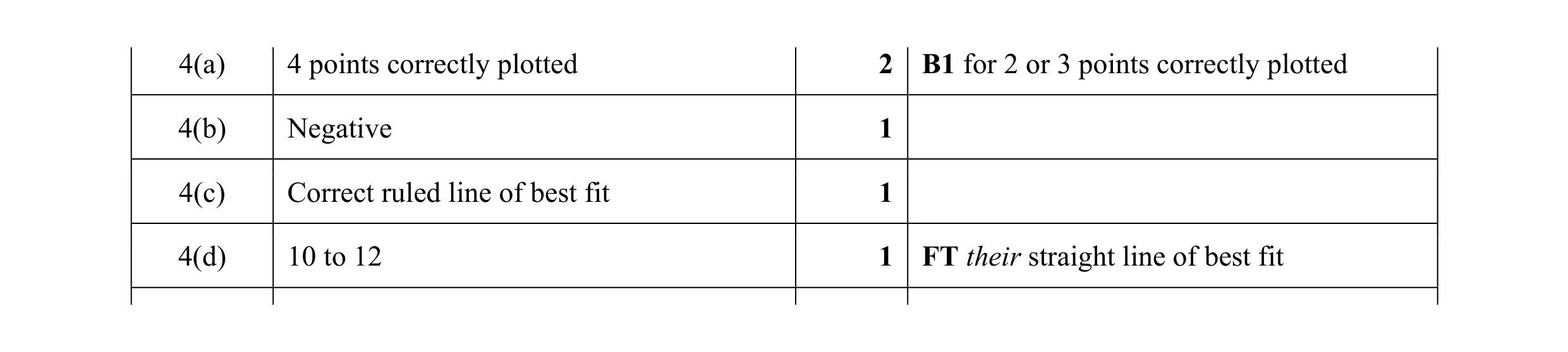 5
5 1
1 2
2 1
1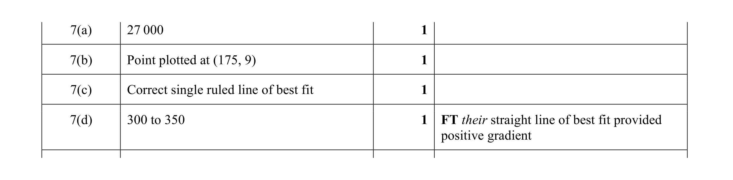 4
4 3
3 1
1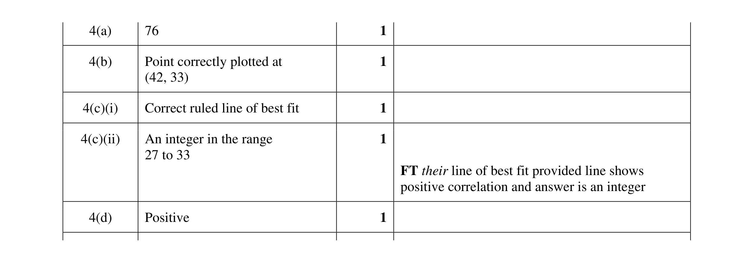 5
5 1
1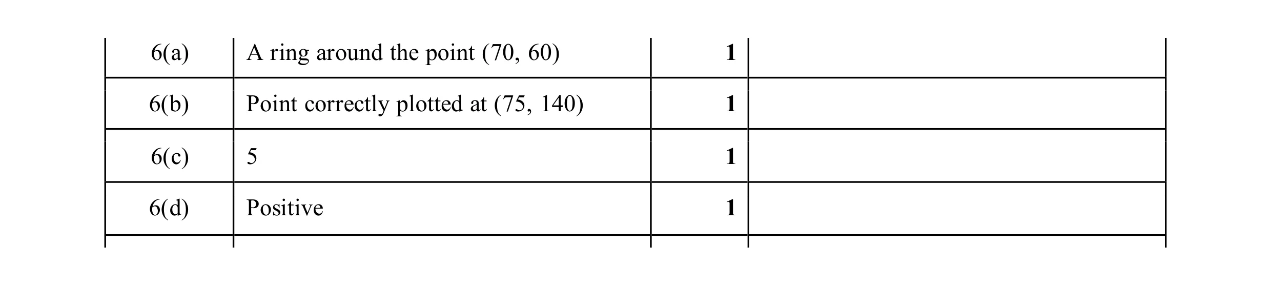 4
4