Cambridge IGCSE Geography 0460 — 2011 May/June Paper 4 · Variant 3
0460/43/M/J/11 · 60 marks · ≈68 min
The question paper and its mark scheme, free to read here and free to download. This is Cambridge’s own paper, exactly as it was sat.
Question paper16 pages



Mark scheme5 pages
Answers below. Sit the paper first if you are practising.
Paper as text
Question paper, page 1
This document consists of 13 printed pages, 3 blank pages and 1 Insert. DC (SM/DJ) 32328/6 © UCLES 2011 [Turn over UNIVERSITY OF CAMBRIDGE INTERNATIONAL EXAMINATIONS International General Certificate of Secondary Education * 6 7 6 9 9 3 8 8 9 3 * GEOGRAPHY 0460/43 Paper 4 Alternative to Coursework May/June 2011 1 hour 30 minutes Candidates answer on the Question Paper. Additional Materials: Calculator Ruler READ THESE INSTRUCTIONS FIRST Write your Centre number, candidate number and name in the spaces provided. Write in dark blue or black pen. You may use a soft pencil for any diagrams, graphs or rough working. Do not use staples, paper clips, highlighters, glue or correction fluid. DO NOT WRITE ON ANY BARCODES. Answer all questions. The Insert contains Figs 3, 4 and 5 for Question 1, and Fig. 8 and Tables 4 and 5 for Question 2. The Insert is not required by the Examiner. Sketch maps and diagrams should be drawn whenever they serve to illustrate an answer. The number of marks is given in brackets [ ] at the end of each question or part question. www.theallpapers.com
Question paper, page 2
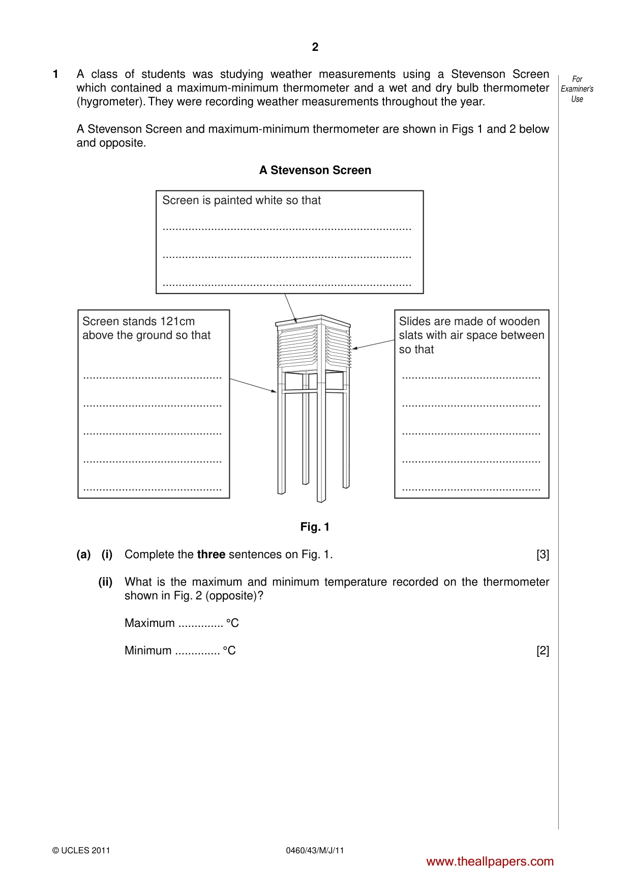
2 0460/43/M/J/11 © UCLES 2011 For Examiner’s Use 1 A class of students was studying weather measurements using a Stevenson Screen which contained a maximum-minimum thermometer and a wet and dry bulb thermometer (hygrometer). They were recording weather measurements throughout the year. A Stevenson Screen and maximum-minimum thermometer are shown in Figs 1 and 2 below and opposite. A Stevenson Screen Screen is painted white so that … … … … … … … … … … … … … Screen stands 121cm above the ground so that Slides are made of wooden slats with air space between so that Fig. 1 (a) (i) Complete the three sentences on Fig. 1. [3] (ii) What is the maximum and minimum temperature recorded on the thermometer shown in Fig. 2 (opposite)? Maximum … °C Minimum … °C [2] www.theallpapers.com
Question paper, page 3
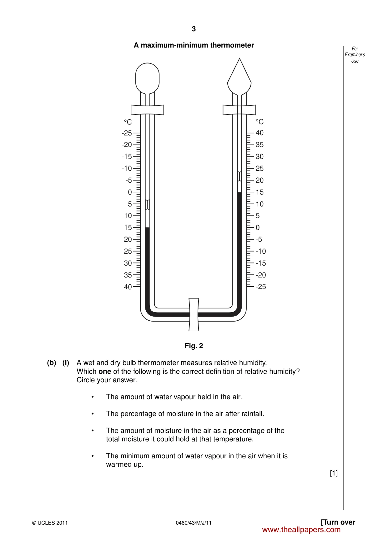
3 [Turn over © UCLES 2011 0460/43/M/J/11 For Examiner’s Use A maximum-minimum thermometer °C -25 -20 -15 -10 -5 0 5 10 15 20 25 30 35 40 °C 40 35 30 25 20 15 10 5 0 -5 -10 -15 -20 -25 Fig. 2 (b) (i) A wet and dry bulb thermometer measures relative humidity. Which one of the following is the correct definition of relative humidity? Circle your answer. • The amount of water vapour held in the air. • The percentage of moisture in the air after rainfall. • The amount of moisture in the air as a percentage of the total moisture it could hold at that temperature. • The minimum amount of water vapour in the air when it is warmed up. [1] www.theallpapers.com
Question paper, page 4
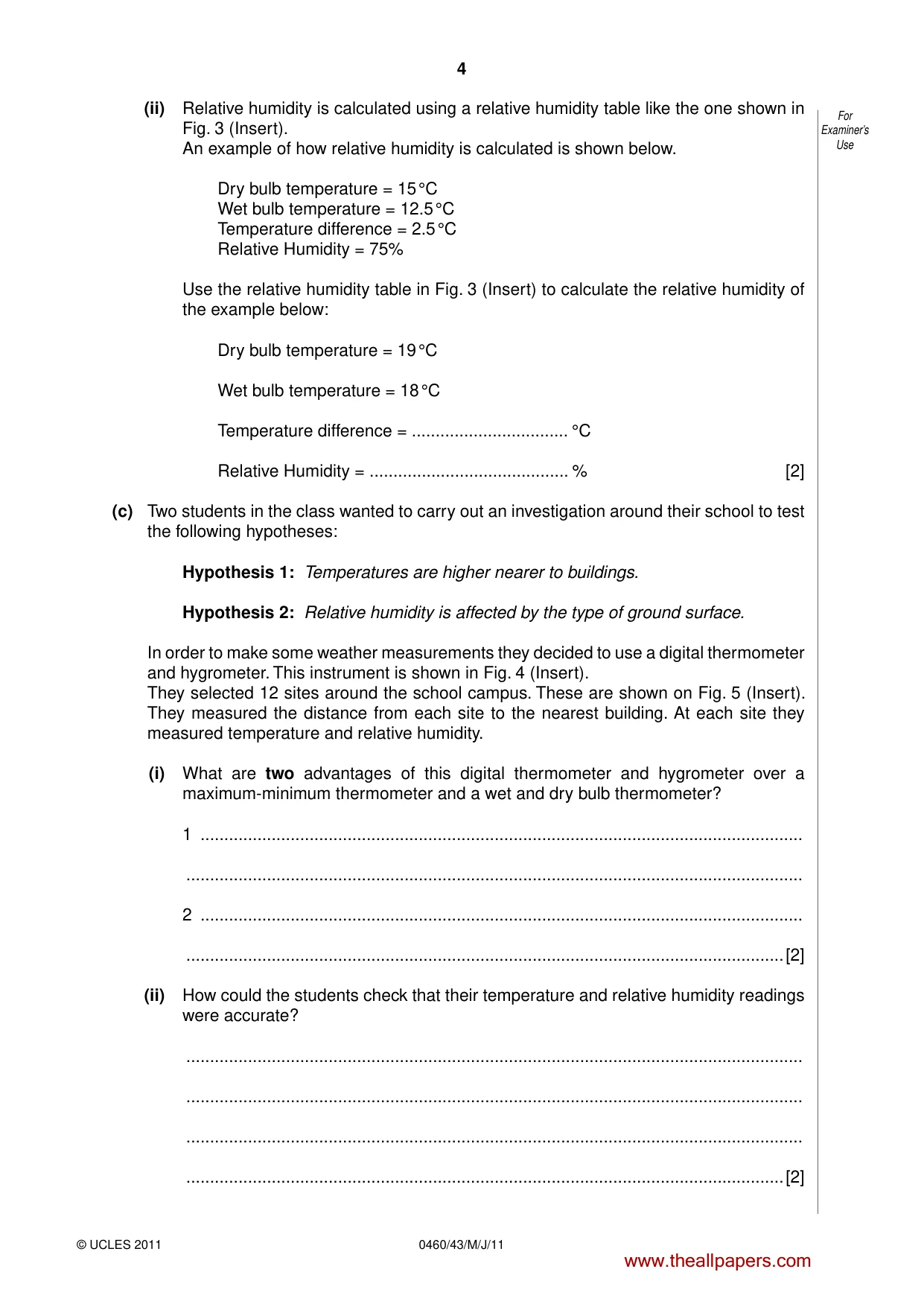
4 0460/43/M/J/11 © UCLES 2011 For Examiner’s Use (ii) Relative humidity is calculated using a relative humidity table like the one shown in Fig. 3 (Insert). An example of how relative humidity is calculated is shown below. Dry bulb temperature = 15 °C Wet bulb temperature = 12.5 °C Temperature difference = 2.5 °C Relative Humidity = 75% Use the relative humidity table in Fig. 3 (Insert) to calculate the relative humidity of the example below: Dry bulb temperature = 19 °C Wet bulb temperature = 18 °C Temperature difference = … °C Relative Humidity = … % [2] (c) Two students in the class wanted to carry out an investigation around their school to test the following hypotheses: Hypothesis 1: Temperatures are higher nearer to buildings. Hypothesis 2: Relative humidity is affected by the type of ground surface. In order to make some weather measurements they decided to use a digital thermometer and hygrometer. This instrument is shown in Fig. 4 (Insert). They selected 12 sites around the school campus. These are shown on Fig. 5 (Insert). They measured the distance from each site to the nearest building. At each site they measured temperature and relative humidity. (i) What are two advantages of this digital thermometer and hygrometer over a maximum-minimum thermometer and a wet and dry bulb thermometer? 1 … … 2 … …[2] (ii) How could the students check that their temperature and relative humidity readings were accurate? … … … …[2] www.theallpapers.com
Question paper, page 5
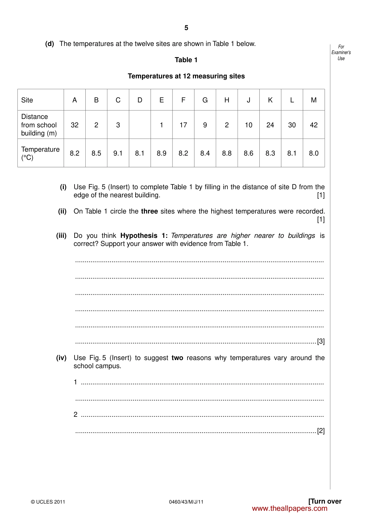
5 [Turn over © UCLES 2011 0460/43/M/J/11 For Examiner’s Use (d) The temperatures at the twelve sites are shown in Table 1 below. Table 1 Temperatures at 12 measuring sites Site A B C D E F G H J K L M Distance from school building (m) 32 2 3 1 17 9 2 10 24 30 42 Temperature (°C) 8.2 8.5 9.1 8.1 8.9 8.2 8.4 8.8 8.6 8.3 8.1 8.0 (i) Use Fig. 5 (Insert) to complete Table 1 by filling in the distance of site D from the edge of the nearest building. [1] (ii) On Table 1 circle the three sites where the highest temperatures were recorded. [1] (iii) Do you think Hypothesis 1: Temperatures are higher nearer to buildings is correct? Support your answer with evidence from Table 1. … … … … … …[3] (iv) Use Fig. 5 (Insert) to suggest two reasons why temperatures vary around the school campus. 1 … … 2 … …[2] www.theallpapers.com
Question paper, page 6
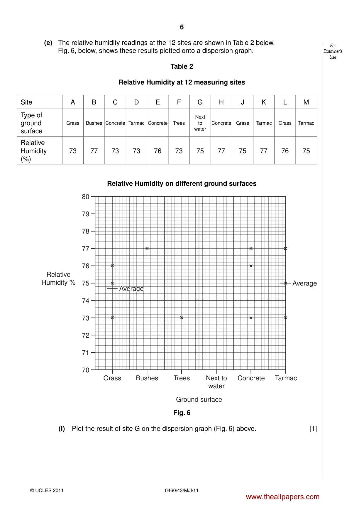
6 0460/43/M/J/11 © UCLES 2011 For Examiner’s Use (e) The relative humidity readings at the 12 sites are shown in Table 2 below. Fig. 6, below, shows these results plotted onto a dispersion graph. Table 2 Relative Humidity at 12 measuring sites Site A B C D E F G H J K L M Type of ground surface Grass Bushes Concrete Tarmac Concrete Trees Next to water Concrete Grass Tarmac Grass Tarmac Relative Humidity (%) 73 77 73 73 76 73 75 77 75 77 76 75 Relative Humidity on different ground surfaces 80 78 76 Relative Humidity % 74 72 79 77 75 Average Average Average 73 71 70 Grass Bushes Trees Ground surface Next to water Concrete Tarmac Average Fig. 6 (i) Plot the result of site G on the dispersion graph (Fig. 6) above. [1] www.theallpapers.com
Question paper, page 7
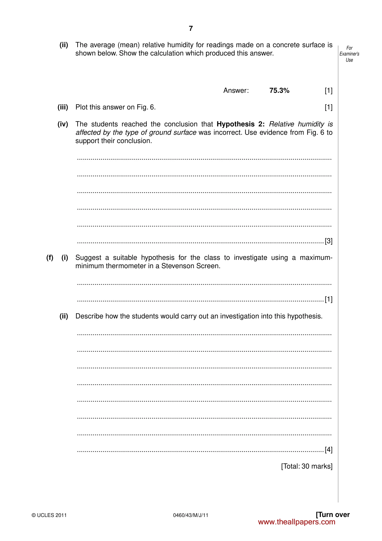
7 [Turn over © UCLES 2011 0460/43/M/J/11 For Examiner’s Use (ii) The average (mean) relative humidity for readings made on a concrete surface is shown below. Show the calculation which produced this answer. Answer: 75.3% [1] (iii) Plot this answer on Fig. 6. [1] (iv) The students reached the conclusion that Hypothesis 2: Relative humidity is affected by the type of ground surface was incorrect. Use evidence from Fig. 6 to support their conclusion. … … … … … …[3] (f) (i) Suggest a suitable hypothesis for the class to investigate using a maximum- minimum thermometer in a Stevenson Screen. … …[1] (ii) Describe how the students would carry out an investigation into this hypothesis. … … … … … … … …[4] [Total: 30 marks] www.theallpapers.com
Question paper, page 8
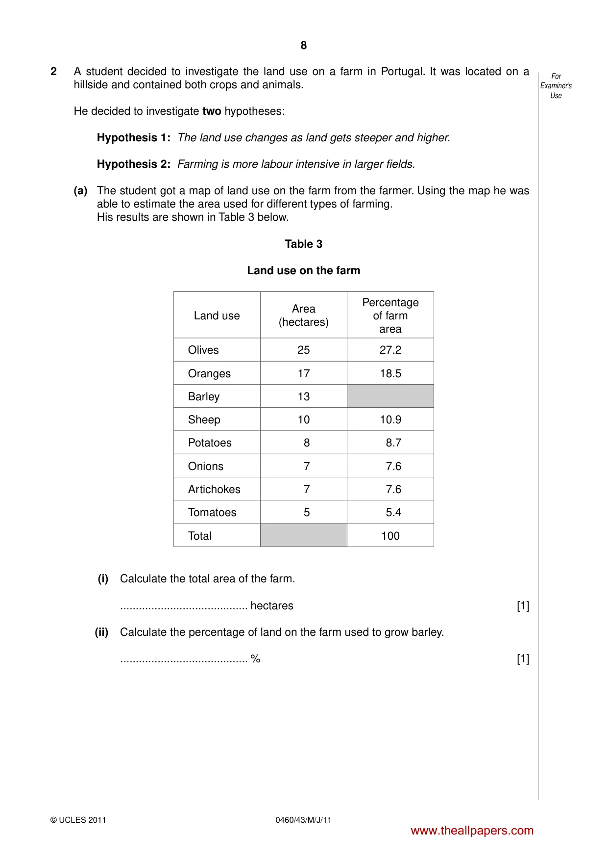
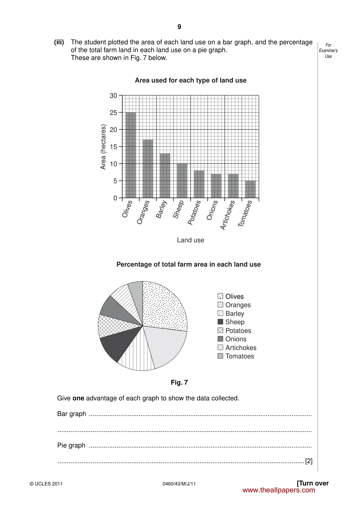
8 0460/43/M/J/11 © UCLES 2011 For Examiner’s Use 2 A student decided to investigate the land use on a farm in Portugal. It was located on a hillside and contained both crops and animals. He decided to investigate two hypotheses: Hypothesis 1: The land use changes as land gets steeper and higher. Hypothesis 2: Farming is more labour intensive in larger fields. (a) The student got a map of land use on the farm from the farmer. Using the map he was able to estimate the area used for different types of farming. His results are shown in Table 3 below. Table 3 Land use on the farm Land use Area (hectares) Percentage of farm area Olives 25 27.2 Oranges 17 18.5 Barley 13 Sheep 10 10.9 Potatoes 8 8.7 Onions 7 7.6 Artichokes 7 7.6 Tomatoes 5 5.4 Total 100 (i) Calculate the total area of the farm. … hectares [1] (ii) Calculate the percentage of land on the farm used to grow barley. … % [1] www.theallpapers.com
Question paper, page 9
9 [Turn over © UCLES 2011 0460/43/M/J/11 For Examiner’s Use (iii) The student plotted the area of each land use on a bar graph, and the percentage of the total farm land in each land use on a pie graph. These are shown in Fig. 7 below. 0 Olives Oranges Barley Sheep Potatoes Onions Artichokes Tomatoes 5 10 15 Area (hectares) Land use Area used for each type of land use 20 25 30 Olives Olives Percentage of total farm area in each land use Oranges Barley Sheep Potatoes Onions Artichokes Tomatoes Fig. 7 Give one advantage of each graph to show the data collected. Bar graph … … Pie graph … …[2] www.theallpapers.com
Question paper, page 10
10 0460/43/M/J/11 © UCLES 2011 For Examiner’s Use (b) The student then looked at how farming varied between different fields on the farm. He followed a path from the farmhouse up the hillside. Every 100 m along the path he performed three tasks. (i) He recorded a reading from a Global Positioning System (GPS). This is shown in Fig. 8 (Insert). Name two pieces of information shown by the GPS. 1 … … 2 … …[2] (ii) He measured the angle of slope by looking up the path. Suggest what equipment he used and how he would have done this. … … … … … …[3] (iii) He recorded the land use in the field next to the path. Unfortunately, the student did not recognise some of the crops growing in the fields. How could he solve this problem? … … … …[2] www.theallpapers.com
Question paper, page 11
11 [Turn over © UCLES 2011 0460/43/M/J/11 For Examiner’s Use (iv) Table 4 (Insert) shows the results of his fieldwork. The student reached the conclusion that his results supported Hypothesis 1: The land use changes as land gets steeper and higher. Use evidence from Table 4 to explain why he reached this conclusion. … … … … … …[3] (v) Give two reasons why farming activity changes as the land gets steeper and higher. 1 … … 2 … …[2] www.theallpapers.com
Question paper, page 12
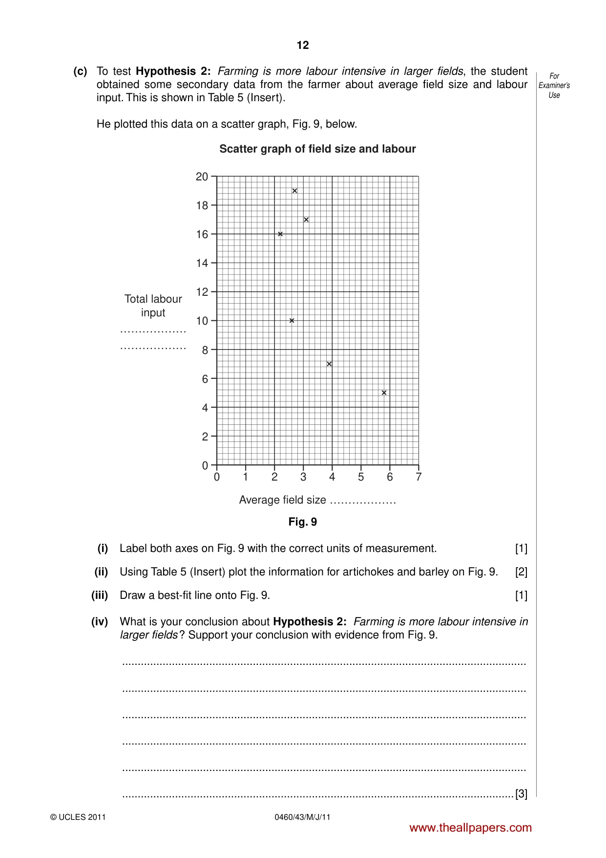
12 0460/43/M/J/11 © UCLES 2011 For Examiner’s Use (c) To test Hypothesis 2: Farming is more labour intensive in larger fields, the student obtained some secondary data from the farmer about average field size and labour input. This is shown in Table 5 (Insert). He plotted this data on a scatter graph, Fig. 9, below. 0 0 2 4 6 8 10 12 14 16 18 20 2 4 Scatter graph of field size and labour Average field size ……………… Total labour input ……………… ……………… 6 1 3 5 7 Fig. 9 (i) Label both axes on Fig. 9 with the correct units of measurement. [1] (ii) Using Table 5 (Insert) plot the information for artichokes and barley on Fig. 9. [2] (iii) Draw a best-fit line onto Fig. 9. [1] (iv) What is your conclusion about Hypothesis 2: Farming is more labour intensive in larger fields ? Support your conclusion with evidence from Fig. 9. … … … … … …[3] www.theallpapers.com
Question paper, page 13
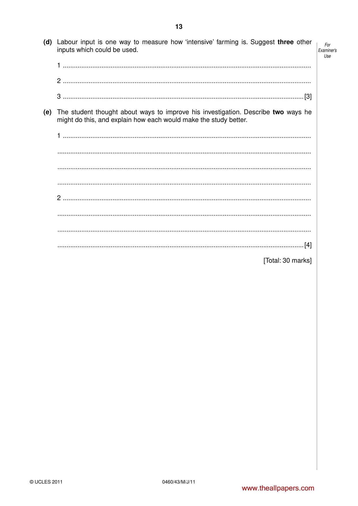
13 © UCLES 2011 0460/43/M/J/11 For Examiner’s Use (d) Labour input is one way to measure how ‘intensive’ farming is. Suggest three other inputs which could be used. 1 … 2 … 3 …[3] (e) The student thought about ways to improve his investigation. Describe two ways he might do this, and explain how each would make the study better. 1 … … … … 2 … … … …[4] [Total: 30 marks] www.theallpapers.com
Question paper, page 14
14 0460/43/M/J/11 © UCLES 2011 BLANK PAGE www.theallpapers.com
Question paper, page 15
15 0460/43/M/J/11 © UCLES 2011 BLANK PAGE www.theallpapers.com
Question paper, page 16
16 0460/43/M/J/11 © UCLES 2011 BLANK PAGE Copyright Acknowledgements: Question 1 Fig. 4 © www.ozspy.com.au/cart/brochure; 11 October 2009. Permission to reproduce items where third-party owned material protected by copyright is included has been sought and cleared where possible. Every reasonable effort has been made by the publisher (UCLES) to trace copyright holders, but if any items requiring clearance have unwittingly been included, the publisher will be pleased to make amends at the earliest possible opportunity. University of Cambridge International Examinations is part of the Cambridge Assessment Group. Cambridge Assessment is the brand name of University of Cambridge Local Examinations Syndicate (UCLES), which is itself a department of the University of Cambridge. www.theallpapers.com
Mark scheme, page 1
UNIVERSITY OF CAMBRIDGE INTERNATIONAL EXAMINATIONS International General Certificate of Secondary Education MARK SCHEME for the May/June 2011 question paper for the guidance of teachers 0460 GEOGRAPHY 0460/43 Paper 4 (Alternative to Coursework), maximum raw mark 60 This mark scheme is published as an aid to teachers and candidates, to indicate the requirements of the examination. It shows the basis on which Examiners were instructed to award marks. It does not indicate the details of the discussions that took place at an Examiners’ meeting before marking began, which would have considered the acceptability of alternative answers. Mark schemes must be read in conjunction with the question papers and the report on the examination. • Cambridge will not enter into discussions or correspondence in connection with these mark schemes. Cambridge is publishing the mark schemes for the May/June 2011 question papers for most IGCSE, GCE Advanced Level and Advanced Subsidiary Level syllabuses and some Ordinary Level syllabuses. www.theallpapers.com
Mark scheme, page 2
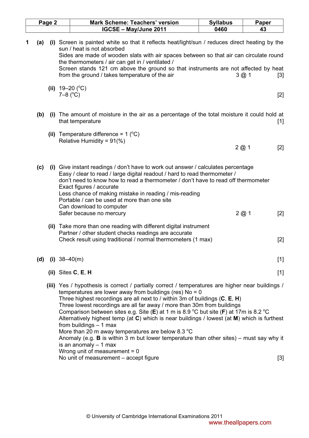
Page 2 Mark Scheme: Teachers’ version Syllabus Paper IGCSE – May/June 2011 0460 43 © University of Cambridge International Examinations 2011 1 (a) (i) Screen is painted white so that it reflects heat/light/sun / reduces direct heating by the sun / heat is not absorbed Sides are made of wooden slats with air spaces between so that air can circulate round the thermometers / air can get in / ventilated / Screen stands 121 cm above the ground so that instruments are not affected by heat from the ground / takes temperature of the air 3 @ 1 [3] (ii) 19–20 (oC) 7–8 (oC) [2] (b) (i) The amount of moisture in the air as a percentage of the total moisture it could hold at that temperature [1] (ii) Temperature difference = 1 (oC) Relative Humidity = 91(%) 2 @ 1 [2] (c) (i) Give instant readings / don’t have to work out answer / calculates percentage Easy / clear to read / large digital readout / hard to read thermometer / don’t need to know how to read a thermometer / don’t have to read off thermometer Exact figures / accurate Less chance of making mistake in reading / mis-reading Portable / can be used at more than one site Can download to computer Safer because no mercury 2 @ 1 [2] (ii) Take more than one reading with different digital instrument Partner / other student checks readings are accurate Check result using traditional / normal thermometers (1 max) [2] (d) (i) 38–40(m) [1] (ii) Sites C, E, H [1] (iii) Yes / hypothesis is correct / partially correct / temperatures are higher near buildings / temperatures are lower away from buildings (res) No = 0 Three highest recordings are all next to / within 3m of buildings (C, E, H) Three lowest recordings are all far away / more than 30m from buildings Comparison between sites e.g. Site (E) at 1 m is 8.9 oC but site (F) at 17m is 8.2 oC Alternatively highest temp (at C) which is near buildings / lowest (at M) which is furthest from buildings – 1 max More than 20 m away temperatures are below 8.3 oC Anomaly (e.g. B is within 3 m but lower temperature than other sites) – must say why it is an anomaly – 1 max Wrong unit of measurement = 0 No unit of measurement – accept figure [3] www.theallpapers.com
Mark scheme, page 3
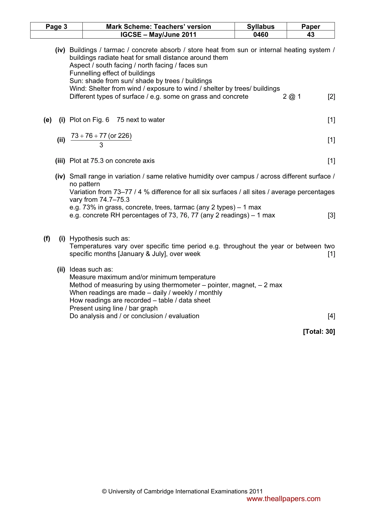
Page 3 Mark Scheme: Teachers’ version Syllabus Paper IGCSE – May/June 2011 0460 43 © University of Cambridge International Examinations 2011 (iv) Buildings / tarmac / concrete absorb / store heat from sun or internal heating system / buildings radiate heat for small distance around them Aspect / south facing / north facing / faces sun Funnelling effect of buildings Sun: shade from sun/ shade by trees / buildings Wind: Shelter from wind / exposure to wind / shelter by trees/ buildings Different types of surface / e.g. some on grass and concrete 2 @ 1 [2] (e) (i) Plot on Fig. 6 75 next to water [1] (ii) 3 226) (or 77 76 73 + + [1] (iii) Plot at 75.3 on concrete axis [1] (iv) Small range in variation / same relative humidity over campus / across different surface / no pattern Variation from 73–77 / 4 % difference for all six surfaces / all sites / average percentages vary from 74.7–75.3 e.g. 73% in grass, concrete, trees, tarmac (any 2 types) – 1 max e.g. concrete RH percentages of 73, 76, 77 (any 2 readings) – 1 max [3] (f) (i) Hypothesis such as: Temperatures vary over specific time period e.g. throughout the year or between two specific months [January & July], over week [1] (ii) Ideas such as: Measure maximum and/or minimum temperature Method of measuring by using thermometer – pointer, magnet, – 2 max When readings are made – daily / weekly / monthly How readings are recorded – table / data sheet Present using line / bar graph Do analysis and / or conclusion / evaluation [4] [Total: 30] www.theallpapers.com
Mark scheme, page 4
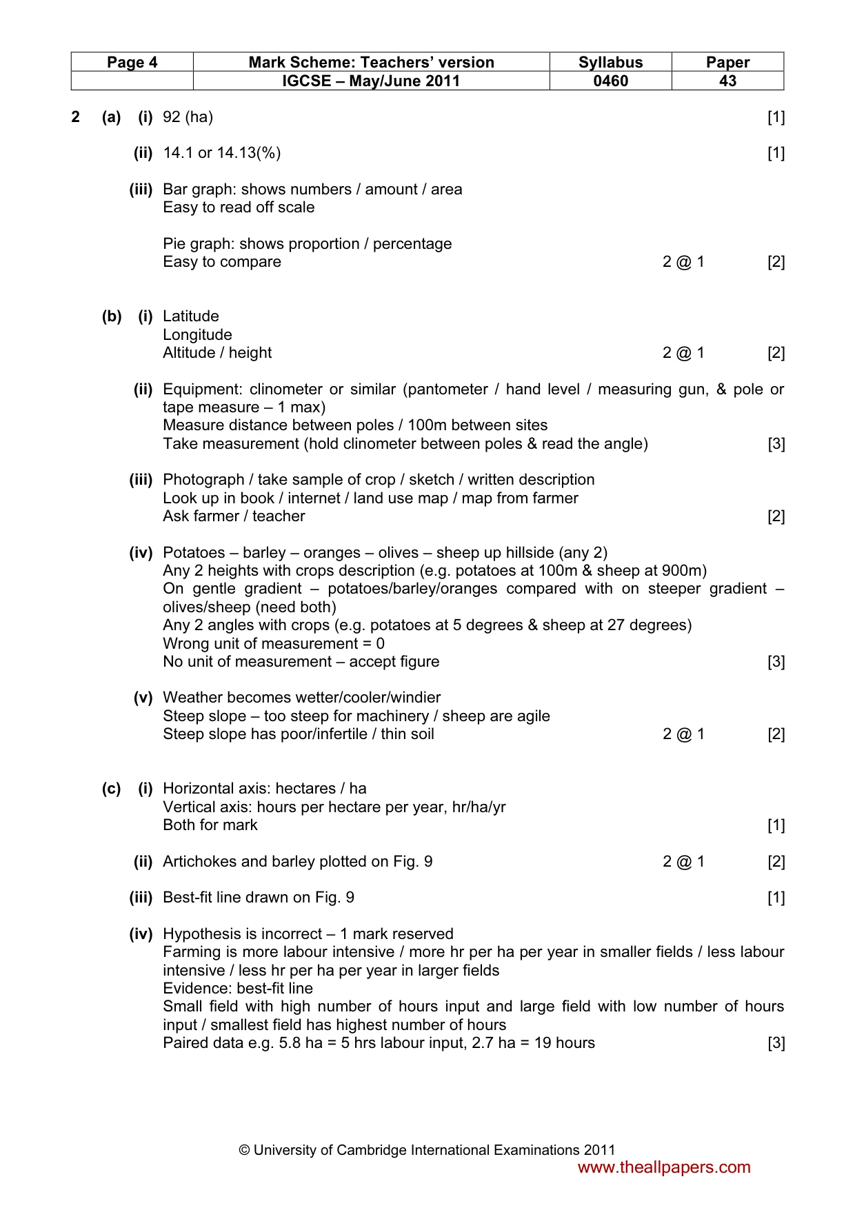
Page 4 Mark Scheme: Teachers’ version Syllabus Paper IGCSE – May/June 2011 0460 43 © University of Cambridge International Examinations 2011 2 (a) (i) 92 (ha) [1] (ii) 14.1 or 14.13(%) [1] (iii) Bar graph: shows numbers / amount / area Easy to read off scale Pie graph: shows proportion / percentage Easy to compare 2 @ 1 [2] (b) (i) Latitude Longitude Altitude / height 2 @ 1 [2] (ii) Equipment: clinometer or similar (pantometer / hand level / measuring gun, & pole or tape measure – 1 max) Measure distance between poles / 100m between sites Take measurement (hold clinometer between poles & read the angle) [3] (iii) Photograph / take sample of crop / sketch / written description Look up in book / internet / land use map / map from farmer Ask farmer / teacher [2] (iv) Potatoes – barley – oranges – olives – sheep up hillside (any 2) Any 2 heights with crops description (e.g. potatoes at 100m & sheep at 900m) On gentle gradient – potatoes/barley/oranges compared with on steeper gradient – olives/sheep (need both) Any 2 angles with crops (e.g. potatoes at 5 degrees & sheep at 27 degrees) Wrong unit of measurement = 0 No unit of measurement – accept figure [3] (v) Weather becomes wetter/cooler/windier Steep slope – too steep for machinery / sheep are agile Steep slope has poor/infertile / thin soil 2 @ 1 [2] (c) (i) Horizontal axis: hectares / ha Vertical axis: hours per hectare per year, hr/ha/yr Both for mark [1] (ii) Artichokes and barley plotted on Fig. 9 2 @ 1 [2] (iii) Best-fit line drawn on Fig. 9 [1] (iv) Hypothesis is incorrect – 1 mark reserved Farming is more labour intensive / more hr per ha per year in smaller fields / less labour intensive / less hr per ha per year in larger fields Evidence: best-fit line Small field with high number of hours input and large field with low number of hours input / smallest field has highest number of hours Paired data e.g. 5.8 ha = 5 hrs labour input, 2.7 ha = 19 hours [3] www.theallpapers.com
Mark scheme, page 5
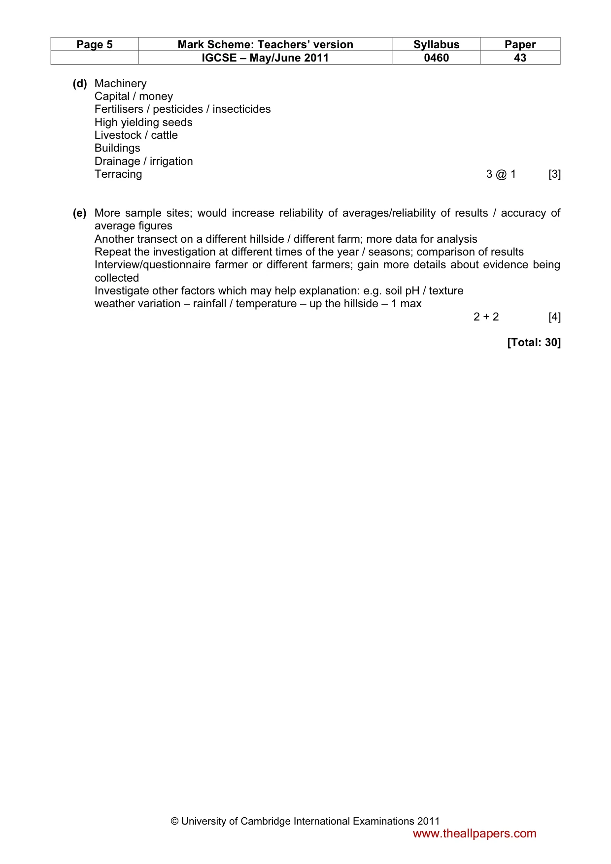
Page 5 Mark Scheme: Teachers’ version Syllabus Paper IGCSE – May/June 2011 0460 43 © University of Cambridge International Examinations 2011 (d) Machinery Capital / money Fertilisers / pesticides / insecticides High yielding seeds Livestock / cattle Buildings Drainage / irrigation Terracing 3 @ 1 [3] (e) More sample sites; would increase reliability of averages/reliability of results / accuracy of average figures Another transect on a different hillside / different farm; more data for analysis Repeat the investigation at different times of the year / seasons; comparison of results Interview/questionnaire farmer or different farmers; gain more details about evidence being collected Investigate other factors which may help explanation: e.g. soil pH / texture weather variation – rainfall / temperature – up the hillside – 1 max 2 + 2 [4] [Total: 30] www.theallpapers.com
What you needed in this session
Cambridge’s own grade thresholds for 2011 May/June, Paper 4 · Variant 3. A higher threshold means an easier paper — the bar moves with how the cohort did.