Cambridge A Level Geography 9696 — 2022 May/June Paper 2 · Variant 3
9696/23/M/J/22 · 6 questions · 60 marks · ≈68 min
The question paper and its mark scheme, free to read here and free to download. This is Cambridge’s own paper, exactly as it was sat.
Question paper4 pages
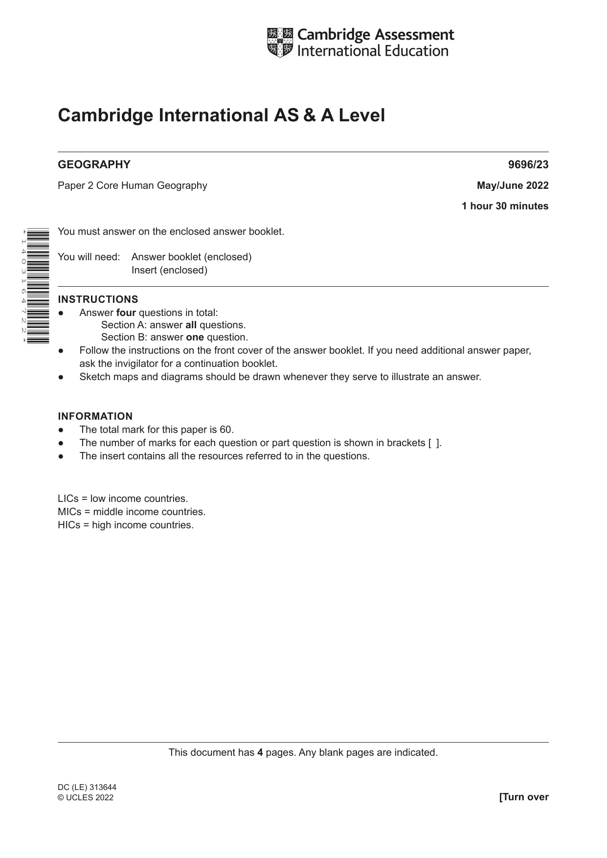
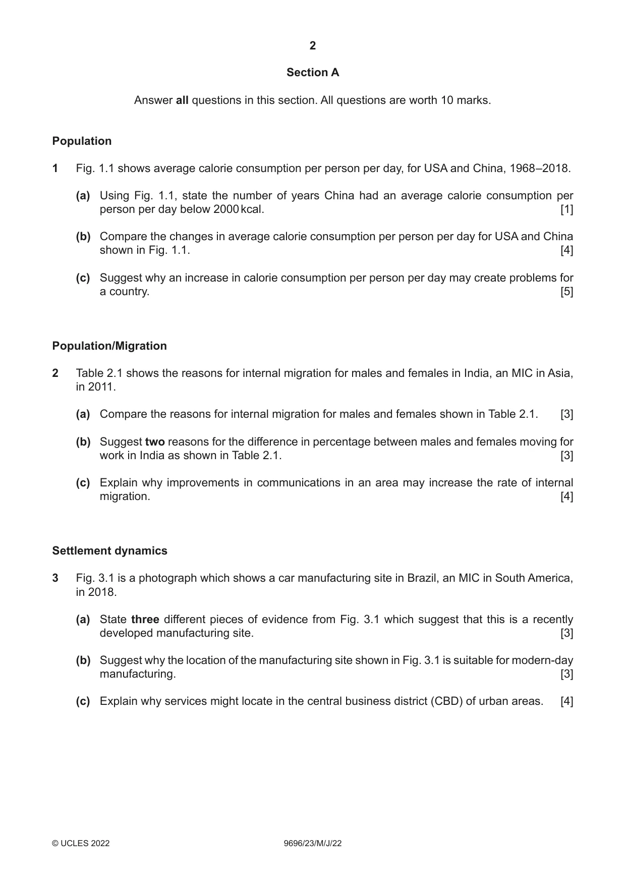
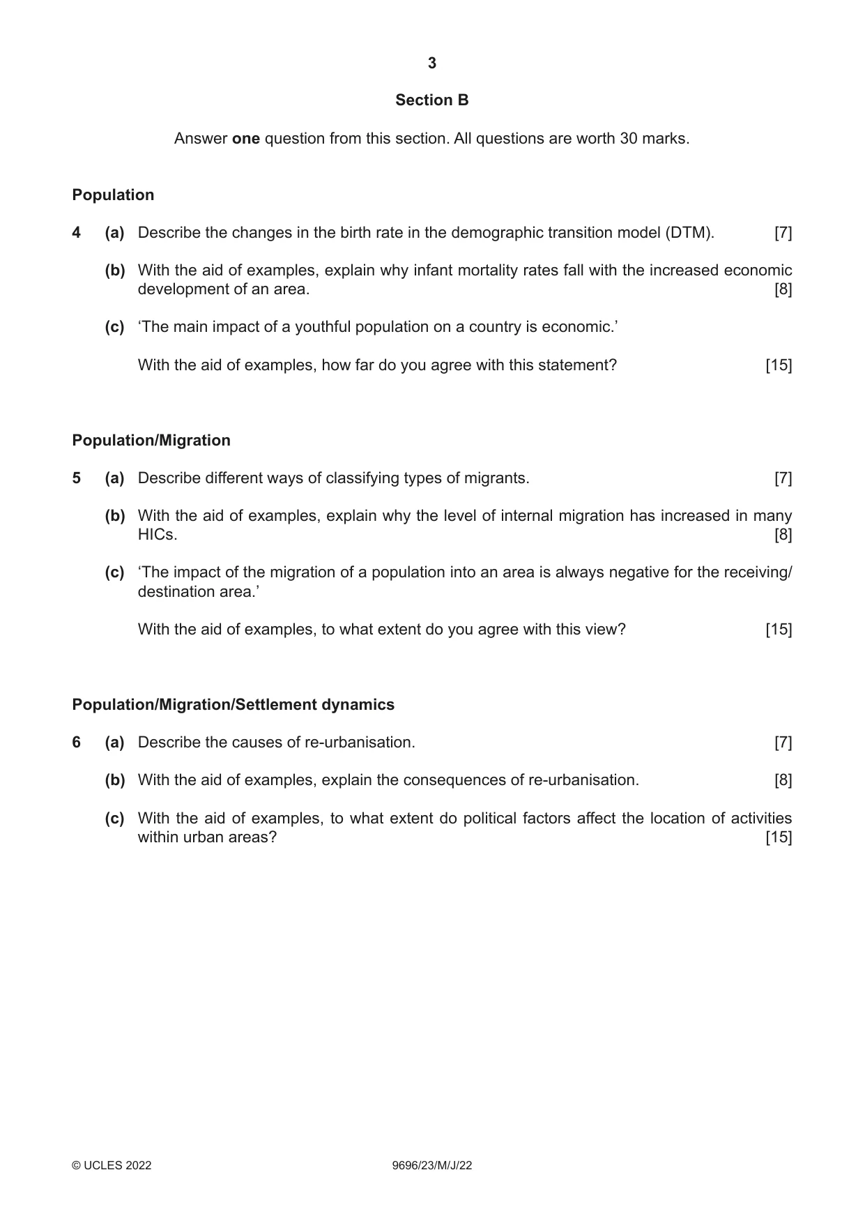

Mark scheme16 pages
Answers below. Sit the paper first if you are practising.

Questions as text
Q1 · Average calorie consumption per person per day, for USA and China, 1968–2018
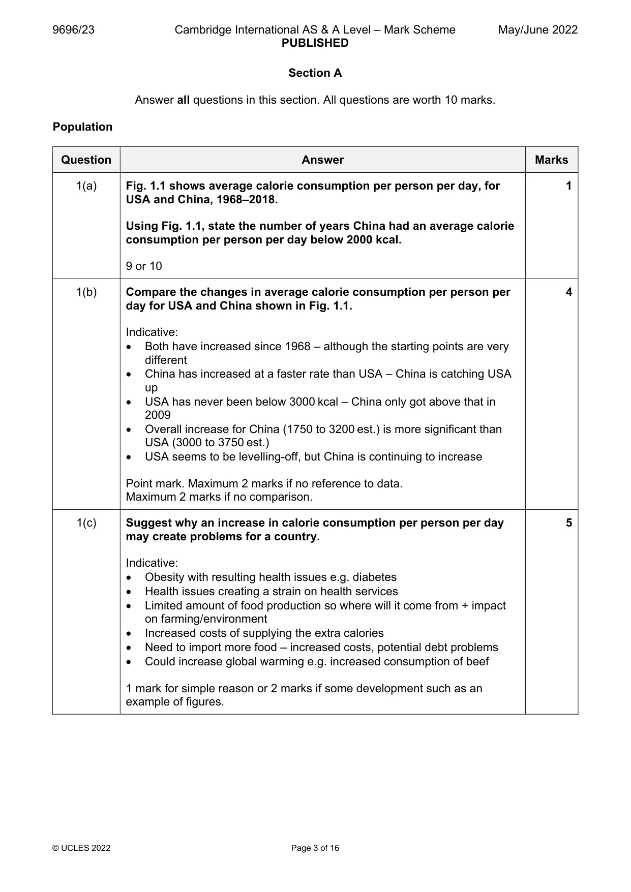
1 Fig. 1.1 shows average calorie consumption per person per day, for USA and China, 1968–2018. (a) Using Fig. 1.1, state the number of years China had an average calorie consumption per person per day below 2000 kcal. [1] (b) Compare the changes in average calorie consumption per person per day for USA and China shown in Fig. 1.1. [4] (c) Suggest why an increase in calorie consumption per person per day may create problems for a country. [5] Population/Migration
Mark scheme: Question Answer Marks 1(a) Fig. 1.1 shows average calorie consumption per person per day, for 1 USA and China, 1968–2018. Using Fig. 1.1, state the number of years China had an average calorie consumption per person per day below 2000 kcal. 9 or 10 1(b) Compare the changes in average calorie consumption per person per 4 day for USA and China shown in Fig. 1.1. Indicative: Both have increased since 1968 – although the starting points are very different China has increased at a faster rate than USA – China is catching USA up USA has never been below 3000 kcal – China only got above that in 2009 Overall increase for China (1750 to 3200 est.) is more significant than USA (3000 to 3750 est.) USA seems to be levelling-off, but China is continuing to increase Point mark. Maximum 2 marks if no reference to data. Maximum 2 marks if no comparison. 1(c) Suggest why an increase in calorie consumption per person per day 5 may create problems for a country. Indicative: Obesity with resulting health issues e.g. diabetes Health issues creating a strain on health services Limited amount of food production so where will it come from + impact on farming/environment Increased costs of supplying the extra calories Need to import more food – increased costs, potential debt problems Could increase global warming e.g. increased consumption of beef 1 mark for simple reason or 2 marks if some development such as an example of figures. Population/Migration
Q2 · The reasons for internal migration for males and females in India, an MIC in Asia, in 2011
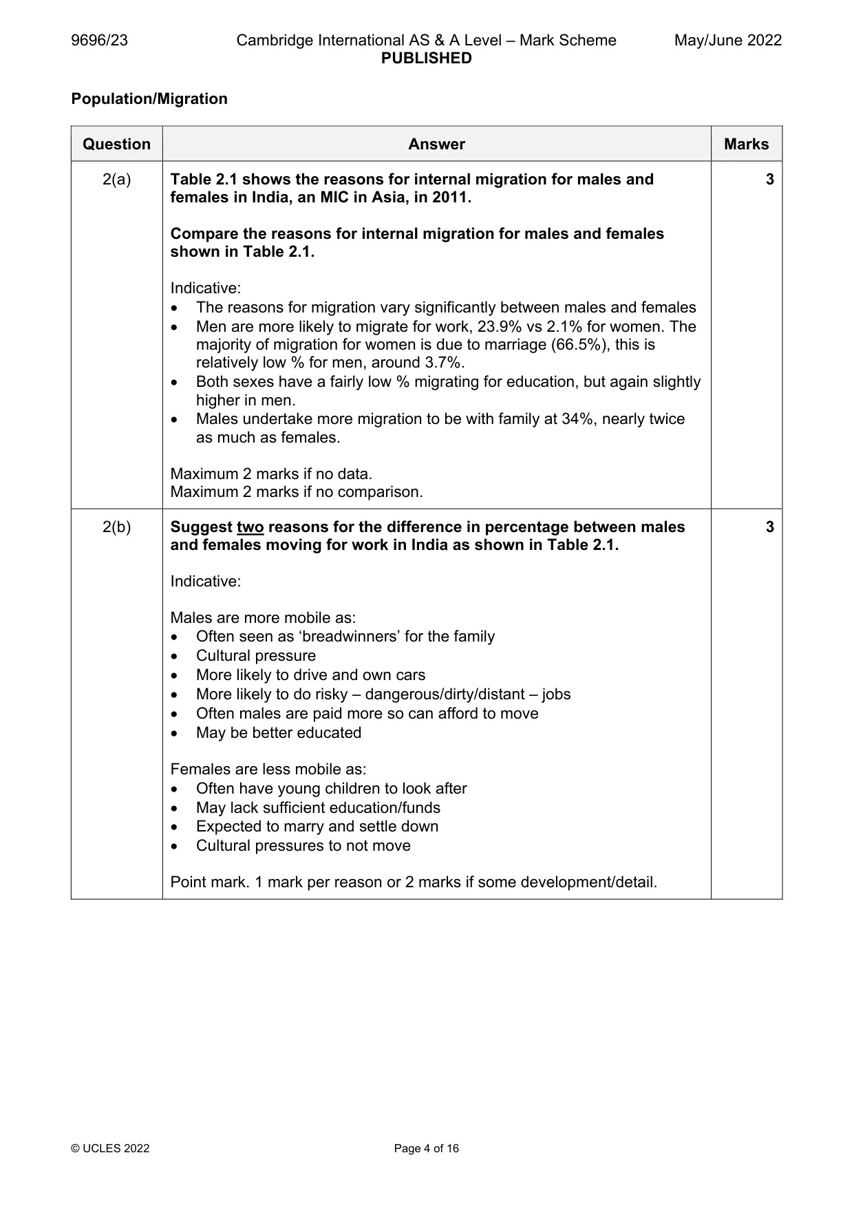
2 Table 2.1 shows the reasons for internal migration for males and females in India, an MIC in Asia, in 2011. (a) Compare the reasons for internal migration for males and females shown in Table 2.1. [3] (b) Suggest two reasons for the difference in percentage between males and females moving for work in India as shown in Table 2.1. [3] (c) Explain why improvements in communications in an area may increase the rate of internal migration. [4] Settlement dynamics
Mark scheme: 2(a) Table 2.1 shows the reasons for internal migration for males and 3 females in India, an MIC in Asia, in 2011. Compare the reasons for internal migration for males and females shown in Table 2.1. Indicative: The reasons for migration vary significantly between males and females Men are more likely to migrate for work, 23.9% vs 2.1% for women. The majority of migration for women is due to marriage (66.5%), this is relatively low % for men, around 3.7%. Both sexes have a fairly low % migrating for education, but again slightly higher in men. Males undertake more migration to be with family at 34%, nearly twice as much as females. Maximum 2 marks if no data. Maximum 2 marks if no comparison. 2(b) Suggest two reasons for the difference in percentage between males 3 and females moving for work in India as shown in Table 2.1. Indicative: Males are more mobile as: Often seen as ‘breadwinners’ for the family Cultural pressure More likely to drive and own cars More likely to do risky – dangerous/dirty/distant – jobs Often males are paid more so can afford to move May be better educated Females are less mobile as: Often have young children to look after May lack sufficient education/funds Expected to marry and settle down Cultural pressures to not move Point mark. 1 mark per reason or 2 marks if some development/detail. 2(c) Explain why improvements in communications in an area may 4 increase the rate of internal migration. Communications can include transport, telecommunications, IT, etc. Indicative: Reduces the friction of distance Reduces travel costs (in time/effort) Supplies more information on destinations to better inform choices Greater feedback from existing migrants; promotes chain migration Enables migrants to keep in touch with friends and family 1 mark for simple reason or 2 marks if some development such as an example. Settlement dynamics
Q3 · A photograph which shows a car manufacturing site in Brazil, an MIC in South America, in…
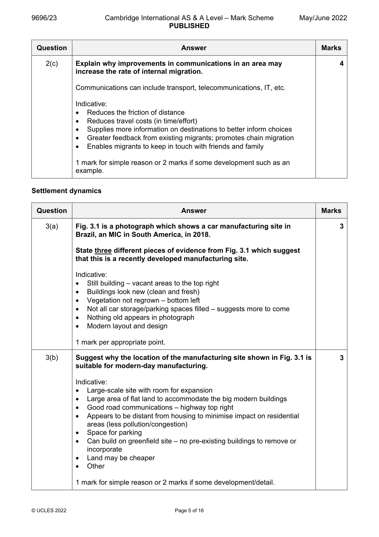
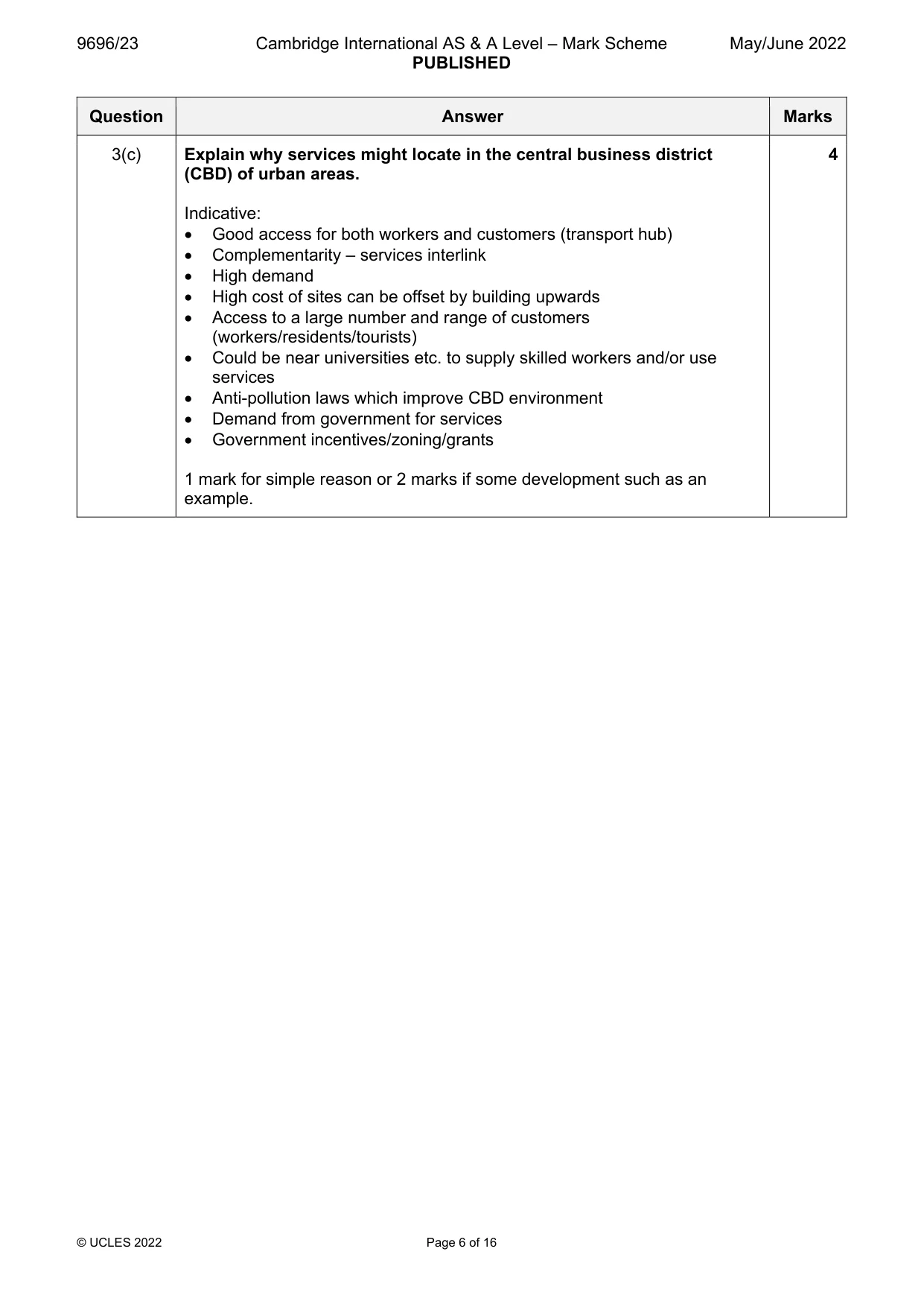
3 Fig. 3.1 is a photograph which shows a car manufacturing site in Brazil, an MIC in South America, in 2018. (a) State three different pieces of evidence from Fig. 3.1 which suggest that this is a recently developed manufacturing site. [3] (b) Suggest why the location of the manufacturing site shown in Fig. 3.1 is suitable for modern‑day manufacturing. [3] (c) Explain why services might locate in the central business district (CBD) of urban areas. [4]
Mark scheme: 3(a) Fig. 3.1 is a photograph which shows a car manufacturing site in 3 Brazil, an MIC in South America, in 2018. State three different pieces of evidence from Fig. 3.1 which suggest that this is a recently developed manufacturing site. Indicative: Still building – vacant areas to the top right Buildings look new (clean and fresh) Vegetation not regrown – bottom left Not all car storage/parking spaces filled – suggests more to come Nothing old appears in photograph Modern layout and design 1 mark per appropriate point. 3(b) Suggest why the location of the manufacturing site shown in Fig. 3.1 is 3 suitable for modern-day manufacturing. Indicative: Large-scale site with room for expansion Large area of flat land to accommodate the big modern buildings Good road communications – highway top right Appears to be distant from housing to minimise impact on residential areas (less pollution/congestion) Space for parking Can build on greenfield site – no pre-existing buildings to remove or incorporate Land may be cheaper Other 1 mark for simple reason or 2 marks if some development/detail. 3(c) Explain why services might locate in the central business district 4 (CBD) of urban areas. Indicative: Good access for both workers and customers (transport hub) Complementarity – services interlink High demand High cost of sites can be offset by building upwards Access to a large number and range of customers (workers/residents/tourists) Could be near universities etc. to supply skilled workers and/or use services Anti-pollution laws which improve CBD environment Demand from government for services Government incentives/zoning/grants 1 mark for simple reason or 2 marks if some development such as an example. Section B Answer one question from this section. All questions are worth 30 marks. Population
Q4 · Describe the changes in the birth rate in the demographic transition model (DTM)
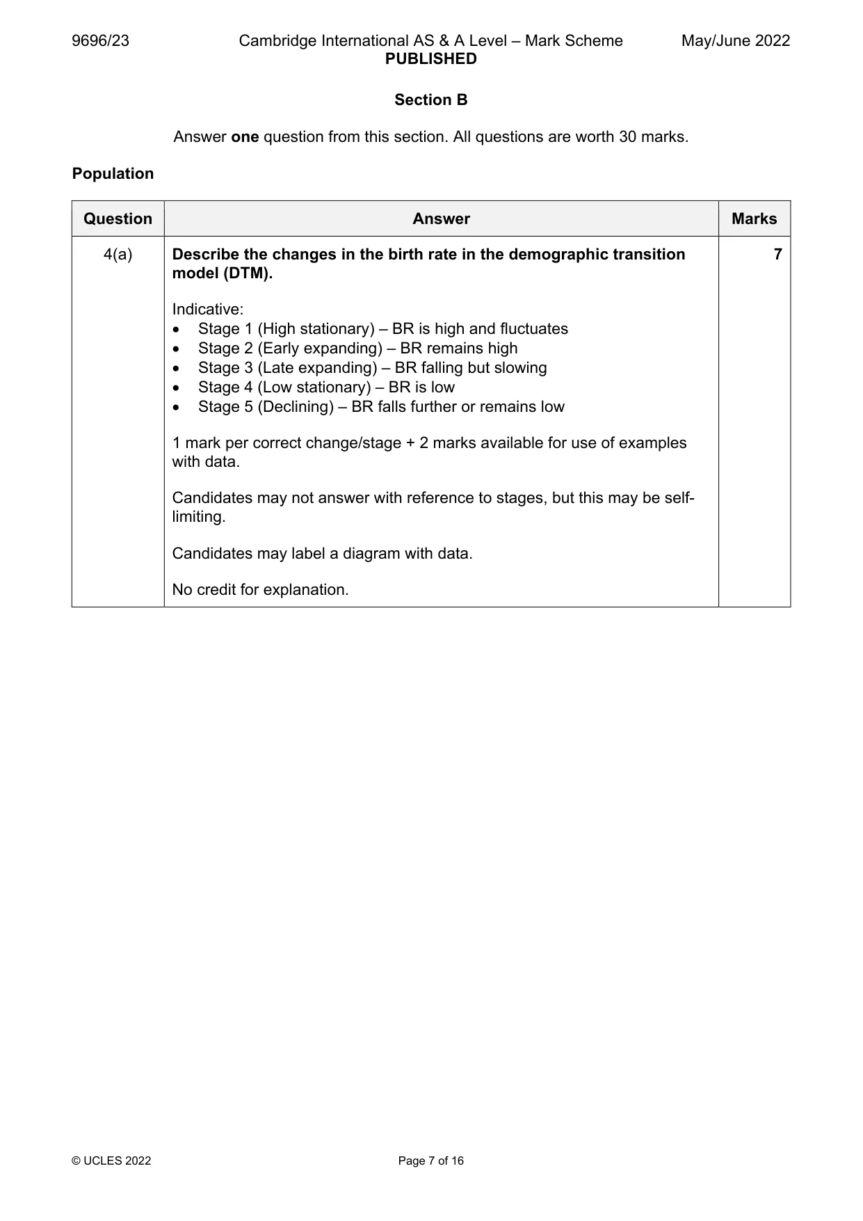
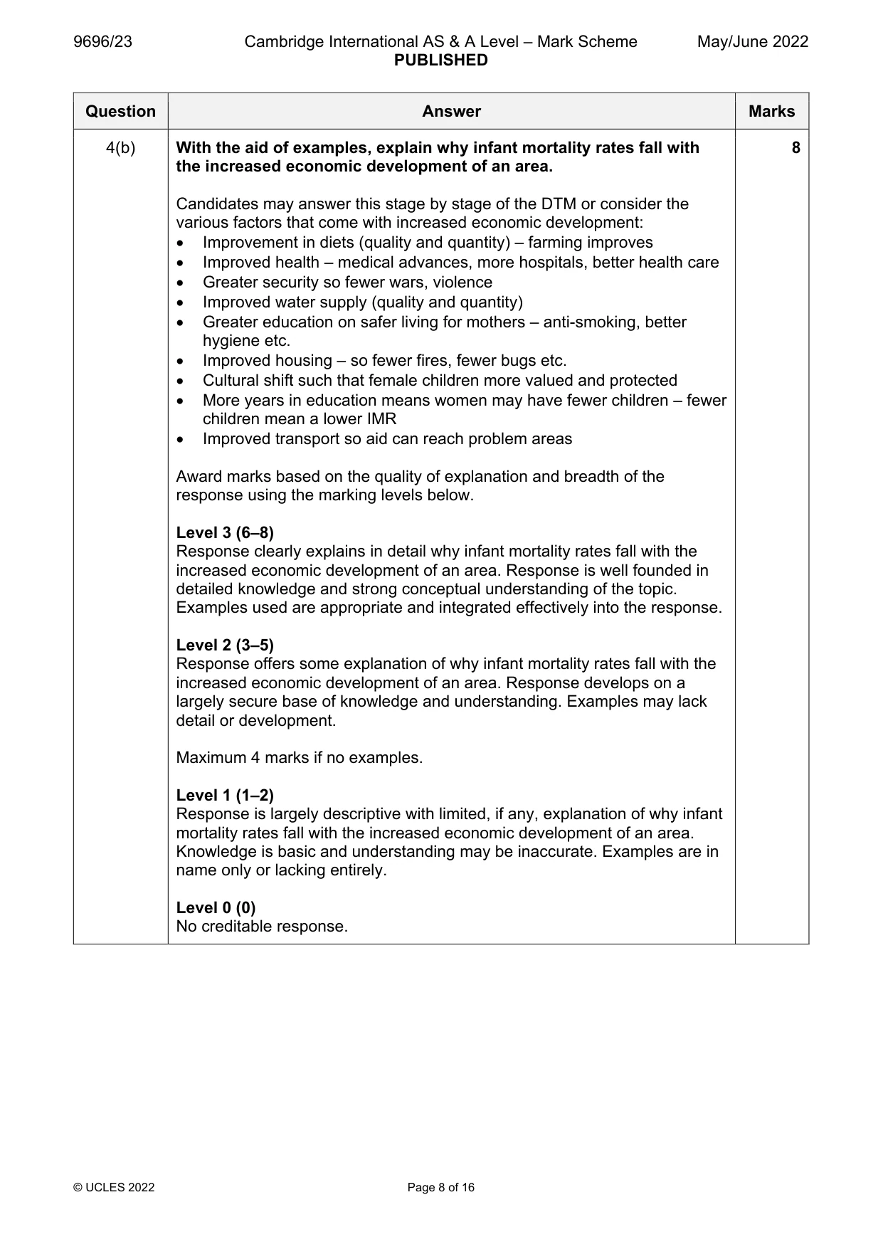
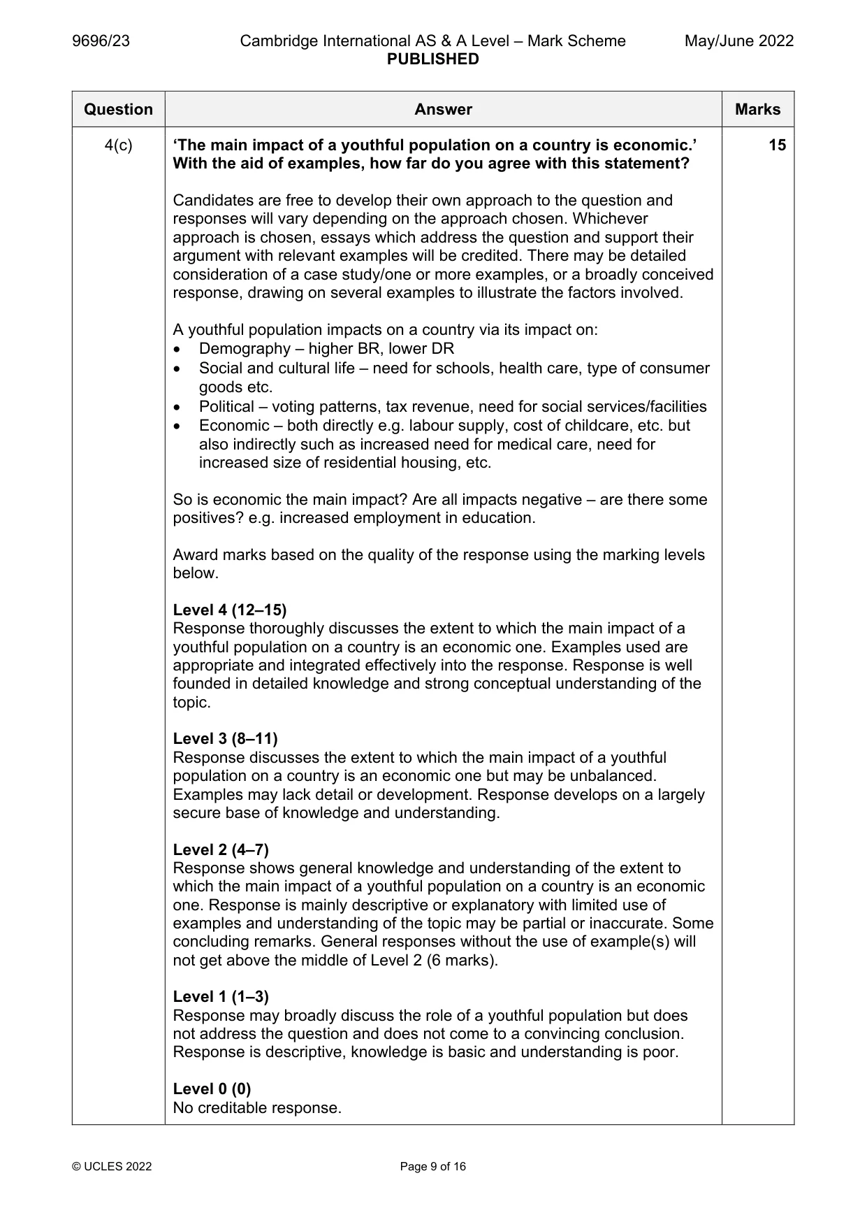
4 (a) Describe the changes in the birth rate in the demographic transition model (DTM). [7] (b) With the aid of examples, explain why infant mortality rates fall with the increased economic development of an area. [8] (c) ‘The main impact of a youthful population on a country is economic.’ With the aid of examples, how far do you agree with this statement? [15] Population/Migration
Mark scheme: 4(a) Describe the changes in the birth rate in the demographic transition 7 model (DTM). Indicative: Stage 1 (High stationary) – BR is high and fluctuates Stage 2 (Early expanding) – BR remains high Stage 3 (Late expanding) – BR falling but slowing Stage 4 (Low stationary) – BR is low Stage 5 (Declining) – BR falls further or remains low 1 mark per correct change/stage + 2 marks available for use of examples with data. Candidates may not answer with reference to stages, but this may be self- limiting. Candidates may label a diagram with data. No credit for explanation. 4(b) With the aid of examples, explain why infant mortality rates fall with 8 the increased economic development of an area. Candidates may answer this stage by stage of the DTM or consider the various factors that come with increased economic development: Improvement in diets (quality and quantity) – farming improves Improved health – medical advances, more hospitals, better health care Greater security so fewer wars, violence Improved water supply (quality and quantity) Greater education on safer living for mothers – anti-smoking, better hygiene etc. Improved housing – so fewer fires, fewer bugs etc. Cultural shift such that female children more valued and protected More years in education means women may have fewer children – fewer children mean a lower IMR Improved transport so aid can reach problem areas Award marks based on the quality of explanation and breadth of the response using the marking levels below. Level 3 (6–8) Response clearly explains in detail why infant mortality rates fall with the increased economic development of an area. Response is well founded in detailed knowledge and strong conceptual understanding of the topic. Examples used are appropriate and integrated effectively into the response. Level 2 (3–5) Response offers some explanation of why infant mortality rates fall with the increased economic development of an area. Response develops on a largely secure base of knowledge and understanding. Examples may lack detail or development. Maximum 4 marks if no examples. Level 1 (1–2) Response is largely descriptive with limited, if any, explanation of why infant mortality rates fall with the increased economic development of an area. Knowledge is basic and understanding may be inaccurate. Examples are in name only or lacking entirely. Level 0 (0) No creditable response. 4(c) ‘The main impact of a youthful population on a country is economic.’ 15 With the aid of examples, how far do you agree with this statement? Candidates are free to develop their own approach to the question and responses will vary depending on the approach chosen. Whichever approach is chosen, essays which address the question and support their argument with relevant examples will be credited. There may be detailed consideration of a case study/one or more examples, or a broadly conceived response, drawing on several examples to illustrate the factors involved. A youthful population impacts on a country via its impact on: Demography – higher BR, lower DR Social and cultural life – need for schools, health care, type of consumer goods etc. Political – voting patterns, tax revenue, need for social services/facilities Economic – both directly e.g. labour supply, cost of childcare, etc. but also indirectly such as increased need for medical care, need for increased size of residential housing, etc. So is economic the main impact? Are all impacts negative – are there some positives? e.g. increased employment in education. Award marks based on the quality of the response using the marking levels below. Level 4 (12–15) Response thoroughly discusses the extent to which the main impact of a youthful population on a country is an economic one. Examples used are appropriate and integrated effectively into the response. Response is well founded in detailed knowledge and strong conceptual understanding of the topic. Level 3 (8–11) Response discusses the extent to which the main impact of a youthful population on a country is an economic one but may be unbalanced. Examples may lack detail or development. Response develops on a largely secure base of knowledge and understanding. Level 2 (4–7) Response shows general knowledge and understanding of the extent to which the main impact of a youthful population on a country is an economic one. Response is mainly descriptive or explanatory with limited use of examples and understanding of the topic may be partial or inaccurate. Some concluding remarks. General responses without the use of example(s) will not get above the middle of Level 2 (6 marks). Level 1 (1–3) Response may broadly discuss the role of a youthful population but does not address the question and does not come to a convincing conclusion. Response is descriptive, knowledge is basic and understanding is poor. Level 0 (0) No creditable response. Population/Migration
Q5 · Describe different ways of classifying types of migrants
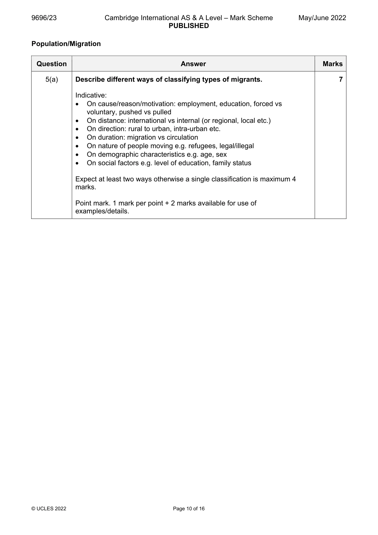
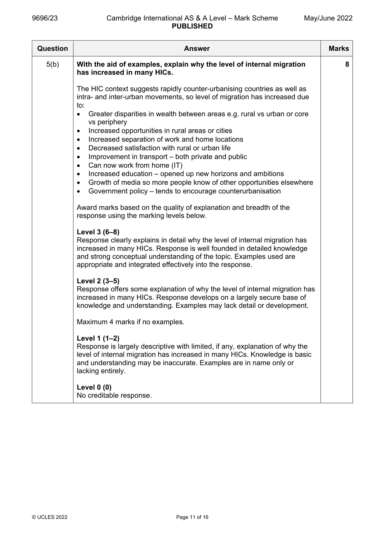
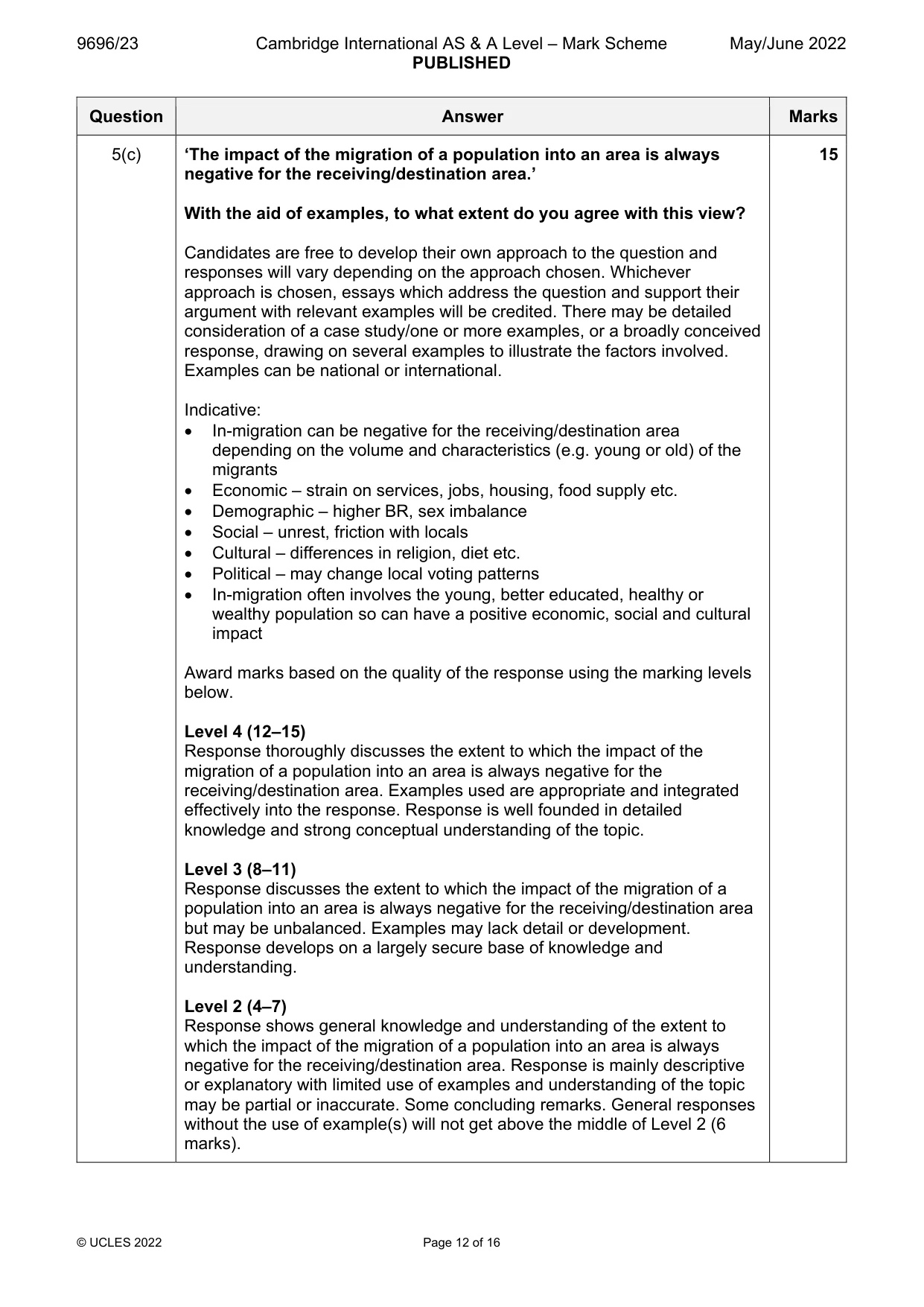
5 (a) Describe different ways of classifying types of migrants. [7] (b) With the aid of examples, explain why the level of internal migration has increased in many HICs. [8] (c) ‘The impact of the migration of a population into an area is always negative for the receiving/ destination area.’ With the aid of examples, to what extent do you agree with this view? [15] Population/Migration/Settlement dynamics
Mark scheme: 5(a) Describe different ways of classifying types of migrants. 7 Indicative: On cause/reason/motivation: employment, education, forced vs voluntary, pushed vs pulled On distance: international vs internal (or regional, local etc.) On direction: rural to urban, intra-urban etc. On duration: migration vs circulation On nature of people moving e.g. refugees, legal/illegal On demographic characteristics e.g. age, sex On social factors e.g. level of education, family status Expect at least two ways otherwise a single classification is maximum 4 marks. Point mark. 1 mark per point + 2 marks available for use of examples/details. 5(b) With the aid of examples, explain why the level of internal migration 8 has increased in many HICs. The HIC context suggests rapidly counter-urbanising countries as well as intra- and inter-urban movements, so level of migration has increased due to: Greater disparities in wealth between areas e.g. rural vs urban or core vs periphery Increased opportunities in rural areas or cities Increased separation of work and home locations Decreased satisfaction with rural or urban life Improvement in transport – both private and public Can now work from home (IT) Increased education – opened up new horizons and ambitions Growth of media so more people know of other opportunities elsewhere Government policy – tends to encourage counterurbanisation Award marks based on the quality of explanation and breadth of the response using the marking levels below. Level 3 (6–8) Response clearly explains in detail why the level of internal migration has increased in many HICs. Response is well founded in detailed knowledge and strong conceptual understanding of the topic. Examples used are appropriate and integrated effectively into the response. Level 2 (3–5) Response offers some explanation of why the level of internal migration has increased in many HICs. Response develops on a largely secure base of knowledge and understanding. Examples may lack detail or development. Maximum 4 marks if no examples. Level 1 (1–2) Response is largely descriptive with limited, if any, explanation of why the level of internal migration has increased in many HICs. Knowledge is basic and understanding may be inaccurate. Examples are in name only or lacking entirely. Level 0 (0) No creditable response. 5(c) ‘The impact of the migration of a population into an area is always 15 negative for the receiving/destination area.’ With the aid of examples, to what extent do you agree with this view? Candidates are free to develop their own approach to the question and responses will vary depending on the approach chosen. Whichever approach is chosen, essays which address the question and support their argument with relevant examples will be credited. There may be detailed consideration of a case study/one or more examples, or a broadly conceived response, drawing on several examples to illustrate the factors involved. Examples can be national or international. Indicative: In-migration can be negative for the receiving/destination area depending on the volume and characteristics (e.g. young or old) of the migrants Economic – strain on services, jobs, housing, food supply etc. Demographic – higher BR, sex imbalance Social – unrest, friction with locals Cultural – differences in religion, diet etc. Political – may change local voting patterns In-migration often involves the young, better educated, healthy or wealthy population so can have a positive economic, social and cultural impact Award marks based on the quality of the response using the marking levels below. Level 4 (12–15) Response thoroughly discusses the extent to which the impact of the migration of a population into an area is always negative for the receiving/destination area. Examples used are appropriate and integrated effectively into the response. Response is well founded in detailed knowledge and strong conceptual understanding of the topic. Level 3 (8–11) Response discusses the extent to which the impact of the migration of a population into an area is always negative for the receiving/destination area but may be unbalanced. Examples may lack detail or development. Response develops on a largely secure base of knowledge and understanding. Level 2 (4–7) Response shows general knowledge and understanding of the extent to which the impact of the migration of a population into an area is always negative for the receiving/destination area. Response is mainly descriptive or explanatory with limited use of examples and understanding of the topic may be partial or inaccurate. Some concluding remarks. General responses without the use of example(s) will not get above the middle of Level 2 (6 marks). 5(c) Level 1 (1–3) Response may broadly discuss the impact of the migration of a population into an area but does not address the question and does not come to a convincing conclusion. Response is descriptive, knowledge is basic and understanding is poor. Level 0 (0) No creditable response. Population/Migration/Settlement dynamics
Q6 · Describe the causes of re‑urbanisation
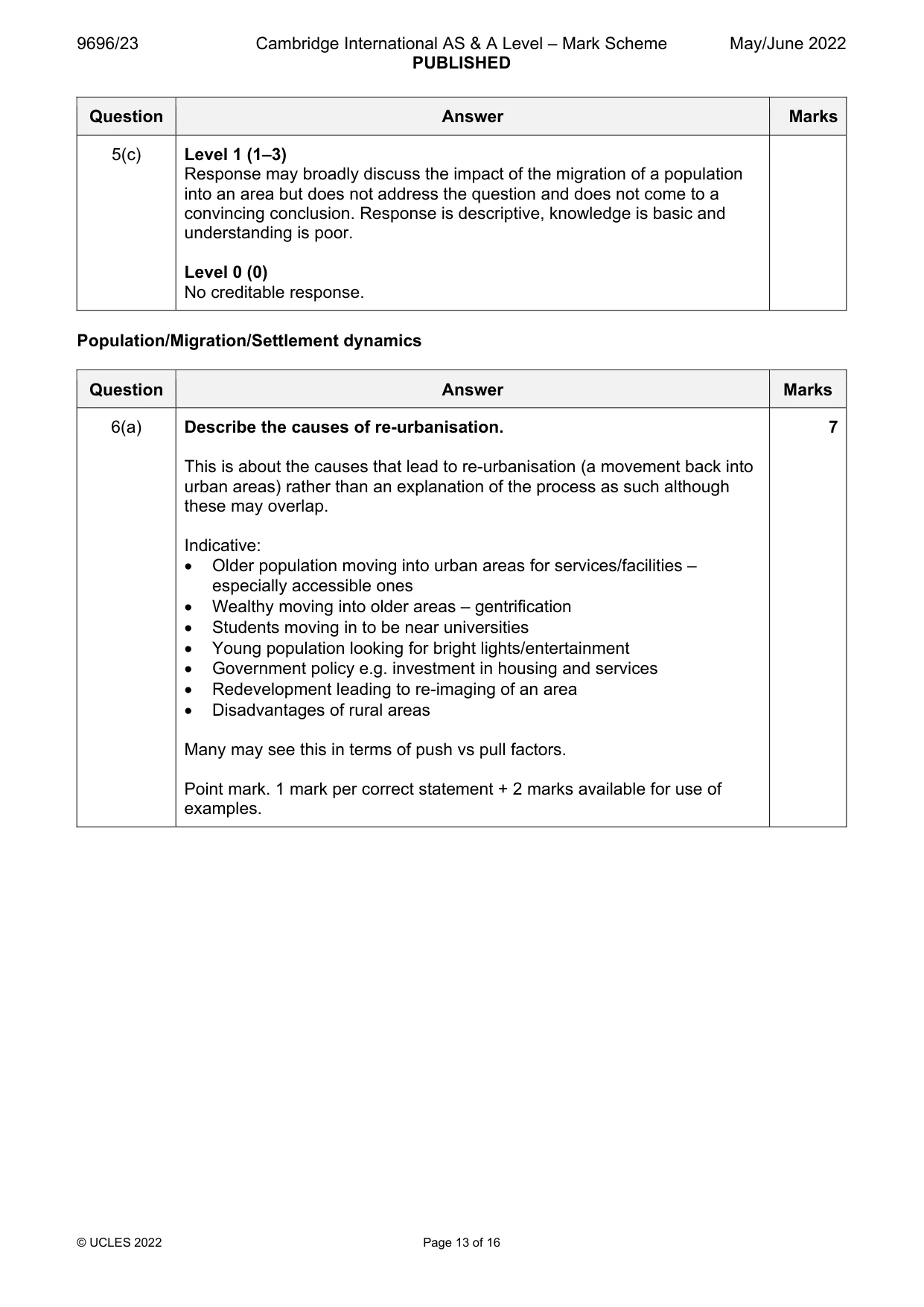
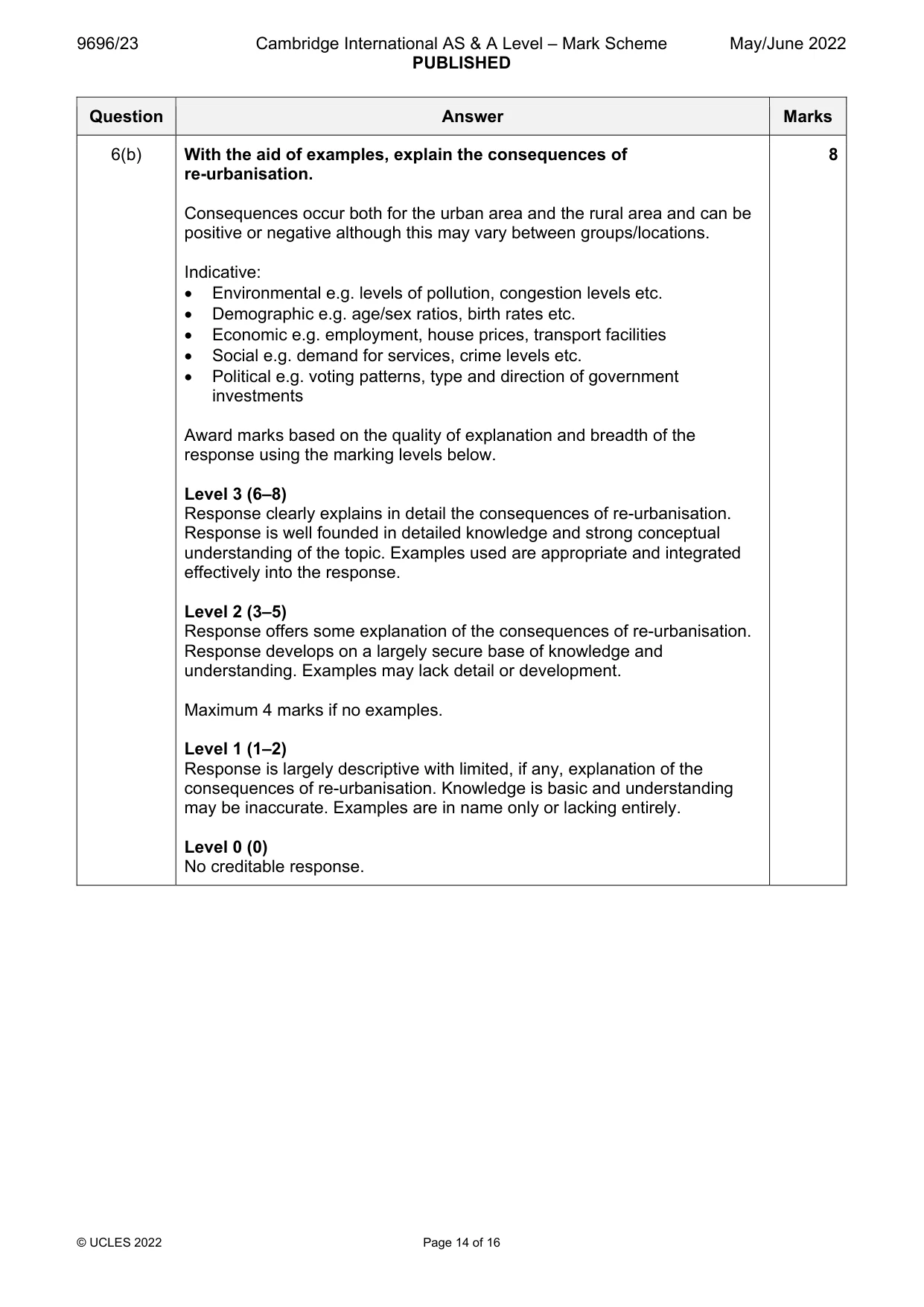
6 (a) Describe the causes of re‑urbanisation. [7] (b) With the aid of examples, explain the consequences of re‑urbanisation. [8] (c) With the aid of examples, to what extent do political factors affect the location of activities within urban areas? [15]
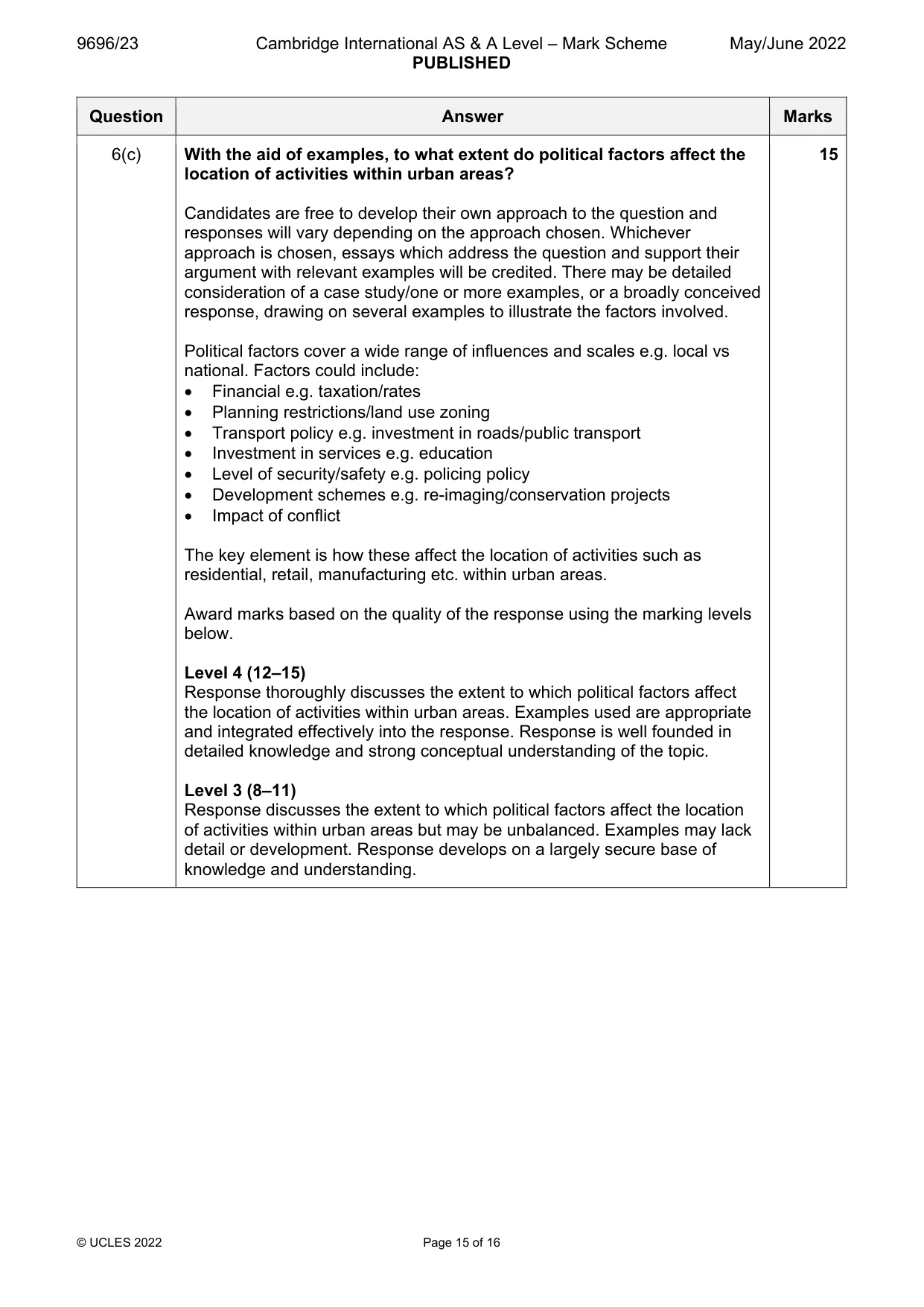
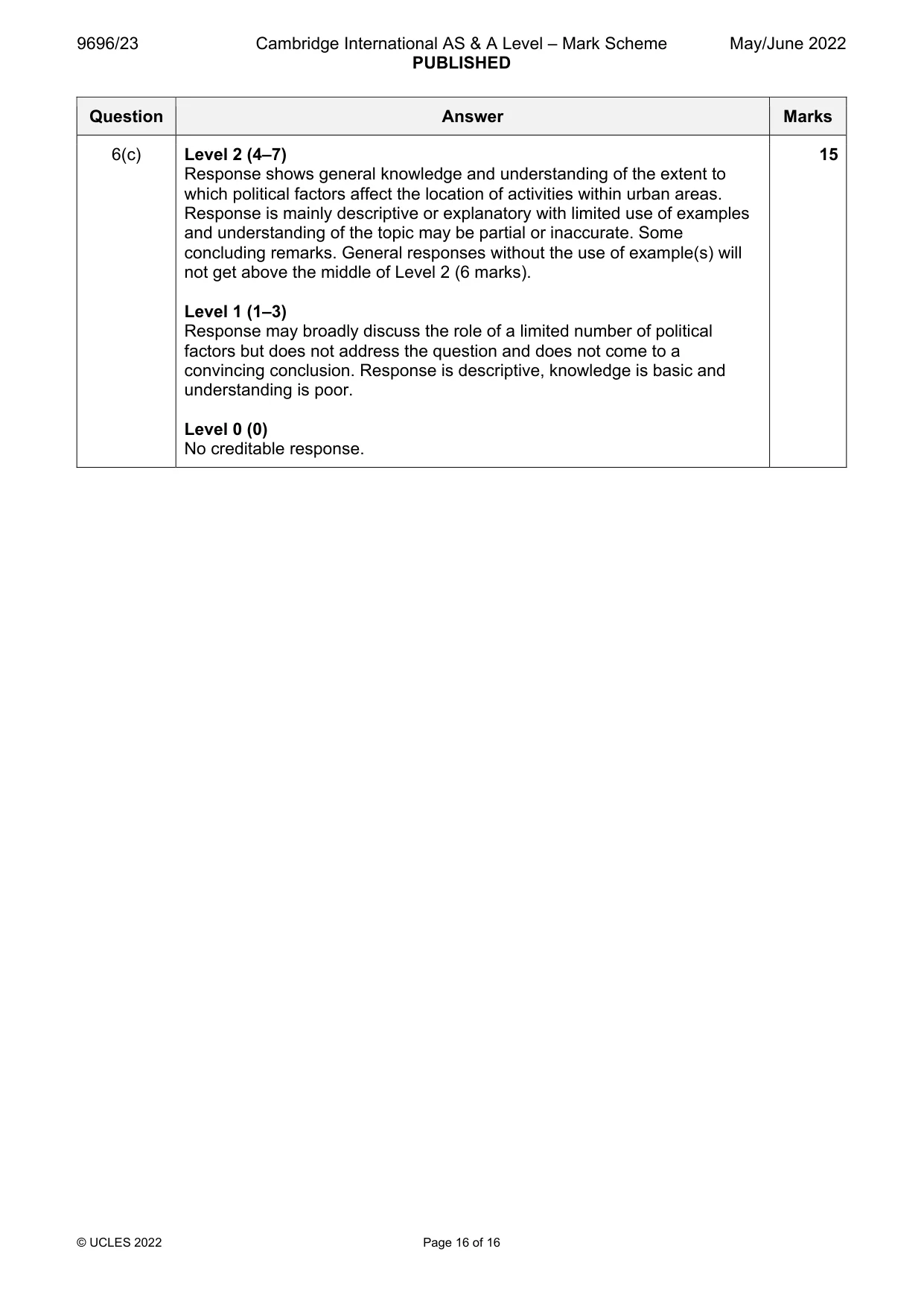
Mark scheme: 6(a) Describe the causes of re-urbanisation. 7 This is about the causes that lead to re-urbanisation (a movement back into urban areas) rather than an explanation of the process as such although these may overlap. Indicative: Older population moving into urban areas for services/facilities – especially accessible ones Wealthy moving into older areas – gentrification Students moving in to be near universities Young population looking for bright lights/entertainment Government policy e.g. investment in housing and services Redevelopment leading to re-imaging of an area Disadvantages of rural areas Many may see this in terms of push vs pull factors. Point mark. 1 mark per correct statement + 2 marks available for use of examples. 6(b) With the aid of examples, explain the consequences of 8 re-urbanisation. Consequences occur both for the urban area and the rural area and can be positive or negative although this may vary between groups/locations. Indicative: Environmental e.g. levels of pollution, congestion levels etc. Demographic e.g. age/sex ratios, birth rates etc. Economic e.g. employment, house prices, transport facilities Social e.g. demand for services, crime levels etc. Political e.g. voting patterns, type and direction of government investments Award marks based on the quality of explanation and breadth of the response using the marking levels below. Level 3 (6–8) Response clearly explains in detail the consequences of re-urbanisation. Response is well founded in detailed knowledge and strong conceptual understanding of the topic. Examples used are appropriate and integrated effectively into the response. Level 2 (3–5) Response offers some explanation of the consequences of re-urbanisation. Response develops on a largely secure base of knowledge and understanding. Examples may lack detail or development. Maximum 4 marks if no examples. Level 1 (1–2) Response is largely descriptive with limited, if any, explanation of the consequences of re-urbanisation. Knowledge is basic and understanding may be inaccurate. Examples are in name only or lacking entirely. Level 0 (0) No creditable response. 6(c) With the aid of examples, to what extent do political factors affect the 15 location of activities within urban areas? Candidates are free to develop their own approach to the question and responses will vary depending on the approach chosen. Whichever approach is chosen, essays which address the question and support their argument with relevant examples will be credited. There may be detailed consideration of a case study/one or more examples, or a broadly conceived response, drawing on several examples to illustrate the factors involved. Political factors cover a wide range of influences and scales e.g. local vs national. Factors could include: Financial e.g. taxation/rates Planning restrictions/land use zoning Transport policy e.g. investment in roads/public transport Investment in services e.g. education Level of security/safety e.g. policing policy Development schemes e.g. re-imaging/conservation projects Impact of conflict The key element is how these affect the location of activities such as residential, retail, manufacturing etc. within urban areas. Award marks based on the quality of the response using the marking levels below. Level 4 (12–15) Response thoroughly discusses the extent to which political factors affect the location of activities within urban areas. Examples used are appropriate and integrated effectively into the response. Response is well founded in detailed knowledge and strong conceptual understanding of the topic. Level 3 (8–11) Response discusses the extent to which political factors affect the location of activities within urban areas but may be unbalanced. Examples may lack detail or development. Response develops on a largely secure base of knowledge and understanding. 6(c) Level 2 (4–7) 15 Response shows general knowledge and understanding of the extent to which political factors affect the location of activities within urban areas. Response is mainly descriptive or explanatory with limited use of examples and understanding of the topic may be partial or inaccurate. Some concluding remarks. General responses without the use of example(s) will not get above the middle of Level 2 (6 marks). Level 1 (1–3) Response may broadly discuss the role of a limited number of political factors but does not address the question and does not come to a convincing conclusion. Response is descriptive, knowledge is basic and understanding is poor. Level 0 (0) No creditable response.
What was in this paper
The subtopics covered by these 6 questions, and how many questions each got. Open one in a new tab to see every Cambridge question on it.
What you needed in this session
Cambridge’s own grade thresholds for 2022 May/June, Paper 2 · Variant 3. A higher threshold means an easier paper — the bar moves with how the cohort did.